Interior Design/Interior Decorating

Interior Design: 3 Blue Color Scheme Options for the…

One of the biggest questions I get asked as an interior designer is what color scheme to use in decorating or designing a space.  If you’re not sure what color is best, trying shopping your closet for inspiration because your favorite outfits or jewelry are often the colors that look best.  Read on for three possibilities for a blue color scheme in your living space.

Karen Mills' blog
Photo courtesty of Century Furniture

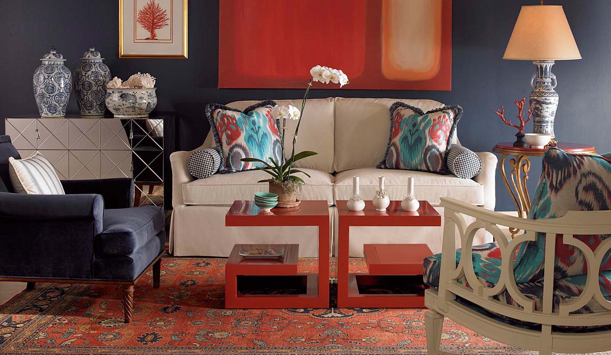
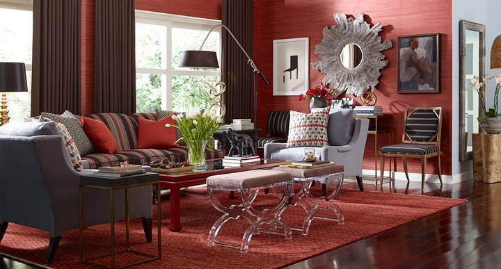
2. Red, White, and Blue

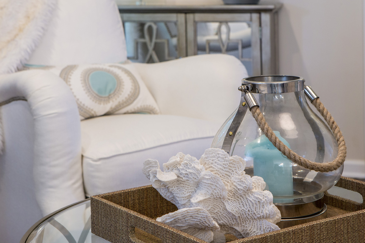
In this living space blue and red has been used quite effectively to create a little drama.  By starting with a neutral base of white and blue gray that’s more relaxing, red decor – tables, pillow patterns, and accents, can be added without overpowering the space.

Karen Mills' blog
Interior decorating by Karen Mills

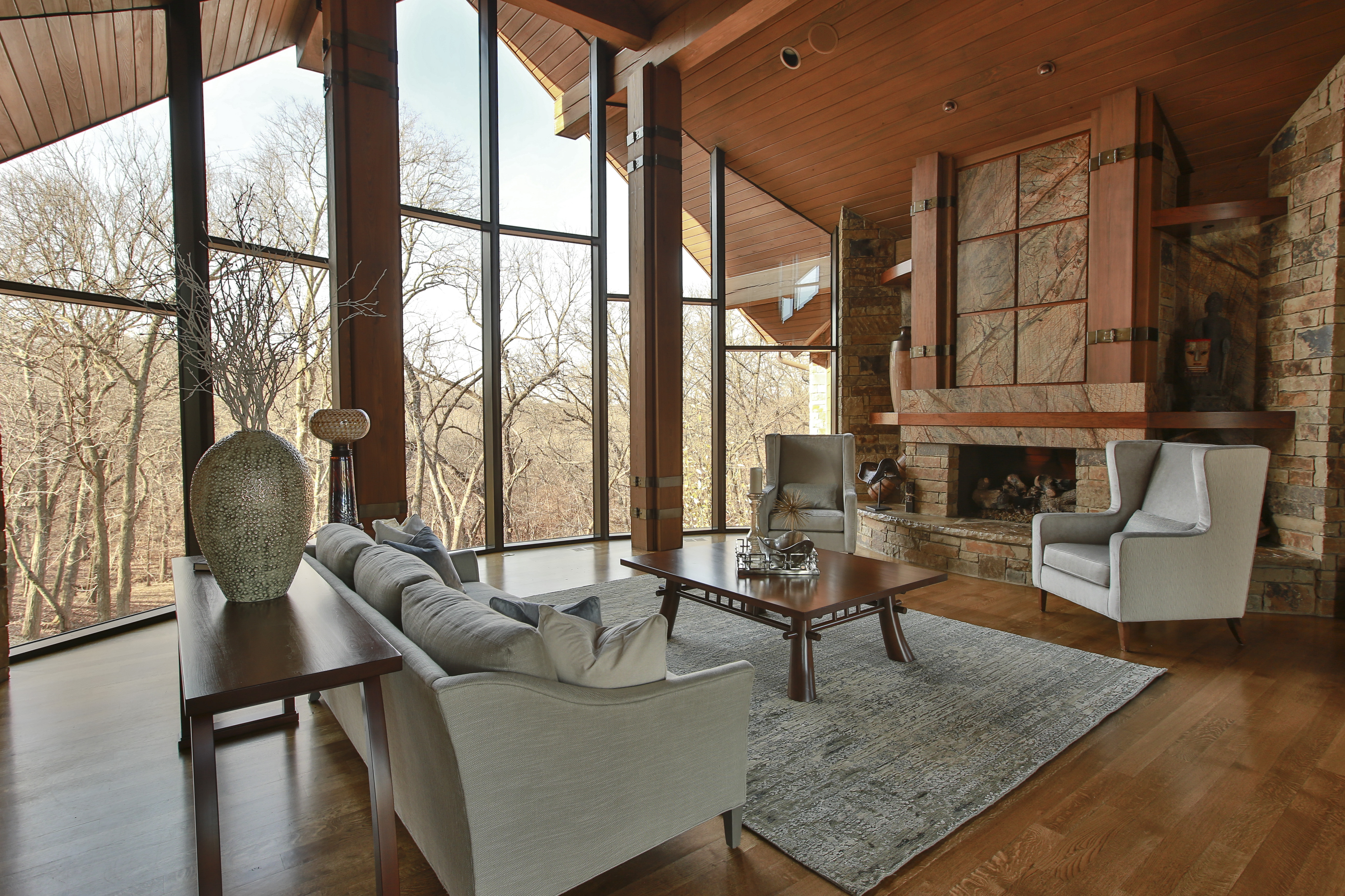
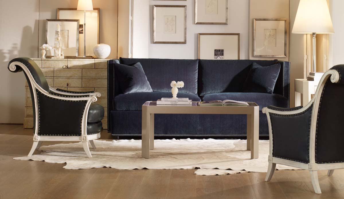
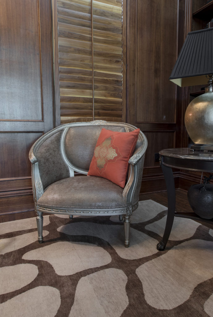
3. Blue, Warm Gray, Beige, and White

When you have a room that already has bold finishes – patterns and color like this one, you might want to introduce lighter neutral colors with little or no pattern for everything else.  Here we introduced lighter upholstery, pillows, decor, and an area rug with interesting textures and less pattern to create a calming effect.

Karen Mills' blog example of pattern
Interior design by Karen Mills

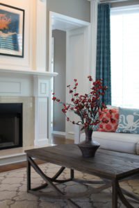
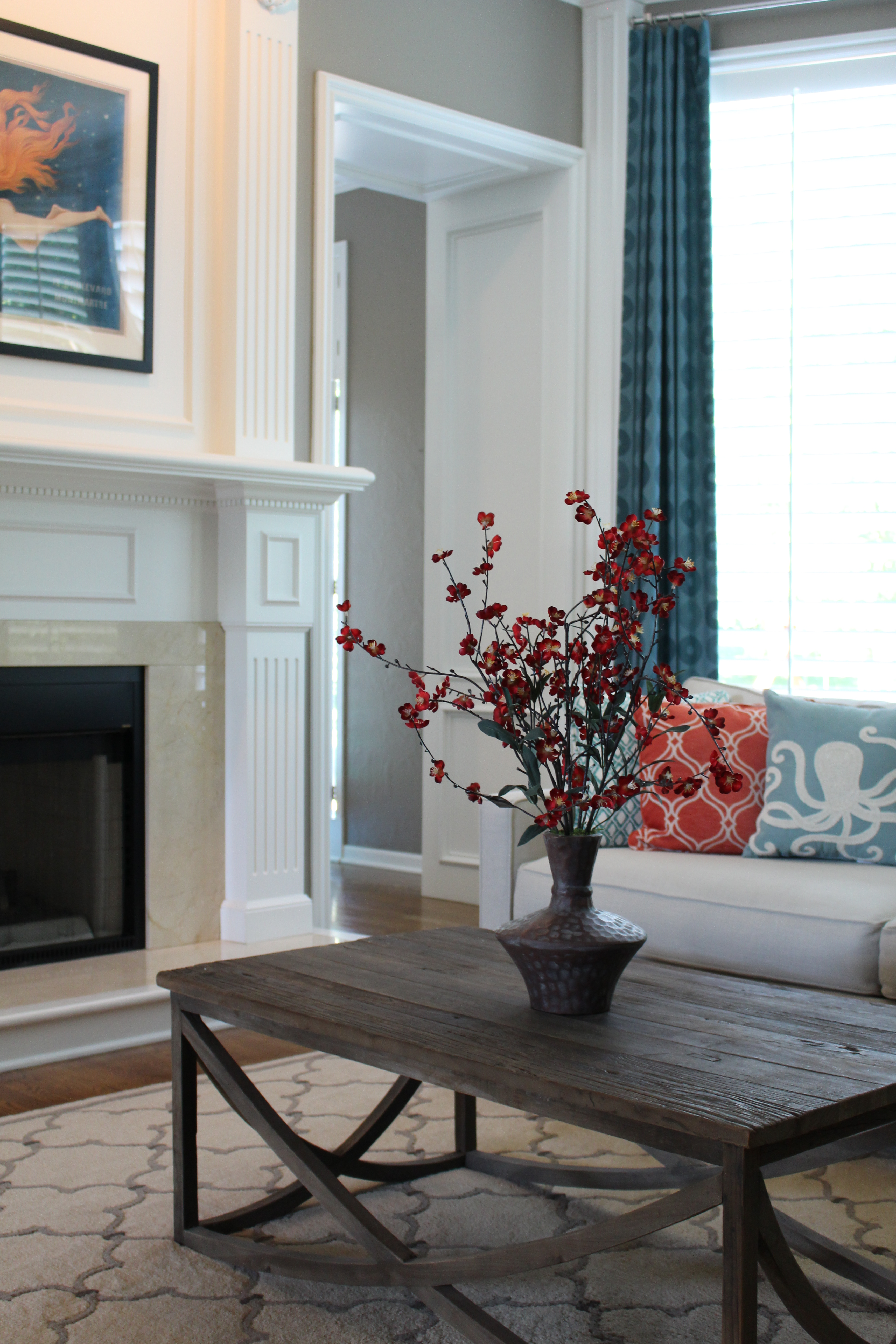
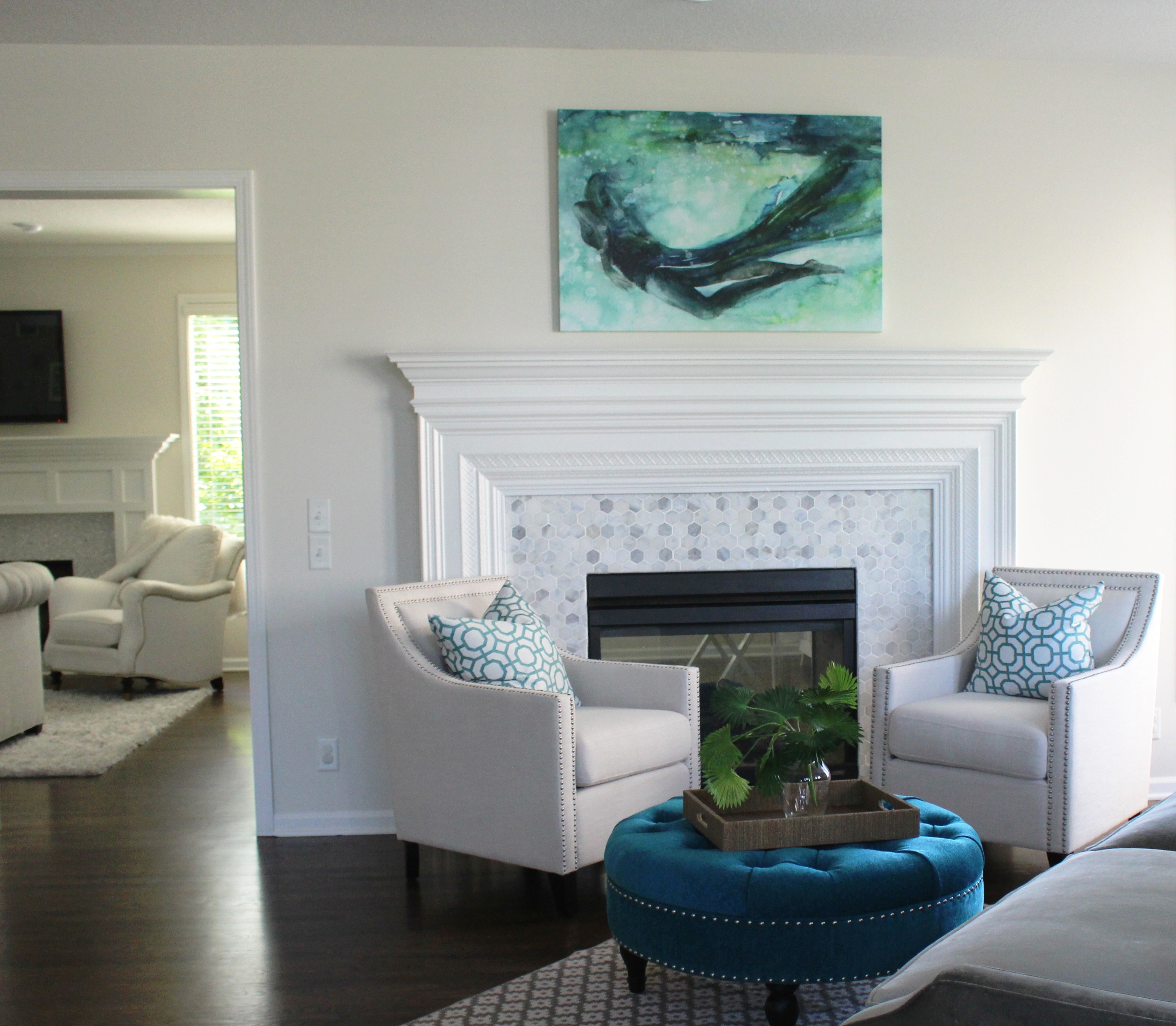
3. Blue, Orange, White, and Taupe

Inspiration for this color scheme came from the existing mermaid artwork over the mantel.  To bring it all together we started with a light neutral sofa and coffee table, then layered in custom blue draperies and fun toss pillows along with an existing rug to create a cohesive color scheme with the artwork. In addition by using orange and blue together, you create a more energetic vibe since they are opposites on the color wheel.

For more great ideas on design or interior decorating sign up for our weekly interior design blog here

Plus become a fan of Kansas City’s interior designer and former host of Living Large design show, Karen Mills, on Instagram or Facebook now!

Interior Design/Interior Decorating

Interior Design: 5 Tips for Selecting a Sofa That…

Share

Designer Tricks for Picking a Sofa to Perfectly Fit Your Room and Body Type

Karen Mills' blog
Photo courtesty of Century Furniture

As an interior designer I realize how little most homeowners know about selecting a sofa that will fit them.  Here are my top 5 secrets to selecting a perfect custom sofa for your home!

  1.  Determine the style and size of sofa needed for your space.  If you have tall ceilings and supersized furnishings, you will need a sofa that’s in proportion to the room’s design and if its a smaller cozier space you need to make sure the sofa doesn’t overpower your space.
Karen Mills' blog
Photo courtesy of Century Furniture

2. Make sure you select the right cushioning for your sofa style and your personal preference whether it’s foam and down, all down, allergy free, or a combination of materials on the seat and back of your sofa.

3.  Ensure the sofa fits your body type and height so your feet aren’t dangling above the floor or you aren’t unable to lean back comfortably in the seat because it too deep.

Karen Mills' blog
Photo courtesy of Bernhardt Furniture

4. Select the correct material for your sofa.  If you will be using the sofa  regularly then you will need a higher double rub count for durability and if you have dogs or cats, try to avoid a fabric that can be snagged easily.  Also keep in mind how easily the fabric will clean and if it will go will with your room’s design and other fabrics.

5. Solid or Tone on Tone Sofa Color  As an interior designer, I prefer a solid color or tone on tone sofa because it’s usually one of the biggest items in your room and can seem overpowering if you select a busy pattern or even a color that’s too bold. Of course rules are meant to be broken but only if you are a professional interior designer or have a keen eye to know what works and what doesn’t

Karen Mills' blog
Photo courtesy of Bernhardt furniture

For more great ideas on selecting furnishings and decorating sign up for our weekly interior design blog here

Plus become a fan of Kansas City’s interior designer and former host of Living Large design show, Karen Mills, on Instagram or Facebook now!

Interior Design/Interior Decorating

Interior Design: What’s Hot and What’s Not for 2019

5 Interior Design Trends To Embrace in 2019

Karen Mills' blog
Photo courtesy of Curated Kravet

1. Warm Vibrant (or Bold) Colors  For the past ten years we’ve seen gray neutral colors dominate the interior design scene but now as an interior designer I’m noticing a return to bolder colors with warmth whether they’re in a whole room color scheme like shown here or just as an accent in a light neutral warm hue.

In fashion this fall crimson red, warm yellow, and tobacco brown mixed in new and unusual ways made a strong comeback including bold combinations like red, black, and white which I will cover in more detail in an upcoming blog.

Karen Mills' blog
Interior Design Project by Karen Mills featured in book DESIGN ICONS

2. Nesting Trend    Homeowners are beginning to return to nesting with all the turmoil in the headlines so we will see a resurgence of comfortable and inviting interiors that are textural including finishes like rattan or raw wood, artisan products, and curves on our sofas or sculptural items.

In this entry the space is warmed up with branches and a comfortable fringe throw along with with comfortable pillows.

Karen Mills' blog
Photo courtesy of Century Furniture


3. Health and Wellness   With environmental factors impacting our health right and left along with an over abundance of processed foods, people are looking for healthy alternatives whether its natural fabrics and controlled sleep environments like our Sleep Better Live Better program or the ability to cook farm fresh meals in the kitchen.

Here in this room shades made of natural fibers, an antler lamp, and wood art piece bring a sense of well being to this space.

Interior design project by Karen Mills featured in Design Icons book

4. Personalization  Even though we’ve heard this term before its still a huge trend this coming year as evidenced in this library we designed that’s has been completely personalized for our client from the custom desk made of champagne wood, leather, and glass and accompanying pebbled leather chair to the custom designed rug underneath, snakeskin chair , and mementos from world travels displayed on the shelves beyond.

Karen Mills' blog
Interior design project by Karen Mills featured in book Architecture Today Interior Design
Karen Mills' blog
Interior design by Karen Mills

5. Maximalism  For years we’ve seen a minimalist trend with less pattern and movement but that’s changing and we will see more bold patterns and/or colors mixed together in a mix of design styles like this entry that includes an antique french console table, classic black and white tile, hand made wallpaper, and a custom contemporary rug in this contained space.

So what’s not hot for this coming year? First copper or rose gold is starting to lose ground in finishes along with single accent walls and overly ornate details. Cool grays, all stark white, wall signs, and ikat patterns have also fallen off the trend wagon for next year but that doesn’t mean that warm grays or white can’t be combined with other vibrant colors which I will cover in an upcoming blog.

For more inspiration, ideas, and photos, sign up for our weekly interior design blog here

Plus become a fan of Kansas City’s interior designer and former host of the Living Large design show, Karen Mills, on 
Instagram and Facebook here!

Interior Design/Interior Decorating

Interior Design: Bold Color Forecast for 2018

Karen Mills' blog
Photo courtesy of Century Furniture


If you’ve been paying attention to interior designers or the fashion runway this fall you may have noticed bold colors popping up everywhere from red and yellow to bold blues.   Sherwin Williams and Benjamin Moore have announced their exciting bold new colors of 2018 but Lea Eiseman with the Pantone Institute has yet to reveal their color of the year which impacts all types of industries from fashion and design to autos and appliances.

Do you think Pantone will select the hot new mustard yellow color or something else?

Karen Mills' blog
Photo courtesy of Sherwin Williams

Benjamin Moore’s color of the year 2018 is a bold hue and one of my favorites!  I especially love it contrasted with white like the room shown above.

Bold blue hues like this also look great with beige colors, red, and orange along with citrine, a yellowy green.

Karen Mills' blog
Interior design by Karen Mills/Photography by 29Pixel Studios

In the room above we incorporated a bold blue hue on the ottoman to give the space pizzazz.


Karen Mills' blog
Photo courtesy of Benjamin Moore

Benjamin Moore selected Caliente Red AF-290 as their color for 2018.  Of course red has been a favorite color of mine forever because its such a vibrant unexpected color that instantly creates drama!

What’s your favorite color for 2018?!  Post in the comments.

For more great information on color and more, sign up for our weekly interior design blog here

plus become a fan of Kansas City’s interior designer and former host of the Living Large interior design show, Karen Mills, on Facebook here.

Interior Design/Interior Decorating

Interior Design: 3 Secrets to a Comfortable Living Space


Karen Mills' blog
Photo courtesy of Century Furniture

Is there anything better than a comfortable relaxing space at the end of a long day?  Not for me.  That’s why my focus at home and with interior design clients is just as much about comfort and function as beauty.  So here are my three tips for creating a comfortable interior design.

1. Comfortable seating.  To begin make sure that you’re selecting upholstery that’s comfortable for long periods such as the custom furniture shown.   When seated on a sofa or chair ensure your legs are able to touch the floor and that your thighs fit the seat depth so you’re not having to lean back uncomfortably. Plus consider adding an ottoman for a late afternoon snooze or to relax while watching TV.

Karen Mills' blog
Interior design by Karen Mills

2. Layer in texture  in everything from area rugs and/or soft window treatments to accessories like pillows or throws remembering that each layer of texture creates a cozier feel.

Karen Mills' blog
Photo courtesy of Century Furniture

 3. Select a color scheme that includes elements of warmth whether that’s on walls, ceilings, floors, windows, or accessories.  For example on a wall you might add textural wallpaper or go with a warmer color.  On the windows you might introduce a bamboo window shade under draperies.  And finish off the room with textural pillows.

For more fabulous interior design trends, sign up for our weekly blog here!

Plus become a fan of Kansas City’s interior designer and former host of the Living Large design show, Karen Mills, on Facebook here!

Interior Design/Interior Decorating

Interior Decorating: What Does Your Favorite Color Say About…


Karen Mills' blog
Photo courtesty of Century Furniture

Ever wonder what your favorite color says about you or how to use it in your interior?

As an interior designer and color expert, I can tell you that’s not always an easy task because it takes years of experience to learn how colors can impact rooms based on lighting and location.  So here’s some insight on what color says about you and how you might use it.

If you love red like I do you most likely live life to the fullest with spontaneity and excitement.  But what does a red interior say to others?  The color, associated with blood and fire, can raise your blood pressure and grab your attention!  So if you don’t want to go completely red, try incorporating red as an accent color like the photo above to make your space a little more vibrant.

Karen Mills' blog
Interior design by Karen Mills. Photography by 29 Pixels.

Blue, however, exudes stability, tranquility, calm and reliable.  Blue’s also the favorite color for the majority of men. A perfect color for bedrooms, blue helps you unwind, especially blue greens that are soothing, and lovers of this color tend to be responsible stable citizens who do the right thing.

Yellow, like a ray of sunshine adds warmth and optimism, making it perfect for a kitchen or a sunny living area, and big fans of this color are often optimistic people with a happy misdemeanor.

Karen Mills' blog
Interior design by Karen Mills Photography by 29 Pixels

Green, the color of nature exudes calmness and warmth, making it also a good color for bedrooms or spaces where you need a more relaxed feel.  Fans of this color are usually warm, kind, and charitable.

Purple, a favorite color among children, denotes creativity.  Lovers of this color are often more complex artistic, fascinating individuals who sometimes may seem mysterious.

Karen Mills' blog
Interior design by Karen Mills

Orange, the color of hunger and vibrancy fits perfectly into that dining room or kitchen area where you need some life or excitement.  And if you’re an orange lover, you probably show the same vibrant spirit as the color with your enthusiastic zest for life.

Karen Mills' blog

But what if your favorite color is beige?  Beige means you’re more timeless, basic, conservative, and simple.  Taupe leans toward traits of well balanced, classic, and fair, but brown usually denotes down to earth and no nonsense.

Karen Mills' blog
Interior design by Karen Mills Photography by 29 Pixels

Grays tend to be intellectual, wise, calm, practical, and conservative and lovers of white lean toward cleanliness, neatness, and purity.

Black, the absence of color leans toward classic good taste but can also mean that you enjoy power, confidence or just being conservative.

For more great interior design ideas and photos, sign up for our blog here!

Plus become a fan of Karen Mills, Kansas City’s interior designer and former host of Living Large on Facebook here now!

Interior Design/Interior Decorating

Interior Design: Trending in Winter White

Karen Mills' blog
Courtesy of Century Furniture

The color white has ruled the interior design market for 2016 and I don’t see signs of this dreamy color dying out yet.   In fact there’s nothing I personally love to wear or be surrounded by than white because of the way it bounces light around the room and how fresh it makes me feel.

Karen Mills' blog
White chair by Z Gallerie

Believe it or not the majority of my new projects as an interior designer are still requests for whites and cool light neutrals with a pop of color even in the midst of winter.

Karen Mills' blog
Photo courtesy of Hickory White

Karen Mills' blog
Burma stool by Bungalow5

So today I’m sharing some winter whites that inspire me and giving more insight into this fabulous color from the color experts.


Karen Mills' blog
Courtesy of Bernhardt Furniture

Karen Mills' blog
Georgina coffee table from Bernhardt Furniture

Karen Mills' blog
Natalie chair by Christopher Guy

According to former Living Large show guest and color expert Kate Smith color affects us physically in the following ways:

Aids mental clarity

Encourages us to clear clutter or obstacles

Evokes purification of thoughts or actions

Enables fresh beginnings

Karen Mills' blog
Visual Comfort lighting

But that’s not all.  The nation’s leading color expert and former Living Large guest Lea Eiseman of the Pantone Color Institute states in one of her books, “White also signifies innocence.  It is a recall of youth and simplicity, and a longing to be young again.”   No wonder I love white!

Karen Mills' blog
Photo of Brittanicca counters courtesy of Cambria

For more great ideas and photos, sign up for our weekly interior design blog here

Plus become a fan of Kansas City’s interior designer and former host of the Living Large design show, Karen Mills, on Facebook here!

Interior Design/Interior Decorating

Interior Decorating: Fabulous New Finds in Chairs


Karen Mills' blog
Courtesy of Lee Industries

Ready to see what’s new or fun in chairs from the interior design industry?  Here are some of my favorites that are starting to make an appearance or already have.

Karen Mills' blog
Courtesy of Lexington furniture

Love how the embossed leather is juxtaposed against the shiny metallic arms to create a “wow” look.

Karen Mills' blog
Elka chair by Bernhardt furniture

This Elka chair looks so inviting and could fit in a wide range of design styles, making it a popular choice for interior designers.

Alexandra chair by Hickory furniture

When I saw this Alexandra chair I just made me smile because its so feminine and light.  Plus I love the quatrofoil design in the back that’s commonly described as Moroccan style.

Karen Mills' blog
Dixon arm chair by Century furniture

How beautiful are the lines in this Dixon chair with arms that almost feel like they’re trying to hug you?

Karen Mills' blog
Barrington chair by Dunn

Love how much style is in the Barrington chair by Dunn.  Amazing how a simple wood chair can have such a feminine edge to it by introducing sexy slim legs and a thin profile seat.

For more great trends and photos sign up for our interior design blog here

Plus become a fan of Kansas City’s interior designer and former host of Living Large design show, Karen Mills, on Facebook here