Interior Design/Interior Decorating

Interior Design: 7 Ways to Space Plan an Open…

Tips for Making Sense of Your Living and Dining Room Open Floorplan Design by using an Effective Room Layout

photo example

As an interior designer who’s worked on over 1300 projects, I’ve noticed the number one interior design dilemma that our clients struggle with begins with how to space plan, especially in an awkward space or an open concept floorplan. Read on for my seven design secrets to space planning more effectively in an open floorplan.

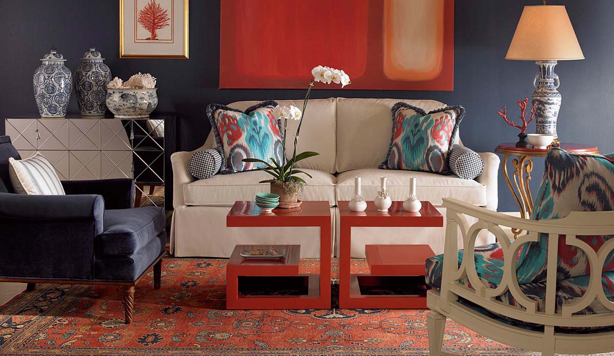
  1. Create Zones – The first step to space planning an open living area is to determine the areas or zones you need to function well in the space whether it’s a TV watching area, conversational grouping, dining area, or work area. But remember when you’re creating zones to ensure they fit naturally into the architecture of that space.
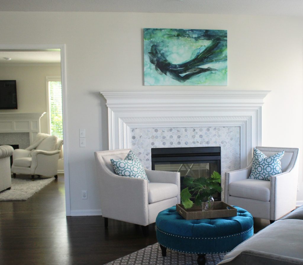
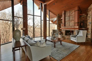
  2. Emphasize Focal Point – Once you’ve laid out the zones and their functions, you need to determine the focal point for each one like the fireplace above, a fantastic view, or a focal point you’ve created with a furniture grouping (vignette).
  3. Place furniture in a cozy grouping – As an interior designer I recommend starting with your living room zone(s) by creating groupings that emphasize conversation with the main sofa or sectional facing your focal point such as a “L” shape, “U” shape configuration. Here in this living room the sofa faces the fireplace focal point while the wingback chairs emphasize the focal point and encourage conversation with people seating on the sofa.
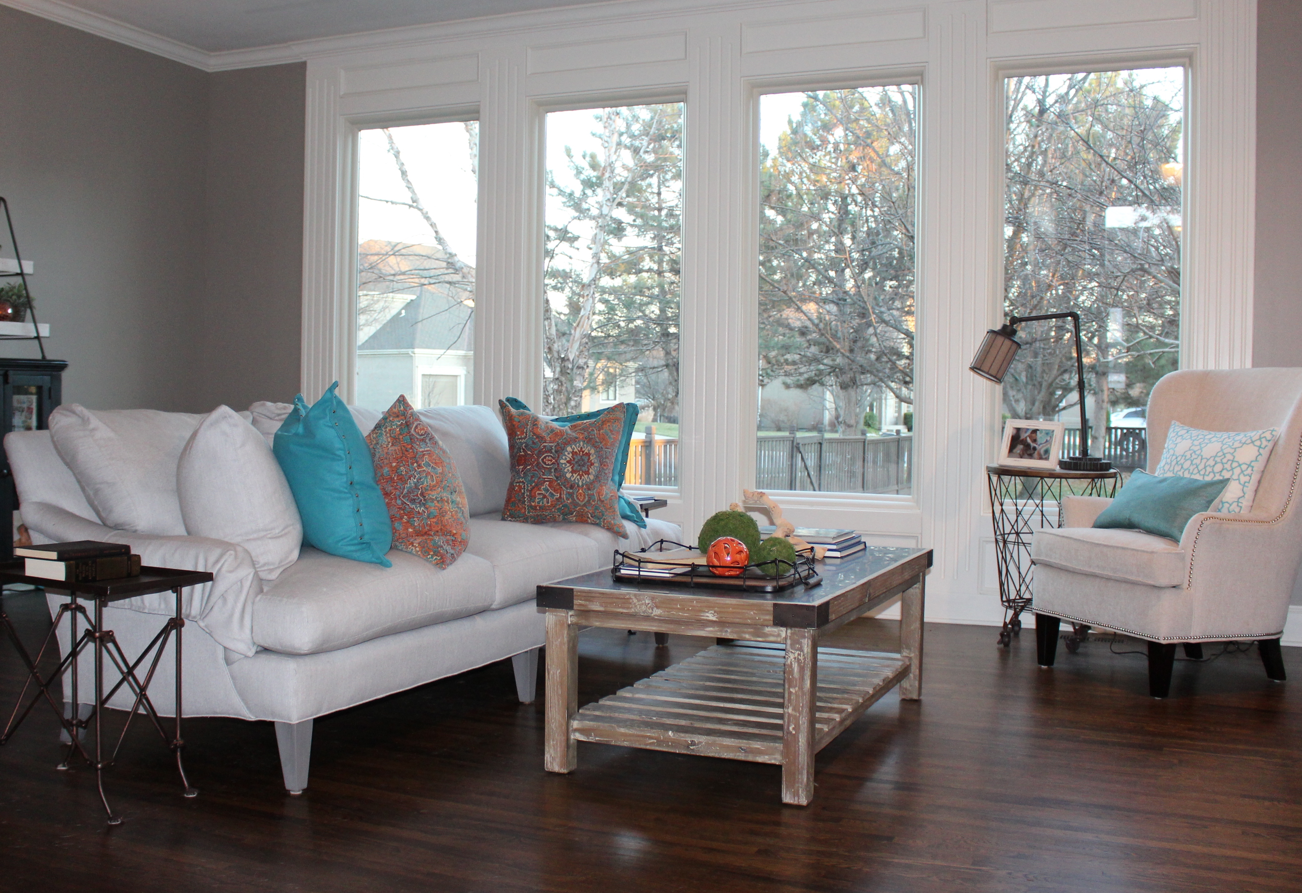
  4. Create cohesiveness with color, design style, rugs, and finishes – When placing furniture in cozy groupings, ensure that you have repeated the same colors and overall design style to make a harmonious space, while layering a rug underneath as shown in this photo.
  5. Leave ample walkways – As you’re creating these zones, remember to leave 3-4′ wide walkways between each one to get from one zone to another, while also leaving room to weave through conversational areas or push back chairs at a dining table.
  6. Use dividers to further separate space when needed, whether it’s a room divider, pocket doors, glass wall or barn doors. Other great ways to divide space when remodeling or building can include different ceiling treatments, ceiling height, architectural features, or even tall elements like trees.
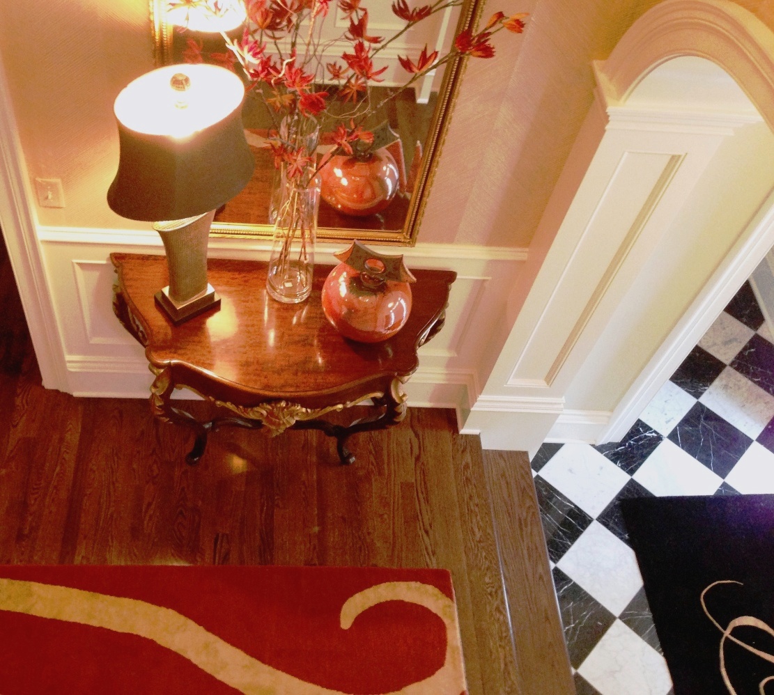
  7. Layer in Lighting – Chandeliers, sconces, lamps, and accent lighting also provide another way to divide a space visually, while adding an ambiance and task lighting when needed.

To learn more about space planning, click here!

Interior Design/Interior Decorating

Interior Decorating: 3 Steps to Creating a Finished Look…

Do you have a collection of mismatched furniture that feels undone?  Read on for my 3 interior designer tips for creating a more cohesive look in your living room.

Interior design by Karen Mills

1. Use Repetition – To coordinate two pieces of mismatched upholstery, unify both upholstery pieces by repeating one color from one piece of furniture to another with a pillow or throw, for example.  Here the blue green color of the ottoman was repeated in the pattern on the pillows, while the artwork brings everything together including the gray velvet sofa in the foreground and the new tile on the fireplace to create a cohesive feel.

2. Introduce a new design element – By introducing a pillow with blue and tan accents on the chair the same color scheme is now picked up in the tan tray that holds white coral and a blue candle, tying both furnishings together.

When creating vignettes of accessories in your space whether its for a tabletop or shelves, try to place objects of various heights, sizes, texture, and shapes together to create a cohesive whole.  Normally placing the taller narrower items at back with shorter wider items at the front works best as shown on this tray.

photo example
Photo courtesy of Curated Kravet

3. Layer a rug underneath – In this living room the striped area rug underneath helps brings together the white sectional and brown chair plus ottomans to create a cohesive feel.

For more great interior design ideas, sign up for our blog here!

Plus become a fan of Kansas City’s interior designer and former host of the Living Large design show, Karen Mills on Facebook or Instagram here.

Interior Design/Interior Decorating

Interior Design: Backsplash Trends 2019

What’s New & Next for Kitchen & Bath Back splashes

Walker Zanger tiles from Virginia Tile

Since I specialize as an interior designer with remodels, especially bathrooms, kitchens, and basements, I’m in tile showrooms constantly always looking for what’s new and next in tile. Of course personal style still dominates as a huge trend but read on for some of the other new trends I’ve been noticing for the past couple of years that are still trending into next year.

1. Go Bold or Go Home – The tiles shown may look small but they are actually closer to 10″ square. Big contrasts like the gold border on the black tile are another trend along with mixing up sizes.

3D Walker Zanger Tiles from Virginia Tile

2. 3D Designs including Graphic Patterns – Three dimensional designs may have been around for a few years but they’ve gotten bolder, especially with a solid tone on tone color. We’re also getting more options in shapes giving homeowners and interior designers an opportunity to play with the tiles like puzzle pieces to create one of a kind designs like this triangle shape shown here.

3D Tiles from Virginia Tile
Walker Zanger Tile

You may have noticed how much I love this graphic 3D design here and that’s because it adds so much style and interest without overpowering the room. Will be sharing a recent kitchen remodel project completed with this tile in the coming weeks so stay tuned!

3D Yosemite Tiles courtesy of M&S Distribution
Yosemite Glass Tile from M&S Distribution

3. Organic Tile Designs – Don’t know about you but I never tire of design that relates to what I see in nature, especially this fabulous large glass tile panel that reminds me of ocean waves rolling in.

Tiles from M&S Distribution

For more great interior design ideas, sign up for our blog here!

Plus become a fan of Kansas City’s interior designer and former host of Living Large design show, Karen Mills here on Facebook or Instagram here.

Interior Design/Interior Decorating

Interior Decorating: How to Show Off Your Color Personality

Ever wonder what your favorite color says about you and how to use it to showcase your personality?

As an interior designer and color expert, I can tell you that’s not always an easy task because it takes years of experience to learn how colors colors can impact a room in different lighting situations..  No wonder painting is currently listed as the most common home improvement project since countless homeowners waste money having their spaces repainted after selecting a color or combination that doesn’t work.

So here’s some insight on your color’s meaning that may help and ideas for using it in your home.

Karen Mills' blog

If you love red like I do you most likely live life to the fullest with spontaneity and excitement like this little girl pictured in a red Halloween costume.  But what does a red interior say to others?  The color, associated with blood, raises your blood pressure and grabs your attention!  So if you don’t want to go completely red, try using it as an accent color to make your space a little more vibrant.

Karen Mills' blog

Blue, however, exudes stability and calm, making it a perfect color for bedrooms where you need to unwind.  Lovers of this color tend to be dependable, responsible citizens who do the right thing.

Karen Mills' blog

Yellow, like a ray of sunshine on a fall day portrays warmth and optimism in a room, making it perfect for a kitchen or a sunny living area, and fans of this color are often optimistic people with a positive encouraging attitude.

Green, the color of nature exudes calmness and warmth, which makes it a good color for bedrooms or spaces where you need a more relaxed feel.  And fans of this color are usually warm, kind, and charitable.

Karen Mills' blog

Purple fans, often a more complex and creative type of individual, are fascinating individuals but sometimes may seem mysterious or dark to others who don’t understand their creativity.

Orange, the color of hunger and vibrancy fits perfectly into that dining room or kitchen area where you need some life.  And if you’re an orange lover, you probably show the same vibrant spirit as the color with your enthusiastic zest for life.

For more great interior design ideas, sign up for our blog here!

Plus become a fan of Karen Mills, Kansas City’s interior designer and former host of Living Large design show

Plus become a fan of Kansas City’s interior designer and former host of the Living Large design show, Karen Mills, on Facebook or Instagram here!

Interior Design/Interior Decorating

Interior Decorating: How to Showcase Your Personality with Color

Ever wonder what your favorite color says about you and how to use it to showcase your personality?

As an interior designer and color expert, I can tell you that’s not always an easy task because it takes years of experience to learn how colors colors can impact a room in different lighting situations..  No wonder painting is currently listed as the most common home improvement project since countless homeowners waste money having their spaces repainted after selecting a color or combination that doesn’t work.

So here’s some insight on your color’s meaning that may help and ideas for using it in your home.

Karen Mills' blog

If you love red like I do you most likely live life to the fullest with spontaneity and excitement like this little girl pictured in a red Halloween costume.  But what does a red interior say to others?  The color, associated with blood, raises your blood pressure and grabs your attention!  So if you don’t want to go completely red, try using it as an accent color to make your space a little more vibrant.

Karen Mills' blog

Blue, however, exudes stability and calm, making it a perfect color for bedrooms where you need to unwind.  Lovers of this color tend to be dependable, responsible citizens who do the right thing.

Karen Mills' blog

Yellow, like a ray of sunshine on a fall day portrays warmth and optimism in a room, making it perfect for a kitchen or a sunny living area, and fans of this color are often optimistic people with a positive encouraging attitude.

Green, the color of nature exudes calmness and warmth, which makes it a good color for bedrooms or spaces where you need a more relaxed feel.  And fans of this color are usually warm, kind, and charitable.

Karen Mills' blog

Purple fans, often a more complex and creative type of individual, are fascinating individuals but sometimes may seem mysterious or dark to others who don’t understand their creativity.

Karen Mills' blog

Orange, the color of hunger and vibrancy fits perfectly into that dining room or kitchen area where you need some life.  And if you’re an orange lover, you probably show the same vibrant spirit as the color with your enthusiastic zest for life.

For more great interior design ideas, sign up for our blog here!

Plus become a fan of Karen Mills, Kansas City’s interior designer and former host of Living Large design show

Plus become a fan of Kansas City’s interior designer and former host of the Living Large design show, Karen Mills, on Facebook or Instagram here!


Interior Design/Interior Decorating

Interior Decorating: 3 Color Scheme Options for Your Living…

One of the biggest questions I get asked as an interior designer is what color scheme to use in decorating or designing a space.  If you’re not sure what color is best, trying shopping your closet for inspiration because often your favorite outfits or jewelry are the colors that look best.  Read on for three possibilities for your living space.

Karen Mills' blog

1. Blue and Orange 

Here in this photo I snapped before the rug was placed to tie everything together, we incorporated cool turquoise pillows to calm down the bold pops of orange along with introducing pillows with both colors to lessen the impact.

Karen Mills' blog
Interior decorating by Karen Mills

This living room is another example of how to decorate with blue and orange.  Our inspiration for the color scheme came from the existing water blue and orange artwork over the mantel.  To bring it all together we started with a light neutral sofa and coffee, then layered in custom blue draperies and fun toss pillows to create a cohesive color scheme with the artwork.

Karen Mills' blog
Photo courtesty of Century Furniture

2. Blue and Red

In this living space blue and red has been used quite effectively to create a little drama.  By starting with a neutral base of white and blue gray that’s more relaxing, red decor – tables, pillow patterns, and accents, can be added without overpowering the space.

Karen Mills' blog
Interior decorating by Karen Mills

3. Taupe gray and beige

When you have a room that already has bold patterns and color in its finishes like this one, you might want to introduce lighter neutral colors with little or no pattern.  Here we introduced lighter upholstery and an area rug with interesting textures and less pattern to create a calming effect.

For more great ideas on interior decorating sign up for our weekly interior design blog here

plus become a fan of Kansas City’s interior designer and former host of the Living Large design show, Karen Mills, on Facebook here!

and check out our latest interior design article on Houzz here

https://www.houzz.com/ideabooks/97946595/list/redecorating-lite-6-quick-updates-to-liven-up-your-living-spaces/

Interior Design/Interior Decorating

Interior Decorating: 3 Steps to Picking the Perfect Color


Karen Mills' blog
Photo courtesy of Lillian August

 Color, the biggest issue faced by homeowners starting an interior design or interior decorating project is often an overwhelming task so I’ve broken it down into three manageable steps for you today.

First and foremost, when you’re selecting colors, make sure that you’re viewing colors on a white background to get a true sense of the colors before placing them on a wall.   Don’t wear colors that might reflect back on those paint colors while you’re making selections because a red top, for example, could reflect red on a neutral color giving it a green cast.

Karen Mills' blog
Photo courtesy of Lillian August

Second, consider natural light along with artificial light in the room.  Once you’ve narrowed down your choices to two or three during daylight, paint large sections of each color on the wall and leave it up two to three days so you can view the colors in daylight and after dark.  For trim and ceiling paint colors, look to the lightest end of your paint strip for possibilities along with whites.  A good rule of thumb would be to pair warmer colors with off white trim and cool colors with white trim.

Karen Mills' blog
Interior design by Karen Mills

Third,  even though you can marry two of almost any color together to create a color scheme, test the colors next to each other first to see if you like them and add a neutral color.  If you don’t know where to start with color, pull inspiration from a favorite item like artwork, a rug, fabric, jewelry or even nature and let the fun begin!

For more great tips on color and how to use it become of fan of our weekly interior design blog here

plus become a fan of Kansas City’s interior designer and former host of Living Large, Karen Mills on Facebook here!