Interior Design/Interior Decorating

Principles of Interior Design: Part 2

What are the Principles and How do You Use?

As an award-winning interior designer, I like to make use of these principles regularly to create stunning spaces. Read on to learn more.

Interior design by Karen MIlls
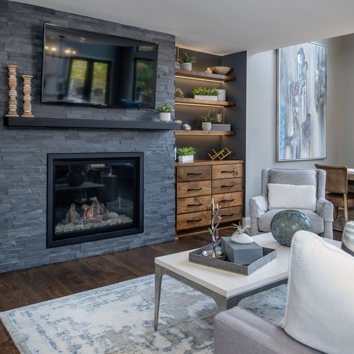
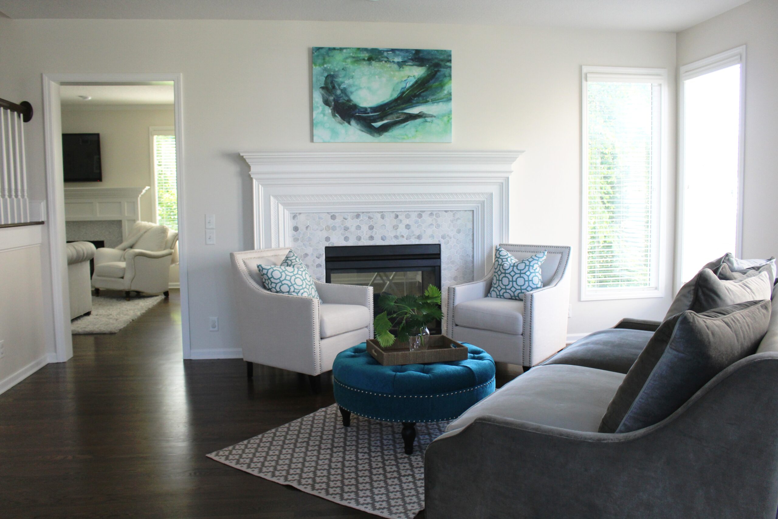
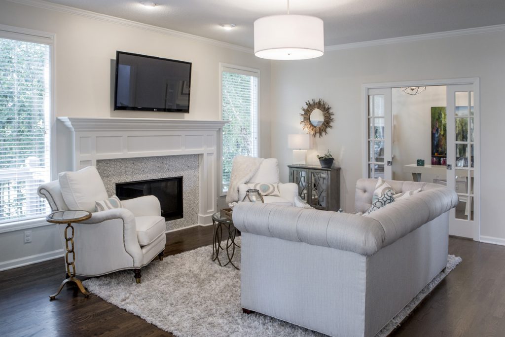
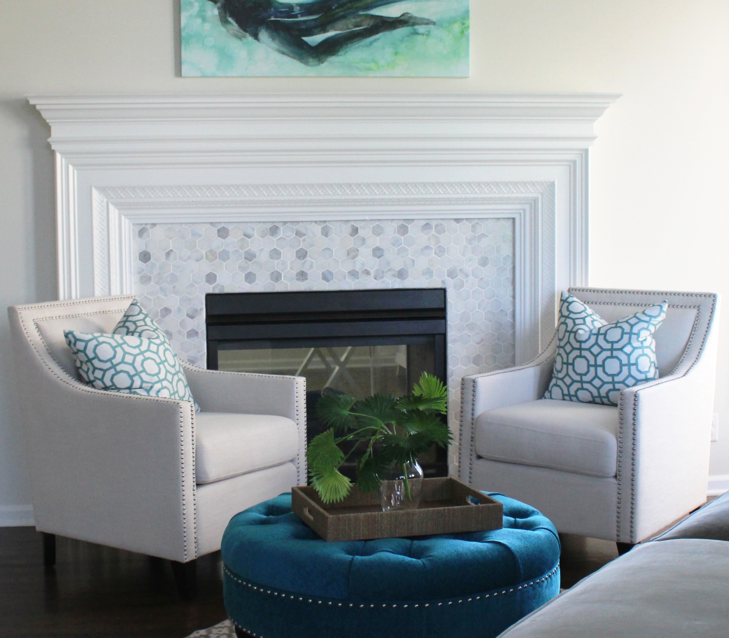
  1. Emphasis: By giving more importance to one feature you create a focal point or feature in the space. In this stunning room we designed we gave the fireplace more emphasis to make it a focal point by covering the dated stone fireplace in charcoal stacked stone and adding glass rocks inside the fireplace. A newly designed floating chest and built in lit shelves add to the emphasis of this focal point.
Interior design by Karen MIlls

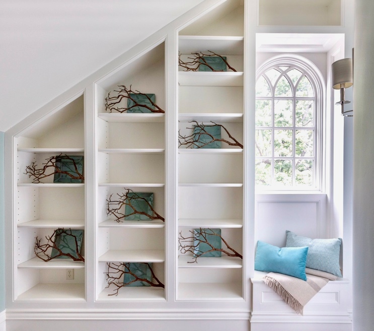
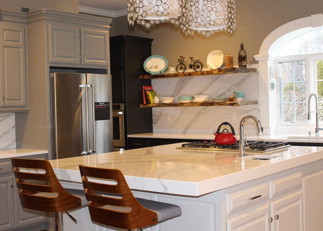
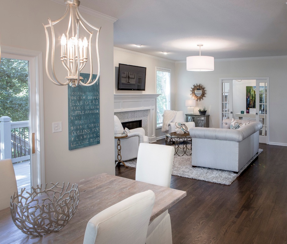
2. Rythm: A pattern of periodic repetition of elements in succession such as lines, shapes, motifs, or colors such as the steps or spindles on stairs. In this foyer branches and plates on the shelves create rhythm in the room.

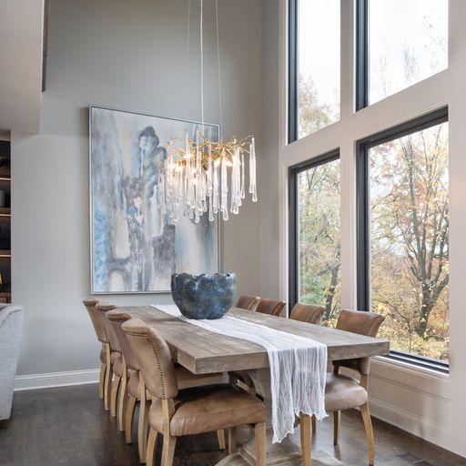
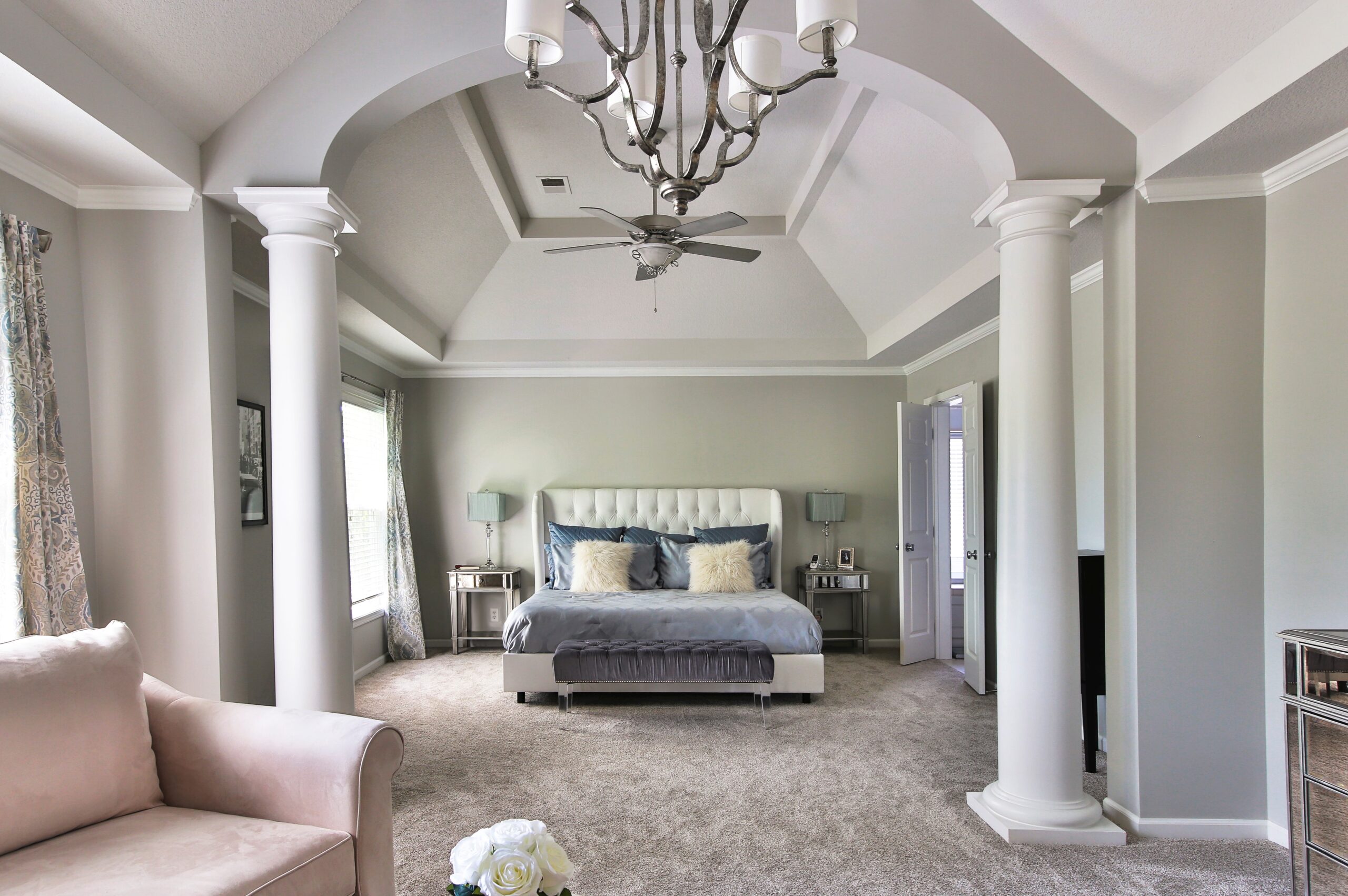
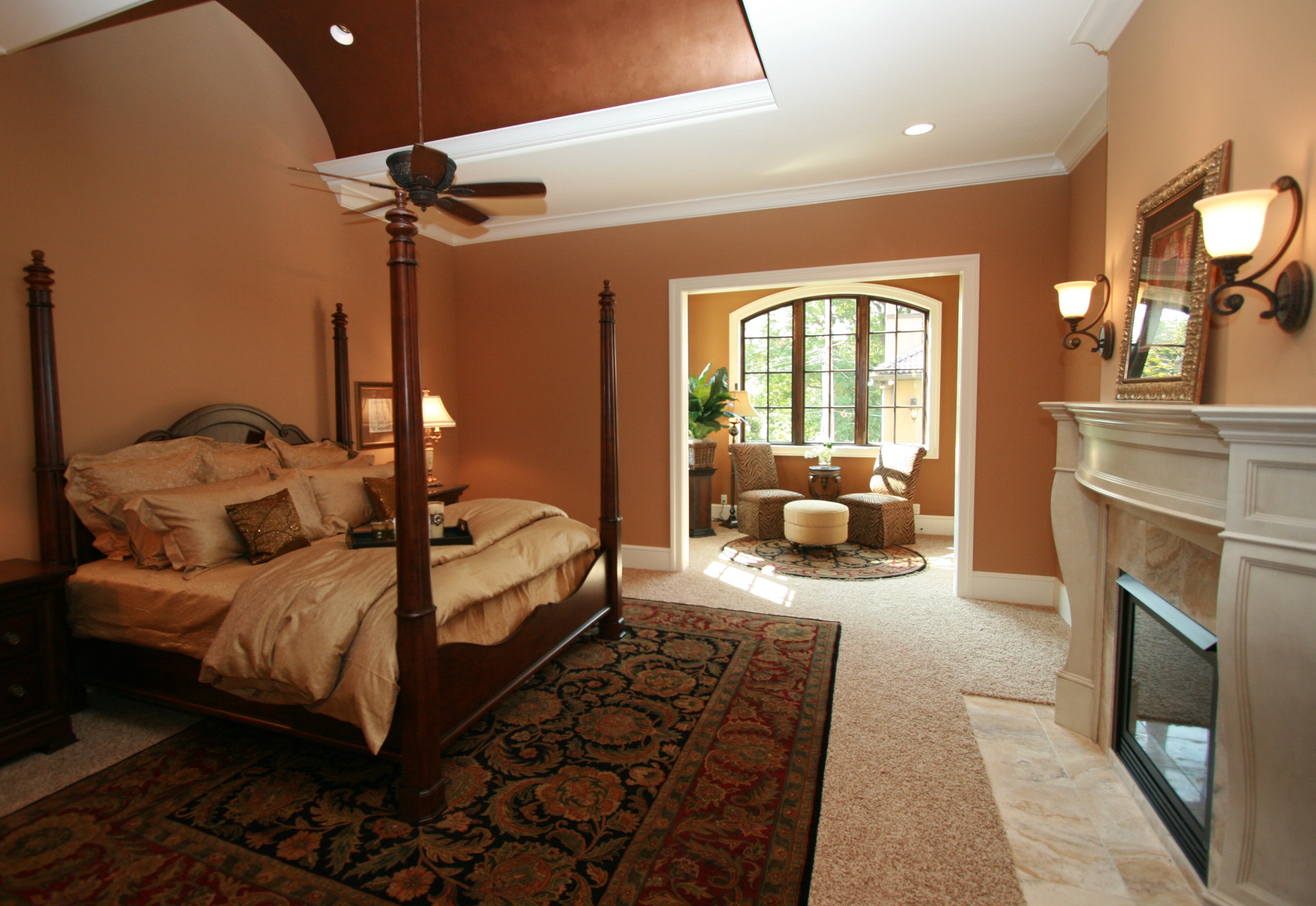
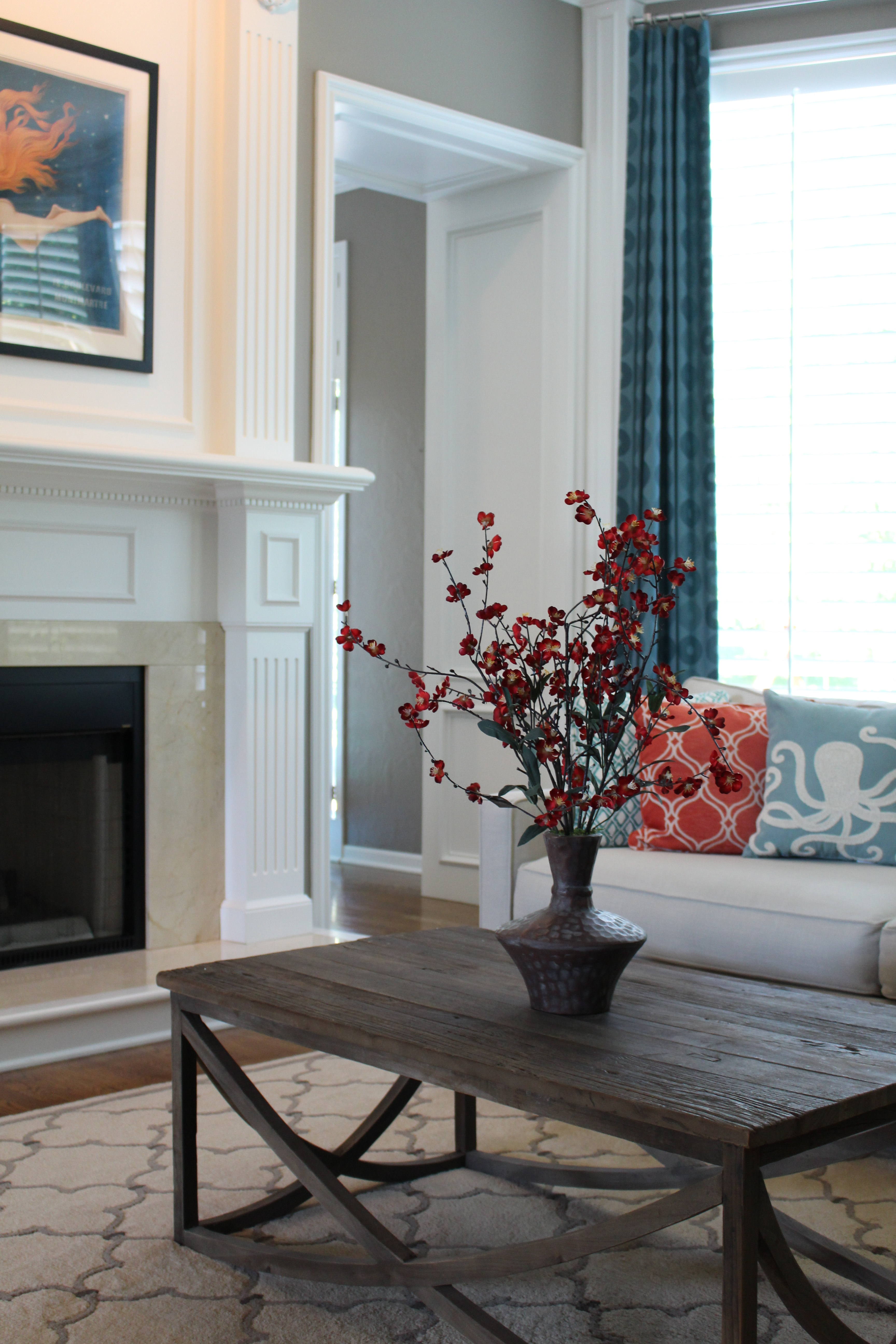
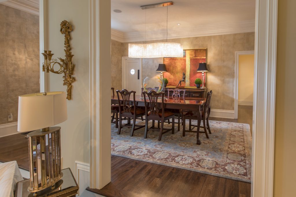
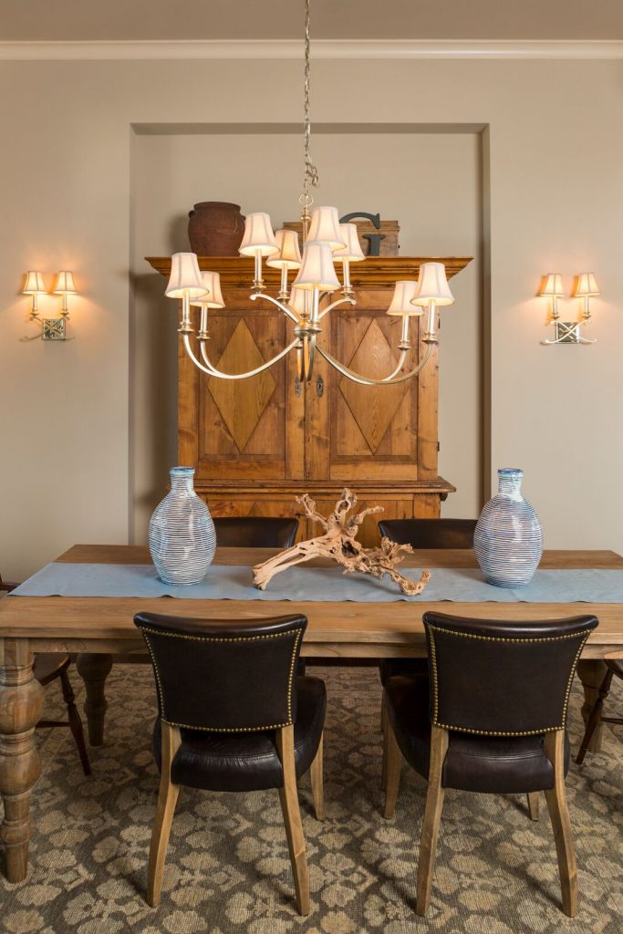
3.Harmony: The creation of a unified design using the various parts to create an overall pleasing whole. When you have harmony, you’ve achieved a successful balance between unity and interest in a space.

Want to learn more about interior design trends and insider secrets from Kansas City’s interior designer and former host of Living Large design show? Sign up for our free newsletter now.

karen-mills.ck.page/8d0663c849

Interior Design/Interior Decorating

Interior Design: 5 Things to Avoid When Remodeling a…

Functional Kitchen Design or Remodel Tips

Are you ready to refresh or remodel your dated or ugly kitchen? If so, read on for professional designer tips on what to keep in mind.

kitchen example
Interior design by Karen Mills
  1. Not bringing in a professional – Hiring a professional kitchen designer with experience who creates kitchens and bathrooms for a living can help you avoid costly mistakes, free up your time, and create the space of your dreams, while ensuring your space is functional. In this kitchen design we opened up the wall between the maid’s room and existing kitchen in this high-rise building to enlarge the space. But we didn’t stop there. We took the two mismatched windows from each existing room and right sized them to work seamlessly together for a more cohesive design and to bring in more light. Then we added wood flooring and beautiful lighting to give the horribly dated dark existing kitchen new life after opening up the wall to the dining room next door so we could create hearth room for relaxing and entertaining.
  2. Wasting storage potential – Countless storage options exist so there’s no reason to waste space in the kitchen especially with the adaptive kitchen storage units that make drawers and cabinets more functional from trash pullouts to roll out shelves. Here in this fabulous historic Walnuts condo where space is at a premium, we added pegged drawers under the stove for pots/lids, hidden pop open storage under the island. and used the extra space we gained straightening out a crooked back wall to create a coffee bar and pantry storage cabinet that’s draws you into the space.
photo example
Interior design by Karen Mills

3. Insufficient or appropriate lighting – If your new kitchen doesn’t have a mix of general, task, and accent lighting, it will tend to be a little lackluster in appeal and possibly function too.

Here in this basement bar kitchen design, I created a space with can lights in the ceiling for general lighting, rope lighting inside glass cabinets/shelves for accent lighting to enhance the design, and mini chandeliers over the island that not only provide accent lighting but also task lighting for working in the kitchen.

Interior design by Karen Mills

4. Work Area Not Functional – Creating a functional layout is the first step to kitchen design whether you’re designing for a new home or doing a kitchen remodel. Here in this kitchen a work area with the stove, refrigerator, and sink easily accessible within a few steps of each other makes cooking easier and less frustrating.

Kitchen design by Karen Mills

5. Work Area Too Cramped- As an interior designer I’ve lost count on how many times I’ve walked into a home that didn’t have enough workspace. Even though the recommended distance between an island and wall cabinetry is at least 42″ I usually I find that the minimum required distance of 36″ is often the reality of existing kitchens which creates a cramped space that’s not very functional because you can barely open the oven door or get between rows of cabinetry to access a drawer. Other issues I often encounter with interior design clients who have existing kitchens are drawers or refrigerator doors can’t open fully to function correctly.

Here in this kitchen our interior design firm designed, we ensured we had at least 42″ between cabinetry in this small kitchen so everything was easily accessible.

For more inspiration, ideas, and photos, sign up for our semi-monthly interior design blog here.

Or sign up for our exclusive weekly email newsletter where we give you even more insight into interior design simply drop us a line at karen@karenmills.net or reach out to discuss your design project now.

Interior Design/Interior Decorating

Interior Decorating: 3 Ways to Use the 60/30/10 Color…

example of color rule
Interior design by Karen Mills

As an interior designer I normally recommend selecting 3-4 colors maximum (mainly neutrals) with at one color for accessories unless you want all one color – monochromatic.

1. When choosing colors for your room try using the 60/30/10 rule – 60% of your primary color -usually a lighter neutral, 30% of your secondary color and 10% of a third accent color – often in accessories or art. How to show off your color personality

In this foyer the 60% color would be white – walls, trim, chairs, and rug, while the 30% color would be charcoal – the oversized sofa, and the blue ottoman/accessories would be the 10%, creating a cohesive look.

photo example
Interior design by Karen Mills

2. Make sure your adjacent room colors (or any other rooms in view of the room you are decorating) flow together for a pleasing overall look. For example, in the office beyond the blue accent color from the accessories in the hearth and kitchen is repeated in the art and accessory in the office. 3 Tips for Picking the Perfect Paint Color

In this kitchen and hearth area, we kept the same light wall color in both rooms to keep the house feeling lighter and airy, while repeating the secondary gray color and the blue accent color in both spaces.

photo example
Interior design by Karen Mills

3. Keep most of your accent color on accessories or a chair, repeating the accent color throughout the floor in each room to create a harmonious design.

In this small grouping shown here the 60% color would be the white, the 30% color would be the light brown, and the 10% would be blue, creating an inviting space.

If you’re looking for more custom interior design, decorating, or remodeling inspiration, ideas, and photos, sign up for our weekly interior design blog here

Plus become a fan of Kansas City’s interior designer and former host of the Living Large design show, Karen Mills, on 
INSTAGRAM and FACEBOOK here!

Interior Design/Interior Decorating

Interior Decorating: 3 Tips for Making Your Bedroom Appear…

Ideas for Enlarging Your Bedroom Without Remodeling

example
Interior design by Karen Mills featured by Design Icons book
  1. Choose bedding in a similar color to walls and other finishes or a little lighter.  In this master bedroom design, our interior design team opted for white airy bedding that bounces more light around the room while also nicely offsetting the dreamy light blue green wallpaper, hand knotted wool rug, and other reupholstered furnishings. In contrast you can also opt for darker bedding and walls to help the boundaries of the room disappear.
Karen Mills' blog
Interior design by Karen Mills

2. Layer in some furniture that feels visually lighter. In this master bedroom, we layered in some furniture with legs showing underneath along with a lighter wood bed, and light fabric on the chair to make the room feel larger. Light neutral bedding, a bed, light painted walls and a light chair bounce more light around the room, visually expanding the space.

Karen Mills' blog

2. Add fabrics and finishes in simple, plain or tone on tone patterns including bedding, walls, furniture, and flooring. In this bedroom the homeowner used tone on tone bedding, a white upholstered bed, an acrylic bench with invisible legs, and mirrored nightstands to help visually expand her bedroom.

For more great ideas on design and decorating sign up for our weekly interior design blog here

Plus become a fan of Kansas City’s interior designer and former host of Living Large design show, Karen Mills, on Instagram or Facebook now!

Interior Design/Interior Decorating

5 Frequent Furniture Arranging Mistakes We Make in the…

What to Avoid When Space Planning Your Bedroom

Karen Mills' blog example
Interior design by Karen Mills
  1. Not Making Your Bed the Focal Point In this bedroom we emphasized the bed as the focal point by placing it on the longest wall, ensuring you can see it from the entry, and by layering in a luxurious blue green wallpaper behind it. Flanking end tables and lamps along with a bench and area rug also emphasize the bed as a focal point. 3 Suggestions for Creating a Restful Bedroom Retreat
Interior design by Karen Mills

2. Placing the head of your bed in front of windows without draperies framing it. The only exception to this design rule would be if you had a glass wall and you were floating the bed in front of it and the view beyond enhanced your bed. That’s because if you place the head of a bed in front of a whole or partial window suddenly the bed loses importance and the window/view gains it. In this space the bed placement is perfect not only because its on the longest wall and can be seen from the entry but also because the bed now affords a view of the spectacular woods beyond. End tables and lamps enhance the look along with a textural wallpaper behind the headboard.

Interior design by Karen Mills

3. Unrelated furniture or furnishings As an interior designer I often walk into a master bedroom for the first time to discover a desk or something else totally unrelated to the bedroom which takes away from the rest of the design. Of course with the trend to stay at home right now a desk might be necessary because of space limitations but in general all work related items need to be out of sight so you can focus on just relaxing and enjoying your sanctuary.

In this bedroom sitting area the furniture fits perfectly providing a place to take a nap, read a book, or just have a conversation.

photo example
Interior decorating by Karen Mills

4. Lack of seating. Having a place to sit down on put on shoes or just relax and rejuvenate should be a top priority if you have the space. In this master suite a bench at the end of the bed provides an option for removing shoes while the chairs in the forefront offer a place to unwind at the end of the day. 3 Biggest Mistakes We Make in The Bedroom

Karen Mills' blog
Interior design by Karen Mills

5. Wrong size or placement of rug under bed. This problem is often one of the most common problems we encounter as interior designers. The rug is either turned the wrong direction, not under the bed at all or doesn’t emphasize the bed in a positive way.

Area rugs should be long enough span the width of the bed and nightstands. Place the rug in front of the nightstands ensuring the part of the rug is showing beyond the end of the bed to enhance the bed as your focal point.

For more great interior design ideas, sign up for our design blog here!

plus become a fan of Kansas City’s interior designer and former host of the Living Large design show, Karen Mills, on Facebook  and Instagram now!

And if you feel someone you know could benefit from this helpful information, pass it on!

Interior Design/Interior Decorating

Interior Design: A Before and After Bathroom Transformation

A DEEP DIVE INTO A DESIGNER’S HISTORIC REMODEL JOURNEY INCLUDING BEFORE PHOTOS 

design photo
MASTER BATH AFTER

As an interior designer I know you will find this master bath remodel amazing not only because of how ugly and dated high rise bathroom built in the early 1900s on the historic Kansas City plaza was before, but also because of the transformation that takes place in such a compact space to make it live larger.

This image has an empty alt attribute; its file name is bathroom-shower-and-vanity-before.jpg
Master bathroom remodel before

When we first entered this dated bathroom we knew we had a real challenge not only because the space was cut in half by a walled in shower, making the bathroom feel small, cramped, and unappealing but also because we were limited by the restrictions of the historic high rise.

Karen Mills' blog
Master bath remodel before

To make matters worse this ugly master bathroom only had one sink and a dimly lit dressing area that wasn’t necessary.

Floorplan by Karen Mills

To solve this interior design dilemma we ripped out everything except the small existing closet and started over with a new floor plan, keeping the plumbing in roughly the same place to save costs.  As you can see in this new floor plan we expanded the shower into the former vanity area and flipped the toilet to make the bathroom easier to navigate, while also moving the vanity to the former dressing area.

For the new sink area we designed a custom vanity that accommodates two sinks while also adding legs to the vanity to make it appear visually lighter. Drawers that wrap around the plumbing above and below make better use of the space and provide more storage.

Karen Mills' blog
Karen Mills' blog
Interior design by Karen Mills

European style custom shaker cabinets with clean lines also give the room a less fussy look while the wall of tile behind the vanity add to the timeless style of this glamorous master bath that really stands out with a fresh new look.

Karen Mills' blog
MASTER BATH AFTER

By placing the identical Italian marble style tile on the floor and walls of this compact space, the room visually expands to live much larger than before, while the new over sized shower for two, curb less entry, and partial glass front add to the spacious feel.

Karen Mills' blog
Interior design by Karen Mills


To transform your own dated bathroom into a beautiful new space that lives larger and enhances your living experience, just follow our recipe for success by improving your layout, knocking down walls, visually expanding, and adding light.

For more great interior design ideas, sign up for our design blog here!

plus become a fan of Kansas City’s interior designer and former host of the Living Large design show, Karen Mills, on Facebook  and Instagram now!

Interior Design/Interior Decorating

Interior Design: 3 Reasons Why White Kitchens Are Timeless

Karen Mills' blog
Interior design and remodel by Karen Mills

White kitchens remind me of grandmother’s house that was nestled in the middle of beautiful flower garden where she taught me how to bake and make pie crusts as a 5 years old. That’s why I will always love white kitchens and I’m sure it might be why you do too because they are often warm, inviting, casual, and smell oh so delicious. Read on for the three other reasons I believe we secretly love white kitchens.

  1. Reflects light and makes us look better – As an interior designer who specializes in kitchen remodels I believe we secretly crave light airy kitchens because they not only feel clean and fresh but also bounce the natural light from outside around our room, enhancing the way we look and feel when we are in there. 3 Big Kitchen Trends for 2020

In addition they make us look younger by reflecting light back onto our face in contrast to darker kitchens that can make you look more haggard..

                                     Interior design by Karen Mills 

2. More Timeless – White kitchens have always stood the test of time as the most popular kitchen cabinet color so if you don’t get too crazy with your design or finishes your white kitchen remodel will likely feel more in style than a darker ktichen over time, especially when it comes time for resale.

Karen Mills' blog
Interior design by Karen Mills

3. More Versatile – White kitchens can be paired with almost any colors and changed up when you tire of the color scheme. And if you’re like the majority of homeowners, you love the ethereal feel of white kitchens, especially one with warm inviting layers of texture like this existing kitchen was refreshed with a can of paint, new back splash, and dining table fixtures. Here the wood tabletop was repainted in a rustic gray finish and existing leather chairs slip slip covered in a washable fabric to finish the look. 5 Big Mistakes We Make In The Kitchen

For more great ideas and photos on kitchen design and kitchen remodels sign up for our weekly interior design blog here

Plus become a fan of Kansas City’s interior designer and former host of the Living Large design show, Karen Mills, on 
INSTAGRAM and FACEBOOK here!

Interior Design/Interior Decorating

Interior Design: 5 Decorating Tips for Enlarging Your Living…

Read on for how to make your room feel bigger without remodeling

example
Overland Park interior design by Karen Mills
  1. Unify Your Wall Color – When our interior design clients ask how to the visually expand their living spaces I always recommend starting with painting the walls all one color – usually lighter . In this hearth room we painted the dark dated walls Sherwin William’s Shoji White to lighten up the room and make it appear larger.

2. Bring in More Daylight – Begin by removing dark furnishings and window coverings to bounce more light around. Introducing mirrors also brings more natural daylight into your space. Here we recovered a dark sofa and chairs to to a light neutral palette plus replaced light fixtures to bring in more light, making the space expand. 3 Tips for Refreshing Living Room for Less

Karen Mills' blog
Overland Park interior design by Karen Mills

3. Place furniture on an angle – By placing all your furniture on an angle away from the walls like this living room, you visually expand the size of your room. Round items like a rug or a piece of furniture like this ottoman we designed make your space feel larger. 3 Tips for Coordinating Mismatched Furniture in Your Living Room

4. Introduce Round Furnishings By bringing in a round ottoman like this space we visually expanded the room but you can create the same effect with a round rug or circular furniture.

Karen Mills' blog
Interior design by Karen Mills

5. Lighten up Your Floors – When I’m talking about interior decorating I don’t mean that you should re stain wood floors light, but go with lighter area rugs or carpet to bounce more light throughout to make it larger. Here our client opted for a plush rug that would feel good with bare feet while enlarging this smaller room.

In summary by removing dark furnishings, painting your walls lighter, and layering back in lighter furnishings you can visually expand your living room. 3 Ways to Make Your Living Space Bloom for Spring

If you would like to re decorate you living spaces right now check out our  interior design and decorating options that we have whether its for remodel/new home builds, a design dilemma, or just decorating.

If you’re looking for more custom interior design, decorating, or remodeling inspiration, ideas, and photos, sign up for our weekly interior design blog here

Plus become a fan of Kansas City’s interior designer and former host of the Living Large design show, Karen Mills, on 
INSTAGRAM and FACEBOOK here!

Interior Design/Interior Decorating

3 Tips for Refreshing Your Living Room for Less

Tips for Updating Your Living Space with Budget Savvy Ideas

If you haven’t updated your living room for 5 years or more, it may be time for a refresh.  If your budget doesn’t allow you to start completely over, why not opt for a one day makeover or refresh instead with a local interior designer or decorator? Read on for my top 3 tips for updating your space for less.

Karen Mills' blog
Interior design by Karen Mills

1.  Create an inviting floor plan that emphasizes your main feature whether its a fireplace, a view outside or another prominent feature.  If you don’t have a focal point, design one yourself by grouping furnishings together like a sofa table or chest with a piece of artwork overhead and a table lamp and/or tabletop decor.

In this room our interior design client started with a favorite piece of art over the mantel to emphasize the focal point and we helped them select a new fireplace tile, chair fabric for existing chairs and a new ottoman to support the color scheme in the art.

Karen Mills' blog

2. Shop your entire house for furniture/furnishings you can use in your room.  Keep those items you discover in mind as you start to put together your room, bringing ones you think might work to a staging area nearby.

As an interior designer I often re purpose items to make them work in a space such as this family room where we reupholstered the sofa and chairs along with layering in a new rug, repainting the walls, adding a new light fixture, tables, and decor.

Karen Mills' blog
Interior design by Karen Mills

3. Add a pop of color with accents throughout your room ‘s interior design with pillows, art, drapes, decor or an area rug.   Remember, you can repaint or re purpose items to use in your refreshed room also.

For example, a chest could repainted and moved to your entry, used as a focal point in a living space, or even placed behind a sofa.  Ottomans can be upholstered and tucked under a sofa table for extra seating, used as a coffee table or pulled up to a comfy chair.

In this fabulous ocean blue living room, our interior design firm began with existing mermaid art as inspiration, then introduced bold blue and orange pillows along with custom blue drapes.

Looking for more great budget friendly decorating ideas?  Sign up for our weekly interior design blog here

Plus become a fan of Kansas City’s interior designer and former host of the Living Large design show, Karen Mills, on 
INSTAGRAM and FACEBOOK here! <

Interior Design/Interior Decorating

Interior Design: 3 Biggest Mistakes We Make in the…

Design Tips for Making Your Dining Room More Stunning

Karen Mills' blog
Interior design by Karen Mills as featured in Architecture Today Interior Design and Design Icons books
  1. Lack of emphasis  Creating a focal point with your table in the dining room gives you the opportunity to create a dramatic look, perfect for a dinner table or family gathering. Here in this Mission Hills dining room we began with an existing table and buffet along with selecting a fabulous hand knotted wool rug. Then we took the design to another whole level but introducing more contemporary elements from the stunning Swarovoski crystal chandelier that compels you to take a closer look to the bold abstract art beyond, contemporary sculpture, and rich leather squares on the wall.
Karen Mills' blog
Interior design by Karen Mills as featured in Architecture Today Interior Design book

2.  Cold uninviting space –  One of the most common issues I see as an interior designer are dining rooms filled with hard shiny surfaces such as crystal, glass, or ceramic along with nothing on the floor or walls. To rectify this issue, try warming up your dining space with lots of texture. Here in this Overland Park room the client requested we use their heirlooms – a table and armoire, along with leather chairs. To warm up the space, we introduced a piece of gnarled wood, two handmade looking vases, and a custom cloth runner along with layering in a thick hand knotted rug underneath.

Karen Mills' blog
Interior design by Karen Mills

3. Looks Unfinished  When we walk into an interior design client’s home one of the first things we often see is an undone dining room. To enhance this space and make it more updated, I recommend adding color and items of interest whether with texture or design. In this dining area, we refinished a door in a soft neutral gray, updated the light fixtures overhead, put slipcovers on plain dark leather chairs, and added an interesting centerpiece along with blue art to create an inviting area to eat and relax.

For more inspiration, ideas, and photos, sign up for our weekly interior design blog here.

Plus become a fan of Kansas City’s interior designer and former host of the Living Large design show, Karen Mills, on 
INSTAGRAM and FACEBOOK here!