Interior Design/Interior Decorating

Interior Design: 3 Tips To Help You Choose the…

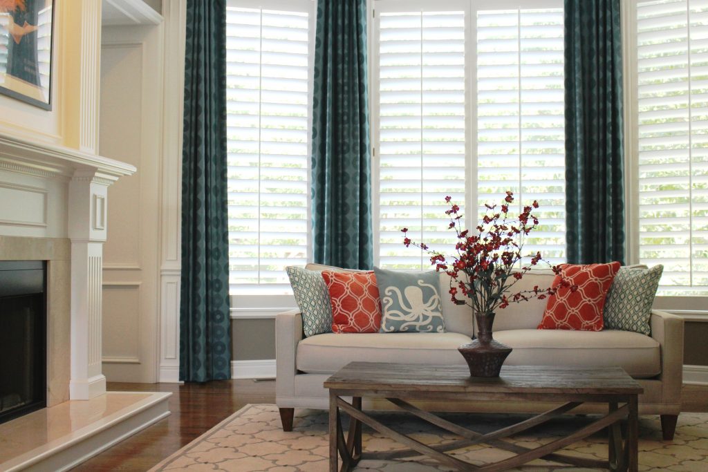
Suggestions for Selecting Paint Colors for Your Interior

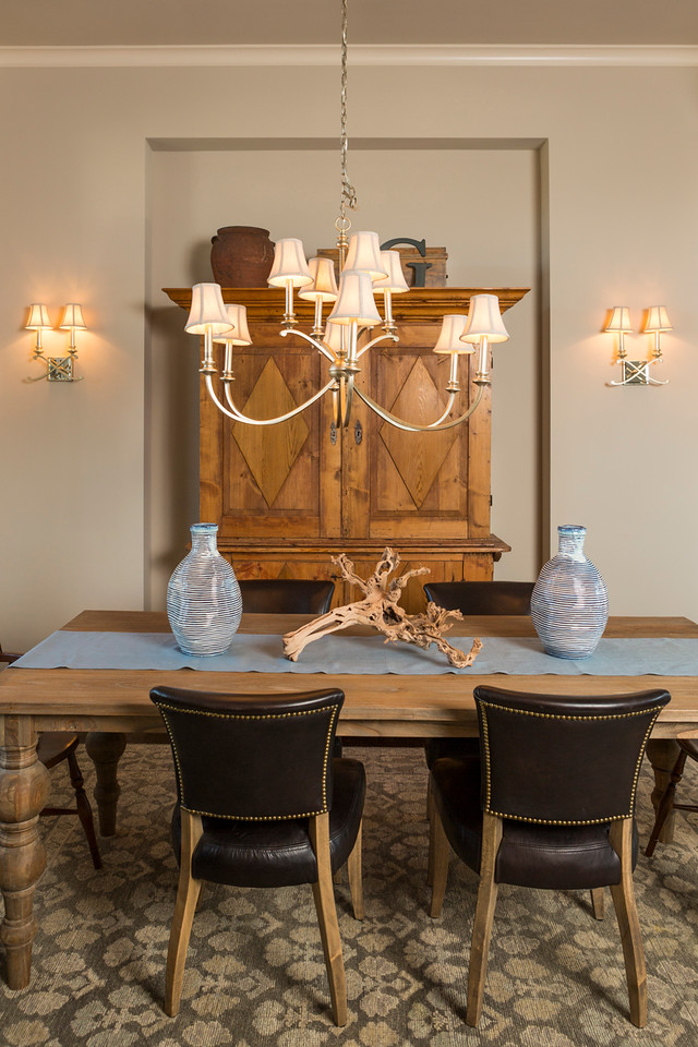
Paint color, one of the biggest issue faced by homeowners starting an interior design or interior decorating project is often an overwhelming task so today I’ve broken it down into three manageable steps for you to implement. 3 Reasons Why White Kitchens Stand the Test of Time

  1. View color swatches on a white background – When you’re ready to select paint colors for your interior, start by placing the color swatches on a solid white background to get a true reflection of the color before painting a large sample of the paint on your wall in the room where you want to paint. While making selections, ensure you’re wearing neutral clothing and don’t have bold colors nearby on walls or furniture that could reflect on your paint sample.
Karen Mills' blog
Photo courtesy of Kravet

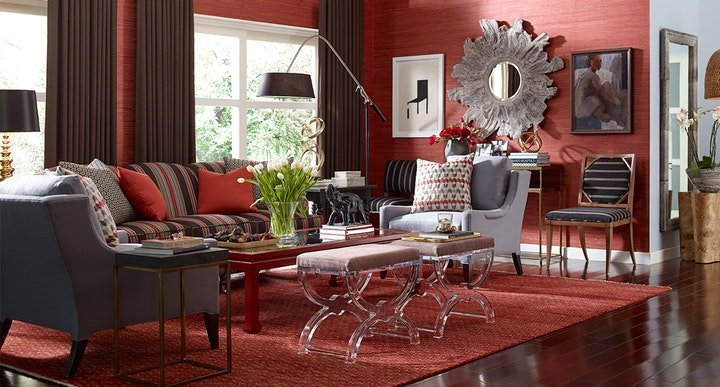
2. Make your color selection during daylight light hours. And if its a cloudy day, look at the paint sample again on a sunny day to get the full range of changes that color will make as you transition from sunlight to cloudy to dark.  3 Color Scheme Options for Your Living Room

When selecting trim and ceiling paint colors, look to the lightest end of your paint strip for options along with whites. 

Karen Mills' blog
Interior design by Karen Mills

3. Paint large swatches of your paint selection on a backed poster board – All too often I walk in as an interior designer and see clients who’ve painted a light neutral over another color on the wall and the original color is bleeding through or distorting the new color. Once you have the board painted, place it against a neutral white background so you can view it during both daylight and after dark.

 But what if you don’t even know where to start with paint colors. Then pull inspiration from your closet, artwork, or a rug, for example. Then let the fun begin!


For more great tips on color and how to use it become of fan of our weekly interior design blog here


plus become a fan of Kansas City’s interior designer and former host of Living Large, Karen Mills on Facebookhere!

or instagram here!

Interior Design/Interior Decorating

Interior Design: 5 Dining Room Paint Color Palettes

Since we don’t spend much time in dining rooms it’s a great opportunity to show off our personality and design something dramatic or even quirky.  Here are 5 fun color palettes to inspire you to refresh your dining space.

Karen Mills' blog
Photo courtesy of Schumacher

1. Black and White – This classic color combination always looks great not only because o the the stark contrast between dark and light, but also because you can pair almost any color with it like the yellow flowers here.

The wallpaper by Schumacher creates a wow factor in this space and draws your eye up to the ceiling to show off the height of the room.

Karen Mills' blog

Photo courtesy of Lillian August furniture

2. Blue

Blue, one of my favorite colors for dining room, especially navy, pair nicely with several colors including the fuchsia shown in this dining room.  By repeating different shades of blue on both the wrap around settee and wall, you can create a more interesting color scheme.  The fuchsia hue of the chair and pillow repeat again on the rug to create a cohesive feel.

Karen Mills' blog
Photo courtesy of Lillian White for Hickory furniture

3. Green 

Even though you don’t often seen green used in the dining room, I love how the green takes a back seat to the furnishings in creamy white and blue to help soften this bold shade of green.  Here in this photo artwork provides the inspiration for the color scheme of blue and green.

Karen Mills' blog

Photo courtesy of Hickory White furniture

Here’s another example of how to incorporate green into your dining room.  In this photo the yellow green in the art is repeated again on the chairs and reinforced by the green decor on the table.


Karen Mills' blog
Photo courtesy of Kravet

4. White/Neutral

If you love white like I do, why not paint your walls an interesting shade of white or light neutral along with white furnishings to create a fresh feel.  Then you can either leave the room white or layer in an accent color or two to change the look as the mood hits you.

Karen Mills' blog
Interior design by Karen Mils/Photograpy by 29Pixel Studios, LLC


Karen Mills' blog
Photo by Spectrum Limited

5. Color Explosion

If you can’t decide on one accent color you like because you love so many why not keep a neutral wall color and introduce two or three accent colors that you love to create a space that reflects your artistic side like this photo by Spectrum Limited chairs.  To create this same look, keep the furnishings simpler also like these clear Lucite chairs to create your dramatic dining room.

Of course orange and purple can also be colorful options for dining rooms along with more neutrals colors as shown here.

For more great ideas on dining room design or other topics sign up for our weekly interior design blog here

plus become a fan of Kansas City’s interior designer and former host of the Living Large design show, Karen Mills, on Facebook here!