Interior Design/Interior Decorating

Interior Design: 5 Decorating Tips for Enlarging Your Living…

Read on for how to make your room feel bigger without remodeling

example
Overland Park interior design by Karen Mills
  1. Unify Your Wall Color – When our interior design clients ask how to the visually expand their living spaces I always recommend starting with painting the walls all one color – usually lighter . In this hearth room we painted the dark dated walls Sherwin William’s Shoji White to lighten up the room and make it appear larger.

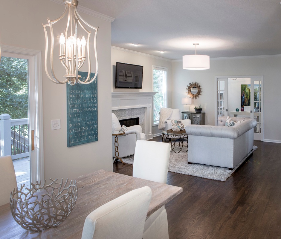
2. Bring in More Daylight – Begin by removing dark furnishings and window coverings to bounce more light around. Introducing mirrors also brings more natural daylight into your space. Here we recovered a dark sofa and chairs to to a light neutral palette plus replaced light fixtures to bring in more light, making the space expand. 3 Tips for Refreshing Living Room for Less

Karen Mills' blog
Overland Park interior design by Karen Mills

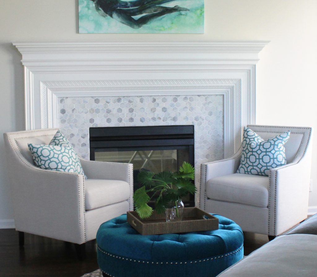
3. Place furniture on an angle – By placing all your furniture on an angle away from the walls like this living room, you visually expand the size of your room. Round items like a rug or a piece of furniture like this ottoman we designed make your space feel larger. 3 Tips for Coordinating Mismatched Furniture in Your Living Room

4. Introduce Round Furnishings By bringing in a round ottoman like this space we visually expanded the room but you can create the same effect with a round rug or circular furniture.

Karen Mills' blog
Interior design by Karen Mills

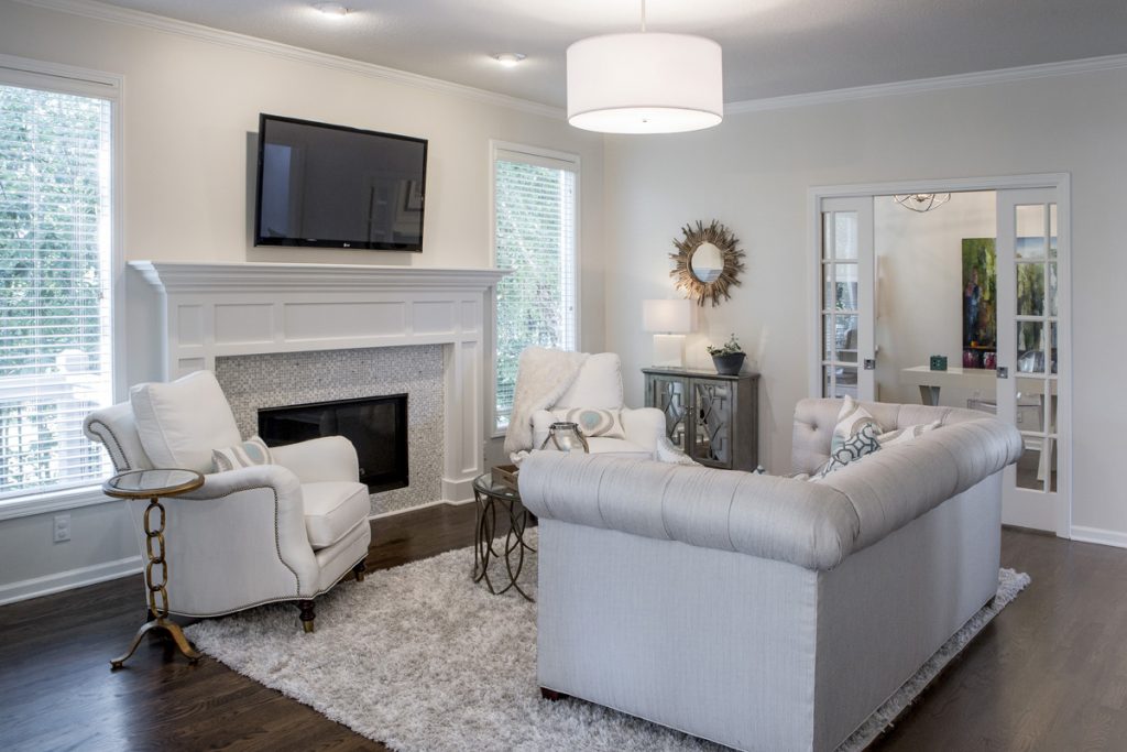
5. Lighten up Your Floors – When I’m talking about interior decorating I don’t mean that you should re stain wood floors light, but go with lighter area rugs or carpet to bounce more light throughout to make it larger. Here our client opted for a plush rug that would feel good with bare feet while enlarging this smaller room.

In summary by removing dark furnishings, painting your walls lighter, and layering back in lighter furnishings you can visually expand your living room. 3 Ways to Make Your Living Space Bloom for Spring

If you would like to re decorate you living spaces right now check out our  interior design and decorating options that we have whether its for remodel/new home builds, a design dilemma, or just decorating.

If you’re looking for more custom interior design, decorating, or remodeling inspiration, ideas, and photos, sign up for our weekly interior design blog here

Plus become a fan of Kansas City’s interior designer and former host of the Living Large design show, Karen Mills, on 
INSTAGRAM and FACEBOOK here!

Interior Design/Interior Decorating

INTERIOR DECORATING: COLOR TRENDS 2019

2019 Color Forecast for 2019

Karen Mills' blog
Photo courtesy of Pantone Color Institute

Color is an equalizing lens through which we experience our natural and digital realities and this is particularly true for Living Coral.  With consumers craving human interaction and social connection, the humanizing and heartening qualities displayed by the convivial Pantone Living Coral hit a responsive chord.  Lea Eiseman, Director of Pantone Color Institute

The impact of the annual color forecast by the Pantone Color Institute reaches much further than what you might imagine covering a wide range of industries from interior design and fashion to cars and appliances to name just a few.  Why?  Because their forecast is considered to be the one to follow for what’s new and next.  But today I want to include a couple of other color forecasts for 2019 along with sharing color trends I see as an interior designer for the future.

As you read through this color forecast look for similarities because I think you might notice an overall trend this year for color.


Karen Mills' blog
Photo courtesy of Benjamin Moore


Calm, composed and effortlessly sophisticated, Benjamin Moore’s Color of the Year 2019, Metropolitan AF-690, exudes glamour, beauty and balance.  

Benjamin Moore company


Karen Mills' blog
Interior design by Karen Mills


Karen Mills' blog
Photo courtesy of Sherwin Williams

A warm terracotta color with ancient, elemental roots, Cavern Clay SW 7701, is our 2019 Color of the Year. Cavern Clay is a nod to midcentury modern style, but with the soul of the American Southwest, which together creates a desert modern aesthetic.  Sherwin Williams Company


Karen Mills' blog
Photo courtesy of Sherwin Williams


My Color Forecast:  Warm Vibrant Colors


Red, black and white color scheme

Karen Mills' blog
Photo courtesy of Ralph Lauren


Even though I’m still a big fan of warm grays, I have to admit I’m a little bit excited to see warm vibrant colors and bold color combinations coming back into vogue.  Red has been huge trend this year in fashion, especially with black, white or other vibrant colors like golden yellow, bold blue, and persimmon.

Karen Mills' blog
Interior design by Karen Mills

Golden yellow or mustard will be popular also along with a return to more traditional tobacco colored in leather, suede, and other materials like this wall pictured above.

For more great ideas on selecting furnishings and design sign up for our weekly interior design blog here

Plus become a fan of Kansas City’s interior designer and former host of Living Large design show, Karen Mills, on Instagram or Facebook

here!


Interior Design/Interior Decorating

Interior Design: Bold Color Forecast for 2018

Karen Mills' blog
Photo courtesy of Century Furniture


If you’ve been paying attention to interior designers or the fashion runway this fall you may have noticed bold colors popping up everywhere from red and yellow to bold blues.   Sherwin Williams and Benjamin Moore have announced their exciting bold new colors of 2018 but Lea Eiseman with the Pantone Institute has yet to reveal their color of the year which impacts all types of industries from fashion and design to autos and appliances.

Do you think Pantone will select the hot new mustard yellow color or something else?

Karen Mills' blog
Photo courtesy of Sherwin Williams

Benjamin Moore’s color of the year 2018 is a bold hue and one of my favorites!  I especially love it contrasted with white like the room shown above.

Bold blue hues like this also look great with beige colors, red, and orange along with citrine, a yellowy green.

Karen Mills' blog
Interior design by Karen Mills/Photography by 29Pixel Studios

In the room above we incorporated a bold blue hue on the ottoman to give the space pizzazz.


Karen Mills' blog
Photo courtesy of Benjamin Moore

Benjamin Moore selected Caliente Red AF-290 as their color for 2018.  Of course red has been a favorite color of mine forever because its such a vibrant unexpected color that instantly creates drama!

What’s your favorite color for 2018?!  Post in the comments.

For more great information on color and more, sign up for our weekly interior design blog here

plus become a fan of Kansas City’s interior designer and former host of the Living Large interior design show, Karen Mills, on Facebook here.

Interior Design/Interior Decorating

Color Trends 2017: A Global Perspective

Screenshot
A sea lion in the Galapagos Islands by Karen Mills

As I’ve watched the the interior design color trends 2017 unfold, I’ve been anxiously anticipating this year’s blog on color trends which I find to be one of our most popular blogs annually!  Last year I predicted white as color of the year and it has definitely dominated the interior design scene along with taupe grays and watery blue colors.

But this time instead of predicting my color choice for 2017 as usual, I wanted to give you a more global perspective on color trends 2017 based on my travels around the world including a trip to the Galapagos Islands where I got an opportunity to encounter this wonderful sea lion pictured at top that shows the burst of color coming next year.

Every year seems to bring a slightly broader palette of colors into the forecast and this year is no exception.  For 2017 Lea Eiseman of the Pantone Color Institute gave a wide range of color predictions, but one of my favorite color groupings for spring is aptly named Florabundant  with bursts of fuchsia, green, and purple pink colors.

Karen Mills blog
Lea Eiseman of Pantone Color Institute

Karen Mills' blog
Italy trip – Karen Mills

Karen Mills' blog
New York City – Karen Mills

Karen Mills' blog
Benjamin Moore color of the year

Benjamin Moore narrowed their top color for 2017 to “Shadow”, a grayed out amethyst similar to the the purple colors in the Blue Mosque below where I visited in Istanbul.   Imagine how sexy that color could look in a dramatic living area or romantic bedroom.

Karen Mills' blog
Blue mosque – Karen Mills

Sherwin Williams decided to play it safe with a wonderful taupe color which as an interior designer, I love because of its ability to adapt to almost any color palette.  Sherwin Williams calls it ” modern and classic… a beautiful balance of warm and cool,”

Karen Mills' blog

Karen Mills' blog
National Geographic resort in Galapagos Islands by Karen Mills

Of course white will still be popular next year along with warmer shades of red, wine, purples, vintage pastels, greens, blues, and even yellow.

For more great color trends and interior design ideas, sign up for our weekly blog here

plus become a fan of Kansas City’s interior designer and former host of Living Large, Karen Mills, on Facebook here!

Karen Mills' blog
Galapagos Islands – Karen Mills