 Interior Design/Interior Decorating
White is amazing – the perfect hue for creating contrast, emphasizing design, or grabbing your attention. In this art piece I discovered at Crystal Bridges museum white creates the perfect backdrop for this metal sculpture, allowing each detail of the design to stand out which makes it great for an entry or when you want to make a statement.
In contrast, this artwork with hands slapping white powder seems to float out of the artwork and creates interest making this piece a good option for drawing people into another room to take a closer look.
But white can also be used rhythmically as seen here where repetition of these doors created an interesting pattern and an artistic statement on their own.
 This wall demonstrates another way to use white effectively in a monochromatic color scheme which can make a powerful statement.
But let’s not forget about exterior design because architecture is what draws you in for a closer look. Here at the Crystal Bridges museum I discovered this wonderful dome of circles that felt right at home in the woods but I could see just as easily on a lawn outside a home.
Memorial Day is almost here! A time to honor those in the military who died protecting our country and a time to relax with family or friends whether its a barbecue outside or jsut doing nothing. Have a wonderful Memorial Day weekend and for more great ideas/ photos sign up for our weekly interior design blog here
plus become a fan of Kansas City’s interior designer and former host of the Living Large design show, Karen Mills, on Facebook
or instagram here!
Interior Design: 3 Tips for Selecting Quality Outdoor Furniture
How to narrow down the choices for high quality outdoor seating
Photo courtesy of B&B Italia furniture
1. Color
I think we as consumers are naturally drawn to our favorite colors and often purchase based on that fact alone but when you’re investing in a quality piece(s) of outdoor furniture you might want to consider longevity of a frame or cushion color that’s beyond a neutral.
Of course if a particular color is part of who you are, then it may not matter. For me as an interior designer, my favorite color is usually what we are designing that day or week. That’s why neutral seating frames and/or cushions are often best because you can switch out accessory colors every time you want a new look without starting over.
Courtesy of Castelle furniture
2. Furniture Style
Style, a key factor in selecting furniture, plays a huge role outside because the furnishings must not only coordinate with the exterior of the home and the view beyond but also relate the the adjacent rooms inside.
This outdoor furniture designed by Barclay Butera, who’s known for his signature blue and white color scheme, comes together beautifully with a fretwork design on the chair sides and gold finials to give a new twist to a timeless classic.
Photo courtesy of Gloster furniture
3. Comfort
Of course comfort is the most important factor when it comes to seating, especially if its where you will sit for prolonged periods savoring your outdoor space. When selecting furniture ensure the seat is not only tall enough for your legs but also the right depth for you.
In this photo the chair dips down in the back to allow a more relaxed seating position which can be ideal for taking in the views while a more upright seat might better accommodate you for dining.
For more great ideas and photos sign up for our weekly interior design blog here
plus become a fan of Kansas City’s interior designer and former host of the Living Large design show, Karen Mills, on Facebook
or instagram here!
Interior Decorating: What Happens When Blue Meets Orange!
When calming blue meets vibrant orange, it’s complementary color, you will have a dramatic look in your room, especially with a light neutral backdrop. Read on for ways to combine this fun combination to create drama and interest in your space. 
Photo courtesy of Wesley Hall furniture
In this living room, blue dominates the space, while orange is shown in the chair/pillow fabric, art, and a flower in smaller doses to keep it from overpowering the space. A light beige sofa, rug, and walls also help neutral the contrast between orange and blue.
Orange chairs frame the bold blue sofa beyond to draw you into the room while a light neutral wall and flooring along with a lucite coffee table help calm the space down.
Here the orange chair with blue accents and matching pillow immediately grab your attention to create an exciting contrast against the calming back drop of light neutral walls and flooring. An orange vase and pattern in the ottoman add more drama to the room’s design.
For more great ideas and photos sign up for our weekly interior design blog here
plus become a fan of Kansas City’s interior designer and former host of the Living Large design show, Karen Mills, on Facebook
or instagram here!
Interior Design: Pretty in Pink (or Fuchsia)
Was suddenly struck by the popularity of pink this year at my birthday party in January when most of the guests showed up with gifts in a pink color ranging from a bold bright fuchsia to a pale pink that just happened to coordinate beautifully with the live fuchsia flowers I had placed on the top of my cake. Of course as an interior designer I know pale pinks have been a hot color trend for a few years but I’m loving this more dramatic shade everywhere from fashion to interior design!
Photo courtesy of Wesley Hall furniture
In this living space the fuchsia takes center stage on the draperies where it mimics the color of the tree blossoms beyond. The color repeats again on the floral chair fabric and in decor.
Photo courtesy of Design within Reach
Love the purple spin on the fabulous fucsia throw in this living space. Here a book and artwork over the mantel repeat this fabulous hue of pink.
Photo courtesy of Spectrum Limited
But if you’re like me and you love all the colors, why not do something fun like Spectrum in this dining space by mixing up all the colors to create a cheerful artistic space.
Or just have a fabulous head covering like this horse I passed by on a trip to New York City.
For more great ideas and photos sign up for our weekly interior design blog here
plus become a fan of Kansas City’s interior designer and former host of the Living Large design show, Karen Mills, on Facebook
or instagram here!
Interior Design: How to Use Black and White in Your Living Spaces
Photo courtesy of Wesley Hall furniture
Who doesn’t love the classic combination of black and white? Timeless and classy, black and white bring a punch to a room like nothing else. And the best part is that you can add touches of your favorite color to completely change the look like this living space that has a warm neutral color added to calm it down.
Photo courtesy of Lillian August for Hickory White
In this space the designer punched up the drama with black walls that visually disappear behind the white upholstery. Pops of red add to the bold look.
Photo courtesy of Wesley Hall furniture
The best feature in this room are the black painted over sized windows that showcase the height of the room, while drawing you into the space. White and red upholstery add to the drama while the white drapes and walls help soothe the living space.
Photo courtesy of All Modern furniture
Because the majority of the finishes and furnishings in this room are white, this space takes on an ethereal feel that’s calms the senses while the touches of greenery help bring the room back to earth.
For more great ideas and photos sign up for our weekly interior design blog here
plus become a fan of Kansas City’s interior designer and former host of the Living Large design show, Karen Mills, on Facebook
or instagram here!
Interior Design: 3 Tips for Creating Rustic Glam Style at Home
As a full time interior designer I’ve noticed a huge trend over the past couple of years towards creating simple spaces that are a mix of rustic and glamour. Here are my 3 tips for creating your own style of rustic glam style.
- Introduce weathered furniture/furnishings
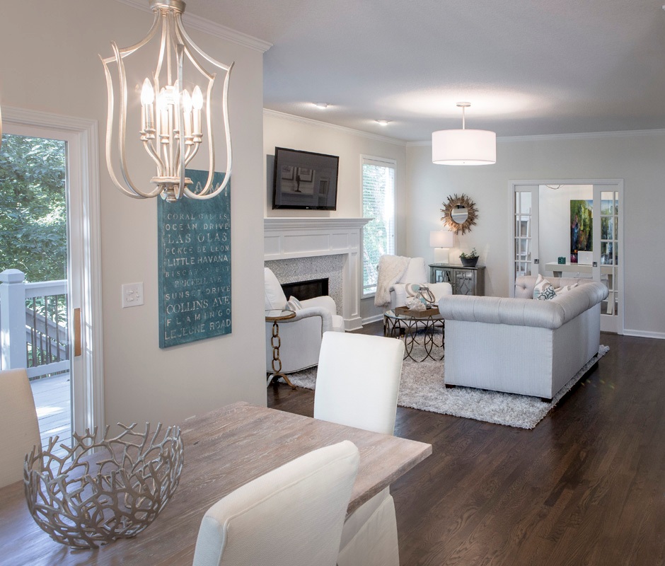
In this great room we layered in an end table with a rustic finish, a simple striped white and blue pillow in a rustic feel and lamp with a rustic base to juxtapose against the more glamorous light fixtures and shiny back splash in the kitchen.
Here’s another view of the great room which clearly shows the client’s bent towards rustic style that’s offset by the more sophisticated gray wall color, light fixture, and crystal decanters.
2. Add touches of white
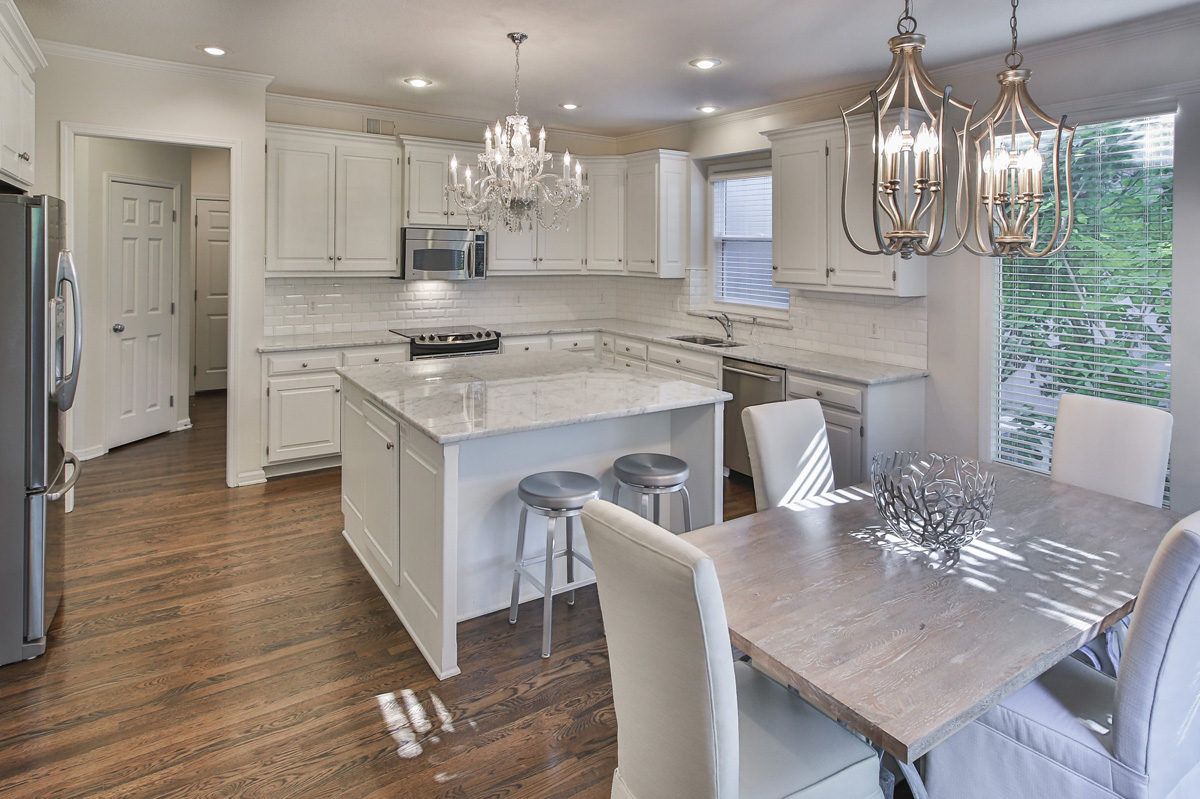
By juxtaposing the white chairs in the eating area against the rustic table finish and shimmery light fixtures, a wonderful symphony is created that undulates between masculine and feminine in this relaxing space.
The family room beyond continues the rustic glam theme with its beach elements on the coffee table contrasting nicely against the tufted sofa and gold mirror beyond.
3. Layer in a glamorous element
In this kitchen a re purposed chandelier provides the perfect glam touch to this beautiful kitchen with updated finishes. The rustic table juxtaposes nicely against the marble in the kitchen to create just the right amount of tension.
For more great ideas and photos, sign up for our weekly interior design blog here
Plus become a fan of Kansas City’s interior designer and former host of the renowned Living Large interior design show, Karen Mills, on Facebook here!
Our Design Projects Just Published in an International Interior Design and Architecture Book
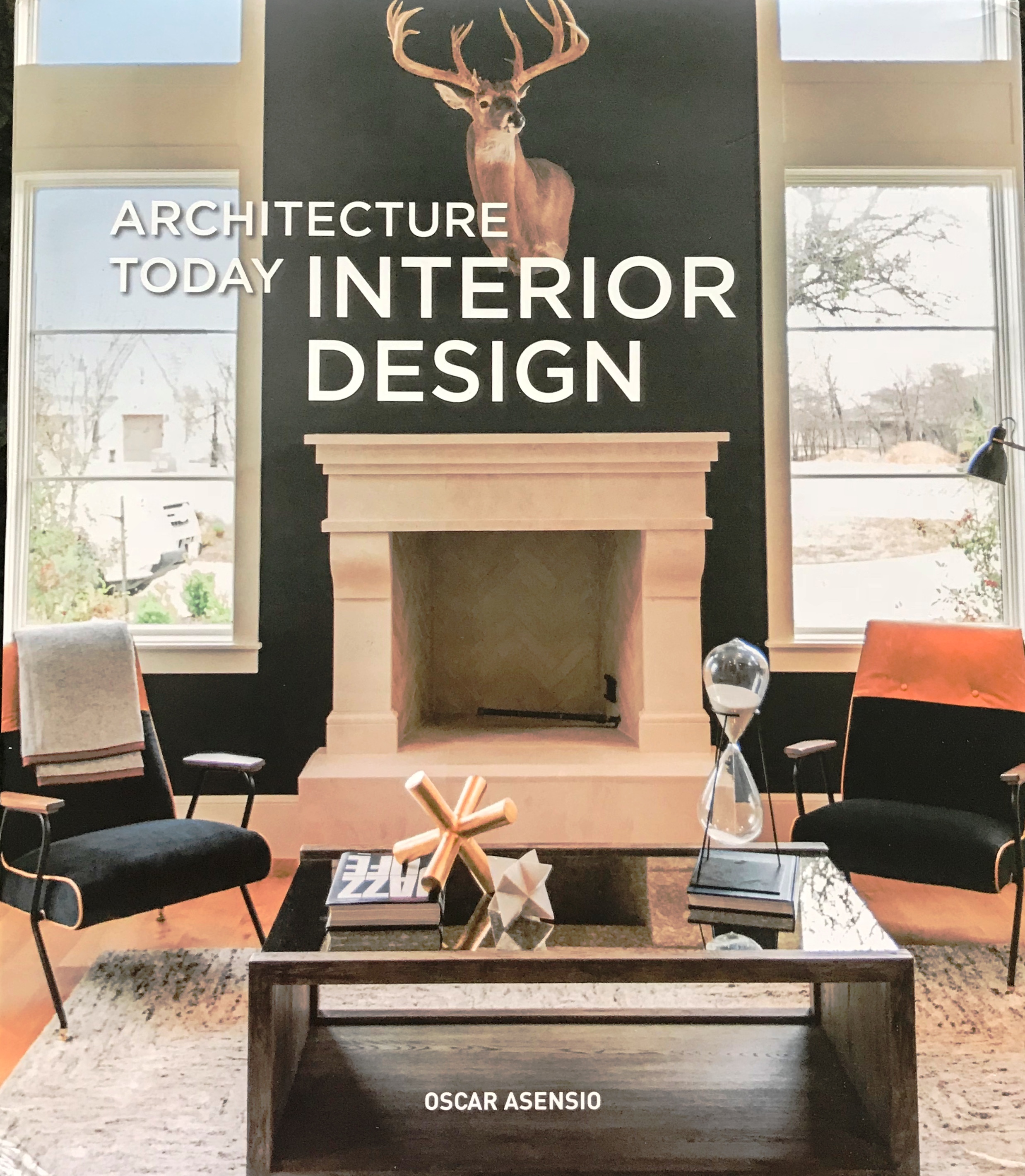 Thrilled to announce that our interior design projects were published this month in an international design book titled Architecture Today Interior Design by Booq Publishing in Barcelona, Spain along with other top interior designers and architects around the world whose work is absolutely fabulous!
Above is a photo of the book I snapped with my cell phone as I held it for the first time late yesterday afternoon.
Here’s a sneak peek of one of our favorite projects fondly called the “The Flat” after the clients’ London flat that will be featured along with other wonderful designs.
Copies of the book are now available at retailers worldwide so we can’t wait for you to pick up a copy and enjoy this book for years to come!
For more great ideas and photos, sign up for our weekly interior design blog here
Plus become a fan of Kansas City’s interior designer and former host of the long running Living Large design show, Karen Mills, on Facebook here!
Interior Decorating: 3 Ways to Make Your Living Room Bloom for Spring
If you’re like me you’re ready for warmer weather and cheerful colors. Here are 3 ways to make your room bloom!
1. Add bold pops of spring color
In this room bold patterned pillows, a cheerful blue vase and red throw mimic the colors of the brightly colored area rug underneath to give a spring like feel to this beautiful room by Kravet furniture.
2. Introduce fresh flowers and/or plants
This dining room gets a touch of spring with fresh flowers on the table that replicate the colors in the artwork on the furniture to add life to this space.
Photo courtesy of Lillian White for Hickory furniture
3. Swap out dark furnishings for lighter ones when possible
If you have a lighter area rug like the one pictured here that you can swap out for a darker one, the entire room can be transformed from winter to spring. Fresh leaf clippings, a red pillow, and purple throw add to the fresh spring atmosphere of this living room.
For more great ideas on interior design sign up for our weekly interior design blog here
plus become a fan of Kansas City’s interior designer and former host of the Living Large design show, Karen Mills, on Facebook here!
Interior Design: 7 Steps to Successfully Designing a Room
Like any project that involves money, you need a budget or at least a range before you start. Do some research and bring in the experts – an interior designer, contractor/builder, and architect to give an estimated investment. Then follow these 7 steps to create the room of your dreams!
- Decide on a design style or mix of styles that will flow with your architecture and existing furnishings you will be re purposing. As an interior designer in Kansas City, I always suggest clients select several photos of room designs they like and make sure any spouse or significant other involved agrees.
2. Determine your color scheme ensuring it coordinates with adjoining rooms and any existing furnishings to be used in the interior design. If you have no idea, take a look in your closet to see what colors you’re drawn too or pull colors out of an inspiration piece such as art, a rug, or fabric.
3. Create a floor plan so you know what fits in your space and the sizes you need. To do that go online and use space planning software or get an expert to help.
4. Set a timetable. At this point you might want to bring in an expert – interior designer and/or contractor/builder- to review your design plan/timetable because investing a few dollars for a master plan and viable timetable can help avoid thousands of dollars in costly mistakes from bad decisions or huge delays.
5. Design and order custom furniture and any built in cabinetry after consulting with your interior designer or tradespeople if you’re managing the project yourself. At this point all custom designs need to be finalized and ordered. In addition permits need to be pulled for construction.
6. Select and order all plumbing, flooring, tile, and general lighting needed.
7. Design furnishings
Furnishings may include rugs, window treatments, pillows, bedding or other items. Also ensure you select art, finishes, and other decor needed.
For more great ideas and photos, sign up for our weekly interior design blog here
Plus become a fan of Kansas City’s interior designer and former host of the long running Living Large design show, Karen Mills, on Facebook here!
Interior Decorating: 3 Ways to Decorate Your Outdoor Area for Spring
If you’re ready to get outside and enjoy the weather here are 3 tips for setting up your outdoor porch, pergola, or open seating area to enjoy for months to come.
1. Create a Comfortable Seating Area
High quality seating and a “L” or “U” shaped configuration like this outdoor room by Lexington Furniture help create a comfortable and inviting outdoor space. Here the yellow chair color repeats again on the sofa pillows while the patterned pillows on both upholstered pieces add to the cohesive look.
2. Introduce Fun Accessories
Some of my favorite accessories are bold pillows, live flowers or plants, and trays for the outdoors like shown in this photo.
3. Layer in an Area Rug to Create a Cozy Grouping
Placing an area rug underneath a seating area helps define the space and make it feel more like the indoors like this outdoor room. Interesting accessories in turquoise add to the finished look along with the pillows and tray on the table.
For more great ideas sign up for our weekly interior design blog here
plus become a fan of Kansas City’s interior designer and former host of Living Large design show, Karen Mills, on Facebook here
and if you have a porch to decorate, check out my latest article on Houzz titled Get Your Porch Ready for Spring Sitting below
https://www.houzz.com/ideabooks/95204125/list/get-your-porch-ready-for-spring-sitting


