 Interior Design/Interior Decorating
Fill Your Home with Joy, One Room at a…
Hello friends! Today I’m sharing ideas to create a joyful home by designing a space that feels both beautiful and comfortable—one that truly reflects your personal style and interests. You can achieve this by decluttering, adding meaningful elements, and by awakening your senses.
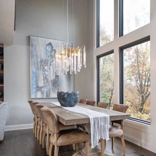
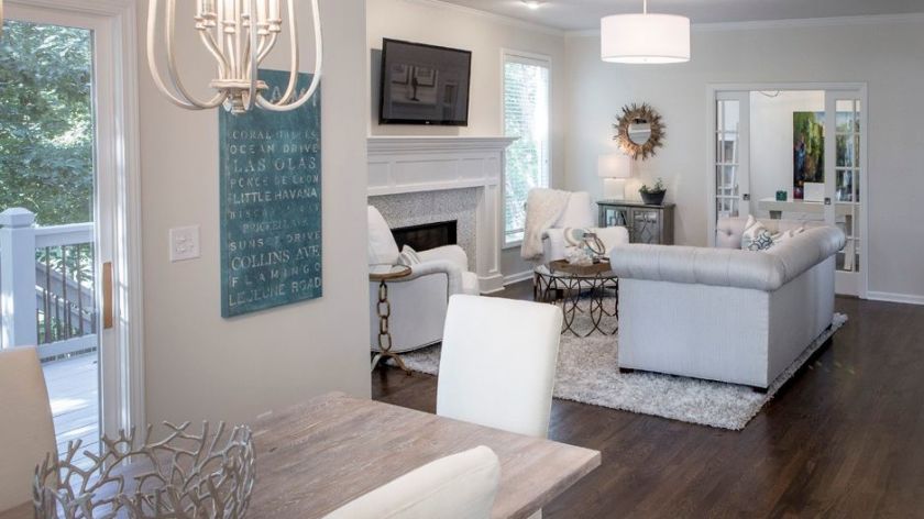
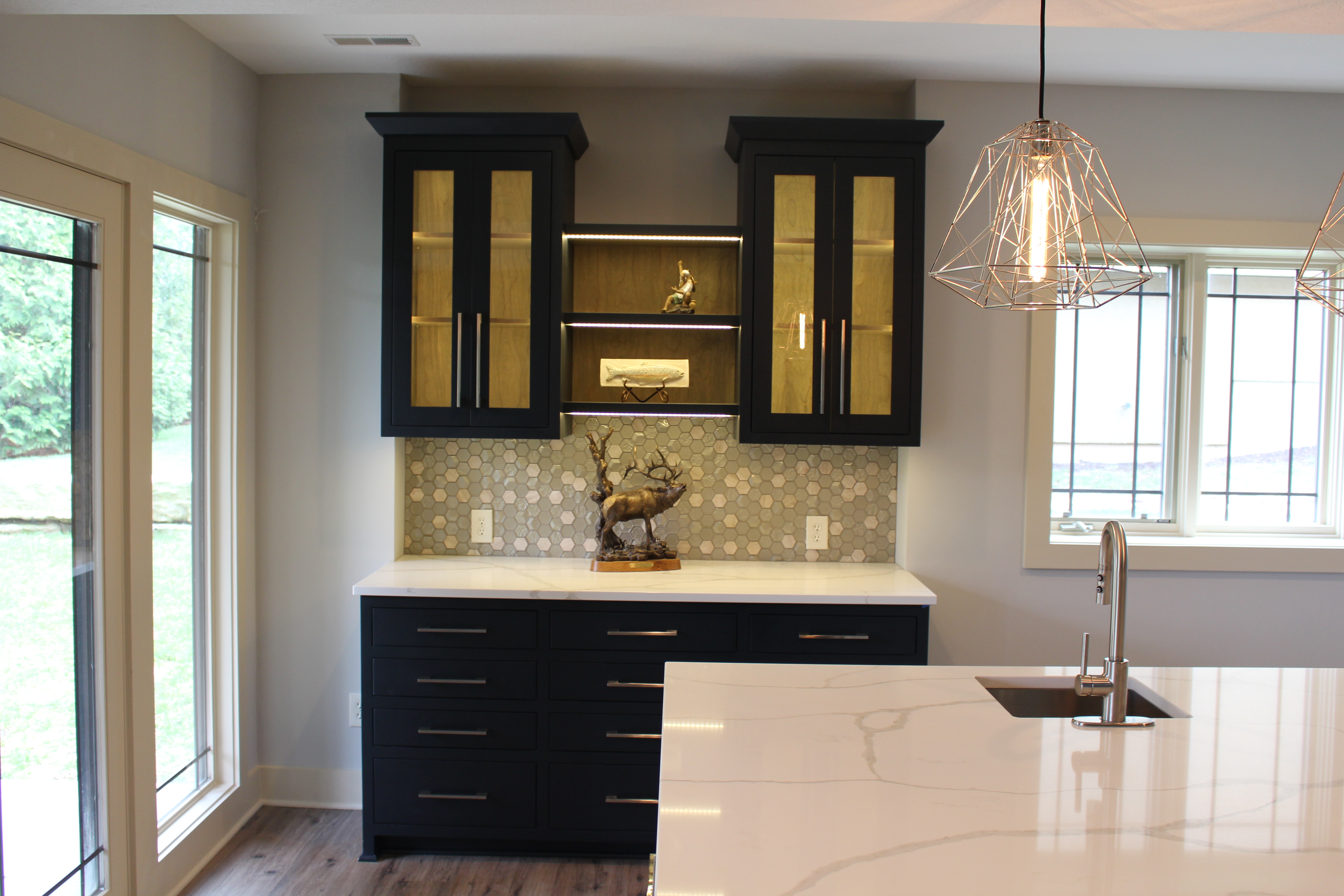
- Surround Yourself with Meaningful, Visually Inspiring Furnishings – Incorporate pieces that reflect your personality—whether it’s a treasured keepsake, a favorite color, or elements of your unique design style. Choose items that spark joy, bring back happy memories, make you smile, or even laugh out loud.
- Stimulate Your Sense of Hearing – Play your favorite music or calming sounds that evoke joyful memories or meaningful experiences. For a deeper sensory experience, immerse yourself in natural, ambient sounds—like the gentle trickle of a fountain or the comforting crackle of a fire.
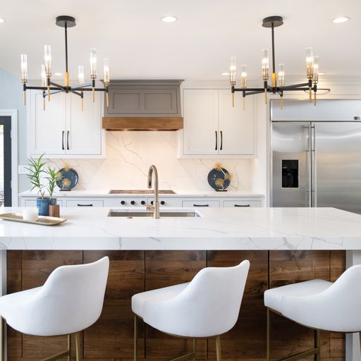
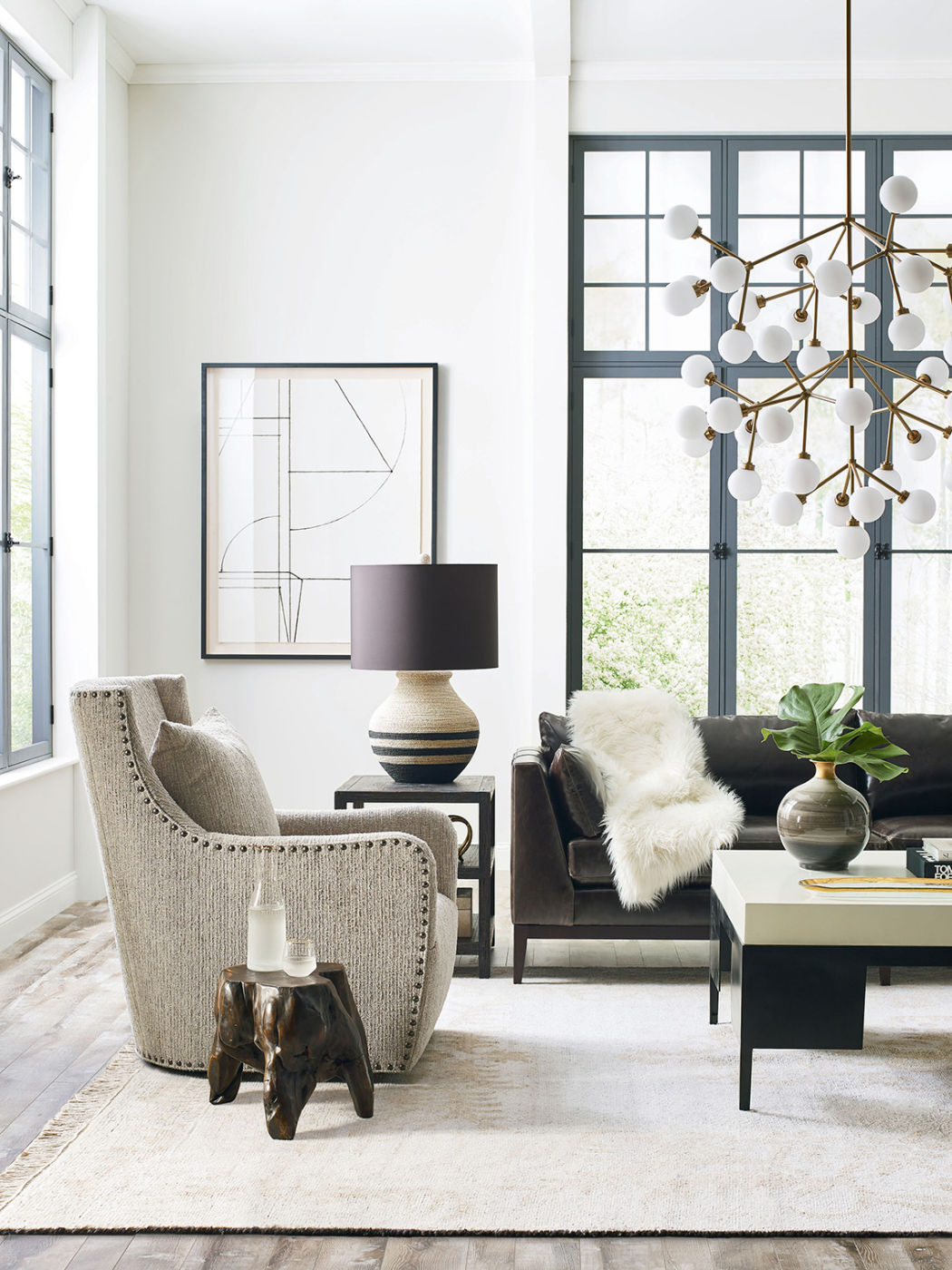
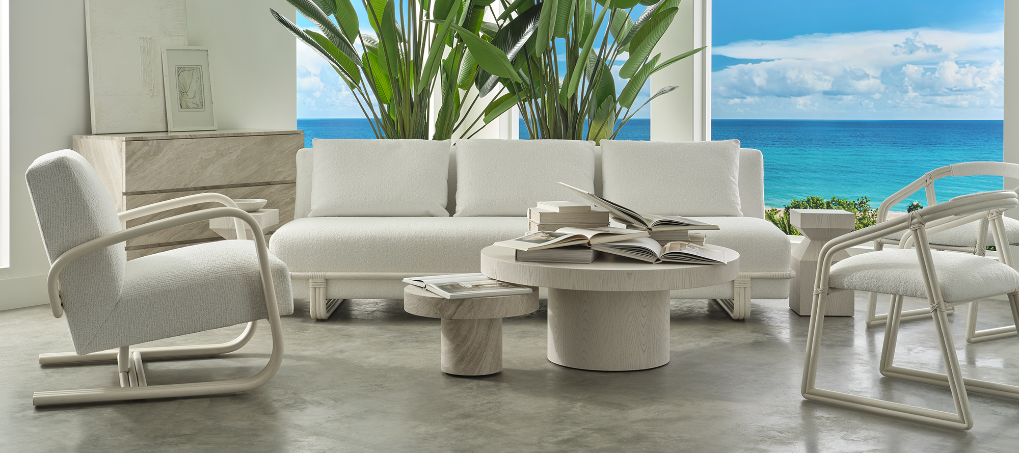
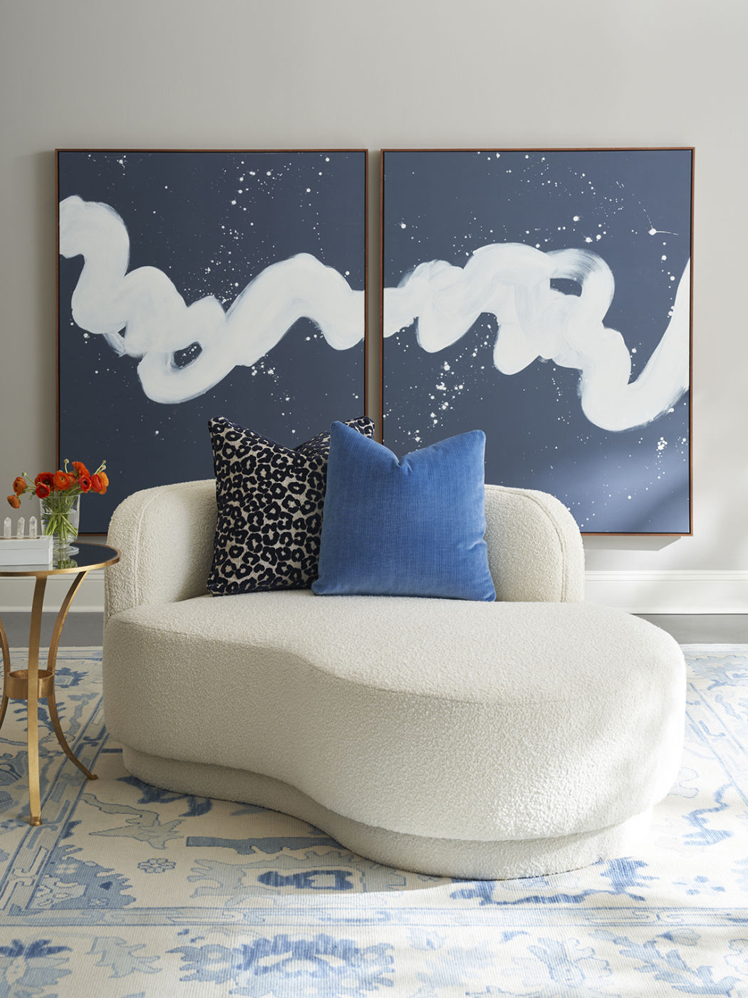
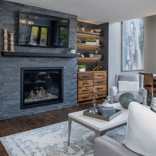
3. The Power of Touch: Creating Comfort Through Texture
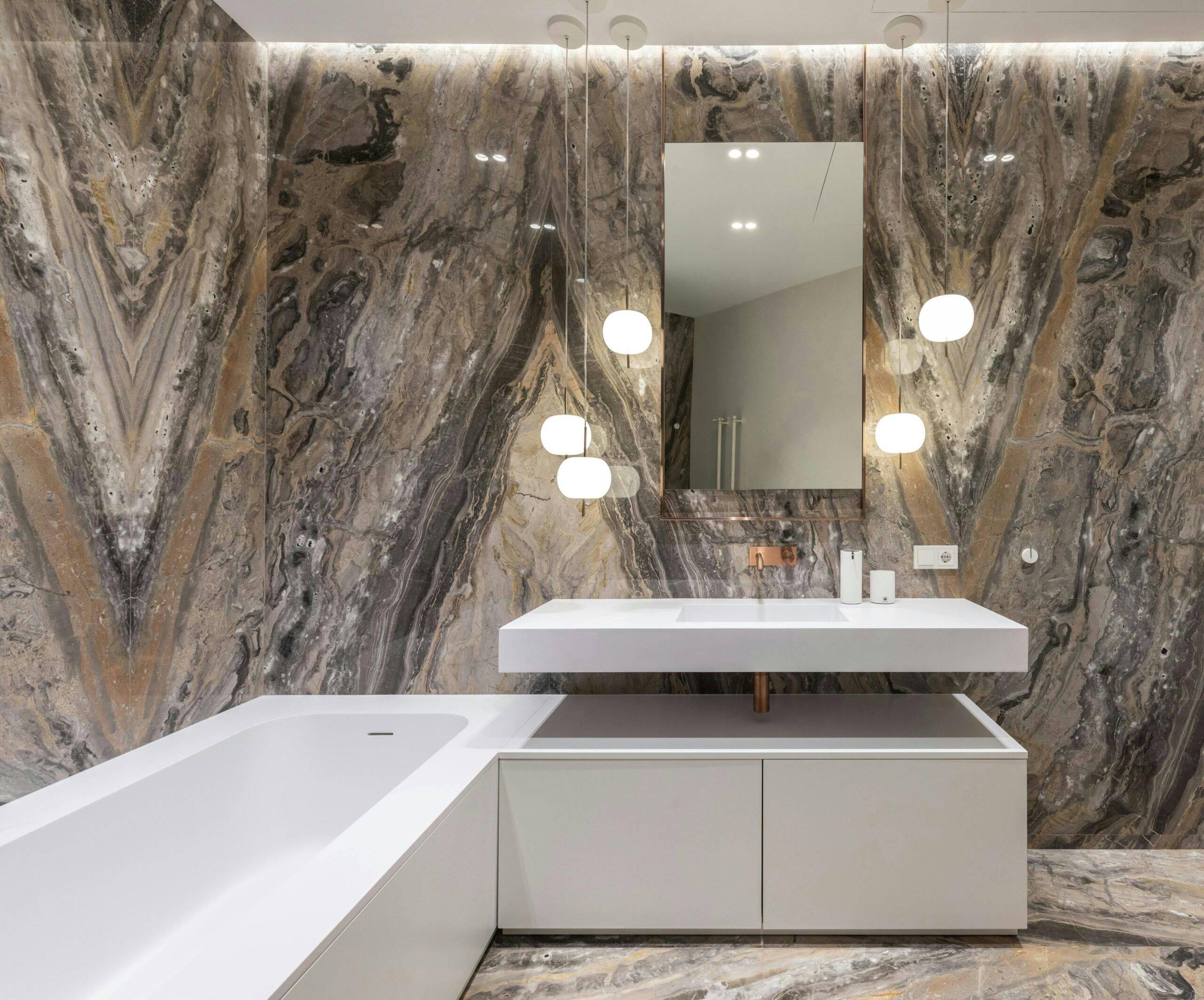
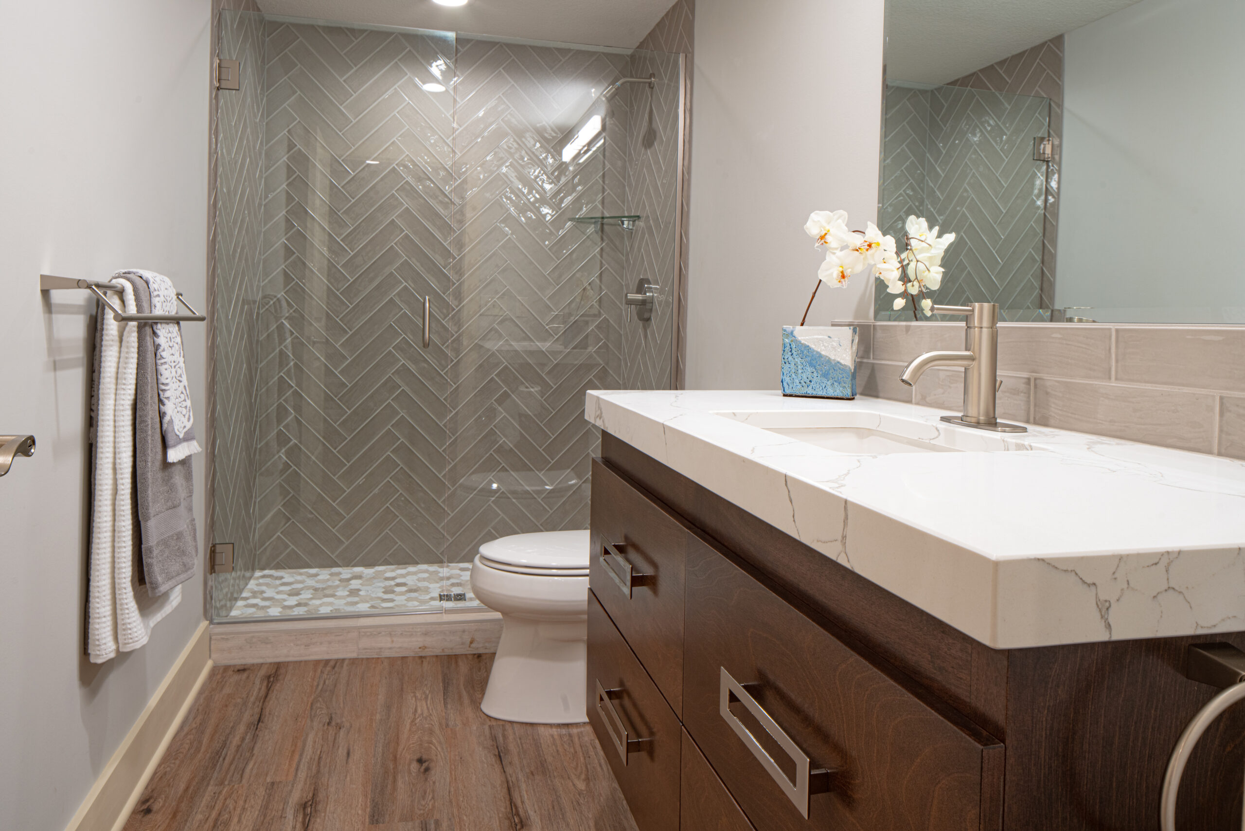
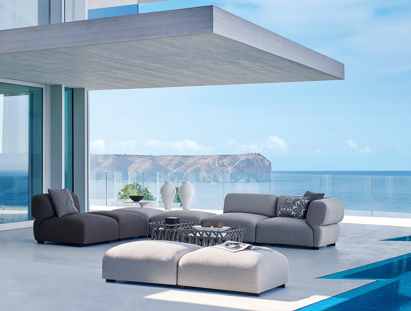
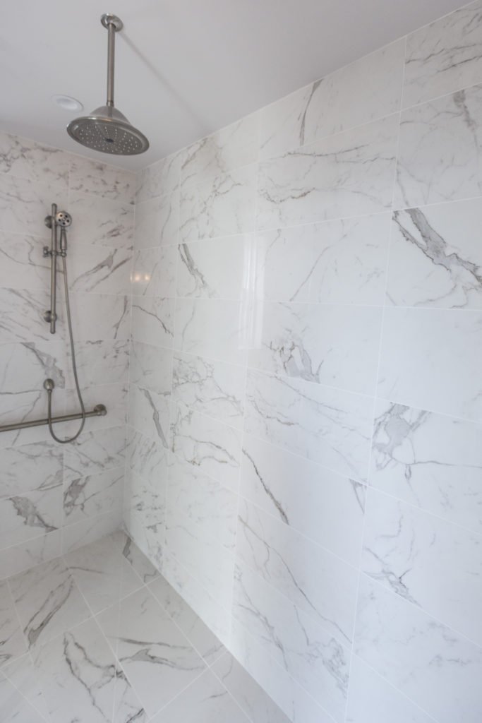
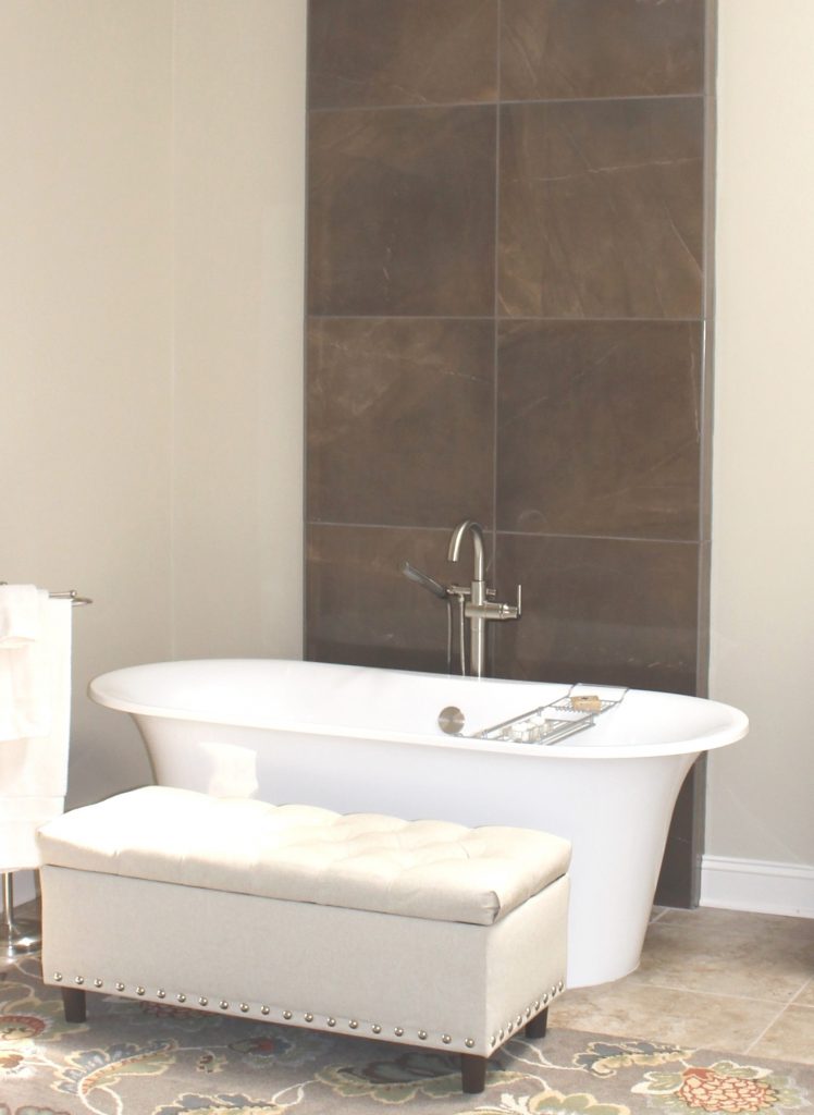
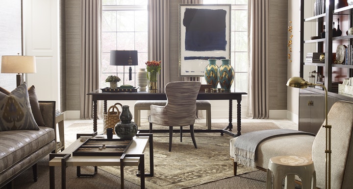
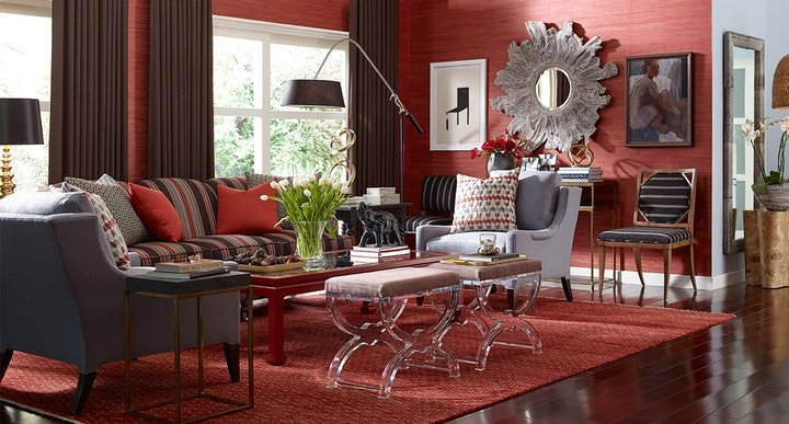
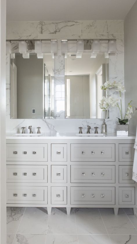
Incorporating touchable textures into your home can elevate comfort and bring a sense of joy and grounding. Soft fabrics like velvet or chenille, cozy throw blankets, smooth wooden furniture, cool stone surfaces, or even a plush rug underfoot all invite interaction and enhance the sensory experience of a space. Mixing textures adds warmth, depth, and personality—making your home not only visually appealing but also emotionally comforting. Choose materials that feel good to you and reflect the atmosphere you want to create, whether it’s soothing, luxurious, or earthy and organic.
4. A Taste of Joy: Infusing Flavor Into Your Living Space – While taste is typically reserved for the kitchen or dining room, it can play a meaningful role in creating a joyful home. Keep your favorite teas, snacks, or spices easily accessible and beautifully displayed to invite daily indulgence. Set up a coffee or tea station, curate a fruit bowl as a centerpiece, or style open shelves with cookbooks and artisanal ingredients that inspire you. By weaving taste into your space, you’re not only feeding your body—you’re nourishing your spirit and creating rituals of joy around flavor and comfort.
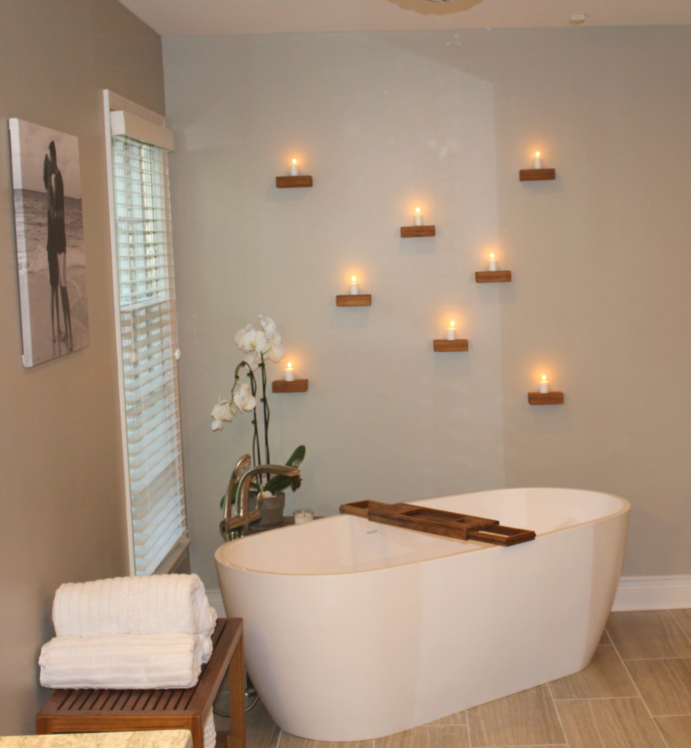
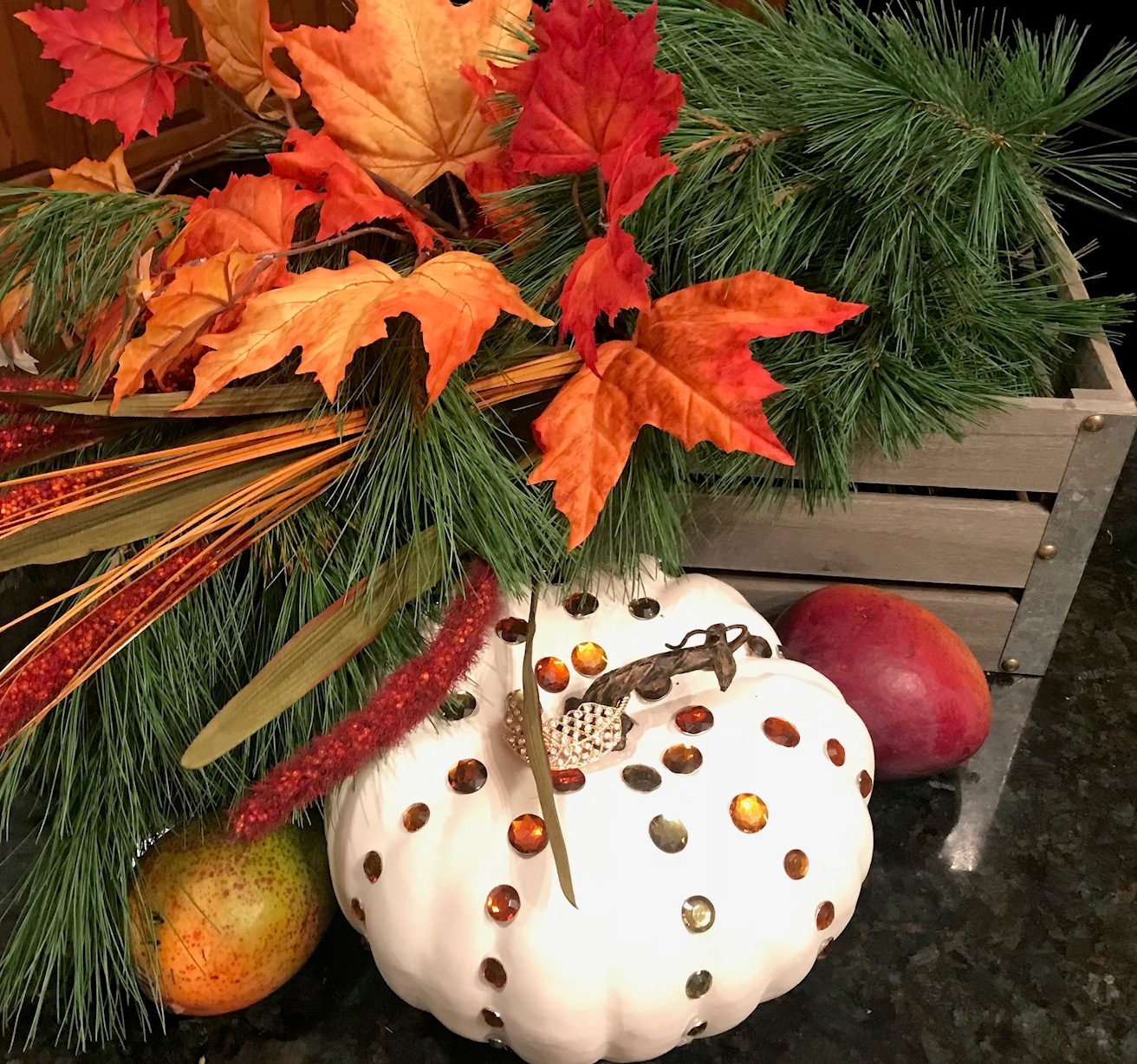
5. Designing with Fragrance to Elevate Your Space – Scent has a powerful ability to influence mood, evoke memories, and create an inviting atmosphere. Infuse your home with fragrances that bring you joy—whether it’s fresh flowers, plants, essential oils, scented candles, or the comforting aroma of home-cooked meals. Incorporate natural elements like eucalyptus, lavender, or citrus to promote calm and energy, depending on the mood you want to set. Strategically placing scent sources in different rooms helps create a sensory journey through your home, making each space feel warm, personal, and emotionally uplifting.
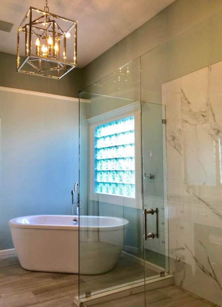
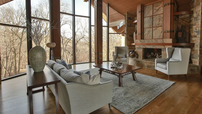
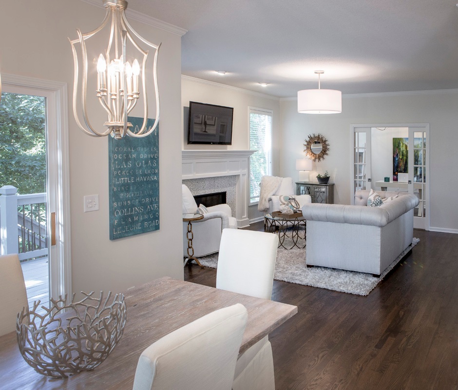
6. Let in the Light – Open or completely remove your window coverings to allow natural light to flood your living spaces. Because natural sunlight is known to improve your mood and has wonderful visual appeal. But don’t stop there. Bring light further into your spaces by strategically placing mirrors that amplify the sunlight along with opening up interior spaces, when possible, with glass doors/panels, skylights, or cased openings. Plus, don’t forget about adding lamps for ambiance.
7. Declutter Regularly – Psychologically, a clutter-free space can help clear your mind and reduce stress. My personal rule of thumb is that every time I purchase an item, another equivalent item has to go.
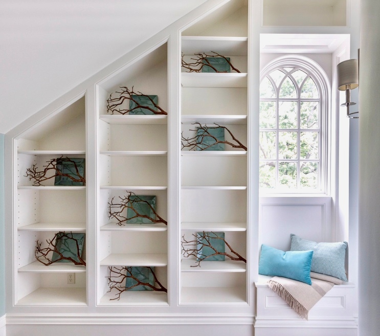
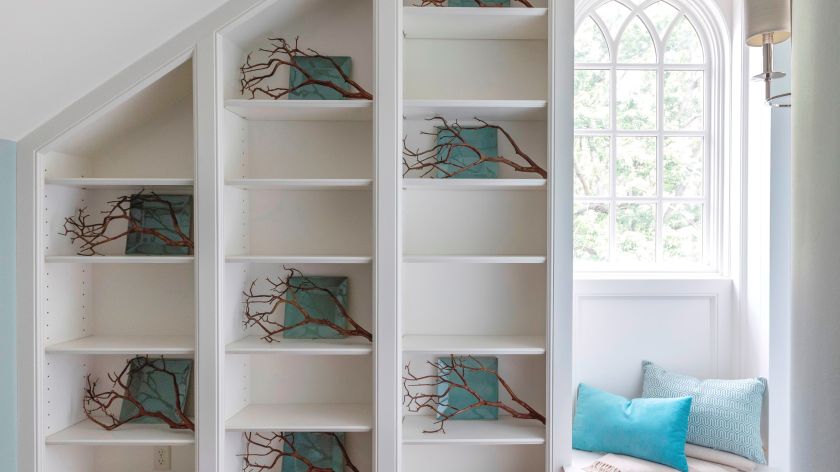
8. Create a Cozy Nook – Creating a cozy nook is a wonderful way to carve out a special space in your home or outside, that’s dedicated to relaxation and finding joy. The key is making an inviting spot that makes you smile. So, why not start with a comfortable chair or beanbag, a plush throw, and good lighting whether it’s a lamp or string lights. Then incorporate some favorite elements to create your own sanctuary where you can unwind, recharge, and simply enjoy a few quiet moments.
Want to learn more interior design tips and tricks of the trade? Want to learn more about interior design trends and insider secrets from Kansas City’s interior designer and former host of Living Large design show? Sign up for our free monthly newsletter now.