 Interior Design/Interior Decorating
An Interior Designer’s Insightful Steps to Transforming a High-Rise Kitchen
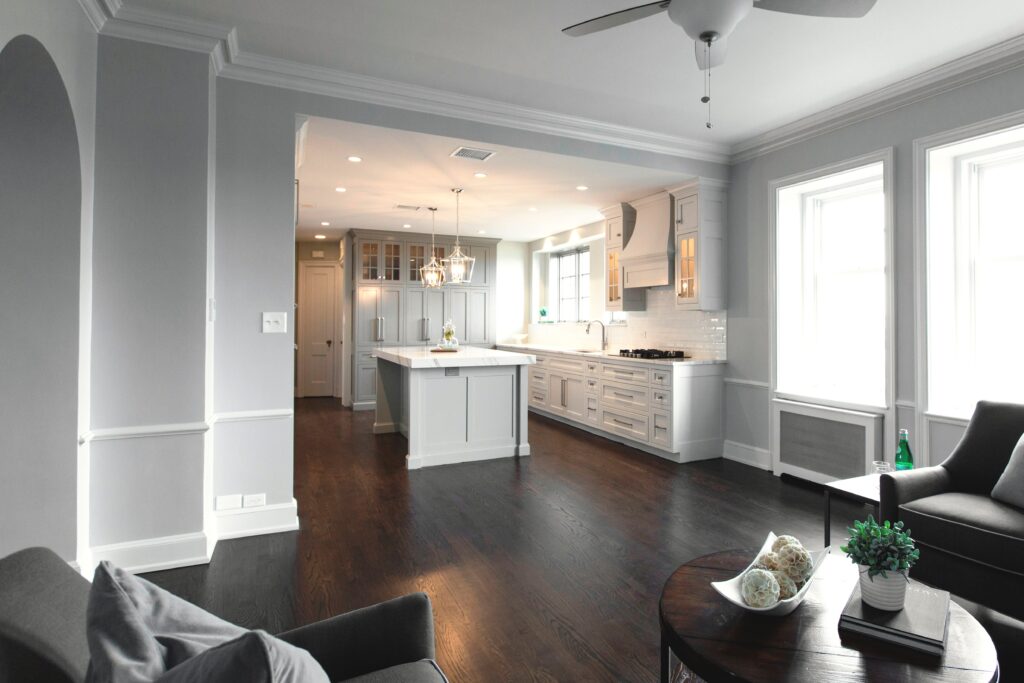
Because of a background in television I see everything through the lens of a TV camera. developing the story plot as I go to create a design that reflects both the architecture and the taste of the homeowners. But stepping into this early 1900s high rise for the first time I knew this interior design remodel project would be much more of a challenge, not only because of the tiny warren of rooms that revealed themselves as they zigzagged back and forth, but also because of the the challenges of redesigning this entire apartment within the confines of a brick building with limited access to the upper floors.
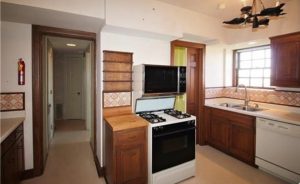
Entering the kitchen initially, I was immediately struck by how small, unappealing, and closed in I felt in the space, so I knew our team would need to remove some walls after reimagining the layout of the entire apartment for both function and aesthetics.
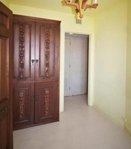
As we passed through the kitchen, we noticed a tiny maid’s room tucked beyond the kitchen with a window that would be perfect for enlarging the kitchen, while also bringing in more natural light. So our team began by tearing down the wall between the two rooms, while I determined how to best resize the disparate windows that would ultimately reside side by side in the kitchen.
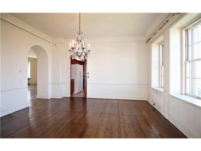
Next, it was time to open up the kitchen to visually expand the space even more by tearing down a wall. The living room wouldn’t work because the wood-burning fireplace that was in the middle of that wall. That meant the only option left was the wall between the dining room and the kitchen.
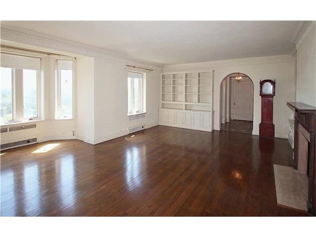
But I didn’t like the idea of the kitchen just opening into a formal dining room without a place to relax, so we decided to move the dining room to the large living room where ample space existed for both functions. And then we made the former dining room a new hearth room.
Now we were ready to space plan the layout of the kitchen to ensure it would function well for our client, while also being inviting.
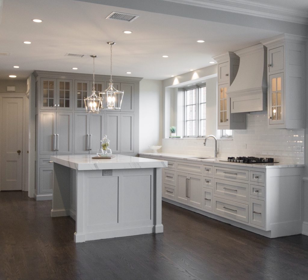
When space planning the kitchen, we made sure to include not only a functioning work zone, but also an island for entertaining guests with a mitered (chunkier) island and small chandeliers to add more emphasis.
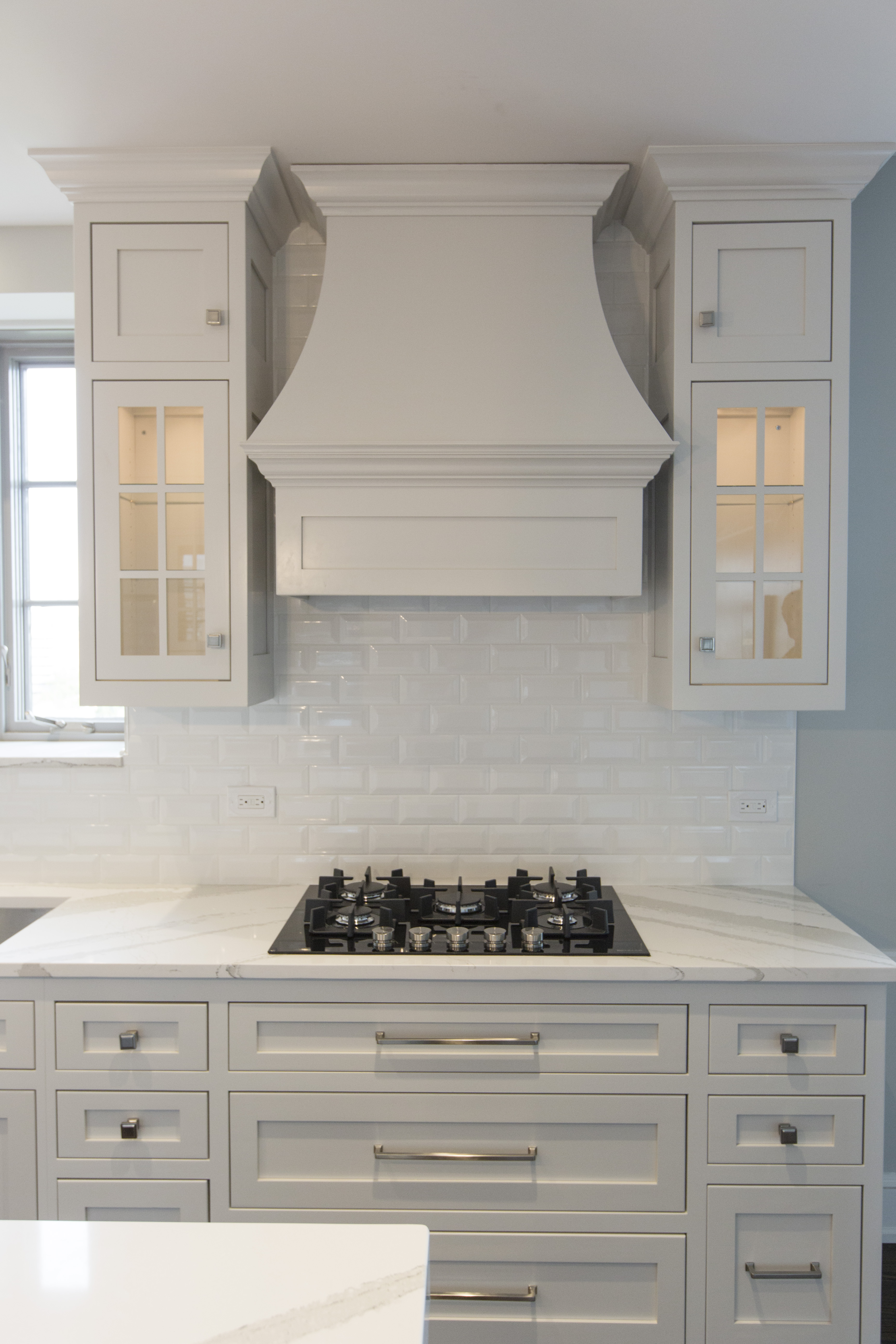
In the main cooking zone, we added pegged drawers under the stove top for lids and pots, while also adding lit glass upper cabinets, a custom designed hood, and ran backsplash tile up to the ceiling to create a more dramatic look.
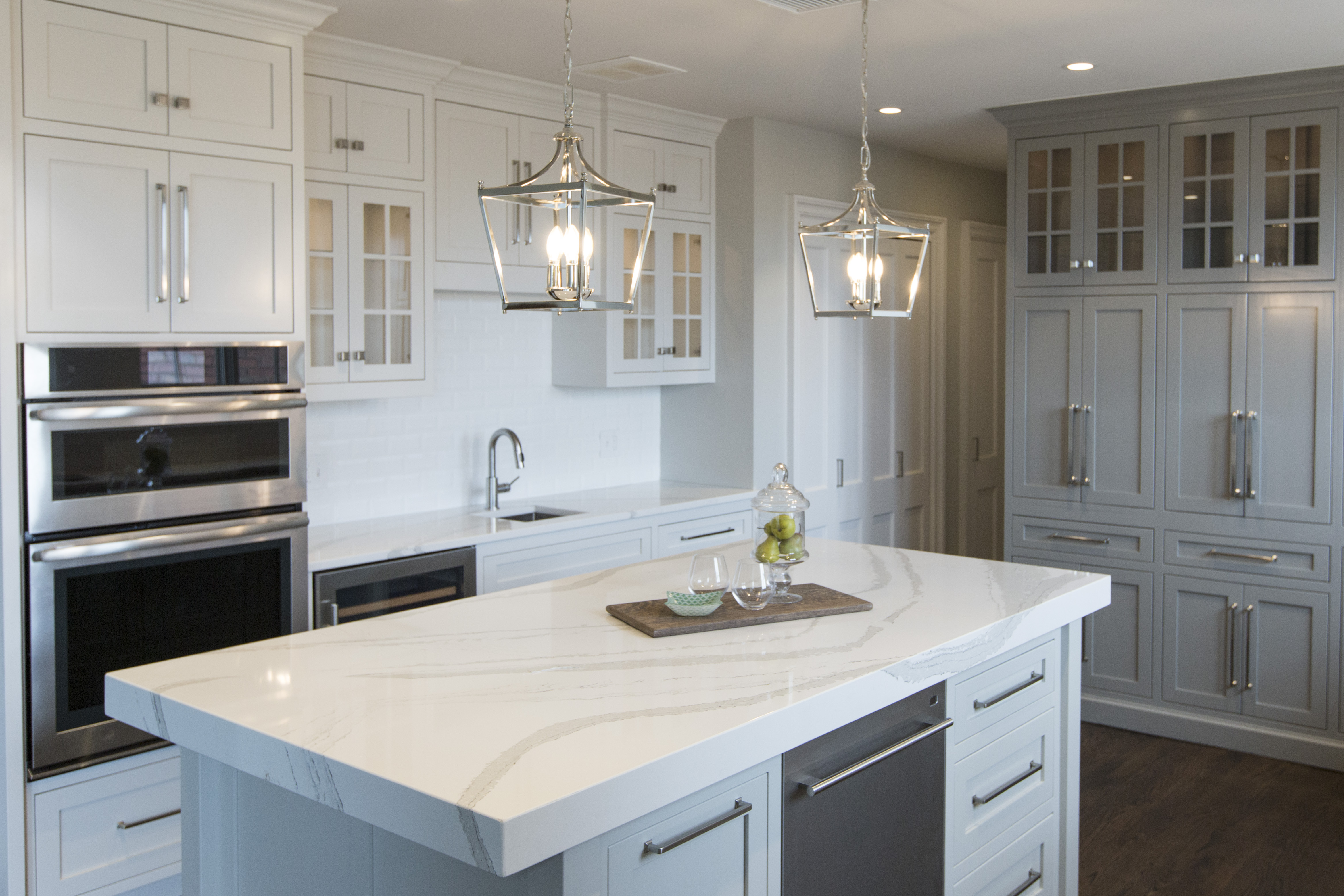
At the far end of the kitchen was the former maid’s room with a slanted wall that couldn’t be removed for functional reasons. To resolve this issue, I designed a coffee bar cabinet and storage that hid the slanted wall complete with tuck back doors that opened to reveal the coffee area. Lit upper cabinets and large pulls complete the look.
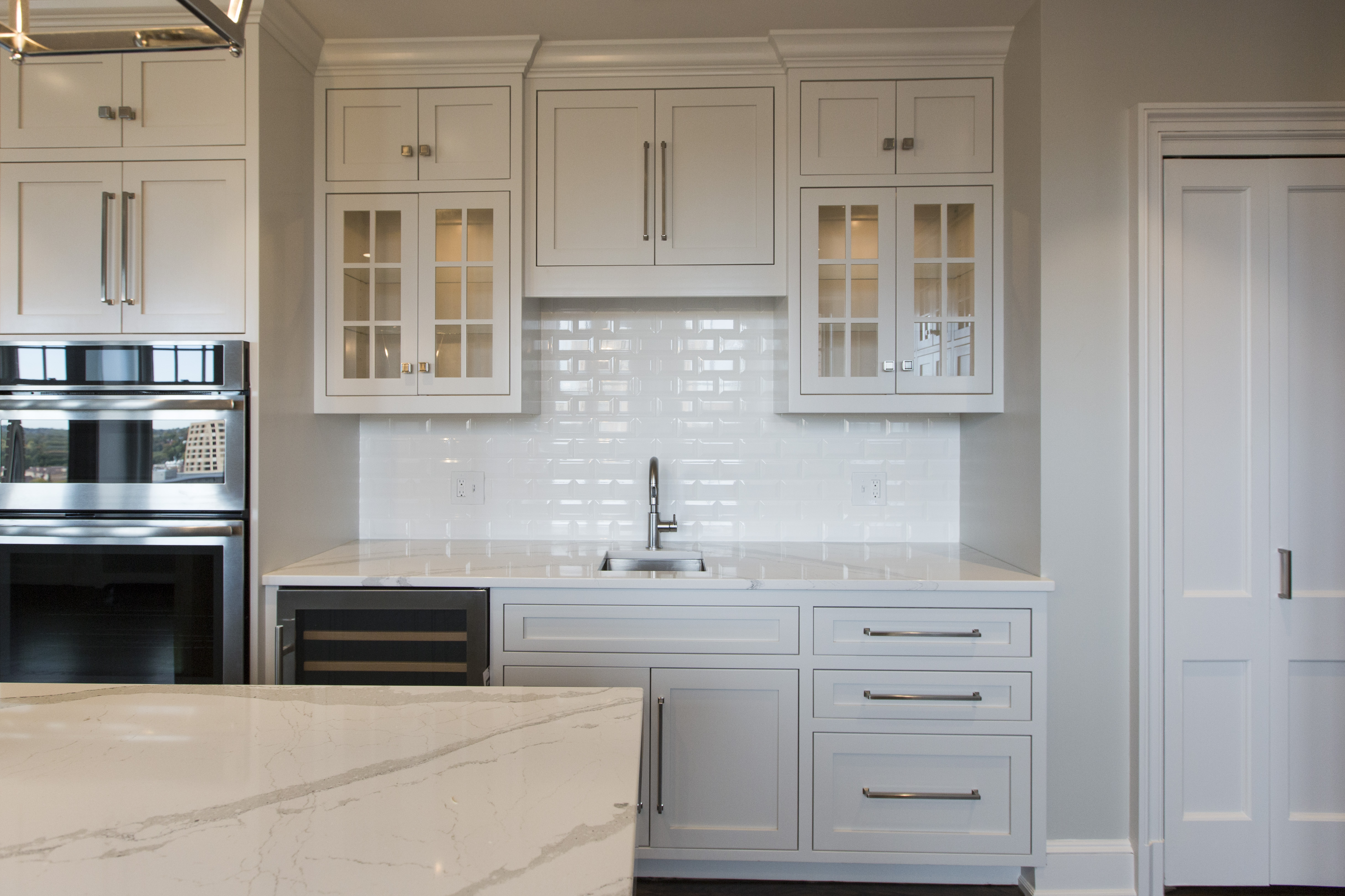
On the opposite side of the stove hood, we created a wine bar area replete with a wine fridge, a bar sink and lit glass front cabinets for wine glass storage.
For more great ideas sign up for our weekly interior design blog here!
Plus become a fan of Kansas City’s interior designer and former host of the Living Large design show, Karen Mills, on
INSTAGRAM and FACEBOOK here!