Blog

Interior Design/Interior Decorating

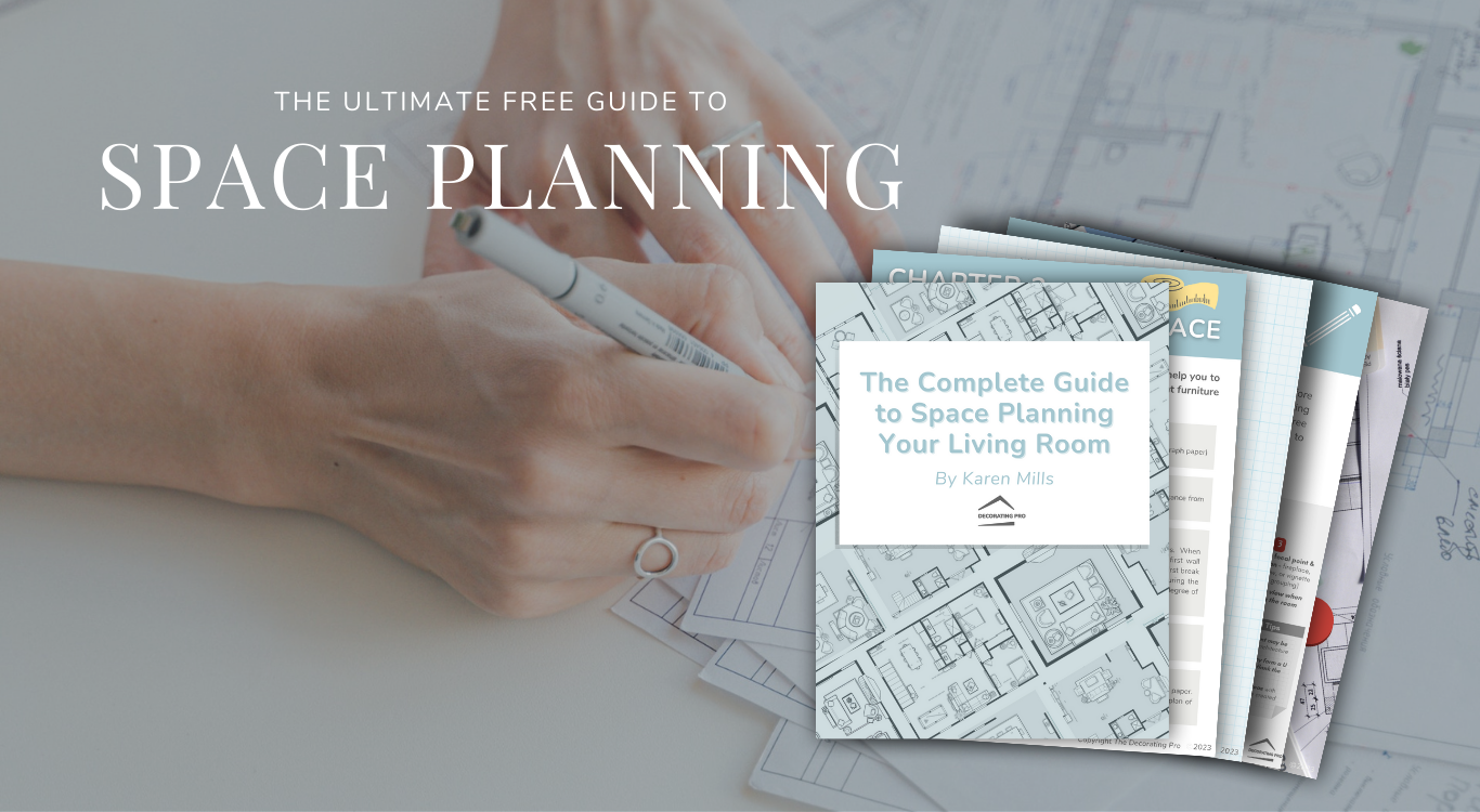
Interior Decorating: Ultimate Free Guide to Space Planning

photo of space plan guide

Ever feel overwhelmed trying to start a new interior design project?

You’re not alone. As an award-winning designer who’s done over 1300 projects, I’ve had countless homeowners share how they not only felt overwhelmed but had no clue where to start.

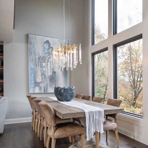
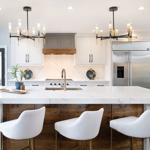
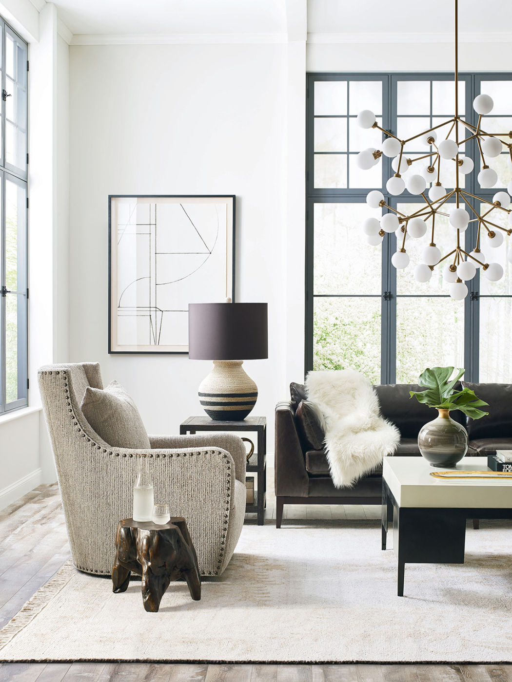
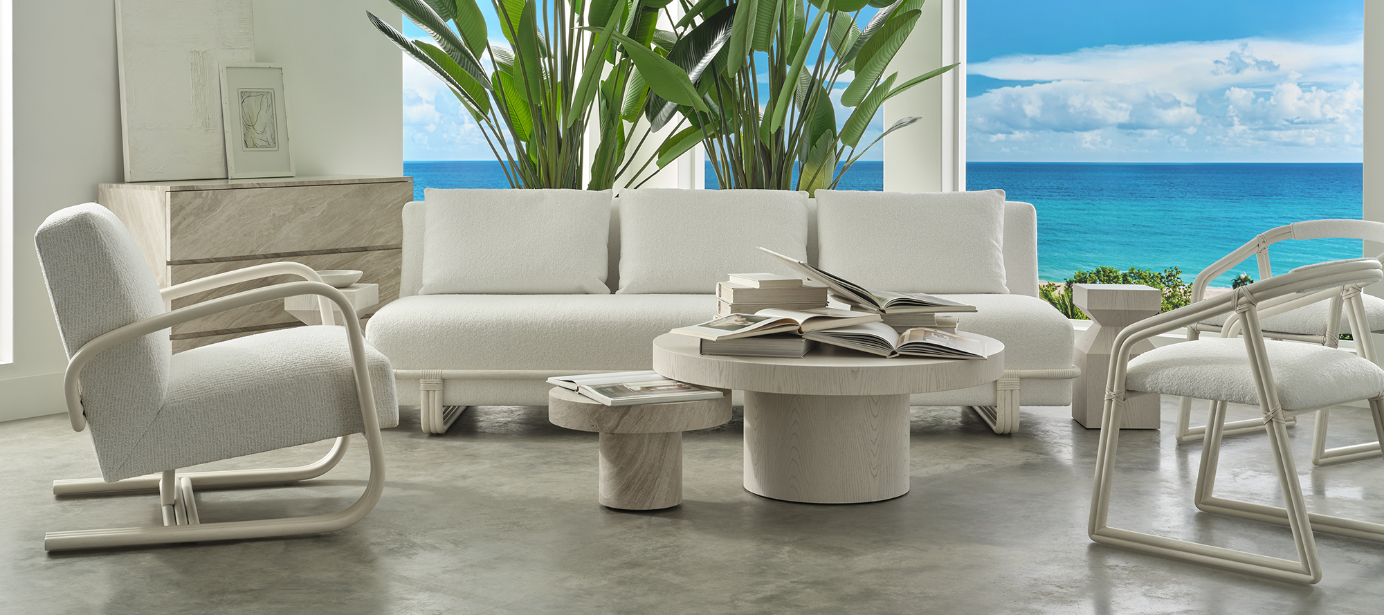
That’s why I’m so excited to share my “Complete Guide to Space Planning Your Living Room” developed over the past 20 years as a professional designer to help guide you through the space planning design process so you can win the battle against overwhelm to create a beautiful room that brings you joy and makes staying home much more enjoyable!

Want to learn more?

Interior Design/Interior Decorating

Elevate Your Design Game: Free Tips, Trends & Eye-Catching…

Level Up Your Skills & Stay Inspired

Have some exciting news! First, we are now offering our incredible weekly Design Tips Newsletter for FREE! This content rich newsletter includes all my designer secrets, insightful design tips, upcoming trends (way ahead of their time), and fabulous photos.

Kansas City’s Favorite Designer

Great news! We’ve been nominated for KC’s favorite designer and would love to have your vote of confidence! It’s quick and easy! After you click on the button select Home & Garden, Interior Design, and Karen Mills.

Interior Design/Interior Decorating

Principles of Interior Design: Part 2

What are the Principles and How do You Use?

As an award-winning interior designer, I like to make use of these principles regularly to create stunning spaces. Read on to learn more.

Interior design by Karen MIlls
  1. Emphasis: By giving more importance to one feature you create a focal point or feature in the space. In this stunning room we designed we gave the fireplace more emphasis to make it a focal point by covering the dated stone fireplace in charcoal stacked stone and adding glass rocks inside the fireplace. A newly designed floating chest and built in lit shelves add to the emphasis of this focal point.
Interior design by Karen MIlls

2. Rythm: A pattern of periodic repetition of elements in succession such as lines, shapes, motifs, or colors such as the steps or spindles on stairs. In this foyer branches and plates on the shelves create rhythm in the room.

3.Harmony: The creation of a unified design using the various parts to create an overall pleasing whole. When you have harmony, you’ve achieved a successful balance between unity and interest in a space.

Want to learn more about interior design trends and insider secrets from Kansas City’s interior designer and former host of Living Large design show? Sign up for our free newsletter now.

karen-mills.ck.page/8d0663c849

Interior Design/Interior Decorating

Principles of Interior Design: Part 1

What are the Principles of Interior Design and How to Use Them

Today I’m going to unlock the secrets of design by sharing the principles of design. And today I’m starting with the first three ones. Read on to learn more.

kitchen
Interior design by Karen Mills
  1. Balance: How we create a sense of stability and harmony in a space by arranging (or balancing) objects evenly. There are three ways to achieve balance:
  • Symmetrical: Identical or similar objects on both sides of a center point. In this kitchen I created a symmetrical balance with the chandeliers, blue plate grouping, and upper cabinets flanking the stove hood to make a powerful statement and draw attention to the focal point of the kitchen.
  • Asymmetrical: The use of different objects with the same visual impact on both sides of a center point. To create an asymmetrical look in this kitchen I would swap out one of the blue plate groupings for another grouping of a similar size.
  • Radial: Objects that radiate out from a common center point in a circular fashion.
Photo courtesy of CR Laine

2. Proportion: Refers to the relative size and scale of different elements within a composition such as a room. Think of proportion the like ingredients in a food dish – much like cooking, getting the proportions right is the key to success. In this beautifully designed living room, the small dark wood stool by the swivel chair feels too small in comparison to the other furnishings and room as a whole.

3. Contrast: Two or more objects or architecture in opposition to each other in a space such as light and dark or smooth and rough. In this living room, a high contrast between light and dark finishes create a dramatic look overall.

Stay tuned next month for Principles of Design: Part Two

Want to learn more about interior design trends and insider secrets from Kansas City’s interior designer and former host of Living Large design show? Sign up for our free newsletter now.

karen-mills.ck.page/8d0663c849

Interior Design/Interior Decorating

3 Big European Design Trends for 2024

What’s New and Next in Interior Design

photo example
Photo courtesy of Baker McGuire

As an interior designer I can tell you that the latest interior design trends normally start in Europe and make their way to other parts of the world like the United States. So, today I’m sharing some big trends that are going to rise in popularity.

  1. Circular Shapes – These curves can be seen on everything from table bases and upholstery like shown above to ceramic lighting, also a hot item. And fluting on table bases plus cabinetry is starting to take off.
Photo courtesy of Baker McGuire

2. Plush Upholstery – This upholstery trend continues to grow in popularity, especially in edge free designs with ultra plush fabrics.

3. Organic materials/designs – Particularly hot right now are products made of marble or nature inspired patterns.

Want to learn more about interior design trends and insider tips? Sign up for our weekly newsletter now.

karen-mills.ck.page/8d0663c849

Interior Design/Interior Decorating

Design Tips for Incorporating Your Favorite Color at Home

What Your Favorite Hue Says About You and How to Use in Your Space

photo example
Room courtesy of Curated Kravet

Did you know that your favorite color gives experts insight into your personality type? As an interior designer who’s worked on over 1300 projects, I can usually get an immediate sense of someone’s personal style by looking at their outfit or by walking through their home.

Everyone experiences color in different ways. So, as we progress through life, we each end up with our own unique color story based on our experiences.  Lea Eiseman, the world’s leading color expert and a regular guest on my former design show Living Large, shared why that’s true in one of her renowned color books, “…much of color knowledge is based on instinctive responses, cultural conditioning, and those aspects of color that we seem to absorb without much conscious thought.”

Read on to gain insight about your favorite color, what it says about you, and ideas for injecting that color into your home’s interior.

Karen Mills' blog
Photo courtesy of Kravet

RED

If you love red like I do, you likely possess a passion and intensity that others don’t possess for living life to the fullest. You’re exciting, daring, and spontaneous, with an inner drive to excel in everything you touch.  The color red, associated with blood, instantly raises your blood pressure and grabs your attention.  So, remember when creating a new interior design that a little bit goes a long way in a room as demonstrated in this all-red room that demands your attention. Alternately, soft pink lovers tend to be charming, peace loving, and romantic types who carry some traits that are similar to the red and bright pink personality.

Karen Mills' blog
Interior design by Karen Mills featured in Architecture Today Interior Design book

BLUE

An extension of sky and water, blue exudes stability and calm making it a perfect color for bedrooms or other areas where you want to unwind and relax. Lovers of this color tend to be dependable, responsible citizens who do the right thing. No wonder blue still remains the favorite color of men! In this entryway, a watery blue landscape painting sets the tone for the rest of the living area while the blue vase reinforces this gorgeous accent color.  

YELLOW

Yellow like a ray of sunshine portrays warmth, cheerfulness, and optimism making it a wonderful hue for a cheery kitchen, sunny living area, or any interior lacking sunshine and warmth. Huge fans of yellow are optimistic, warm, and playful, while also being inquisitive and encouraging to others.

photo example
Interior design by Karen Mills

Interior design by Karen Mills featured in Design Icons book

ORANGE

As an orange lover, you have an enthusiastic zest for life, outgoing personality, sense of humor, bright outlook, and longing for adventure. Orange, the color of hunger, fits seamlessly into a dining area or kitchen where hungry people often come. But that’s not all as you can see in this foyer where we sourced a Mattini painting, pulling out the orange hue as as an accent color on our custom designed rug, original ceramic art piece, and flowers, while also repeating a golden hue from the art on the wool rug and handmade chevron wallpaper to add more interest.

Interior design by Karen Mills featured in Design Icons book

GREEN

Green, the color of nature, exudes calmness and warmth, making it a perfect color for calming bedrooms or interiors when a more relaxed vibe is wanted.  Enthusiastic fans of green are usually warm, kind, and charitable people who like to give back to their communities. Green fans also bring stability and loyalty as additional attributes. Here in this stunning foyer featured in the international Design Icons book, that we designed, the blue green plates with branches overlaid on the white shelves were repeated to create a dramatic pattern, but also created a calming entry into this third floor foyer aptly named The Flat after our client’s London home.

PURPLE

A complex and creative type of individual, purple lovers are fascinating observant individuals who often have a generous spirit and artistic flair. Purple, the favorite color of most children, also has a mysterious air about it making it popular with artists or creatives too. In interiors purple usually works best as a light or a very dark almost neutral hue wall color or as an accent in any shade.

Interior Design by Karen Mills featured in Architecture Today Interior Design Book

BROWN

Brown personalities tend to be down to earth, stable, and in harmony with life around them, while still appreciating quality. Brown lovers like to keep things simple, secure, and peaceful, but that doesn’t mean they aren’t cosmopolitan. Brown hues work great for your interior if you’re looking to create a grounded space that’s also cozy and inviting whether its a living room, dining room, den, or even a bedroom. Beige, a lighter version of brown speaks of someone who is warm, reliable, and doesn’t often rock the boat. As a light neutral this color can be introduced almost anywhere including combining it with gray for a cool/warm color combination. Here in this stunning rustic great room featured in the international book Architecture Today Interior Design, that we designedwarm browns wrap around the room like a big hug, creating a welcoming feel. While in contrast calming blue hues on the area rug and pillows, help balanced out the color, adding a soothing feel.

White

Did you know that white is the sum of all other colors combined? Isn’t that amazing? As an interior designer I love that white can do so much in a room’s interior design from creating more contrast and bouncing light around a room to visually expanding it.  But white also represents innocence, cleanliness, and purity which is why lovers of the white color often have clean fresh organized spaces with a pure aesthetic. In this hearth area we darkened the floors to contrast against the white walls and trim we introduced to create more drama. Then we continued to lighten up the interior by recovering heavy dark fabrics on the upholstery with lighter ones, slip covering the dark leather dining chairs, layering in pillows with white backgrounds, updating the fireplace with a white/gray marble tile, and adding a kitchen table that had been whitewashed a lighter color.

Gray

Gray personalities seem content, cool, and collected, often preferring to stay out of the limelight.  Instead, they opt for safety, security, and practicality. That’s why I believe as an interior designer that gray color schemes have become so popular at home for years because this color creates a calm respite from the outside world and works well in almost every room. In this gorgeous high rise master bathroom we designed, the gray in the Italian marble style tile repeats again on the custom designed vanity and walls. White quartz counters, square knobs and a tiled wall enhance the look of this small but stunning space.

example of blog topic
Interior design by Karen Mills

BLACK

Did you know that black is completely void of color?  But as we know the black suit signifies power, sophistication and status in the business world.  Black hue aficionados also seem confident in their ability to hold a conversation, clever in their communication abilities, and make security a top priority in their lives.

Black is a wonderful color for interiors, especially when combined with white and can used throughout your interior from living, dining, and powder rooms to home theaters, or on doors/trim to create a dramatic look. Here in this bar area, the stunning black cabinetry steals the show with its dramatic color juxtaposed against the warm wood interiors and lit glass cabinetry.

But what if your favorite color is a combination of two different colors? Then you likely have some personality traits from both colors.

To summarize, colors whether worn or used in your interior reveal insight into your personality and life story. And when you utilize your favorite color in your home it can bring back wonderful memories that cradle you in comfort whether it’s on the walls, ceilings, floors or furnishings.

Want to learn all my design secrets from 20 years of experience?

Subscribe to our weekly design tips newsletter now.

For more great interior design ideas, sign up for our design blog here! plus become a fan of Kansas City’s interior designer and former host of the Living Large design show, Karen Mills, on Facebook  and Instagram now! And if you feel someone you know could benefit from this helpful information, please pass it on!

Interior Design/Interior Decorating

5 Steps for Creating Fall Decorations Using Found Items…

How to Use Fall Foliage, Pinecones, and More to Decorate

Since I’ve been too busy with interior design projects the past few years to have time to share my design tips on local television every week or two, I wanted to share some fun ideas today for creating fabulous fall decorations.

Karen Mills' blog
Interior decorating by Karen Mills
  1. Determine your color scheme. In this example I chose typical fall colors including green, orange, and red with brown and white as neutrals. For the pine branches, I normally trim from my own pine trees so I can also have the wonderful smell of pine inside.
Decorating by Karen Mills

2. Gather natural items from your backyard, woods, or home. If you don’t have enough real items available to do all your fall decorating like me, then consider adding realistic looking decor or other items that reflect your personal style. In this table setting, I incorporated a couple of my favorite themes with found items at home including a real shell napkin ring and a fashion forward coaster. I also layered in three placemats I had at home to create an interesting base for the table setting. Then I tucked in berries to add texture and another pop of color to the existing orange napkin and white plate in my table setting collection.

photo example

3. Began with taller items first at back of your fall decoration. Or center taller items if your decoration will be viewed from multiple angles. In this kitchen, I began with the tallest item at the back, the tiered plate and then added additional items to enhance it. But you could also layer in additional items that are mid-height to create a fuller look.

photo example

4. Fill out your decoration with foliage or other decor. In this tray I began with a bottom layer of petrified wood I found outside, and then layered in pinecones. But you could also introduce pine leaves.

5. Add final touches with pops of color. In this tray I introduced fall leaves and berries.

Need Decorating Advice?

Drop your questions below and we’ll answer them in an upcoming issue of our newsletter.

Subscribe now so you don’t miss it.

Interior Design/Interior Decorating

It’s Here! Our New Division

Official Launch of The Decorating Pro Membership

photo example

I’m so incredibly excited to announce the official launch of our new division, The Decorating Pro, where we will teach you how to create the home of your dreams or become a professional in this fun and informative self-paced membership subscription! And the best part is that a portion of our profits will go to Karen’s Kids, our new charitable cause. Here’s just a few of the benefits.

⌂ Proprietary teaching method to make learning easier/faster

⌂ College-level content from a state-certified instructor

⌂ Staggered learning stages to fit your skill level

⌂ Design secrets using real world examples

Click to learn more and get our free exclusive offer...

For more designer secrets and shortcuts, sign up for our free Design Tips from Karen Mills newsletter now.

Interior Design/Interior Decorating

Interior Decorating: 5 Tips for Dressing Your Sofa

How to Decorate Your Sofa with Pillows

living room example
Interior design by Karen Mills

  1. Pull pillow colors from your room’s color scheme. In this room the colors are white, citrine green, fuchsia, and red.
  2. Try to select pillow fabrics that contrast against your sofa color for a dramatic look like shown here.
  3. Mix in different pillow fabric textures as shown on the solid citrine green pillow.
example of contrasting pillow colors
Interior design by Karen MIlls


4. Layer larger pillows (usually 22″ or larger minimum) in back and smaller pillows in front (usually around 20″) as shown on this sofa. In this more calming color scheme, the blue pillows on top create a texture variance from the base pillow by introducing a layer of sparkle texture over the base fabric. 3 Tips for Creating a Finished Look

Interior design by Karen Mills

5. When selecting a mix of pillow fabrics ensure you mix smaller and larger patterns and/or a mix of pattern styles like shown here with the large stripe base pillows and blue pillows in a stylized floral pattern that’s small in size or scale.

Designer Tip: Always use down inserts for your pillow covers so you can punch down the top middle of each pillow to give it a finished look and help it stay in place.

For more great interior design ideas, sign up for our design blog here!

plus become a fan of Kansas City’s interior designer and former host of the Living Large design show, Karen Mills, on Facebook  and Instagram now! And if you feel someone you know could benefit from this helpful information, please pass it on!

Interior Design/Interior Decorating

7 Tips for Hiding Your Television in a Room

How to Disguise Your TV

photo example
Interior design by Karen Mills

  Let’s face it.  Even though we often love the convenience of a large flat screen TV in rooms, we don’t always want them to the focal point of our space because they can detract from the beauty of the interior design.  As an interior designer, I usually avoid putting TVs on display in any room except a home theatre or similar space unless it’s to make the TV a focal point.  Read on below to learn more.  

  1.  Disguise television with a frame around it.  We’ve done this for years in our interior design projects to minimize them and make the interior design the star of the room.
  2. Stash it with a TV lift.  My favorite way to hide a television begins with storing it in a lower cabinet on the wall, in a free-standing piece of furniture or in a cabinet at the end of the bed.
Interior design by Karen Mills

3. Conceal your TV with art.    In this interior design project we did, the television is hidden behind two wood panels painted by an artist that swing open to reveal the TV.   For more great photos and interior design sign up for my blog here or click below for four more tips. 

To learn more about DIY interior design, check out our online interior decorating membership – The Decorating Pro.

plus become a fan of Kansas City’s interior designer and former host of the Living Large design show, Karen Mills, on Facebook here!  

And to learn more ways to disguise your TV, read the article I wrote for Houzz – 7 Clever Ways to Conceal Your Flat Screen.