 Interior Design/Interior Decorating
Master bath before remodeling
As an interior designer I think you will find this master bath remodel quite amazing not only because of the transformation of this historic high rise built in the early 1900s but also because of how it lives so much larger in the same space.
When you entered the master bath as shown here the space was chopped up by a walled in shower placed in the middle of the room making the space feel cramped, small, and unattractive.
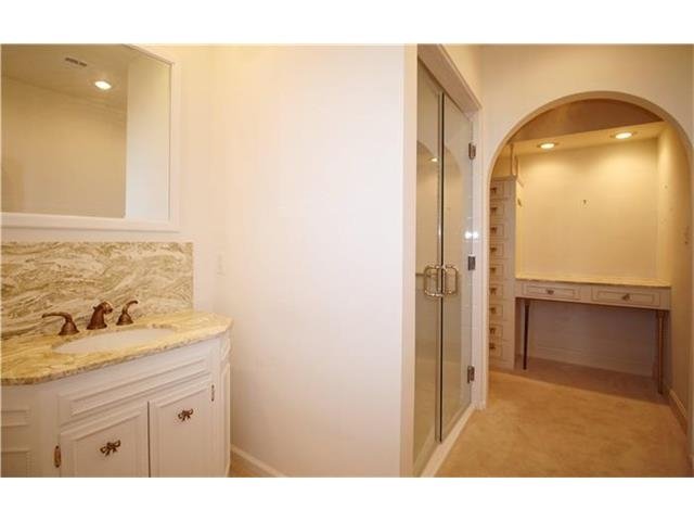
To the right of the shower was a dimly lit dressing area with a small amount of storage that didn’t function well.
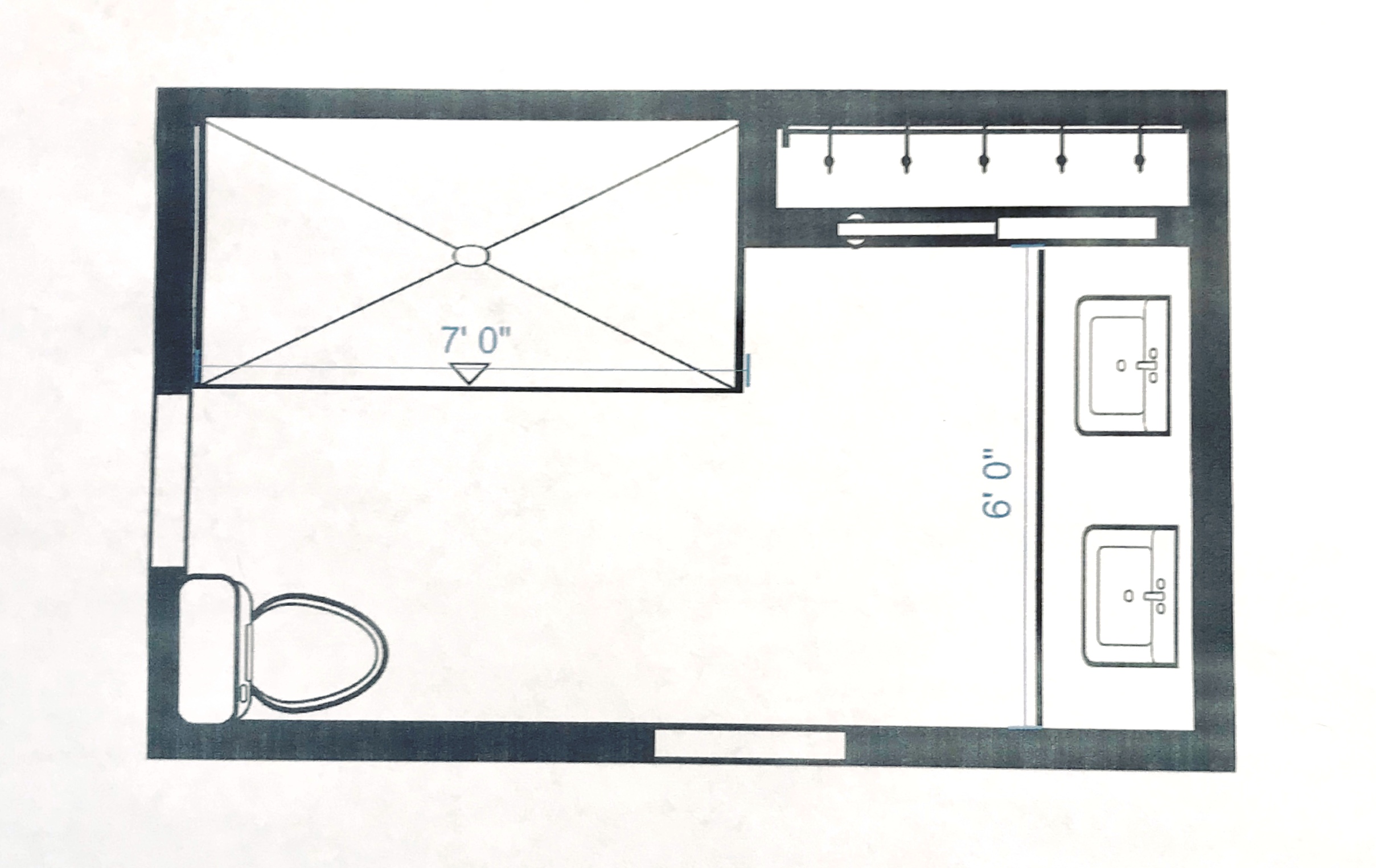
To solve this interior design dilemma we ripped out everything but one small closet and started over. By pushing back the shower we gave the bathroom a bigger sense of volume and were able to expand the vanity to accommodate two people instead of one just like the shower.

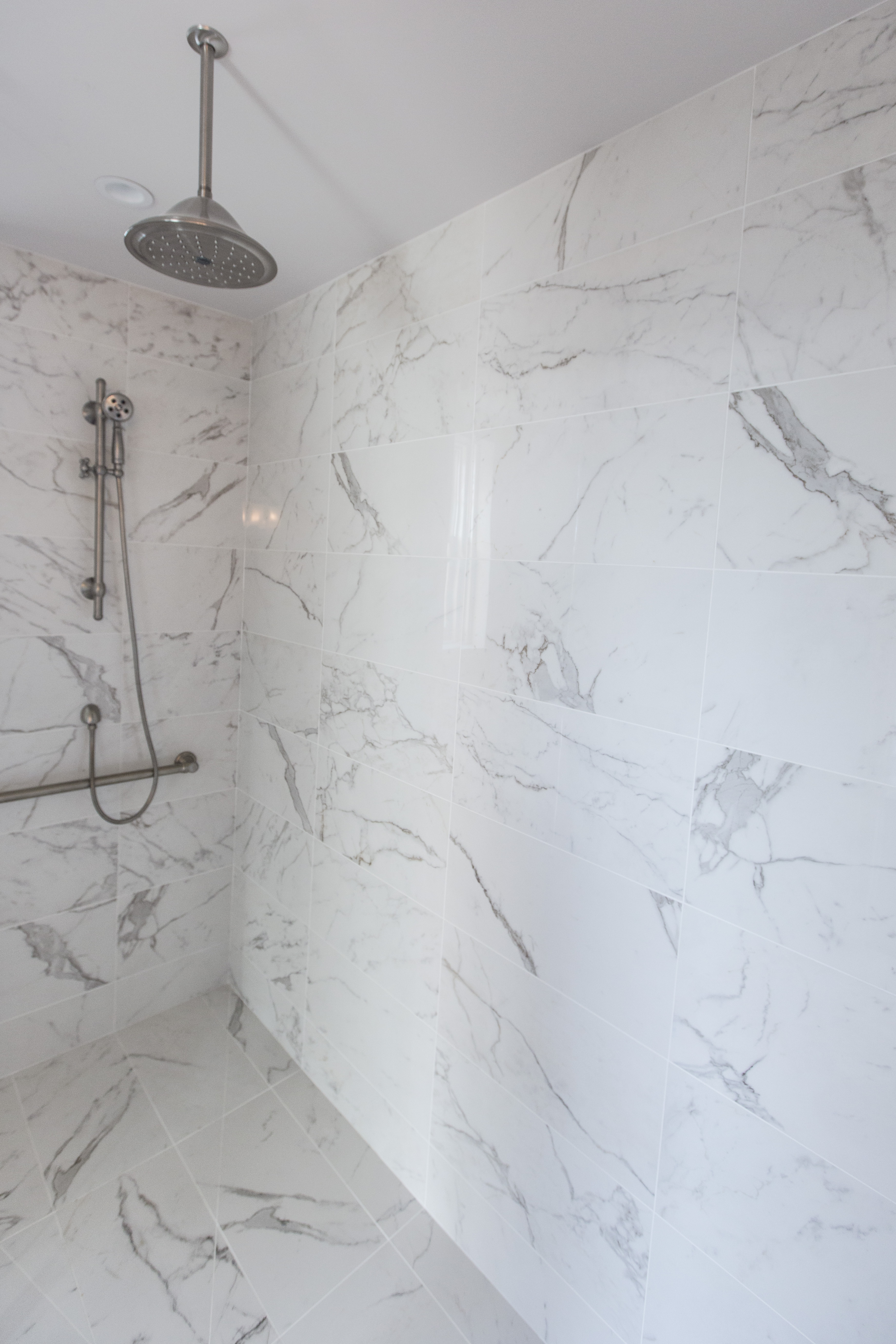
As you can see the transformation was amazing! By placing the same marble style tile from Italy on the floor and walls the room suddenly visually expanded into a beautiful timeless space with an over sized shower for two. To help the bathroom live even larger we also eliminated the shower curb and placed a solid glass panel along the front so the shower space virtually disappears.
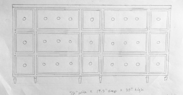
For the former dressing area I designed a double vanity that included usable top drawers that wrapped around the plumbing for more storage.
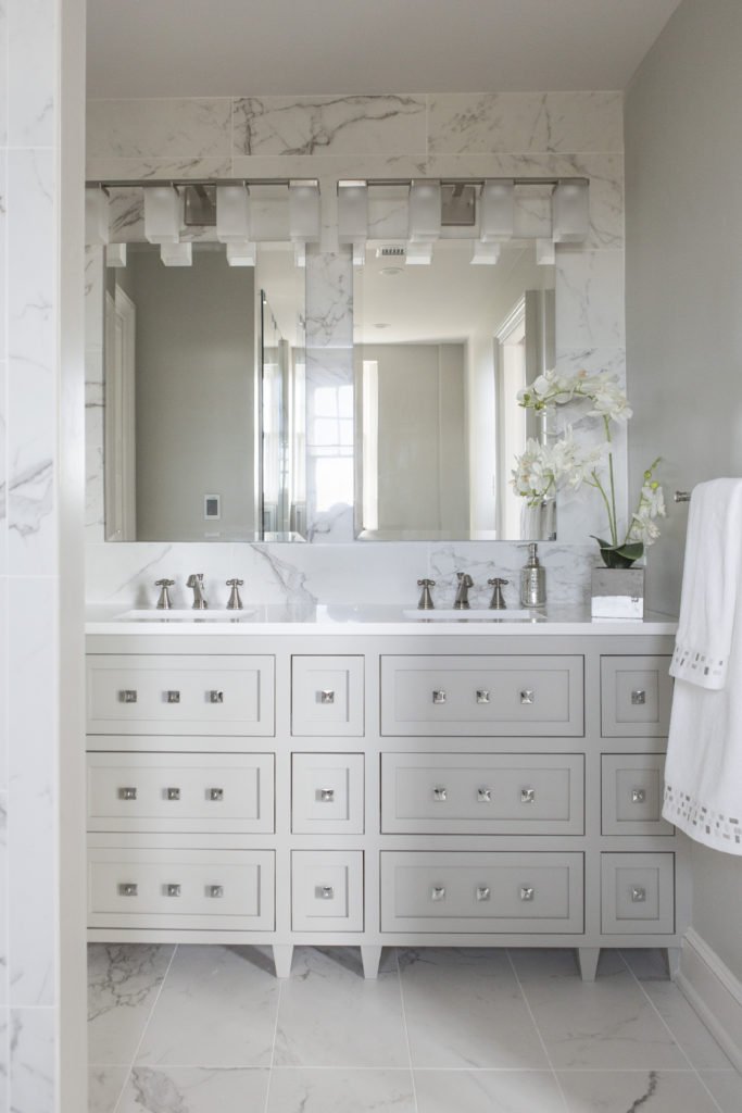
The result? A gorgeous bathroom that ended up in Kitchen Bath Design News – the national design magazine for kitchens and baths. Click now to read article!
Looking for more great bathroom design ideas that you can implement?
Sign up for our weekly interior design blog here
Plus become a fan of Kansas City’s interior designer and former host of the Living Large design show, Karen Mills, on Facebook here!
or instagram here.