 Interior Design/Interior Decorating
Interior Design: Kitchen Remodel – From Ugly Duckling to…
Remodeling a historic high rise kitchen
When updating a historic high rise apartment like this one on the renowned plaza area in Kansas City, there’s much more to consider than the interior design of your home.

First you must find out the building’s requirements for construction from time of day limits to how the construction is completed. Next you need to know building structure limitations (especially for a 1931 historic building like this one) and if your finish materials or products will fit whether it’s up the elevator or via another method.

When I first entered this kitchen in Kansas City I knew as an interior designer it was going to be one of our more challenging interior design projects which was exciting because I new the change would be dramatic and could see the new open space in my mind almost instantly.

To start the process I got a barely legible copy of the 1930’s blueprints and immediately went to work creating an interior design that was an open floor plan. For the kitchen I had the wall between the maid’s room and kitchen torn out along with the wall between the dining room and kitchen.

In addition we right sized the windows from the maid’s room and kitchen to flow together and added layers of lighting. The result?!

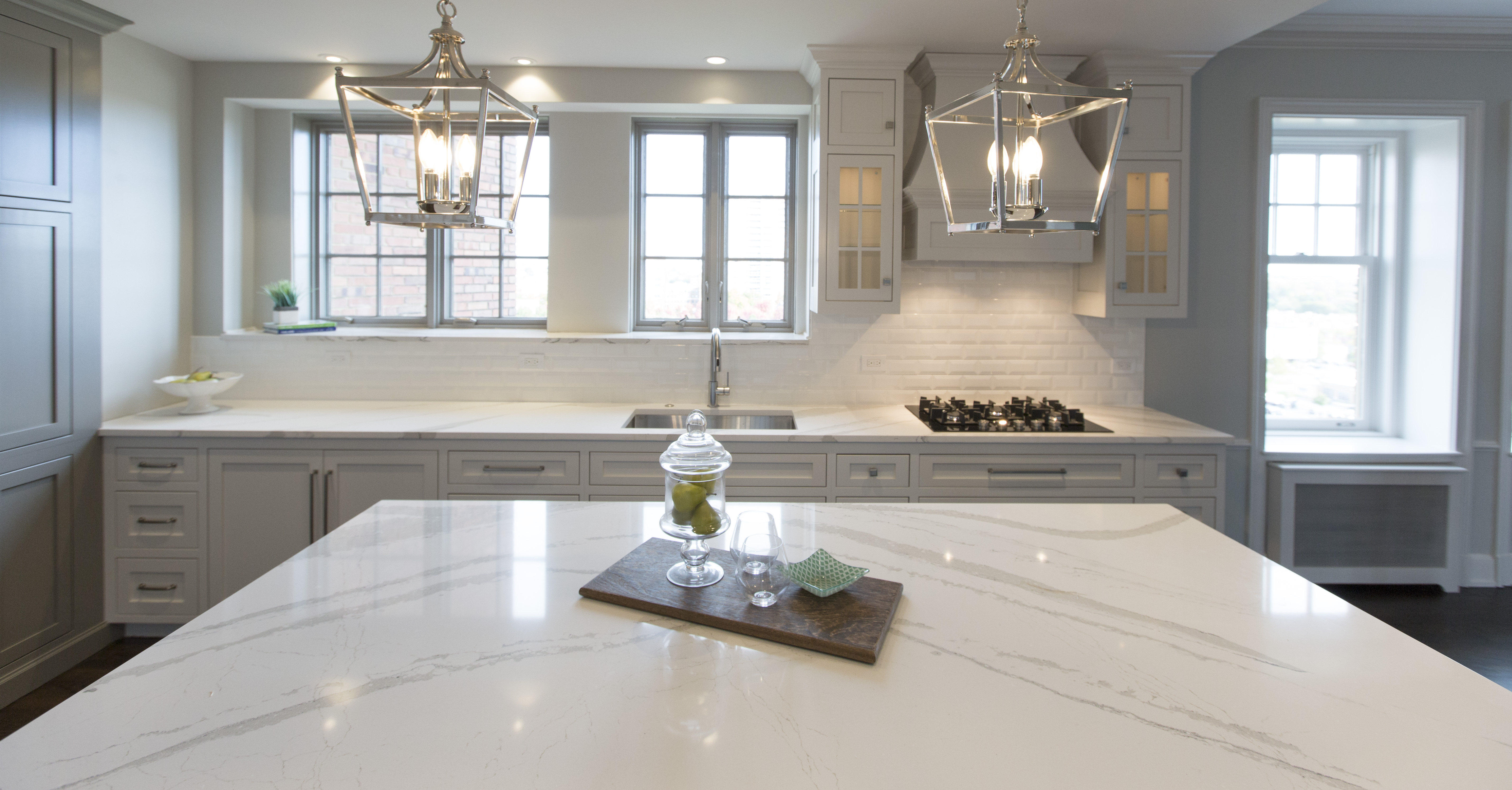
A beautiful airy light filled kitchen that now opens to the hearth room (formerly a dining room.

Much of this high rise apartment had original wood floors so we weaved in new wood flooring in the kitchen to make the space live larger and feel more cohesive.

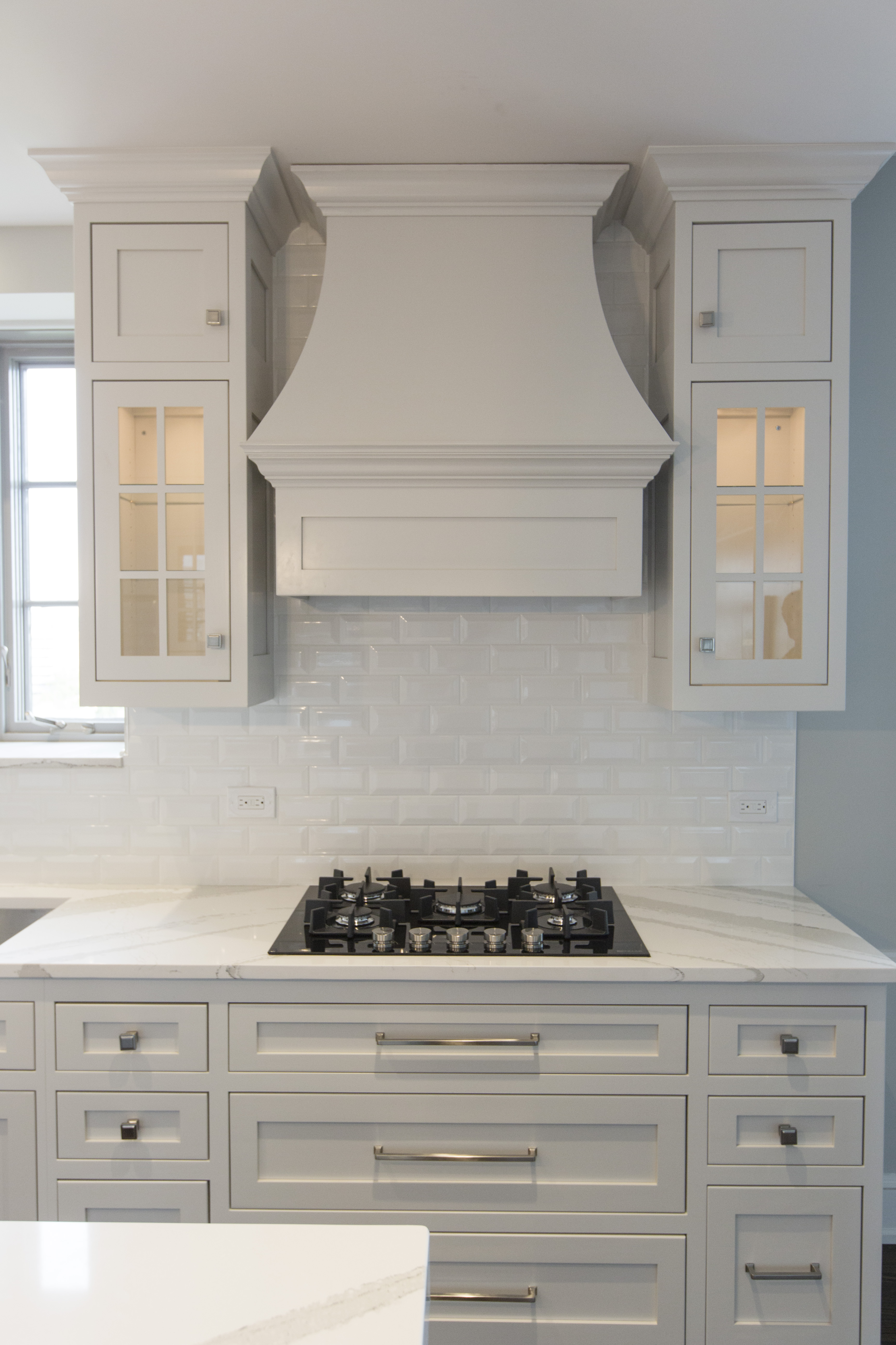
For the stove area we squeezed in a beautiful custom wood hood and beautifully lit glass cabinets flanking the hood to create a wow factor when entering the hearth/kitchen area. In addition we designed inset cabinetry drawers and doors (flush with cabinet frame) to create a luxurious look along with mixing it up with pulls and knobs.

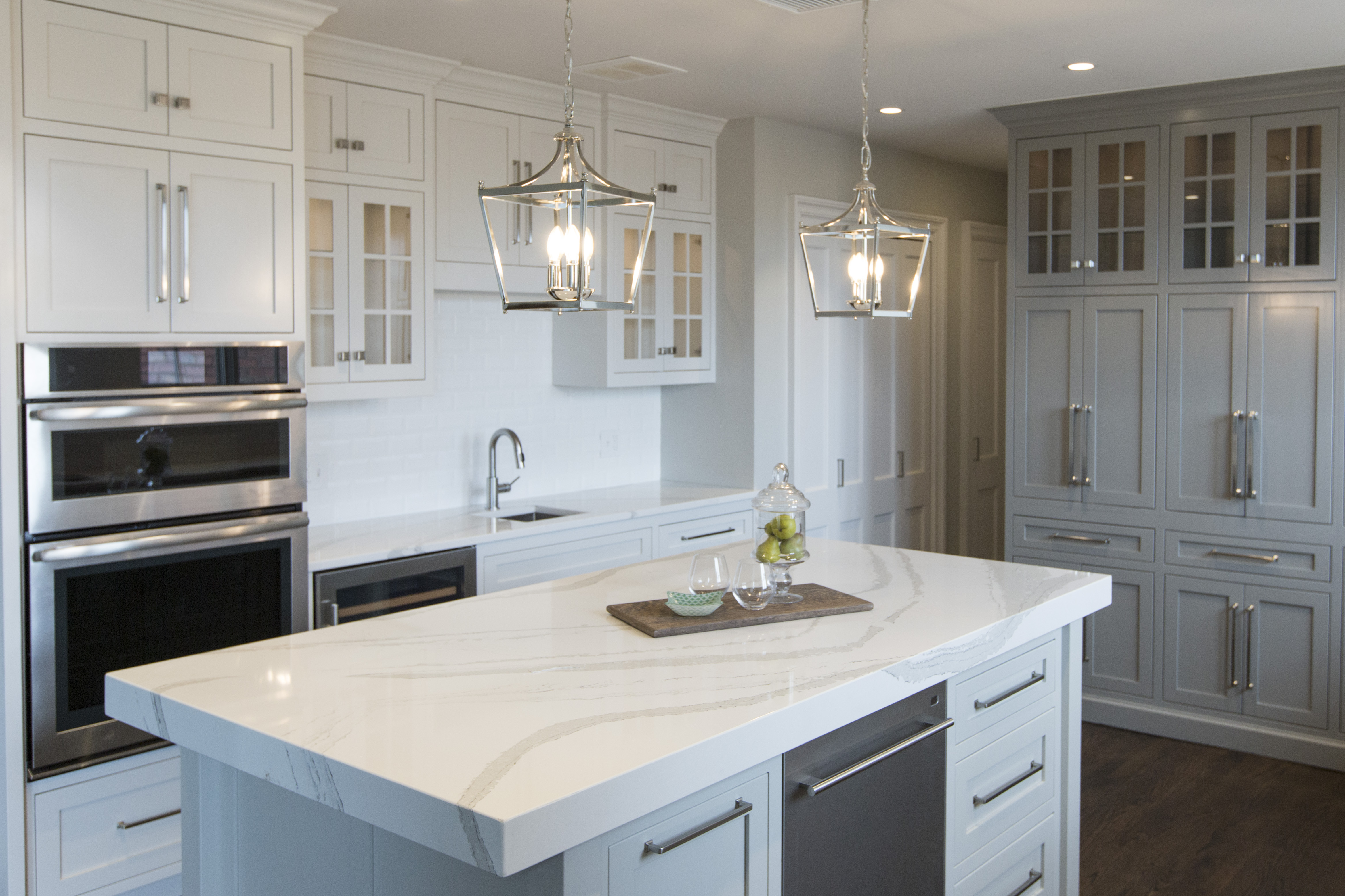
At the end of the kitchen (formerly maid’s room) we designed pantry area that hides a permanent slanted wall and to provide much needed storage which includes cabinet doors that open up to reveal both a coffee station and appliance garage.
The thick mitered island counter by Cambria was juxtaposed against the light airy mini chandeliers for a perfect composition.

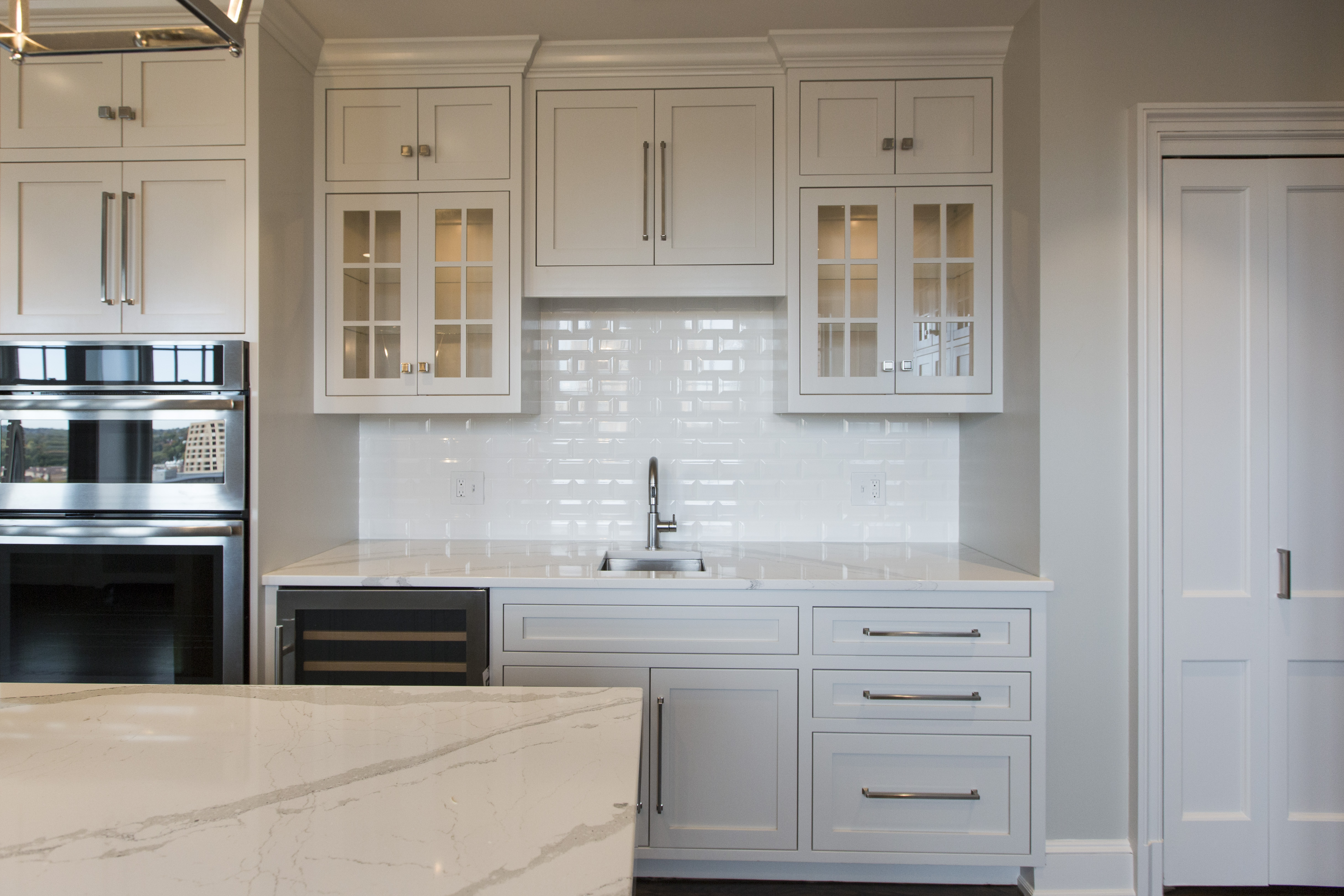
The bar area includes a wine cooler, bar sink, and lit glass cabinets to hold glassware along with a hidden washer/dryer area.
Overall as an interior designer I was thrilled with the outcome of this remodeled kitchen especially now as I’m reminded of where we started.
Looking for more great remodeling ideas that you can implement? SIgn up for our weekly interior design blog here
Plus become a fan of Kansas City’s interior designer and former host of the Living Large design show, Karen Mills, on Facebook here!
or instagram