Interior Design/Interior Decorating

Interior Design: 3 Ways to Warm up Your Contemporary…

Karen Mills
Photo courtesy of Design within Reach

One common complaint I often hear as an interior designer is that contemporary rooms are cold and uninviting.  But these spaces are becoming more popular because of their simple lines and often calming effect.  Below are 3 ways to warm up your contemporary style room.

1. Color not only warms up an interior but can also add drama like this room above where the lime green pillow provides a dramatic contrast against the blue sofa.  The live branches also warm up the room.

Karen Mills' blog
Photo courtesy of Jonathan Charles

2. Live Elements are wonderful because they add life and energy to a space whether its a plant, flowers, fruit or other element.  As an interior designer, my favorite way to bring life to a space is by introducing flowers, especially exotic ones like orchids that can last for months.

Karen Mills' blog
Photo courtesy of Hickory White

3. Texture can be layered in throughout your room in a variety of ways. Here above the pillows, wall finish, and hanging branch warm up the room nicely along with the warmth of the area rug underneath.  Other creative ways to add texture include wood ceilings/walls, rustic finishes, draperies, and/or furnishings with a textural component.

For more great ideas and photos, sign up up for our weekly interior design blog here

Plus become a fan today of Kansas City’s interior designer and former host of Living Large, Karen Mills, on Facebook here.


Interior Design/Interior Decorating

Interior Design: 3 Tips for Creating an Outdoor Space…

Karen Mills' blog


When I daydream about the beach, it’s usually one of my favorite vacations like this one on St. John’s island with great views, fabulous restaurants, and wonderful friends.
When you’re planning your own outdoor space, why not recreate one of your favorite vacation spots that you can enjoy in your own backyard whenever the weather permits.   I did and here are my 3 tips accomplishing that.
Tip #1  Create a dedicated space outdoors with the feel of a room – floors and maybe a ceiling or walls.  Then add seating and possibly a table for meals.
Here in this photo above, the floors are tiled and a roof lingers overhead along with pillars that become the walls of the space.
In my own backyard, I designed a pergola to recreate that look but made one that was my own style.  I still mimicked the round pillars at St. John’s and a partial roof overhead for a similar feel. Then I layered in palm trees and tropical flowers to recreate the laid back island vibe.

Karen Mills' blog

2. Select a look or style that reminds you of one of your favorite vacations.  To accomplish that look in my own backyard space, I mixed in found antique metal seating fitted with custom white cushions along with a couple of new wicker chairs to achieve a more collected aesthetic. Then I threw in a weathered old trunk on wheels for a coffee table and placed a tray of shells from diving trips and walks on the beach on top.
Karen Mills' blog
3. Add a specific element that reminds you of your favorite spot.  That element for me was a touch of romance so we added LED lights at the top of the pillars to create a wonderful ambiance at night and accessories in turquoise to remind us of the blue blue ocean.
For more great interior design ideas and photos, sign up for our weekly blog here!
Plus become a fan of Kansas City’s interior designer and former host of Living Large, Karen Mills, on Facebook here!
Interior Design/Interior Decorating

Interior Design: How to Make Your Room Live Larger…

If you love acrylic furniture check out the Associated Press article I was recently featured in that’s already made appearances in ABC, The Washington Post, Yahoo and many more titled  Clear Favorite: Acrylics a Versatile Furniture Option .

Karen Mills' blog
Interior design by Karen Mills, photography by Nick Schale

Our project in this photo that was part of the Associated Press article shows how acrylic furniture can be used in a room effectively which I also talk about in the interview link above.


Karen Mills' blog
Photo courtesy of Allan Knight furniture

Coffee tables and nesting end tables are one of my favorite pieces to use in a project too, especially in a smaller space like this photo  where they don’t take up room visually but still serve a function.

Karen Mills
Photo courtesy of Century Furniture

Dining rooms like this photo offer another opportunity to include acrylic whether its the table, chairs, or a bar cart.   Here the Century table almost disappears in the room keeping the space light and airy.

Karen Mills' blog
Photo courtesy of Spectrum Limited furniture

For more great tips and photos, sign up for our weekly interior design blog here

Plus become a fan of Kansas City’s interior designer and former host of the Living Large design show on Facebook here!


Interior Design/Interior Decorating

Interior Design: 5 Tips for Injecting Spring into Your…

The first day of spring has arrived in the United States and it’s a joyous time for most of us in the colder climates because it marks the end of a season of cold, ice, and snow.


Karen Mills' blog
Photo courtesy of Jonathan Charles

As I walked through my yard this last weekend I saw green buds appearing everywhere from bushes and trees to perennials.   So of course that motivated me to perform my semi-annual tradition of packing up heavy winter decor and ushering in spring with lighter decor.  If you would like to lighten your interior too, here are 5 tips for injecting spring into your home.

  1. Add life with fresh flowers and seasonal plants like this photo by Jonathan Charles furniture above.  Lighter finishes also help enhance the spring feel of this room along with an infusion of sunlight.
Karen Mills' blog
Interior design by Karen Mills. Photography by 29 Pixels.

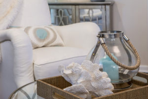
2. Add fresh pops of color in pillows and decor like the room above.  The shell and lantern beach inspired decor also add to the warm season feel.

Karen Mills' blog
Photo courtesy of Jonathan Charles

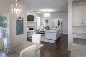
3. Replace dark heavy items like rugs with lighter options  like shown above or go with a natural rug like a sisal.  If that’s not possible, opt for removing the rug altogether.

Light pillow covers in natural fabrics also add to the appeal along with fresh flowers and light upholstery.  If you don’t have light upholstery, consider adding a slipcover for spring/summer weather like the dining chairs we had slip covered below.

Karen Mills' blog
Interior design by Karen Mills
Karen Mills' blog
Photo courtesy of Circa Lighting

4. Lighten up in the bedroom by replacing heavy dark bedding with light natural fabrics in cotton and consider using sheer drapery panels instead of heavy drapes.

5. Spring Clean  Remove all the extra items that have accumulated over the winter months and do some spring cleaning so your room feels fresh and fabulous.  Now you’re ready for spring!

For more great photos and tips, sign up for our weekly interior design blog here!

Plus become a fan of Kansas City’s interior designer and former host of Living Large, Karen Mills, on Facebook here!


Interior Design/Interior Decorating

Interior Design: 3 Ways to Use a Vessel Sink…

Karen Mills' blog
Photo courtesy of Link a Sink

Vessel sinks add energy to a bathroom’s interior design because they’re elevated to a place of importance on top of the vanity.  And they add style with their unique shape, color, pattern, finish, or material!

Vessel sinks come in an array of materials from stone or ceramic to glass, metal, wood, and more so the options are endless considering that you can also have an artist create an one of kind piece for you.

So if you’re considering redoing your bathroom to include a vessel sink, here are 5 ways to incorporate them in your bathroom design.

1. To enhance your design   In the photo above, the vessel sink by Link a Sink plays a wonderful supporting role in this dramatic powder room design, keeping the room from getting too busy.  But if you have a more neutral bathroom without much pattern or color, a  vessel with an interesting shape could be the perfect solution.

Karen Mills' blog
Photo courtesy of Signature Hardware
Karen Mills' blog
Photo courtesy of Copenhagen Sinks

2. To add texture

By adding a rougher finish like this carrara marble sink show above by Signature Hardware to a bathroom full of hard shiny surfaces, you can make it more inviting .

Karen Mills' blog
Photo courtesy of Kraus

3. To introduce color  

In the photo above this blue vessel sink by Kraus offers an exciting pop of color for neutral bathrooms.   I’m particularly fond of the faucet shown with it designed by a former Mercedes Benz designer to look like an auto stick shift.

Karen Mills' blog
Photo courtesy of Copenhagen Sinks

For more great tips and photos, sign up for our weekly interior design blog here

Plus become a fan of Kansas City’s interior designer and former host of the Living Large design show, Karen Mills, on Facebook here.


Interior Design/Interior Decorating

Interior Design: 5 Tips for a Budget Kitchen Makeover


Karen Mills' blog
Interior design by Karen Mills

If you want to update your tired old kitchen but don’t want to invest in a full remodel, here are 5 tips for freshening up your kitchen for less.

1. Refurbish your existing kitchen cabinets.   If your cabinets are in good shape and not too dated, sand, repaint and seal them.   In this kitchen above we painted the cabinets different colors, added a mitered (thicker) edge island counter top, and replaced some upper cabinets with live edge shelving to create a more interesting look.

If your cabinet door styles are dated, have them refaced with new doors and fronts.  You can also add glass inserts, replace your dated moldings and add crown molding overhead to completely transform them.   Plus pull out those dated appliance garages housed in the corner.

2. Replace your dated or worn appliances with more updated ones you can find for less in a clearance section or replace appliance fronts only if that updates the look.  In this kitchen above we also painted the cabinets, added a vintage chandelier the homeowner already had for a Hollywood Glam feel along with new light fixtures above the table which she had finished to a more grayed out rustic look.

Karen Mills' blog
Interior design by Karen Mills/Photography by 29 Pixels


3. Update your hardware finishes  by replacing pulls or knobs, your sink faucet, and light fixtures.  If you don’t have the budget for new light fixtures, have your old ones spray painted or do it yourself.

4. Replace your dated counter tops and back splashes ensuring you add under cabinet lighting to show them off.

5. Refurbish your existing floors by refinishing hardwoods or by replacing flooring with stone tile found on clearance and install yourself.  As an interior designer, I’ve used faux wood tile more than once on kitchen remodels to create a cozier rustic feel when wood isn’t an option.

For more great tips and trends subscribe to our weekly interior design blog here!

Plus become a fan of Kansas City’s interior designer and former host of the Living Large design show, Karen Mills. on Facebook here!

Interior Design/Interior Decorating

Interior Design: 3 Secrets to a Comfortable Living Space


Karen Mills' blog
Photo courtesy of Century Furniture

Is there anything better than a comfortable relaxing space at the end of a long day?  Not for me.  That’s why my focus at home and with interior design clients is just as much about comfort and function as beauty.  So here are my three tips for creating a comfortable interior design.

1. Comfortable seating.  To begin make sure that you’re selecting upholstery that’s comfortable for long periods such as the custom furniture shown.   When seated on a sofa or chair ensure your legs are able to touch the floor and that your thighs fit the seat depth so you’re not having to lean back uncomfortably. Plus consider adding an ottoman for a late afternoon snooze or to relax while watching TV.
Karen Mills' blog
Interior design by Karen Mills
2. Layer in texture  in everything from area rugs and/or soft window treatments to accessories like pillows or throws remembering that each layer of texture creates a cozier feel.
Karen Mills' blog
Photo courtesy of Century Furniture
 3. Select a color scheme that includes elements of warmth whether that’s on walls, ceilings, floors, windows, or accessories.  For example on a wall you might add textural wallpaper or go with a warmer color.  On the windows you might introduce a bamboo window shade under draperies.  And finish off the room with textural pillows.

For more fabulous interior design trends, sign up for our weekly blog here!

Plus become a fan of Kansas City’s interior designer and former host of the Living Large design show, Karen Mills, on Facebook here!

Interior Design/Interior Decorating

INTERIOR DESIGN: 3 TIPS FOR TRANSFORMING YOUR ROOM FROM…

Karen Mills' blog
Photo courtesy of Circa Lighting

Does your interior feel “blah” or boring even though its filled with furniture? Often the reason a space looks unfinished is because rooms either lack the key ingredients to make them come alive or the key ingredients aren’t placed in a way that creates harmony and variety.  So here are my 3 tips to transforming your interior ordinary to extraordinary!

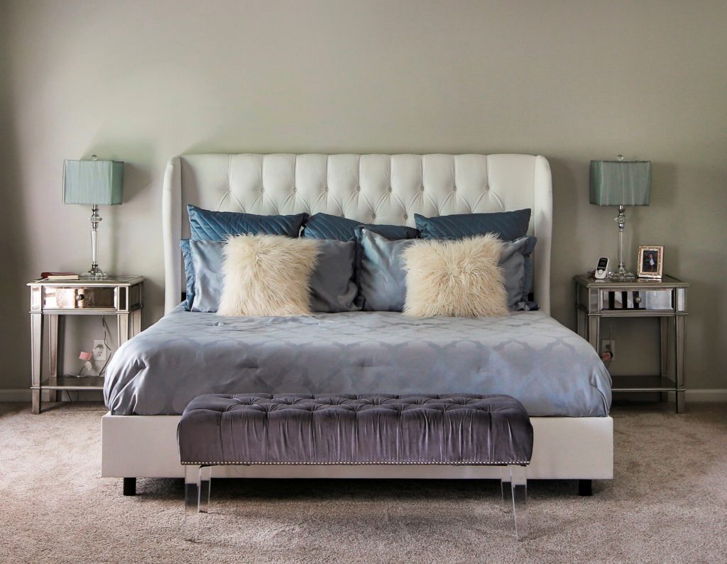
1. A Color Story – The first thing that’s usually missing in a home is color. And I don’t necessarily mean bold color, just a lack of cohesive color throughout.  Take a look at this bedroom design above from Circa.  Even though the grayed out blue isn’t dramatic, by placing it on the headboard, bedding, bench, and drapes it creates a color story of calm and quiet for the person who sleeps there.

Karen Mills' blog
Photo courtesy of Kravet furniture

In contrast this dramatic living space by Kravet above shows how you can create drama in a room by using bolder colors like the warm reds  used throughout to draw your eye around the room along with the blue that plays a supporting role and nice contrast in the interior design.


Karen Mills' blog
Photo courtesy of Jonathan Charles furniture

2. Accent lighting – Having ample accent lighting in a space makes it more inviting and interesting. And as a general rule, I  you need at least three lamps in every living space to add ambiance to your interior design.

.

Karen Mills' blog
Interior design by Karen Mills. Photography by 29 Pixels.

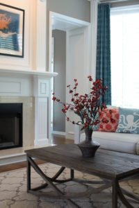
3. Groupings of large accessories – Most people tend to buy small accessories which when grouped together often creates a feeling of clutter that adds to the tension in your space instead of enhancing your interior design.  Instead strive for a balance of accessory sizes with more emphasis on large than small.

Another key to successfully accessorizing includes selecting colors, styles, and textures that will enhance your design and grouping accessories together to create vignettes or points of interest throughout your space. For example when I’m adding the final touches to a project as an interior designer, I often mix not only sizes of accessories but also textures which gives the vignette or grouping a more interesting mix.

For more great photos and tip for accessorizing and ideas on interior design, become a fan of Kansas City’s interior designer and former host of Living Large design show, Karen Mills on Facebook here

or sign up for our weekly interior design trend blog here!

Interior Design/Interior Decorating

Interior Design: 3 Secrets to Showcasing Your Room with…


Karen Mills' blog
Photo courtesy of Circa lighting

To make your ceiling light fixture the star of the show you need to ensure you have everything in place first.   The background, color scheme, natural light, and interior design all play an important role.

Karen Mills' blog
Amaca by Swarovski
  1.  Pick a light fixture that grabs your attention.  Look for light fixtures with interesting shapes, texture, or a look overall that draws you into the room like the Swarovski fixture above or the Circa pendant lights in the kitchen at top.  Plus consider selecting a light that not only looks great when lit but also holds its own when not.
Karen Mills' blog
Photo courtesy of Swarovski
Karen Mills' blog
Photo courtesy of Swarovski
Karen Mills' blog
Photo and lighting courtesy of Swarovski

2.  Select a light that enhances your room instead of detracting from it.   You don’t have to purchase a light in the same style as your room’s interior design as long as it complements your room and makes it more interesting.  For example, if you have a room with a dramatic col

Other considerations for selecting an ideal fixture include making sure its proportionate to the space like the kitchen pictured above and that the finish color adds to the overall design.

Karen Mills' blog
Photo courtesy of Lighting by Pecaso

3. Create a neutral backdrop or interior design that doesn’t compete with your light like this entry above where the chandelier has the starring role in the scene, while the rest of the room has a supporting role.

If you already have a dramatic interior design with color and/or pattern, then you’ll need to find a light fixture that doesn’t compete with what you already have in the room.


Karen Mills' blog
Photo courtesy of Hubbardton Forge

For more ideas and photos, sign up for our weekly interior design blog here

Plus become a fan of Kansas City’s interior designer and former host of the Living Large design show, Karen Mills, on Facebook now.


Karen Mills' blog
Photo courtesy of Terzani Etoile
Interior Design/Interior Decorating

Interior Design: 3 Ways to Create Drama with Doors

Karen Mills' blog
Photo courtesy of Coastal Shower Doors

The architecture or bones of the house are the most important elements when building or remodeling because they set the backdrop for any interior design you’re about to create and determine the style of your space.  That’s why not only the walls and ceilings are so important but also the doors and windows.

Here are 3 ways you can use doors to create drama in your space.

  1. Make your door the focal point like the shower door pictured above.  In this room the grid design of the door draws attention to itself along with the dark dramatic color, making it the star of the room.

Once you’ve selected your shower door, then you can repeat the color or pattern on the               door to unify your space.

Karen Mills' blog
Photo courtesy of Haute Living

2. Introduce doors that are wider or taller than the average door to draw attention to it like       sliding doors pictured above.  In this photo, these doors have a beautiful ethereal feel to              them that makes the room feel like its floating while allowing light to filter into adjacent                rooms.

As an interior designer, I recently completed a project where I recommended a row of            taller doors/windows installed for a room addition at the back of the house and now when          you enter the front door the first thing you see are the wall of grand doors/windows and the      incredible view beyond.

3. Use doors to visually divide space without closing off the rooms in an open floor plan.  Often      we use wall screens or room dividers to accomplish this, but these doors pictured below add      a sophistication and one of a kind feel to the the rooms that nothing else can.

Karen Mills' blog
Photo courtesy of Haute Living

For more great ideas and photos, sign up for our weekly interior design blog here

Plus become a fan of Kansas City’s interior designer and former host of the Living Large design show, Karen Mills, on Facebook here!