Interior Design/Interior Decorating

Interior Decorating: What Does Your Favorite Color Say About…
 

Karen Mills' blog
Photo courtesty of Century Furniture

Ever wonder what your favorite color says about you or how to use it in your interior?

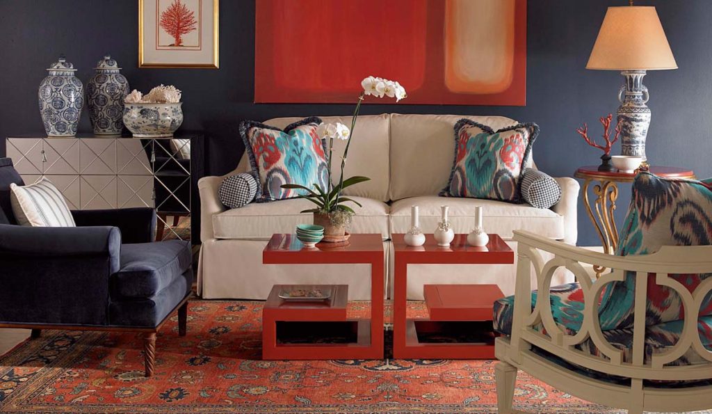
As an interior designer and color expert, I can tell you that’s not always an easy task because it takes years of experience to learn how colors can impact rooms based on lighting and location.  So here’s some insight on what color says about you and how you might use it.

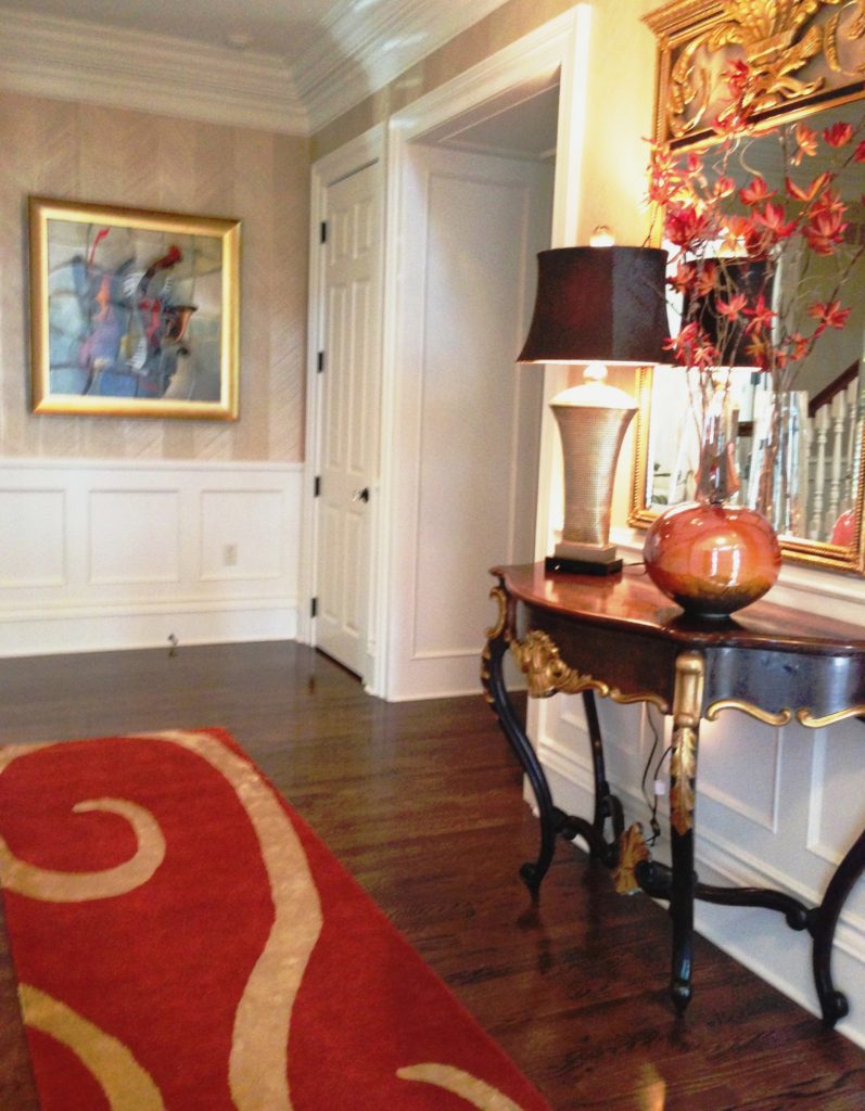
If you love red like I do you most likely live life to the fullest with spontaneity and excitement.  But what does a red interior say to others?  The color, associated with blood and fire, can raise your blood pressure and grab your attention!  So if you don’t want to go completely red, try incorporating red as an accent color like the photo above to make your space a little more vibrant.

Karen Mills' blog
Interior design by Karen Mills. Photography by 29 Pixels.

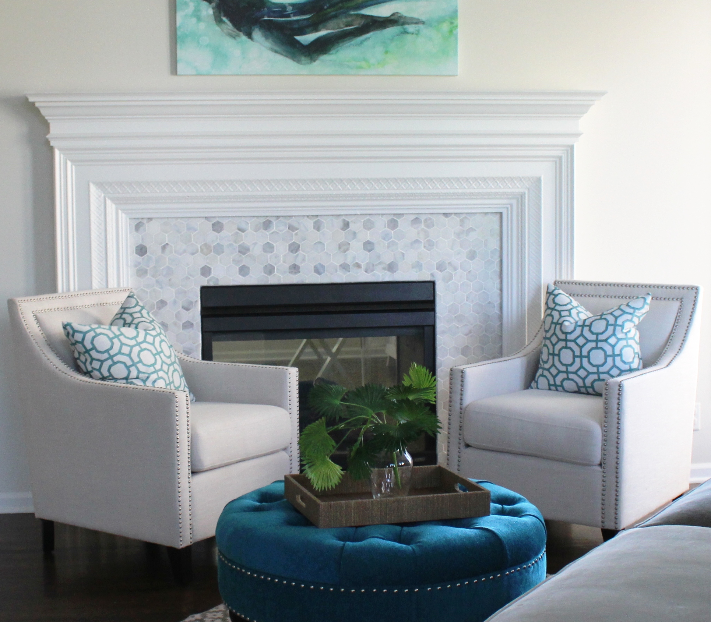
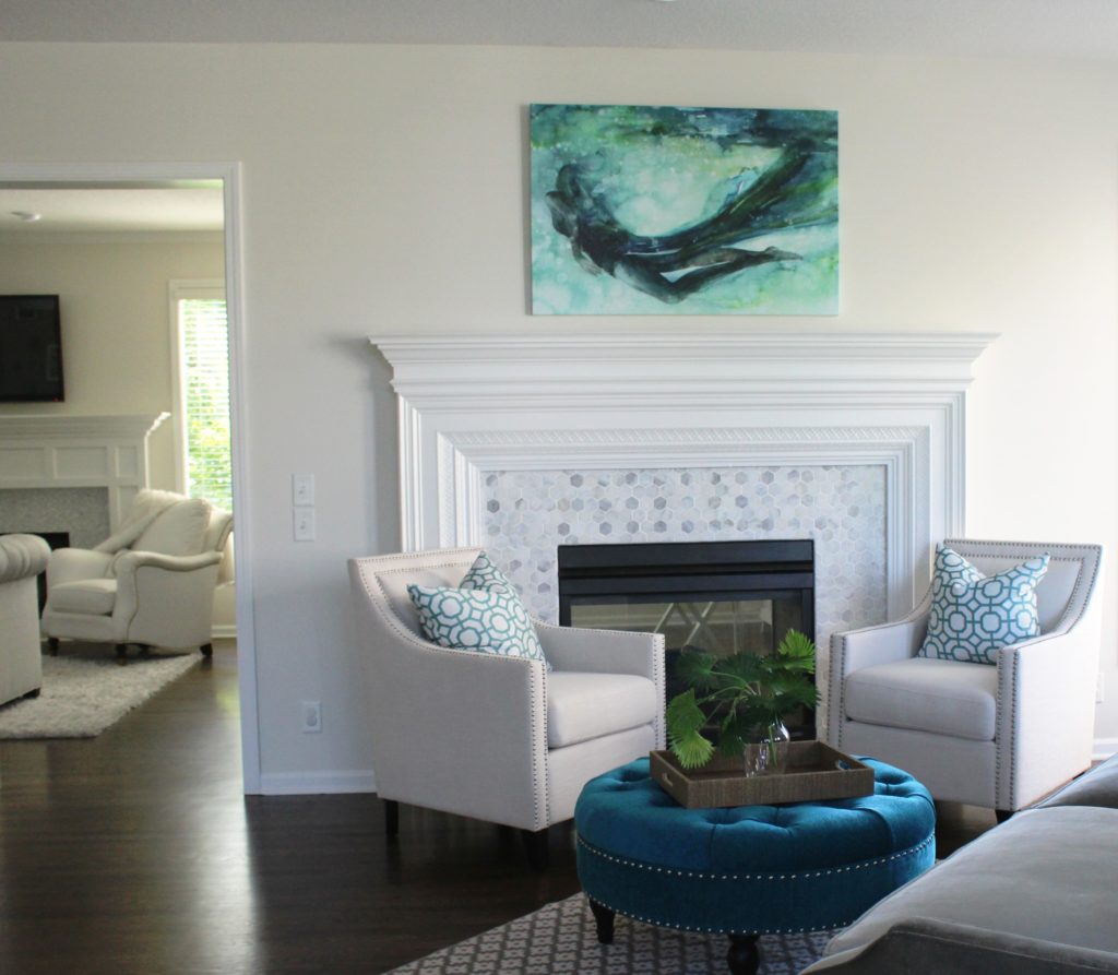
Blue, however, exudes stability, tranquility, calm and reliable.  Blue’s also the favorite color for the majority of men. A perfect color for bedrooms, blue helps you unwind, especially blue greens that are soothing, and lovers of this color tend to be responsible stable citizens who do the right thing.

Yellow, like a ray of sunshine adds warmth and optimism, making it perfect for a kitchen or a sunny living area, and big fans of this color are often optimistic people with a happy misdemeanor.
Karen Mills' blog
Interior design by Karen Mills Photography by 29 Pixels

Green, the color of nature exudes calmness and warmth, making it also a good color for bedrooms or spaces where you need a more relaxed feel.  Fans of this color are usually warm, kind, and charitable.

Purple, a favorite color among children, denotes creativity.  Lovers of this color are often more complex artistic, fascinating individuals who sometimes may seem mysterious.
Karen Mills' blog
Interior design by Karen Mills

Orange, the color of hunger and vibrancy fits perfectly into that dining room or kitchen area where you need some life or excitement.  And if you’re an orange lover, you probably show the same vibrant spirit as the color with your enthusiastic zest for life.

Karen Mills' blog

But what if your favorite color is beige?  Beige means you’re more timeless, basic, conservative, and simple.  Taupe leans toward traits of well balanced, classic, and fair, but brown usually denotes down to earth and no nonsense.

Karen Mills' blog
Interior design by Karen Mills Photography by 29 Pixels

Grays tend to be intellectual, wise, calm, practical, and conservative and lovers of white lean toward cleanliness, neatness, and purity.

Black, the absence of color leans toward classic good taste but can also mean that you enjoy power, confidence or just being conservative.

For more great interior design ideas and photos, sign up for our blog here!

Plus become a fan of Karen Mills, Kansas City’s interior designer and former host of Living Large on Facebook here now!
Interior Design/Interior Decorating

INTERIOR DESIGN: 3 TIPS FOR TRANSFORMING YOUR ROOM FROM…

Karen Mills' blog
Photo courtesy of Circa Lighting

Does your interior feel “blah” or boring even though its filled with furniture? Often the reason a space looks unfinished is because rooms either lack the key ingredients to make them come alive or the key ingredients aren’t placed in a way that creates harmony and variety.  So here are my 3 tips to transforming your interior ordinary to extraordinary!

1. A Color Story – The first thing that’s usually missing in a home is color. And I don’t necessarily mean bold color, just a lack of cohesive color throughout.  Take a look at this bedroom design above from Circa.  Even though the grayed out blue isn’t dramatic, by placing it on the headboard, bedding, bench, and drapes it creates a color story of calm and quiet for the person who sleeps there.

Karen Mills' blog
Photo courtesy of Kravet furniture

In contrast this dramatic living space by Kravet above shows how you can create drama in a room by using bolder colors like the warm reds  used throughout to draw your eye around the room along with the blue that plays a supporting role and nice contrast in the interior design.


Karen Mills' blog
Photo courtesy of Jonathan Charles furniture

2. Accent lighting – Having ample accent lighting in a space makes it more inviting and interesting. And as a general rule, I  you need at least three lamps in every living space to add ambiance to your interior design.

.

Karen Mills' blog
Interior design by Karen Mills. Photography by 29 Pixels.

3. Groupings of large accessories – Most people tend to buy small accessories which when grouped together often creates a feeling of clutter that adds to the tension in your space instead of enhancing your interior design.  Instead strive for a balance of accessory sizes with more emphasis on large than small.

Another key to successfully accessorizing includes selecting colors, styles, and textures that will enhance your design and grouping accessories together to create vignettes or points of interest throughout your space. For example when I’m adding the final touches to a project as an interior designer, I often mix not only sizes of accessories but also textures which gives the vignette or grouping a more interesting mix.

For more great photos and tip for accessorizing and ideas on interior design, become a fan of Kansas City’s interior designer and former host of Living Large design show, Karen Mills on Facebook here

or sign up for our weekly interior design trend blog here!

Interior Design/Interior Decorating

Interior Design: 5 Trends to Watch in 2017

Do you ever feel overwhelmed by the bombardment of different decorating styles, finishes, and patterns?  With all those choices, the ability to make a final decision on your interior design can be daunting.   So today I’m sharing five trends to watch.


Karen Mils' blog
Photo courtesy of Overstock.com

1. Mix n match of fabrics and finishes

Mixing patterns in quilt like combinations, terrazo, and mixed finishes will continue to gain popularity from mixed wood and metal furniture pieces, accessories, or lighting to mixed metals in a room, especially in more muted tones.

Other ways we can apply this hot trend is by mixing up the patterns on upholstery, bedding, wallpaper, or accessories.

Karen Mills' blog
Abaca bed courtesy of Bernhardt Furniture

2. Texture

Texture will never die as a popular choice because we need it to balance the hard cold surfaces or more formal items in our interior design projects.  This year we’re seeing an increase in material choices ranging from wicker and rattan to crushed velvets and tassels/ trims.

Karen Mills' blog
Interior design by Karen Mills

3. Greens and Blues 

When Lea Eiseman of the world renowned Pantone Color Institute announced the color of 2017, Greenery, we began to see the color green popping up everywhere from paint and accessories to clothing and more in different shades and tones from dark to light.

As an interior designer, I’ve done several rooms in navy too, especially dining rooms because navy’s such a regal classic color and looks spectacular against white trim.  Navy also goes well with everything from spring green and pink hues to silver or gold.

Organic whites still dominant the interior design scene also as they connect us to nature and the outdoors.

Karen Mills' blog
Photo courtesy of Baker Furniture

4. Artisan/Handmade Quality

As interior designers, we try to educate our clients on the value of investing in quality furnishings because they last longer, are more comfortable, and a better value over the long haul.  This year we’re starting to see an increase in this trend towards quality by homeowners who are looking for new or antique/vintage quality furniture and handmade items including art or accessories.

Karen Mills' blog
Photo courtesy of Cutting Edge Stencils

5. Organic Materials and Patterns 

If you’ve been paying close attention, you may have noticed the growing trend towards tropical designs, especially butterflies, parrots, and leaves which is perfect match with our color of the year Greenery.  Mix that trend with the texture trend and you’ll have an interesting casual interior that’s warm and welcoming.

Marble, an organic material that I absolutely adore, is still hugely popular in kitchens, baths, and even on faux patterns.

For more great ideas, photos, and trends, sign up for our weekly interior design blog here

Plus become a fan of Kansas City’s interior designer and former host of the Living Large design show, Karen Mills, on Facebook here!


Interior Design/Interior Decorating

Interior Design: 3 Secrets to Showcasing Your Room with…


Karen Mills' blog
Photo courtesy of Circa lighting

To make your ceiling light fixture the star of the show you need to ensure you have everything in place first.   The background, color scheme, natural light, and interior design all play an important role.

Karen Mills' blog
Amaca by Swarovski
  1.  Pick a light fixture that grabs your attention.  Look for light fixtures with interesting shapes, texture, or a look overall that draws you into the room like the Swarovski fixture above or the Circa pendant lights in the kitchen at top.  Plus consider selecting a light that not only looks great when lit but also holds its own when not.
Karen Mills' blog
Photo courtesy of Swarovski
Karen Mills' blog
Photo courtesy of Swarovski
Karen Mills' blog
Photo and lighting courtesy of Swarovski

2.  Select a light that enhances your room instead of detracting from it.   You don’t have to purchase a light in the same style as your room’s interior design as long as it complements your room and makes it more interesting.  For example, if you have a room with a dramatic col

Other considerations for selecting an ideal fixture include making sure its proportionate to the space like the kitchen pictured above and that the finish color adds to the overall design.

Karen Mills' blog
Photo courtesy of Lighting by Pecaso

3. Create a neutral backdrop or interior design that doesn’t compete with your light like this entry above where the chandelier has the starring role in the scene, while the rest of the room has a supporting role.

If you already have a dramatic interior design with color and/or pattern, then you’ll need to find a light fixture that doesn’t compete with what you already have in the room.


Karen Mills' blog
Photo courtesy of Hubbardton Forge

For more ideas and photos, sign up for our weekly interior design blog here

Plus become a fan of Kansas City’s interior designer and former host of the Living Large design show, Karen Mills, on Facebook now.


Karen Mills' blog
Photo courtesy of Terzani Etoile
Interior Design/Interior Decorating

Interior Design: 3 Ways to Create Drama with Doors

Karen Mills' blog
Photo courtesy of Coastal Shower Doors

The architecture or bones of the house are the most important elements when building or remodeling because they set the backdrop for any interior design you’re about to create and determine the style of your space.  That’s why not only the walls and ceilings are so important but also the doors and windows.

Here are 3 ways you can use doors to create drama in your space.

  1. Make your door the focal point like the shower door pictured above.  In this room the grid design of the door draws attention to itself along with the dark dramatic color, making it the star of the room.

Once you’ve selected your shower door, then you can repeat the color or pattern on the               door to unify your space.

Karen Mills' blog
Photo courtesy of Haute Living

2. Introduce doors that are wider or taller than the average door to draw attention to it like       sliding doors pictured above.  In this photo, these doors have a beautiful ethereal feel to              them that makes the room feel like its floating while allowing light to filter into adjacent                rooms.

As an interior designer, I recently completed a project where I recommended a row of            taller doors/windows installed for a room addition at the back of the house and now when          you enter the front door the first thing you see are the wall of grand doors/windows and the      incredible view beyond.

3. Use doors to visually divide space without closing off the rooms in an open floor plan.  Often      we use wall screens or room dividers to accomplish this, but these doors pictured below add      a sophistication and one of a kind feel to the the rooms that nothing else can.

Karen Mills' blog
Photo courtesy of Haute Living

For more great ideas and photos, sign up for our weekly interior design blog here

Plus become a fan of Kansas City’s interior designer and former host of the Living Large design show, Karen Mills, on Facebook here!


Interior Design/Interior Decorating

Interior Decorating: Wild About Wallpaper

Karen Mills' blog

Wallpaper continues to grow in popularity and as an interior designer I believe part of the reason is because wallpaper is such an affordable way to make a impression on an accent wall or anywhere.

Karen Mills' blog
Interior design by Karen Mills

You can go with an interesting grass cloth texture like pictured above or select an unique paper like Celestial Dragon below that shows off your personality and style.

Karen Mills' blog
Celestial Dragon wallpaper courtesy of Osborne & Little
Karen Mills' blog
Courtesy of Phillip Jeffries

Plus don’t forget about digital wallpaper!  You can buy something already designed  or create your own version using a sketch or a photograph, maybe of a favorite destination.

Karen Mills' blog
Interior design by Karen Mills

And there’s nothing better than a wallpaper that’s textural because it adds so much interest to a room without overpowering the space like the chevron paper by F. Schumacher that we used above.

For more great trends and ideas, sign up for our weekly interior design blog here

Karen Mills' blog
Wallpaper courtesy of Ralph Lauren

Plus become a fan of Kansas City’s interior designer and former host of the Living Large design show, Karen Mills, on Facebook here.

Karen Mills' blog
Wallpaper courtesy of Ralph Lauren


Interior Design/Interior Decorating

Interior Design: Lucite (clear acrylic) Furniture Finds


Karen Mills' blog
Raleigh bed by Bernhardt Furniture

Here’s something I bet you didn’t know.  When an interior design trend reaches the retail market it’s usually a good sign to interior designers that the trend is on its way out.   But that’s not been true with lucite furnishings, an acrylic almost transparent material.

Karen Mills' blog
Iconic Ghost chair by Phillip Starck for Kartell

In fact as an interior designer, I just suggested this lucite sink base pictured below for a bathroom.


Karen Mills' blog
Acrylic sink legs by Palmer Industries

And I specified a lucite coffee table for another interior design project recently.  One of the big reasons I love lucite is because it virtually disappears in a room helping create a lighter feel.  But lucite was popular in the 70s too which has made a huge comeback in the U.S.

Karen Mills' blog
Lipstick chair courtesy of Sand Birch
Karen Mills' blog
Lucite coffee table featured by 1st Dibs

If you’re a fan of lucite furnishings and want to add one to your collection you need to understand that not all lucite furnishings are high quality.

Karen Mills' blog
Lucite scroll table featured by 1st Dibs

One way to tell if you’re looking at a quality piece is to ensure the joints or connected areas are transparent.  Then you can purchase a piece that will be more likely to hold up and maybe even become valuable later.

Karen Mills' blog
Lucite bar stools featured by 1st Dibs

For more great photos and design inspiration, sign up for our weekly interior design blog here

Plus become a fan of Kansas City’s interior designer and former host of the Living Large design show, Karen Mills, on Facebook here!

Interior Design/Interior Decorating

Interior Design: Trending in Winter White

Karen Mills' blog
Courtesy of Century Furniture

The color white has ruled the interior design market for 2016 and I don’t see signs of this dreamy color dying out yet.   In fact there’s nothing I personally love to wear or be surrounded by than white because of the way it bounces light around the room and how fresh it makes me feel.

Karen Mills' blog
White chair by Z Gallerie

Believe it or not the majority of my new projects as an interior designer are still requests for whites and cool light neutrals with a pop of color even in the midst of winter.

Karen Mills' blog
Photo courtesy of Hickory White
Karen Mills' blog
Burma stool by Bungalow5

So today I’m sharing some winter whites that inspire me and giving more insight into this fabulous color from the color experts.


Karen Mills' blog
Courtesy of Bernhardt Furniture
Karen Mills' blog
Georgina coffee table from Bernhardt Furniture
Karen Mills' blog
Natalie chair by Christopher Guy

According to former Living Large show guest and color expert Kate Smith color affects us physically in the following ways:

Aids mental clarity

Encourages us to clear clutter or obstacles

Evokes purification of thoughts or actions

Enables fresh beginnings

Karen Mills' blog
Visual Comfort lighting

But that’s not all.  The nation’s leading color expert and former Living Large guest Lea Eiseman of the Pantone Color Institute states in one of her books, “White also signifies innocence.  It is a recall of youth and simplicity, and a longing to be young again.”   No wonder I love white!

Karen Mills' blog
Photo of Brittanicca counters courtesy of Cambria

For more great ideas and photos, sign up for our weekly interior design blog here

Plus become a fan of Kansas City’s interior designer and former host of the Living Large design show, Karen Mills, on Facebook here!

Interior Design/Interior Decorating

Interior Decorating: 3 Steps to Creating a Home for…


Karen Mills' blog

If you’re like much of the world, you may have run out of time to decorate for the holidays whether you celebrate Christmas, Hanukkah, or just having time off work.   That’s why today I’ve come up with 3 easy steps as an interior designer that you can use to decorate your home for the holidays whether its to host last minute guests or just for you to enjoy.

  1. Style  –  Start by determining how you want to feel in your space whether it’s more formal and glamorous, casual like a woodsy or cottage feel, nostalgic like a retro/vintage or a style all your own.
Karen Mills' blog
Christmas tree by Raz Imports

Some of the hot looks right now include plaids, shiny glam, or organic/woodsy  along with graphic patterns and softer colors.

Karen Mills' blog
Christmas tree from Raz Imports

Then start with your Christmas tree, tabletop, or mantel decorations and build from there.   I would look for at least one or two antique/vintage items you may have laying around the house to start or begin your journey by shopping vintage/antique shops to find an item that reflects  your personality such as an old pair of skis, sled, or other item that fits your design scheme.

Karen Mills' blog
Wreaths and trees from Accent Decor

christmas-wreath-pexels

Karen Mills' blog

2. Select a color scheme that not only makes sense for the interior design style you selected but also coordinates with your home whether it’s traditional red and green or a fun variation.

3. Create vignettes or groupings of decor in key areas only for the most impact such as a tree, mantel, and tabletop or door wreath.

Karen Mills' blog

For more great holiday decorating ideas and photos sign up for our weekly interior design blog here or check out some great tabletop inspiration from Williams Sonoma’s blog

Plus become a fan of Kansas City’s interior designer and former host of Living Large design show, Karen Mills, on Facebook here!

Interior Design/Interior Decorating

Interior Decorating: Fabulous New Finds in Chairs


Karen Mills' blog
Courtesy of Lee Industries

Ready to see what’s new or fun in chairs from the interior design industry?  Here are some of my favorites that are starting to make an appearance or already have.

Karen Mills' blog
Courtesy of Lexington furniture

Love how the embossed leather is juxtaposed against the shiny metallic arms to create a “wow” look.

Karen Mills' blog
Elka chair by Bernhardt furniture

This Elka chair looks so inviting and could fit in a wide range of design styles, making it a popular choice for interior designers.

Alexandra chair by Hickory furniture

When I saw this Alexandra chair I just made me smile because its so feminine and light.  Plus I love the quatrofoil design in the back that’s commonly described as Moroccan style.

Karen Mills' blog
Dixon arm chair by Century furniture

How beautiful are the lines in this Dixon chair with arms that almost feel like they’re trying to hug you?

Karen Mills' blog
Barrington chair by Dunn

Love how much style is in the Barrington chair by Dunn.  Amazing how a simple wood chair can have such a feminine edge to it by introducing sexy slim legs and a thin profile seat.

For more great trends and photos sign up for our interior design blog here

Plus become a fan of Kansas City’s interior designer and former host of Living Large design show, Karen Mills, on Facebook here