Interior Design/Interior Decorating

Interior Design: 3 Tips for Warming up Modern Living…

Karen Mills' blog
Photo courtesy of Design within Reach

As I’ve matured as an interior designer I’ve come to love clean simple design that stands on it’s own.  Of course it’s much more difficult to attain a modern look because each piece of the design has an important role and you don’t want the room to become sterile.    So if you’re looking for more simplicity in your life without sacrificing warmth, here are 3 tips for creating an inviting contemporary look.

  1. Add texture to your room.  In this living space shown above a  textural rug was layered underneath to ground the seating area along with a throw, books, and plant.  Textural fireplace tile, art, and wood logs also add more interest to the room.

In this modern contemporary living room below texture is introduced through the fabrics on      the upholstery and pillows along with the sisal and fur rugs underneath.  Wood furniture also      plays a key role in adding warmth.

Karen Mills' blog
Photo courtesy of All Modern
Karen Mills
Photo courtesy of Design within Reach

2. Introduce live elements like the branch cutting shown in this living room create a more inviting feel.  Other live elements you can introduce include fruit, flowers, and plants.  Pops of color also help warm up this living room along with a book, art, and color.

Karen Mills' blog
Photo courtesy of Design within Reach

3. Use Color  to warm up a room especially if its a orange sofa like the space above.  The tree in the corner, wooden spools, and pillow also add warmth to the room.

Karen Mills
Photo courtesy of All Modern

In this modern living room above the leather chair, pillows and sofa all add texture and warmth along with the rug and wood topped coffee table.

For more great tips and photos sign up for our interior design blog here

plus become a fan of Kansas City’s interior designer and former host of the Living Large design show on Facebook here!


Interior Design/Interior Decorating

Interior Design: 3 Ways to Use a Vessel Sink…

Karen Mills' blog
Photo courtesy of Link a Sink

Vessel sinks add energy to a bathroom’s interior design because they’re elevated to a place of importance on top of the vanity.  And they add style with their unique shape, color, pattern, finish, or material!

Vessel sinks come in an array of materials from stone or ceramic to glass, metal, wood, and more so the options are endless considering that you can also have an artist create an one of kind piece for you.

So if you’re considering redoing your bathroom to include a vessel sink, here are 5 ways to incorporate them in your bathroom design.

1. To enhance your design   In the photo above, the vessel sink by Link a Sink plays a wonderful supporting role in this dramatic powder room design, keeping the room from getting too busy.  But if you have a more neutral bathroom without much pattern or color, a  vessel with an interesting shape could be the perfect solution.

Karen Mills' blog
Photo courtesy of Signature Hardware
Karen Mills' blog
Photo courtesy of Copenhagen Sinks

2. To add texture

By adding a rougher finish like this carrara marble sink show above by Signature Hardware to a bathroom full of hard shiny surfaces, you can make it more inviting .

Karen Mills' blog
Photo courtesy of Kraus

3. To introduce color  

In the photo above this blue vessel sink by Kraus offers an exciting pop of color for neutral bathrooms.   I’m particularly fond of the faucet shown with it designed by a former Mercedes Benz designer to look like an auto stick shift.

Karen Mills' blog
Photo courtesy of Copenhagen Sinks

For more great tips and photos, sign up for our weekly interior design blog here

Plus become a fan of Kansas City’s interior designer and former host of the Living Large design show, Karen Mills, on Facebook here.


Interior Design/Interior Decorating

Interior Design: 5 Tips for a Budget Kitchen Makeover


Karen Mills' blog
Interior design by Karen Mills

If you want to update your tired old kitchen but don’t want to invest in a full remodel, here are 5 tips for freshening up your kitchen for less.

1. Refurbish your existing kitchen cabinets.   If your cabinets are in good shape and not too dated, sand, repaint and seal them.   In this kitchen above we painted the cabinets different colors, added a mitered (thicker) edge island counter top, and replaced some upper cabinets with live edge shelving to create a more interesting look.

If your cabinet door styles are dated, have them refaced with new doors and fronts.  You can also add glass inserts, replace your dated moldings and add crown molding overhead to completely transform them.   Plus pull out those dated appliance garages housed in the corner.

2. Replace your dated or worn appliances with more updated ones you can find for less in a clearance section or replace appliance fronts only if that updates the look.  In this kitchen above we also painted the cabinets, added a vintage chandelier the homeowner already had for a Hollywood Glam feel along with new light fixtures above the table which she had finished to a more grayed out rustic look.

Karen Mills' blog
Interior design by Karen Mills/Photography by 29 Pixels


3. Update your hardware finishes  by replacing pulls or knobs, your sink faucet, and light fixtures.  If you don’t have the budget for new light fixtures, have your old ones spray painted or do it yourself.

4. Replace your dated counter tops and back splashes ensuring you add under cabinet lighting to show them off.

5. Refurbish your existing floors by refinishing hardwoods or by replacing flooring with stone tile found on clearance and install yourself.  As an interior designer, I’ve used faux wood tile more than once on kitchen remodels to create a cozier rustic feel when wood isn’t an option.

For more great tips and trends subscribe to our weekly interior design blog here!

Plus become a fan of Kansas City’s interior designer and former host of the Living Large design show, Karen Mills. on Facebook here!

Interior Design/Interior Decorating

Interior Design: 3 Secrets to a Comfortable Living Space


Karen Mills' blog
Photo courtesy of Century Furniture

Is there anything better than a comfortable relaxing space at the end of a long day?  Not for me.  That’s why my focus at home and with interior design clients is just as much about comfort and function as beauty.  So here are my three tips for creating a comfortable interior design.

1. Comfortable seating.  To begin make sure that you’re selecting upholstery that’s comfortable for long periods such as the custom furniture shown.   When seated on a sofa or chair ensure your legs are able to touch the floor and that your thighs fit the seat depth so you’re not having to lean back uncomfortably. Plus consider adding an ottoman for a late afternoon snooze or to relax while watching TV.
Karen Mills' blog
Interior design by Karen Mills
2. Layer in texture  in everything from area rugs and/or soft window treatments to accessories like pillows or throws remembering that each layer of texture creates a cozier feel.
Karen Mills' blog
Photo courtesy of Century Furniture
 3. Select a color scheme that includes elements of warmth whether that’s on walls, ceilings, floors, windows, or accessories.  For example on a wall you might add textural wallpaper or go with a warmer color.  On the windows you might introduce a bamboo window shade under draperies.  And finish off the room with textural pillows.

For more fabulous interior design trends, sign up for our weekly blog here!

Plus become a fan of Kansas City’s interior designer and former host of the Living Large design show, Karen Mills, on Facebook here!
Interior Design/Interior Decorating

Universal Design: Bathroom Trend of the Future

Karen Mills' blog
Photo courtesy of Moen

Whether you’re planning to grow old in your home or not, you should seriously consider incorporating some universal design practices into your home.

Why? Because universal design is becoming more in demand by an aging baby boomer generation, plus universal design features can add value.

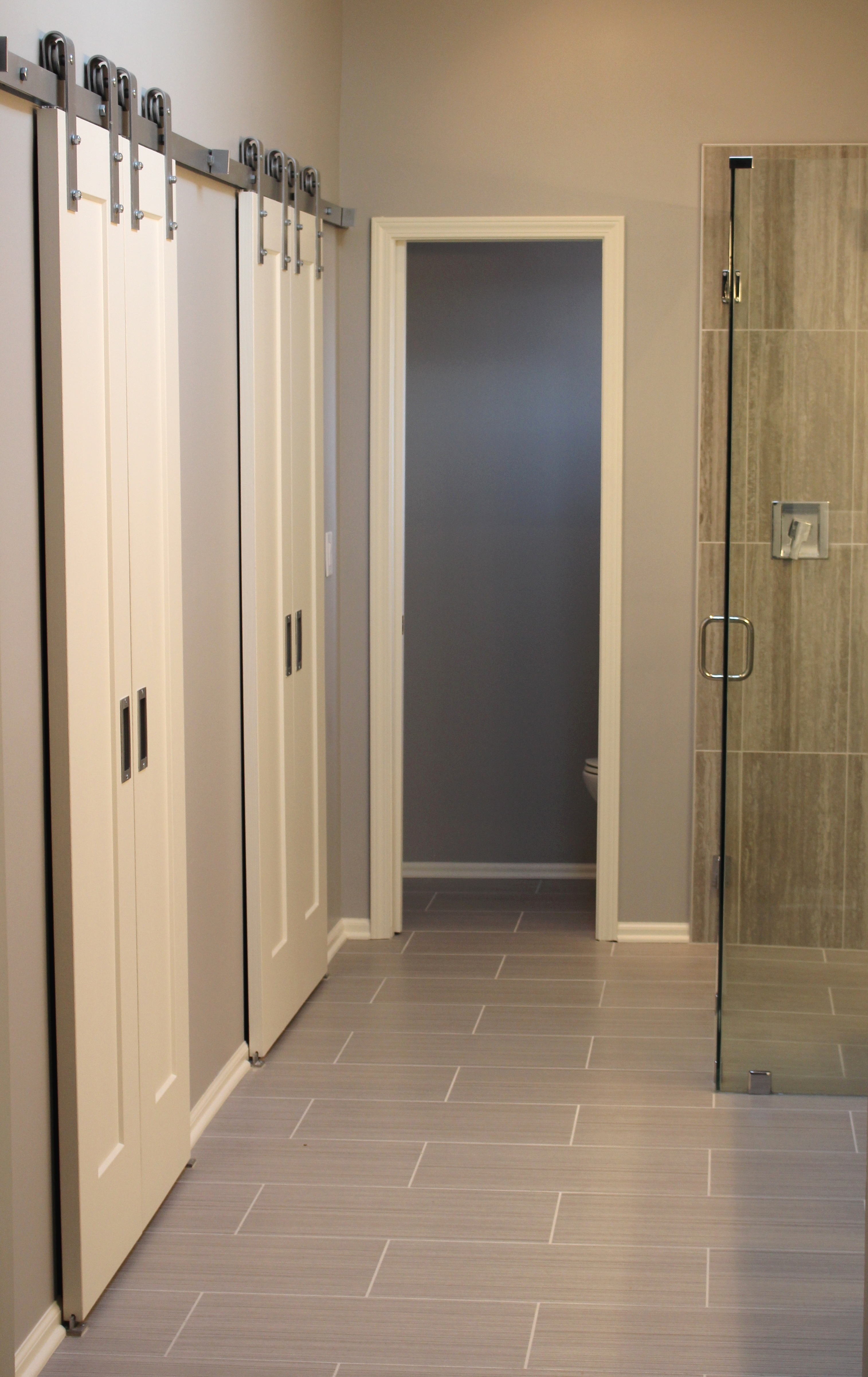
Glass enclosed showers make your room not only appear larger but large zero entry showers can usually accommodate a wheelchair or walker.

Interior design by Karen Mills  Zero entry shower

For years, homeowners have thought of universal design as utilitarian or ugly like the white bathroom grab bars and plastic bath benches, but the good news is that universally designed homes, especially bathrooms have become beautiful thanks to the interior designers and those savvy architects or builders who understand universal design and how to make it beautiful.

Karen Mills' blog
Interior design by Karen Mills

Karen Mills' blog
Interior design by Karen Mills Zero entry shower

Some additional considerations besides large walk in showers for a more universal design include wall mounted sinks, 36″ wide doorways and grab bars that look like towel bars.

Karen Mills' blog
Photo courtesy of Kohler

I also love the idea of the bathroom melding into the bedroom to become one large space.

For more great information on how to create a beautiful universally designed bathroom space, subscribe to our weekly interior design blog here

Plus become a fan of Kansas City’s interior designer Karen Mills on Facebook here!

Interior Design/Interior Decorating

Interior Design: 8 Ingredients of Timeless Design

Karen Mills' blog
Photo courtesay of Bernhardt furniture

Timeless spaces are beautiful, sophisticated, and understated. They tell the story of their occupants and their belongings like nothing else can. Plus they hold their value and memories of loved ones for years to come, as they bring family closer to live, love, and grow.   That’s why I love to design timeless spaces. So if you would like to avoid trendy decorating and have a more enduring design too, here is an informative article I wrote on Friday for Houzz .  (Click link below to read)

8 Rooms with Staying Power

Kansas City’s interior designer Karen Mills


Interior Design/Interior Decorating

INTERIOR DESIGN: 3 TIPS FOR TRANSFORMING YOUR ROOM FROM…

Karen Mills' blog
Photo courtesy of Circa Lighting

Does your interior feel “blah” or boring even though its filled with furniture? Often the reason a space looks unfinished is because rooms either lack the key ingredients to make them come alive or the key ingredients aren’t placed in a way that creates harmony and variety.  So here are my 3 tips to transforming your interior ordinary to extraordinary!

1. A Color Story – The first thing that’s usually missing in a home is color. And I don’t necessarily mean bold color, just a lack of cohesive color throughout.  Take a look at this bedroom design above from Circa.  Even though the grayed out blue isn’t dramatic, by placing it on the headboard, bedding, bench, and drapes it creates a color story of calm and quiet for the person who sleeps there.

Karen Mills' blog
Photo courtesy of Kravet furniture

In contrast this dramatic living space by Kravet above shows how you can create drama in a room by using bolder colors like the warm reds  used throughout to draw your eye around the room along with the blue that plays a supporting role and nice contrast in the interior design.


Karen Mills' blog
Photo courtesy of Jonathan Charles furniture

2. Accent lighting – Having ample accent lighting in a space makes it more inviting and interesting. And as a general rule, I  you need at least three lamps in every living space to add ambiance to your interior design.

.

Karen Mills' blog
Interior design by Karen Mills. Photography by 29 Pixels.

3. Groupings of large accessories – Most people tend to buy small accessories which when grouped together often creates a feeling of clutter that adds to the tension in your space instead of enhancing your interior design.  Instead strive for a balance of accessory sizes with more emphasis on large than small.

Another key to successfully accessorizing includes selecting colors, styles, and textures that will enhance your design and grouping accessories together to create vignettes or points of interest throughout your space. For example when I’m adding the final touches to a project as an interior designer, I often mix not only sizes of accessories but also textures which gives the vignette or grouping a more interesting mix.

For more great photos and tip for accessorizing and ideas on interior design, become a fan of Kansas City’s interior designer and former host of Living Large design show, Karen Mills on Facebook here

or sign up for our weekly interior design trend blog here!

Interior Design/Interior Decorating

Interior Design: 5 Trends to Watch in 2017

Do you ever feel overwhelmed by the bombardment of different decorating styles, finishes, and patterns?  With all those choices, the ability to make a final decision on your interior design can be daunting.   So today I’m sharing five trends to watch.


Karen Mils' blog
Photo courtesy of Overstock.com

1. Mix n match of fabrics and finishes

Mixing patterns in quilt like combinations, terrazo, and mixed finishes will continue to gain popularity from mixed wood and metal furniture pieces, accessories, or lighting to mixed metals in a room, especially in more muted tones.

Other ways we can apply this hot trend is by mixing up the patterns on upholstery, bedding, wallpaper, or accessories.

Karen Mills' blog
Abaca bed courtesy of Bernhardt Furniture

2. Texture

Texture will never die as a popular choice because we need it to balance the hard cold surfaces or more formal items in our interior design projects.  This year we’re seeing an increase in material choices ranging from wicker and rattan to crushed velvets and tassels/ trims.

Karen Mills' blog
Interior design by Karen Mills

3. Greens and Blues 

When Lea Eiseman of the world renowned Pantone Color Institute announced the color of 2017, Greenery, we began to see the color green popping up everywhere from paint and accessories to clothing and more in different shades and tones from dark to light.

As an interior designer, I’ve done several rooms in navy too, especially dining rooms because navy’s such a regal classic color and looks spectacular against white trim.  Navy also goes well with everything from spring green and pink hues to silver or gold.

Organic whites still dominant the interior design scene also as they connect us to nature and the outdoors.

Karen Mills' blog
Photo courtesy of Baker Furniture

4. Artisan/Handmade Quality

As interior designers, we try to educate our clients on the value of investing in quality furnishings because they last longer, are more comfortable, and a better value over the long haul.  This year we’re starting to see an increase in this trend towards quality by homeowners who are looking for new or antique/vintage quality furniture and handmade items including art or accessories.

Karen Mills' blog
Photo courtesy of Cutting Edge Stencils

5. Organic Materials and Patterns 

If you’ve been paying close attention, you may have noticed the growing trend towards tropical designs, especially butterflies, parrots, and leaves which is perfect match with our color of the year Greenery.  Mix that trend with the texture trend and you’ll have an interesting casual interior that’s warm and welcoming.

Marble, an organic material that I absolutely adore, is still hugely popular in kitchens, baths, and even on faux patterns.

For more great ideas, photos, and trends, sign up for our weekly interior design blog here

Plus become a fan of Kansas City’s interior designer and former host of the Living Large design show, Karen Mills, on Facebook here!


Interior Design/Interior Decorating

Interior Design: 3 Secrets to Showcasing Your Room with…


Karen Mills' blog
Photo courtesy of Circa lighting

To make your ceiling light fixture the star of the show you need to ensure you have everything in place first.   The background, color scheme, natural light, and interior design all play an important role.

Karen Mills' blog
Amaca by Swarovski
  1.  Pick a light fixture that grabs your attention.  Look for light fixtures with interesting shapes, texture, or a look overall that draws you into the room like the Swarovski fixture above or the Circa pendant lights in the kitchen at top.  Plus consider selecting a light that not only looks great when lit but also holds its own when not.
Karen Mills' blog
Photo courtesy of Swarovski
Karen Mills' blog
Photo courtesy of Swarovski
Karen Mills' blog
Photo and lighting courtesy of Swarovski

2.  Select a light that enhances your room instead of detracting from it.   You don’t have to purchase a light in the same style as your room’s interior design as long as it complements your room and makes it more interesting.  For example, if you have a room with a dramatic col

Other considerations for selecting an ideal fixture include making sure its proportionate to the space like the kitchen pictured above and that the finish color adds to the overall design.

Karen Mills' blog
Photo courtesy of Lighting by Pecaso

3. Create a neutral backdrop or interior design that doesn’t compete with your light like this entry above where the chandelier has the starring role in the scene, while the rest of the room has a supporting role.

If you already have a dramatic interior design with color and/or pattern, then you’ll need to find a light fixture that doesn’t compete with what you already have in the room.


Karen Mills' blog
Photo courtesy of Hubbardton Forge

For more ideas and photos, sign up for our weekly interior design blog here

Plus become a fan of Kansas City’s interior designer and former host of the Living Large design show, Karen Mills, on Facebook now.


Karen Mills' blog
Photo courtesy of Terzani Etoile
Interior Design/Interior Decorating

Interior Design: 3 Ways to Create Drama with Doors

Karen Mills' blog
Photo courtesy of Coastal Shower Doors

The architecture or bones of the house are the most important elements when building or remodeling because they set the backdrop for any interior design you’re about to create and determine the style of your space.  That’s why not only the walls and ceilings are so important but also the doors and windows.

Here are 3 ways you can use doors to create drama in your space.

  1. Make your door the focal point like the shower door pictured above.  In this room the grid design of the door draws attention to itself along with the dark dramatic color, making it the star of the room.

Once you’ve selected your shower door, then you can repeat the color or pattern on the               door to unify your space.

Karen Mills' blog
Photo courtesy of Haute Living

2. Introduce doors that are wider or taller than the average door to draw attention to it like       sliding doors pictured above.  In this photo, these doors have a beautiful ethereal feel to              them that makes the room feel like its floating while allowing light to filter into adjacent                rooms.

As an interior designer, I recently completed a project where I recommended a row of            taller doors/windows installed for a room addition at the back of the house and now when          you enter the front door the first thing you see are the wall of grand doors/windows and the      incredible view beyond.

3. Use doors to visually divide space without closing off the rooms in an open floor plan.  Often      we use wall screens or room dividers to accomplish this, but these doors pictured below add      a sophistication and one of a kind feel to the the rooms that nothing else can.

Karen Mills' blog
Photo courtesy of Haute Living

For more great ideas and photos, sign up for our weekly interior design blog here

Plus become a fan of Kansas City’s interior designer and former host of the Living Large design show, Karen Mills, on Facebook here!