Interior Design/Interior Decorating

Interior Design: 5 Tips for Injecting Spring into Your…

The first day of spring has arrived in the United States and it’s a joyous time for most of us in the colder climates because it marks the end of a season of cold, ice, and snow.


Karen Mills' blog
Photo courtesy of Jonathan Charles

As I walked through my yard this last weekend I saw green buds appearing everywhere from bushes and trees to perennials.   So of course that motivated me to perform my semi-annual tradition of packing up heavy winter decor and ushering in spring with lighter decor.  If you would like to lighten your interior too, here are 5 tips for injecting spring into your home.

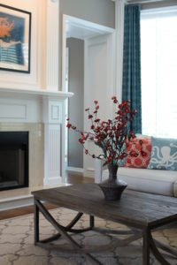
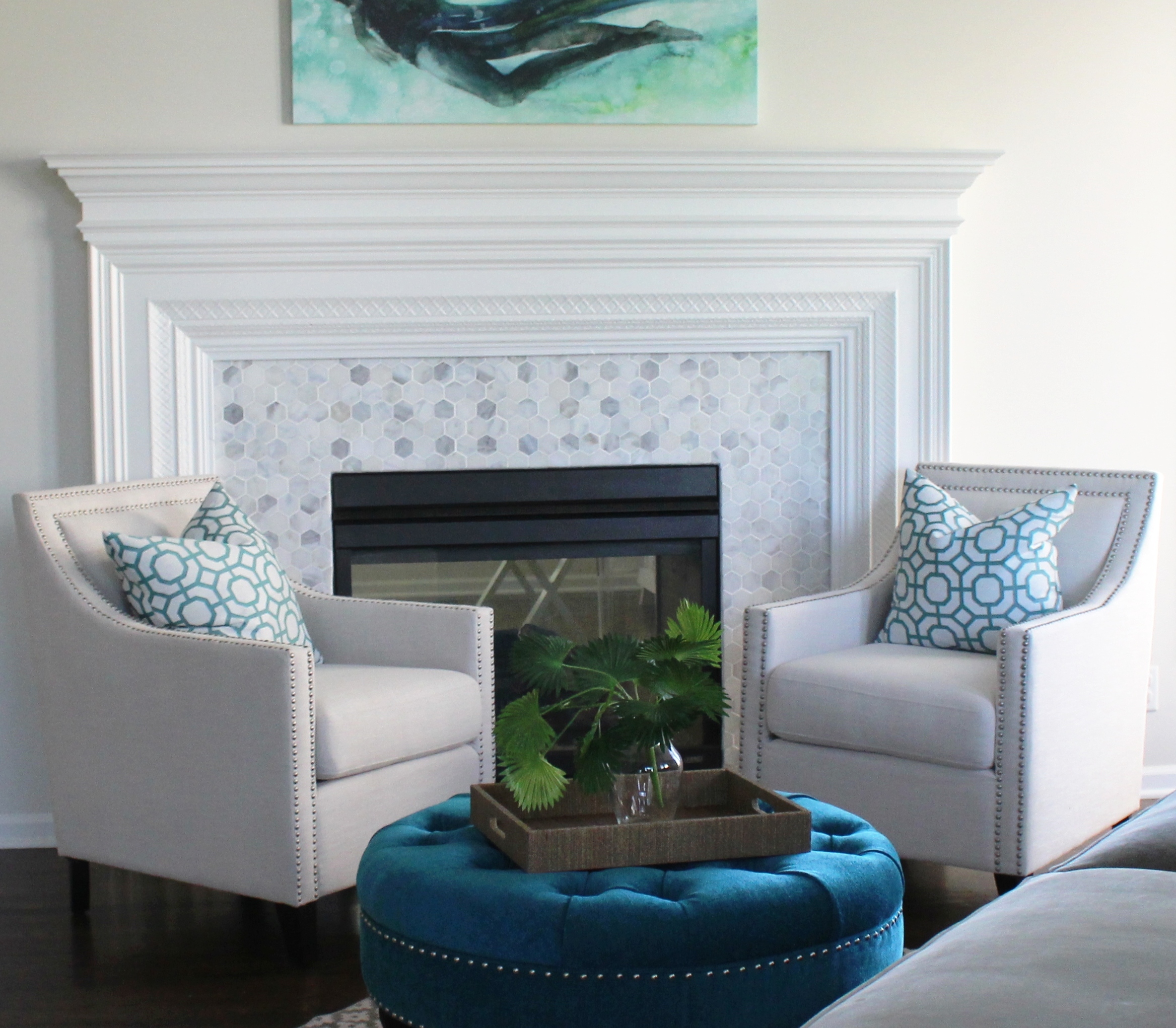
  1. Add life with fresh flowers and seasonal plants like this photo by Jonathan Charles furniture above.  Lighter finishes also help enhance the spring feel of this room along with an infusion of sunlight.
Karen Mills' blog
Interior design by Karen Mills. Photography by 29 Pixels.

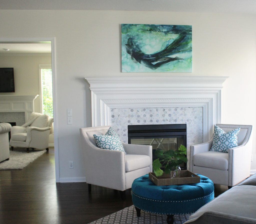
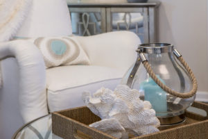
2. Add fresh pops of color in pillows and decor like the room above.  The shell and lantern beach inspired decor also add to the warm season feel.

Karen Mills' blog
Photo courtesy of Jonathan Charles

3. Replace dark heavy items like rugs with lighter options  like shown above or go with a natural rug like a sisal.  If that’s not possible, opt for removing the rug altogether.

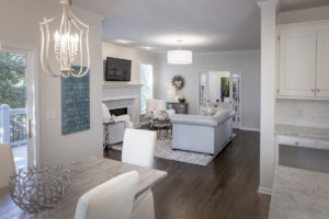
Light pillow covers in natural fabrics also add to the appeal along with fresh flowers and light upholstery.  If you don’t have light upholstery, consider adding a slipcover for spring/summer weather like the dining chairs we had slip covered below.
Karen Mills' blog
Interior design by Karen Mills
Karen Mills' blog
Photo courtesy of Circa Lighting

4. Lighten up in the bedroom by replacing heavy dark bedding with light natural fabrics in cotton and consider using sheer drapery panels instead of heavy drapes.

5. Spring Clean  Remove all the extra items that have accumulated over the winter months and do some spring cleaning so your room feels fresh and fabulous.  Now you’re ready for spring!

For more great photos and tips, sign up for our weekly interior design blog here!

Plus become a fan of Kansas City’s interior designer and former host of Living Large, Karen Mills, on Facebook here!


Interior Design/Interior Decorating

Interior Design: 3 Tips for Warming up Modern Living…

Karen Mills' blog
Photo courtesy of Design within Reach

As I’ve matured as an interior designer I’ve come to love clean simple design that stands on it’s own.  Of course it’s much more difficult to attain a modern look because each piece of the design has an important role and you don’t want the room to become sterile.    So if you’re looking for more simplicity in your life without sacrificing warmth, here are 3 tips for creating an inviting contemporary look.

  1. Add texture to your room.  In this living space shown above a  textural rug was layered underneath to ground the seating area along with a throw, books, and plant.  Textural fireplace tile, art, and wood logs also add more interest to the room.

In this modern contemporary living room below texture is introduced through the fabrics on      the upholstery and pillows along with the sisal and fur rugs underneath.  Wood furniture also      plays a key role in adding warmth.

Karen Mills' blog
Photo courtesy of All Modern
Karen Mills
Photo courtesy of Design within Reach

2. Introduce live elements like the branch cutting shown in this living room create a more inviting feel.  Other live elements you can introduce include fruit, flowers, and plants.  Pops of color also help warm up this living room along with a book, art, and color.

Karen Mills' blog
Photo courtesy of Design within Reach

3. Use Color  to warm up a room especially if its a orange sofa like the space above.  The tree in the corner, wooden spools, and pillow also add warmth to the room.

Karen Mills
Photo courtesy of All Modern

In this modern living room above the leather chair, pillows and sofa all add texture and warmth along with the rug and wood topped coffee table.

For more great tips and photos sign up for our interior design blog here

plus become a fan of Kansas City’s interior designer and former host of the Living Large design show on Facebook here!


Interior Design/Interior Decorating

Interior Design: 3 Ways to Use a Vessel Sink…

Karen Mills' blog
Photo courtesy of Link a Sink

Vessel sinks add energy to a bathroom’s interior design because they’re elevated to a place of importance on top of the vanity.  And they add style with their unique shape, color, pattern, finish, or material!

Vessel sinks come in an array of materials from stone or ceramic to glass, metal, wood, and more so the options are endless considering that you can also have an artist create an one of kind piece for you.

So if you’re considering redoing your bathroom to include a vessel sink, here are 5 ways to incorporate them in your bathroom design.

1. To enhance your design   In the photo above, the vessel sink by Link a Sink plays a wonderful supporting role in this dramatic powder room design, keeping the room from getting too busy.  But if you have a more neutral bathroom without much pattern or color, a  vessel with an interesting shape could be the perfect solution.

Karen Mills' blog
Photo courtesy of Signature Hardware
Karen Mills' blog
Photo courtesy of Copenhagen Sinks

2. To add texture

By adding a rougher finish like this carrara marble sink show above by Signature Hardware to a bathroom full of hard shiny surfaces, you can make it more inviting .

Karen Mills' blog
Photo courtesy of Kraus

3. To introduce color  

In the photo above this blue vessel sink by Kraus offers an exciting pop of color for neutral bathrooms.   I’m particularly fond of the faucet shown with it designed by a former Mercedes Benz designer to look like an auto stick shift.

Karen Mills' blog
Photo courtesy of Copenhagen Sinks

For more great tips and photos, sign up for our weekly interior design blog here

Plus become a fan of Kansas City’s interior designer and former host of the Living Large design show, Karen Mills, on Facebook here.


Interior Design/Interior Decorating

Interior Design: 5 Tips for a Budget Kitchen Makeover


Karen Mills' blog
Interior design by Karen Mills

If you want to update your tired old kitchen but don’t want to invest in a full remodel, here are 5 tips for freshening up your kitchen for less.

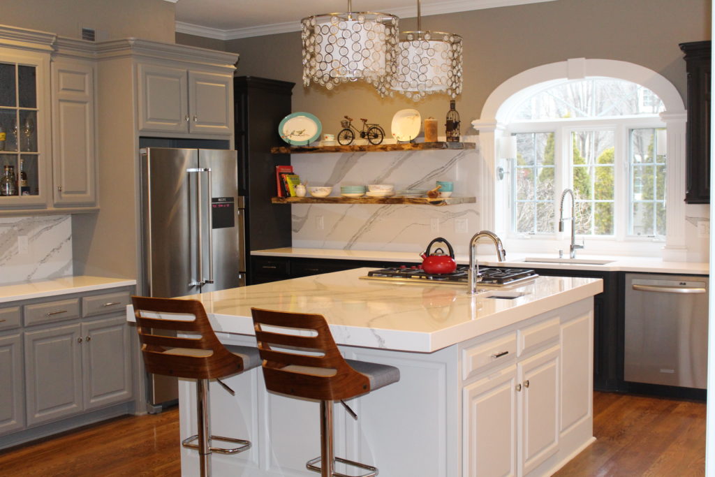
1. Refurbish your existing kitchen cabinets.   If your cabinets are in good shape and not too dated, sand, repaint and seal them.   In this kitchen above we painted the cabinets different colors, added a mitered (thicker) edge island counter top, and replaced some upper cabinets with live edge shelving to create a more interesting look.

If your cabinet door styles are dated, have them refaced with new doors and fronts.  You can also add glass inserts, replace your dated moldings and add crown molding overhead to completely transform them.   Plus pull out those dated appliance garages housed in the corner.

2. Replace your dated or worn appliances with more updated ones you can find for less in a clearance section or replace appliance fronts only if that updates the look.  In this kitchen above we also painted the cabinets, added a vintage chandelier the homeowner already had for a Hollywood Glam feel along with new light fixtures above the table which she had finished to a more grayed out rustic look.

Karen Mills' blog
Interior design by Karen Mills/Photography by 29 Pixels


3. Update your hardware finishes  by replacing pulls or knobs, your sink faucet, and light fixtures.  If you don’t have the budget for new light fixtures, have your old ones spray painted or do it yourself.

4. Replace your dated counter tops and back splashes ensuring you add under cabinet lighting to show them off.

5. Refurbish your existing floors by refinishing hardwoods or by replacing flooring with stone tile found on clearance and install yourself.  As an interior designer, I’ve used faux wood tile more than once on kitchen remodels to create a cozier rustic feel when wood isn’t an option.

For more great tips and trends subscribe to our weekly interior design blog here!

Plus become a fan of Kansas City’s interior designer and former host of the Living Large design show, Karen Mills. on Facebook here!

Interior Design/Interior Decorating

Interior Design: 3 Secrets to a Comfortable Living Space


Karen Mills' blog
Photo courtesy of Century Furniture

Is there anything better than a comfortable relaxing space at the end of a long day?  Not for me.  That’s why my focus at home and with interior design clients is just as much about comfort and function as beauty.  So here are my three tips for creating a comfortable interior design.

1. Comfortable seating.  To begin make sure that you’re selecting upholstery that’s comfortable for long periods such as the custom furniture shown.   When seated on a sofa or chair ensure your legs are able to touch the floor and that your thighs fit the seat depth so you’re not having to lean back uncomfortably. Plus consider adding an ottoman for a late afternoon snooze or to relax while watching TV.
Karen Mills' blog
Interior design by Karen Mills
2. Layer in texture  in everything from area rugs and/or soft window treatments to accessories like pillows or throws remembering that each layer of texture creates a cozier feel.
Karen Mills' blog
Photo courtesy of Century Furniture
 3. Select a color scheme that includes elements of warmth whether that’s on walls, ceilings, floors, windows, or accessories.  For example on a wall you might add textural wallpaper or go with a warmer color.  On the windows you might introduce a bamboo window shade under draperies.  And finish off the room with textural pillows.

For more fabulous interior design trends, sign up for our weekly blog here!

Plus become a fan of Kansas City’s interior designer and former host of the Living Large design show, Karen Mills, on Facebook here!

Interior Design/Interior Decorating

Universal Design: Bathroom Trend of the Future

Karen Mills' blog
Photo courtesy of Moen

Whether you’re planning to grow old in your home or not, you should seriously consider incorporating some universal design practices into your home.

Why? Because universal design is becoming more in demand by an aging baby boomer generation, plus universal design features can add value.

Glass enclosed showers make your room not only appear larger but large zero entry showers can usually accommodate a wheelchair or walker.

Interior design by Karen Mills  Zero entry shower

For years, homeowners have thought of universal design as utilitarian or ugly like the white bathroom grab bars and plastic bath benches, but the good news is that universally designed homes, especially bathrooms have become beautiful thanks to the interior designers and those savvy architects or builders who understand universal design and how to make it beautiful.

Karen Mills' blog
Interior design by Karen Mills

Karen Mills' blog
Interior design by Karen Mills Zero entry shower

Some additional considerations besides large walk in showers for a more universal design include wall mounted sinks, 36″ wide doorways and grab bars that look like towel bars.

Karen Mills' blog
Photo courtesy of Kohler

I also love the idea of the bathroom melding into the bedroom to become one large space.

For more great information on how to create a beautiful universally designed bathroom space, subscribe to our weekly interior design blog here

Plus become a fan of Kansas City’s interior designer Karen Mills on Facebook here!
Interior Design/Interior Decorating

Interior Design: 8 Ingredients of Timeless Design

Karen Mills' blog
Photo courtesay of Bernhardt furniture

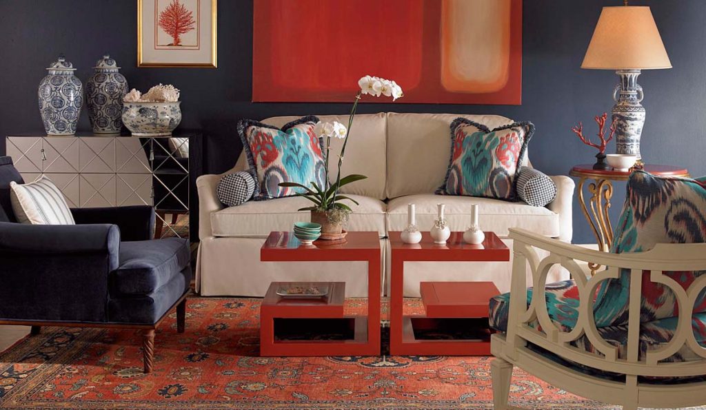
Timeless spaces are beautiful, sophisticated, and understated. They tell the story of their occupants and their belongings like nothing else can. Plus they hold their value and memories of loved ones for years to come, as they bring family closer to live, love, and grow.   That’s why I love to design timeless spaces. So if you would like to avoid trendy decorating and have a more enduring design too, here is an informative article I wrote on Friday for Houzz .  (Click link below to read)

8 Rooms with Staying Power

Kansas City’s interior designer Karen Mills


Interior Design/Interior Decorating

Interior Decorating: What Does Your Favorite Color Say About…


Karen Mills' blog
Photo courtesty of Century Furniture

Ever wonder what your favorite color says about you or how to use it in your interior?

As an interior designer and color expert, I can tell you that’s not always an easy task because it takes years of experience to learn how colors can impact rooms based on lighting and location.  So here’s some insight on what color says about you and how you might use it.

If you love red like I do you most likely live life to the fullest with spontaneity and excitement.  But what does a red interior say to others?  The color, associated with blood and fire, can raise your blood pressure and grab your attention!  So if you don’t want to go completely red, try incorporating red as an accent color like the photo above to make your space a little more vibrant.

Karen Mills' blog
Interior design by Karen Mills. Photography by 29 Pixels.

Blue, however, exudes stability, tranquility, calm and reliable.  Blue’s also the favorite color for the majority of men. A perfect color for bedrooms, blue helps you unwind, especially blue greens that are soothing, and lovers of this color tend to be responsible stable citizens who do the right thing.

Yellow, like a ray of sunshine adds warmth and optimism, making it perfect for a kitchen or a sunny living area, and big fans of this color are often optimistic people with a happy misdemeanor.

Karen Mills' blog
Interior design by Karen Mills Photography by 29 Pixels

Green, the color of nature exudes calmness and warmth, making it also a good color for bedrooms or spaces where you need a more relaxed feel.  Fans of this color are usually warm, kind, and charitable.

Purple, a favorite color among children, denotes creativity.  Lovers of this color are often more complex artistic, fascinating individuals who sometimes may seem mysterious.

Karen Mills' blog
Interior design by Karen Mills

Orange, the color of hunger and vibrancy fits perfectly into that dining room or kitchen area where you need some life or excitement.  And if you’re an orange lover, you probably show the same vibrant spirit as the color with your enthusiastic zest for life.

Karen Mills' blog

But what if your favorite color is beige?  Beige means you’re more timeless, basic, conservative, and simple.  Taupe leans toward traits of well balanced, classic, and fair, but brown usually denotes down to earth and no nonsense.

Karen Mills' blog
Interior design by Karen Mills Photography by 29 Pixels

Grays tend to be intellectual, wise, calm, practical, and conservative and lovers of white lean toward cleanliness, neatness, and purity.

Black, the absence of color leans toward classic good taste but can also mean that you enjoy power, confidence or just being conservative.

For more great interior design ideas and photos, sign up for our blog here!
Plus become a fan of Karen Mills, Kansas City’s interior designer and former host of Living Large on Facebook here now!

Interior Design/Interior Decorating

INTERIOR DESIGN: 3 TIPS FOR TRANSFORMING YOUR ROOM FROM…

Karen Mills' blog
Photo courtesy of Circa Lighting

Does your interior feel “blah” or boring even though its filled with furniture? Often the reason a space looks unfinished is because rooms either lack the key ingredients to make them come alive or the key ingredients aren’t placed in a way that creates harmony and variety.  So here are my 3 tips to transforming your interior ordinary to extraordinary!

1. A Color Story – The first thing that’s usually missing in a home is color. And I don’t necessarily mean bold color, just a lack of cohesive color throughout.  Take a look at this bedroom design above from Circa.  Even though the grayed out blue isn’t dramatic, by placing it on the headboard, bedding, bench, and drapes it creates a color story of calm and quiet for the person who sleeps there.

Karen Mills' blog
Photo courtesy of Kravet furniture

In contrast this dramatic living space by Kravet above shows how you can create drama in a room by using bolder colors like the warm reds  used throughout to draw your eye around the room along with the blue that plays a supporting role and nice contrast in the interior design.


Karen Mills' blog
Photo courtesy of Jonathan Charles furniture

2. Accent lighting – Having ample accent lighting in a space makes it more inviting and interesting. And as a general rule, I  you need at least three lamps in every living space to add ambiance to your interior design.

.

Karen Mills' blog
Interior design by Karen Mills. Photography by 29 Pixels.

3. Groupings of large accessories – Most people tend to buy small accessories which when grouped together often creates a feeling of clutter that adds to the tension in your space instead of enhancing your interior design.  Instead strive for a balance of accessory sizes with more emphasis on large than small.

Another key to successfully accessorizing includes selecting colors, styles, and textures that will enhance your design and grouping accessories together to create vignettes or points of interest throughout your space. For example when I’m adding the final touches to a project as an interior designer, I often mix not only sizes of accessories but also textures which gives the vignette or grouping a more interesting mix.

For more great photos and tip for accessorizing and ideas on interior design, become a fan of Kansas City’s interior designer and former host of Living Large design show, Karen Mills on Facebook here

or sign up for our weekly interior design trend blog here!

Interior Design/Interior Decorating

Interior Design: 5 Trends to Watch in 2017

Do you ever feel overwhelmed by the bombardment of different decorating styles, finishes, and patterns?  With all those choices, the ability to make a final decision on your interior design can be daunting.   So today I’m sharing five trends to watch.


Karen Mils' blog
Photo courtesy of Overstock.com

1. Mix n match of fabrics and finishes

Mixing patterns in quilt like combinations, terrazo, and mixed finishes will continue to gain popularity from mixed wood and metal furniture pieces, accessories, or lighting to mixed metals in a room, especially in more muted tones.

Other ways we can apply this hot trend is by mixing up the patterns on upholstery, bedding, wallpaper, or accessories.

Karen Mills' blog
Abaca bed courtesy of Bernhardt Furniture

2. Texture

Texture will never die as a popular choice because we need it to balance the hard cold surfaces or more formal items in our interior design projects.  This year we’re seeing an increase in material choices ranging from wicker and rattan to crushed velvets and tassels/ trims.

Karen Mills' blog
Interior design by Karen Mills

3. Greens and Blues 

When Lea Eiseman of the world renowned Pantone Color Institute announced the color of 2017, Greenery, we began to see the color green popping up everywhere from paint and accessories to clothing and more in different shades and tones from dark to light.

As an interior designer, I’ve done several rooms in navy too, especially dining rooms because navy’s such a regal classic color and looks spectacular against white trim.  Navy also goes well with everything from spring green and pink hues to silver or gold.

Organic whites still dominant the interior design scene also as they connect us to nature and the outdoors.

Karen Mills' blog
Photo courtesy of Baker Furniture

4. Artisan/Handmade Quality

As interior designers, we try to educate our clients on the value of investing in quality furnishings because they last longer, are more comfortable, and a better value over the long haul.  This year we’re starting to see an increase in this trend towards quality by homeowners who are looking for new or antique/vintage quality furniture and handmade items including art or accessories.

Karen Mills' blog
Photo courtesy of Cutting Edge Stencils

5. Organic Materials and Patterns 

If you’ve been paying close attention, you may have noticed the growing trend towards tropical designs, especially butterflies, parrots, and leaves which is perfect match with our color of the year Greenery.  Mix that trend with the texture trend and you’ll have an interesting casual interior that’s warm and welcoming.

Marble, an organic material that I absolutely adore, is still hugely popular in kitchens, baths, and even on faux patterns.

For more great ideas, photos, and trends, sign up for our weekly interior design blog here

Plus become a fan of Kansas City’s interior designer and former host of the Living Large design show, Karen Mills, on Facebook here!