Interior Design/Interior Decorating

Principles of Interior Design: Part 1

What are the Principles of Interior Design and How to Use Them

Today I’m going to unlock the secrets of design by sharing the principles of design. And today I’m starting with the first three ones. Read on to learn more.
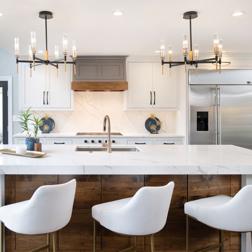
kitchen
Interior design by Karen Mills
  1. Balance: How we create a sense of stability and harmony in a space by arranging (or balancing) objects evenly. There are three ways to achieve balance:
  • Symmetrical: Identical or similar objects on both sides of a center point. In this kitchen I created a symmetrical balance with the chandeliers, blue plate grouping, and upper cabinets flanking the stove hood to make a powerful statement and draw attention to the focal point of the kitchen.
  • Asymmetrical: The use of different objects with the same visual impact on both sides of a center point. To create an asymmetrical look in this kitchen I would swap out one of the blue plate groupings for another grouping of a similar size.
  • Radial: Objects that radiate out from a common center point in a circular fashion.
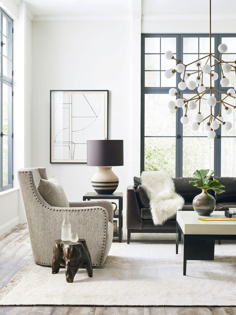
Photo courtesy of CR Laine

2. Proportion: Refers to the relative size and scale of different elements within a composition such as a room. Think of proportion the like ingredients in a food dish – much like cooking, getting the proportions right is the key to success. In this beautifully designed living room, the small dark wood stool by the swivel chair feels too small in comparison to the other furnishings and room as a whole.

3. Contrast: Two or more objects or architecture in opposition to each other in a space such as light and dark or smooth and rough. In this living room, a high contrast between light and dark finishes create a dramatic look overall.

Stay tuned next month for Principles of Design: Part Two

Want to learn more about interior design trends and insider secrets from Kansas City’s interior designer and former host of Living Large design show? Sign up for our free newsletter now.

karen-mills.ck.page/8d0663c849
Interior Design/Interior Decorating

Interior Design: 7 Mistakes to Avoid When Space Planning…

The majority of consumers I polled named space planning or laying out a room as their biggest challenge when trying to design an interior. Not surprising as that’s one of the top reasons homeowners reach out to our interior design firm for assistance. Read on to gain more insight into what homeowners do wrong and why it doesn’t work

example of topic
  1. Not planning ahead by creating a floorplan. By planning beforehand, you can ensure your space meets your needs, can accommodate the furniture you’ve selected, and be accessible. Plus, once you’ve created a floorplan you can doublecheck it works by laying out furniture dimensions in your room.
  2. Not emphasizing your focal point. By showcasing your focal point, you give more importance to it, whether its an architectural feature, vignette, or amazing view.
  3. Not designing your space to leave ample space for flow and walkways. For your room to function well you need to have flow through your seating areas for traffic along with main walkways that allow access from one room to the next or access to the outdoors.
  4. Not making the room functional A room that doesn’t function well may be missing tabletops for drinks or a book, lack ample lighting, or not be easily accessible, for example.
  5. Impulsive furniture buy – I understand. You’re standing in this huge store with all this beautiful furniture, and you spot something on sale or that seems to be what you want so you buy it. But when you get it home it just doesn’t work because it’s way too big for the space, too small a scale with your room, out of proportion, or doesn’t fit the design style.
  6. Placing the furniture against the walls Unless you’re having a huge gathering that’s standing room only inside your home or you’re planning to dance the night away in your room, shoving furniture against the wall is never a good idea. Why? Because its uninviting and not conducive to conversation .
  7. Overcrowding the Room Just because furniture physically fits in your room doesn’t mean it’s a good idea to put it there. For your room to functional and inviting, you need create a flow through the room, walkways for passing by, and blank areas for the eye to rest so you’re not visually overwhelmed by too much stuff.

If you have any questions or comments, I would love to hear from you!

If you’re looking for more interior design, decorating, or remodeling inspiration, watch our free One Day Makeover video tutorial now.

And if you would like to learn how to decorate like a pro so you can win the battle against a dated/ugly interior or learn how to decorate/stage professionally, click now to learn about our new subscription, The Decorating Pro!