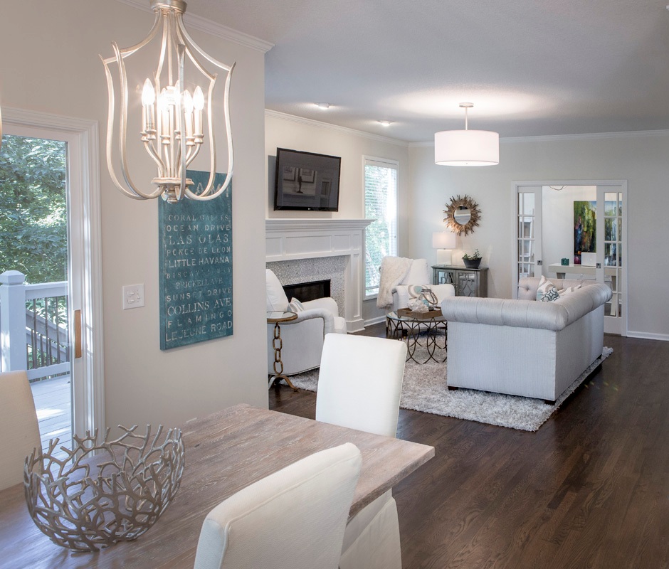
Interior Design/Interior Decorating

Interior Decorating: 3 Biggest Mistakes We Make in the…
Karen Mills' blog
Interior design by Karen Mills

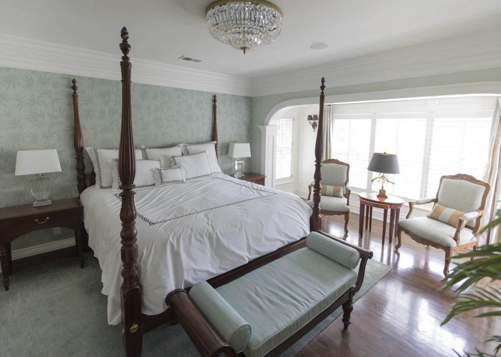
1. Lack of a Focal Point – Often as an interior designer I walk into a bedroom to discover a stark cold space that has no focus. Your bed is the focal point of the bedroom and the area you want to emphasize.

Here in this beautiful inviting bedroom we enhanced the existing poster bed with crisp white bedding, a gorgeous calming textural leaf wallpaper, and a warm hand knotted wool rug.

blog photo
Photo courtesy of Kravet

2. Uninviting – Often a bedroom becomes a dumping ground for everything we need to put away or even worse our home office space so to begin remove everything that’s not bedroom related.

In this space by Kravet, simple timeless bedding, a cozy bed that envelopes you and simple furnishings help create an inviting space.
Karen Mills' blog
Interior design by Karen Mills

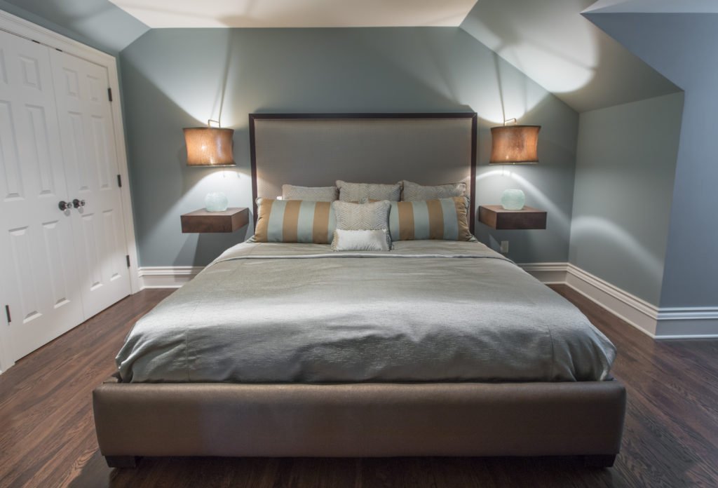
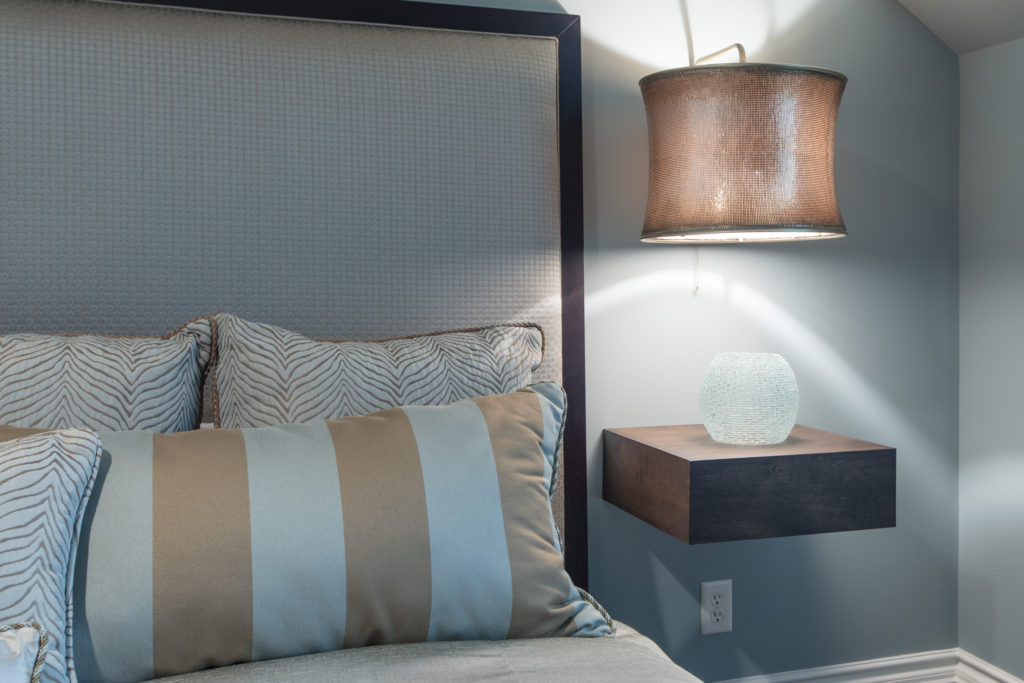
3. Too Cluttered or Crowded – In this smaller attic bedroom we didn’t want the room to feel crowded or cluttered with the king size mattress the clients needed so we designed a bed that didn’t overwhelm the room. Floating tables we designed along with light fixtures we adapted to hover over the tables gives a more open airy feel to the space.

Looking for more great bedroom design or decorating ideas?  Sign up for our weekly interior design blog here,
Karen Mills' blog

Plus become a fan of Kansas City’s interior designer and former host of the Living Large design show, Karen Mills, on 
INSTAGRAM, FACEBOOKTWITTER, or LINKEDIN here!

Interior Design/Interior Decorating

Interior Decorating: 3 Tips for Coordinating Mismatched Furnishings in…

Do you have a collection of mismatched furniture that feels unfinished or undone?  Read on for my 3 interior designer tips for creating a cohesive look in your room.

Interior design by Karen Mills

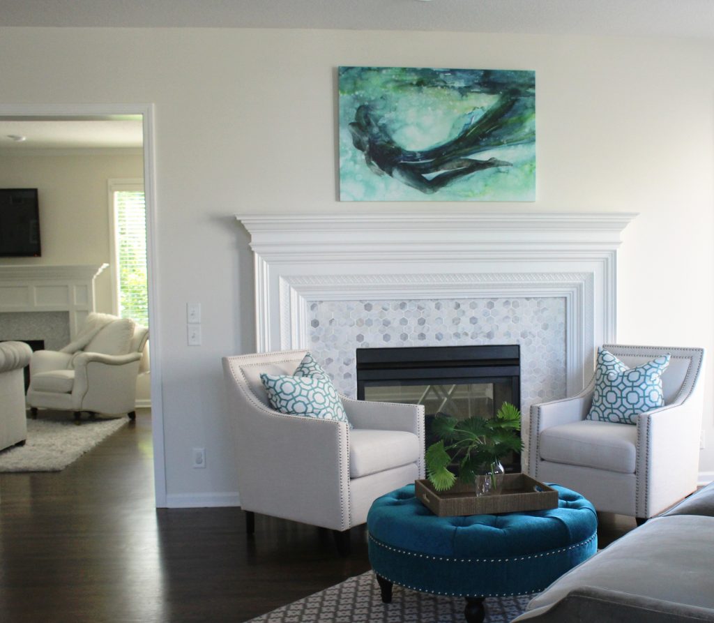
1. Repetition – To coordinate two pieces of mismatched upholstery, unify both pieces by repeating a color from one piece to onto another with a pillow or throw.  Here the blue green color of the ottoman was repeated in the pattern on the pillows, while the artwork brings everything together including the gray velvet sofa in the foreground and the new tile on the fireplace.

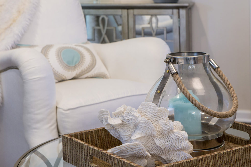
2. Introduce a new design element  – A piece of artwork overhead or nearby accessories  with both colors can also serve as a way to bring two different colors of upholstery together effectively.  Here in this family room the blue center of the pillow is repeated in the blue candle nearby while the white seashell picks up the white upholstery.

When creating vignettes of accessories in your space whether its for a tabletop or shelves, try to place objects of various heights, sizes, texture, and shapes together to create a cohesive whole.  Normally placing the taller narrower items at back with shorter wider items at the front works best.

Karen Mills' blog
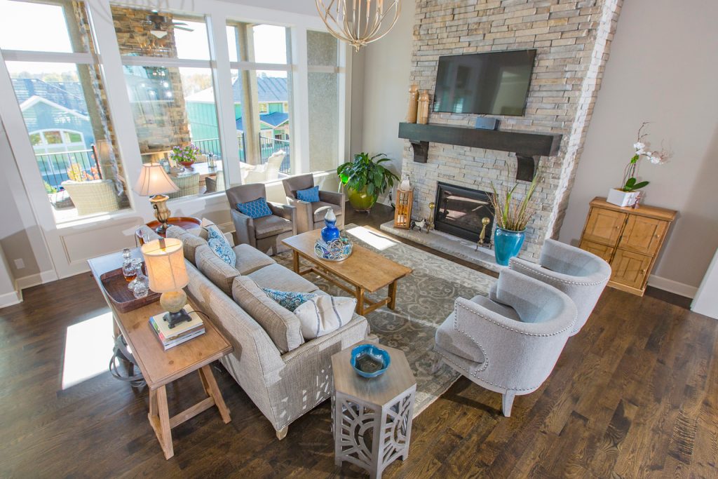
Photo courtesy of All Modern furniture

3. Layer a rug underneath – Placing a rug underneath your upholstery helps create a cozy grouping of furniture like this living area but it may also pick up colors from one or several pieces of upholstery.  Here the brown chair color is repeated on a pillow accent color and coffee table while the yellow and gray hues in the rug are mimicked again on the sofa and pillows.

For more great ideas and photos, sign up for our weekly interior design and decorating blog here

Become a fan of Kansas City’s interior designer and former host of the Living Large design show, Karen Mills, on Facebook here!

Interior Design/Interior Decorating

Interior Design: 3 Tips for Getting Cozy with Area…

Suggestions for Creating a More Inviting Feel in Your Living Space Using Area Rugs

Interior design by Karen Mills
  1. Create a cozy seating area for conversation. In this room we introduced a rug that not only adds another layer of texture but also nice contrast to this darker space, picking up some of the daylight beyond. To further enhance the coziness of this room we went with a wool and silk rug that has a luxurious soft texture so it feels great on bare feet or in socks.
rug sizing example
Interior design by Karen Mills

2. Layer an area rug under the furniture (or at least the feet) of your seating area. Placement of the rug under your furniture in a cozy arrangement draws onlookers into the space for a closer look like shown here where we used a high quality wool rug which are washable and comfortable to the touch.

Interior design by Karen Mills

3. Select a rug with a soft hand or texture that feels great underfoot. In this living space we layered in a super lush long shag area rug where you can dig in your toes and snuggle up for conversation, reading, or just watching a movie.

For more great ideas and photos, sign up for our weekly interior design blog here

Plus become a fan of Kansas City’s interior designer and former host of the Living Large design show, Karen Mills, on Facebook or Instagram here!