Interior Design/Interior Decorating

Interior Design: How to Coordinate Mismatched Upholstery


Do you have a room with mismatched furnishings that you’re not sure how to decorate?  Then read on for my 3 interior designer tips for creating a cohesive look in your room that includes a recent TV INTERVIEW on KCTV5 I did last week along with a Houzz article I wrote on a similar topic. 

Interior design by Karen Mills/Photography by 29Pixel Studios

1. Repetition – To coordinate two pieces of mismatched upholstery, unify both pieces by repeating a color from one piece to onto another with a pillow or throw.  Here the blue green color of the ottoman was repeated in the pattern on the pillows, while the artwork brings everything together including the gray velvet sofa in the foreground.


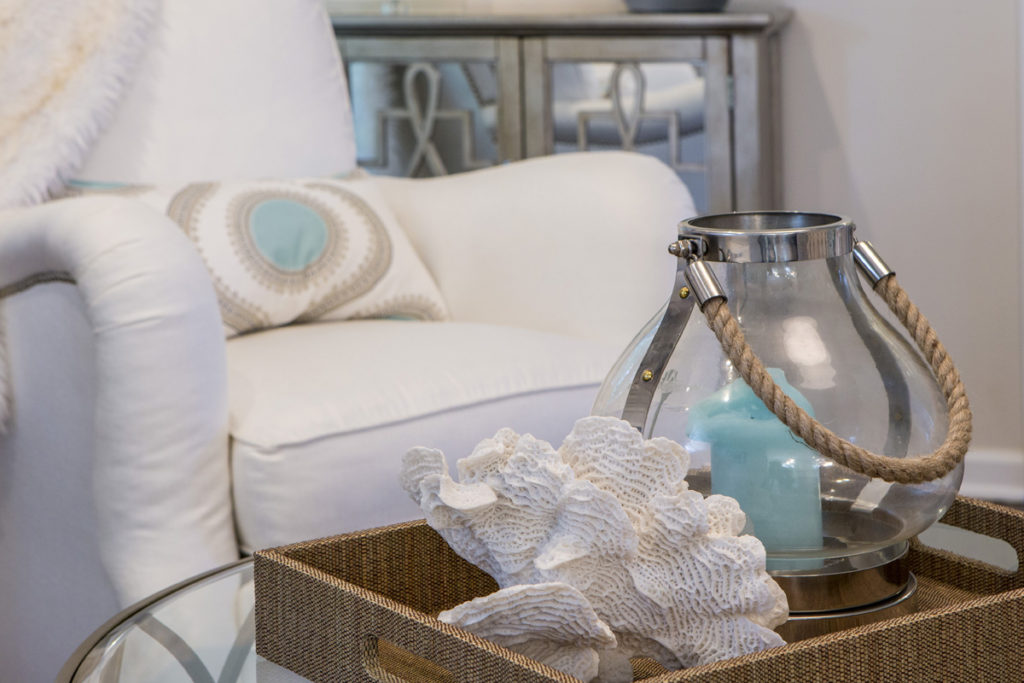
2. Introduce a new design element  – A piece of artwork overhead or nearby accessories  with both colors can also serve as a way to bring two different colors of upholstery together effectively.  Here the blue center of the pillow is repeated in the blue candle nearby while the white seashell picks up the white upholstery.

When creating vignettes of accessories in your space whether its for a tabletop or shelves, try to place objects of various heights, sizes, texture, and shapes together to create a cohesive whole. Normally I place the taller narrower items at back with shorter wider items at the front.

Karen Mills' blog
Photo courtesy of Lillian August furniture

3. Layer a rug underneath – Placing a rug underneath your upholstery not only creates a grouping of furniture but can also help bring the two disparate colors together by introducing both of them in your rug.  In this photo above the magenta red pillow picks up the color in the chair on the banquette along with the rug, while the cream white from the rug is also repeated in the banquette pillow and upholstery legs.

For more great ideas and photos, sign up for our weekly interior design and decorating blog here

Become a fan of Kansas City’s interior designer and former host of the Living Large design showKaren Mills, on Facebook here!

Watch my KCTV5 interview on Better Kansas City on the same topic last week


Interior Design/Interior Decorating

Interior Decorating: Tips n Tricks to Creating a Closet…


Karen Mills' blog
Photo courtesy of Closets to Go

Do you ever cringe at the disorganized mess you call a closet?  Read on for great tips and ideas for creating a beautiful closet that you can enjoy every day.

  1. Add storage whether that’s adding built ins or simple as simple as  free standing shelves with bins/baskets and/or a storage unit with drawers to your space.

    Karen Mills' blog
    Photo courtesy of Doctor Closet
  2. Organize your clothing and accessories for easy access.  Personally as an interior designer when I speak to groups about how to organize I  recommend you begin by pulling everything out of your closet, trying it on, and only putting back what you love.   When placing items back in your closet, separate your spring/summer clothing from                     your fall/winter clothing if you’re in a climate that dictates different wardrobes.  Then take it a couple of steps  further and separate by type of clothing and then by color.  

    Karen Mills' blog
    Photo courtesy of Easy Closets
  3. Style Your Closet – Click below to read the article I recently wrote on styling  for Houzz –   We Can Dream: Turn a Walk In Closet into a Glam Dressing Room below.

https://www.houzz.com/ideabooks/54686783/list/we-can-dream-turn-a-walk-in-closet-into-         a-glam-dressing-room

Plus sign up for our weekly interior design blog here so you don’t miss out on ways to                  improve your home and life

And become a fan of Kansas City’s interior designer and former host of Living Large design           show, Karen Mills, on Facebook here!

Interior Design/Interior Decorating

Interior Design: 3 Tips for Making Your Basement Live…

Karen Mills' blog
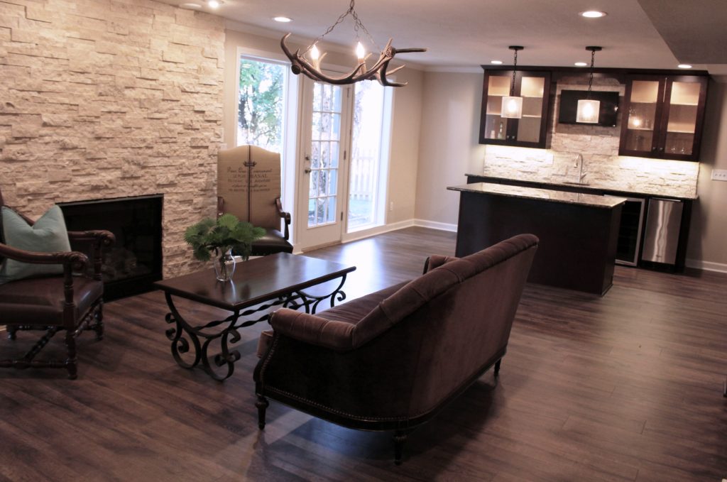
Interior design by Karen Mills/Photography by 29 Pixels, LLC

If you’re lucky enough to have a basement and are thinking about remodeling or finishing it, keep these three tips in mind when designing your basement to make it live large like upstairs.

1. Bring in the daylight.   When creating an interior design plan for your basement, think about ways you can bring natural sunshine further into your space.  One of my favorite tricks?  Use french doors or glass windows in interior rooms that allow the sun to penetrate further.

Other ways to bring in the light could include adding a glass door and and sidelights to a walkout basement or a large daylight window.  For a daylight basement try creating a walk up.

Karen Mills' blog
Interior design by Karen Mills/Photography by 29Pixels, LLC

2. Give it importance.  Treat your basement space like you would a main level room.  Use drywall on the ceilings and create focal points with architecture, color and/or interior design to give the rooms a “wow” feel. I personally prefer lighter wall colors in a basement that’s dark so it doesn’t feel a cave unless its a home theater area or wine cellar.

Karen Mills' blog
Interior design by Karen Mills

3. Beef up your artificial lighting.  By adding extensive artificial light with wall washers, accent lighting and/or directional strip lights in addition to your standard lighting, you’ll find that your basement feels more like an upstairs living space.

For more basement remodeling ideas and more, sign up for our weekly interior design blog here

plus become a fan of Kansas City’s interior designer and former host of the Living Large design show, Karen Mills, on Facebook here!

Interior Design/Interior Decorating

Interior Design: 5 Tips for Refreshing Your Kitchen For…

Karen Mills' blog
Interior design by Karen Mills

Kitchens can be a huge investment so countless homeowners across the United States are choosing to just refresh their kitchen to save costs instead of remodeling.   Read on for my 5 tips as an interior designer for refreshing your kitchen.  Then watch my live interview on

1.Paint kitchen walls along with kitchen cabinets.  In this photo we painted the walls an almost white color to lighten up the dark space that didn’t get much light and kept the original footprint of the floor plan to save costs since she needed new cabinets.  When painting kitchen cabinets, remember to replace exposed hinges with hidden ones beforehand and update your pulls/knobs.

2.Replace back splash along with counter top – After working on over 1200 interior design projects we’ve noticed that homeowners doing a budget kitchen remodel  usually plan to replace only their counter tops and that’s a problem because the old back splash often makes the kitchen still look dated and less desirable.    In this kitchen we opted for a linear glass, marble, and stainless tile that would make the kitchen pop.


Karen Mills' blog

Photo courtesy of Design Within Reach

3. Introduce new bar stools  New stools that contrast well against your island or peninsula can completely change the look and feel of your kitchen without spending a large sum of money.

4. Replace dated chandeliers or pendant lights – By updating your light fixtures you can make a great impression walking into your kitchen because they are usually front and center over an island or table.

Karen Mills' blog
Interior design by Karen Mills

5. Layer in accent color with accessories, rug, or art –  When I’m styling a space for an interior design project, especially a kitchen, I love to introduce a fun accent color that can be layered in on everything from napkins or a rug to platters and art.  In this photo the client showcased their beautiful collection of red and turquoise dishes on the live edge shelves to create a “wow” factor.


Karen Mills' blog
My  recent TV interview on 41KSHB’s KC Live with host Michelle Davidson about How to Refresh Your Kitchen

For more information check out my recent TV interview about How to Refresh Your Kitchen plus

for more great ideas and photos, sign up for our weekly interior design blog here

and become a fan of Kansas City’s interior designer and former host of the Living Large design show, Karen Mills, on Facebook now!

ALso here’s an article we recently wrote – Ideas for Refreshing Your Kitchen for Less

https://www.houzz.com/ideabooks/80705354/list/ideas-for-refreshing-your-kitchen-without-remodeling


Interior Design/Interior Decorating

Interior Design: 7 Steps to Designing a Dramatic Dining…


Karen Mills' blog
Photo courtesy of Lillian August furniture

Who doesn’t love the thought of a beautiful dining room where you can have dinner parties, a romantic dinner, or just intimate family gatherings. Read on for how to design your own beautiful dining room.

1. Select Your Personal Design Style –  If  you have no idea what style you are start by finding inspiration photos online or in print.  Then notate your favorite elements from each room to get a sense of your style.   In this room a transitional glam style sectional is combined with a more traditional style chair and artwork.

Karen Mills' blog
Photo courtesy of Hickory White furniture

2. Pick  a Color Scheme –  Most of us don’t spend much time in a dining room so have fun in here and pick colors you love.  Bolder colors can go on decor, rugs, chairs, or even walls but if you like to change up your style often, you might consider neutral walls and floors that give more flexibility when you want to change your color scheme.  Here the yellow green chair fabrics repeat one of the colors in the art while the buffet and tabletop add a dark contrast to the bold colors.

Karen Mills' blog
Photo courtesy of Hickory White

3. Add Dining Table and Seating –  The dining room table and chairs along with the items directly behind them are the focal point of your room.   Begin by determining how many people you need to seat and ensuring you have room for the table you want.  Plus remember that your chairs don’t need to match your table, just enhance them.

If you opt for a dramatically styled table, then consider simpler style chairs and backdrop.  Or if you go with a simpler style table, you might bring in drama with a wall covering or beautiful buffet with art above.

Karen Mills' blog
Photo courtesy of Lillian White for Hickory furniture

4. Consider Including Additional Furniture –  The majority of dining rooms benefit from functional storage furniture like a buffet and curio cabinets shown in this photo, but don’t forget about sofa tables, tea carts, and other furnishings that can enhance your room and provide handy surfaces for lamps, platters, trays, or display.

Karen Mills' blog
Photo courtesy of Schumacher

 5. Introduce a Dramatic Element – A bold element can range from a gorgeous piece of art like a sculpture or painting to wallpaper or beautiful buffet/curio to a stunning light fixture.

Karen Mills' blog
Photo courtesy of Wesley Hall

6. Layer in Texture  – Adding texture softens all the hard surfaces of the table, chairs, buffets, and hard flooring.   Texture can be introduced with an area rug, drapes/window coverings, fresh flowers, live plants/trees, or textural decor.  In this photo fresh flowers on the table and upholstered furniture add texture.

7.  Add lighting – Don’t forget about lighting because it creates much need ambiance and light when necessary.  Table lamps on a buffet or sofa table look beautiful behind a table along with a stunning chandelier and/or sconces on the wall behind.

For more great ideas and photos, sign up for our weekly interior design blog here

Plus become a fan of Kansas City’s interior designer and former host of the Living Large design show, Karen Mills, on Facebook or Instagram here!


Interior Design/Interior Decorating

Interior Design: Your Vote Counts!

K.C.s Best Interior Designer Award


Karen Mills' blog
Interior design by Karen Mills/Photography by 29 Pixels, LLC

WE NEED YOUR HELP! Even though you may have seen our design work featured recently in USA TODAY and ABC National News  we weren’t sure if you knew our firm Interiors by Design made it into the semi finals for Johnson County’s Lifestyle magazine’s BEST INTERIOR DESIGNER award since most of you only know me as Karen Mills.

Please take a minute (literally) to cast your vote here for our company Interiors by Design! (You can skip categories – we are #50)

https://www.surveymonkey.com/r/rcjoco

Karen Mills' blog           Karen Mills' blog

Thank you from the bottom of our hearts to those who nominated us and for your support by voting now!

P.S. We will have several projects featured in a new design book by an international publisher next spring so stay tuned for more details including how to get an advanced copy!

For more great design photos become a fan of Kansas City’s interior designer and former host of the Living Large design show, Karen Mills, on Facebook here.

Interior Design/Interior Decorating

Interior Design: 7 Easy Ways to Style Your Foyer


Karen Mills' blog
Photo courtesy of Wesley Hall

Front entries are the first impression you make on guests so why not create an inviting space.  As an interior designer I tell my clients to think of their entry as an advertisement for their home and what’s to come.  The entry should hold some of their favorite things and introduce the color scheme for their home’s interior design, revealing a little about their personal style.  Read on for 7 simple ways to create a beautiful foyer.

  1. Introduce a Sofa Table or Case piece –  Start with a piece of furniture that fits easily in your entry and ideally can also hold decor.  Examples of case pieces could include a chest like this photo, a curio, sofa table, desk, etc.   A chair adds pattern and color to create a more interesting look.
  2.   Freshen Up with Live Flowers or a Plant – In the photo above the texture of the flowers and branches  balance out the cold surfaces of the mirror, chest, and vases, bringing the outdoors in.
  3.   Layer in Artwork or a Mirror – Introducing artwork can add texture and reveal a bit of your personality, while a mirror is not only functional but also makes a style statement and can bounce light around from a lamp placed in front.
  4. Ground Your Entry with a Rug – Layering a rug underneath adds warmth, color, and style to your foyer.  In this photo the rug also picks up the colors of the chair and flowers.

    Karen Mills' blog
    Photo courtesy of Schumacher
  5.  Light it up With a Lamp –  Lamps not only provide function and ambiance, but they can introduce more style to a space like the demure pink lamp in this photo of a sofa table grouping that’s actually part of a living room.  The gold color throughout creates a cohesive element, while the pattern of the sofa table, stools, and branches add style and interest.
  6.  Replace Your Overhead Lighting – This photo provides a great example of how to dress up an entry with a stunning light fixture.  Of course an actual entry chandelier might be smaller but this fixture adds style without competing with the rest of the furnishings.

    Karen Mills' blog
    Photo courtesy of Motif Designs
  7. Tell a Color Story – You don’t have to be as bold and bright as this entry photo, but every space does have a color scheme even it’s neutral.  The red color of the sofa table and vase do add more sizzle to the blue lamp and wallpaper, but their simple lines and lack of pattern help calm the space to keep it from being overwhelming.  Fresh leaves give life while the mirror helps bounce light and visually enlarge the space.

To learn about color options for your foyer, read my Houzz article titled 7 Color Palettes for a Pleasing Entryway  – 

https://www.houzz.com/ideabooks/…/list/7-color-palettes-for-a-pleasing-entryway

become a fan of Kansas City’s interior designer and former Living Large design show host Karen Mills, on Facebook here

and sign up for our weekly interior design blog here


Karen Mills' blog
Photo courtesy of Palecek


Interior Design/Interior Decorating

Interior Design: 3 Ways to Successfully Mix n Match…


As an interior designer who’s designed or decorated over 1100 homes, I understand how overwhelming it can be for a homeowner to bring together their disparate furnishings to create a beautifully designed interior.  Read on for 3 steps you can take today to created a more finished look.

Karen Mills' blog
Photo courtesy of Horst by Hickory White

1. Repetition – To coordinate mismatched furniture or accessories I recommend tying them together by repeating a color from one piece to onto another like the pillow, rug, and art in this photo that helps unify the furnishings to create a beautiful interior design.  The branches, rug, artwork, and cloth fabrics also provide a welcome contrast to the hard surfaces of the floor, windows, walls, and table.


Karen Mills' blog
Photo courtesy of Marge Carson

2. Opposites Attract –  One great way to combine furnishings is by juxtaposing shiny finishes with dull, textural with smooth or formal with casual to give your room life and keep it interesting.   The upholstery, branches, stone formation, and rug contrast beautifully against the hard surface of the tables while the brown pillow on the sofa marries the sofa to the chair.

3. Size (and shape) Matters –  When creating vignettes of accessories in your space whether its for a tabletop or shelves, try to place objects of various heights, sizes, texture, and shapes together to create a cohesive whole like this photo, while keeping taller items at the back for a graduated look.   Pillows, artwork, and blue accessories bring together the color palette, while the yellow vases provide an unexpected pop of color.

Click here to watch one of my recent TV interviews with Gina Bullard on Better Kansas City on KCTV5 about how to create rooms with staying power

http://www.kctv5.com/clip/13418623/home-design-with-staying-power

plus sign up for our weekly interior design and decorating blog here

and become a fan of Kansas City’s interior designer and former host of Living Large design show, Karen Mills, on Facebook here!

Interior Design/Interior Decorating

Interior Design: How to Use Interior Doors to Enhance…

Karen Mills' blog
Interior design by Karen Mills

How often do we think of interior doors as design elements?  Probably not much but they can have a big impact on your interior design like the glass french doors in this photo of an Overland Park  home that frames the desk and art beyond.    The glass allows light and a view into the office, while the panes add interest to the interior design.

Karen Mills' blog
Photo courtesy of Haute Living

Or if you’re looking for a more contemporary interior door option, why not consider sliding panel doors that can allow light to penetrate further into your home like this photo above.  The repetition of the horizontal slats create an interesting pattern in this simple clean design.

To learn more about designing with interior doors, click below to read my recent article Beyond Open and Shut:  7 Ways to Use Interior Doors as Decor.  

https://www.houzz.com/ideabooks/82255678/list/beyond-open-and-shut-7-ways-to-use-interior-doors-as-decor

Plus sign up for our weekly interior design blog here

and become a fan of Kansas City’s interior designer and former host of Living Large design show, Karen Mills, on Facebook here!

Interior Design/Interior Decorating

Interior Design: Make a Grand Entrance with Your Front…

Karen Mills' blog
Photo courtesy of Rylock doors

If you want to make a grand entrance to your home the front door is key because its the focal point area at the front of your home and can add or detract from your home’s curb appeal.   If you have a great eye for design, then you can do it yourself, but if you don’t please contact an interior designer first to ensure you don’t make a costly mistake.

Karen Mills' blog
Door photo courtesy of Therma Tru

Countless styles of doors exist from the red pivot style I reveal in my Houzz article in the link below to doors with cut outs like this door.

Karen Mills' blog
Photo courtesy of Simpson Door

Read my article in the following link titled Make an Entrance with a Dramatic Front Door  to learn about more door styles and possibilities.

https://www.houzz.com/ideabooks/82788557/list/make-an-entrance-with-a-dramatic-front-door

For more information and inspiration sign up for my weekly interior design blog here

Plus become a fan of Kansas City’s interior designer and former host of Living Large, Karen Mills, on Facebook here!