 Interior Design/Interior Decorating
Interior Design: 5 Steps to Space Planning Your Living…
Do you ever feel frustrated or lost when it comes to deciding how to place your furniture in the living room? Read on for my tips as an interior designer on how to space plan your room to be both functional and appealing.
- Make it Functional – The first question I ask interior design clients who want our firm to space plan their living room is how they will use the room and what they need in the room to accomplish that. For example, how much seating do you need daily? And if you entertain often how many people do you need to accommodate? Other questions to ask yourself is what else do you want to do in the living room? If you’re reading a book, you will need a lamp nearby and if you’re eating or drinking, tabletops will be critical for placing glasses or plates down. In this great room we designed, a coffee table and sofa table provide surfaces to place items on while a nearby end table holds a much-needed lamp.
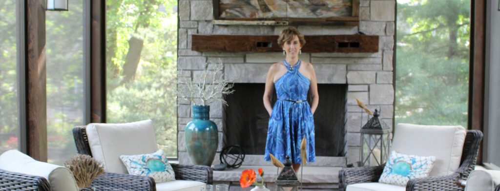
2. Determine Your Focal Point – In this outdoor living room the focal point is the fireplace we placed front and center in the design of the porch, but if you don’t have a fireplace or great outdoor view, you can create one with a vignette. A vignette is a grouping of furnishings created to make a focal point such as a table, artwork, and lamp arranged together.
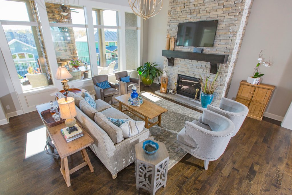
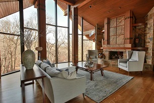
3. Place your sofa or largest upholstery (seating) facing your focal point to give it more emphasis or importance. Here in this great room design we placed the sofa facing the fireplace because it’s the focal point and your eye naturally goes to where the largest piece of upholstery is facing. Two more pairs of chairs flank the sofa, adding more emphasis and a cozy atmosphere, while the rug we layered underneath creates a cohesive pulled together look.
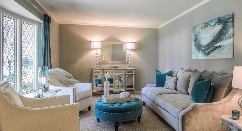
4. Make your furniture arrangement inviting and cozy, but not crowded. In this living room the sofa is facing a focal point, the view out the window. A round ottoman helps create a more spacious feel while the chairs are angled to mimic the shape of the ottoman while still being a part of the intimate seating arrangement that makes the space planning a success.
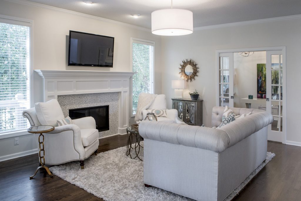
5. Layer in tables and an area rug underneath. Tables are critical in your room both for holding lamps to provide ample lighting and for placing glasses, plates, or other items in your possession. In this hearth living space we remodeled, we faced the sofa towards the fireplace or focal point. Then we flanked matching chairs on each side of the fireplace to further emphasize the focal point. Next, we layered in functional tables and a comfortable rug underneath to bring the furnishings into a cozy grouping.
For more great ideas and photos, sign up for our weekly interior design blog here
Plus become a fan of Kansas City’s interior designer and former host of the Living Large design show, Karen Mills, on Facebook or Instagram here!
