Interior Design/Interior Decorating

5 Steps for Creating Fall Decorations Using Found Items…

How to Use Fall Foliage, Pinecones, and More to Decorate

Since I’ve been too busy with interior design projects the past few years to have time to share my design tips on local television every week or two, I wanted to share some fun ideas today for creating fabulous fall decorations.

Karen Mills' blog
Interior decorating by Karen Mills
  1. Determine your color scheme. In this example I chose typical fall colors including green, orange, and red with brown and white as neutrals. For the pine branches, I normally trim from my own pine trees so I can also have the wonderful smell of pine inside.
Decorating by Karen Mills

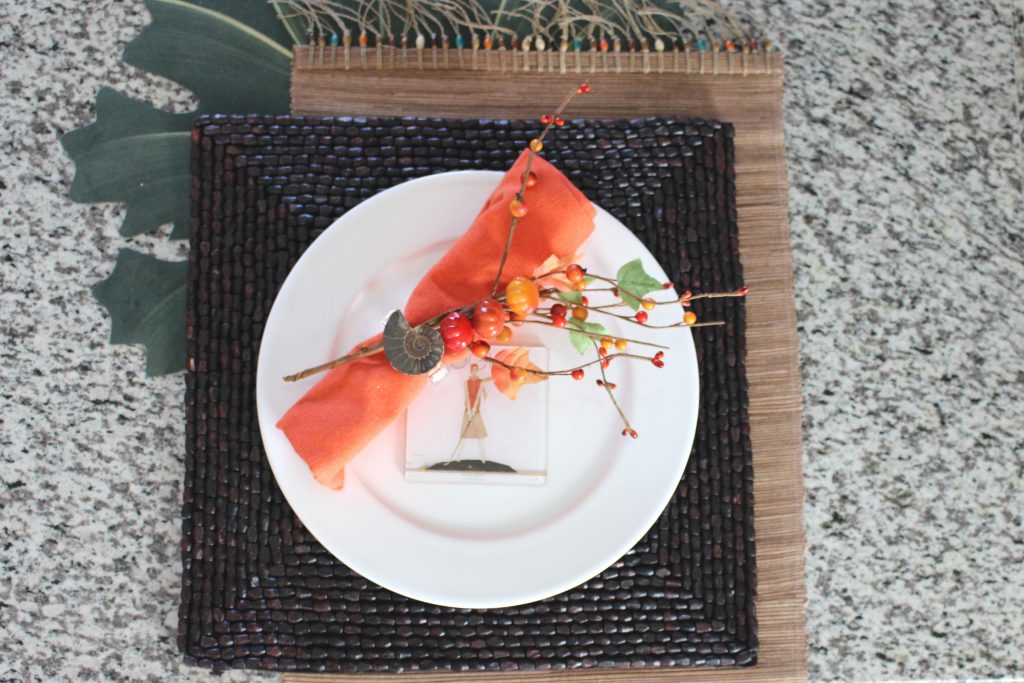
2. Gather natural items from your backyard, woods, or home. If you don’t have enough real items available to do all your fall decorating like me, then consider adding realistic looking decor or other items that reflect your personal style. In this table setting, I incorporated a couple of my favorite themes with found items at home including a real shell napkin ring and a fashion forward coaster. I also layered in three placemats I had at home to create an interesting base for the table setting. Then I tucked in berries to add texture and another pop of color to the existing orange napkin and white plate in my table setting collection.
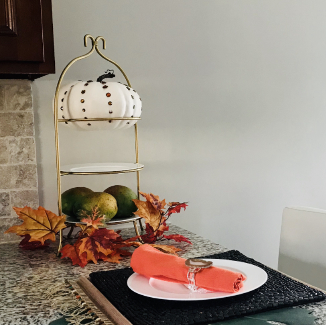
photo example

3. Began with taller items first at back of your fall decoration. Or center taller items if your decoration will be viewed from multiple angles. In this kitchen, I began with the tallest item at the back, the tiered plate and then added additional items to enhance it. But you could also layer in additional items that are mid-height to create a fuller look.

photo example

4. Fill out your decoration with foliage or other decor. In this tray I began with a bottom layer of petrified wood I found outside, and then layered in pinecones. But you could also introduce pine leaves.

5. Add final touches with pops of color. In this tray I introduced fall leaves and berries.

Need Decorating Advice?

Drop your questions below and we’ll answer them in an upcoming issue of our newsletter.

Subscribe now so you don’t miss it.

Interior Design/Interior Decorating

Interior Design: Tips for Selecting the Correct Size Rug…

Guidelines for Purchase the Right Size Area Rug for Your Living, Dining, and Bedrooms

rug example
Interior design by Karen Mills
  1. Living Room Rug Size – When selecting the right size rug for your living room, look for a rug that will hold all your furniture, but if that isn’t in the budget then ensure the feet of your upholstery sit on top of your rug at a minimum like shown here.  That’s important because a smaller rug or one that doesn’t sit up the feet of your upholstery will feel disconnected as though it’s just floating in your room.  Ideal sizes for living room rugs usually start at 8 x 10 or 9 x 12 sizes.

  3 Tips for Getting Cozy with Area Rugs

Karen Mills' blog rug example
Interior design by Karen Mills

2. Best Bedroom Rug Size – Interior design clients often have difficulty with understanding the concept of flipping an area rug the other direction when placing it under a bed but why that direction is so effective is because it allows the bedside tables to be included so they feel like a part of the focal point, making a more powerful statement.   When placing your rug under the bed lay it perpendicular to your bed ending right at the edge of the nightstands but not under them.  That placement will allow a few feet of the rug to still show beyond the base of your rug like shown.  Ideal rug size for a king size bed would be 9 x 12.

Karen Mills' blog rug example
Interior Design by Karen Mills

3. Best Dining Room Rug Size – As an interior designer I often see rugs that are just too small under the dining room table. Calculating this rug size can be tricky because you want two feet on each side of the table to allow room for sliding back the chairs from the table, but you also need to ensure the final rug size fits into your space like the one shown here. For more design ideas and photos, sign up for our weekly interior design blog here plus become a fan of Kansas City’s interior designer and former host of the Living Large design show, Karen Mills, on Facebook  and Instagram now! If you feel someone you know could benefit from this helpful information, pass it on.

Interior Design/Interior Decorating

Interior Design: 3 Enduring Design Trends

Porch photo
Interior Design by Karen Mills

  Post pandemic life at home has changed dramatically for most people around the world both inside and outside with work/life balance issues and the ability to destress becoming even more important.  Read on for what this interior designer believes is here to stay.  

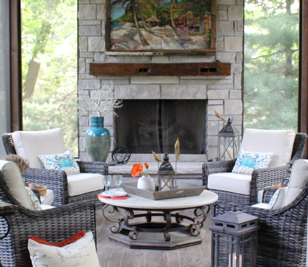
  1. EMPHASIS ON OUTDOOR ROOMS – Having the ability to go outside and just relax is key to our mental and physical well-being.  Not only does nature have the ability to create a calming effect on us emotionally, but it’s good for our physical health to get a little sunshine and Vitamin D every day, if only for a few minutes.  So why not create an amazing outdoor room like this screened in porch shown here with a heated floor and fans to enjoy almost year-round or even just a small space outside your home with a chair or two and table to just relax.
  2. ADAPTABLE INTERIORS – Making the most of each space is crucial now that we find ourselves often living and working in the same space.   When I was in the thriving metropolis of Istanbul years ago, the biggest difference I noticed about the interiors was what I call “Transformer Furniture”.   Sofas had hidden storage under the cushions and transformed into beds when needed as did chairs.  Everything had a functional purpose including screened in porches where clothes were hung to dry besides providing a space to enjoy the outdoors. Here in the United States, we need to shift our thinking to create more adaptable spaces or rooms also.  Using French or barn doors to close off part of the living room for an office, home theatre, or library gives you more options as situations change in your household.  Other ways to make your space adaptable could be hiding a desk area inside kitchen cabinetry, adding a murphy bed to a guest room you now need for an office, or enclosing a niche with barn doors in the basement to hide bunk beds for the grandkids.
example of modern
Interior Design by Karen Mills

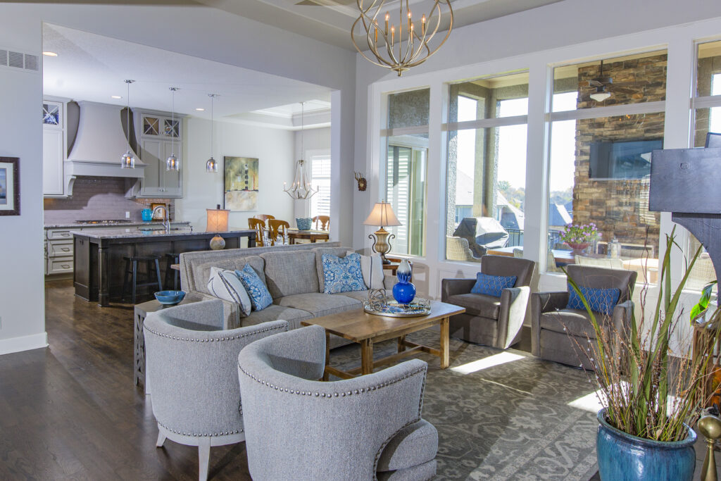
3. MORE CONTEMPORY MODERN DESIGN STYLE AESTHETIC – Furnishings and finishes in a lighter airer feel help create a more modern look that can be achieved by layering in more furniture with legs instead of visually heavier pieces.  Layering in more furniture with simple lines and more textural tone on tone finishes instead of busy patterns also help give a room a more modern vibe.  Of course, nature inspired patterns and real plants indoors continue to be popular with the emphasis on outdoors. Here the homeowners wanted to keep their beloved family heirlooms, but also wanted to bring a more modern updated look to their new house with an open floor plan.  That’s why we integrated more modern furniture into the room to give the space a more timeless appeal.

  If you’re looking for more custom interior design, decorating, or remodeling inspiration, ideas, and photos, sign up for our bi-monthly interior design blog here Plus become a fan of Kansas City’s interior designer and former host of the Living Large design show, Karen Mills, on INSTAGRAM and FACEBOOK here!

Interior Design/Interior Decorating

Imagine Living in a Contemporary Home Like The Ones…

Harmony in the exterior facade at Long Horizontal house

Here is part two of the 3-part series on interior design I promised you. Enjoy!

It doesn’t have to be a big house. It could be like the wood-framed, one-bedroom cantilever you see on Bosch, not much bigger than a Beverly Hills garage with breathtaking views of LA just over the edge of the hill. 

The irreverent detective’s modern house is perched precariously on three steel pylons at its mid-point like a delicate treehouse, floating above the city below. It’s all windows and glass and geometric angles. 

Meanwhile, driving through one of the most affluent neighborhoods in a different city in the midwest, the streamlined profile of another sleek, modern house is so smoothly integrated into the landscape that it is almost indistinguishable from it. At first glance, this architectural gem is functional and stylish with a futuristic vibe.  Dramatic lighting underscores the modular boxes that fit together like lego pieces to create artistic angles, intriguing juxtapositions, and sharp lines.

The house looks like someone ripped it from the pages of a glossy architectural magazine and dropped it on top of a mountain. This is consistent with the spirit of contemporary home design: personal expression and individuality.

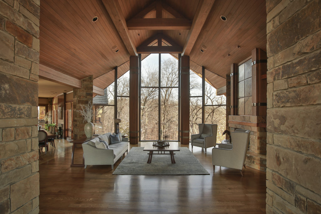
In this week’s feature story, the lead graphic showcases the contemporary mountain cabin with two-story ceilings, cinematic wood beams, and a rugged stone fireplace. 

Oversized lighting fixtures, bleached floors, and the ubiquitous but invisible presence of glass reinforce a feeling of openness. The naked eye can’t see where it ends, like an infinity pool, so our imagination fills in the blanks.

Once inside, you are surrounded by large open floor plans and intentional asymmetry, creating more visual interest than the predictable linear repetition of symmetrical shapes in traditional home design. 

Expansive floor-to-ceiling glass panes bring the outside into the interior living space. These homes incorporate the latest home design trends. Modern architects value functionality over aesthetics, removing unnecessary details that divert attention from primary focal points.

Modern homes are more than just a place to live and work. They reflect the people who live there and their unique styles, influenced by a blend of trends from different periods and cultures. The common thread that ties these design ideas together is a commitment to quality, craftsmanship, and durable relevance. 

We can trace the roots of modern architecture back to the 1893 Chicago World’s Fair and the cutting-edge buildings that cemented the role of the US as a world leader in art, architecture, and technology.

From modern furniture pieces carved out of natural materials like wood or granite stone to traditional designs utilizing dark rich woods and marble accents, the trend toward simplicity in design is likely to continue unabated for at least ten years. 

The next big breakthrough is integrating our rapidly expanding arsenal of technology into our sci-fi houses as seamlessly as built-in appliances, recessed lighting, and hidden storage areas. Office equipment is now hiding in plain sight.  It materializes when you need it and gets lost when you don’t. 

Don’t let Sonja Rudolf get started on that text thread. The commercial furniture expert at Vari is passionate about her mission to “elevate workspaces.” 

Rudolf told Life In Style during an exclusive interview that the home office is melding into a “real office with commercial-grade office furniture.” Check out our feature story about home office design in the last episode for more ideas.

Contemporary home office design sports clean lines with a simplistic “less is more” design philosophy. “Straight-lined simple design aesthetics with neutral earthy colors never go out of style, “ said Rudolf. 

Removing unnecessary design elements to spotlight the sharp edges may appear sparse, even impersonal, but many modern homes will welcome you into a warm and inviting interior. 

She cited the materials used in the construction and the interior design of the home – dark woods and marble with toasty accents of color.  

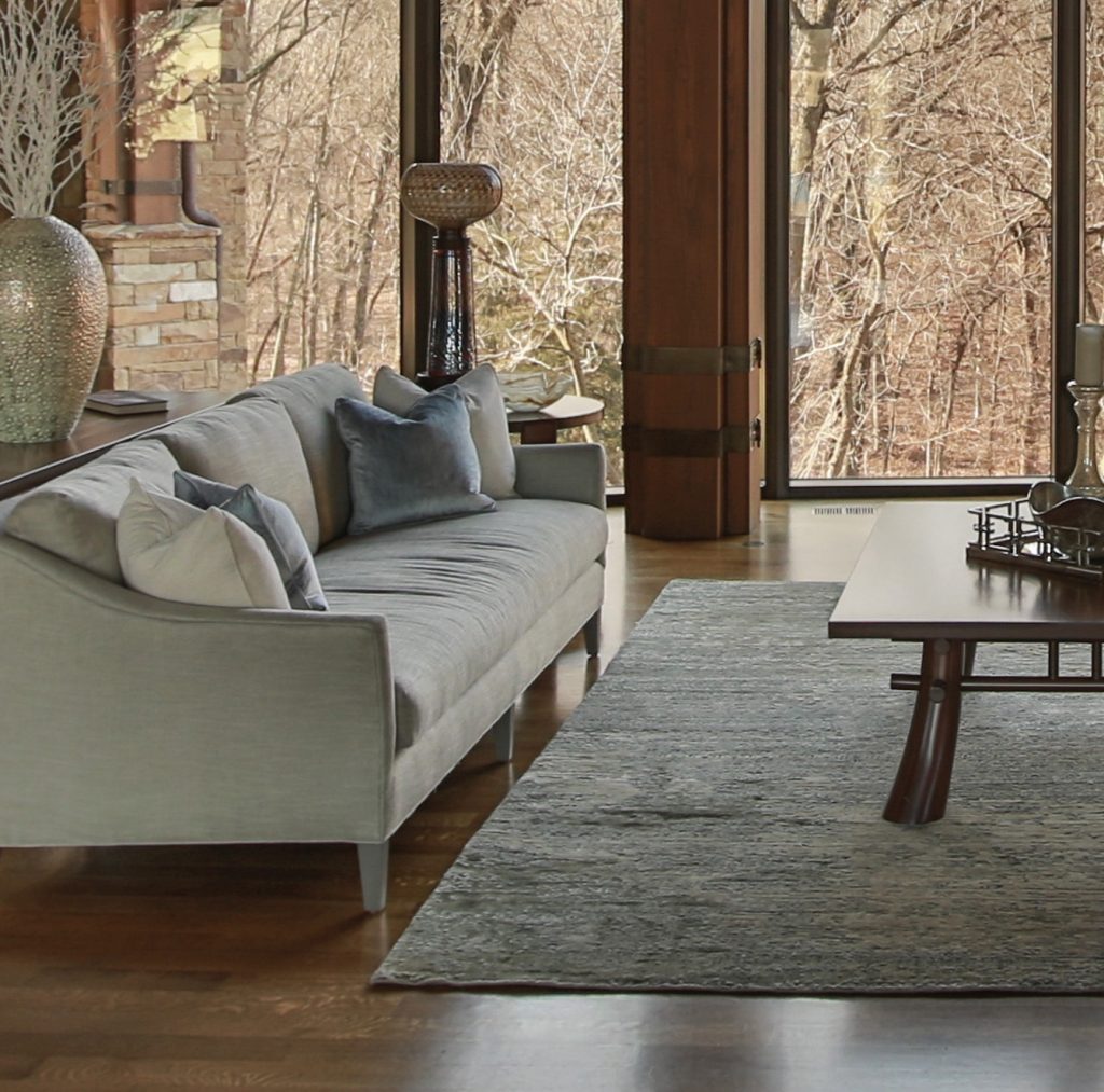
Karen Mills served as the interior designer on a Rustic lodge adjacent to a beautiful lake and forest. “The stunning home nestled between a private lake and woods yearned for a lighter color palette and more spartan furnishings to allow the outside views to take center stage, “ Mills told an international design magazine featuring her work.  

From country homes to beach houses, these ultramodern spaces are filled with edgy materials, bold lighting, streamlined furnishings, and even some pops of color, creating striking spaces. 

The contemporary home represents 21st-century architecture and design. It’s evolutionary, meaning it changes and grows as we do, constantly adapting to what’s new, intriguing, and trending in home design.

The primary distinction between contemporary homes and traditional homes is that they don’t have a predefined style. Modern homes borrow and adopt features from a diversified mix of international, minimalist, modern, and eclectic design styles that are unique yet still familiar.

While traditional architecture and design can be beautiful, they can also feel outdated and stuffy. According to Adam Grimsman, a mortgage banker at USA Mortgage in Overland Park, contemporary homes always feel fresh and current, and demand in this category is rising. 

“Many people want white lines, a nice clean space. We are seeing an uptick in loan applications for contemporary homes as they are more desirable to millennials and Gen Z,” he said. 

Contemporary home design often incorporates natural materials like wood, stone, metal, and glass. This design tends to be more energy-efficient than traditional designs, making it a popular choice for eco-conscious homeowners. We will delve more into that topic next week. 

Popular shelter magazines like Elle Decor, Architectural Digest, and House Beautiful celebrate phenomenal modern home designs. They showcase inviting spaces that feel both contemporary and timeless. 

“When considering a contemporary design approach, my core belief is that good planning and design of space has a direct and positive impact on our quality of life,” said Lior Brosh, owner of UK-based Brosh Architects in Borehamwood, England.  

Brosh recently completed a project in Notting Hill, London for a client who wanted a bright space with a contemporary aesthetic that still felt calm, warm, and homey.  

From streamlined lighting and plumbing fixtures to cool doors, water features, sculptures, window treatments, and oversized address number treatments to dramatic special effect landscape lighting, contemporary design can be stunning.  

Another popular trend is bold geometric shapes in both furniture and architecture. These accents can add tons of visual interest to any space. Once you get comfortable with all the photographers in your living room and cars slowing down to get a closer look at your house, you’ll be fine!

Life in Style, the weekly Publication from Team Real Estate is dedicated to helping homeowners make more inspired decisions about their homes and lifestyles. It features original news, commentary, tips, and analysis from leading industry experts. To be considered for inclusion in future stories, email  lifeinstyle@teamre.com

Interior Design/Interior Decorating

Interior Decorating: 3 Design Tips for Cozying Up Your…

Ideas for Creating a Comfortable Nest at Home

Karen Mills' blog
Interior design by Karen Mills.

1. Comfortable seating.  As an interior designer I recommend selecting high quality upholstery with upgraded cushions that will provide comfortable seating for hours at a time, while also making sure the sofa fits your body type from the seat height and depth to level of cushioning desired and style of seating cushion needed.

In this room we went with high quality custom furniture that you can sink into while enjoying the incredible views. We included a branch style fabric pattern on the sides of the chairs to tie them into the outdoors beyond.  3 Tips for a Budget Living Room Makeover

rug sizing example
Overland Park interior design by Karen Mills

2. Create a Cozy Conversation Area When we put together a floor plan for a living area, we should focus on designing intimate seating areas like this one shown to create a relaxing comfortable space. Adding an area rug underneath helps define the space and cozy pillows enhance the feel. 3 Big Design Mistakes We Make in Living Rooms

Karen Mills' blog
Interior design by Karen Mills

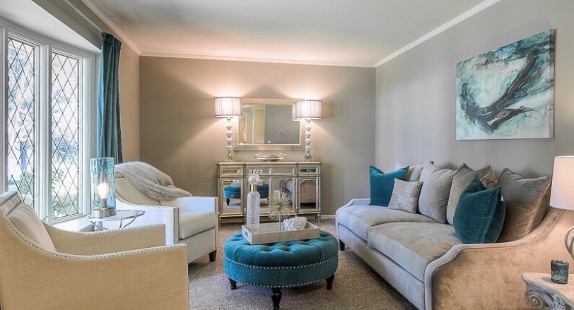
3. Layer in texture  Texture can be added with fabrics, soft window treatments, decor, rugs, or art. In this intimate living area, drapes, pillows, and a throw bring texture into the space along with a fabric ottoman, tray, and artwork.

Looking for more great ideas that you can implement?  Sign up for our weekly interior design blog here

Plus become a fan of Kansas City’s interior designer and former host of the Living Large design showKaren Mills, on Facebook  or Instagram now.

Interior Design/Interior Decorating

Interior Decorating: How to Use Your Favorite Hue at…

Tips for Injecting Your Favorite Color into Your Interior

example
Interior design by Karen Mills featured by Design Icons book

Did you know that your favorite color gives experts insight into your personality type? As an interior designer who’s been in over 1200 homes I can get an immediate sense of someone’s personality just by looking at the styles and colors of clothing in their closet or by walking through their home interior when we first meet.

You may be wondering how that’s possible, but all of us experience color in different ways as we progress through life creating an unique color story that’s all our own. Lea Eiseman, the world’s leading color expert and a regular guest on my former design show Living Large, shared why that’s true in one of her renowned color books, “…much of color knowledge is based on instinctive responses, cultural conditioning, and those aspects of color that we seem to absorb without much conscious thought.” Read on to gain insight about your favorite color, what it says about you, and ideas for injecting that color into your home’s interior.

Karen Mills' blog
Interior design by Karen Mills

RED

If you love red like I do you live life to the fullest with a passion and intensity that others don’t possess. You’re exciting, daring, and spontaneous, but also have an inner drive to excel at everything you do. So how does that color translate into an interior design? The color red that we associate with blood, instantly raises your blood pressure and grabs your attention so remember that a little bit goes a long way in a room! 

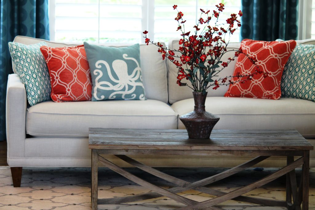
In this great room orange red pillows and flowers pop against the white sofa creating an exciting tension and bold contrast, while the custom blue draperies we designed introduce a secondary color that’s cooler and more restful.

Alternately, soft pink lovers tend to be charming, peace loving, and romantic types who carry some of the same traits as the red/bright pink.

example of comfortable seating
Interior design by Karen Mills featured in Architecture Today Interior Design book

BLUE

An extension of sky and water, blue exudes stability and calm making it a perfect color for bedrooms or other areas where you want to unwind and relax. Lovers of this color tend to be dependable, responsible citizens who do the right thing. No wonder blue still remains the favorite color of men!

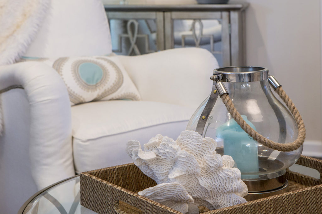
In this close up photo of a family room we designed, a watery blue pillow and candle join forces with rustic beach elements – a shell and rope – to create a wonderful ocean vibe in this space. 

YELLOW

Yellow like a ray of sunshine portrays warmth, cheerfulness, and optimism making it a wonderful hue for a cheery kitchen, sunny living area, or any interior lacking sunshine and warmth. Huge fans of yellow are optimistic, warm, and playful, while also being inquisitive and encouraging to others. 

example
Interior design by Karen Mills featured in Design Icons book

ORANGE

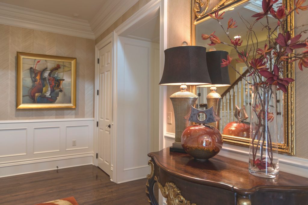
As an orange enthusiast you share an enthusiastic zest for life, outgoing personality, sense of humor, bright outlook, and longing for adventure. Orange, known as the color of hunger, fits perfectly into a dining room or kitchen eat in area where you need some energy or more life. But that’s not all as you can see in this foyer where we sourced an original Mattini painting and pulled out the orange hue as as the main accent color on our custom designed rug, original ceramic art piece, and flowers, while also repeating a golden hue from the art on the wool rug and and handmade chevron wallpaper to add more interest.

Interior design by Karen Mills featured in Design Icons book

GREEN

Green, the color of nature exudes calmness and warmth, which makes it a great color for bedrooms or spaces where you need a more relaxed feel like a sun room, den, or library.  Enthusiastic fans of green are usually warm, kind, and charitable people who like to give back to their communities. Green fans also bring stability and loyalty as additional attributes.

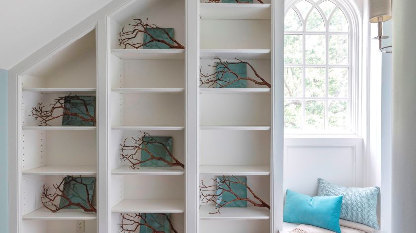
Here in this stunning foyer we designed that was featured in the international Design Icons book, we repeated the blue green plates with branches overlaid on the white shelves to create a dramatic but also calm entrance into this third floor foyer aptly named The Flat after our client’s London home.

PURPLE

A complex and creative type of individual, purple lovers are fascinating observant individuals who often have a generous spirit and artistic flair. Purple, the favorite color of most children, also has a mysterious air about it making it popular with artists or creatives too. In interiors purple usually works best as a light or a very dark almost neutral hue wall color or as an accent in any shade. 

Interior Design by Karen Mills featured in Architecture Today Interior Design Book

BROWN

Brown personalities tend to be down to earth, stable, and in harmony with life around them, while still appreciating quality. Brown lovers like to keep things simple, secure, and peaceful, but that doesn’t mean they aren’t cosmopolitan. Brown hues work great for your interior if you’re looking to create a grounded space that’s also cozy and inviting whether its a living room, dining room, den, or even a bedroom.

Beige, a lighter version of brown speaks of someone who is warm, reliable, and doesn’t often rock the boat. As a light neutral this color can be introduced almost anywhere including combining it with gray for a cool/warm color combination. 

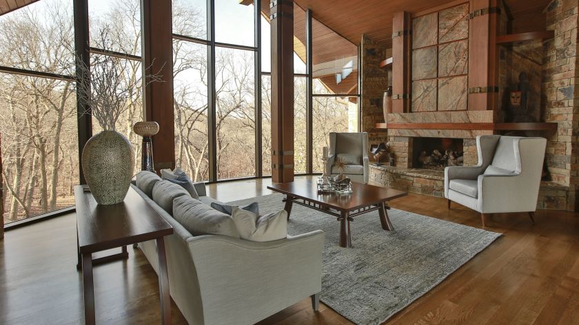
Here in this stunning rustic great room we designed that was featured in the international book Architecture Today Interior Design, warm browns wrap around the room like a big hug, creating a welcoming feel.

White

Did you know that white is the sum of all other colors combined? Isn’t that amazing? As an interior designer I love that white can do so much in a room’s interior design from creating more contrast and bouncing light around a room to visually expanding it. But white also signifies innocence, cleanliness, and purity so you may notice that white hue lovers sometimes have the same characteristics in their neatly organized and well kept homes or crave the innocence of their youth.   

In this hearth area renovation we darkened the floors to contrast against the white walls and trim we introduced. Then we continued the white theme by slip covering dining chairs, upholstering arm chairs, layering in pillows with white backgrounds, putting in white/gray marble tile, and adding a table we had white washed that was formerly a door.

Gray

The gray personalities that I’ve experienced are content to be calm, cool, and collected. They prefer to stay out of the limelight, opting instead for safety, security, and practicality. That’s why I believe as an interior designer that gray color schemes have become so popular at home for years because this color creates a calm respite from the outside world and works well in almost every room.

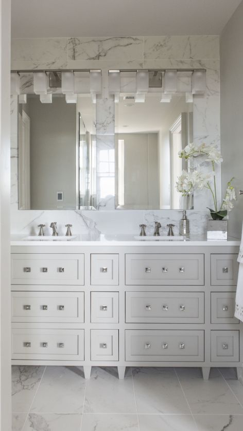
In this gorgeous high rise master bathroom we designed, gray from the Italian marble style tile repeats again on the custom designed vanity and walls. White quartz counters, square knobs and a tiled wall enhance the look of this small but stunning space.

BLACK

Don’t know if you aware of this little known fact, but black is completely void of color, the opposite of white. Of course we all know that the black suit signifies sophistication and status in the business world, but black color hue aficionados are also confident in their ability to hold a conversation, clever in their communication abilities, and make security a top priority in their lives. Black is a wonderful color for interiors, especially when combined with white and can used throughout your interior from living, dining, and powder rooms to home theaters, or on doors/trim to create a dramatic look.

So what if your favorite color is a combination of two colors. If that’s the case, simply combine the traits associated with each color for a picture of your personality.

To summarize, colors whether worn or used in your interior reveal insight into your personality and life story. And when you utilize your favorite color in your home it can bring back wonderful memories that cradle you in comfort whether its on the walls, ceilings, floors or furnishings. 

For more great interior design ideas, sign up for our design blog here!

plus become a fan of Kansas City’s interior designer and former host of the Living Large design show, Karen Mills, on Facebook  and Instagram now!

If you feel someone you know could benefit from this helpful information, pass it on!

Interior Design/Interior Decorating

Interior Decorating: 3 Tips for Selecting the Right Size…

A Designer’s Secrets to Picking the Right Rug for Your Room

example
Interior design by Karen Mills
  1. Best Living Room Rug Size – When calculating the ideal size for an area rug for your living room, try to find a rug that lays underneath ALL of your furniture in the room. But if you want to show off more floor or save money, you can also buy an area rug where only the front feet of your upholstered furniture sits on top of the area rug like shown here.
Karen Mills' rug sizing example
Interior design by Karen Mills

The last option and definitely least preferred by the interior design and rug community is to place a smaller rug in front of your sofa but not under the feet. Please note however, that this example is a larger rug that would actually work under the feet of the sofa and chairs nearby (not shown).

3 Tips for Getting Cozy with Area Rugs

Karen Mills' blog rug example
Interior design by Karen Mills

2. Best Bedroom Rug Size – Interior design clients often have a difficult time understanding this concept but a bedroom area rug should be large enough that it can be laid perpendicular under your bed just up to the edge of the nightstands without sliding under them and still have a few feet showing at the bottom of the bed like shown.

Karen Mills' blog rug example
Interior Design by Karen Mills

3. Best Dining Room Rug Size – As an interior designer I often see rugs that are just too small under the dining room table. Calculating this rug size can be tricky because you want two feet on each side of the table for room to slide back the chairs, but also need to ensure the final rug size fits into your space like the one shown here.

For more design ideas and photos, sign up for our weekly interior design blog here

plus become a fan of Kansas City’s interior designer and former host of the Living Large design show, Karen Mills, on Facebook  and Instagram now!

If you feel someone you know could benefit from this helpful information, pass it on.

Interior Design/Interior Decorating

Interior Design: 4 Tips for a Kitchen Refresh

If a kitchen remodel isn’t in your future because of either lack of budget or not recouping your investment in your current home, then why not consider what I like to call as an interior designer a KITCHEN REFRESH! Read on for my 5 tips for giving your kitchen a budget friendly makeover below.  

example of blog topic
Interior design by Karen MIlls

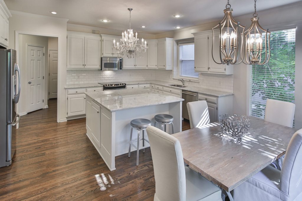
1.Paint both your kitchen cabinets and walls to give your entire space a fresh new look. In this kitchen refresh the dated stained cabinetry and dark walls were painted much lighter white colors that bounced light across the room, making it appear larger. Dark counter tops were also replaced for light ones.

To save money and not waste perfectly good granite our client re purposed the darker counters to a new basement bar where they were a perfect fit! Then to bring in more light we installed an existing chandelier the client loved and added new mini chandeliers over the eating area where we had the door repurposed as a tabletop painted and slip covered the existing dark leather dining chairs. The transformation was amazing!

Karen MIlls' blog
Interior design by Karen Mills

2.Replace your dated back splash along with counter tops – After working on over 1300 interior design projects we’ve realized that most homeowners planning a budget kitchen remodel typically omit replacing their back splash. Unfortunately an old back splash instantly reveals just how old the kitchen is and that’s why as an interior designer I recommend replacing it at the the same time.

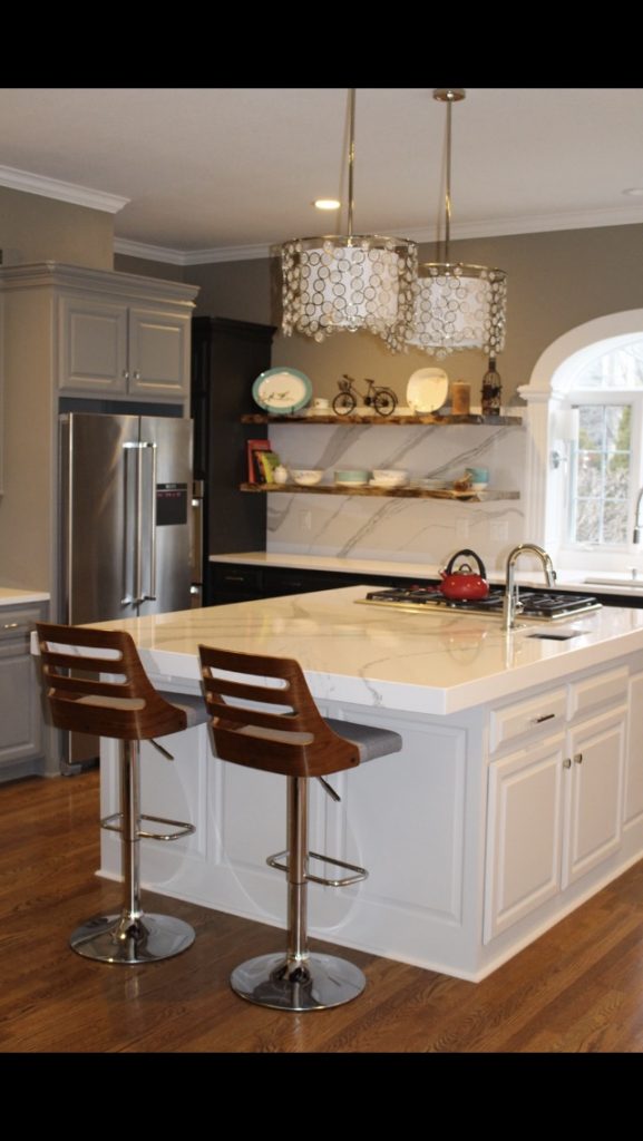
In this playful and creative Leawood kitchen makeover, we replaced the dark granite counter with white mitered (thick) quartz counters on the island and ran the same quartz up the walls behind the cabinetry instead of traditional backsplash tile to add drama and interest. Then we painted the existing cabinets three different shades of gray, added new mini chandeliers, and tore down a few upper wall cabinets so we could layer in live edge shelves to create a fun focal point.

3. Introduce new counter or bar stools  In addition to the new live edge shelves the client in this kitchen purchased contemporary counter stools that really pop against the gray and white color scheme while adding a little warmth with the wood tone. New stools that contrast against your island or peninsula can have a huge impact on your kitchen without a big investment.

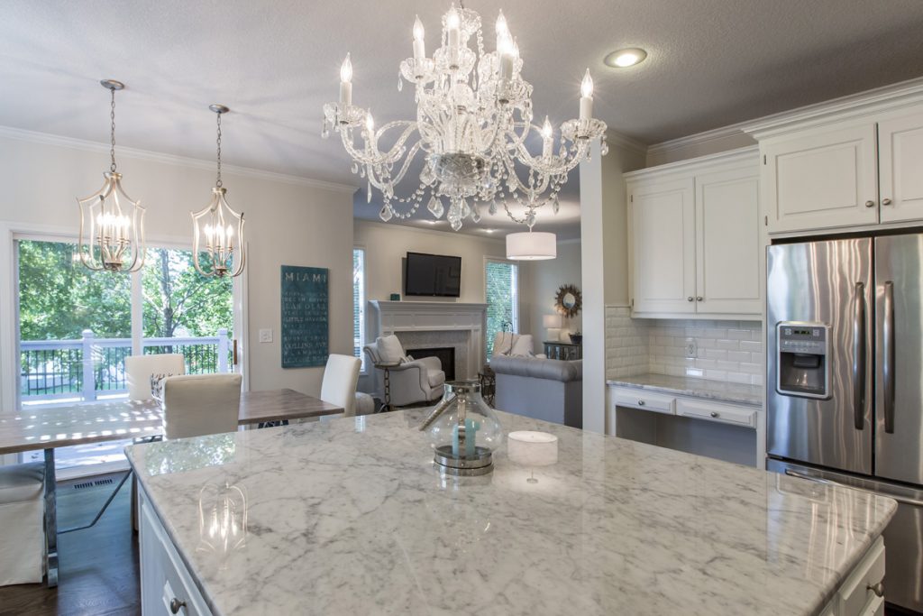
4. Replace dated chandeliers or pendant lights – By updating your light fixtures you can make a great impression walking into your kitchen where the fixtures are usually front and center over an island or table like shown here.

To help these new mini chandeliers and the drum shade beyond in the hearth area blend seamlessly with the existing chandelier in this Overland Park kitchen the client wanted to use in this space, we went with lighter finishes – champagne on the mini chandeliers and silver on the drum shade.

For more great ideas and photos, sign up for our weekly interior design blog here

Plus become a fan of Kansas City’s interior designer and former host of the Living Large design show, Karen Mills, on Facebook or Instagram here!

Interior Design/Interior Decorating

Interior Decorating: 3 Ways to Cozy up Your Bedroom

Often we take sleep for granted until we start to have problems with concentration, alertness, or our overall ability to function well. Then good sleep becomes more of a priority. Read on for 3 ways to create a nest like atmosphere in your bedroom that’s conducive to better sleep.

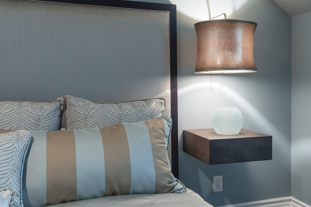
Interior design by Karen Mills featured in international book titled Architecture Today Interior Design
  1. Simpler Bedding and Patterns As an interior designer in Kansas City I’ve used simple tone on tone patterns and texture in bedrooms for years in everything from fabulous washable linens from Italy to textured velvet or sheared fabrics like we’ve seen recently in fashion wear. Here in this Overland Park bedroom Italian bedding from Terrasi Home on the Plaza in simpler patterns, textural finishes and clutter free space create a stress free environment where we can unwind and relax.
Karen Mills' blog
Interior design by Karen Mills featured in international book titled Architecture Today Interior Design

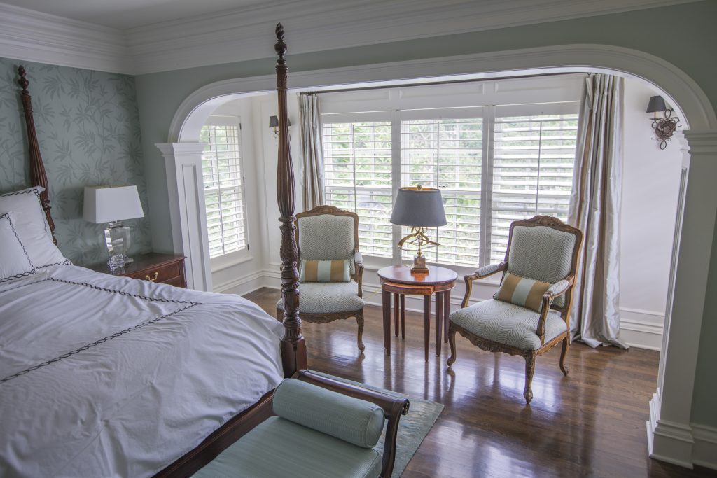
2. Cozy Beds  Beds that envelope us will continue to be popular whether its are a four poster bed, an upholstered bed like this guest room in Mission Hills, or a fabulous combination of both. In this guest room calming colors and patterns, low lighting, and clean lined furnishings enhance the overall feel, creating a beautiful interior design.

Karen Mills' blog
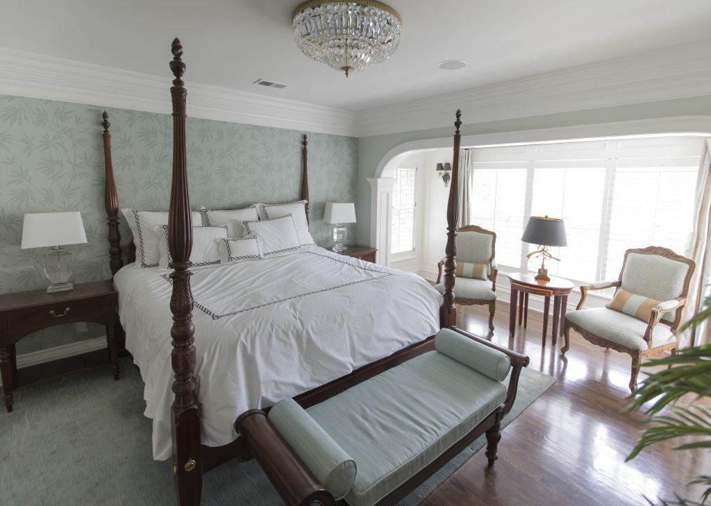
Interior design by Karen Mills featured international book titled Design Icons

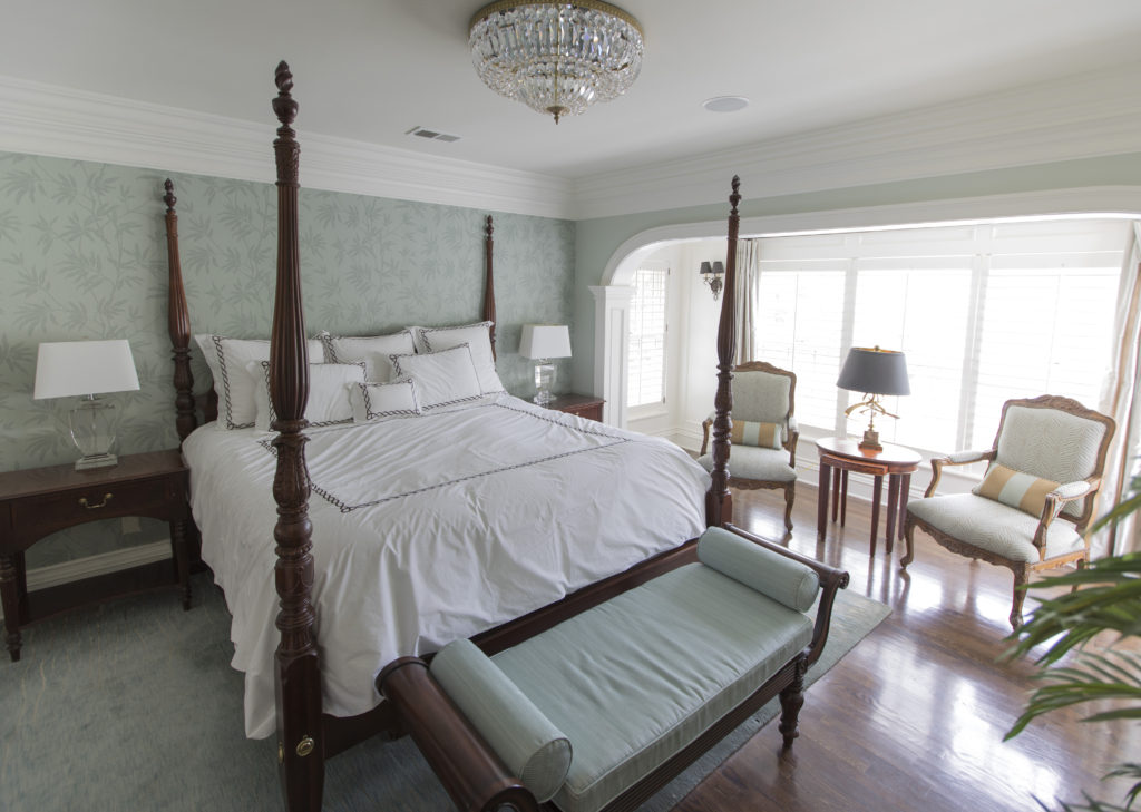
In this bedroom we designed a four poster bed creates a cozy feel
while the wallpaper, area rug, upholstered bench, and simpler fabrics on the chairs beyond enhance the relaxed inviting feel of this beautifully designed master bedroom in Mission Hills.

Karen Mills' blog
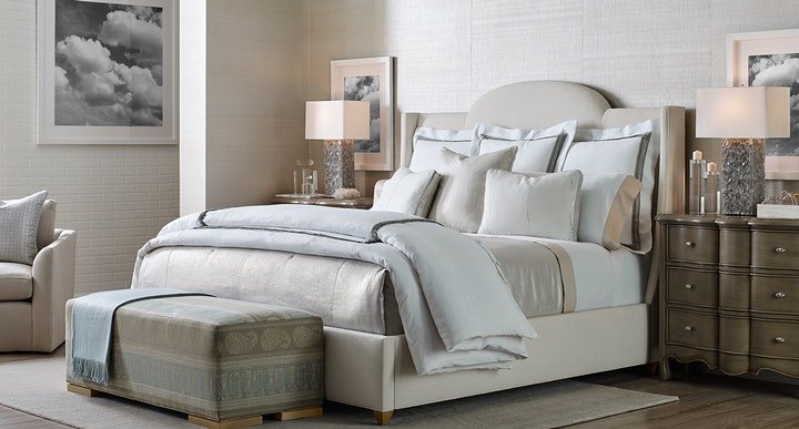
Photo courtesy of Curated Kravet


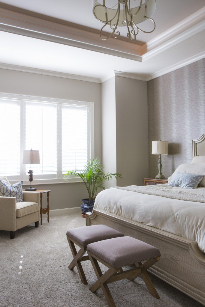
3. Textured Walls  Painted accent walls have been a craze for years but wrapping the whole room in textural walls are becoming more popular. In this interior design space featured by Curated Kravet an upholstered bed, area rug, bench, throw, and bedding add to the cocoon feel created by the gorgeous textural walls enveloping the space.

For more inspiration, ideas, and photos, sign up for our weekly interior design blog here.

For more information on how to get better sleep and create a healthier environment, learn more at SLEEP BETTER LIVE BETTER now!

Plus become a fan of Kansas City’s interior designer and former host of the Living Large interior design show, Karen Mills, on 
INSTAGRAM and FACEBOOK here!

Interior Design/Interior Decorating

Interior Decorating: 7 Tips for a Delicious Dining Room…

Karen Mills' blog rug example
Interior Design by Karen Mills

1. Select Your Personal Design Style –  If  you have no idea what style you are start by finding inspiration photos online or in print.  Then notate your favorite elements from each room to get a sense of your style.

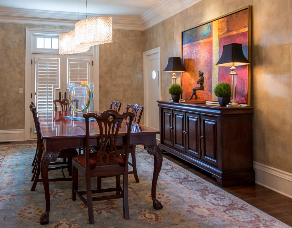
Using existing furniture, we added personality to this room by introducing a stunning crystal chandelier by Schonbek along with an original abstract painting and sculpture, hand knotted rug, custom seat covers, and wallpaper.

Karen Mills
Styling by Summer Ann of Girlsinmadras.com

2. Pick  a Color Scheme –  Most of us don’t spend much time in a dining room so have fun in here and pick colors you love.  Bolder colors can go on decor, rugs, chairs, or even walls but if you like to change up your style often, you might consider neutral walls and floors that give more flexibility when you want to change your color scheme.

3. Add Dining Table and Seating –  The dining room table and chairs along with the items directly behind them are the focal point of your room.   Begin by determining how many people you need to seat and ensuring you have room for the table you want.  Plus remember that your chairs don’t need to match your table, just enhance them.

If you opt for a dramatically styled table, then consider simpler style chairs and backdrop.  Or if you go with a simpler style table, you might bring in drama with a wall covering or beautiful buffet with art above.

Karen Mills' blog
Interior decorating by Karen Mills

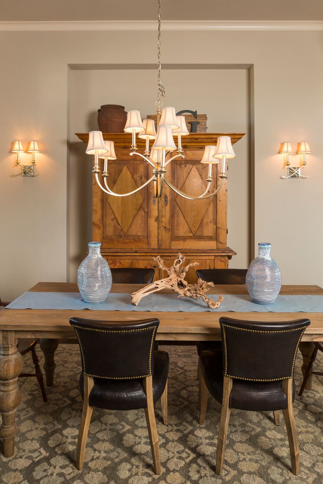
4. Consider Including Additional Furniture –  The majority of dining rooms benefit from functional storage furniture like a buffet and curio cabinets or an antique armoire like shown in this photo, but remember sofa tables, tea carts, and other furnishings can also enhance your room and provide handy surfaces for lamps, platters, trays, or display.

 5. Introduce a Dramatic Element – A bold element can range from a gorgeous piece of art and beautiful buffet to a stunning light fixture over a painting or interesting chair backs and wallpaper like shown here.

Photo courtesy of Kravet

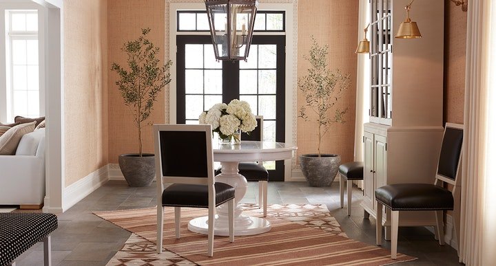
6. Layer in Texture  – Adding texture softens all the hard surfaces of the table, chairs, buffets, and hard flooring.   Texture can be introduced with an area rug, drapes, fresh flowers, and live trees/plants like shown here in this beautiful space.

7.  Add lighting –  Table lamps on a buffet or sofa table look beautiful behind a dining table along with a stunning chandelier and/or sconces on the wall behind. In this dining room courtesy of Kravet, the over sized chandelier commands attention, while the sconces on the right enhance the overall lighting and design scheme.

For more great ideas and photos, sign up for our weekly interior design blog here

Plus become a fan of Kansas City’s interior designer and former host of the Living Large design show, Karen Mills, on Facebook or Instagram here!