Interior Design/Interior Decorating

Interior Design: 5 Big Mistakes We Make in the…

If you’re thinking about remodeling or designing a new home, read on to learn about some of the biggest mistakes people make when designing a kitchen.
Karen Mills' blog
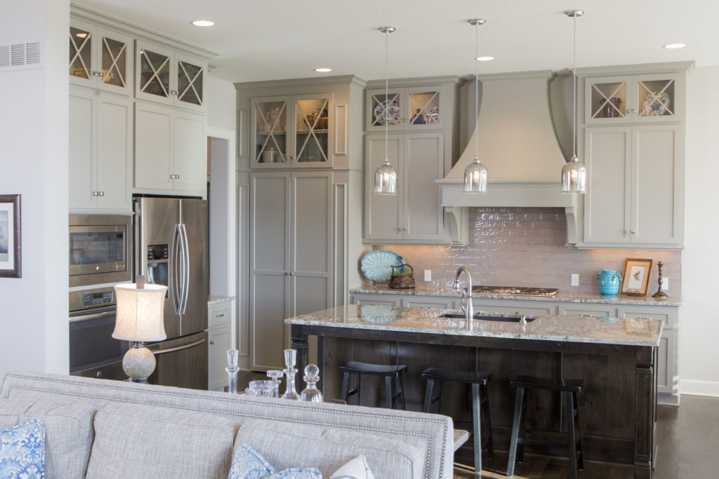
  1. Work Area Not Functional – Creating a functional layout is the first step to kitchen design that works whether you’re designing for a new home or doing a kitchen remodel. Here in this interior design client’s kitchen a work area with the stove, refrigerator, and sink in an accessible triangle and distance reduces the number of steps required when cooking and easy access.
Karen Mills' blog
Interior design by Karen Mills

2. Wasting Potential Storage – Countless storage options exist so there’s no reason to waste space in the kitchen especially with the adaptive kitchen storage units that make drawers and cabinets more functional from trash pullouts to roll out shelves. Here in this fabulous historic Walnuts condo where space is at a premium, we added pegged drawers under the stove for pots/lids, hidden pop open storage under the island. and used the extra space we gained straightening out a crooked back wall to create a coffee bar and pantry area that’s also draws you into the space.
Karen Mills' blog
Interior design and remodel by Karen Mills

3. Work Area Too Crowded- As an interior designer I’ve lost count on how many times I’ve walked into a home that didn’t have enough work space. Even though the recommended distance between an island and wall cabinetry is at least 42-48″ usually I find that the minimum required distance of 36″ is often the reality of existing kitchens, resulting in a space that’s too cramped and not functional. Other issues I often encounter with interior design clients are kitchens where drawers or refrigerator doors can’t open to function correctly.

Here in this kitchen we widened the walking area and made sure counter space was provided where needed whether to set down groceries or items from the dishwasher or room to simply bake a pie.
Karen Mills' blog
Interior design by Karen Mills

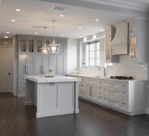
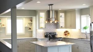
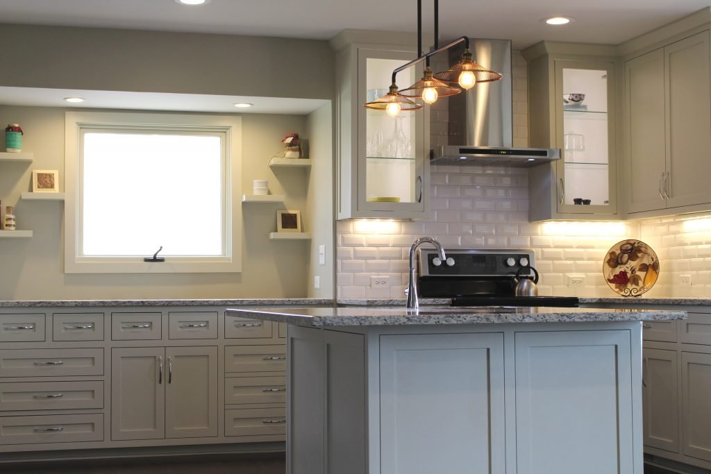
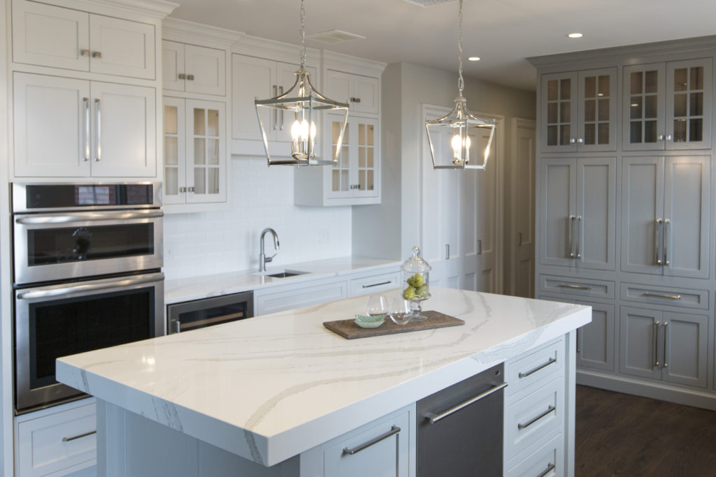
4. Lack of right lighting –  If your new kitchen doesn’t have a mix of general, task, and accent lighting, it will tend to be a little lackluster in appeal and probably function. Here in this kitchen design, I created a kitchen with can lights for general lighting, added puck lights tucked away inside the glass cabinets for accent lighting and interest, plus introduced mini chandeliers over the island that not only provide accent lighting but also task lighting for working in the kitchen.

Karen Mills' blog
Kitchen refresh by Karen Mills

5. Not bringing in a professional –  Hiring a professional kitchen designer with experience who creates kitchens and bathrooms for a living can help you avoid costly mistakes, free up your time, and create the space of your dreams, while ensuring your space is functional. In this kitchen refresh where we reused most of the existing cabinetry, we were able to introduce new elements that created a wow factor – bigger airy light fixtures open shelving, counters that continued up the wall, a mitered edge island counter top, and bold cabinetry colors, to create a fresh new look showed off our client’s creative spirit while ensuring the space would well for them.

For more inspiration, ideas, and photos, sign up for our weekly interior design blog here.

Plus become a fan of Kansas City’s interior designer and former host of the Living Large design show, Karen Mills, on 
INSTAGRAM and FACEBOOK here!
Interior Design/Interior Decorating

Interior Decorating: 3 Biggest Mistakes We Make in the…

Karen Mills' blog
Interior design by Karen Mills

1. Lack of a Focal Point – Often as an interior designer I walk into a bedroom to discover a stark cold space that has no focus. Your bed is the focal point of the bedroom and the area you want to emphasize.

Here in this beautiful inviting bedroom we enhanced the existing poster bed with crisp white bedding, a gorgeous calming textural leaf wallpaper, and a warm hand knotted wool rug.

blog photo
Photo courtesy of Kravet

2. Uninviting – Often a bedroom becomes a dumping ground for everything we need to put away or even worse our home office space so to begin remove everything that’s not bedroom related.

In this space by Kravet, simple timeless bedding, a cozy bed that envelopes you and simple furnishings help create an inviting space.

Karen Mills' blog
Interior design by Karen Mills

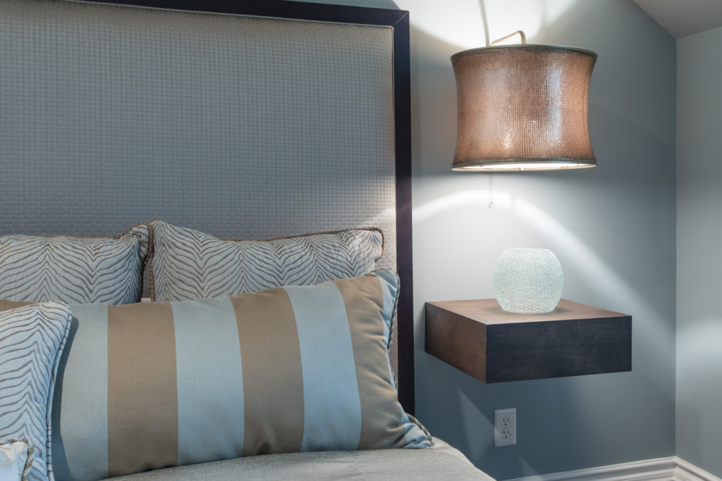
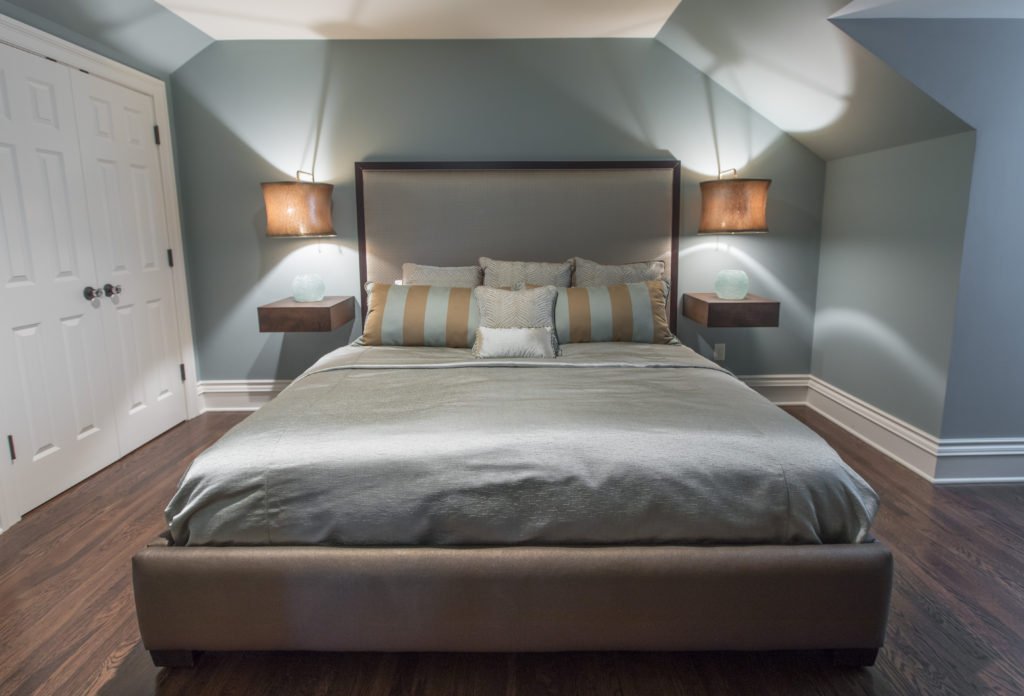
3. Too Cluttered or Crowded – In this smaller attic bedroom we didn’t want the room to feel crowded or cluttered with the king size mattress the clients needed so we designed a bed that didn’t overwhelm the room. Floating tables we designed along with light fixtures we adapted to hover over the tables gives a more open airy feel to the space.

Looking for more great bedroom design or decorating ideas?  Sign up for our weekly interior design blog here,

Karen Mills' blog

Plus become a fan of Kansas City’s interior designer and former host of the Living Large design show, Karen Mills, on 
INSTAGRAM, FACEBOOKTWITTER, or LINKEDIN here!

Interior Design/Interior Decorating

Interior Decorating: 3 Biggest Mistakes We Make in the…

Interior design by Karen Mills featured in two international books
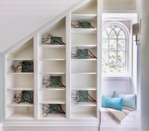
  1. Unwelcoming  –  If you want your guests to feel welcome then its important to create an inviting interior design like this entry where you are greeted by natural light, soothing colors, interesting patterns and textured materials like the pillows, throw, and branches.
Interior Design by Karen Mills

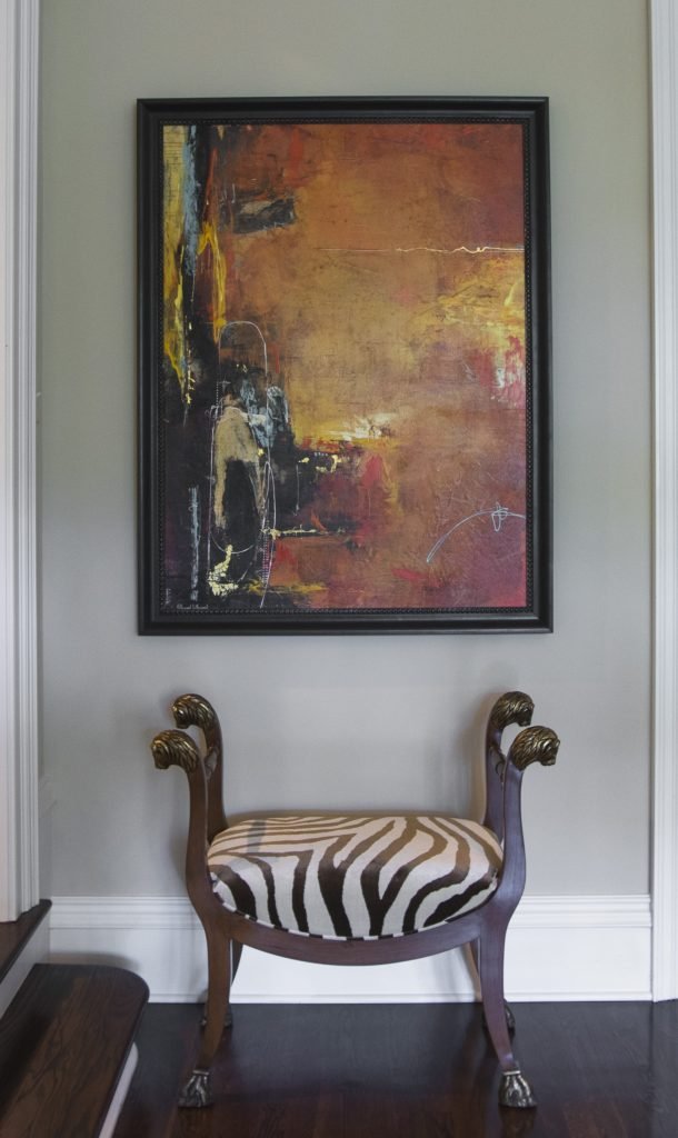
2. Zero Personality – As an interior designer I can’t repeat enough the importance of showcasing your personal style in the foyer. The entry has become the most important area in your home because it gives people an idea of your personality and taste. In this foyer we showcased the clients’ love of animal prints on this traditional custom designed stool while also pairing it with abstract art to reveal their unique style and great taste.

Karen Mills' blog
Interior design by Karen Mills featured in Architecture Today Interior Design book

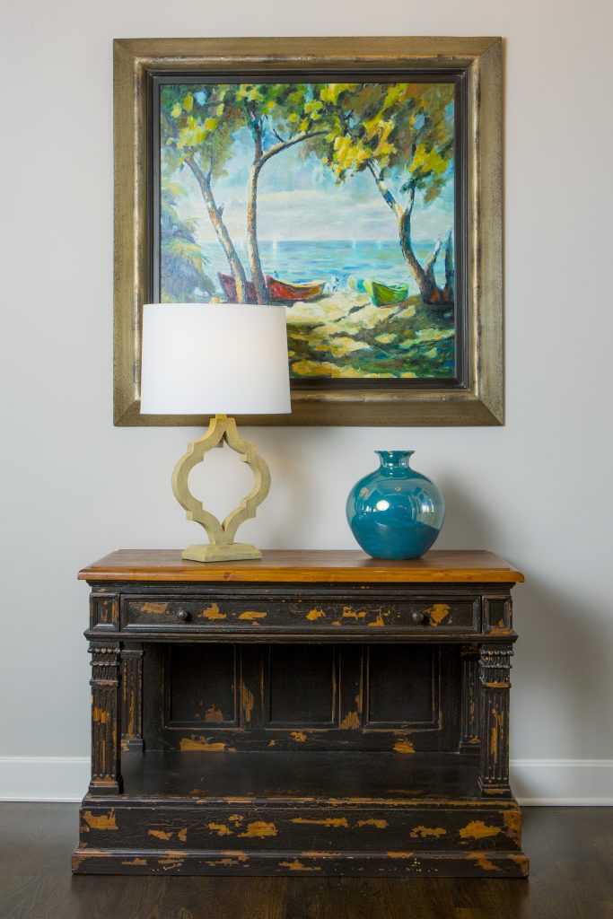
3. Lack of Intrigue   I always tell our interior design clients to think of their foyer as the advertisement for their home because your entry should give visitors a glimpse into what’s coming next from colors and style to personal mementos like this entry where we began with a family heirloom piece and dressed it up with a beautiful landscape painting, vase, and lamp that gives you a preview of the color scheme and what’s next.

For more inspiration, ideas, and photos, sign up for our weekly interior design blog here.

Plus become a fan of Kansas City’s interior designer, former host of the Living Large interior design show, and coach Karen Mills, on 
INSTAGRAM and FACEBOOK here!

And for more foyer inspiration, click here to read my Houzz interior design article on Color Palettes for Pleasing Entryway

or my budget tips titled Refresh Foyer for Less

Interior Design/Interior Decorating

Interior Decorating: 3 Big Design Mistakes We Make in…

rug sizing example
Interior design by Karen Mills
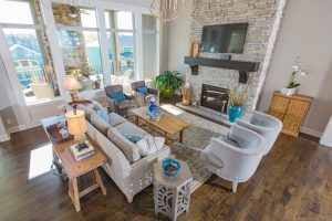
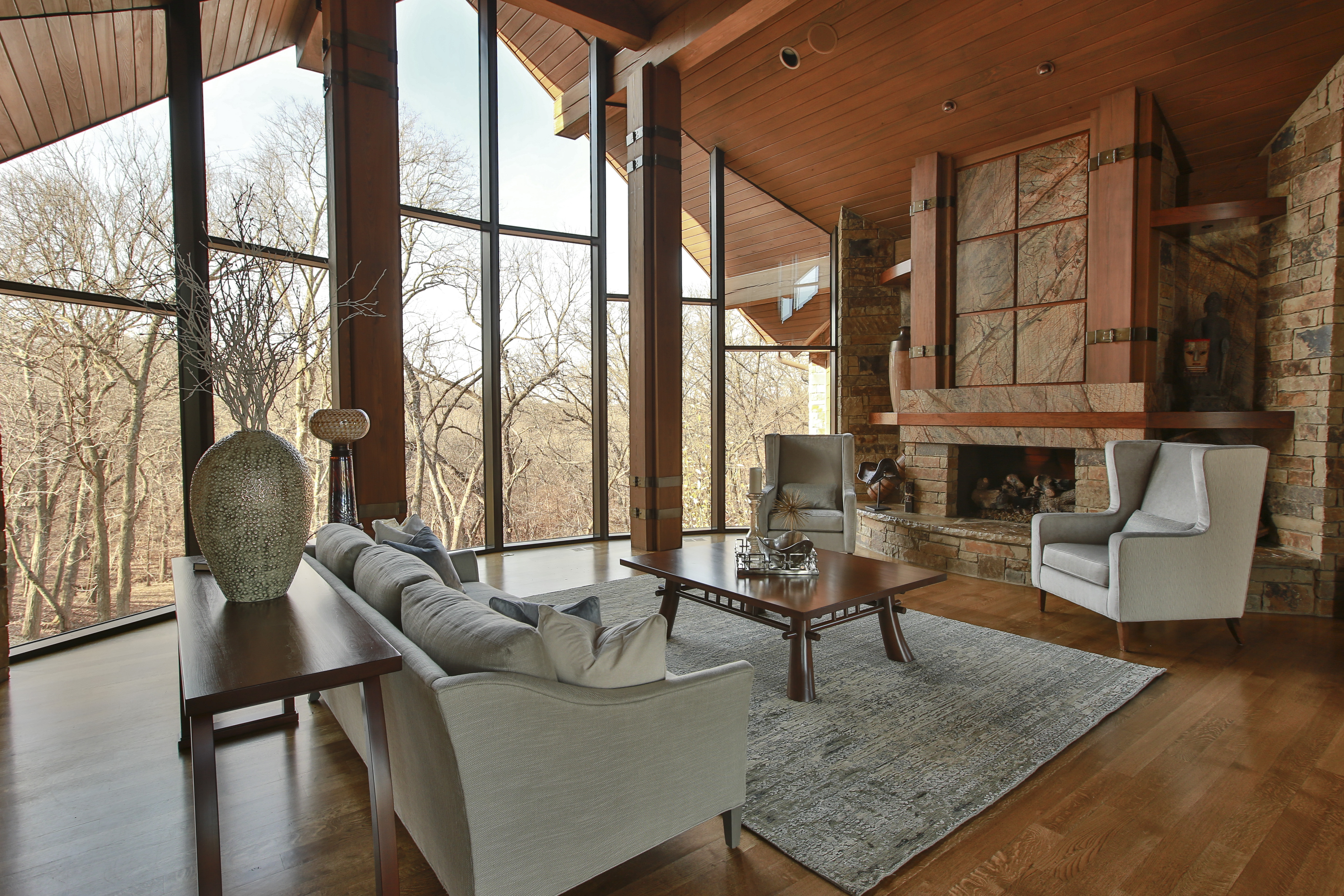
  1. Lack of a Focal Point    Often the best area to emphasize in a living space is the fireplace or great view outside but if you don’t have those options, create a vignette (grouping) of furniture/accessories that will grab your attention. Then group your upholstery around the focal point to emphasize it. Here in this living room the stone fireplace acts as a focal point for the seating area.
Karen Mills' blog
Interior design by Karen Mills

2.  Purchasing Over Sized Upholstery Or Too Many Pieces  Have you ever decided you wanted to buy a new living room grouping but didn’t bother creating a floor plan or measuring the space first? Suddenly your furniture arrives and the furniture takes up so much real estate you can barely walk through or don’t have room? As an interior designer I can’t tell you how many frantic calls I’ve received from homeowners requesting help with their space planning only to discover the wrong furniture was already purchased and they want me to fix it which we know is impossible. In this living room, the right size furniture was used and strategically placed to not only enhance the focal point (fireplace) but also leave ample room for someone to pass through.

Karen Mills' blog
Interior decorating by Karen Mills

3.  Selecting The Wrong Wall Color   After working on 1200+ interior design projects I see this mistake happen more than any other. We might want to blame a decorating network like HGTV or DIY for making us believe that picking paint colors is easy but I think its because the general public doesn’t realize how much a color can change when it goes from a tiny paint swatch to an interior or in different lighting situations. In this great room we selected the paint color during day that not only coordinated with the finishes and furniture but also played well with other rooms in view.

For more inspiration, ideas, and photos, sign up for our weekly interior design blog here.

Plus become a fan of Kansas City’s interior designer and former host of the Living Large design show, Karen Mills, on 
INSTAGRAM and FACEBOOK here!

Interior Design/Interior Decorating

Interior Decorating: 3 Tips for Creating a Cozy Bedroom

Often we take sleep for granted until we start to have problems with concentration, alertness, or our overall ability to function well. Then good sleep becomes more of a priority. Read on for 3 ways to create a nest like atmosphere in your bedroom that’s conducive to better sleep.

Interior design by Karen Mills featured in international book titled Architecture Today Interior Design
  1. Simpler Bedding and Patterns As an interior designer in Kansas City I’ve used simple tone on tone patterns and texture in bedrooms for years in everything from fabulous washable linens from Italy to textured velvet or sheared fabrics like we’ve seen recently in fashion wear. Here in this Overland Park bedroom Italian bedding from Terrasi Home on the Plaza in simpler patterns, textural finishes and clutter free space create a stress free environment where we can unwind and relax.
Karen Mills' blog
Interior design by Karen Mills featured in international book titled Architecture Today Interior Design

2. Cozy Beds  Beds that envelope us will continue to be popular whether its are a four poster bed, an upholstered bed like this guest room in Mission Hills, or a fabulous combination of both. In this guest room calming colors and patterns, low lighting, and clean lined furnishings enhance the overall feel, creating a beautiful interior design.

Karen Mills' blog
Interior design by Karen Mills featured international book titled Design Icons

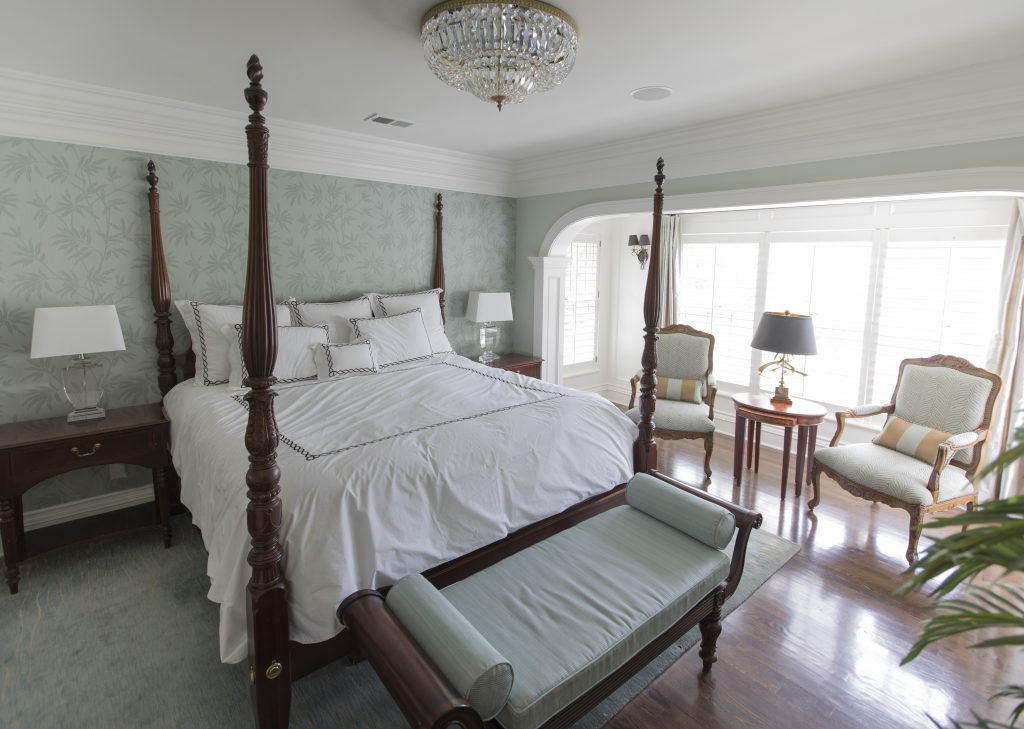
In this bedroom a four poster bed creates a cozy feel
while the wallpaper, area rug, upholstered bench, and simpler fabrics on the chairs beyond enhance the relaxed inviting feel of this beautifully designed master bedroom in Mission Hills.

Karen Mills' blog
Photo courtesy of Curated Kravet


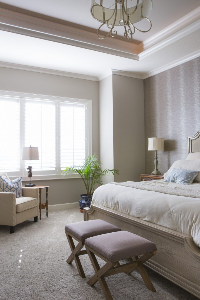
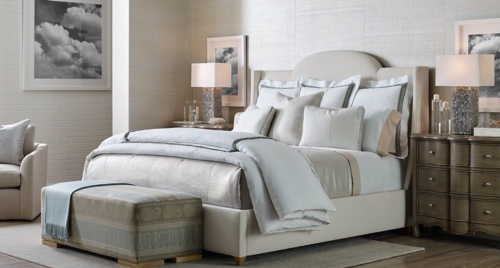
3. Textured Walls  Painted accent walls have been a craze for years but wrapping the whole room in textural walls will gain popularity again this year. In this interior design space featured by Curated Kravet an upholstered bed, area rug, bench, throw, and bedding add to the cocoon feel created by the gorgeous textural walls enveloping the space.

For more inspiration, ideas, and photos, sign up for our weekly interior design blog here.

For more information on how to get better sleep and create a healthier environment, learn more at SLEEP BETTER LIVE BETTER now!

Plus become a fan of Kansas City’s interior designer and former host of the Living Large interior design show, Karen Mills, on 
INSTAGRAM and FACEBOOK here!
Interior Design/Interior Decorating

Interior Design: 3 Tips for Designing a Monochromatic Living…

Custom design by interior designer Karen Mills – Overland Park
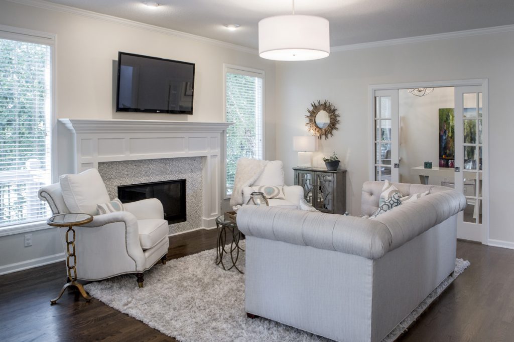
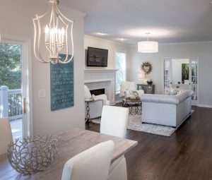
  1. Choose One Color Hue – When an interior designer says the word hue, we are referring to a color family such as blue, white, or black, for example. By focusing on one color like the white we selected for this family room area, you can make a huge impact. Here the whites vary from walls and trim to finishes, furniture, and floor coverings.

2. Use softer variation of color hue on upholstery or walls. In this lobby living area space, a darker color of pumpkin grounds the floor, while lighter upholstery fabrics and tile on pillars repeat the color scheme

Karen Mills' blog
Custom Design by interior designer Karen Mills – Mission Hills

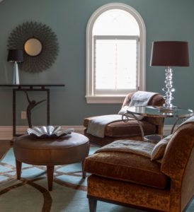
3. Layer in multiple textures. Even though we created custom upholstery in a solid neutral brown, the soothing gray blue green color scheme selected still makes a strong statement while evoking a calming vibe. A darker contemporary wool rug we designed grounds the room, while the custom pillows and throws we created enhance the monochromatic hue along with blue walls beyond.

For more great ideas on design or interior decorating sign up for our weekly interior design blog here

Plus become a fan of Kansas City’s interior designer and former host of Living Large design show, Karen Mills, on Instagram or Facebook now!

Interior Design/Interior Decorating

Interior Design: 3 Ways to Remodel Smaller Kitchens to…

An Interior Designer’s Perspective on How to Make Your Kitchen Remodel Appear Bigger

As an interior designer who specializes in kitchen remodels, I often get called on to make a kitchen live larger. Read on for my 3 expert tips on how to do just that.

Interior design by Karen Mills – Kansas City
  1. Paint cabinets white or a light neutral color to reflect light around the room so the kitchen appears larger and cabinets seem to disappear. In this kitchen remodel natural light and interior lighting also give the room a larger feel.
Interior design by Karen Mills – Leawood

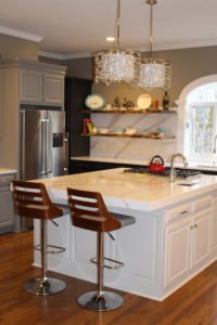
2. Incorporate open shelving or another design element to make cabinetry not appear so overwhelming. In this kitchen partial remodel we ran beautiful white quartz counter tops by Cambria up the wall as a back splash behind the shelving to offset the dark cabinets and lighten the room.

Interior design by Karen Mills – Kansas City

3. Glass front shelves, preferably lit, help open up this kitchen remodel to make it live larger by visually shrinking the cabinetry. Great interior lighting, sunlight, light neutral painted kitchen cabinets, white granite counter tops, and open shelves add to the larger feel.

For more great ideas on design or interior decorating sign up for our weekly interior design blog here

Plus become a fan of Kansas City’s interior designer and former host of Living Large design show, Karen Mills, on Instagram or Facebook now!

Interior Design/Interior Decorating

Interior Design: 3 Blue Color Scheme Options for the…

One of the biggest questions I get asked as an interior designer is what color scheme to use in decorating or designing a space.  If you’re not sure what color is best, trying shopping your closet for inspiration because your favorite outfits or jewelry are often the colors that look best.  Read on for three possibilities for a blue color scheme in your living space.

Karen Mills' blog
Photo courtesty of Century Furniture

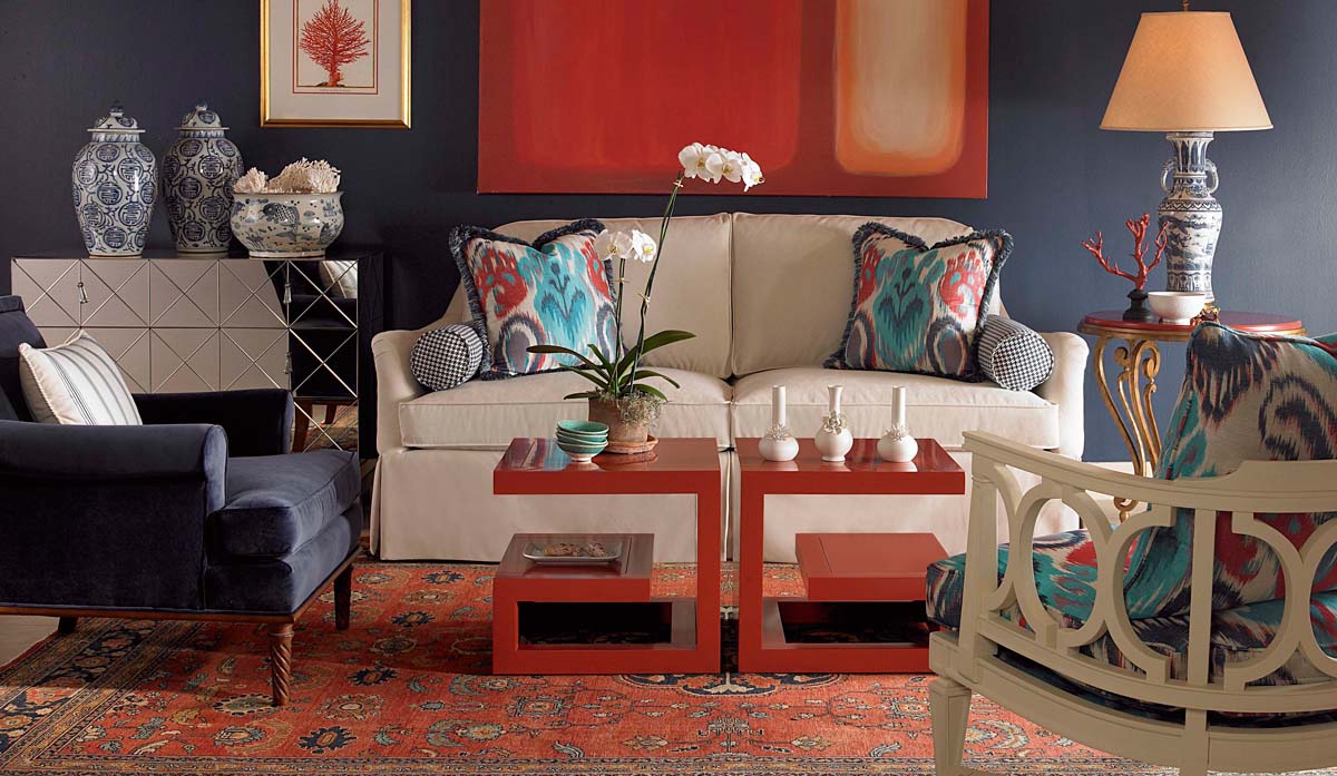
2. Red, White, and Blue

In this living space blue and red has been used quite effectively to create a little drama.  By starting with a neutral base of white and blue gray that’s more relaxing, red decor – tables, pillow patterns, and accents, can be added without overpowering the space.

Karen Mills' blog
Interior decorating by Karen Mills

3. Blue, Warm Gray, Beige, and White

When you have a room that already has bold finishes – patterns and color like this one, you might want to introduce lighter neutral colors with little or no pattern for everything else.  Here we introduced lighter upholstery, pillows, decor, and an area rug with interesting textures and less pattern to create a calming effect.

Karen Mills' blog example of pattern
Interior design by Karen Mills

3. Blue, Orange, White, and Taupe

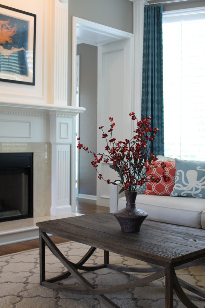
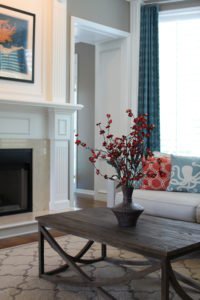
Inspiration for this color scheme came from the existing mermaid artwork over the mantel.  To bring it all together we started with a light neutral sofa and coffee table, then layered in custom blue draperies and fun toss pillows along with an existing rug to create a cohesive color scheme with the artwork. In addition by using orange and blue together, you create a more energetic vibe since they are opposites on the color wheel.

For more great ideas on design or interior decorating sign up for our weekly interior design blog here

Plus become a fan of Kansas City’s interior designer and former host of Living Large design show, Karen Mills, on Instagram or Facebook now!

Interior Design/Interior Decorating

Interior Design: 3 Tips for Your Bedroom to Live…

Ideas for Visually Expanding Your Bedroom

Interior design by Karen Mills
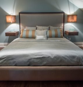
  1. Choose bedding in a similar color to other finishes. In this tight attic space where our interior design client requested a large bed and nightstands for guests we designed blue green bedding in similar hues to the wall color so the bed would seem to decrease in size even though it took up most of the space. Custom designed shelves and and light fixtures add to the visually larger feel.
Karen Mills' blog
Interior decorating by Karen Mills

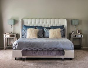
2. Add fabrics and finishes with little or no pattern including bedding, walls, furniture, and flooring. In this bedroom tone on tone bedding, solid furniture finishes, acrylic legs on the bench, mirrored nightstands, and a white bed that bounces light around the room help create the light airy feel.

Karen Mills' blog
Interior design by Karen Mills

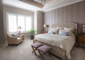
3. Layer in some furniture with legs that show. In this bedroom space, we layered in some furniture with legs showing underneath along with vertical striped wallpaper to draw the eye up and make the room feel larger. Light neutral bedding, a bed, and chair bounce more light around the room visually expanding the space.

For more great ideas on design and decorating sign up for our weekly interior design blog here

Plus become a fan of Kansas City’s interior designer and former host of Living Large design show, Karen Mills, on Instagram or Facebook now!

Interior Design/Interior Decorating

Interior Decorating: 3 Tips for Fall Decorating Using Existing…

Styling by Karen Mills
  1. Mix together unexpected elements to create interest Here I created a one of a kind place setting using items I found around my house – a layer of two chargers and a place mat stacked on top of each other with a fossil napkin ring, berries, and a fashionista type coaster that makes a statement all its own.
Karen Mills' blog
Styling by Karen Mills

2. Repeat an Accent Color to Add Emphasis In this example I used things I had around the house starting with a rustic crate with evergreens and then layered pops of bright color with a beautiful pumpkin and fall foliage along with a couple of real mangoes.

Styling by Karen Mills

3. Create a vignette or grouping of fall decor items on a tray or in a container to give it more importance. Here I used items found in the woods behind my house along with berries and glass vases.

Styling by Karen Mills

For more great ideas on holiday decorating and photos, sign up for our weekly interior design and decorating blog here

Plus become a fan of Kansas City’s interior designer and former host of the Living Large design show, Karen Mills, on Facebook here!