Interior Design/Interior Decorating

Interior Design: Bold Color Forecast for 2018
Karen Mills' blog
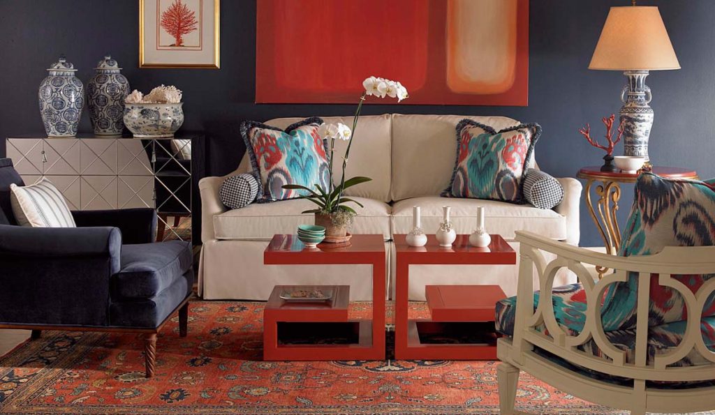
Photo courtesy of Century Furniture


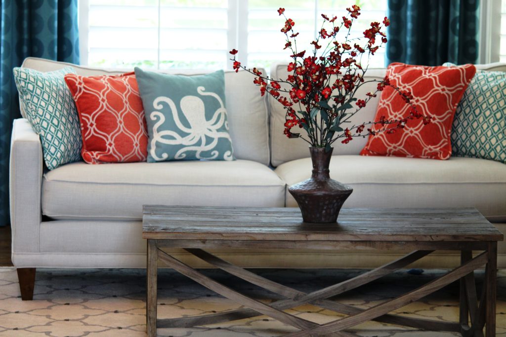
If you’ve been paying attention to interior designers or the fashion runway this fall you may have noticed bold colors popping up everywhere from red and yellow to bold blues.   Sherwin Williams and Benjamin Moore have announced their exciting bold new colors of 2018 but Lea Eiseman with the Pantone Institute has yet to reveal their color of the year which impacts all types of industries from fashion and design to autos and appliances.

Do you think Pantone will select the hot new mustard yellow color or something else?

Karen Mills' blog
Photo courtesy of Sherwin Williams

Benjamin Moore’s color of the year 2018 is a bold hue and one of my favorites!  I especially love it contrasted with white like the room shown above.

Bold blue hues like this also look great with beige colors, red, and orange along with citrine, a yellowy green.

Karen Mills' blog
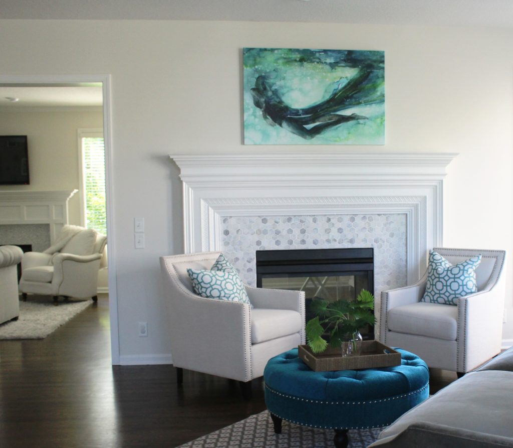
Interior design by Karen Mills/Photography by 29Pixel Studios

In the room above we incorporated a bold blue hue on the ottoman to give the space pizzazz.


Karen Mills' blog
Photo courtesy of Benjamin Moore

Benjamin Moore selected Caliente Red AF-290 as their color for 2018.  Of course red has been a favorite color of mine forever because its such a vibrant unexpected color that instantly creates drama!

What’s your favorite color for 2018?!  Post in the comments.

For more great information on color and more, sign up for our weekly interior design blog here

plus become a fan of Kansas City’s interior designer and former host of the Living Large interior design show, Karen Mills, on Facebook here.
Interior Design/Interior Decorating

Interior Design: Top 4 Bathroom Design Trends of 2018


The bathroom remodel industry has continued to explode this year and doesn’t show signs of slowing down anytime soon.  As a bathroom designer I’ve been immersed in so many bathroom remodels the past two years I’ve lost count and the phones just keep ringing.  But during this season, I’ve noticed four bathroom trends in the U.S. that I believe will continue into 2018.

Karen Mills' blog
Interior design by Karen Mills/Photography by 29Pixel Studios, LLC
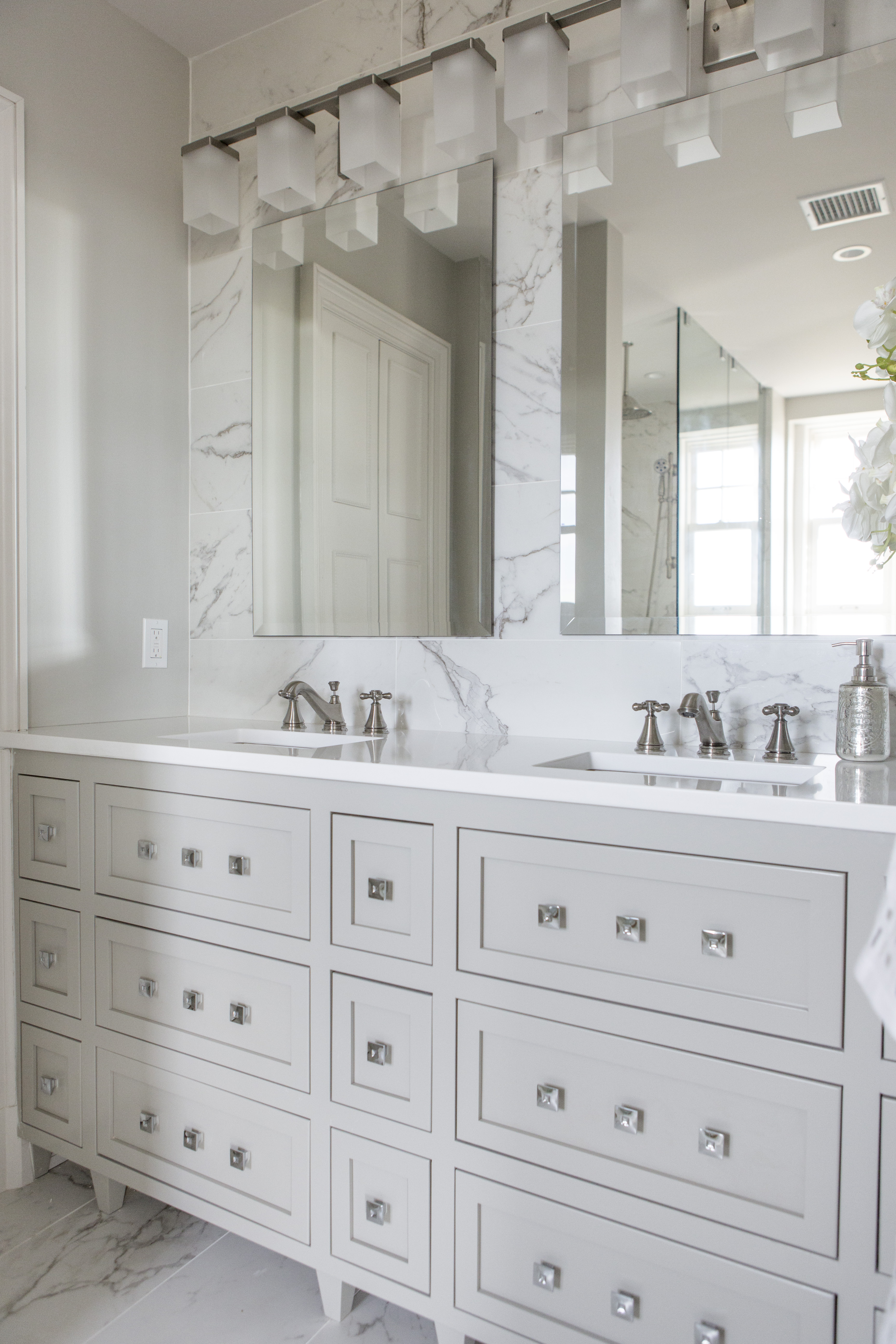
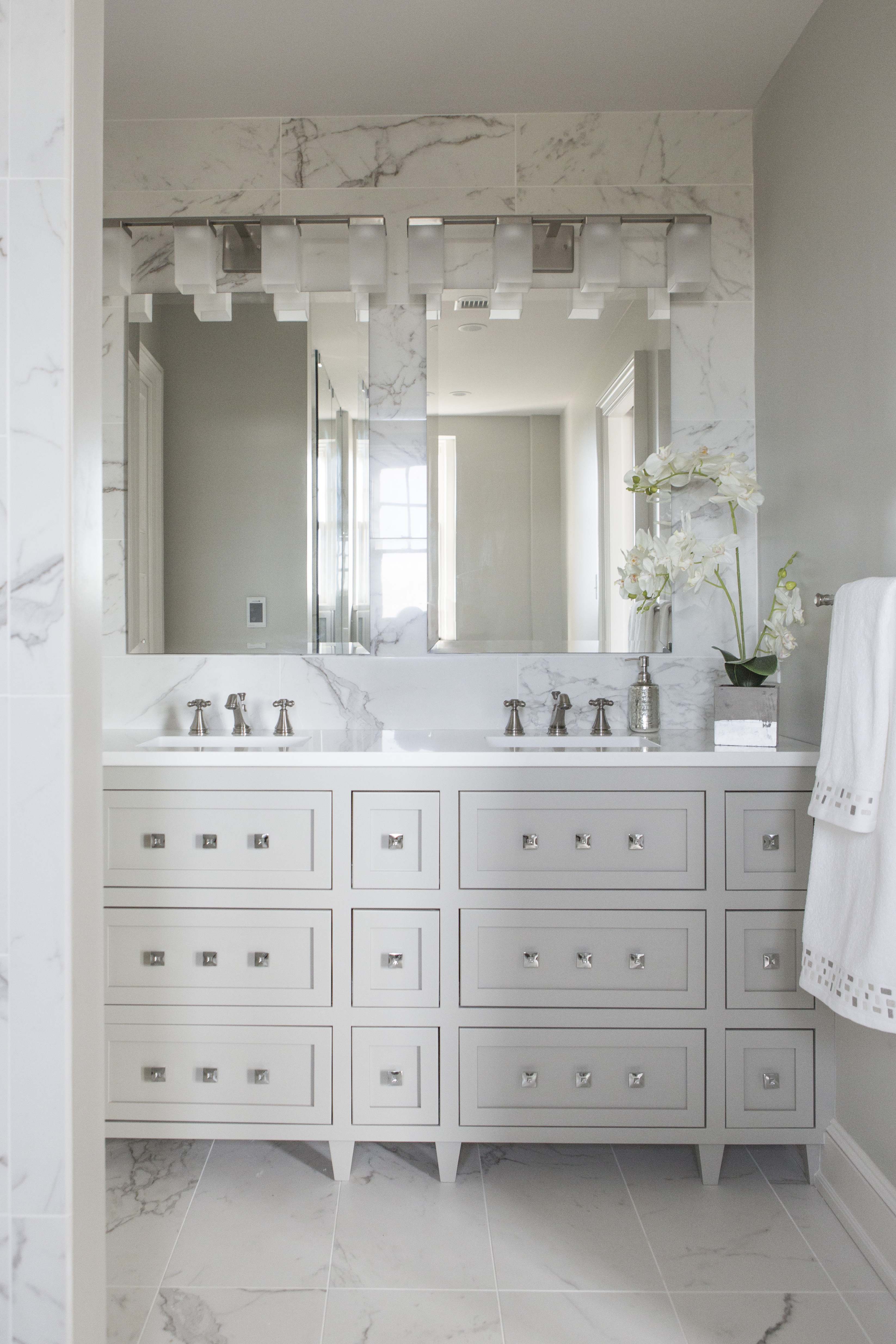
  1. Clean Lines with a Zen Feel – Hotels and restaurants figured out years ago that ambiance is key for creating an inviting atmosphere and homeowners are starting to crave this inviting look too.  To create a simple zen feel, opt for cleaner lines, less pattern, a mix of textures, and vanities that look more like furniture than a boring row of cabinetry along the wall.


Karen Mills' blog


    2. More Timeless – For years our interior design firm has advocated interior design with staying power in our custom bathrooms but now its becoming a trend as seen in the trend towards classic marble, cleaner lines, less ornate architectural details, simpler tile designs, and less patterns.

    3. Luxury – The word luxury doesn’t mean that your bathroom design has to cost a fortune or be stuffy.  Luxury can be had through beautiful options like free standing tubs, steam showers, heated floors, custom cabinetry, or technology.  Technology could include heated towel racks, a coffee bar, hidden plug  ins for hair dryers, adaptable cabinetry for more efficient storage, or remote control window treatments.

    Karen Mills' blog
    Interior design by Karen Mills

    4. Rustic Elements   Products that fall into this category could include wood walls made of boat wood (duck board or engineered wood flooring, wood surrounds for tubs, concrete vanity tops, concrete wall finishes, river rock vanities, rock floors or walls, stone vessels, or rustic tiles, among others.

    To keep up with the latest trends, sign up for our weekly interior design blog here

    Karen Mills' blog
    Interior design by Karen Mills/Photography by 29Pixel Studios, LLC

    plus become a fan of Kansas City’s interior designer and former host of the Living Large design show, Karen Mills, on Facebook here!


    Interior Design/Interior Decorating

    Interior Design: How to Succeed at A Classic Kitchen…


    Karen Mills' blog  Karen Mills' blog

    BEFORE                                                                      AFTER

    Are you dreaming of a kitchen like the one on the right but your reality is the one on the left?

    As I toured this historic high rise condo on the plaza in Kansas City for the first time as the interior designer, the reality of the situation was bleak.  The condo hadn’t been updated for years and the warren of tiny rooms made it difficult to imagine a beautiful open kitchen.  On top of that the small elevator and restrictions limited what could be done with cabinetry, counters, and much more.


    To start I knew we had to enlarge the kitchen so we took over the tiny adjoining maid’s room shown above to gain a few more feet.

    Our end goal was a large open inviting kitchen full of natural daylight that was a classic so to start we tore down the existing entrance wall (shown on left) to open the kitchen up to the existing dining room and we resized the mismatched windows in each room to flow together as one big window area.

    We also relocated the adjoining dining room to the over sized living area and made the former dining room a hearth area that opened into the kitchen.

    Karen Mills' blog

    To make the rooms feel more expansive but also timeless, we tore out the flooring in the kitchen and wove in new wood floors to match the existing wood flooring elsewhere.

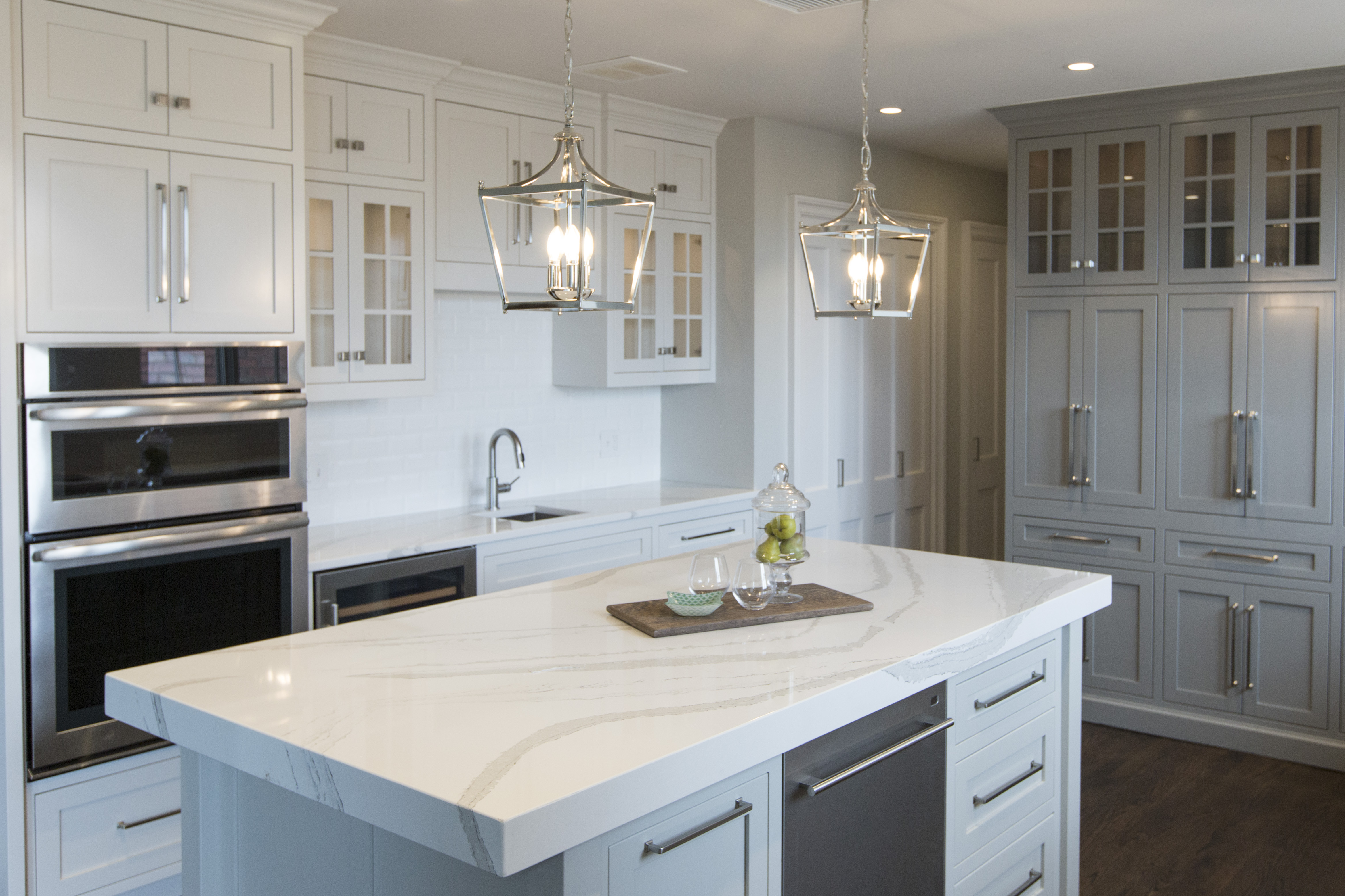
    Next we began to lay out a floor plan that included a gorgeous custom island along with designing custom flush mount European style cabinetry that was also functional and a lighting plan that would make the room pop.


    Karen Mills' blog
    Interior design by Karen Mills/Photography by 29Pixel Studios, LLC

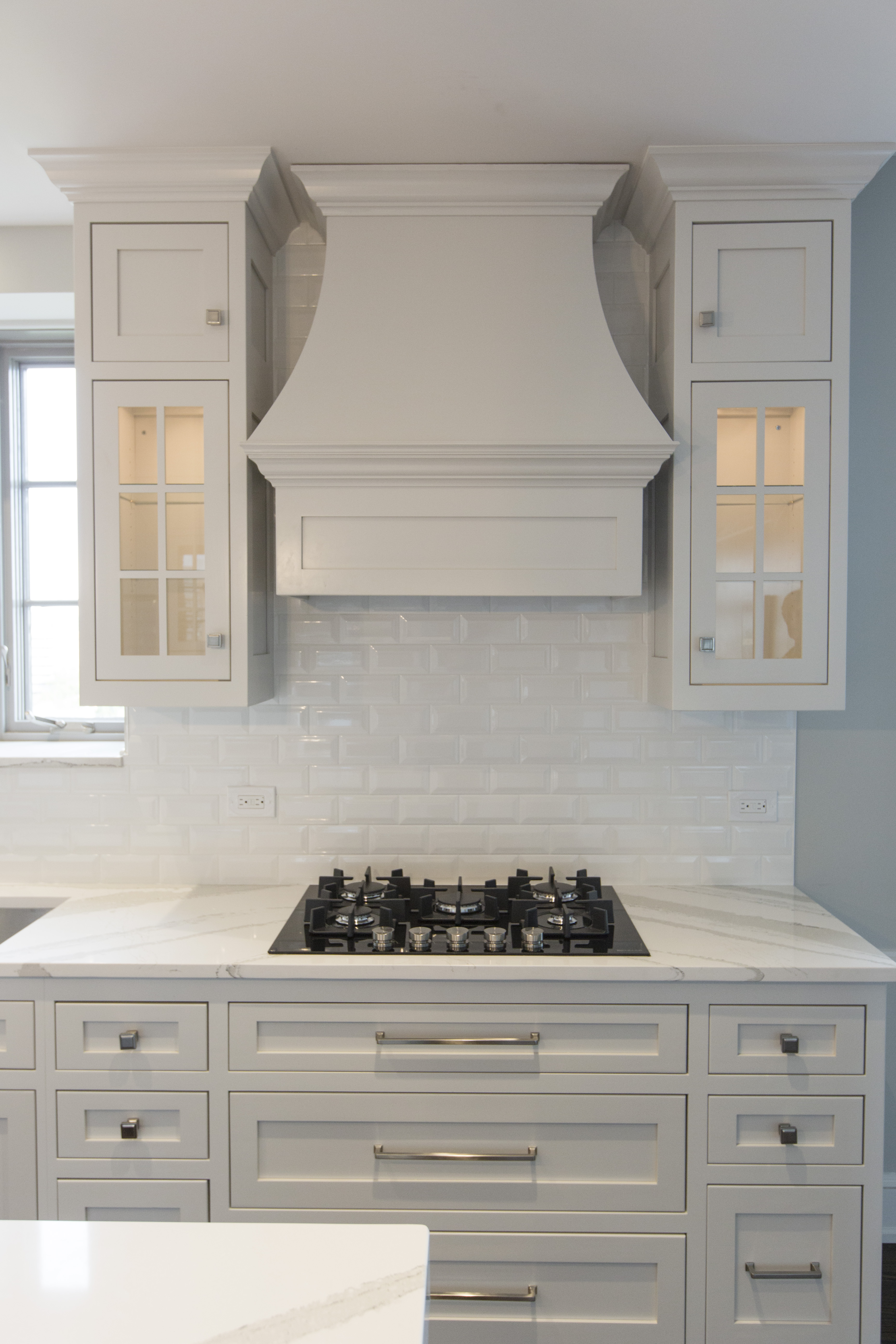
    On the right we designed a beautiful custom stove hood with lit glass cabinetry and large drawers underneath to hold pots and pans.  Plus we took the beveled subway tile to the ceiling to add height and drama to the space.

    Karen Mills' blog
    Interior design by Karen Mills

    In the back we designed a pantry area that disguised the crooked structural wall and added doors that opened to reveal a coffee station and appliance storage along with additional glass lit cabinetry.

    Karen Mills' blog
    Interior design by Karen Mills

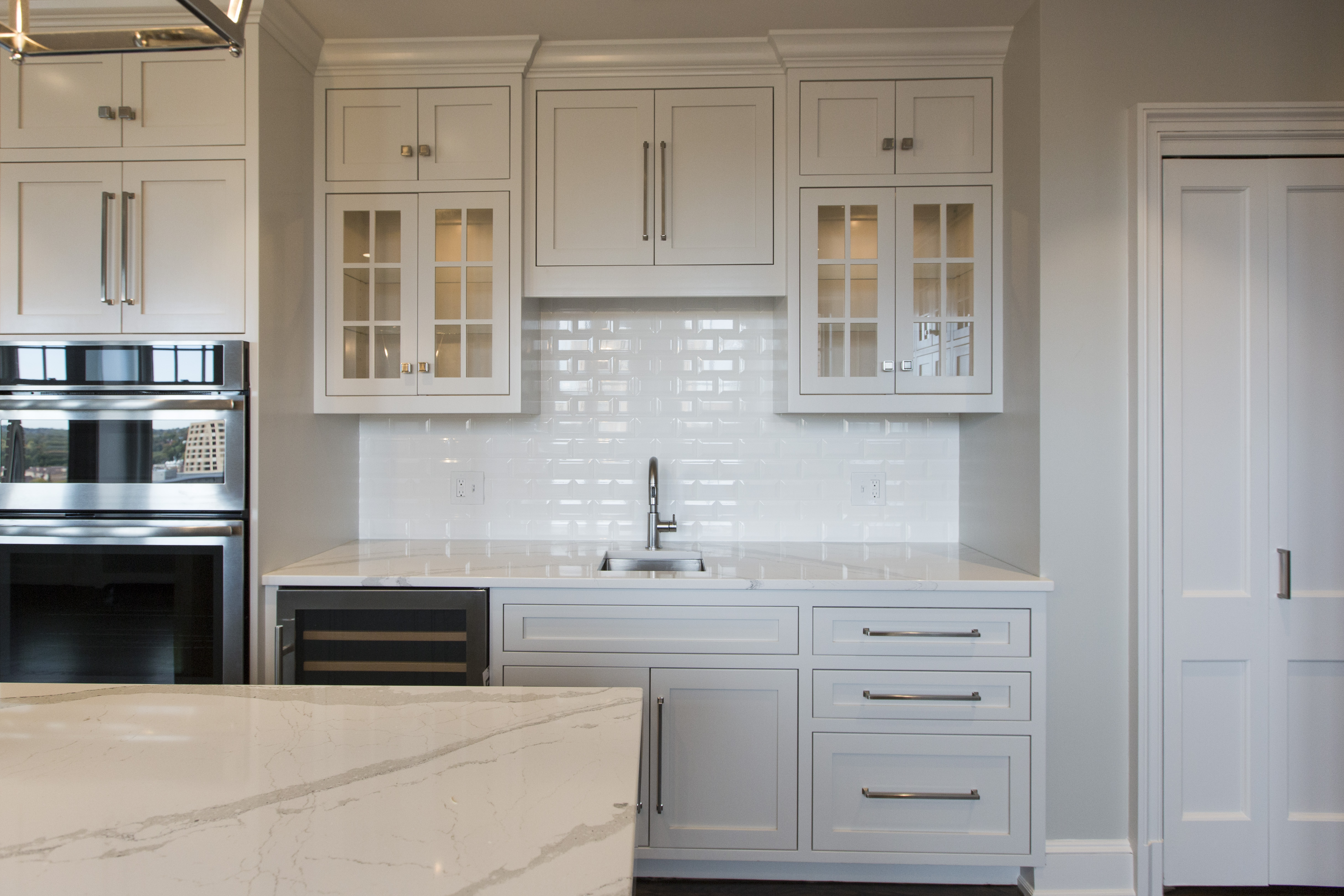
    On the left we created a bar area with a wine cooler, additional sink, and storage along with lit glass front cabinetry to hold glassware.

    Karen Mills' blog

    And on the island we added a mitered top to give the beautiful Cambria marble style top even more importance!

    Karen Mills' blog
    Interior design by Karen Mills

    The result – a large open living/work space that lives large and is also functional.

    For more great ideas sign up for our weekly interior design blog here

    Plus become a fan of Kansas City’s interior designer and former host of the Living Large design show, Karen Mills, on Facebook here and let us know how we can make your dream a reality!

    Interior Design/Interior Decorating

    Interior Design: The Making of a Beautiful Bathroom

    Interior Design: The Making of a Beautiful Bathroom

    Karen Mills' blog

    Interior design by Karen Mills

    After working  as an interior designer on over 1200 projects , I’ve realized that most homeowners have no idea the amount of detail that goes into successfully creating a beautiful bathroom redmodel.   That’s why today I’m sharing a NARI award winning bathroom project we designed in a collaborative effort with our clients that’s been featured by Elle Decor magazine and MSN in the United States along with the United Kingdom.

    The clients had a wonderful vision of a Hollywood Glam style bathroom and we helped them turn that vision into a reality, ensuring the bath was  warm, inviting, and up to date.

    Karen Mills' blog

    Since we already had a vision for the Hollywood glam design style, we began by selecting a color scheme from Benjamin Moore.

    shower-layout

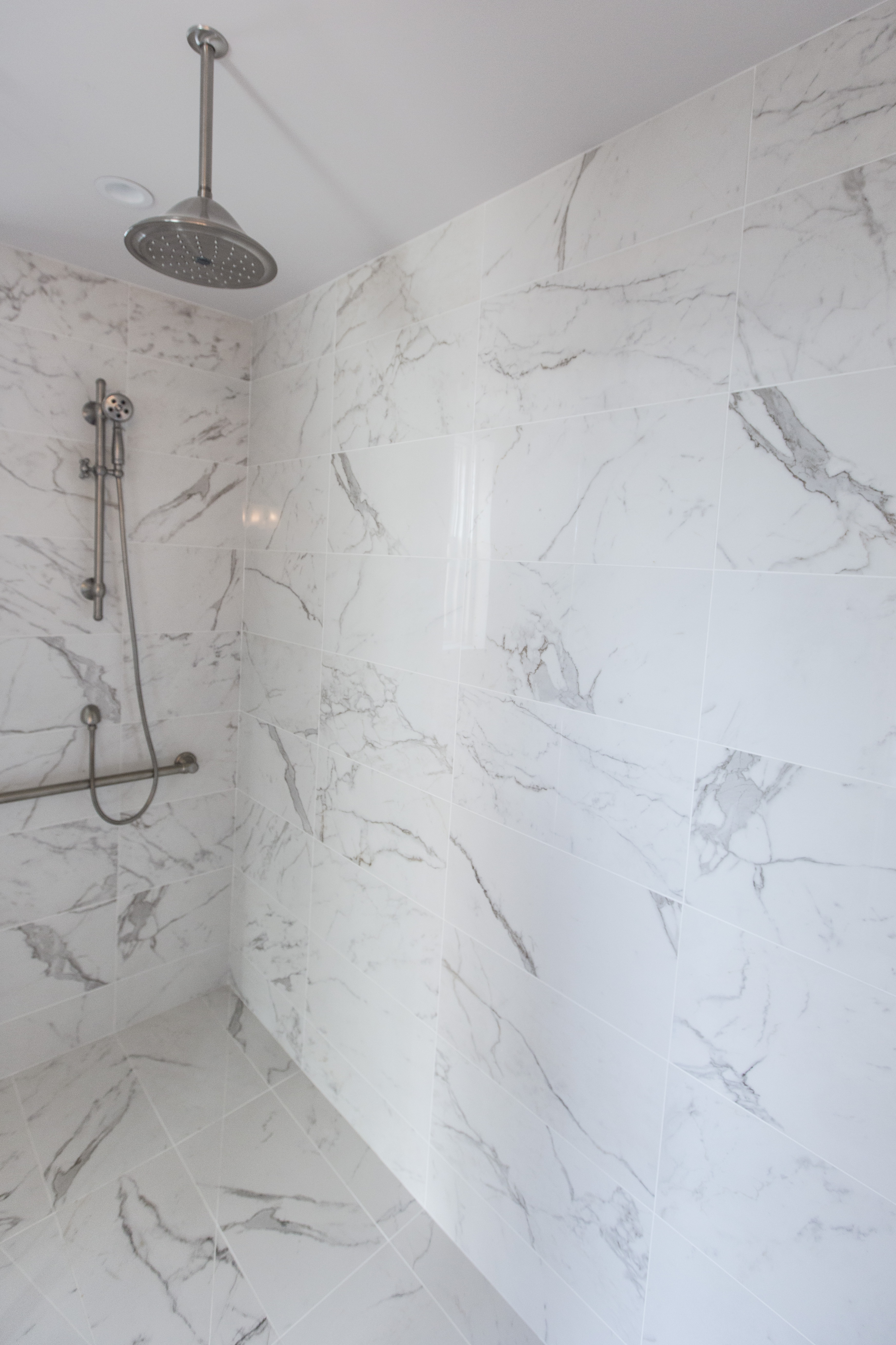
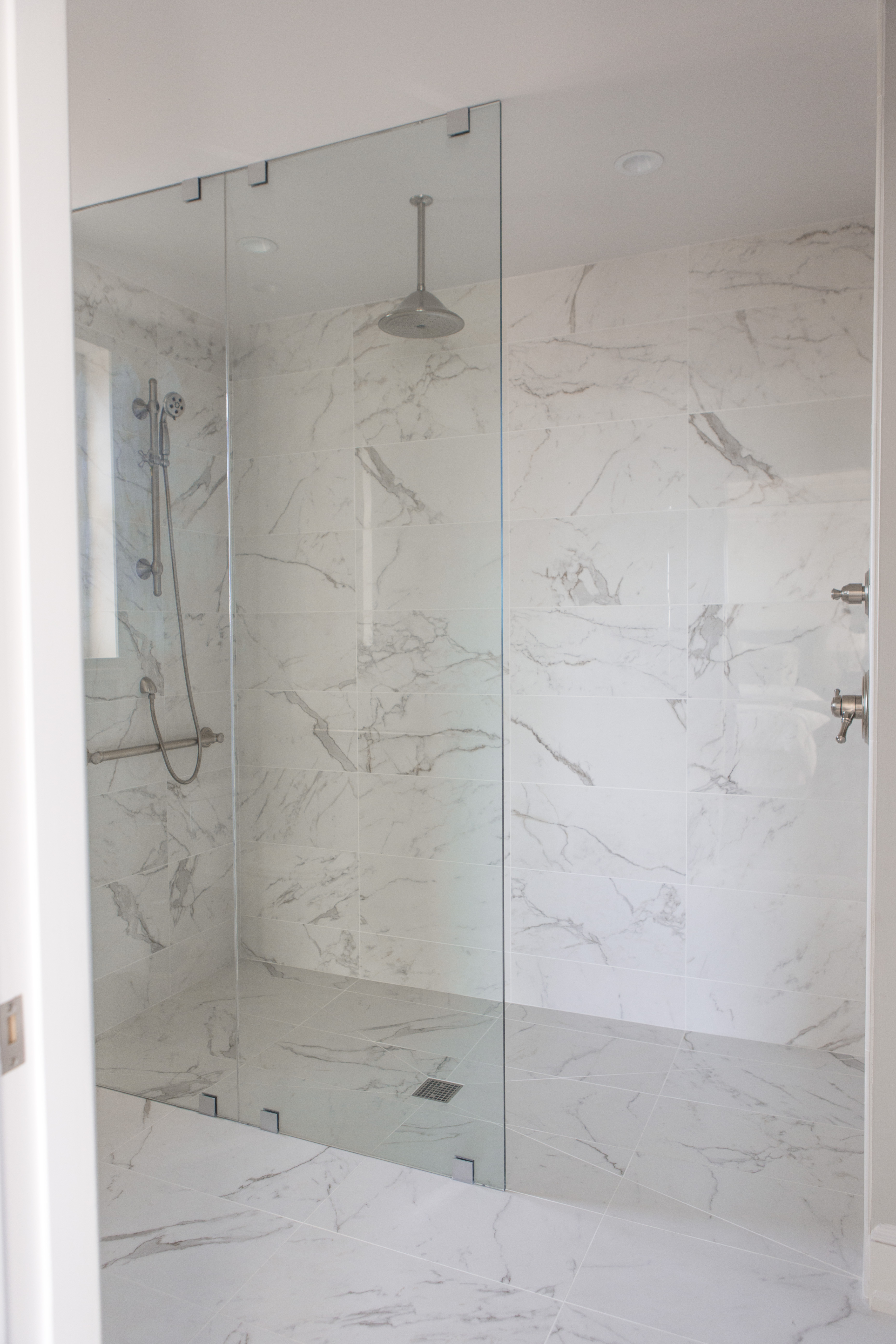
    Then we discussed requirements for functionality including layout/space planning, storage, electrical requirements, and more.  And even though we loved the glossy marble finish on the floor, we opted instead for a matte finish to minimize slippage coming out of the zero entry shower or free standing tub.

    Karen Mills' blog

    Karen Mills' blog

    The existing fireplace was not being used, so we decided to replace it with a fabulous custom make up cabinet where our client could relax and get ready.


    Karen Mills' blog


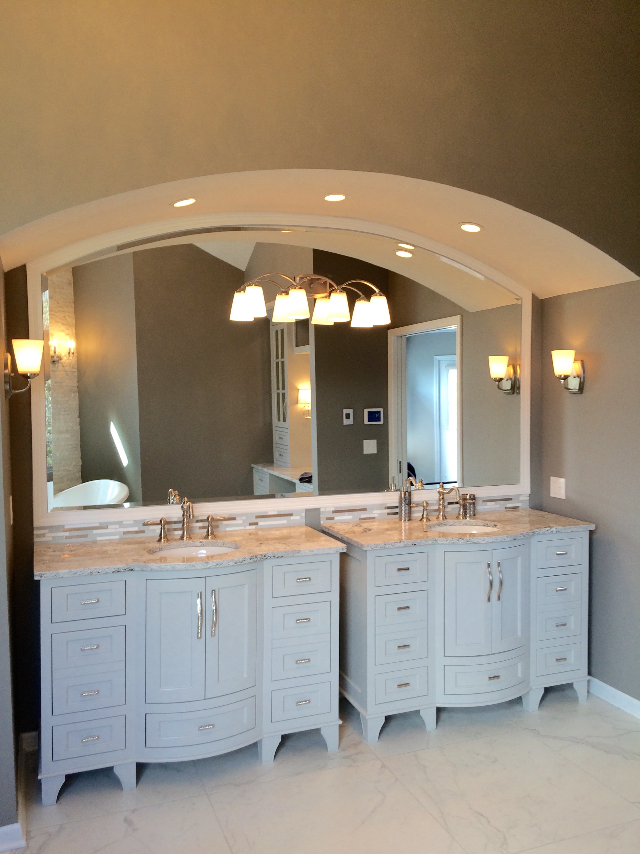
    As we began designing the beautiful custom vanities, we made sure they were functional with drawers deep enough to fit requirements for storage and built in electrical outlets for recharging toothbrushes/razors.  For the custom make up cabinet, we opted for mirrored fronts instead of glass on the upper cabinet doors to hide toiletries and make up.

    finishes

    Marvel floor tile by Atlas Concorde

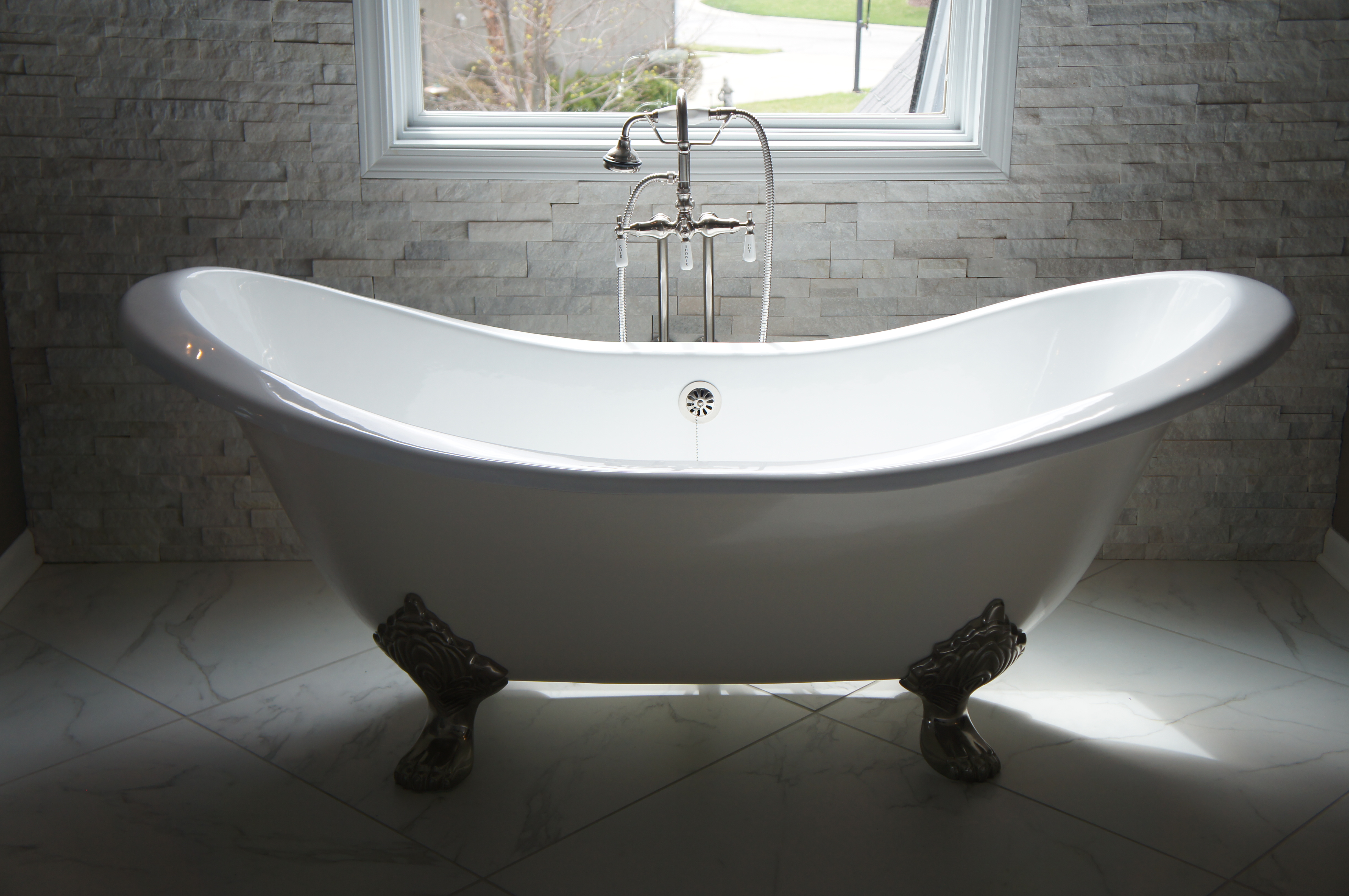
    Once the beautiful custom cabinetry design was finalized, we begin selecting the other finishes for the bathroom including a gorgeous stacked stone with embedded crystals for an accent wall behind the tub, a free standing tub, counter tops, back splash, floor/wall tile, plumbing fixtures, pulls, and light fixtures along with a lighting plan to show it off.

    shower-in-progressKaren Mills' blog

    But we didn’t stop there.  Once the walls were up, we sketched plans on exactly how to layout all the different colors and sizes of tile we had selected so  we would have just the look we wanted.

    master-bath-bench-1

    master-rock-wall-with-lighting-edited-for-website

    The result?  A beautiful one of a kind award winning bathroom that our clients enjoy every day that helps reduce stress and make life better!

    Karen Mills' blog

    Interior design by Karen Mills

    For more great ideas and photos, sign up for our weekly design blog here!

    plus become a fan of Kansas City’s designer and former host of Living Large design show, Karen Mills, on Facebook here.
     

    vanity-top-closeup

    Interior Design/Interior Decorating

    Interior Design: How to Inject Autumn Orange into Your…


    Karen Mills' blog
    Interior design by Karen Mills

    Injecting fall hues like orange into your home for the season can be as simple as fall leaves in a vase or a ceramic pieces like this entry we designed in orange.


    Karen Mills' blog
    Interior design by Karen Mills

    Other possibilities for layering in the warm color of autumn could include toss pillows like the great room here, a throw, or even a rug underneath.

    And if you’re a big fan of orange, why not make a bigger commitment like painting one accent wall with orange or installing drapery with orange hues.

    Simpler options might include pumpkins or oranges grouped together in a clear glass container or orange decor.

    For more great ideas about how to inject orange into your home for autumn, click here to read my latest Houzz article – https://www.houzz.com/ideabooks/92328651/list/7-rooms-that-fall-for-orange

    then sign up for our weekly interior design blog here

    plus become a fan of Kansas City’s interior designer and former host of the Living Large design show, Karen Mills, on Facebook here!

    Interior Design/Interior Decorating

    Interior Decorating: What Your Favorite Color Says About You


    Karen Mills' blog

    Ever wonder what your favorite color says about you, the meaning of color, or how to use it to design your interior?

    As an interior designer and color expert, I can tell you that’s not always an easy task because it takes years of experience to learn how colors colors can impact a room in different lighting situations..  No wonder painting is currently listed as the most common home improvement project since countless homeowners waste money having their spaces repainted after selecting a color or combination that doesn’t work.

    So here’s some insight on your color’s meaning that may help and ideas for using it in your home.

    Karen Mills' blog
    Photo courtesty of Century Furniture

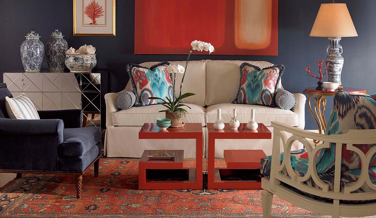
    If you love red like I do you most likely live life to the fullest with spontaneity and excitement.  But what does a red interior say to others?  The color, associated with blood, raises your blood pressure and grabs your attention!  So if you don’t want to go completely red, try using it as an accent color to make your space a little more vibrant.

    Blue, however, exudes stability and calm, making it a perfect color for bedrooms where you need to unwind.  Lovers of this color tend to be dependable, responsible citizens who do the right thing.

    Yellow, like a ray of sunshine portrays warmth and optimism in a room, making it perfect for a kitchen or a sunny living area, and fans of this color are often optimistic people with a positive encouraging attitude.

    Karen Mills' blog
    Interior design by Karen Mills

    Green, the color of nature exudes calmness and warmth, which makes it a good color for bedrooms or spaces where you need a more relaxed feel.  And fans of this color are usually warm, kind, and charitable.

    Karen Mills' blog
    Interior design by Karen Mills

    Purple fans, often a more complex and creative type of individual, are fascinating individuals but sometimes may seem mysterious or dark to others who don’t understand their creativity.

    Karen Mills' blog
    Interior design by Karen Mills

    Orange, the color of hunger and vibrancy fits perfectly into that dining room or kitchen area where you need some life.  And if you’re an orange lover, you probably show the same vibrant spirit as the color with your enthusiastic zest for life.

    For more great interior design ideas, sign up for our blog here!

    Plus become a fan of Karen Mills, Kansas City’s interior designer and former host of Living Large design show  on Facebook here now!


    Interior Design/Interior Decorating

    Interior Design: Why White Kitchens Stand the Test of…

    Karen Mills' blog
    Kitchen refresh by Karen Mills/Photography by 29Pixels, LLC

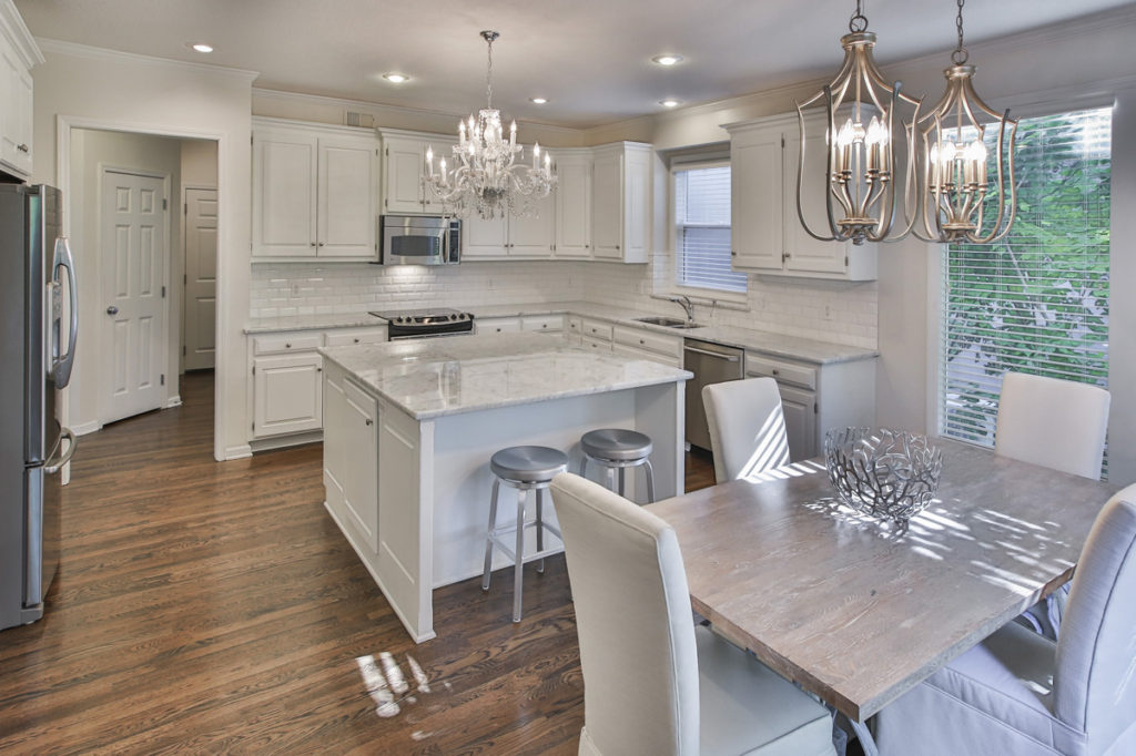
    If you’re like the majority of homeowners around the world, you love the ethereal feel of white kitchens, especially warm inviting ones with layers of texture and interest like this kitchen photo where the table top, formerly a door, was refinished in gray and leather chairs were slip covered in a washable fabric.

    Some of you I know will disagree about the appeal of white kitchens but this kitchen has been featured repeatedly in the news, both in national print and on television, plus its a favorite of our clients.  And I think its because of its simplistic, light, classic design and marble counters even though existing cabinets weren’t replaced during the remodel.

    Karen Mills' blog
    Interior design by Karen Mills

    As an interior designer who specializes in remodels I believe we secretly crave these airy white spaces to work and play in because they not only feel clean and fresh but also reflect light from outside and around the room, enhancing the way we look and often feel when entering the space.

    One of the other reasons I believe white kitchens are popular is because can go with almost any accent color and can easily be changed to another color scheme when we tire of the original one.

    Karen Mills' blog

    Interior design by Karen Mills

    But if you’re looking for something different besides a simple white, you might consider having  your kitchen cabinets painted with a white that has been tinted with a favorite color like this photo where cabinets and walls have a hint of green.

    For more great kitchen remodeling ideas, sign up for our weekly award winning interior design blog here

    Karen Mills' blog
    Interior design by Karen Mills

    Plus become a fan of Kansas City’s interior designer and former host of the Living Large interior design show, Karen Mills, on Facebook here!


    Interior Design/Interior Decorating

    Interior Design: Falling for Autumn Red


    Karen Mills' blog
    Styling by Karen Mills

    As fall descends upon us I’m drawn to it’s beautiful rich colors, especially autumn red.  Vacationing in Breckenridge, Colorado last week was a reminder of how much I love autumn with its brilliant changing leaves beginning to create an explosion of color on the mountains, hills, and valleys.

    So this week I’m compelled to write about autumn in all its splendor, and how to apply it to our spaces.  Read on for great ideas for injecting red into your home whether its in a temporary fashion like fresh flowers, fruit/vegetables, or decor or in a more permanent way with wall coverings or furniture.
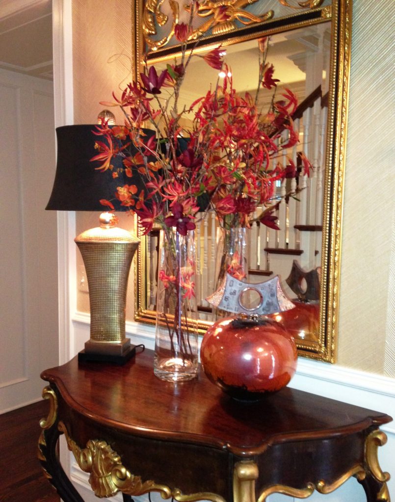
    Here in this entryway, the red platter, leaves, and stunning artwork showcase simple ways to introduce autumn red into your home.


    Karen Mills' blog
    Interior design by Karen Mills

    In this living room, we placed red toss pillows and a custom blown vase to add a fall feel to the room.  The dark wood furniture and taupe drapes also add to the autumn ambiance.

    Other simple ideas for introducing fall re could include red delicious apples in a bowl or clear container, a warm throw, an area rug with red or decor items layered into your room.

    For more fabulous ideas on how to introduce autumn red into your decorating, read my latest article from Houzz here titled 6 Ways to Inject Rich Autumn Red in Your Living Room.

    Plus become a fan of our weekly interior design blog here

    And become a fan of Kansas City’s interior designer and former host of Living Large, Karen Mills, on Facebook here!

    Interior Design/Interior Decorating

    Interior Design: Soothing Laundry Room Color Palettes


    Karen Mills' blog
    Photo courtesy of Whirlpool

    If you’re like most homeowners the laundry room may be the last place to get a makeover but its still important because a pleasing paint color on the walls can be soothing for what’s often a daunting task.   And what better time of year to repaint inside than fall!

    Click below to read the popular article titled 7 Laundry Room Color Palettes to Make Washday More Relaxing that I wrote that was recently featured in Houzz’s newsletter

    https://www.houzz.com/ideabooks/89436594/list/7-laundry-room-color-palettes-to-make-washday-more-relaxing

    plus sign up for our weekly interior design blog here

    and become a fan of Kansas City’s interior designer and former host of Living Large design show, Karen Mills on Facebook here!

    Interior Design/Interior Decorating

    Interior Design: Designer Spotlight


    Karen Mills' blog
    Interior design by Karen Mills. Photography by 29 Pixels.

    DesignerInc just did a Designer Spotlight interview with me today and wanted to share it with you!

    Absolutely love interior design and working as an interior designer but if you knew my heart you would know my top priority is helping people make things better – increase their joy through forgiveness,  help navigate life changing choices,  or by simply creating an extraordinary living experience.


    DESIGNER INC SPOTLIGHT                                           August 23, 2017

    One of our favorite things about working with interior designers at DesignerInc is taking a moment to pause and revel in their work.  There are so many talented designers on the site that it’s hard not lose hours perusing their portfolios once you learn of them.

    Our latest discovery was Karen Mills and her firm Interiors by Design.  You may have heard of her, as her work has been featured in over 100 media outlets including USA Today, Elle Decor, and The Washington Post.  When she’s not designing, she’s the host of nationally acclaimed Living Large, the first design and lifestyle radio program in the US.  And if that wasn’t enough, her award-winning blog was named to one of the Top 100 Interior Design Blogs.  It was there that we learned a few tricks of her trade.

    Her blog offers many useful design tips such as how to deemphasis mismatched upholstery, reimagine a walk-in closet into a glam dressing room, design a basement that lives and breathes like the rest of house, or strike the right balance of drama in the dining room.  With her wealth of knowledge, it’s easy to understand how she’s become a go-to design expert in the media and a spokesperson for Kohler, Sherwin William, and Ferguson.

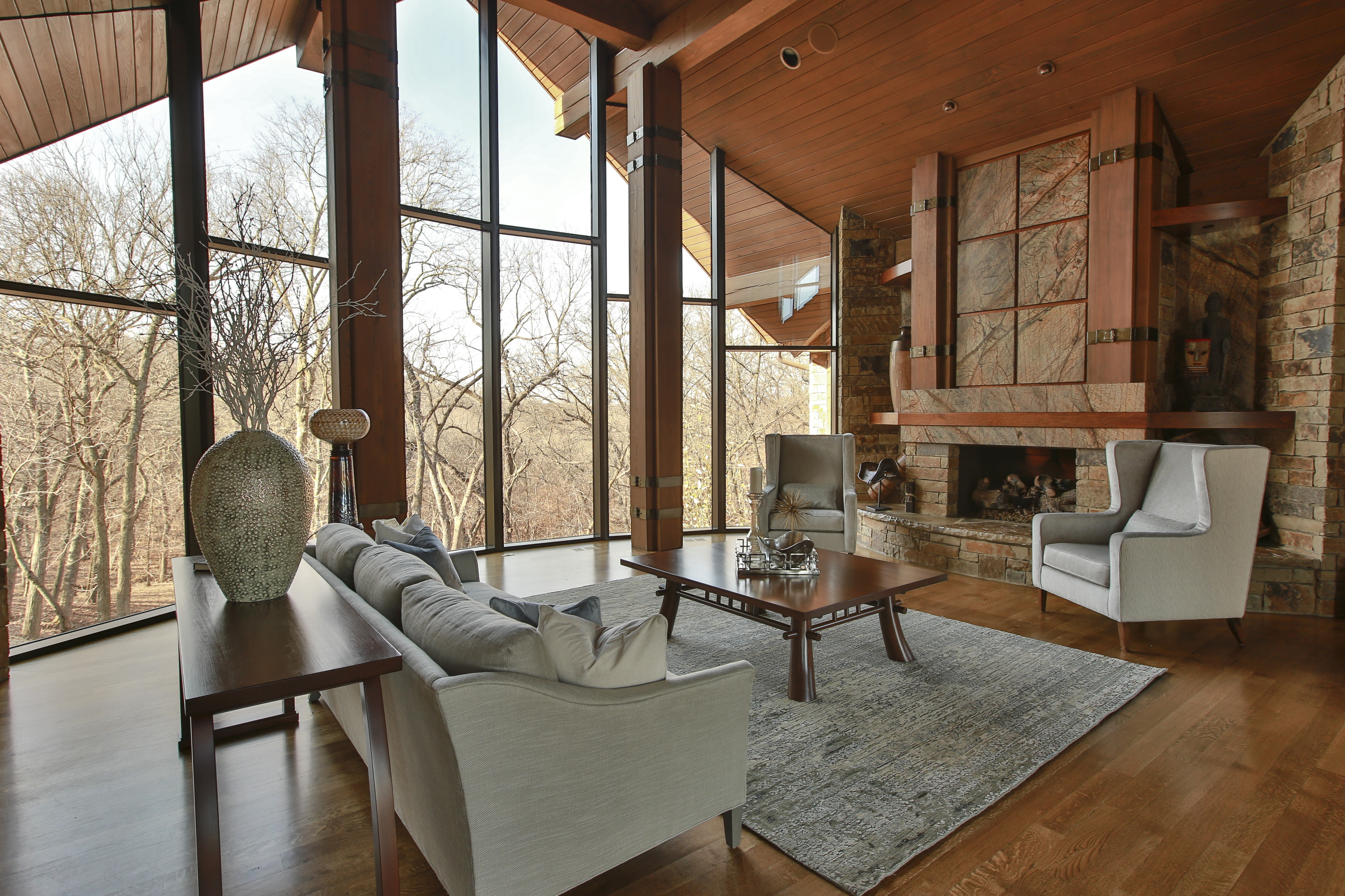
    We love her skill of blending and layering textures.  In this mountain home living room, she balances a soft cool palette to enhance the warmth, color, and tone of the natural elements of rock, wood, metal and leather.

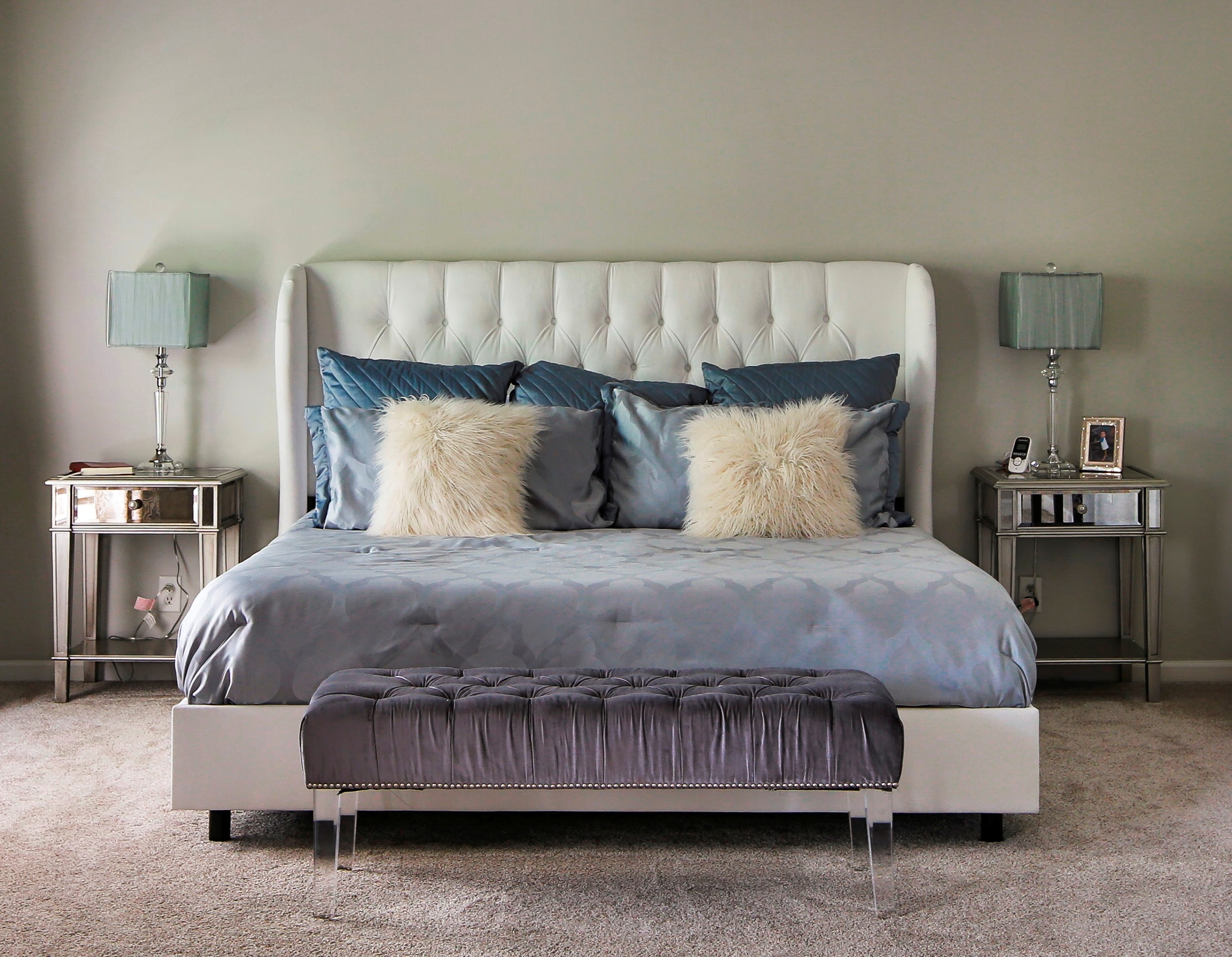
    Or how she strikes the right amount of symmetry in this plush master bedroom that gives structure to various textures and materials in the room.

    Karen says she “spent her childhood surrounded by art, literature, music, and textiles” and that this along with her travel experiences have founded the way she designs today.  We can’t help but wonder which memory or muse from her past she drew upon when asked to design a piano for Steinway & Sons!  We had a chance to chat with Karen this month to learn more about her:

    What is your favorite part of being a designer?

    The best part about being a designer are relationships forged with clients, as we translate their personal style into a timeless signature look that helps reduce stress, nurture their soul, and help them live better. The result is an extraordinary living experience, which often brings families closer together and creates a lifelong connection between us and them.

    Who or what would you cite as your most important influence?

    Experiencing different cultures through international travel and being cognizant of changes around me in everything from fashion or technology to lifestyle are my biggest influences.

    If you could travel back, what advice would you give yourself as you start this career?

    I would keep asking until I found a mentor in the design field before launching our company, along with getting advice offered to start ups from the business development center.

    What is your current favorite resource?

    My favorite resource would be a mix of local tradespeople who help bring our visions to life and to-the-trade designer-only showrooms, both online and local.

    We loved getting to know Karen and her work better.  Look out for more Designer Spotlights coming soon!