Interior Design/Interior Decorating

Interior Design: Tips for Incorporating Your Favorite Color

What Your Favorite Hue Says About You and How to Use in Your Space
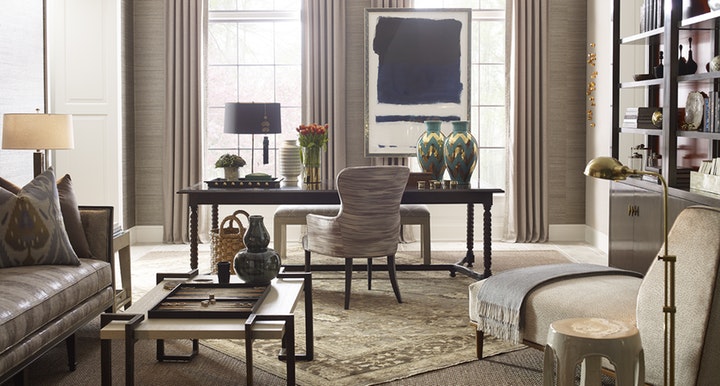
photo example
Room courtesy of Curated Kravet

Did you know that your favorite color gives experts insight into your personality type? As an interior designer who’s worked on over 1300 project, I can usually get an immediate sense of someone’s personal style by looking at their outfit or by walking through their home.

Everyone experiences color in different ways. So, as we progress through life, we each end up with our own unique color story based on our experiences.  Lea Eiseman, the world’s leading color expert and a regular guest on my former design show Living Large, shared why that’s true in one of her renowned color books, “…much of color knowledge is based on instinctive responses, cultural conditioning, and those aspects of color that we seem to absorb without much conscious thought.”

Read on to gain insight about your favorite color, what it says about you, and ideas for injecting that color into your home’s interior.
Karen Mills' blog
Photo courtesy of Kravet

RED

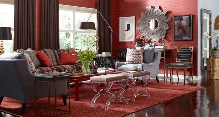
If you love red like I do, you likely possess a passion and intensity that others don’t possess for living life to the fullest. You’re exciting, daring, and spontaneous, with an inner drive to excel in everything you touch.  The color red, associated with blood, instantly raises your blood pressure and grabs your attention.  So, remember when creating a new interior design that a little bit goes a long way in a room as demonstrated in this all-red room that demands your attention. Alternately, soft pink lovers tend to be charming, peace loving, and romantic types who carry some traits that are similar to the red and bright pink personality.
Karen Mills' blog
Interior design by Karen Mills featured in Architecture Today Interior Design book

BLUE

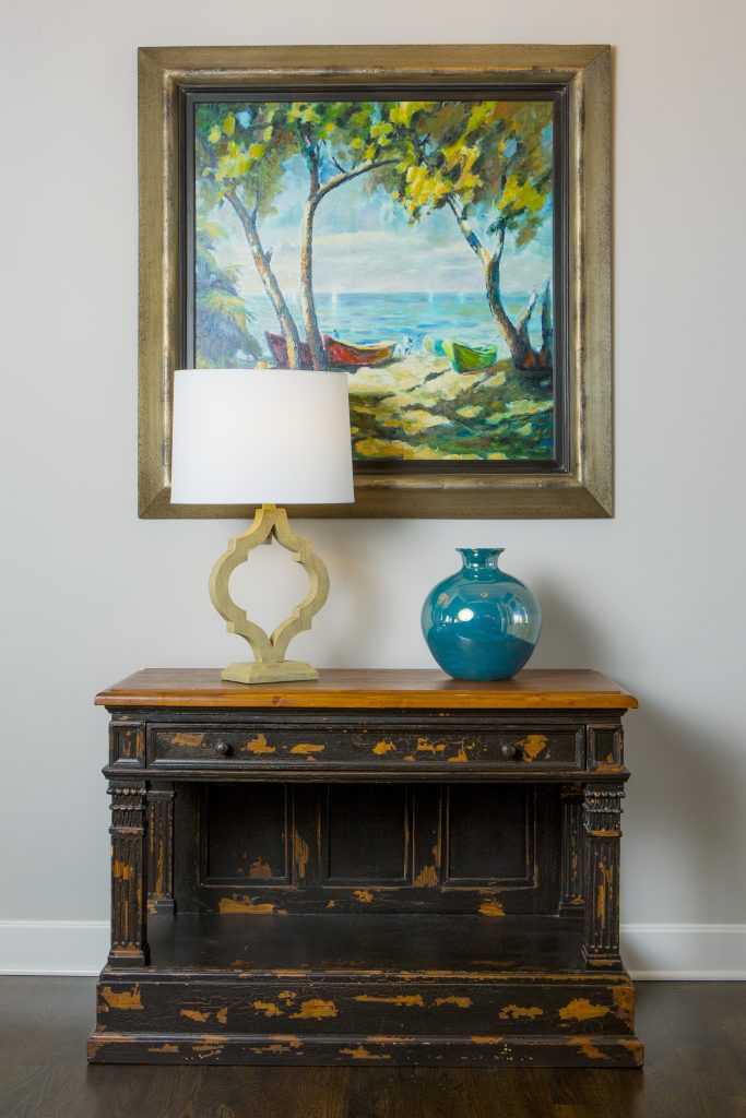
An extension of sky and water, blue exudes stability and calm making it a perfect color for bedrooms or other areas where you want to unwind and relax. Lovers of this color tend to be dependable, responsible citizens who do the right thing. No wonder blue still remains the favorite color of men! In this entryway, a watery blue landscape painting sets the tone for the rest of the living area while the blue vase reinforces this gorgeous accent color.  

YELLOW

Yellow like a ray of sunshine portrays warmth, cheerfulness, and optimism making it a wonderful hue for a cheery kitchen, sunny living area, or any interior lacking sunshine and warmth. Huge fans of yellow are optimistic, warm, and playful, while also being inquisitive and encouraging to others.
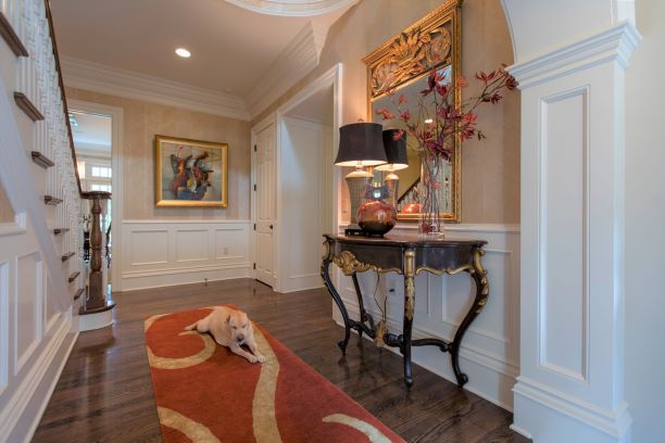
photo example
Interior design by Karen Mills

Interior design by Karen Mills featured in Design Icons book

ORANGE

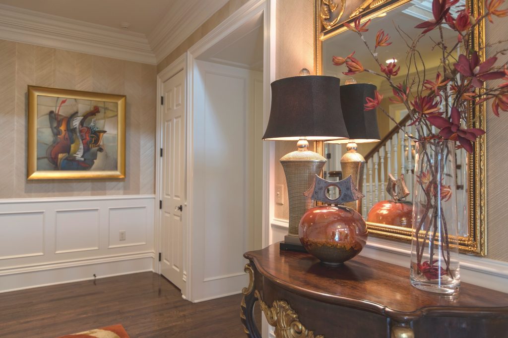
As an orange lover, you have an enthusiastic zest for life, outgoing personality, sense of humor, bright outlook, and longing for adventure. Orange, the color of hunger, fits seamlessly into a dining area or kitchen where hungry people often come. But that’s not all as you can see in this foyer where we sourced a Mattini painting, pulling out the orange hue as as an accent color on our custom designed rug, original ceramic art piece, and flowers, while also repeating a golden hue from the art on the wool rug and handmade chevron wallpaper to add more interest.
Interior design by Karen Mills featured in Design Icons book

GREEN

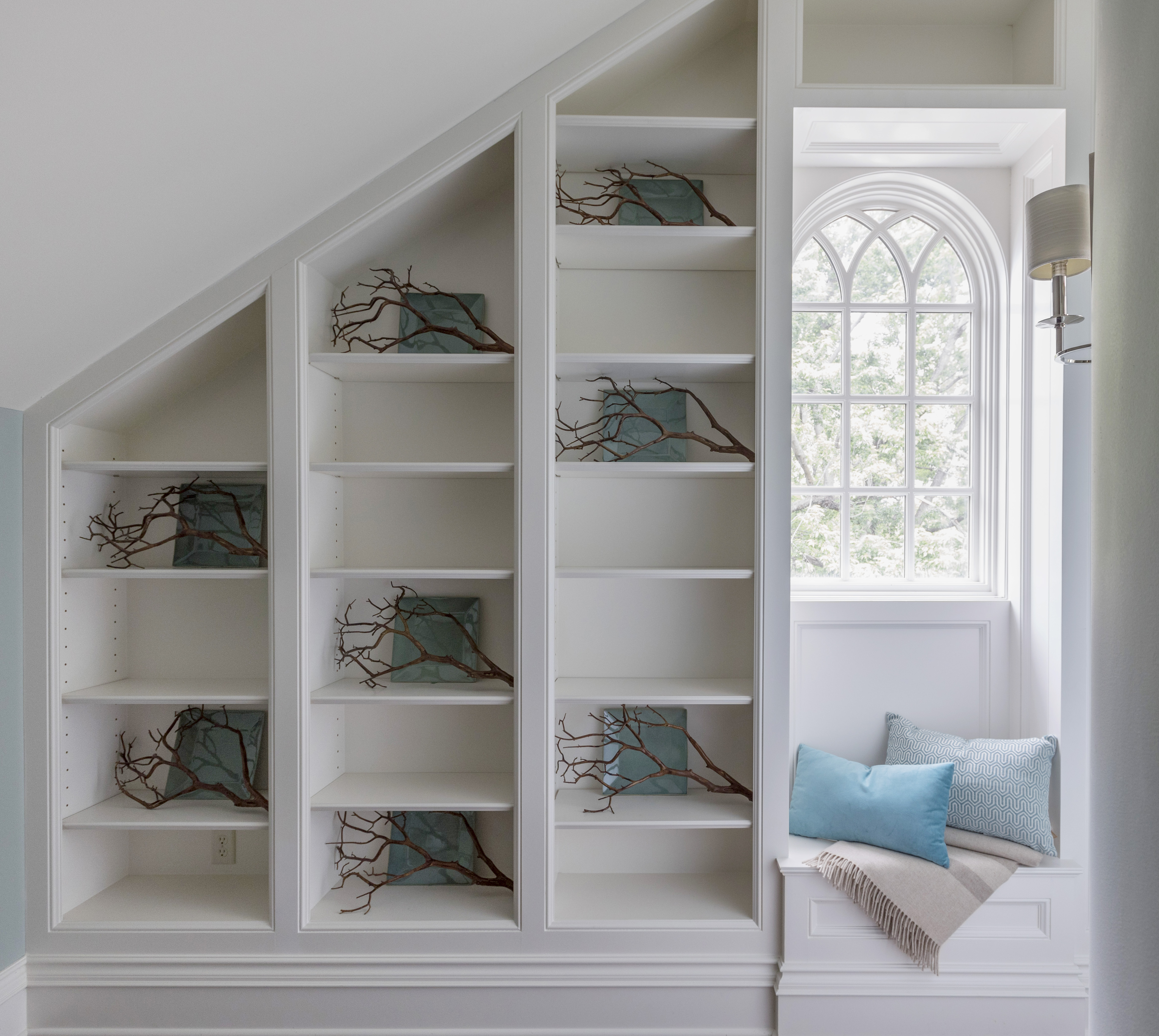
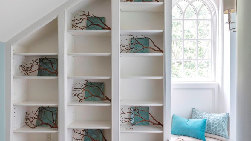
Green, the color of nature, exudes calmness and warmth, making it a perfect color for calming bedrooms or interiors when a more relaxed vibe is wanted.  Enthusiastic fans of green are usually warm, kind, and charitable people who like to give back to their communities. Green fans also bring stability and loyalty as additional attributes. Here in this stunning foyer featured in the international Design Icons book, that we designed, the blue green plates with branches overlaid on the white shelves were repeated to create a dramatic pattern, but also created a calming entry into this third floor foyer aptly named The Flat after our client’s London home.

PURPLE

A complex and creative type of individual, purple lovers are fascinating observant individuals who often have a generous spirit and artistic flair. Purple, the favorite color of most children, also has a mysterious air about it making it popular with artists or creatives too. In interiors purple usually works best as a light or a very dark almost neutral hue wall color or as an accent in any shade.
Interior Design by Karen Mills featured in Architecture Today Interior Design Book

BROWN

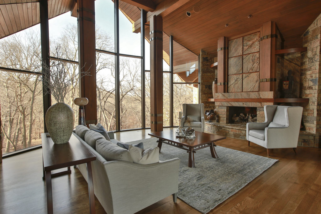
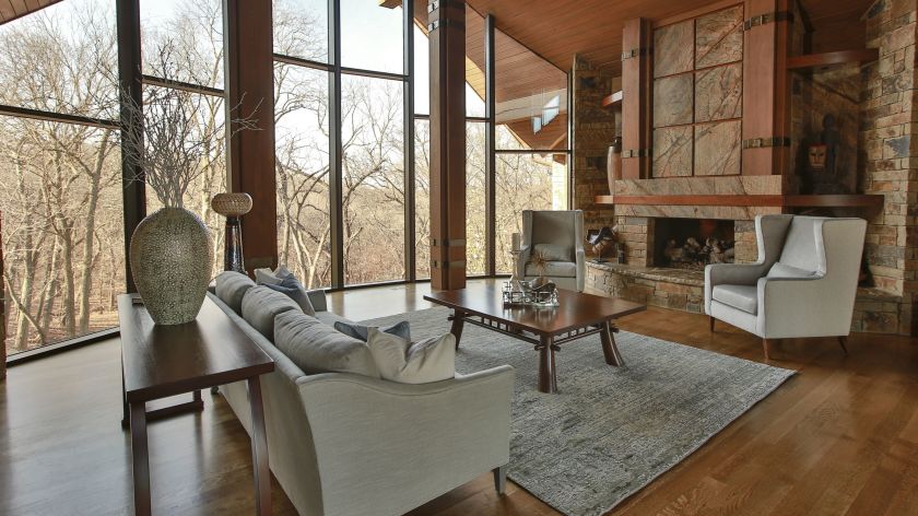
Brown personalities tend to be down to earth, stable, and in harmony with life around them, while still appreciating quality. Brown lovers like to keep things simple, secure, and peaceful, but that doesn’t mean they aren’t cosmopolitan. Brown hues work great for your interior if you’re looking to create a grounded space that’s also cozy and inviting whether its a living room, dining room, den, or even a bedroom. Beige, a lighter version of brown speaks of someone who is warm, reliable, and doesn’t often rock the boat. As a light neutral this color can be introduced almost anywhere including combining it with gray for a cool/warm color combination. Here in this stunning rustic great room featured in the international book Architecture Today Interior Design, that we designedwarm browns wrap around the room like a big hug, creating a welcoming feel. While in contrast calming blue hues on the area rug and pillows, help balanced out the color, adding a soothing feel.
White

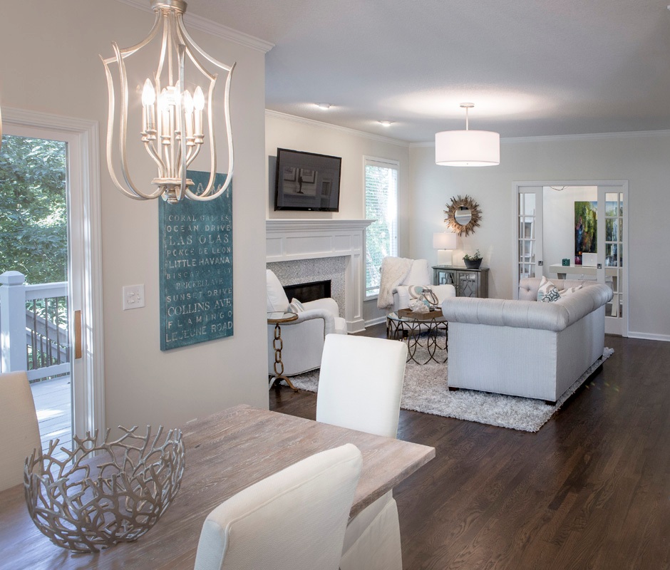
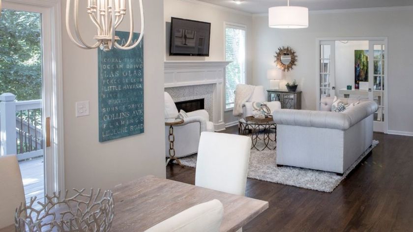
Did you know that white is the sum of all other colors combined? Isn’t that amazing? As an interior designer I love that white can do so much in a room’s interior design from creating more contrast and bouncing light around a room to visually expanding it.  But white also represents innocence, cleanliness, and purity which is why lovers of the white color often have clean fresh organized spaces with a pure aesthetic. In this hearth area we darkened the floors to contrast against the white walls and trim we introduced to create more drama. Then we continued to lighten up the interior by recovering heavy dark fabrics on the upholstery with lighter ones, slip covering the dark leather dining chairs, layering in pillows with white backgrounds, updating the fireplace with a white/gray marble tile, and adding a kitchen table that had been whitewashed a lighter color.
Gray

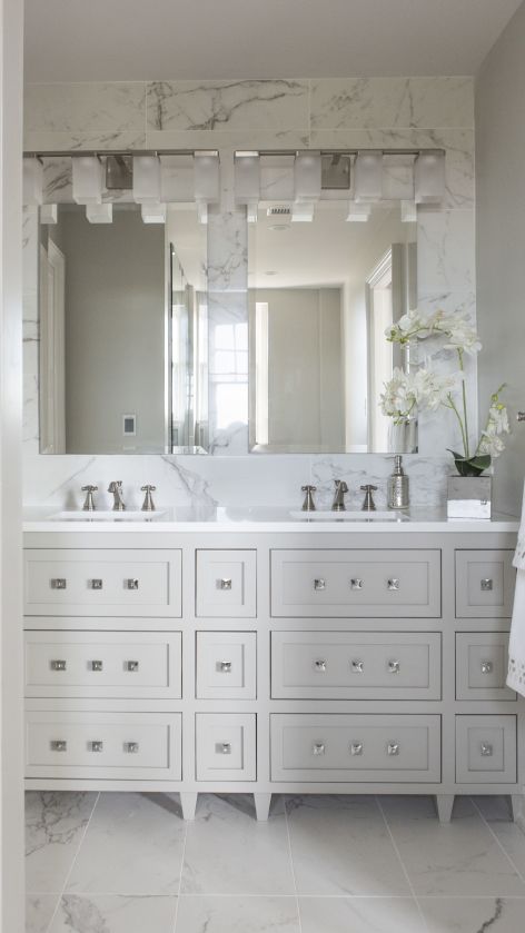
Gray personalities seem content, cool, and collected, often preferring to stay out of the limelight.  Instead, they opt for safety, security, and practicality. That’s why I believe as an interior designer that gray color schemes have become so popular at home for years because this color creates a calm respite from the outside world and works well in almost every room. In this gorgeous high rise master bathroom we designed, the gray in the Italian marble style tile repeats again on the custom designed vanity and walls. White quartz counters, square knobs and a tiled wall enhance the look of this small but stunning space.
example of blog topic
Interior design by Karen Mills

BLACK

Did you know that black is completely void of color?  But as we know the black suit signifies power, sophistication and status in the business world.  Black hue aficionados also seem confident in their ability to hold a conversation, clever in their communication abilities, and make security a top priority in their lives.

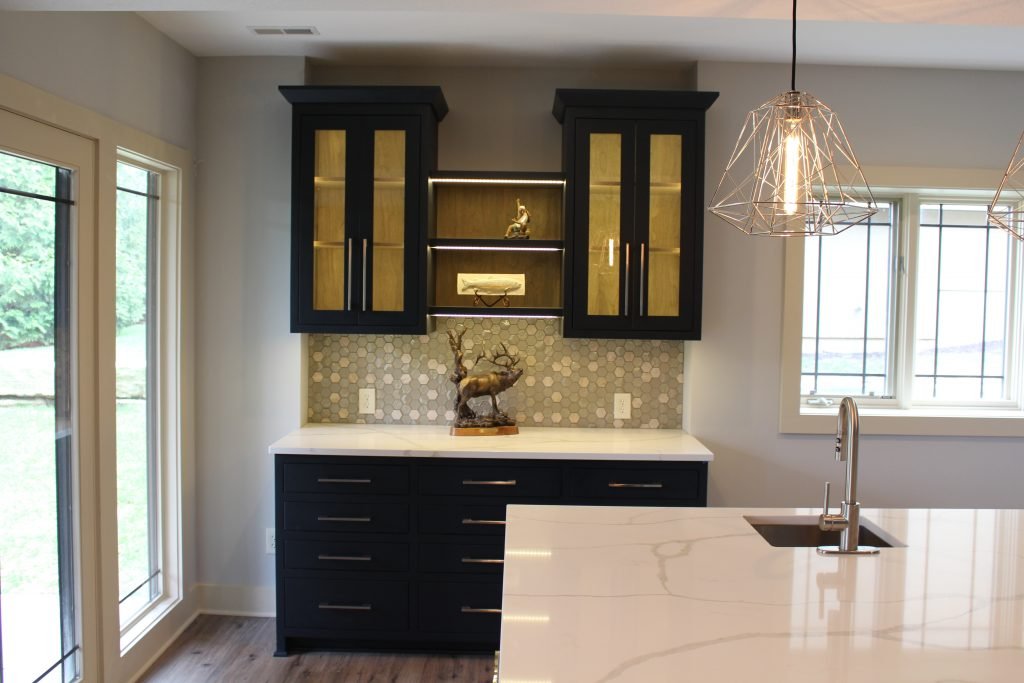
Black is a wonderful color for interiors, especially when combined with white and can used throughout your interior from living, dining, and powder rooms to home theaters, or on doors/trim to create a dramatic look. Here in this bar area, the stunning black cabinetry steals the show with its dramatic color juxtaposed against the warm wood interiors and lit glass cabinetry.

But what if your favorite color is a combination of two different colors? Then you likely have some personality traits from both colors.

To summarize, colors whether worn or used in your interior reveal insight into your personality and life story. And when you utilize your favorite color in your home it can bring back wonderful memories that cradle you in comfort whether it’s on the walls, ceilings, floors or furnishings.

For more great interior design ideas, sign up for our design blog here! plus become a fan of Kansas City’s interior designer and former host of the Living Large design show, Karen Mills, on Facebook  and Instagram now! And if you feel someone you know could benefit from this helpful information, please pass it on!
Interior Design/Interior Decorating

Interior Decorating: How to Use Your Favorite Hue at…

Tips for Injecting Your Favorite Color into Your Interior

example
Interior design by Karen Mills featured by Design Icons book

Did you know that your favorite color gives experts insight into your personality type? As an interior designer who’s been in over 1200 homes I can get an immediate sense of someone’s personality just by looking at the styles and colors of clothing in their closet or by walking through their home interior when we first meet.

You may be wondering how that’s possible, but all of us experience color in different ways as we progress through life creating an unique color story that’s all our own. Lea Eiseman, the world’s leading color expert and a regular guest on my former design show Living Large, shared why that’s true in one of her renowned color books, “…much of color knowledge is based on instinctive responses, cultural conditioning, and those aspects of color that we seem to absorb without much conscious thought.” Read on to gain insight about your favorite color, what it says about you, and ideas for injecting that color into your home’s interior.

Karen Mills' blog
Interior design by Karen Mills

RED

If you love red like I do you live life to the fullest with a passion and intensity that others don’t possess. You’re exciting, daring, and spontaneous, but also have an inner drive to excel at everything you do. So how does that color translate into an interior design? The color red that we associate with blood, instantly raises your blood pressure and grabs your attention so remember that a little bit goes a long way in a room! 

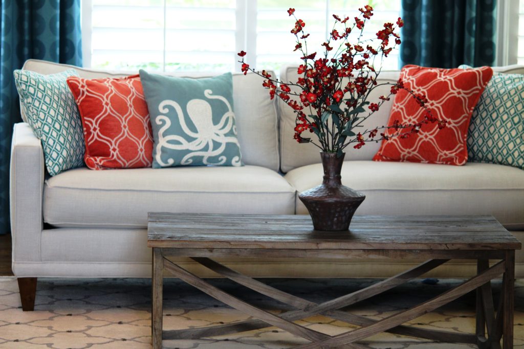
In this great room orange red pillows and flowers pop against the white sofa creating an exciting tension and bold contrast, while the custom blue draperies we designed introduce a secondary color that’s cooler and more restful.

Alternately, soft pink lovers tend to be charming, peace loving, and romantic types who carry some of the same traits as the red/bright pink.

example of comfortable seating
Interior design by Karen Mills featured in Architecture Today Interior Design book

BLUE

An extension of sky and water, blue exudes stability and calm making it a perfect color for bedrooms or other areas where you want to unwind and relax. Lovers of this color tend to be dependable, responsible citizens who do the right thing. No wonder blue still remains the favorite color of men!

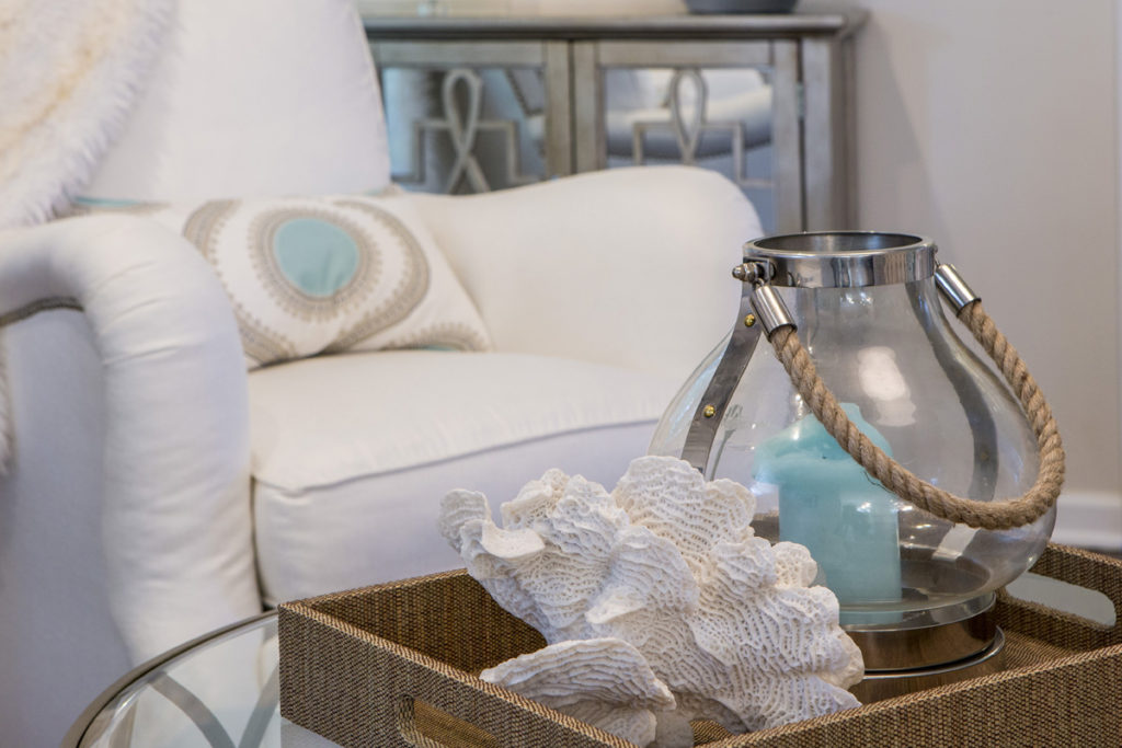
In this close up photo of a family room we designed, a watery blue pillow and candle join forces with rustic beach elements – a shell and rope – to create a wonderful ocean vibe in this space. 

YELLOW

Yellow like a ray of sunshine portrays warmth, cheerfulness, and optimism making it a wonderful hue for a cheery kitchen, sunny living area, or any interior lacking sunshine and warmth. Huge fans of yellow are optimistic, warm, and playful, while also being inquisitive and encouraging to others. 

example
Interior design by Karen Mills featured in Design Icons book

ORANGE

As an orange enthusiast you share an enthusiastic zest for life, outgoing personality, sense of humor, bright outlook, and longing for adventure. Orange, known as the color of hunger, fits perfectly into a dining room or kitchen eat in area where you need some energy or more life. But that’s not all as you can see in this foyer where we sourced an original Mattini painting and pulled out the orange hue as as the main accent color on our custom designed rug, original ceramic art piece, and flowers, while also repeating a golden hue from the art on the wool rug and and handmade chevron wallpaper to add more interest.

Interior design by Karen Mills featured in Design Icons book

GREEN

Green, the color of nature exudes calmness and warmth, which makes it a great color for bedrooms or spaces where you need a more relaxed feel like a sun room, den, or library.  Enthusiastic fans of green are usually warm, kind, and charitable people who like to give back to their communities. Green fans also bring stability and loyalty as additional attributes.

Here in this stunning foyer we designed that was featured in the international Design Icons book, we repeated the blue green plates with branches overlaid on the white shelves to create a dramatic but also calm entrance into this third floor foyer aptly named The Flat after our client’s London home.

PURPLE

A complex and creative type of individual, purple lovers are fascinating observant individuals who often have a generous spirit and artistic flair. Purple, the favorite color of most children, also has a mysterious air about it making it popular with artists or creatives too. In interiors purple usually works best as a light or a very dark almost neutral hue wall color or as an accent in any shade. 

Interior Design by Karen Mills featured in Architecture Today Interior Design Book

BROWN

Brown personalities tend to be down to earth, stable, and in harmony with life around them, while still appreciating quality. Brown lovers like to keep things simple, secure, and peaceful, but that doesn’t mean they aren’t cosmopolitan. Brown hues work great for your interior if you’re looking to create a grounded space that’s also cozy and inviting whether its a living room, dining room, den, or even a bedroom.

Beige, a lighter version of brown speaks of someone who is warm, reliable, and doesn’t often rock the boat. As a light neutral this color can be introduced almost anywhere including combining it with gray for a cool/warm color combination. 

Here in this stunning rustic great room we designed that was featured in the international book Architecture Today Interior Design, warm browns wrap around the room like a big hug, creating a welcoming feel.

White

Did you know that white is the sum of all other colors combined? Isn’t that amazing? As an interior designer I love that white can do so much in a room’s interior design from creating more contrast and bouncing light around a room to visually expanding it. But white also signifies innocence, cleanliness, and purity so you may notice that white hue lovers sometimes have the same characteristics in their neatly organized and well kept homes or crave the innocence of their youth.   

In this hearth area renovation we darkened the floors to contrast against the white walls and trim we introduced. Then we continued the white theme by slip covering dining chairs, upholstering arm chairs, layering in pillows with white backgrounds, putting in white/gray marble tile, and adding a table we had white washed that was formerly a door.

Gray

The gray personalities that I’ve experienced are content to be calm, cool, and collected. They prefer to stay out of the limelight, opting instead for safety, security, and practicality. That’s why I believe as an interior designer that gray color schemes have become so popular at home for years because this color creates a calm respite from the outside world and works well in almost every room.

In this gorgeous high rise master bathroom we designed, gray from the Italian marble style tile repeats again on the custom designed vanity and walls. White quartz counters, square knobs and a tiled wall enhance the look of this small but stunning space.

BLACK

Don’t know if you aware of this little known fact, but black is completely void of color, the opposite of white. Of course we all know that the black suit signifies sophistication and status in the business world, but black color hue aficionados are also confident in their ability to hold a conversation, clever in their communication abilities, and make security a top priority in their lives. Black is a wonderful color for interiors, especially when combined with white and can used throughout your interior from living, dining, and powder rooms to home theaters, or on doors/trim to create a dramatic look.

So what if your favorite color is a combination of two colors. If that’s the case, simply combine the traits associated with each color for a picture of your personality.

To summarize, colors whether worn or used in your interior reveal insight into your personality and life story. And when you utilize your favorite color in your home it can bring back wonderful memories that cradle you in comfort whether its on the walls, ceilings, floors or furnishings. 

For more great interior design ideas, sign up for our design blog here!

plus become a fan of Kansas City’s interior designer and former host of the Living Large design show, Karen Mills, on Facebook  and Instagram now!

If you feel someone you know could benefit from this helpful information, pass it on!
Interior Design/Interior Decorating

Interior Decorating: 3 Designer Suggestions for How to Incorporate…

Tips for Injecting Your Favorite Color into Your Interior

example
Interior design by Karen Mills featured by Design Icons book

Did you know that your favorite color gives experts insight into your personality type? As an interior designer who’s been in over 1200 homes I can get an immediate sense of someone’s personality just by looking at the styles and colors of clothing in their closet or by walking through their home interior when we first meet.

You may be wondering how that’s possible, but all of us experience color in different ways as we progress through life creating an unique color story that’s all our own. Lea Eiseman, the world’s leading color expert and a regular guest on my former design show Living Large, shared why that’s true in one of her renowned color books, “…much of color knowledge is based on instinctive responses, cultural conditioning, and those aspects of color that we seem to absorb without much conscious thought.” Read on to gain insight about your favorite color, what it says about you, and ideas for injecting that color into your home’s interior.

Karen Mills' blog
Interior design by Karen Mills

RED

If you love red like I do you live life to the fullest with a passion and intensity that others don’t possess. You’re exciting, daring, and spontaneous, but also have an inner drive to excel at everything you do. So how does that color translate into an interior design? The color red that we associate with blood, instantly raises your blood pressure and grabs your attention so remember that a little bit goes a long way in a room! 

In this great room orange red pillows and flowers pop against the white sofa creating an exciting tension and bold contrast, while the custom blue draperies we designed introduce a secondary color that’s cooler and more restful.

Alternately, soft pink lovers tend to be charming, peace loving, and romantic types who carry some of the same traits as the red/bright pink.

example of comfortable seating
Interior design by Karen Mills featured in Architecture Today Interior Design book

BLUE

An extension of sky and water, blue exudes stability and calm making it a perfect color for bedrooms or other areas where you want to unwind and relax. Lovers of this color tend to be dependable, responsible citizens who do the right thing. No wonder blue still remains the favorite color of men!

In this close up photo of a family room we designed, a watery blue pillow and candle join forces with rustic beach elements – a shell and rope – to create a wonderful ocean vibe in this space. 

YELLOW

Yellow like a ray of sunshine portrays warmth, cheerfulness, and optimism making it a wonderful hue for a cheery kitchen, sunny living area, or any interior lacking sunshine and warmth. Huge fans of yellow are optimistic, warm, and playful, while also being inquisitive and encouraging to others. 

example
Interior design by Karen Mills featured in Design Icons book

ORANGE

As an orange enthusiast you share an enthusiastic zest for life, outgoing personality, sense of humor, bright outlook, and longing for adventure. Orange, known as the color of hunger, fits perfectly into a dining room or kitchen eat in area where you need some energy or more life. But that’s not all as you can see in this foyer where we sourced an original Mattini painting and pulled out the orange hue as as the main accent color on our custom designed rug, original ceramic art piece, and flowers, while also repeating a golden hue from the art on the wool rug and and handmade chevron wallpaper to add more interest.

Interior design by Karen Mills featured in Design Icons book

GREEN

Green, the color of nature exudes calmness and warmth, which makes it a great color for bedrooms or spaces where you need a more relaxed feel like a sun room, den, or library.  Enthusiastic fans of green are usually warm, kind, and charitable people who like to give back to their communities. Green fans also bring stability and loyalty as additional attributes.

Here in this stunning foyer we designed that was featured in the international Design Icons book, we repeated the blue green plates with branches overlaid on the white shelves to create a dramatic but also calm entrance into this third floor foyer aptly named The Flat after our client’s London home.

PURPLE

A complex and creative type of individual, purple lovers are fascinating observant individuals who often have a generous spirit and artistic flair. Purple, the favorite color of most children, also has a mysterious air about it making it popular with artists or creatives too. In interiors purple usually works best as a light or a very dark almost neutral hue wall color or as an accent in any shade. 

Interior Design by Karen Mills featured in Architecture Today Interior Design Book

BROWN

Brown personalities tend to be down to earth, stable, and in harmony with life around them, while still appreciating quality. Brown lovers like to keep things simple, secure, and peaceful, but that doesn’t mean they aren’t cosmopolitan. Brown hues work great for your interior if you’re looking to create a grounded space that’s also cozy and inviting whether its a living room, dining room, den, or even a bedroom.

Beige, a lighter version of brown speaks of someone who is warm, reliable, and doesn’t often rock the boat. As a light neutral this color can be introduced almost anywhere including combining it with gray for a cool/warm color combination. 

Here in this stunning rustic great room we designed that was featured in the international book Architecture Today Interior Design, warm browns wrap around the room like a big hug, creating a welcoming feel.

White

Did you know that white is the sum of all other colors combined? Isn’t that amazing? As an interior designer I love that white can do so much in a room’s interior design from creating more contrast and bouncing light around a room to visually expanding it. But white also signifies innocence, cleanliness, and purity so you may notice that white hue lovers sometimes have the same characteristics in their neatly organized and well kept homes or crave the innocence of their youth.   

In this hearth area renovation we darkened the floors to contrast against the white walls and trim we introduced. Then we continued the white theme by slip covering dining chairs, upholstering arm chairs, layering in pillows with white backgrounds, putting in white/gray marble tile, and adding a table we had white washed that was formerly a door.

Gray

The gray personalities that I’ve experienced are content to be calm, cool, and collected. They prefer to stay out of the limelight, opting instead for safety, security, and practicality. That’s why I believe as an interior designer that gray color schemes have become so popular at home for years because this color creates a calm respite from the outside world and works well in almost every room.

In this gorgeous high rise master bathroom we designed, gray from the Italian marble style tile repeats again on the custom designed vanity and walls. White quartz counters, square knobs and a tiled wall enhance the look of this small but stunning space.

BLACK

Don’t know if you aware of this little known fact, but black is completely void of color, the opposite of white. Of course we all know that the black suit signifies sophistication and status in the business world, but black color hue aficionados are also confident in their ability to hold a conversation, clever in their communication abilities, and make security a top priority in their lives. Black is a wonderful color for interiors, especially when combined with white and can used throughout your interior from living, dining, and powder rooms to home theaters, or on doors/trim to create a dramatic look.

So what if your favorite color is a combination of two colors. If that’s the case, simply combine the traits associated with each color for a picture of your personality.

To summarize, colors whether worn or used in your interior reveal insight into your personality and life story. And when you utilize your favorite color in your home it can bring back wonderful memories that cradle you in comfort whether its on the walls, ceilings, floors or furnishings. 

For more great interior design ideas, sign up for our design blog here!

plus become a fan of Kansas City’s interior designer and former host of the Living Large design show, Karen Mills, on Facebook  and Instagram now!

If you feel someone you know could benefit from this helpful information, pass it on by clicking this link to City Lifestyle magazine where I originally posted this article, and then share or like it.

Interior Design/Interior Decorating

Interior Design: What Your Decor Color Says About You

Tips for Injecting Your Favorite Color into Your Interior

example
Interior design by Karen Mills featured by Design Icons book

Did you know that your favorite color gives experts insight into your personality type? As an interior designer who’s been in over 1200 homes I can get an immediate sense of someone’s personality just by looking at the styles and colors of clothing in their closet or by walking through their home interior when we first meet.

You may be wondering how that’s possible, but all of us experience color in different ways as we progress through life creating an unique color story that’s all our own. Lea Eiseman, the world’s leading color expert and a regular guest on my former design show Living Large, shared why that’s true in one of her renowned color books, “…much of color knowledge is based on instinctive responses, cultural conditioning, and those aspects of color that we seem to absorb without much conscious thought.” Read on to gain insight about your favorite color, what it says about you, and ideas for injecting that color into your home’s interior.

Karen Mills' blog
Interior design by Karen Mills

RED

If you love red like I do you live life to the fullest with a passion and intensity that others don’t possess. You’re exciting, daring, and spontaneous, but also have an inner drive to excel at everything you do. So how does that color translate into an interior design? The color red that we associate with blood, instantly raises your blood pressure and grabs your attention so remember that a little bit goes a long way in a room! 

In this great room orange red pillows and flowers pop against the white sofa creating an exciting tension and bold contrast, while the custom blue draperies we designed introduce a secondary color that’s cooler and more restful.

Alternately, soft pink lovers tend to be charming, peace loving, and romantic types who carry some of the same traits as the red/bright pink.

example of comfortable seating
Interior design by Karen Mills featured in Architecture Today Interior Design book

BLUE

An extension of sky and water, blue exudes stability and calm making it a perfect color for bedrooms or other areas where you want to unwind and relax. Lovers of this color tend to be dependable, responsible citizens who do the right thing. No wonder blue still remains the favorite color of men!

In this close up photo of a family room we designed, a watery blue pillow and candle join forces with rustic beach elements – a shell and rope – to create a wonderful ocean vibe in this space. 

YELLOW

Yellow like a ray of sunshine portrays warmth, cheerfulness, and optimism making it a wonderful hue for a cheery kitchen, sunny living area, or any interior lacking sunshine and warmth. Huge fans of yellow are optimistic, warm, and playful, while also being inquisitive and encouraging to others. 

example
Interior design by Karen Mills featured in Design Icons book

ORANGE

As an orange enthusiast you share an enthusiastic zest for life, outgoing personality, sense of humor, bright outlook, and longing for adventure. Orange, known as the color of hunger, fits perfectly into a dining room or kitchen eat in area where you need some energy or more life. But that’s not all as you can see in this foyer where we sourced an original Mattini painting and pulled out the orange hue as as the main accent color on our custom designed rug, original ceramic art piece, and flowers, while also repeating a golden hue from the art on the wool rug and and handmade chevron wallpaper to add more interest.

Interior design by Karen Mills featured in Design Icons book

GREEN

Green, the color of nature exudes calmness and warmth, which makes it a great color for bedrooms or spaces where you need a more relaxed feel like a sun room, den, or library.  Enthusiastic fans of green are usually warm, kind, and charitable people who like to give back to their communities. Green fans also bring stability and loyalty as additional attributes.

Here in this stunning foyer we designed that was featured in the international Design Icons book, we repeated the blue green plates with branches overlaid on the white shelves to create a dramatic but also calm entrance into this third floor foyer aptly named The Flat after our client’s London home.

PURPLE

A complex and creative type of individual, purple lovers are fascinating observant individuals who often have a generous spirit and artistic flair. Purple, the favorite color of most children, also has a mysterious air about it making it popular with artists or creatives too. In interiors purple usually works best as a light or a very dark almost neutral hue wall color or as an accent in any shade. 

Interior Design by Karen Mills featured in Architecture Today Interior Design Book

BROWN

Brown personalities tend to be down to earth, stable, and in harmony with life around them, while still appreciating quality. Brown lovers like to keep things simple, secure, and peaceful, but that doesn’t mean they aren’t cosmopolitan. Brown hues work great for your interior if you’re looking to create a grounded space that’s also cozy and inviting whether its a living room, dining room, den, or even a bedroom.

Beige, a lighter version of brown speaks of someone who is warm, reliable, and doesn’t often rock the boat. As a light neutral this color can be introduced almost anywhere including combining it with gray for a cool/warm color combination. 

Here in this stunning rustic great room we designed that was featured in the international book Architecture Today Interior Design, warm browns wrap around the room like a big hug, creating a welcoming feel.

White

Did you know that white is the sum of all other colors combined? Isn’t that amazing? As an interior designer I love that white can do so much in a room’s interior design from creating more contrast and bouncing light around a room to visually expanding it. But white also signifies innocence, cleanliness, and purity so you may notice that white hue lovers sometimes have the same characteristics in their neatly organized and well kept homes or crave the innocence of their youth.   

In this hearth area renovation we darkened the floors to contrast against the white walls and trim we introduced. Then we continued the white theme by slip covering dining chairs, upholstering arm chairs, layering in pillows with white backgrounds, putting in white/gray marble tile, and adding a table we had white washed that was formerly a door.


Gray

The gray personalities that I’ve experienced are content to be calm, cool, and collected. They prefer to stay out of the limelight, opting instead for safety, security, and practicality. That’s why I believe as an interior designer that gray color schemes have become so popular at home for years because this color creates a calm respite from the outside world and works well in almost every room.

In this gorgeous high rise master bathroom we designed, gray from the Italian marble style tile repeats again on the custom designed vanity and walls. White quartz counters, square knobs and a tiled wall enhance the look of this small but stunning space.

BLACK

Don’t know if you aware of this little known fact, but black is completely void of color, the opposite of white. Of course we all know that the black suit signifies sophistication and status in the business world, but black color hue aficionados are also confident in their ability to hold a conversation, clever in their communication abilities, and make security a top priority in their lives. Black is a wonderful color for interiors, especially when combined with white and can used throughout your interior from living, dining, and powder rooms to home theaters, or on doors/trim to create a dramatic look.

So what if your favorite color is a combination of two colors. If that’s the case, simply combine the traits associated with each color for a picture of your personality.

To summarize, colors whether worn or used in your interior reveal insight into your personality and life story. And when you utilize your favorite color in your home it can bring back wonderful memories that cradle you in comfort whether its on the walls, ceilings, floors or furnishings. 

For more great interior design ideas, sign up for our design blog here!

plus become a fan of Kansas City’s interior designer and former host of the Living Large design show, Karen Mills, on Facebook  and Instagram now!

If you feel someone you know could benefit from this helpful information, pass it on by clicking this link to City Lifestyle magazine where I originally posted this article, and then share or like it.

Interior Design/Interior Decorating

Interior Design: How to Use White as Art to…

Karen Mills' blog

White is amazing – the perfect hue for creating contrast, emphasizing design, or grabbing your attention.  In this art piece I discovered at Crystal Bridges museum white creates the perfect backdrop for this metal sculpture, allowing each detail of the design to stand out which makes it great for an entry or when you want to make a statement.

Karen Mills' blog

In contrast, this artwork with hands slapping white powder seems to float out of the artwork and creates interest making this piece a good option for drawing people into another room to take a closer look.


But white can also be used rhythmically as seen here where repetition of these doors created an interesting pattern and an artistic statement on their own.

Karen Mills' blog  This wall demonstrates another way to use white effectively in a monochromatic color scheme which can make a powerful statement.

Karen Mills' blog

But let’s not forget about exterior design because architecture is what draws you in for a closer look.  Here at the Crystal Bridges museum I discovered this wonderful dome of circles that felt right at home in the woods but I could see just as easily on a lawn outside a home.

Karen Mills' blog

Memorial Day is almost here!  A time to honor those in the military who died protecting our country and a time to relax with family or friends whether its a barbecue outside or jsut doing nothing. Have a wonderful Memorial Day weekend and for more great ideas/ photos sign up for our weekly interior design blog here

plus become a fan of Kansas City’s interior designer and former host of the Living Large design show, Karen Mills, on Facebook

or instagram here!


Interior Design: 3 Tips for Selecting Quality Outdoor Furniture

How to narrow down the choices for high quality outdoor seating

Karen Mills' blog

Photo courtesy of B&B Italia furniture

1. Color

I think we as consumers are naturally drawn to our favorite colors and often purchase based on that fact alone but when you’re investing in a quality piece(s) of outdoor furniture you might want to consider longevity of a frame or cushion color that’s beyond a neutral.

Of course if a particular color is part of who you are, then it may not matter.  For me as an interior designer, my favorite color is usually what we are designing that day or week.  That’s why neutral seating frames and/or cushions are often best because you can switch out accessory colors every time you want a new look without starting over.

Karen Mills' blog

Courtesy of Castelle furniture

2. Furniture Style

Style, a key factor in selecting furniture, plays a huge role outside because the furnishings must not only coordinate with the exterior of the home and the view beyond but also relate the the adjacent rooms inside.

This outdoor furniture designed by Barclay Butera, who’s known for his signature blue and white color scheme, comes together beautifully with a fretwork design on the chair sides and gold finials to give a new twist to a timeless classic.

Karen Mills' blog

Photo courtesy of Gloster furniture

3. Comfort

Of course comfort is the most important factor when it comes to seating, especially if its where you will sit for prolonged periods savoring your outdoor space.   When selecting furniture ensure the seat is not only tall enough for your legs but also the right depth for you.

In this photo the chair dips down in the back to allow a more relaxed seating position which can be ideal for taking in the views while a more upright seat might better accommodate you for dining.

For more great ideas and photos sign up for our weekly interior design blog here

plus become a fan of Kansas City’s interior designer and former host of the Living Large design show, Karen Mills, on Facebook

or instagram here!

Interior Decorating: What Happens When Blue Meets Orange!

When calming blue meets vibrant orange, it’s complementary color, you will have a dramatic look in your room, especially with a light neutral backdrop.  Read on for ways to combine this fun combination to create drama and interest in your space.  Karen Mills' blog

Photo courtesy of Wesley Hall furniture

In this living room, blue dominates the space, while orange is shown in the chair/pillow fabric, art, and a flower in smaller doses to keep it from overpowering the space.  A light beige sofa, rug, and walls also help neutral the contrast between orange and blue.


Karen Mills' blog

Photo courtesy of Allan Knight furniture

Orange chairs frame the bold blue sofa beyond to draw you into the room while a light neutral wall and flooring along with a lucite coffee table help calm the space down.

Karen Mills' blog

Photo courtesy of Wesley Hall furniture

Here the orange chair with blue accents and matching pillow immediately grab your attention to create an exciting contrast against the calming back drop of light neutral walls and flooring.   An orange vase and pattern in the ottoman add more drama to the room’s design.

For more great ideas and photos sign up for our weekly interior design blog here

plus become a fan of Kansas City’s interior designer and former host of the Living Large design show, Karen Mills, on Facebook

or instagram here!

Interior Design: Pretty in Pink (or Fuchsia)

Was suddenly struck by the popularity of pink this year at my birthday party in January when most of the guests showed up with gifts in a pink color ranging from a bold bright fuchsia to a pale pink that just happened to coordinate beautifully with the live fuchsia flowers I had placed on the top of my cake.  Of course as an interior designer I know pale pinks have been a hot color trend for a few years but I’m loving this more dramatic shade everywhere from fashion to interior design!

Karen Mills' blog

Photo courtesy of Wesley Hall furniture

In this living space the fuchsia takes center stage on the draperies where it mimics the color of the tree blossoms beyond.  The color repeats again on the floral chair fabric and in decor.

Karen Mills' blog

Photo courtesy of Design within Reach

Love the purple spin on the fabulous fucsia throw in this living space.   Here a book and artwork over the mantel repeat this fabulous hue of pink.


Karen Mills' blog

Photo courtesy of Spectrum Limited

But if you’re like me and you love all the colors, why not do something fun like Spectrum in this dining space by mixing up all the colors to create a cheerful artistic space.

Karen Mills' blog

New York City

Or just have a fabulous head covering like this horse I passed by on a trip to New York City.

For more great ideas and photos sign up for our weekly interior design blog here

plus become a fan of Kansas City’s interior designer and former host of the Living Large design show, Karen Mills, on Facebook

or instagram here!


Interior Design: How to Use Black and White in Your Living Spaces

Karen Mills' blog

Photo courtesy of Wesley Hall furniture

Who doesn’t love the classic combination of black and white?  Timeless and classy, black and white bring a punch to a room like nothing else.  And the best part is that you can add touches of your favorite color to completely change the look like this living space that has a warm neutral color added to calm it down.

Karen Mills' blog

Photo courtesy of Lillian August for Hickory White

In this space the designer punched up the drama with black walls that visually disappear behind the white upholstery.  Pops of red add to the bold look.

Karen Mills' blog

Photo courtesy of Wesley Hall furniture

The best feature in this room are the black painted over sized windows that showcase the height of the room, while drawing you into the space.  White and red upholstery add to the drama while the white drapes and walls help soothe the living space.

Karen Mills' blog

Photo courtesy of All Modern furniture

Because the majority of the finishes and furnishings in this room are white, this space takes on an ethereal feel that’s calms the senses while the touches of greenery help bring the room back to earth.

For more great ideas and photos sign up for our weekly interior design blog here

plus become a fan of Kansas City’s interior designer and former host of the Living Large design show, Karen Mills, on Facebook

or instagram here!


Interior Design: 3 Tips for Creating Rustic Glam Style at Home

As a full time interior designer I’ve noticed a huge trend over the past couple of years towards creating simple spaces that are a mix of rustic and glamour.  Here are my 3 tips for creating your own style of rustic glam style.

Interior decorating by Karen Mills

  1. Introduce weathered furniture/furnishings

In this great room we layered in an end table with a rustic finish, a simple striped white and blue pillow in a rustic feel and lamp with a rustic base to juxtapose against the more glamorous light fixtures and shiny back splash in the kitchen.

Karen Mills' blog

Interior decorating by Karen Mills

Here’s another view of the great room which clearly shows the client’s bent towards rustic style that’s offset by the more sophisticated gray wall color, light fixture, and crystal decanters.

Karen Mills' blog

From dark to light


2. Add touches of white

By juxtaposing the white chairs in the eating area against the rustic table finish and shimmery light fixtures, a wonderful symphony is created that undulates between masculine and feminine in this relaxing space.

The family room beyond continues the rustic glam theme with its beach elements on the coffee table contrasting nicely against the tufted sofa and gold mirror beyond.

Karen Mills' blog

Interior design by Mills/Photography by 29Pixels, LLC


3. Layer in a glamorous element

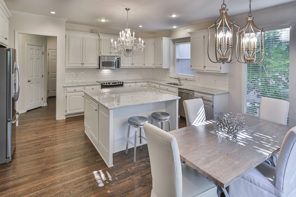
In this kitchen a re purposed chandelier provides the perfect glam touch to this beautiful  kitchen with updated finishes.  The rustic table juxtaposes nicely against the marble in the kitchen to create just the right amount of tension.

For more great ideas and photos, sign up for our weekly interior design blog here

Plus become a fan of Kansas City’s interior designer and former host of the renowned Living Large interior design show, Karen Mills, on Facebook here!

Our Design Projects Just Published in an International Interior Design and Architecture Book

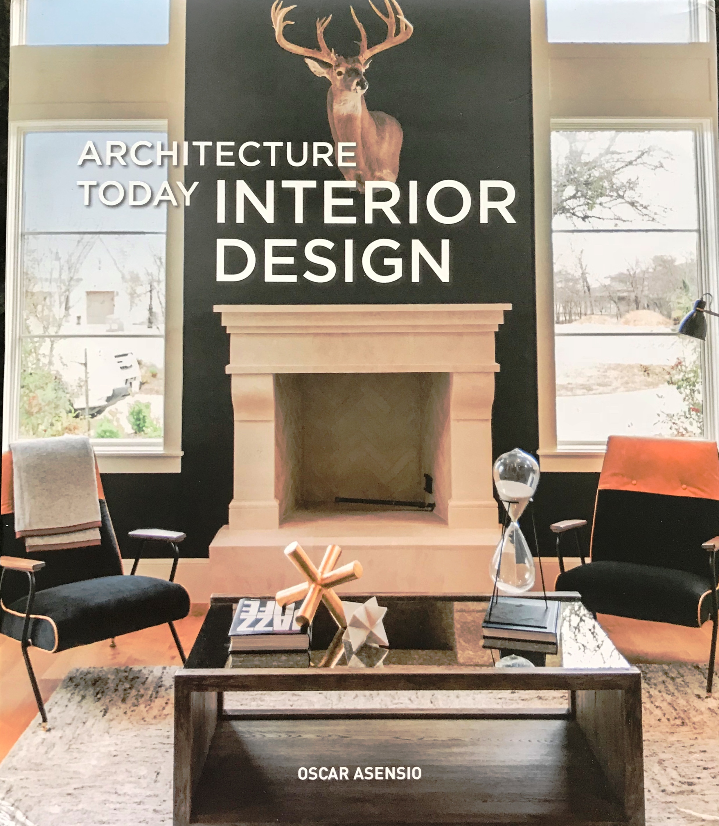
Karen Mills' blogThrilled to announce that our interior design projects were published this month in an international design book titled Architecture Today Interior Design by Booq Publishing in Barcelona, Spain along with other top interior designers and architects around the world whose work is absolutely fabulous!

Above is a photo of the book I snapped with my cell phone as I held it for the first time late yesterday afternoon.


Karen Mills' blog

Interior design by Karen Mills/Photography by 29 Pixels Studios, LLC

Here’s a sneak peek of one of our favorite projects fondly called the “The Flat” after the clients’ London flat that will be featured along with other wonderful designs.

Karen Mills' blog

Interior design by Karen Mills/Photography by 29 Pixel Studios, LLC

Copies of the book are now available at retailers worldwide so we can’t wait for you to pick up a copy and enjoy this book for years to come!

For more great ideas and photos, sign up for our weekly interior design blog here

Plus become a fan of Kansas City’s interior designer and former host of the long running Living Large design show, Karen Mills, on Facebook here!

Interior Decorating: 3 Ways to Make Your Living Room Bloom for Spring

If you’re like me you’re ready for warmer weather and cheerful colors.  Here are 3 ways to make your room bloom!

Karen Mills' blog

Photo courtesy of Kravet furniture

1. Add bold pops of spring color

In this room bold patterned pillows, a cheerful blue vase and red throw mimic the colors of the brightly colored area rug underneath to give a spring like feel to this beautiful room by Kravet furniture.

Karen Mills' blog

Photo courtesy of Lillian White for Hickory furniture

2. Introduce fresh flowers and/or plants

This dining room gets a touch of spring with fresh flowers on the table that replicate the colors in the artwork on the furniture to add life to this space.

Karen Mills' blog

Photo courtesy of Lillian White for Hickory furniture

Karen Mills' blog

Photo courtesy of Design within Reach

3. Swap out dark furnishings for lighter ones when possible

If you have a lighter area rug like the one pictured here that you can swap out for a darker one, the entire room can be transformed from winter to spring.   Fresh leaf clippings, a red pillow, and purple throw add to the fresh spring atmosphere of this living room.

For more great ideas on interior design sign up for our weekly interior design blog here

plus become a fan of Kansas City’s interior designer and former host of the Living Large design show, Karen Mills, on Facebook here!

Interior Design: 7 Steps to Successfully Designing a Room

Like any project that involves money, you need a budget or at least a range before you start. Do some research and bring in the experts  – an interior designer, contractor/builder, and architect  to give an estimated investment.  Then follow these 7 steps to create the room of your dreams!

Karen Mills' blog

    Interior Decorating by Karen Mills
  1. Decide on a design style or mix of styles that will flow with your architecture and existing furnishings you will be re purposing.   As an interior designer in Kansas City, I always suggest clients select several photos of room designs they like and make sure any spouse or significant other involved agrees.


Karen Mills' blog

 2. Determine your color scheme ensuring it coordinates with adjoining rooms and any                   existing furnishings to be used in the interior design.   If you have no idea, take a look in               your closet to see what colors you’re drawn too or pull colors out of an inspiration piece               such as art, a rug, or fabric.

  3. Create a floor plan so you know what fits in your space and the sizes you need.   To do that       go online and use space planning software or get an expert to help.

  4.  Set a timetable.   At this point you might want to bring in an expert – interior designer                  and/or contractor/builder- to review your design plan/timetable because investing a                      few dollars for a master plan and viable timetable can help avoid thousands of dollars in              costly mistakes from bad decisions or huge delays.    

Karen Mills' blog

Interior design by Karen Mills. Photo by 29 Pixels, LLC

5. Design and order custom furniture and any built in cabinetry after consulting with your        interior designer or tradespeople if you’re managing the project yourself.    At this point all          custom designs need to be finalized and ordered.   In addition permits need to be pulled for        construction.

6.  Select and order all plumbing, flooring, tile, and general lighting needed.

Karen Mills' blog

Interior design by Karen Mills

7.  Design furnishings

Furnishings may include rugs, window treatments, pillows, bedding or other items.  Also ensure you select art, finishes, and other decor needed.

For more great ideas and photos, sign up for our weekly interior design blog here

Plus become a fan of Kansas City’s interior designer and former host of the long running Living Large design show, Karen Mills, on Facebook here!

Interior Decorating: 3 Ways to Decorate Your Outdoor Area for Spring

If you’re ready to get outside and enjoy the weather here are 3 tips for setting up your outdoor porch, pergola, or open seating area to enjoy for months to come.

Karen Mills' blog

Photo courtesy of Lexington Furniture

1. Create a Comfortable Seating Area 

High quality seating and a  “L” or “U” shaped configuration like this outdoor room by Lexington Furniture help create a comfortable and inviting outdoor space.  Here the yellow chair color repeats again on the sofa pillows while the patterned pillows on both upholstered pieces add to the cohesive look.

Karen Mills' blog

Photo courtesy of Lexington Furniture

2.  Introduce Fun Accessories

Some of my favorite accessories are bold pillows, live flowers or plants, and trays for the outdoors like shown in this photo.

Karen Mills' blog

Photo courtesy of Braxton Culler

3.  Layer in an Area Rug to Create a Cozy Grouping

Placing an area rug underneath a seating area helps define the space and make it feel more like the indoors like this outdoor room.  Interesting accessories in turquoise add to the finished look along with the pillows and tray on the table.

For more great ideas sign up for our weekly interior design blog here

plus become a fan of Kansas City’s interior designer and former host of Living Large design show, Karen Mills, on Facebook here

and if you have a porch to decorate, check out my latest article on Houzz titled Get Your Porch Ready for Spring Sitting below

https://www.houzz.com/ideabooks/95204125/list/get-your-porch-ready-for-spring-sitting

Karen Mills' blog