 Interior Design/Interior Decorating
What to Avoid When Space Planning Your Bedroom
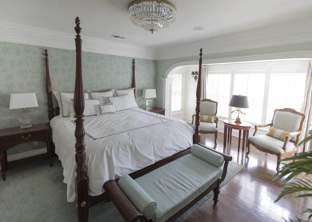
- Not Making Your Bed the Focal Point In this bedroom we emphasized the bed as the focal point by placing it on the longest wall, ensuring you can see it from the entry, and by layering in a luxurious blue green wallpaper behind it. Flanking end tables and lamps along with a bench and area rug also emphasize the bed as a focal point. 3 Suggestions for Creating a Restful Bedroom Retreat
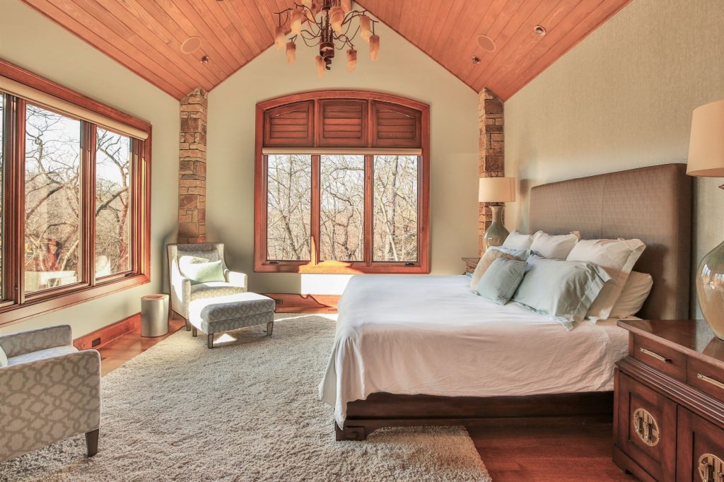
2. Placing the head of your bed in front of windows without draperies framing it. The only exception to this design rule would be if you had a glass wall and you were floating the bed in front of it and the view beyond enhanced your bed. That’s because if you place the head of a bed in front of a whole or partial window suddenly the bed loses importance and the window/view gains it. In this space the bed placement is perfect not only because its on the longest wall and can be seen from the entry but also because the bed now affords a view of the spectacular woods beyond. End tables and lamps enhance the look along with a textural wallpaper behind the headboard.
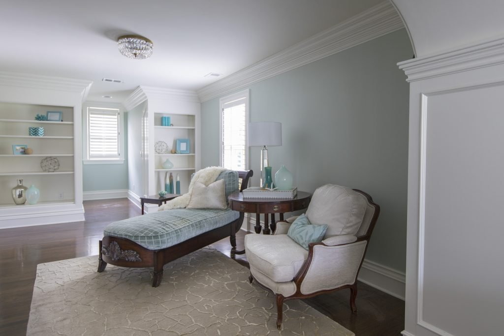
3. Unrelated furniture or furnishings As an interior designer I often walk into a master bedroom for the first time to discover a desk or something else totally unrelated to the bedroom which takes away from the rest of the design. Of course with the trend to stay at home right now a desk might be necessary because of space limitations but in general all work related items need to be out of sight so you can focus on just relaxing and enjoying your sanctuary.
In this bedroom sitting area the furniture fits perfectly providing a place to take a nap, read a book, or just have a conversation.
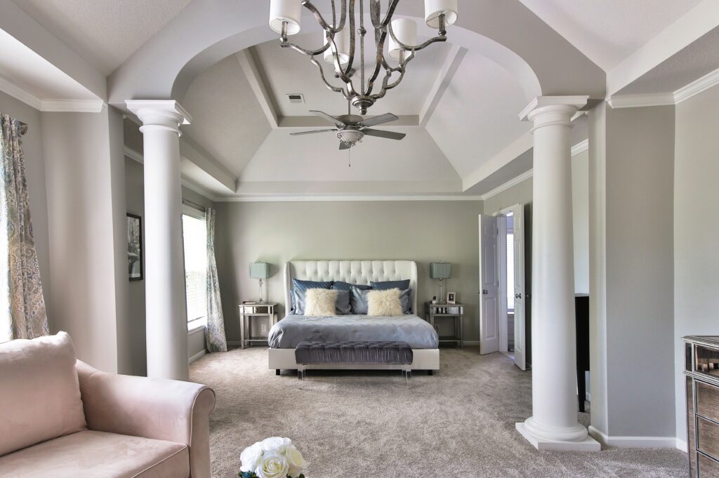
4. Lack of seating. Having a place to sit down on put on shoes or just relax and rejuvenate should be a top priority if you have the space. In this master suite a bench at the end of the bed provides an option for removing shoes while the chairs in the forefront offer a place to unwind at the end of the day. 3 Biggest Mistakes We Make in The Bedroom
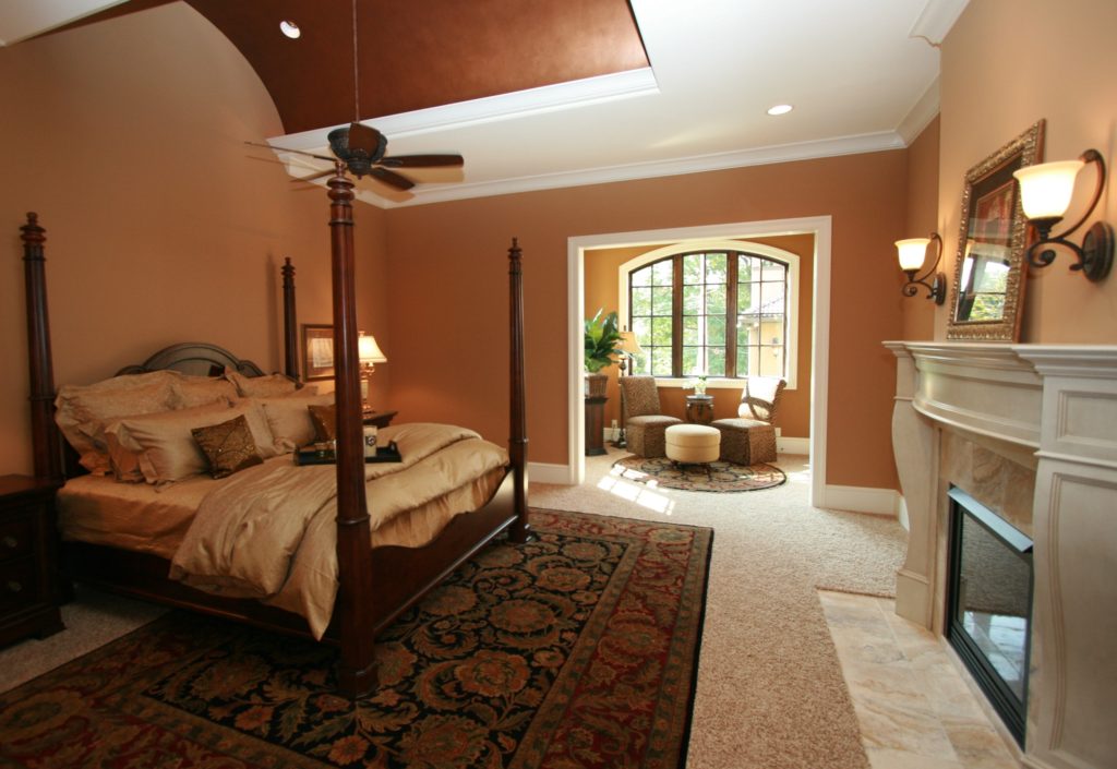
5. Wrong size or placement of rug under bed. This problem is often one of the most common problems we encounter as interior designers. The rug is either turned the wrong direction, not under the bed at all or doesn’t emphasize the bed in a positive way.
Area rugs should be long enough span the width of the bed and nightstands. Place the rug in front of the nightstands ensuring the part of the rug is showing beyond the end of the bed to enhance the bed as your focal point.
For more great interior design ideas, sign up for our design blog here!
plus become a fan of Kansas City’s interior designer and former host of the Living Large design show, Karen Mills, on Facebook and Instagram now!
And if you feel someone you know could benefit from this helpful information, pass it on!