Interior Design/Interior Decorating

Interior Design: 3 Tips for Creating a Restful Retreat…

A good night’s sleep can be difficult enough without adding a room design that’s not relaxing and calm.  Read on for three ways to decorate a bedroom that’s a wonderful space for restful sleep.
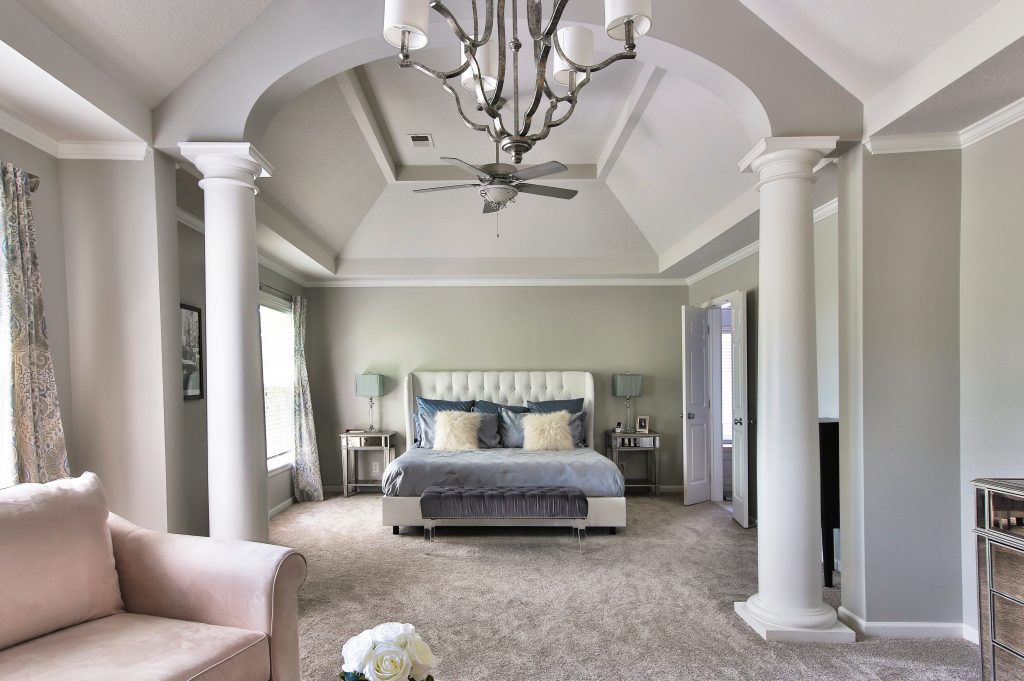
master bedroom retreat
Interior design by Karen Mills

1. Starting with a soothing color scheme 

When selecting a color palette that’s soothing opt for muted colors or neutrals when possible. Here in this nationally published master bedroom we decorated the soothing colors draw you in for a good night’s sleep.
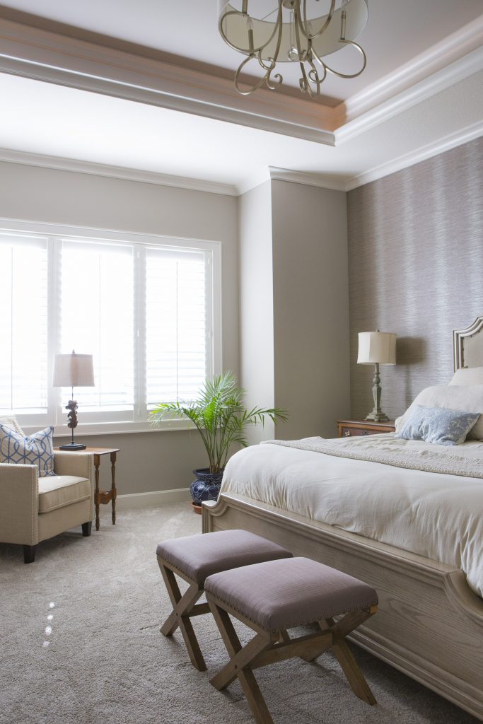
Master bedroom retreat example
Interior design by Karen Mills

2. Choose bedding in natural washable fabrics that are soothing. Here in this master bedroom we designed we used washable bedding from Europe that only looks great but can stand up to the wear and tear of children or pets. The soothing muted colors and seating enhance the retreat like feel of this space.
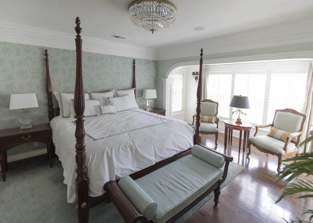
master retreat
Interior design by Karen Mills

3. Provide seating for getting dressed or just relaxing. In this gorgeous master bedroom we designed we added seating not only at the end of the bed and by the window but also in a nearby sitting area that’s set up just for relaxing. A muted color scheme on the leafy wallpaper, watery area rug, and seating for fabrics enhance the relaxing feel of the space.

For more great ideas on interior decorating sign up for our weekly interior design blog here

plus become a fan of Kansas City’s interior designer and former host of the Living Large design show, Karen Mills, on Facebook here!
Interior Design/Interior Decorating

Interior Decorating: 3 Tips for Refreshing Living Room with…

One Day Makeover Tips 

If you haven’t updated your interior for 5 years or more, it may be time for a refresh.  If your budget doesn’t allow you to start completely over, why not opt for a one day makeover instead?

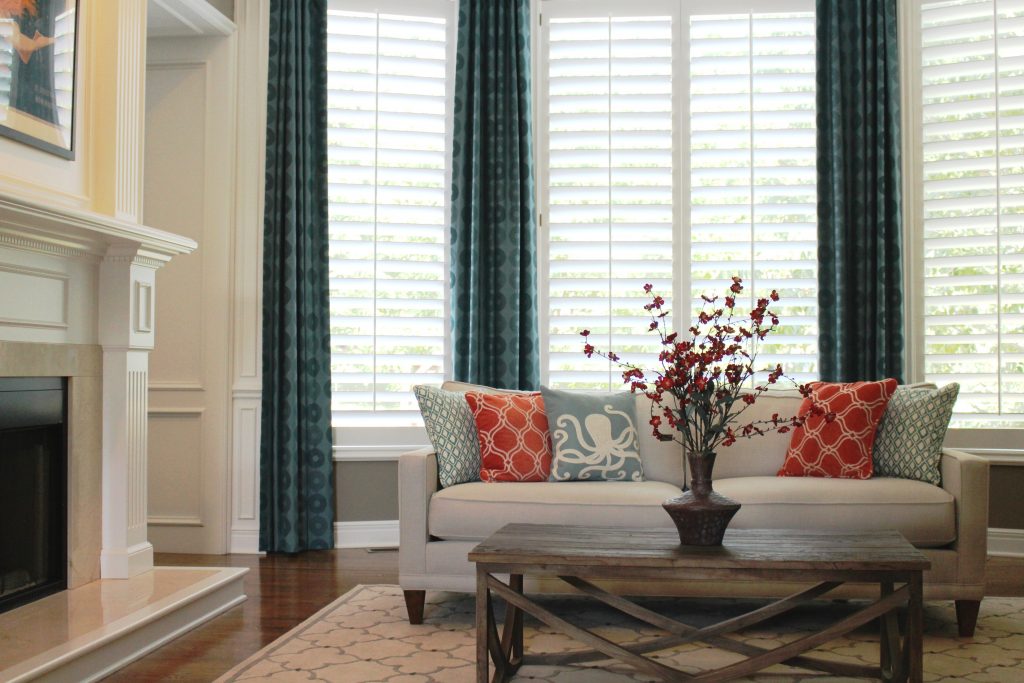
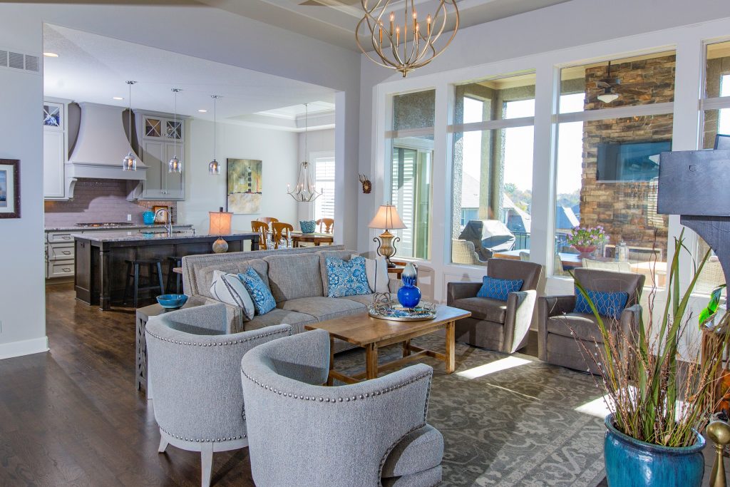
In this photo above our interior design firm reupholstered an existing sofa and chairs to freshen up the space along with refinishing the kitchen table top and updating the room’s finishes including the floor, light fixtures and walls.

If you’re ready to refresh your space, here are my top three tips!

Karen Mills' blog

Interior design by Karen Mills

1.  Create an inviting floor plan that emphasizes your focal point whether its a fireplace or bed, for example.  If you don’t have a focal point, design one yourself by grouping items together such as a sofa table or chest with a piece of artwork overhead plus a table lamp and/or tabletop decor.

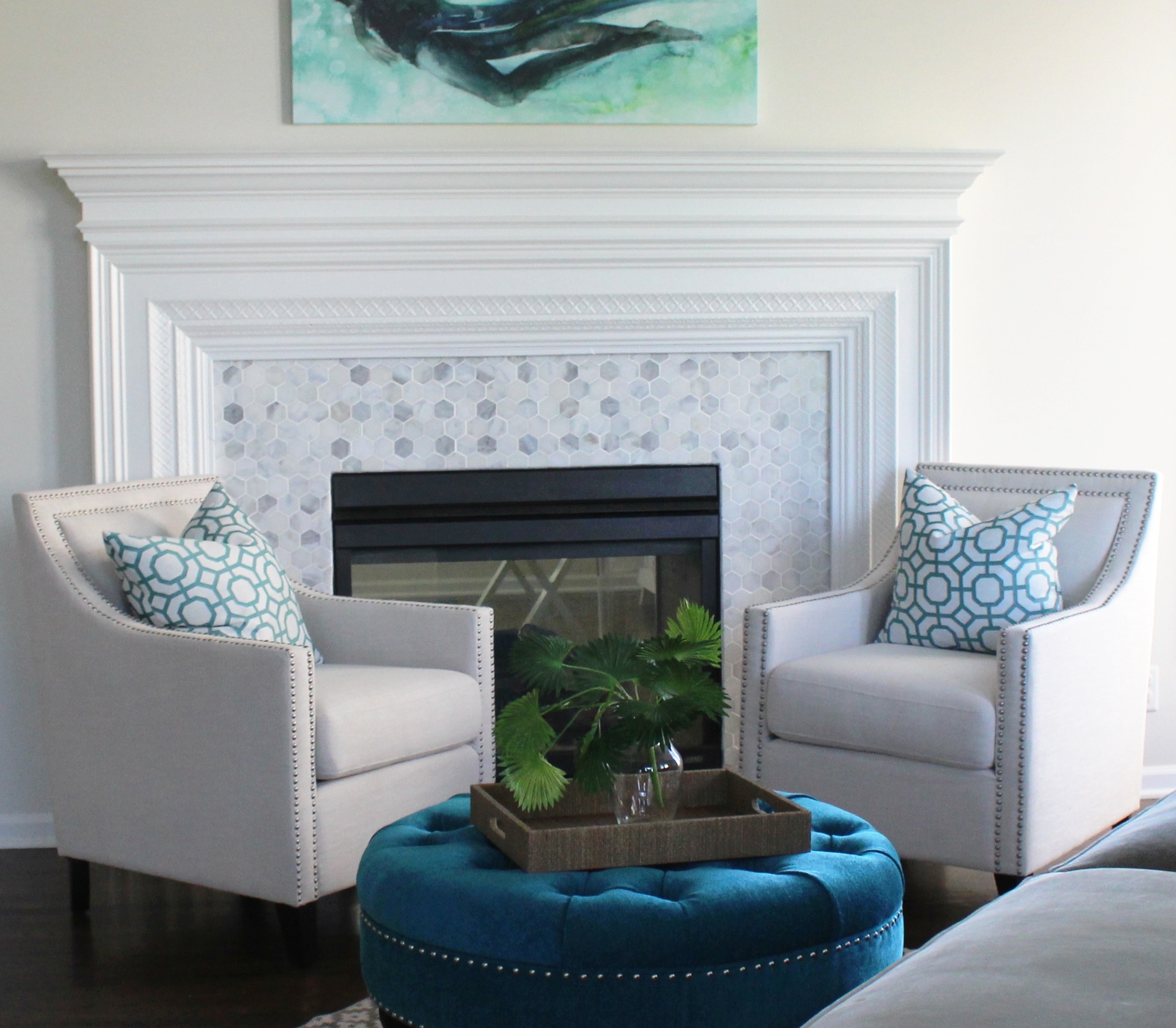
In this room the client started with a favorite piece of art over the mantel and we replaced the fireplace tile along with upholstering the existing chairs and ottoman to create a fabulous new look!

To explain idea
Interior design by Karen Mills

2. Shop your entire house for furniture/furnishings you can use in your room.  Keep those items you discover in mind as you start to put together your room, bringing ones you think might work to a staging area nearby.  

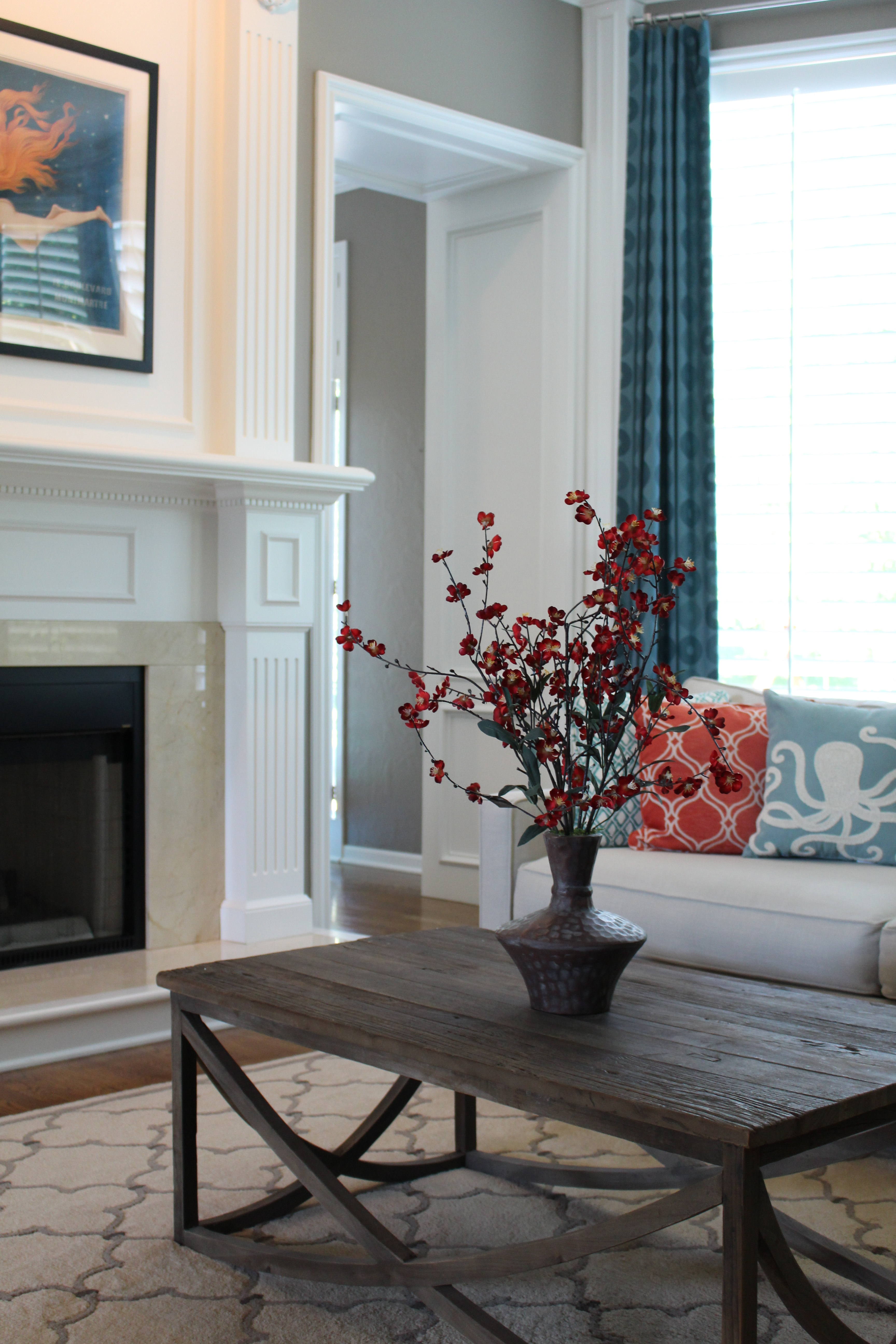
In this living area, the client wanted to keep an existing coffee table that had been passed down through her family in the interior design of this living room so we had to ensure we had similar warm hues – the outdoor fireplace beyond, to create a  cohesive feel with the antique table.

Karen Mills' blog

Interior design by Karen Mills

3. Add a pop of color with accents throughout your room with pillows, art, drapes, decor or an area rug.   Remember, you can repaint or re purpose items to use in your refreshed roomtoo.   In this great room the client wanted to keep the mermaid art over the mantel so we tied in the furnishings to the art by layering in orange and blue pillows along with luxurious blue drapes beyond.

Looking for more great budget friendly decorating ideas that you can implement this summer?  SIgn up for our weekly interior design blog here

Plus become a fan of Kansas City’s interior designer and former host of the Living Large design show, Karen Mills, on Facebook here!
or instagram here!

Interior Design/Interior Decorating

Interior Design: 8 Ingredients of Timeless Design

 So if you would like to avoid trendy decorating and have a more enduring design too, here is an informative article I wrote for Houzz .  (Click link below to read)

8 Rooms with Staying Power

Looking for more great design ideas that you can implement? 
Sign up for our weekly interior design blog here

Plus become a fan of Kansas City’s interior designer and former host of the Living Large design show, Karen Mills, on Facebook here!
or instagram here.

Interior Design/Interior Decorating

Interior Design: Transforming an Ugly Duckling Bath into a…

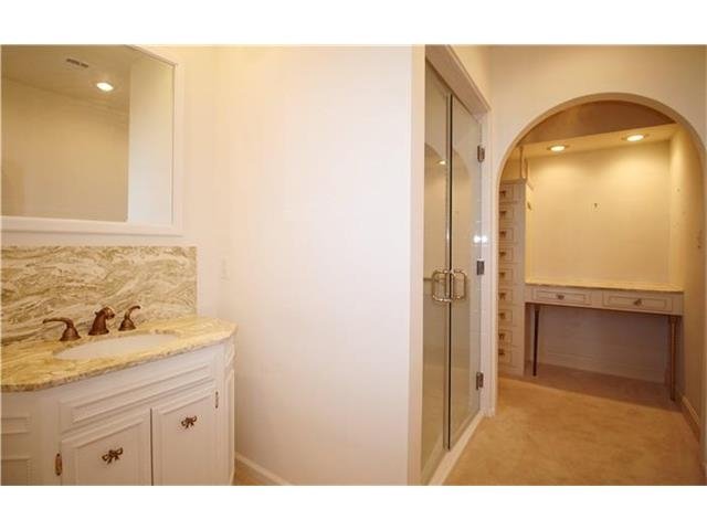
Master bath before remodeling

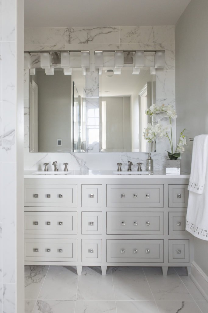
As an interior designer I think you will find this master bath remodel quite amazing not only because of the transformation of this historic high rise built in the early 1900s but also because of how it lives so much larger in the same space.

When you entered the master bath as shown here the space was chopped up by a walled in shower placed in the middle of the room making the space feel cramped, small, and unattractive.

Karen Mills' blog
Master bath remodel before

To the right of the shower was a  dimly lit dressing area with a small amount of storage that didn’t function well.

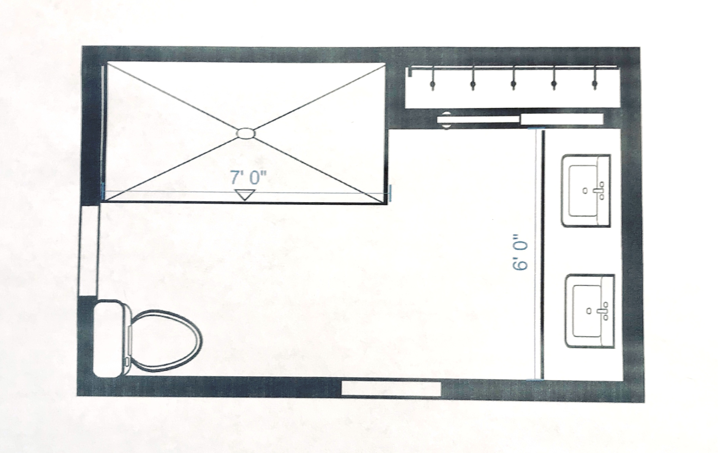
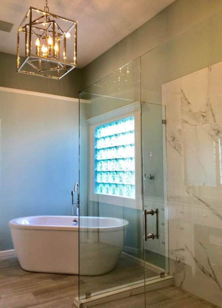
To solve this interior design dilemma we ripped out everything but one small closet and started over.  By pushing back the shower we gave the bathroom a bigger sense of volume and were able to expand the vanity to accommodate two people instead of one just like the shower.

Karen Mills' blog
Interior design by Karen Mills

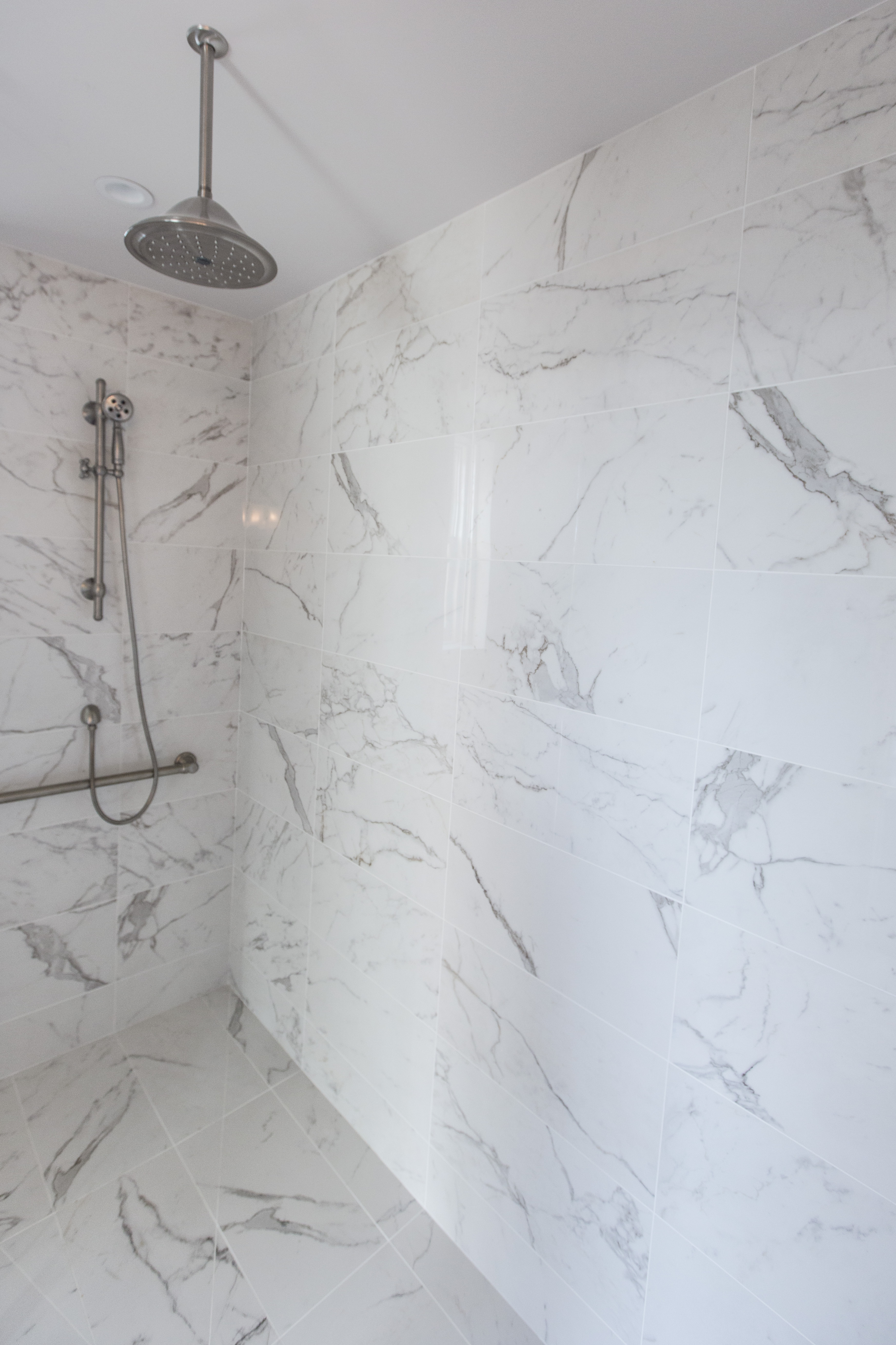
As you can see the transformation was amazing!  By placing the same marble style tile from Italy on the floor and walls the room suddenly visually expanded into a beautiful timeless space with an over sized shower for two.  To help the bathroom live even larger we also eliminated the shower curb and placed a solid glass panel along the front so the shower space virtually disappears.

Karen Mills
Interior design by Karen Mills
Karen Mills' blog
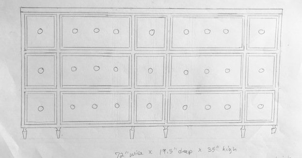
Hand sketch by Karen Mills

For the former dressing area I designed a double vanity that included usable top drawers that wrapped around the plumbing for more storage. 

Karen Mills' blog
Interior design by Karen Mills


The result? A gorgeous bathroom that ended up in Kitchen Bath Design News – the national design magazine for kitchens and baths. Click now to read article!

Looking for more great bathroom design ideas that you can implement? 
Sign up for our weekly interior design blog here

Plus become a fan of Kansas City’s interior designer and former host of the Living Large design show, Karen Mills, on Facebook here!
or instagram here.

Interior Design/Interior Decorating

Interior Decorating: 3 Ways to Create a Rustic Glam…

As an interior designer I’ve noticed a huge trend over the past several years towards creating simple spaces that are a wonderful mix of rustic and glamour.  Here are my 3 tips for creating your own style of rustic glam.

Karen Mills' blog
Interior decorating by Karen Mills
  1. Introduce weathered furniture/furnishings

Weathered style furnishings could include anything from antique/vintage brand new furniture in weathered finishes and styles that remind you of a farmhouse look.

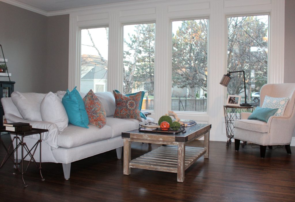
In this great room a rustic wood coffee table and wire bin end table on wheels were introduced along with the casual cotton covered sofa and chair.

Karen Mills' blog
From dark to light

2. Add touches of white

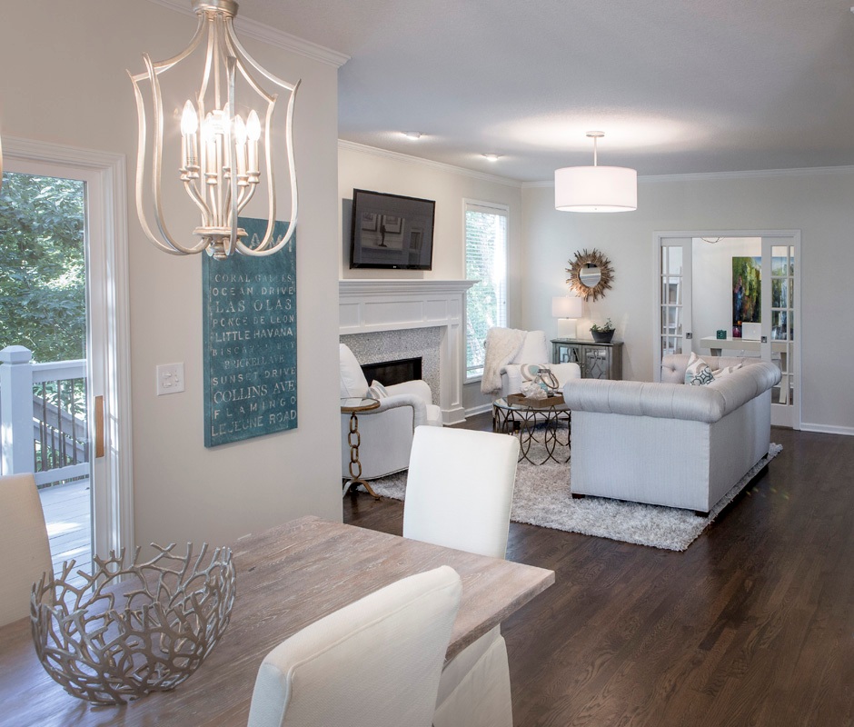
By juxtaposing the white chairs in the eating area against the rustic table finish and shimmery light fixtures, a wonderful symphony is created that undulates between masculine and feminine in this relaxing space.

The family room beyond continues the rustic glam theme with its beach elements on the coffee table contrasting nicely against the tufted sofa and gold mirror beyond which feel more glamorous.

Karen Mills' blog
Interior decorating Mills/Photography by 29Pixels, LLC

3. Layer in a glamorous element

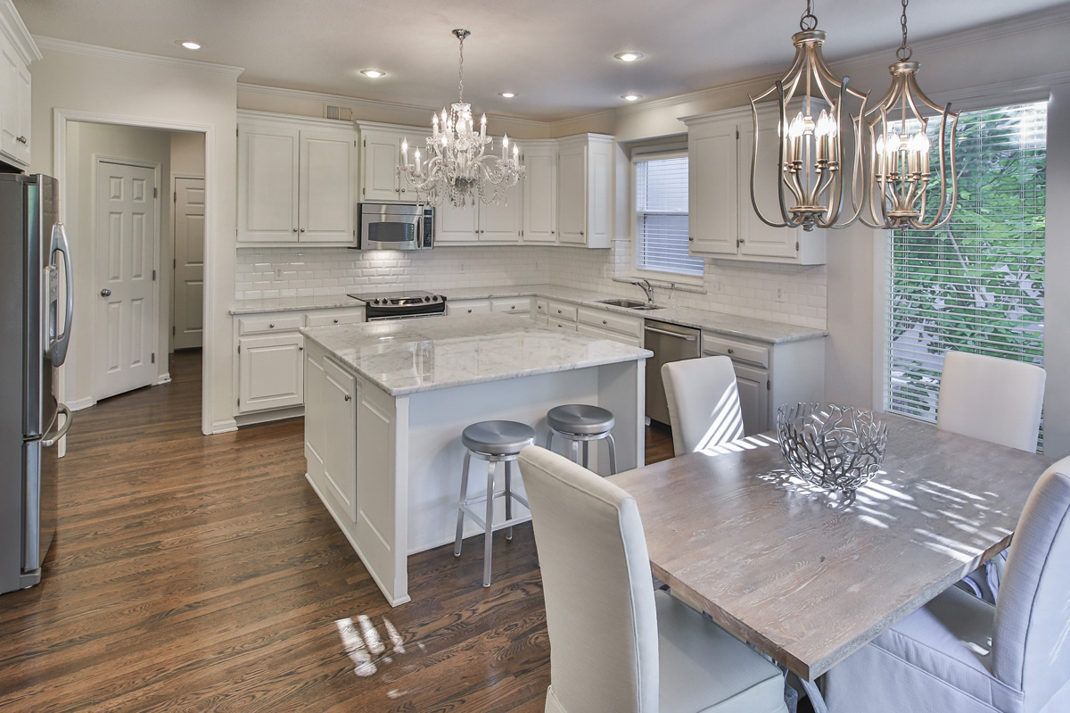
In this kitchen area matching mini chandeliers provides the perfect glam touch to this older kitchen with updated finishes.  The rustic table juxtaposes nicely against the marble in the kitchen to create just the right amount of tension.

For more great ideas and photos on design styles, sign up for our weekly interior design blog here

Plus become a fan of Kansas City’s interior designer and former host of the Living Large design show, Karen Mills, on 
INSTAGRAM and FACEBOOK here!

Interior Design/Interior Decorating

Interior Design: 3 Tips for Selecting Quality Outdoor Upholstery

How to Choose Your Outdoor Furniture Wisely

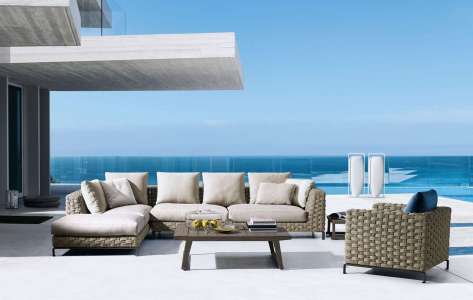
As Memorial Day is drawing near some of you are contemplating an investment in quality outdoor upholstery where you can spend the days outdoors relaxing with family or friends.   Here are my 3 tips as an interior designer for selecting outdoor furniture that will be a good investment.

Photo courtesy of B&B Italia

  1. Functional Furniture – Comfort is my top priority when selecting outdoor upholstery so make sure you try sitting on the furniture for at least 20 minutes to ensure it’s comfortable and fits your body type – seating height and depth plus arm location and overall size. Thicker cushions and sizes are also critical when purchasing because the furniture may too large for your space if you haven’t measured ahead. Here in this outdoor space by B&B Italia furniture the furniture is amply spaced apart providing comfortable seating.
Interior design by Karen Mills

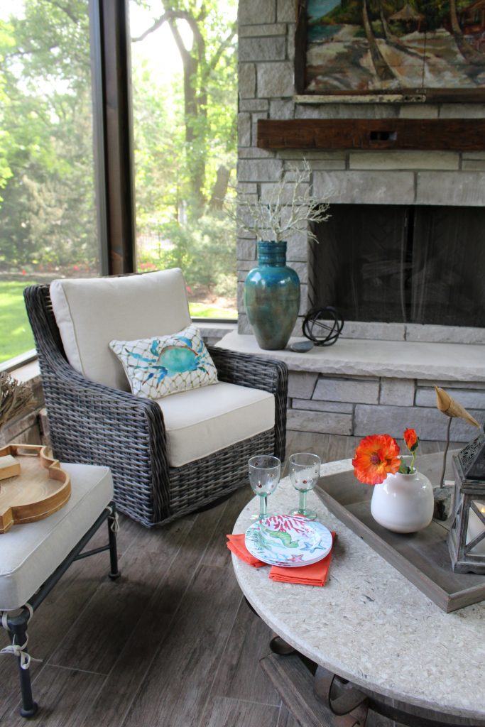
2. A color that will stand the test of time I think we as consumers are naturally drawn to our favorite colors and often purchase based on that fact alone but when you’re investing in a quality piece(s) of outdoor furniture you might want to consider longevity of a frame when selecting colors that aren’t neutral.

Of course if a particular color is part of who you are and always has been, then it may not matter.  For me as an interior designer, my favorite color is usually what we are designing that day or week.  That’s why neutral seating frames and/or cushions like shown on this porch are often best because pillows and other accessories can create a fresh new look without a big investment.

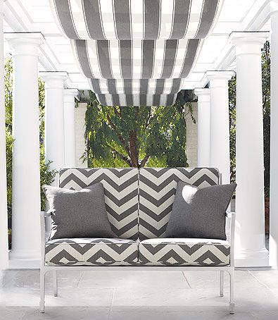
Photo courtesy of Schumacher

3. Design Style

Style, a key factor in selecting furniture, plays a huge role outside because the furnishings must not only coordinate with the exterior of the home and the view beyond but also relate to the adjacent rooms inside.

In this outdoor space the white furniture and cushion color help marry the contemporary fabric with the more traditional Greek pillars to create a more cohesive feel.

For more great ideas and photos on outdoor design and furniture, sign up for our weekly interior design blog here

Plus become a fan of Kansas City’s interior designer and former host of the Living Large design show, Karen Mills, on 
INSTAGRAM and FACEBOOK here!

Interior Design/Interior Decorating

Interior Design: 3 Biggest Mistakes We Make in Basement…

Karen Mills' blog
Interior design by Karen Mills

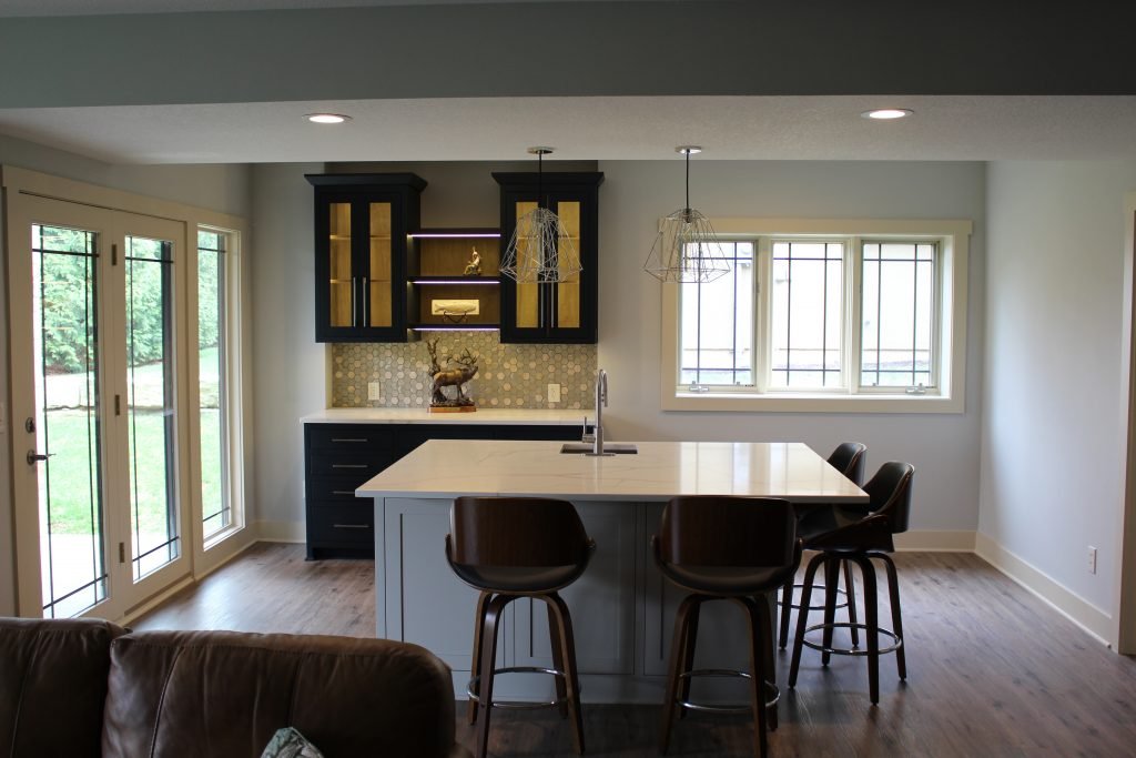
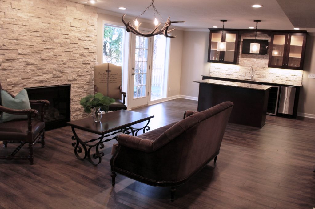
1. Not taking advantage of natural daylight – In this recent basement design we situated the bar area in a spot surrounded by natural light to make the space feel like the main level of the home. To further enhance the light airy feel we designed the bar with white counter tops and lighter paint colors to bounce more light around the room.

Karen Mills' blog

2. Not hiding the telltale signs of a basement living space. –When finishing your basement ensure that you hide all ledges, duct work, and niches or anything else that screams basement. Here in this space we added wood flooring, artificial light, and and accent lighting to give this basement a first floor feel.

Karen Mills' blog
Interior design by Karen Mills

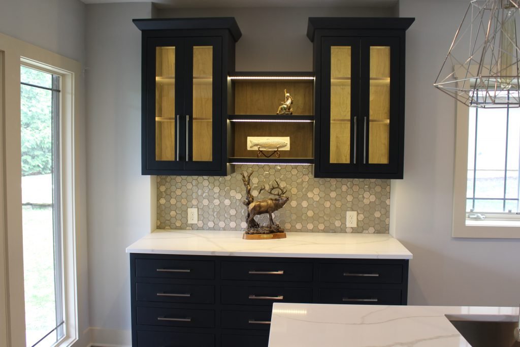
3. Lack of adequate artificial light – As an interior designer I can’t emphasize enough the importance of artificial lighting. Here we started with general can lights, added task lighting over the island, and then topped it off with accent lighting inside the shelves and under the cabinets to create a wow factor.

For more great ideas and photos on basement interior design or remodels, sign up for our weekly interior design blog here

Plus become a fan of Kansas City’s interior designer and former host of the Living Large design show, Karen Mills, on 
INSTAGRAM and FACEBOOK here!

Interior Design/Interior Decorating

Interior Design: 5 Hottest Product Trends for Kitchen Design/Remodels…

Karen Mills' blog
Interior design by Karen Mills
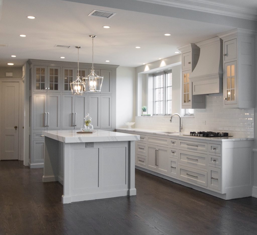
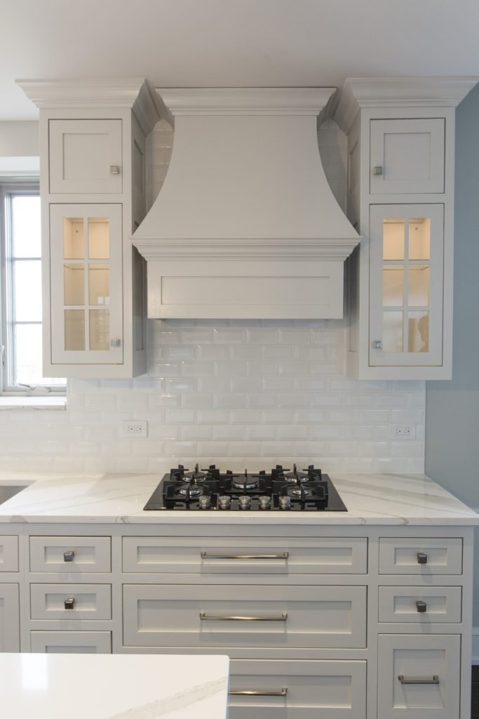
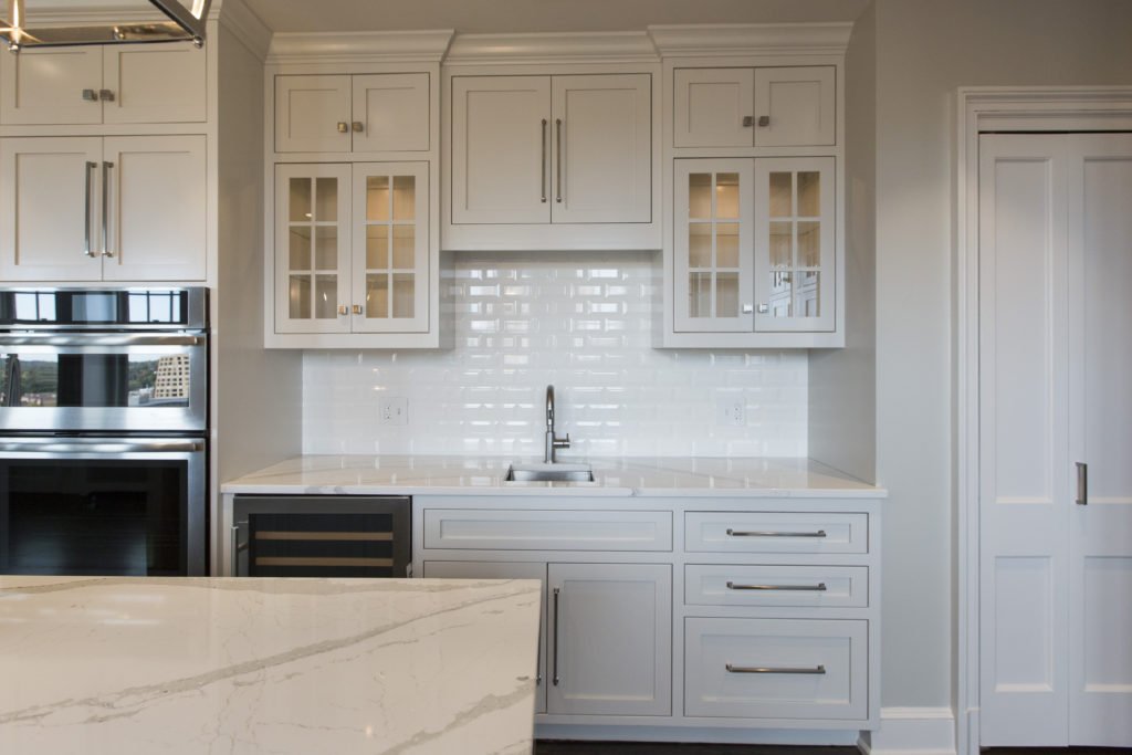
  1. White Quartz Counter tops – Even though darker kitchens are making appearances across the U.S. and especially on the coasts, white quartz counters still dominate with interior design clients as the most popular material here in the United States. As an interior designer I’ve worked with over 1200 clients and believe wholeheartedly the reason for this appeal is because white reflected back onto our skin makes us look and feel younger. White also feels fresh after years of darker colors plus marble style patterns are classic and timeless.

Here in this kitchen the island counter has been designed with a mitered edge (thick) which is another huge kitchen remodel trend that gives a more luxurious feel and wow factor.

Karen Mills' blog
Interior decorating by Karen Mills

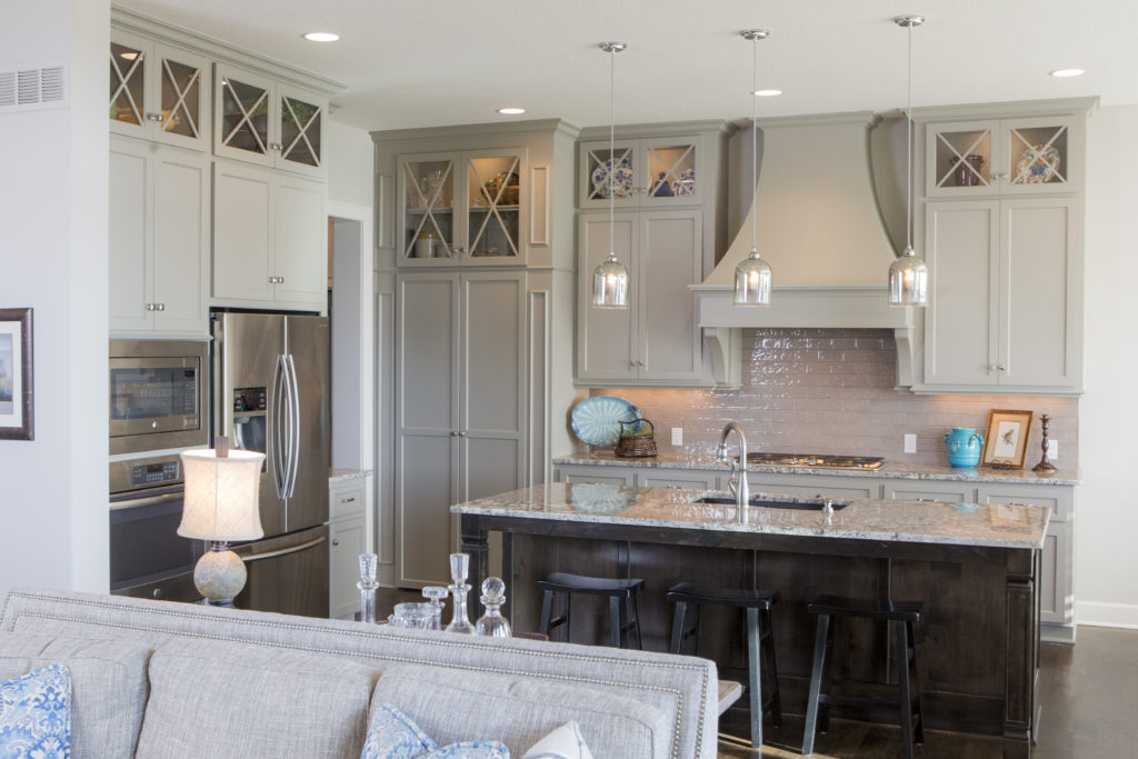
2. Counter Depth Refrigerator Here in this kitchen space a counter depth fridge creates a wider walkway through the kitchen to the garage and other rooms behind. Other trendy features include reflective tile back splash, and lit glass cabinets.

3. Touch Faucet – Touch faucets are gaining popularity because you only need to touch the faucet with a part of your body to activate or deactivate the flow of water at a preset temperature.

4. Steam Convection Oven – Who doesn’t love an oven that can cook food in half the time at a lower temperature plus keep foods moister and brown bread.

Karen Mills' blog
Interior design by Karen Mills

5. LED lighting

For more great ideas and photos on kitchen design or kitchen remodels, sign up for our weekly interior design blog here

Plus become a fan of Kansas City’s interior designer and former host of the Living Large design show, Karen Mills, on 
INSTAGRAM and FACEBOOK here!

Interior Design/Interior Decorating

Interior Design: 5 Questions to Ask Remodeler Before You…

What to Consider Before Using a Contractor Besides Cost

Karen Mills' blog
Interior design by Karen MIlls
  1. What qualifications/experience do you have with my type of project and can you provide references? For example ask if the contractor belongs to NARI, National Association of Remodelers or HBA, Home Building Association.

2. Can your insurance company mail a current copy of your insurance policy(s) before we sign the contract? Contractors should have liability insurance to cover any damage to your property and workman’s comp for anyone working on your home to protect you if they get hurt on the job.

3. How do you charge? Normally remodelers give a bid/estimate of total amount for project minus any unseen issues or simply charge for time (hourly) and materials (products). If you want to buy materials yourself and just pay the contractor for your time, make sure they offer that option and that you can put a limit on the hours billed so project doesn’t get out of hand.

Karen Mills' blog
Interior design by Karen Mills Zero entry shower

4. Can you complete work within my requirements and may I have a timeline/schedule of construction beforehand?

5. Will you provide a signed contract with scope of work to be done and warranty?

Karen Mills' blog
Interior design by Karen MIlls

For more great ideas on remodeling or interior design sign up for our weekly interior design blog here

Plus become a fan of Kansas City’s interior designer and former host of the Living Large design show, Karen Mills, on 
INSTAGRAM and FACEBOOK here!

Interior Design/Interior Decorating

Interior Decorating: 3 Tips for Selecting the Perfect Color

Helpful Hints for Selecting Paint Color

Color, the biggest issue faced by homeowners starting an interior design or interior decorating project is often an overwhelming task so I’ve broken it down into three manageable steps for you today.

  1. View colors on a white background – First and foremost, when selecting colors, make sure that you’re viewing colors on a white background to get a true sense of the colors before placing them on a wall.   Don’t wear colors that might reflect back on those paint colors while you’re making selections because red, for example, could reflect back on another color giving it a green cast.
Karen Mills' blog
Photo courtesy of Kravet

2. Make color selections during daylight – Consider natural light along with artificial light in the room. 

For trim and ceiling paint colors, look to the lightest end of your paint strip for possibilities along with whites. 

Karen Mills' blog
Interior design by Karen Mills

3. Paint large swatches of your paint selection on a backed poster board – All too often I walk in as an interior designer and see clients who’ve painted a light neutral over another color on the wall and the original color is bleeding through or distorting the hue. Once you have the board painted, place against a neutral white background view during both daylight and after dark to ensure you still like it.

 If you don’t know where to start with color, pull inspiration from a favorite item like artwork, a rug, fabric, jewelry or even nature and let the fun begin!


For more great tips on color and how to use it become of fan of our weekly interior design blog here


plus become a fan of Kansas City’s interior designer and former host of Living Large, Karen Mills on Facebookhere!

or instagram here!