Interior Design/Interior Decorating

Interior Decorating: 5 Keys to Profitability When Staging Home…

You only get one chance to make a great first impression when selling a home for resale because buyers are visual and often lack imagination. So where do you start? Besides a thorough cleaning, basic repairs and removing clutter (usually 50%+) I recommend focusing on five target areas to make a home more appealing to buyers.

Karen Mills' blog

1. Curb Appeal – The majority of buyers won’t leave their car if the house lacks curb appeal. Stand outside and take an objective look at your house ensuring your yard is manicured and the entry inviting including a freshly painted door, welcoming doormat and perhaps a pot of flowers, weather permitting.

Karen Mills' blog
Styling by Karen Mills

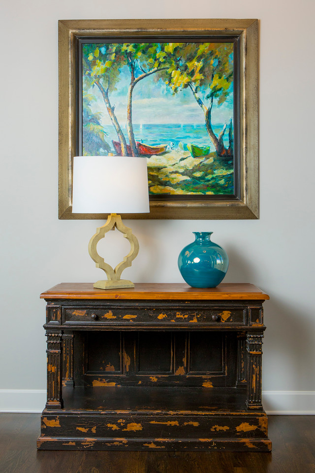
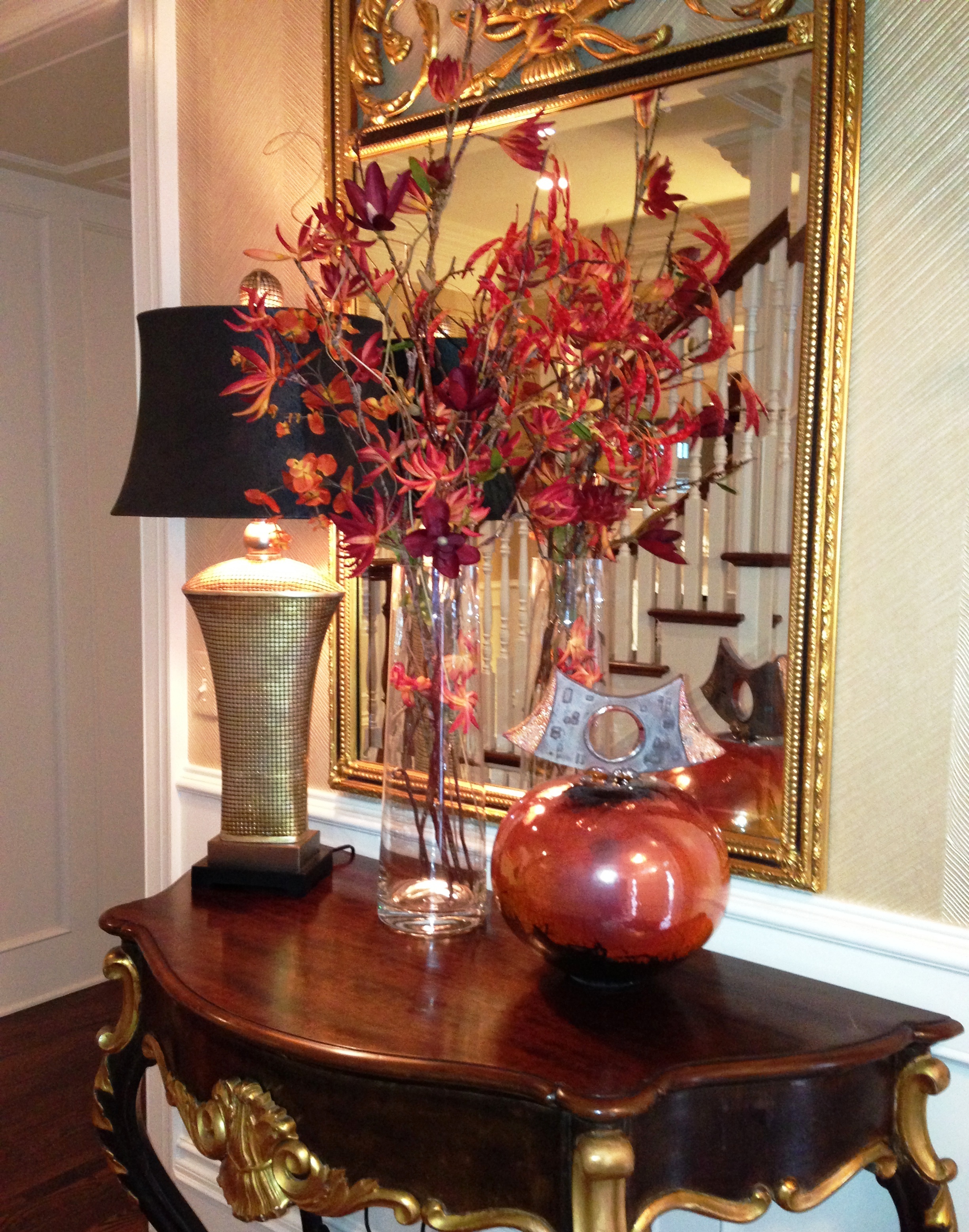
2. Inside Foyer – As a state certified staging for resale instructor and interior designer I always tell homeowners to think of their entry as an advertisement for what’s to come in their home.  Start by creating a wonderful ambiance with an inviting entry rug, nice looking furnishings, a table lamp, and a neutral wall color.

Karen Mills' blog
Styling by Karen Mills

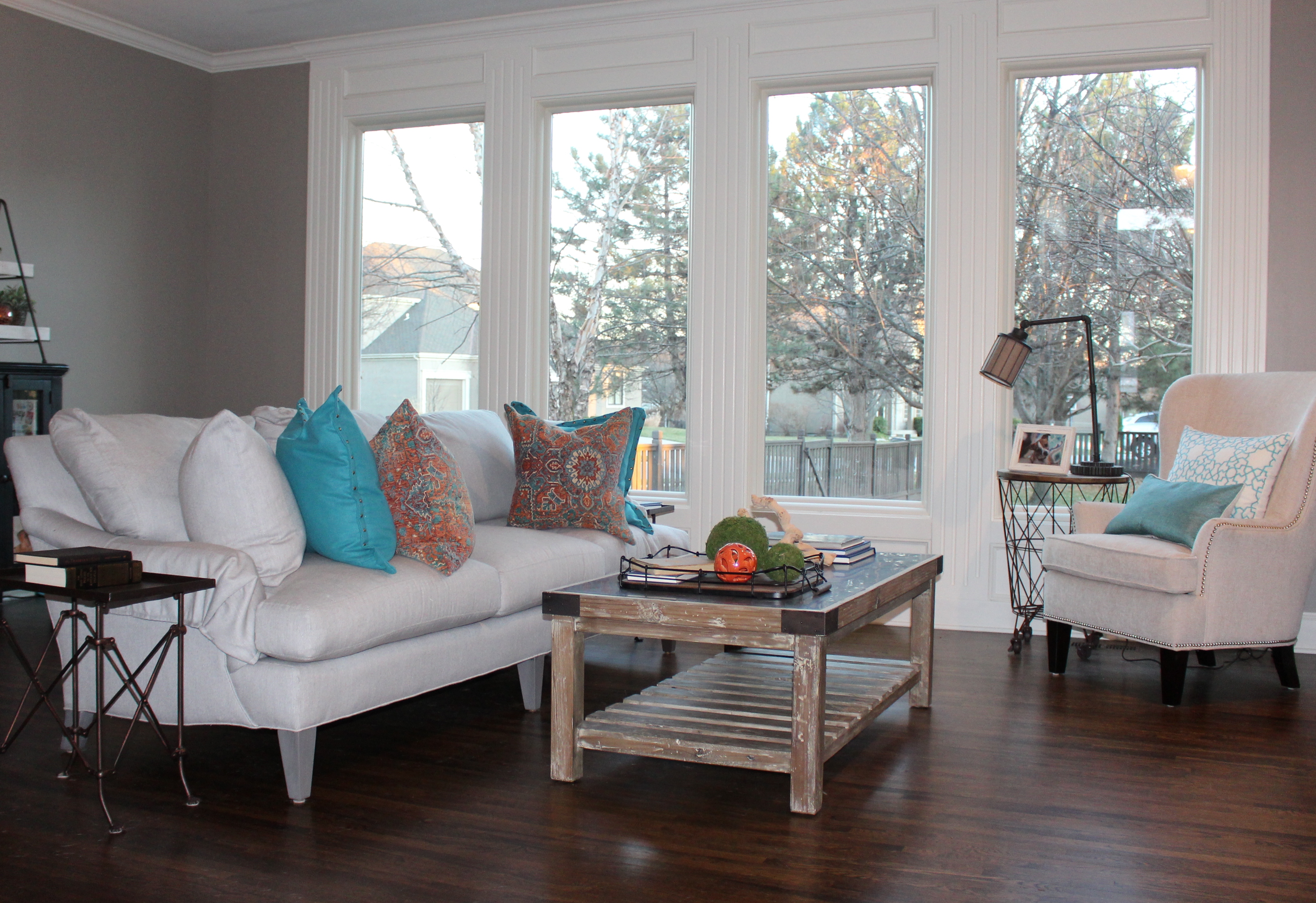
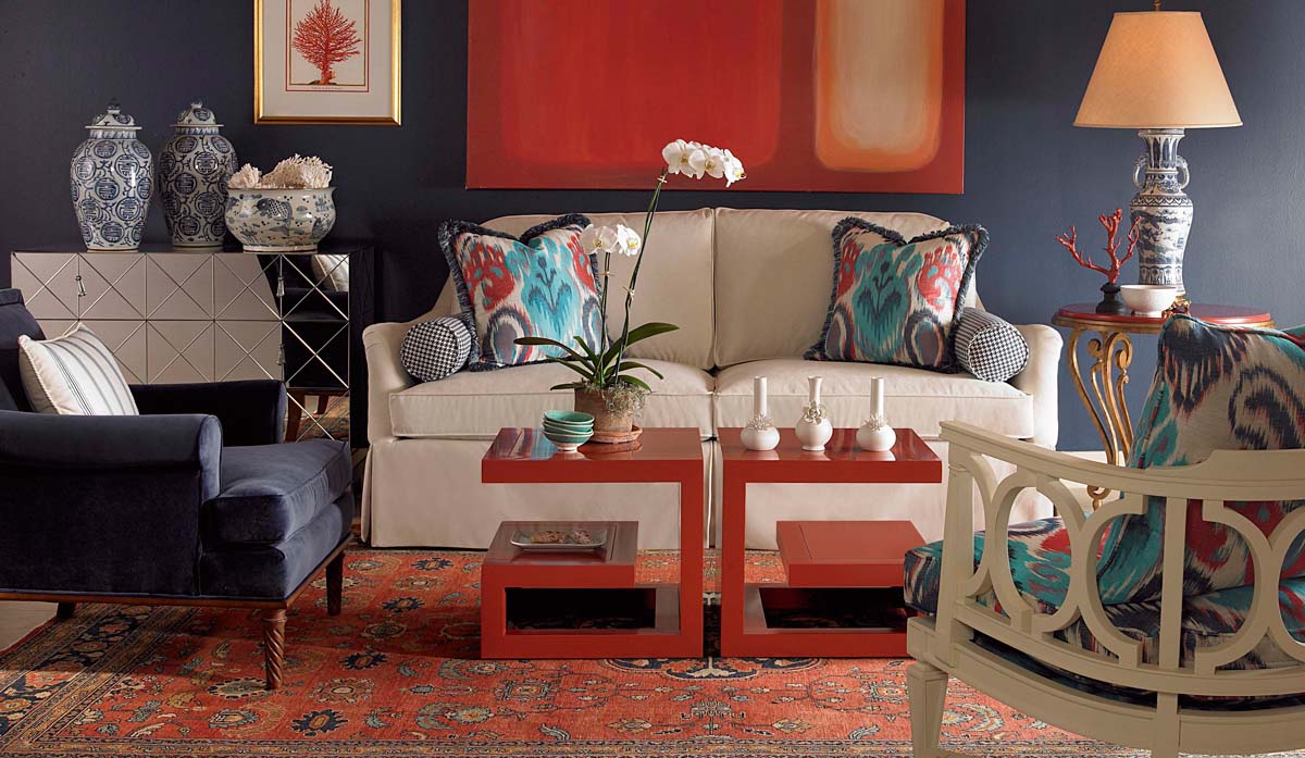
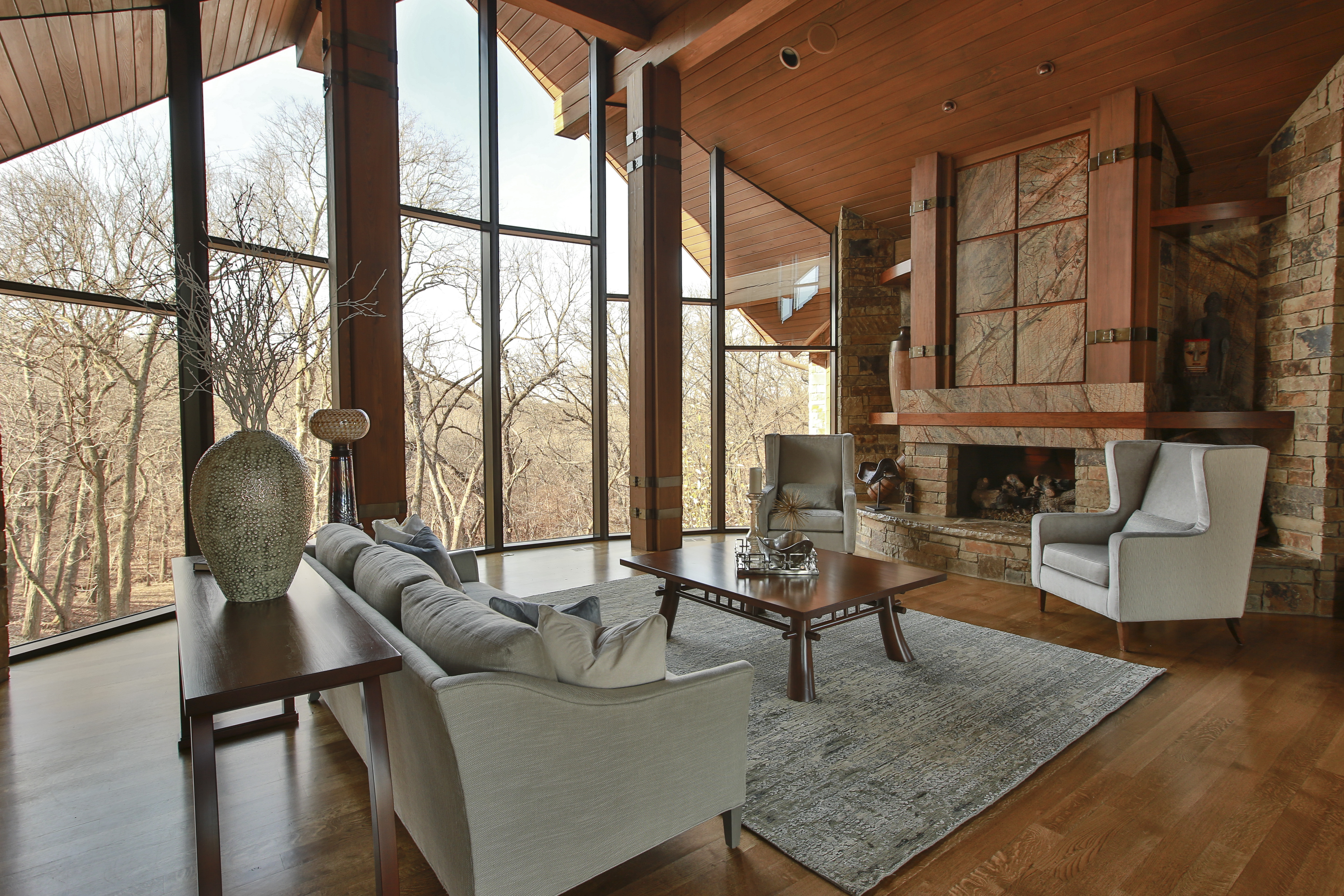
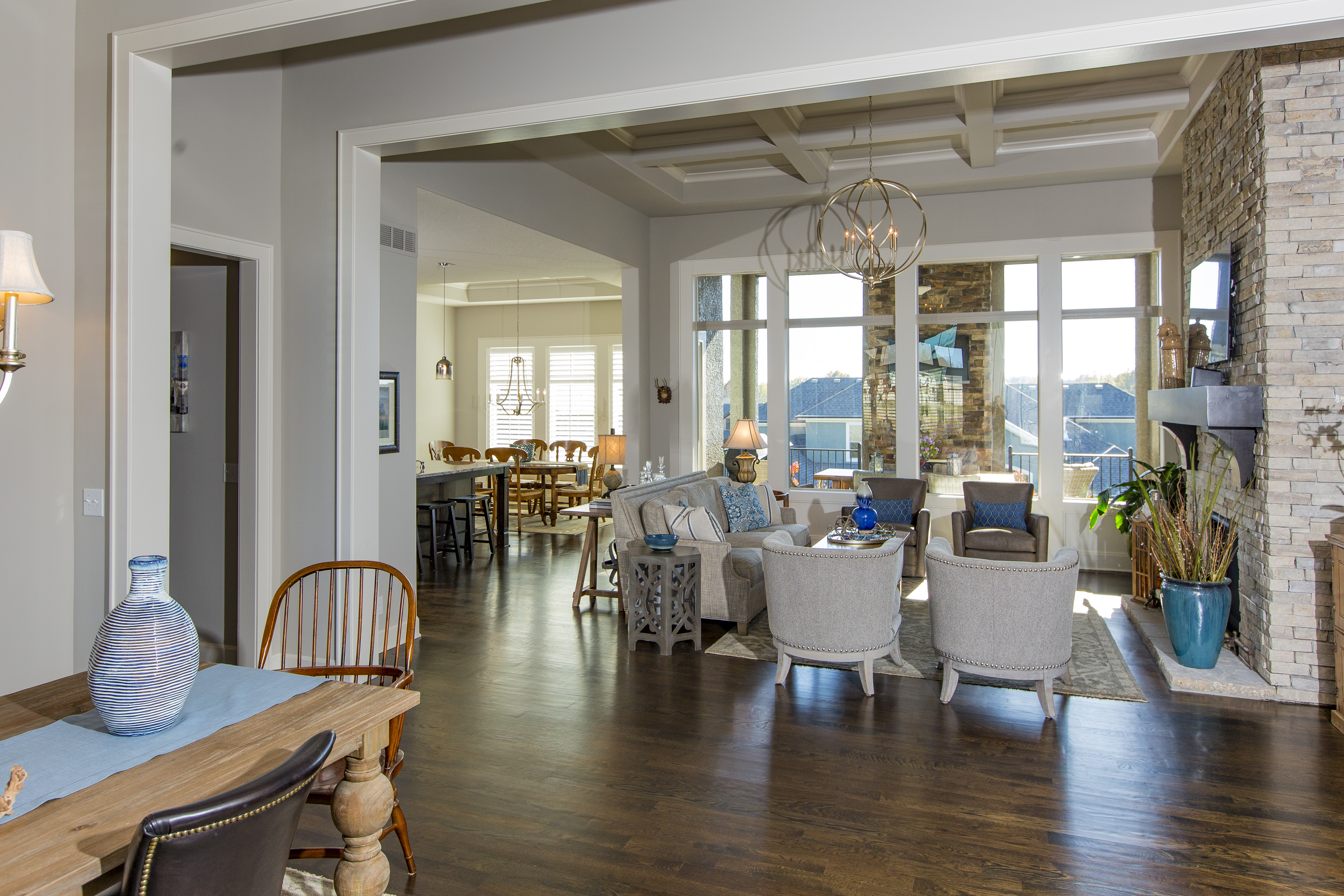
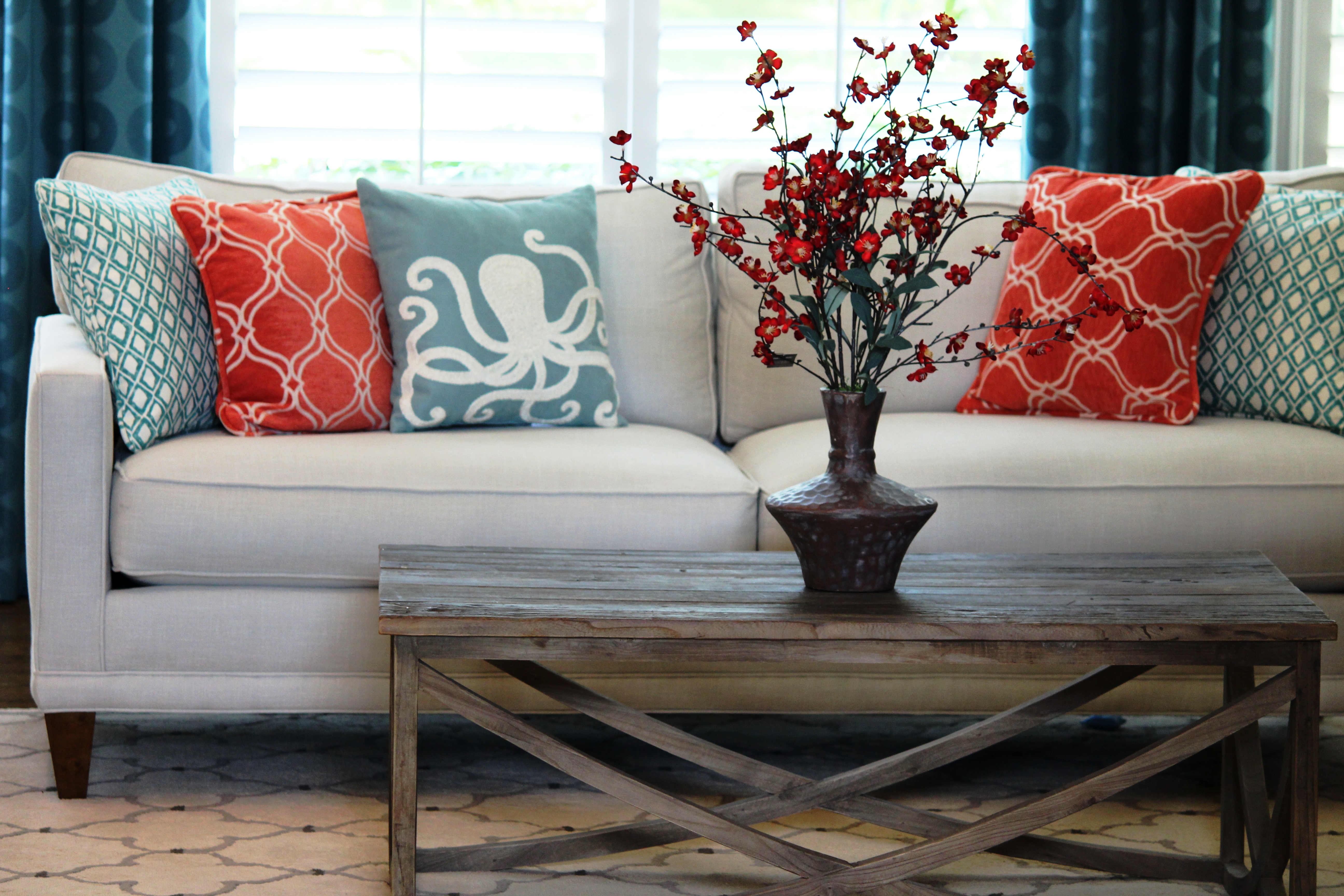
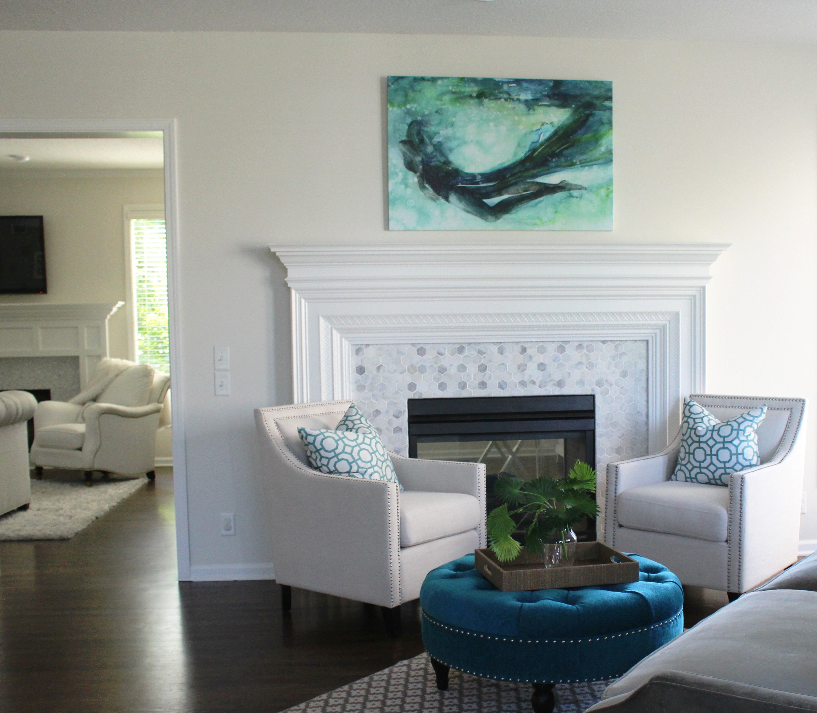
3. Living/Dining Room – Arrange your rooms to emphasize your focal point such as a fireplace or view outside, while  adding pops of color with accessories such as pillows or throws to draw your eye through the space and create interest, while removing personal items such as photos that make it clear its not the buyers home.

Karen Mills' blog
Interior design by Karen Mills

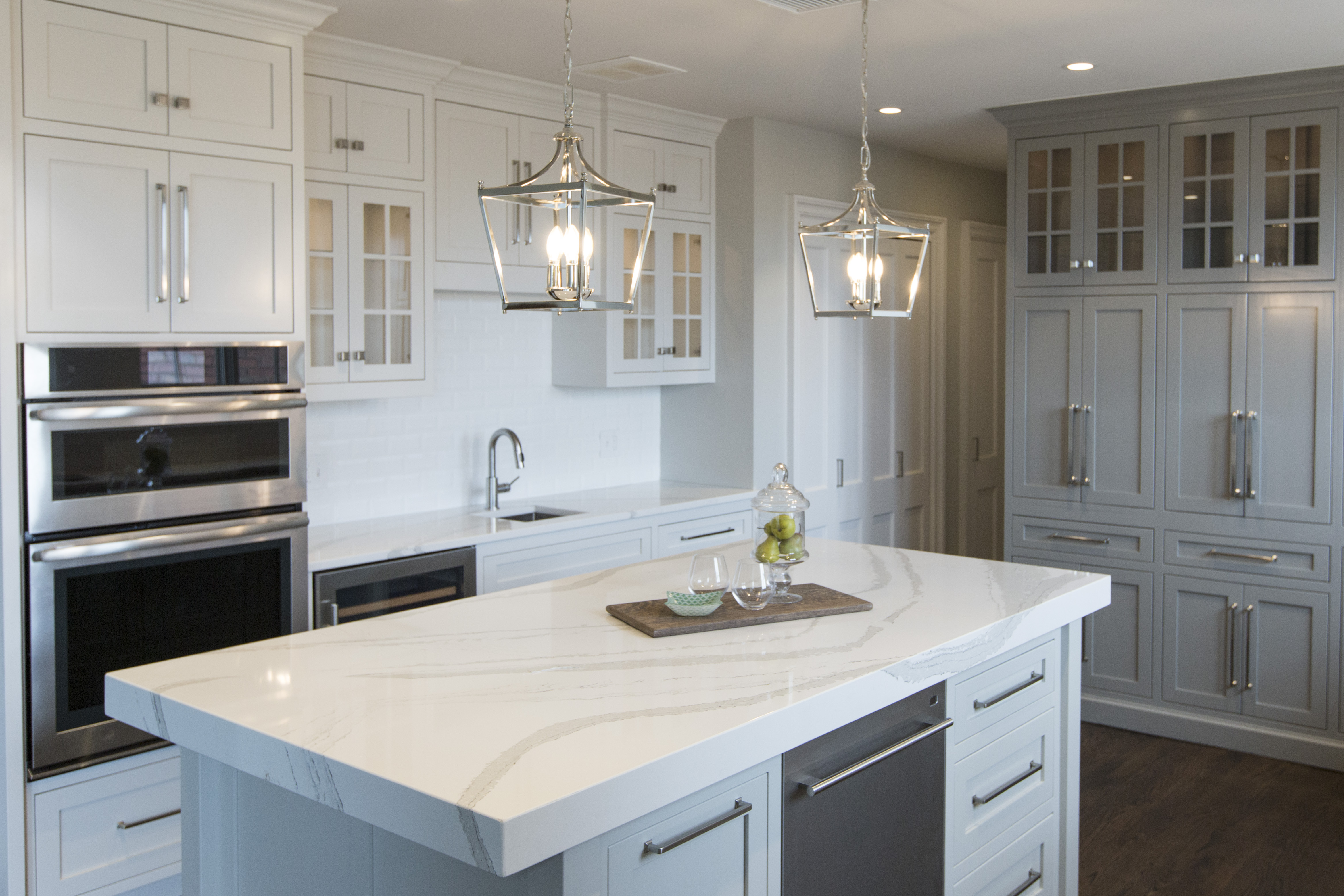
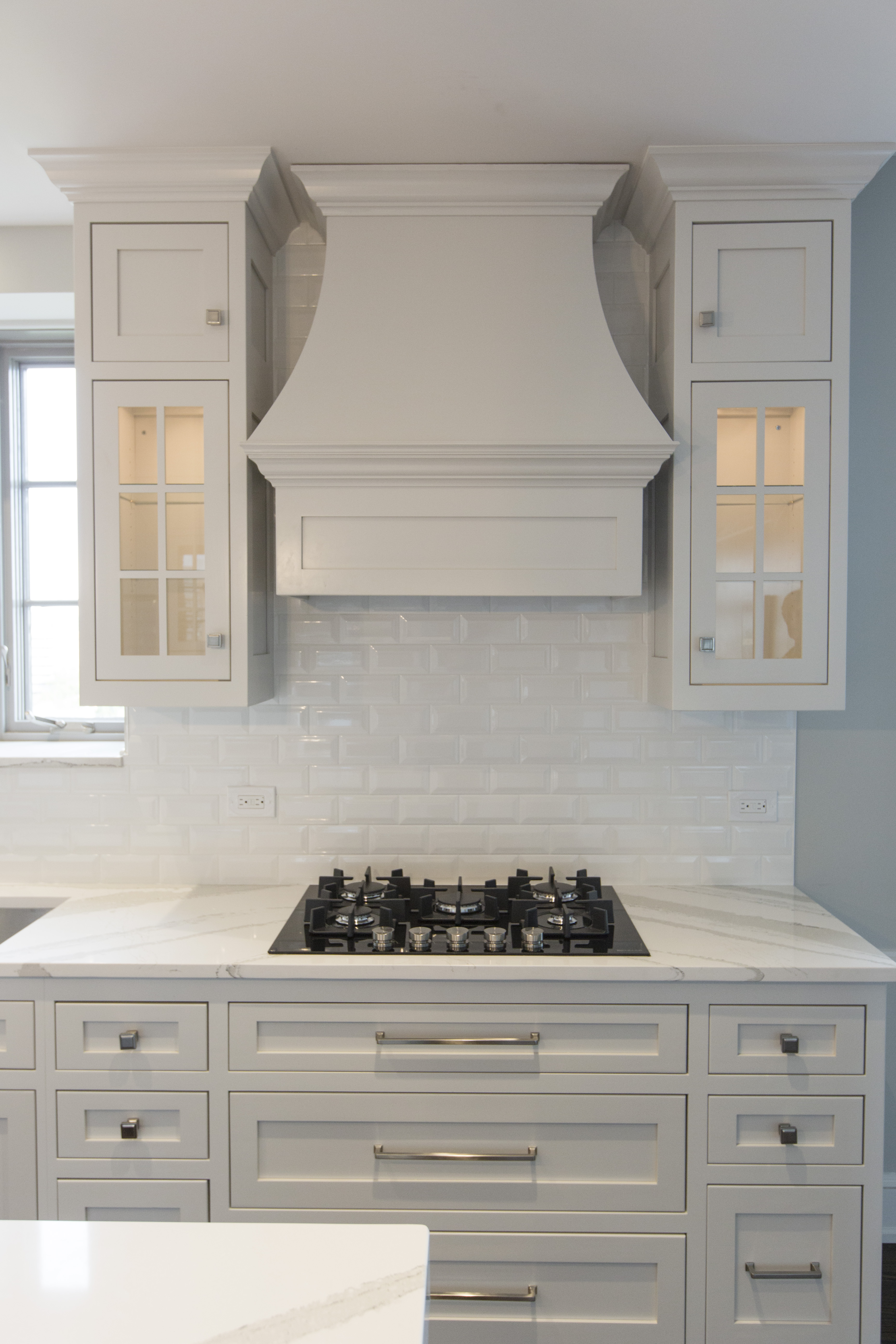
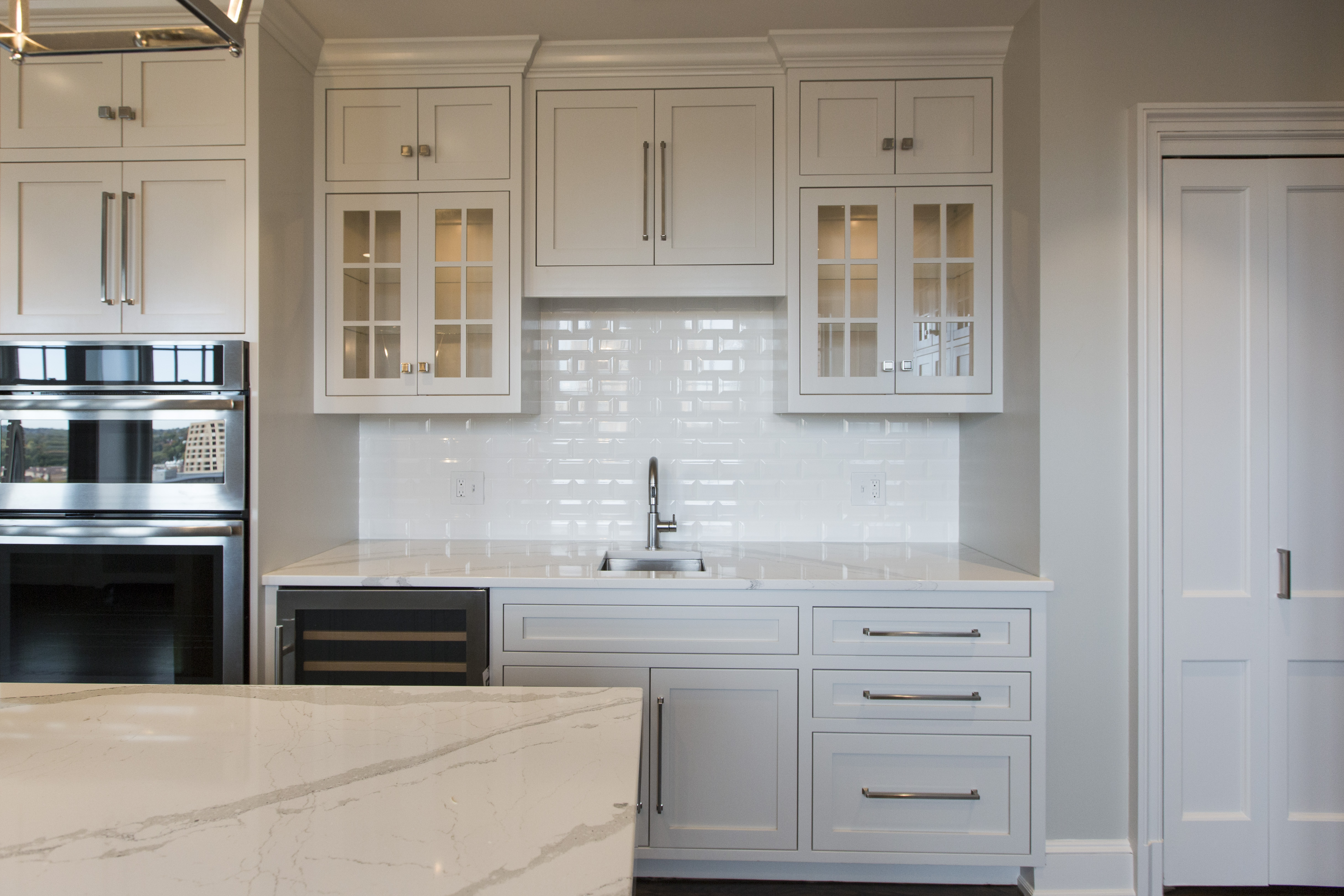
4. Kitchen – Clear the counter tops except for a couple of large vignettes of accessories, clean the kitchen thoroughly, and add a dab of vanilla extract on your light bulbs to give the sense that something just came out of the oven.

Karen Mills' blog
Interior design by Karen Mills

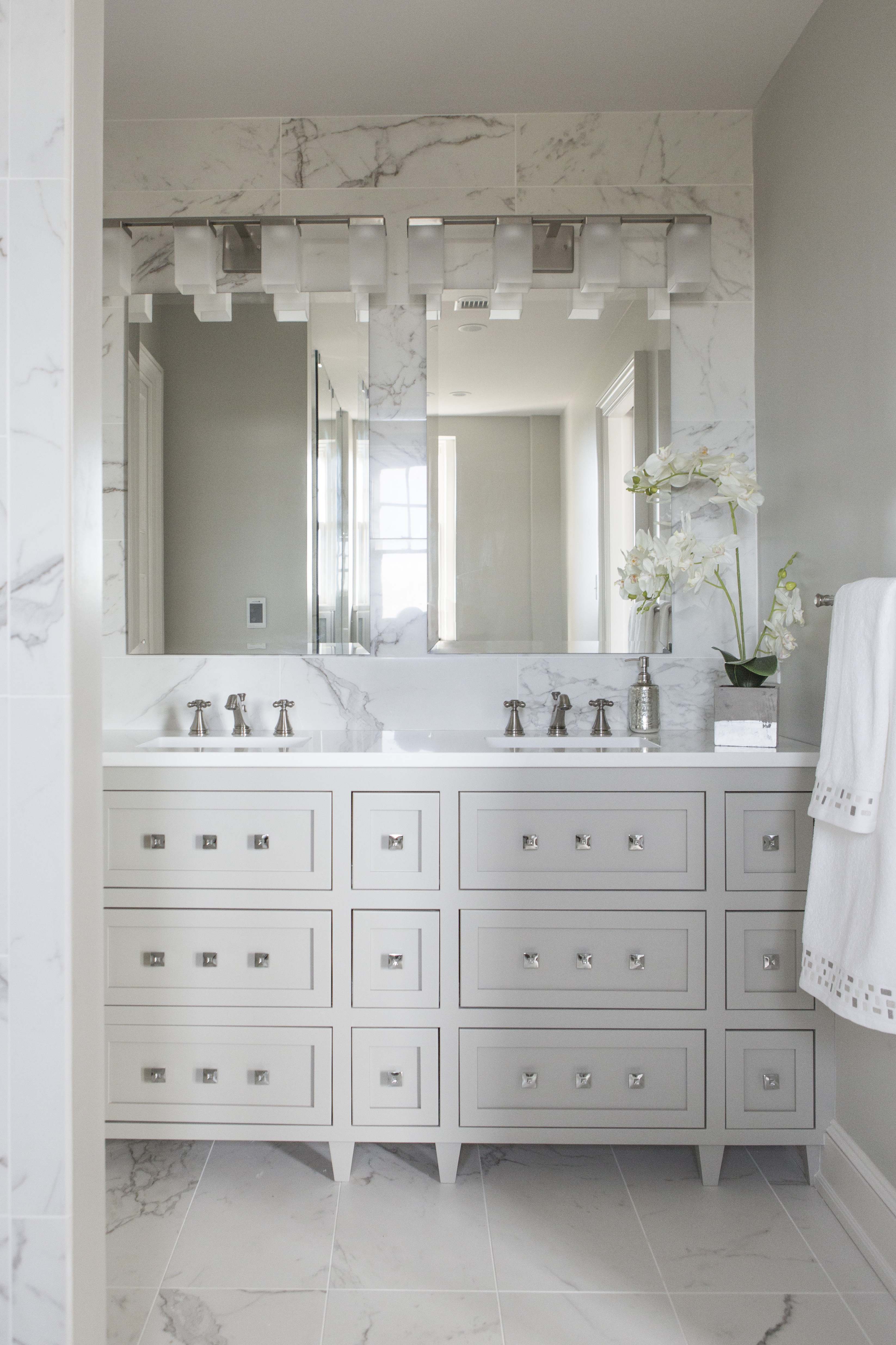
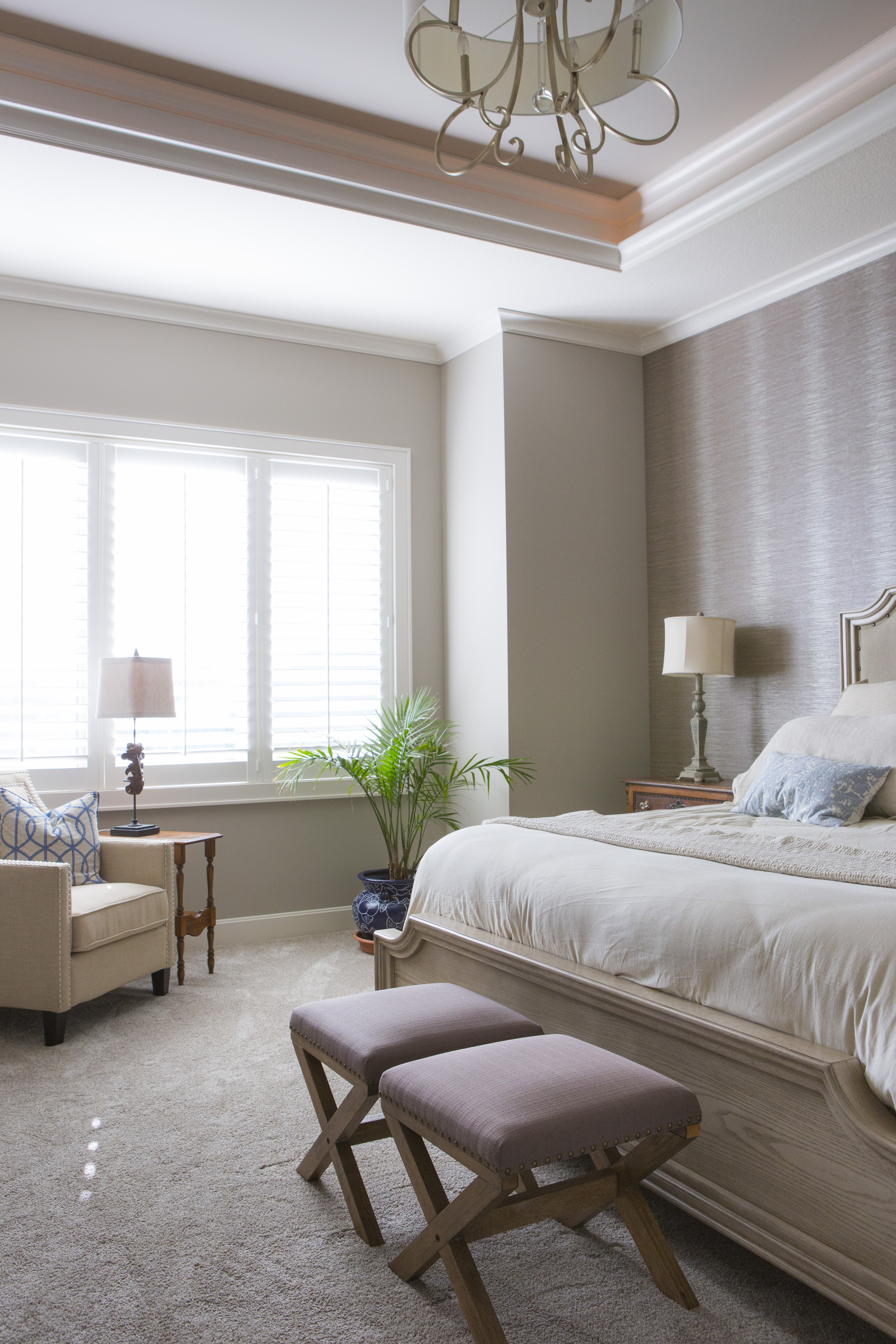
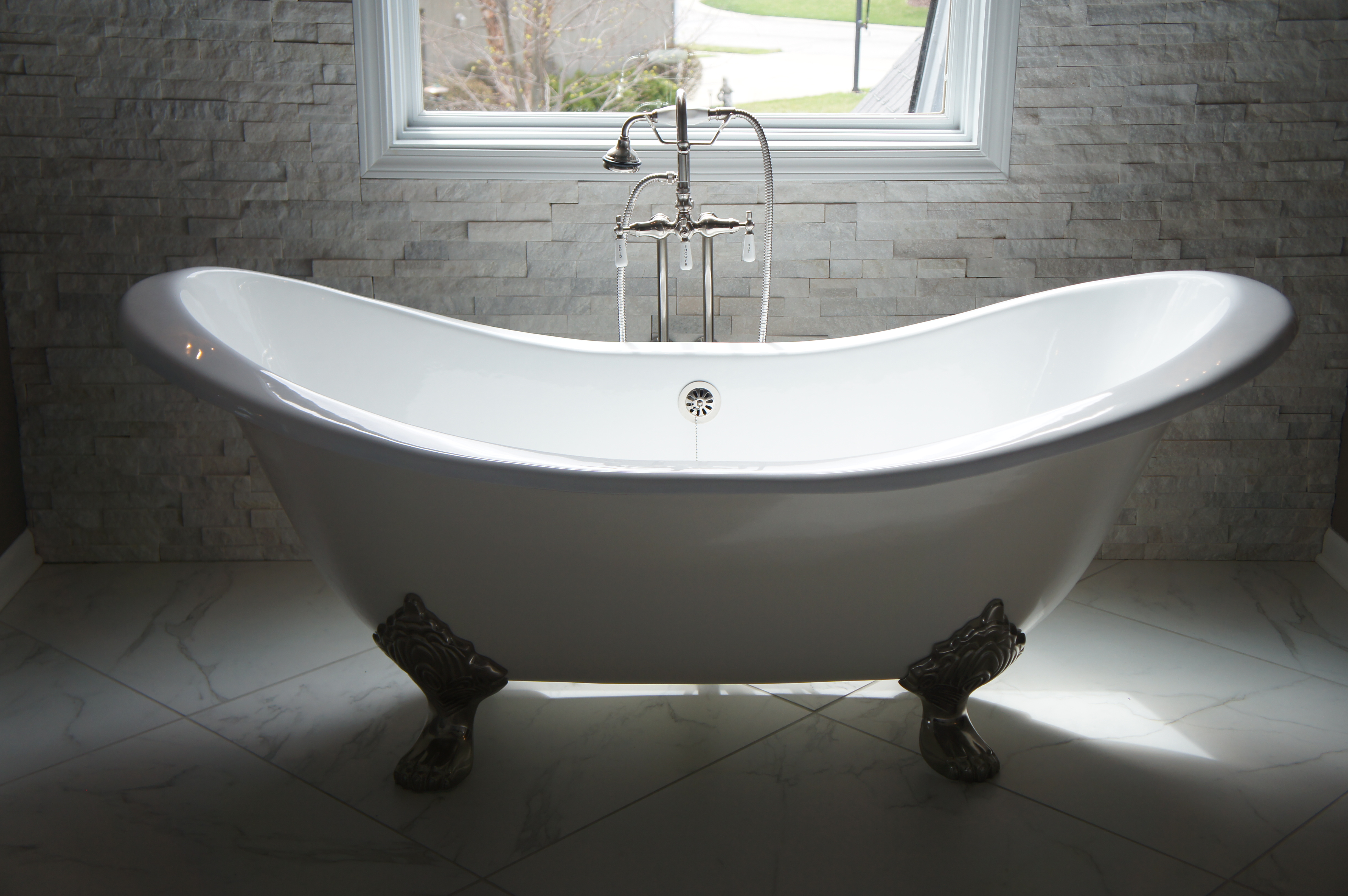
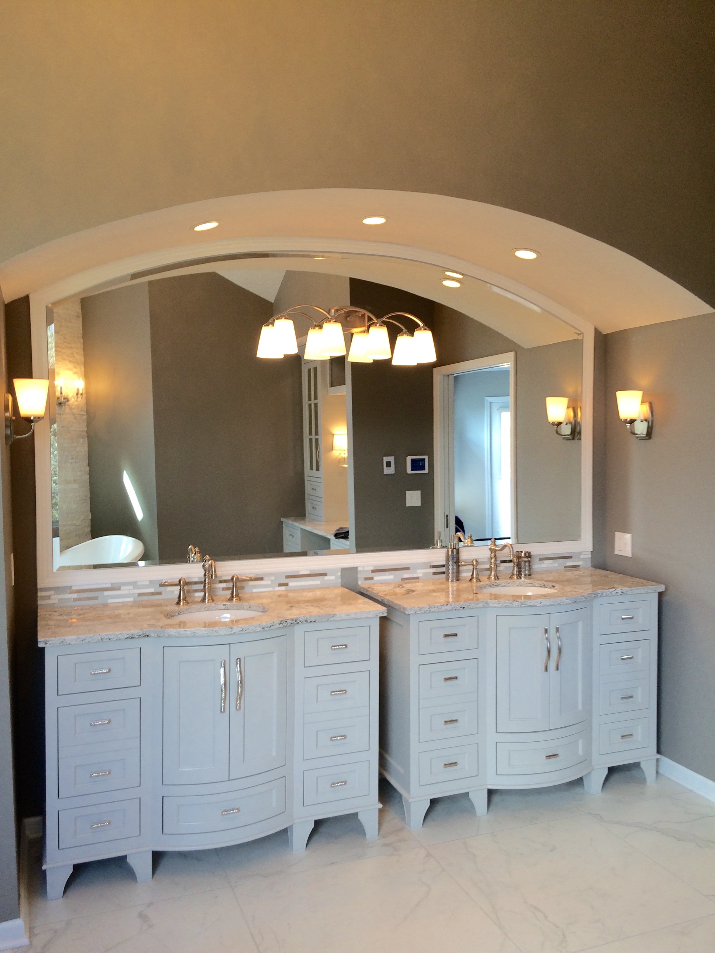
5. Master Suite – Set the stage for an inviting retreat in the bedroom that includes organized closets and clutter free floors/tops. Create an inviting bed with light colored washable bedding in simplistic patterns, add a seating area, if possible, and create a spa feel in the bath with thick white towels.

Karen Mills
Photo courtesy of Bernhardt

For more great ideas on interior decorating sign up for our weekly interior design blog here

plus become a fan of Kansas City’s interior designer and former host of the Living Large design show, Karen Mills, on Facebook here!

Interior Design/Interior Decorating

Interior Design: 3 Tips for Designing a Restful Bedroom

A good night’s sleep can be difficult enough without adding a room design that’s not relaxing and calm.  Read on for three ways to decorate a bedroom that’s a wonderful place to sleep.

Karen Mills' blog
Photo courtesy of Circa

1. Starting with a soothing color scheme 

When selecting a color palette that’s soothing opt for muted colors or neutrals.  In this bedroom by Circa furniture, the grayed out blues of the bedding, bench fabric, and drapes help calm down the room while also adding a touch of color to the gray walls and white rug.

Karen Mills' blog
Interior design by Karen Mills

2. Choose bedding in natural washable fabrics that are soothing

In this bedroom, we selected washable Italian sourced bedding, wallpaper and furnishings in muted colors with minimum pattern to keep the room’s interior design from getting too busy.  I love washable bedding because it cleans up easily when children or pets make a mess to reduce the worry.

Here the blue of the accent pillows on the bed repeat again on the chair’s pillow while the warmth of the bed’s wood is picked up again by the chair and carpet.

Karen Mills' blog
Photo courtesy of Century Furniture

3. Provide an inviting seating for getting dressed or just relaxing

In this room by Century seating abounds from the large tufted ottoman and bench to the chairs for sitting and reading.  The neutral color palette creates a soothing feel while the plants add life and color.

For more great ideas on interior decorating sign up for our weekly interior design blog here

plus become a fan of Kansas City’s interior designer and former host of the Living Large design show, Karen Mills, on Facebook here!

Interior Design/Interior Decorating

Interior Decorating: 3 Color Scheme Options for Your Living…

One of the biggest questions I get asked as an interior designer is what color scheme to use in decorating or designing a space.  If you’re not sure what color is best, trying shopping your closet for inspiration because often your favorite outfits or jewelry are the colors that look best.  Read on for three possibilities for your living space.

Karen Mills' blog

1. Blue and Orange 

Here in this photo I snapped before the rug was placed to tie everything together, we incorporated cool turquoise pillows to calm down the bold pops of orange along with introducing pillows with both colors to lessen the impact.

Karen Mills' blog
Interior decorating by Karen Mills

This living room is another example of how to decorate with blue and orange.  Our inspiration for the color scheme came from the existing water blue and orange artwork over the mantel.  To bring it all together we started with a light neutral sofa and coffee, then layered in custom blue draperies and fun toss pillows to create a cohesive color scheme with the artwork.

Karen Mills' blog
Photo courtesty of Century Furniture

2. Blue and Red

In this living space blue and red has been used quite effectively to create a little drama.  By starting with a neutral base of white and blue gray that’s more relaxing, red decor – tables, pillow patterns, and accents, can be added without overpowering the space.

Karen Mills' blog
Interior decorating by Karen Mills

3. Taupe gray and beige

When you have a room that already has bold patterns and color in its finishes like this one, you might want to introduce lighter neutral colors with little or no pattern.  Here we introduced lighter upholstery and an area rug with interesting textures and less pattern to create a calming effect.

For more great ideas on interior decorating sign up for our weekly interior design blog here

plus become a fan of Kansas City’s interior designer and former host of the Living Large design show, Karen Mills, on Facebook here!

and check out our latest interior design article on Houzz here

https://www.houzz.com/ideabooks/97946595/list/redecorating-lite-6-quick-updates-to-liven-up-your-living-spaces/

Interior Design/Interior Decorating

Interior Design: 5 Dining Room Paint Color Palettes

Since we don’t spend much time in dining rooms it’s a great opportunity to show off our personality and design something dramatic or even quirky.  Here are 5 fun color palettes to inspire you to refresh your dining space.

Karen Mills' blog
Photo courtesy of Schumacher

1. Black and White – This classic color combination always looks great not only because o the the stark contrast between dark and light, but also because you can pair almost any color with it like the yellow flowers here.

The wallpaper by Schumacher creates a wow factor in this space and draws your eye up to the ceiling to show off the height of the room.

Karen Mills' blog

Photo courtesy of Lillian August furniture

2. Blue

Blue, one of my favorite colors for dining room, especially navy, pair nicely with several colors including the fuchsia shown in this dining room.  By repeating different shades of blue on both the wrap around settee and wall, you can create a more interesting color scheme.  The fuchsia hue of the chair and pillow repeat again on the rug to create a cohesive feel.

Karen Mills' blog
Photo courtesy of Lillian White for Hickory furniture

3. Green 

Even though you don’t often seen green used in the dining room, I love how the green takes a back seat to the furnishings in creamy white and blue to help soften this bold shade of green.  Here in this photo artwork provides the inspiration for the color scheme of blue and green.

Karen Mills' blog

Photo courtesy of Hickory White furniture

Here’s another example of how to incorporate green into your dining room.  In this photo the yellow green in the art is repeated again on the chairs and reinforced by the green decor on the table.


Karen Mills' blog
Photo courtesy of Kravet

4. White/Neutral

If you love white like I do, why not paint your walls an interesting shade of white or light neutral along with white furnishings to create a fresh feel.  Then you can either leave the room white or layer in an accent color or two to change the look as the mood hits you.

Karen Mills' blog
Interior design by Karen Mils/Photograpy by 29Pixel Studios, LLC


Karen Mills' blog
Photo by Spectrum Limited

5. Color Explosion

If you can’t decide on one accent color you like because you love so many why not keep a neutral wall color and introduce two or three accent colors that you love to create a space that reflects your artistic side like this photo by Spectrum Limited chairs.  To create this same look, keep the furnishings simpler also like these clear Lucite chairs to create your dramatic dining room.

Of course orange and purple can also be colorful options for dining rooms along with more neutrals colors as shown here.

For more great ideas on dining room design or other topics sign up for our weekly interior design blog here

plus become a fan of Kansas City’s interior designer and former host of the Living Large design show, Karen Mills, on Facebook here!


Interior Design/Interior Decorating

Design Dilemma: How to Layer Heirloom Antiques into a…

Karen Mills' blog
Interior design by Karen Mills/Photography by 29Pixel Studios, LLC

When these Kansas City area clients purchased a brand new home that was already finished, they were excited to start over with new furniture too except for a few family heirloom pieces that had sentimental meaning.   So they called on our interior design firm who had worked with them before to solve their design dilemma.

First they needed to incorporate an antique coffee table into the interior design of this spacious living area so we placed the table front and center to create a wonderful conversation piece and cohesive look with the outdoor fireplace beyond.

Karen Mills' blog
Interior design by Karen Mills/Photography by 29Pixel Studios, LLC

As we placed key heirloom pieces the homeowners wanted to incorporate, we had to ensure the pieces complemented the interior design overall because the main living area was an open concept.

Karen Mills' blog
Interior design by Karen Mils/Photograpy by 29Pixel Studios, LLC

The armoire in the dining area was another existing piece that needed to be incorporated so we placed it behind a rustic style table with two existing end chairs that reflected an era gone by.

Karen Mills' blog
Interior design by Karen Mills/Photography by 29Pixel Studios, LLC

The entry chest, initially one of the biggest dilemmas because of it’s orange speckles, fell into place beautifully once we placed an existing piece of artwork that picked up the same colors as the chest.  To finish off the look we added a more contemporary lamp and vase that mimicked colors in the painting to create a wow factor in the foyer.

Karen Mills' blog
Interior design by Karen Mills /Photography by 29Pixel Studios, LLC

The master bedroom suite was also finished in warm gray colors so by repeating the orange wood hues of family heirlooms around the room along with designing simple custom bedding, the room complemented the antique pieces instead of competing.  A rustic bed and benches also help reinforce the timeworn feel of this space, making it more inviting and serene.

 For more great interior design ideas and photos, sign up for our weekly blog here

Karen Mills' blog
Interior design by Karen Mills/Photography by 29Pixel Studios, LLC

plus become a fan of Kansas City’s interior designer and former host of the Living Large design show, Karen Mills, on Facebook here!


Interior Design/Interior Decorating

Interior Design: 3 Ways to Design Smaller Kitchens to…

Karen Mills' blog
Interior design by Karen Mills/Photography by 29Pixel Studios, LLC

   1. Open up kitchen to rest of the house

In this kitchen we took out the wall to the former dining room and the wall to the maid’s quarters on the opposite end to create a space that lives large and even has enough room for a sit down island.  Once the walls were removed we matched the wood floors of the dining (now hearth) in the kitchen which also visually expands the kitchen so it lives larger.

2. Use lighter colors on walls and cabinetry

Karen Mills' blog
Interior design by Karen Mills/Photography by 29Pixel Studios, LLC

By selecting colors that are similar in hue and lighter in color, this kitchen becomes more cohesive and ultimately feels larger because the lighter colors bounce light around the room.


Karen Mills' blog
Interior design by Karen Mills/Photography by 29 Pixels

In this kitchen by designing a lighter white/gray color palette including the table/chairs, back splash and wall color, the room seems to visually expand also as light is reflected throughout.

  3. Add great lighting 

Karen Mills' blog
Interior design by Karen Mills/Photography by 29Pixel Studios, LLC

Great lighting can make or break a room, especially a kitchen.  Here in this kitchen we not only added great under cabinet lighting, beautiful chandeliers, extensive general lighting. and lit glass cabinetry but we also coordinated the lighting to be the same color temperature so it flowed together beautifully.

Karen Mills' blog
Interior design by Karen Mills

Here’s another example of a smaller kitchen where we layered lighting to create a wonderful ambiance and a happy place to spend cooking or entertaining.

For more great ideas on kitchen design or other topics sign up for our weekly interior design blog here

plus become a fan of Kansas City’s interior designer and former host of the Living Large design show, Karen Mills, on Facebook here!

Interior Design/Interior Decorating

Interior Design: How to Succeed at A Classic Kitchen…


Karen Mills' blog  Karen Mills' blog

BEFORE                                                                      AFTER

Are you dreaming of a kitchen like the one on the right but your reality is the one on the left?

As I toured this historic high rise condo on the plaza in Kansas City for the first time as the interior designer, the reality of the situation was bleak.  The condo hadn’t been updated for years and the warren of tiny rooms made it difficult to imagine a beautiful open kitchen.  On top of that the small elevator and restrictions limited what could be done with cabinetry, counters, and much more.


To start I knew we had to enlarge the kitchen so we took over the tiny adjoining maid’s room shown above to gain a few more feet.

Our end goal was a large open inviting kitchen full of natural daylight that was a classic so to start we tore down the existing entrance wall (shown on left) to open the kitchen up to the existing dining room and we resized the mismatched windows in each room to flow together as one big window area.

We also relocated the adjoining dining room to the over sized living area and made the former dining room a hearth area that opened into the kitchen.

Karen Mills' blog

To make the rooms feel more expansive but also timeless, we tore out the flooring in the kitchen and wove in new wood floors to match the existing wood flooring elsewhere.

Next we began to lay out a floor plan that included a gorgeous custom island along with designing custom flush mount European style cabinetry that was also functional and a lighting plan that would make the room pop.


Karen Mills' blog
Interior design by Karen Mills/Photography by 29Pixel Studios, LLC

On the right we designed a beautiful custom stove hood with lit glass cabinetry and large drawers underneath to hold pots and pans.  Plus we took the beveled subway tile to the ceiling to add height and drama to the space.

Karen Mills' blog
Interior design by Karen Mills

In the back we designed a pantry area that disguised the crooked structural wall and added doors that opened to reveal a coffee station and appliance storage along with additional glass lit cabinetry.

Karen Mills' blog
Interior design by Karen Mills

On the left we created a bar area with a wine cooler, additional sink, and storage along with lit glass front cabinetry to hold glassware.

Karen Mills' blog

And on the island we added a mitered top to give the beautiful Cambria marble style top even more importance!

Karen Mills' blog
Interior design by Karen Mills

The result – a large open living/work space that lives large and is also functional.

For more great ideas sign up for our weekly interior design blog here

Plus become a fan of Kansas City’s interior designer and former host of the Living Large design show, Karen Mills, on Facebook here and let us know how we can make your dream a reality!

Interior Design/Interior Decorating

Interior Design: The Making of a Beautiful Bathroom

Interior Design: The Making of a Beautiful Bathroom

Karen Mills' blog

Interior design by Karen Mills

After working  as an interior designer on over 1200 projects , I’ve realized that most homeowners have no idea the amount of detail that goes into successfully creating a beautiful bathroom redmodel.   That’s why today I’m sharing a NARI award winning bathroom project we designed in a collaborative effort with our clients that’s been featured by Elle Decor magazine and MSN in the United States along with the United Kingdom.

The clients had a wonderful vision of a Hollywood Glam style bathroom and we helped them turn that vision into a reality, ensuring the bath was  warm, inviting, and up to date.

Karen Mills' blog

Since we already had a vision for the Hollywood glam design style, we began by selecting a color scheme from Benjamin Moore.

shower-layout

Then we discussed requirements for functionality including layout/space planning, storage, electrical requirements, and more.  And even though we loved the glossy marble finish on the floor, we opted instead for a matte finish to minimize slippage coming out of the zero entry shower or free standing tub.

Karen Mills' blog

Karen Mills' blog

The existing fireplace was not being used, so we decided to replace it with a fabulous custom make up cabinet where our client could relax and get ready.


Karen Mills' blog


As we began designing the beautiful custom vanities, we made sure they were functional with drawers deep enough to fit requirements for storage and built in electrical outlets for recharging toothbrushes/razors.  For the custom make up cabinet, we opted for mirrored fronts instead of glass on the upper cabinet doors to hide toiletries and make up.

finishes

Marvel floor tile by Atlas Concorde

Once the beautiful custom cabinetry design was finalized, we begin selecting the other finishes for the bathroom including a gorgeous stacked stone with embedded crystals for an accent wall behind the tub, a free standing tub, counter tops, back splash, floor/wall tile, plumbing fixtures, pulls, and light fixtures along with a lighting plan to show it off.

shower-in-progressKaren Mills' blog

But we didn’t stop there.  Once the walls were up, we sketched plans on exactly how to layout all the different colors and sizes of tile we had selected so  we would have just the look we wanted.

master-bath-bench-1

master-rock-wall-with-lighting-edited-for-website

The result?  A beautiful one of a kind award winning bathroom that our clients enjoy every day that helps reduce stress and make life better!

Karen Mills' blog

Interior design by Karen Mills

For more great ideas and photos, sign up for our weekly design blog here!

plus become a fan of Kansas City’s designer and former host of Living Large design show, Karen Mills, on Facebook here.


vanity-top-closeup

Interior Design/Interior Decorating

Interior Design: How to Inject Autumn Orange into Your…


Karen Mills' blog
Interior design by Karen Mills

Injecting fall hues like orange into your home for the season can be as simple as fall leaves in a vase or a ceramic pieces like this entry we designed in orange.


Karen Mills' blog
Interior design by Karen Mills

Other possibilities for layering in the warm color of autumn could include toss pillows like the great room here, a throw, or even a rug underneath.

And if you’re a big fan of orange, why not make a bigger commitment like painting one accent wall with orange or installing drapery with orange hues.

Simpler options might include pumpkins or oranges grouped together in a clear glass container or orange decor.

For more great ideas about how to inject orange into your home for autumn, click here to read my latest Houzz article – https://www.houzz.com/ideabooks/92328651/list/7-rooms-that-fall-for-orange

then sign up for our weekly interior design blog here

plus become a fan of Kansas City’s interior designer and former host of the Living Large design show, Karen Mills, on Facebook here!

Interior Design/Interior Decorating

Interior Decorating: What Your Favorite Color Says About You


Karen Mills' blog

Ever wonder what your favorite color says about you, the meaning of color, or how to use it to design your interior?

As an interior designer and color expert, I can tell you that’s not always an easy task because it takes years of experience to learn how colors colors can impact a room in different lighting situations..  No wonder painting is currently listed as the most common home improvement project since countless homeowners waste money having their spaces repainted after selecting a color or combination that doesn’t work.

So here’s some insight on your color’s meaning that may help and ideas for using it in your home.

Karen Mills' blog
Photo courtesty of Century Furniture

If you love red like I do you most likely live life to the fullest with spontaneity and excitement.  But what does a red interior say to others?  The color, associated with blood, raises your blood pressure and grabs your attention!  So if you don’t want to go completely red, try using it as an accent color to make your space a little more vibrant.

Blue, however, exudes stability and calm, making it a perfect color for bedrooms where you need to unwind.  Lovers of this color tend to be dependable, responsible citizens who do the right thing.

Yellow, like a ray of sunshine portrays warmth and optimism in a room, making it perfect for a kitchen or a sunny living area, and fans of this color are often optimistic people with a positive encouraging attitude.

Karen Mills' blog
Interior design by Karen Mills

Green, the color of nature exudes calmness and warmth, which makes it a good color for bedrooms or spaces where you need a more relaxed feel.  And fans of this color are usually warm, kind, and charitable.

Karen Mills' blog
Interior design by Karen Mills

Purple fans, often a more complex and creative type of individual, are fascinating individuals but sometimes may seem mysterious or dark to others who don’t understand their creativity.

Karen Mills' blog
Interior design by Karen Mills

Orange, the color of hunger and vibrancy fits perfectly into that dining room or kitchen area where you need some life.  And if you’re an orange lover, you probably show the same vibrant spirit as the color with your enthusiastic zest for life.

For more great interior design ideas, sign up for our blog here!

Plus become a fan of Karen Mills, Kansas City’s interior designer and former host of Living Large design show  on Facebook here now!