 Interior Design/Interior Decorating
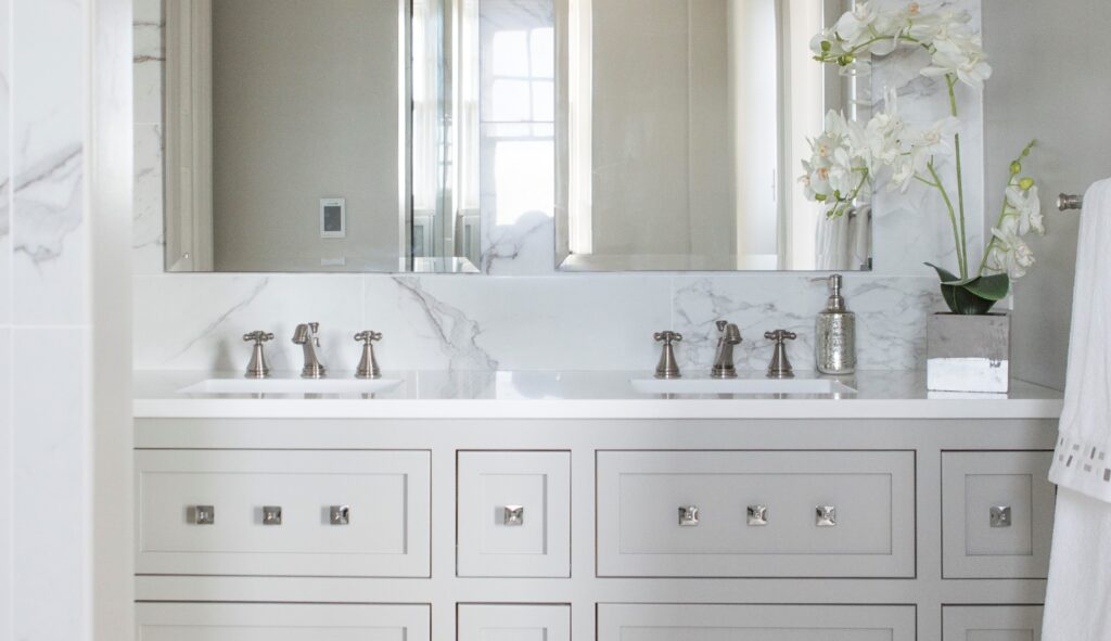
Interior Design: 3 Reasons to Remodel Your Bath
Why You Might Consider Updating Your Bathroom
 Interior Design/Interior Decorating
Why You Might Consider Updating Your Bathroom

 Interior Design/Interior Decorating
As an interior designer I’ve heard numerous sad stories recanted by homeowners who’ve selected a remodeler based on lowest price that resulted in poor craftsmanship, unfinished work, or even worse, damage to their property. Read on for my design tips on what to ask a contractor before hiring.
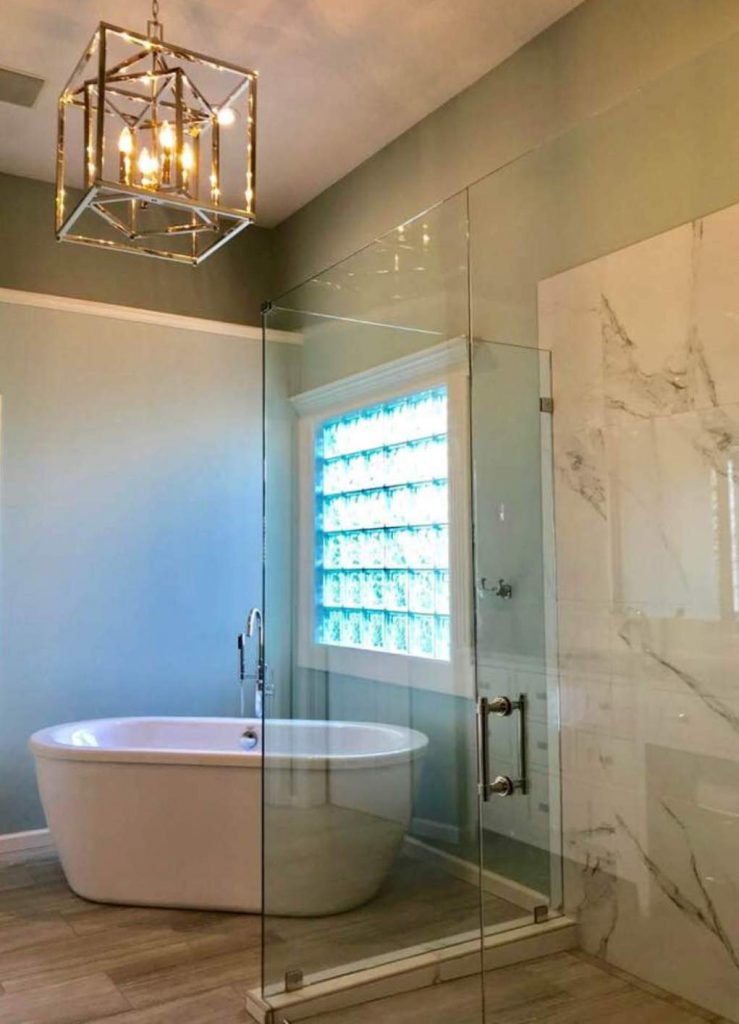
2. Can your insurance company mail a current copy of your insurance policy(s) before we sign the contract? Contractors need to have liability insurance to cover any damage to your property and workman’s comp for anyone working on your home to protect you if they get hurt on the job.
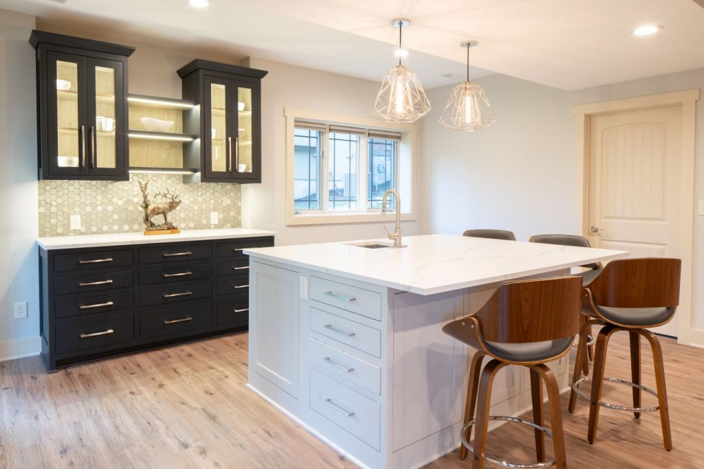
3. How do you charge? Normally remodelers give a bid/estimate of total amount for project minus any unseen issues or simply charge for time (hourly) and materials (products). If you want to buy materials yourself and just pay the contractor for your time, make sure they offer that option and that you can put a limit on the hours billed so project doesn’t get out of hand.
4. Can you complete work within my time requirements and may I have a written timeline/schedule of construction beforehand?
5. Will you provide a signed contract with scope of work to be done that includes a warranty? Warranties are critical because they provide a guarantee and help ensure the remodel is done correctly the first time.
Now that you’ve hired a contractor ensure you have a professional interior designer also for your project to avoid costly design mistakes. And if you need guidance in that area, give us a call at 913.764.5915 to find out how we can help.
For more great ideas on remodeling or interior design sign up for our interior design blog here
Plus become a fan of Kansas City’s interior designer and former host of the Living Large design show, Karen Mills, on
INSTAGRAM and FACEBOOK here!
 Interior Design/Interior Decorating
Homeowners are looking for a home of the future that’s flexible as their needs change whether it’s adding a home office, a gym, entertainment area, or outdoor area for a staycation. Read on for my interior designer tips on how to make your home more adaptable.
A. A multipurpose area off the garage for dropping off jackets/shoes/sports gear, cleanup, or even deliveries – if the delivery can be made through an exterior door. like this room. In one project for interior design clients, we turned part of the garage and the existing laundry into an adaptable space that can serve either as a laundry, mudroom or butler’s pantry when needed.

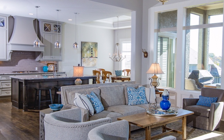
B. Design your open living area to allow portions of it to be partitioned off with doors – barn, pocket, partition, or French doors like this family room area with a home office to create private spaces for family members, while also making the spaces multi-functional. For example, you could have doors that provide a cozy sitting area for reading/games, home office or home theater that could transform into a guest bedroom with just the addition of a small closet.
In the kitchen hidden doors that look like cabinetry could open to reveal a small home office area that could later become a pantry or even a panic room. French doors that lead to a porch/sunroom can also provide much needed additional space for alone time without sacrificing your outdoor view.
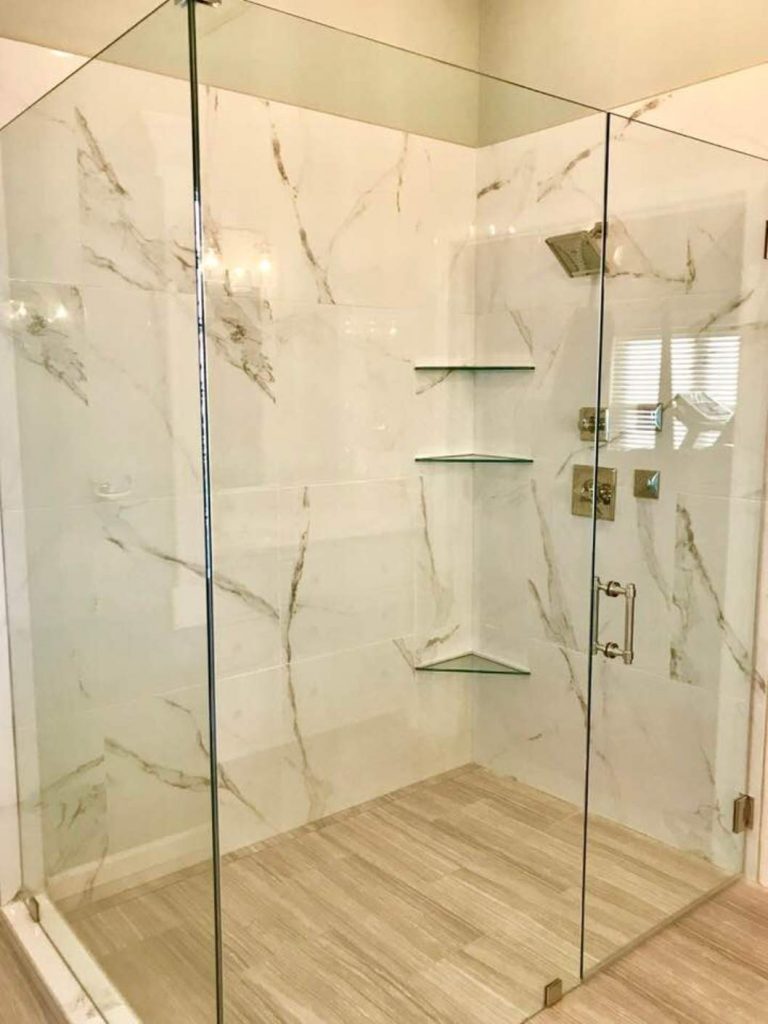
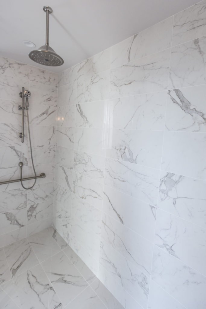
C. Plan for aging in place or surgeries that may limit mobility with 36″ wide doorways into your home, zero entry threshold from your garage to interior and into your shower area like this bathroom.
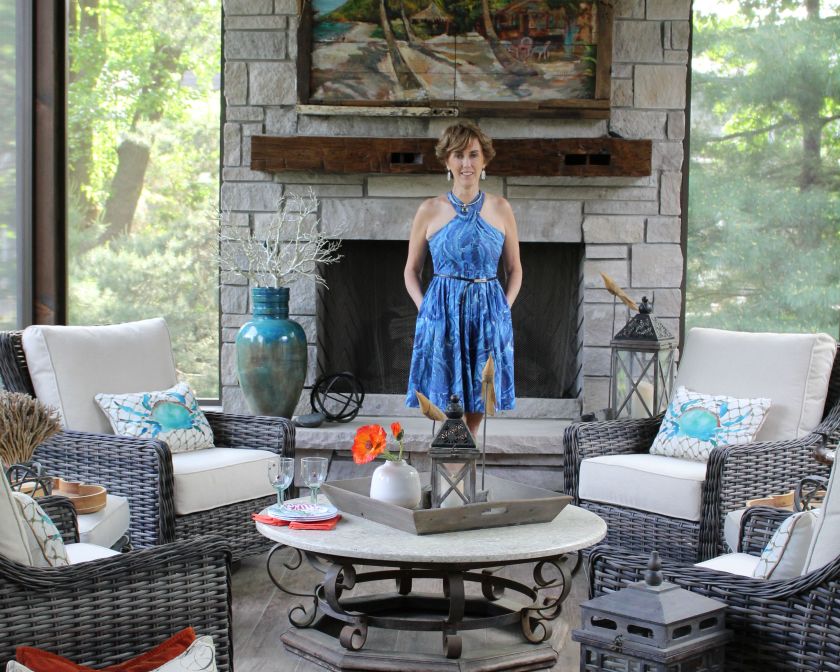
2. Add outdoor spaces that are multifunctional. Outdoor entertainment options could range from heated pools, hot tubs, and putting greens to outdoor kitchens, covered bars with big screen TVs, and/or a small guest house with French glass doors that morphs into a studio/office, man cave, or pool house if needed.
In this porch design heated floors and a fireplace were included to make the porch more all weather where winters can be quite cold. A TV hidden behind an original artwork provides flexibility for using this space to watch television too.
In summary successfully designing a house of the future starts with a floorplan that’s adaptable and planning ahead for your needs.
For more great ideas sign up for our weekly interior design blog here
Plus become a fan of Kansas City’s interior designer and former host of the Living Large design show, Karen Mills, on
INSTAGRAM and FACEBOOK here!
 Interior Design/Interior Decorating

Here is part two of the 3-part series on interior design I promised you. Enjoy!
It doesn’t have to be a big house. It could be like the wood-framed, one-bedroom cantilever you see on Bosch, not much bigger than a Beverly Hills garage with breathtaking views of LA just over the edge of the hill.
The irreverent detective’s modern house is perched precariously on three steel pylons at its mid-point like a delicate treehouse, floating above the city below. It’s all windows and glass and geometric angles.
Meanwhile, driving through one of the most affluent neighborhoods in a different city in the midwest, the streamlined profile of another sleek, modern house is so smoothly integrated into the landscape that it is almost indistinguishable from it. At first glance, this architectural gem is functional and stylish with a futuristic vibe. Dramatic lighting underscores the modular boxes that fit together like lego pieces to create artistic angles, intriguing juxtapositions, and sharp lines.
The house looks like someone ripped it from the pages of a glossy architectural magazine and dropped it on top of a mountain. This is consistent with the spirit of contemporary home design: personal expression and individuality.
In this week’s feature story, the lead graphic showcases the contemporary mountain cabin with two-story ceilings, cinematic wood beams, and a rugged stone fireplace.
Oversized lighting fixtures, bleached floors, and the ubiquitous but invisible presence of glass reinforce a feeling of openness. The naked eye can’t see where it ends, like an infinity pool, so our imagination fills in the blanks.
Once inside, you are surrounded by large open floor plans and intentional asymmetry, creating more visual interest than the predictable linear repetition of symmetrical shapes in traditional home design.
Expansive floor-to-ceiling glass panes bring the outside into the interior living space. These homes incorporate the latest home design trends. Modern architects value functionality over aesthetics, removing unnecessary details that divert attention from primary focal points.
Modern homes are more than just a place to live and work. They reflect the people who live there and their unique styles, influenced by a blend of trends from different periods and cultures. The common thread that ties these design ideas together is a commitment to quality, craftsmanship, and durable relevance.
We can trace the roots of modern architecture back to the 1893 Chicago World’s Fair and the cutting-edge buildings that cemented the role of the US as a world leader in art, architecture, and technology.
From modern furniture pieces carved out of natural materials like wood or granite stone to traditional designs utilizing dark rich woods and marble accents, the trend toward simplicity in design is likely to continue unabated for at least ten years.
The next big breakthrough is integrating our rapidly expanding arsenal of technology into our sci-fi houses as seamlessly as built-in appliances, recessed lighting, and hidden storage areas. Office equipment is now hiding in plain sight. It materializes when you need it and gets lost when you don’t.
Don’t let Sonja Rudolf get started on that text thread. The commercial furniture expert at Vari is passionate about her mission to “elevate workspaces.”
Rudolf told Life In Style during an exclusive interview that the home office is melding into a “real office with commercial-grade office furniture.” Check out our feature story about home office design in the last episode for more ideas.
Contemporary home office design sports clean lines with a simplistic “less is more” design philosophy. “Straight-lined simple design aesthetics with neutral earthy colors never go out of style, “ said Rudolf.
Removing unnecessary design elements to spotlight the sharp edges may appear sparse, even impersonal, but many modern homes will welcome you into a warm and inviting interior.
She cited the materials used in the construction and the interior design of the home – dark woods and marble with toasty accents of color.
Karen Mills served as the interior designer on a Rustic lodge adjacent to a beautiful lake and forest. “The stunning home nestled between a private lake and woods yearned for a lighter color palette and more spartan furnishings to allow the outside views to take center stage, “ Mills told an international design magazine featuring her work.
From country homes to beach houses, these ultramodern spaces are filled with edgy materials, bold lighting, streamlined furnishings, and even some pops of color, creating striking spaces.
The contemporary home represents 21st-century architecture and design. It’s evolutionary, meaning it changes and grows as we do, constantly adapting to what’s new, intriguing, and trending in home design.
The primary distinction between contemporary homes and traditional homes is that they don’t have a predefined style. Modern homes borrow and adopt features from a diversified mix of international, minimalist, modern, and eclectic design styles that are unique yet still familiar.
While traditional architecture and design can be beautiful, they can also feel outdated and stuffy. According to Adam Grimsman, a mortgage banker at USA Mortgage in Overland Park, contemporary homes always feel fresh and current, and demand in this category is rising.
“Many people want white lines, a nice clean space. We are seeing an uptick in loan applications for contemporary homes as they are more desirable to millennials and Gen Z,” he said.
Contemporary home design often incorporates natural materials like wood, stone, metal, and glass. This design tends to be more energy-efficient than traditional designs, making it a popular choice for eco-conscious homeowners. We will delve more into that topic next week.
Popular shelter magazines like Elle Decor, Architectural Digest, and House Beautiful celebrate phenomenal modern home designs. They showcase inviting spaces that feel both contemporary and timeless.
“When considering a contemporary design approach, my core belief is that good planning and design of space has a direct and positive impact on our quality of life,” said Lior Brosh, owner of UK-based Brosh Architects in Borehamwood, England.
Brosh recently completed a project in Notting Hill, London for a client who wanted a bright space with a contemporary aesthetic that still felt calm, warm, and homey.
From streamlined lighting and plumbing fixtures to cool doors, water features, sculptures, window treatments, and oversized address number treatments to dramatic special effect landscape lighting, contemporary design can be stunning.
Another popular trend is bold geometric shapes in both furniture and architecture. These accents can add tons of visual interest to any space. Once you get comfortable with all the photographers in your living room and cars slowing down to get a closer look at your house, you’ll be fine!
Life in Style, the weekly Publication from Team Real Estate is dedicated to helping homeowners make more inspired decisions about their homes and lifestyles. It features original news, commentary, tips, and analysis from leading industry experts. To be considered for inclusion in future stories, email lifeinstyle@teamre.com
 Interior Design/Interior Decorating
For the first time I am sharing a series of fabulous guest articles written by my former executive producer of Living Large, Andrew Ellenberg. Enjoy!
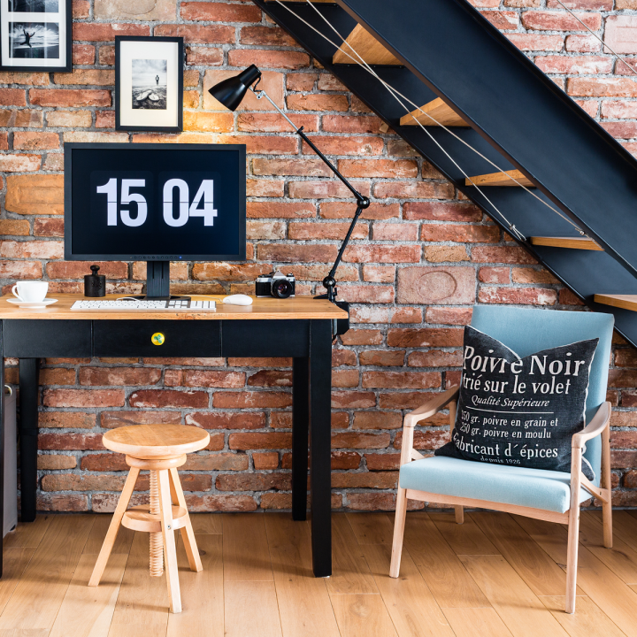
Deborah rises to the sound of soothing nature sound effects and meditation music gently nudging her to ignite the day. She tells Alexa to turn on the shower and warm up the water temperature to the perfect temperature. As she prepares for another round of carpe diem and Starbucks Espresso, she watches her favorite YouTube newscast in the foggy mirror.
After she pushes a button to rotate dressing options from her wardrobe to her fingertips, she is camera ready to step into her home office, which doubles as a Television and podcast studio.
Once Deborah is ready to kick off another exciting business adventure, she tells Alexa to raise the twin monitors for her computer, silently ascending from under the table in response to her command. Alexa reads her priority emails delivered to an exacting standard of relevance and value per her specifications.
A pleasant audio notification reminds Deborah about an online meeting that she needs to join in ten minutes. The video conferencing app kicks in and initiates the call. Compact Sonos speakers sneak into view.
The green screen pops up; she puts on her anchor face, and two cameras go live. Welcome to the future of home offices!
As we move from temporary home offices to permanent ones, scenes of hilarious real-life photos of video calls conducted from playrooms and makeshift ironing board desks are becoming less relevant.
Corporate executives and owners realize the benefits of foregoing lease renewals and expansions and instead choose to go virtual. Often seen as a way to reduce costs, it can also increase efficiency and productivity. As businesses have become more globalized, the need for physical office space continues to diminish.
Home Offices Aren’t Going Away.
The September 2021 Gallup Poll found that as many as 45 percent of American workers now work from home permanently. That means many of us never want to go back to the office and are finding solutions to make working from home a phenomenal experience.
Big tech brands Google, Microsoft, Twitter, Square, Facebook, Dropbox, Slack, empower employees to work from home and offer flexible work schedules to accommodate family time. As the most innovative sector in the market, tech is always ahead of the curve.
We’re going to take an educated guess here. You are probably motivated more by freeing up windshield time for date night while the kids are getting spoiled at your mom’s house than by reducing your carbon footprint.
Let’s be honest. You can’t work all day and then go home. Your home office needs to be where you do your best work 24/7, so it must accommodate whatever crazy schedule life throws at you.
Do yourself a favor. Get some white noise headphones because they will help minimalize distractions from other conversations so you can maintain deep focus no matter what is going on around you.
If you have children at home, try to set aside some dedicated time when you can arrange to provide entertainment for them, so you avoid distractions. And if you find yourself working odd hours, don’t be afraid to let your family and friends know so they can adjust their expectations accordingly.
Home Office Design is Built into Home Design
Karen Mills, an internationally respected interior designer and Founder of Interiors by Design, says, “Now that people are working at home, they want their office to blend into the living space. They don’t want their homes to look like corporate offices, so all the ugly office equipment must disappear.”
For those using a guest room as an office, the Murphy bed is an excellent choice. Create the desk space when you need it while still having a place for guests to sleep. Soundproofing rooms is another design choice people are making; homeowners want a place to work quietly, close the door at the end of the day, and live in the rest of the house without being reminded of work.
Now that working at home is permanent, workers are decorating home offices. Gone are the pandemic days of sharing the playroom with kids. We’re creating Zoom rooms or spaces in the home where we can do our video calls uninterrupted. But if the dog wanders into the studio and barks during a call, no one cares.
We all understand the challenges and beauty of working at home. We’re adding color, art, photos, plants, and lighting to our permanent workspaces. We’re investing in office chairs like we would a new couch or bed because we want to be comfortable while we work.
Families make space in playrooms, bedrooms, and dining rooms for work. Sometimes it means sharing space and dividing it with a partition. Room dividers are back in fashion; you can use them as an accent wall or add color to an office setting. No one needs to know that’s the guest bed behind you!
When you’re not working, how does your home function? It’s an important consideration, especially if you’re thinking of buying a new home or renovating your current one to be more functional for your lifestyle. Creating a work-life balance seems to be the new American Dream.
Meditation and Exercise: Rooms for Work-Life Balance
To support work-life balance, we’re rethinking how the home functions for our families. Dining rooms are now meditation and exercise spaces. Music is piped throughout the house to create a sense of peace or to pump up the energy on long workdays.
Patios are now offices. Pets are coworkers who join us for at-home yoga classes and an occasional video call—each of these needs a convertible or dedicated space that works for you and your family.
As you consider your next home, think about how you want to optimize your space and what you want the house to be for your family. The remodeling options are virtually unlimited, from home offices to rooms for work-life balance.
Life in Style, the weekly Publication from Team Real Estate is dedicated to helping homeowners make intelligent decisions about their homes and lifestyles. It features original news, commentary, tips, and analysis from leading industry experts. To be considered for inclusion in future stories, email lifeinstyle@teamre.com
If you’re looking for more custom interior design, decorating, or remodeling inspiration, ideas, and photos, sign up for our weekly interior design blog here
Plus become a fan of Kansas City’s interior designer and former host of the Living Large design show, Karen Mills, on
INSTAGRAM and FACEBOOK here!
 Interior Design/Interior Decorating
Tips for Creating a Functional Kitchen Interior Design
If you’re thinking about remodeling or designing your kitchen read on to learn about some of the biggest mistakes homeowners make when designing a kitchen.
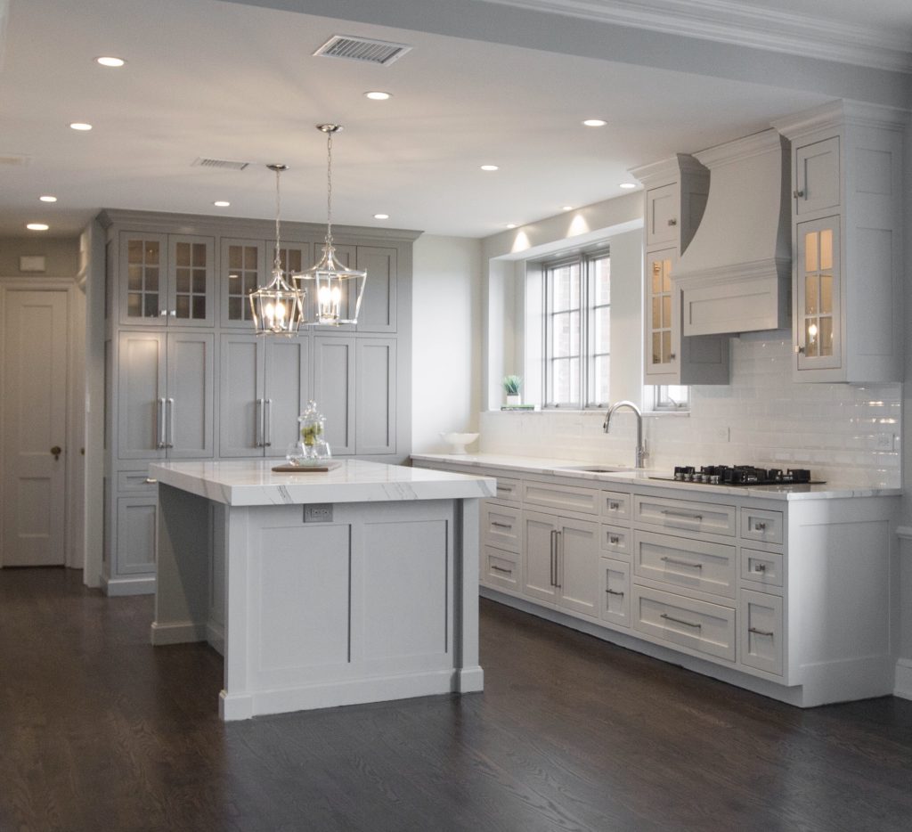
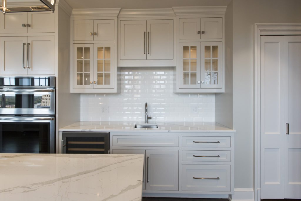
2. Wasting Potential Storage – Countless storage options exist so there’s no reason to waste space in the kitchen especially with the adaptive kitchen storage units that make drawers and cabinets more functional from trash pullouts to roll out shelves. Here in this fabulous historic Walnuts condo where space is at a premium, we added pegged drawers under the stove for pots/lids, hidden pop open storage under the island. and used the extra space we gained straightening out a crooked back wall to create a coffee bar and pantry cabinet that’s draws you into the space.
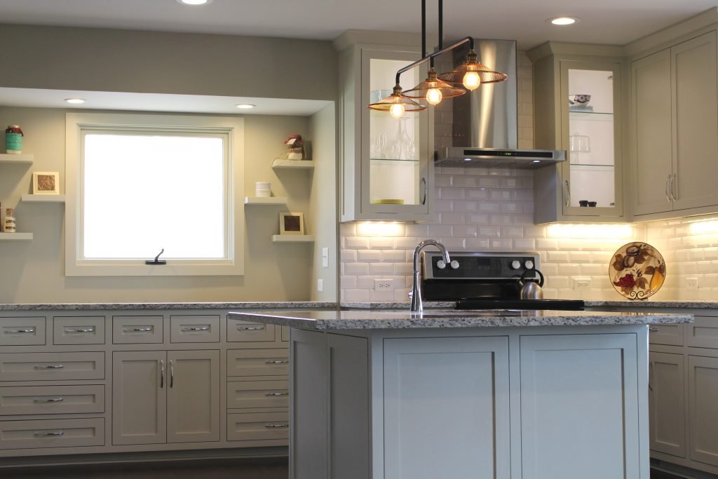
3. Work Area Too Crowded- As an interior designer I’ve lost count on how many times I’ve walked into a home that didn’t have enough work space. Even though the recommended distance between an island and wall cabinetry is at least 42″ I usually I find that the minimum required distance of 36″ is often the reality of existing kitchens which creates a cramped space that’s not very functional. Other issues I often encounter with interior design clients who have existing kitchens already are drawers or refrigerator doors can’t open fully to function correctly.
Here in this kitchen we widened the walking area and made sure counter space was provided where needed whether to set down groceries, place dishes from the dishwasher or a space to simply bake a pie.
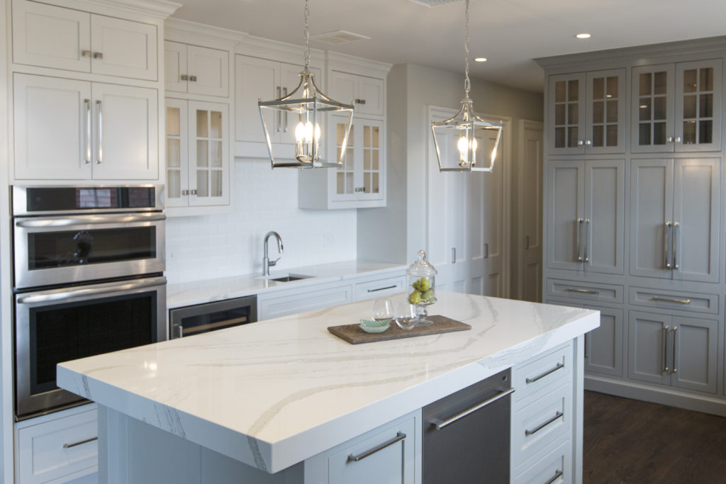
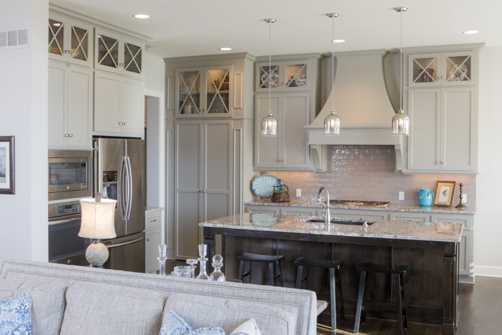
4. Lack of right lighting – If your new kitchen doesn’t have a mix of general, task, and accent lighting, it will tend to be a little lackluster in appeal and possibly function too. Here in this kitchen design, I created a kitchen with can lights in the ceiling for general lighting, puck lights tucked away inside the glass cabinets for accent lighting, plus introduced mini chandeliers over the island that not only provide accent lighting but also task lighting for working in the kitchen.
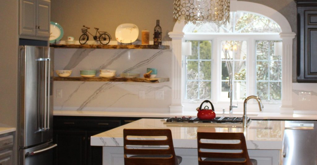
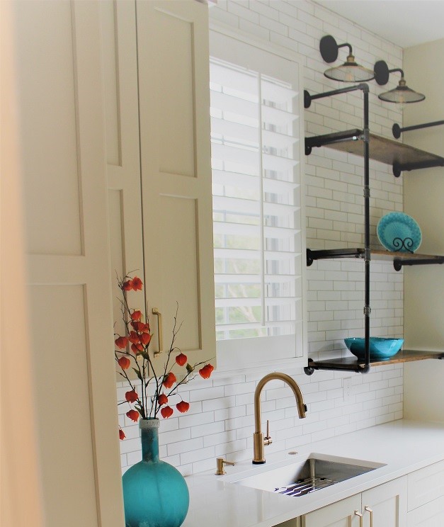
5. Not bringing in a professional – Hiring a professional kitchen designer with experience who creates kitchens and bathrooms for a living can help you avoid costly mistakes, free up your time, and create the space of your dreams, while ensuring your space is functional. In this kitchen refresh where we reused most of the existing cabinetry, we were able to introduce new elements that created a wow factor – bigger airy light fixtures open shelving, counters that continued up the wall, a mitered edge island counter top, and bold cabinetry colors. The result? A fresh new look that showed off our client’s creative spirit while ensuring the space would function well for them.
For more inspiration, ideas, and photos, sign up for our weekly interior design blog here.
Become a fan of Kansas City’s interior designer and former host of the Living Large design show, Karen Mills, on
INSTAGRAM and FACEBOOK here!
Or give us a call at 913.764.5915 to discuss your kitchen project.
 Interior Design/Interior Decorating
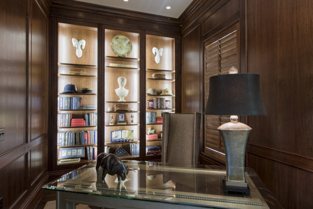
If you prefer to have your home office in full view, you can also opt for French door style pocket doors that can make your overall living space feel larger like this interior design project below we designed.
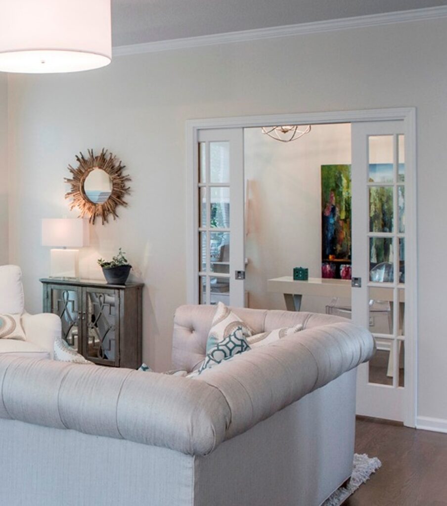
If you prefer to have your home office in full view, you can also opt for French door style pocket doors that can make your overall living space feel larger like this interior design project below we designed.
2. Hide your workspace behind built in cabinetry or in a closet. – As an interior designer I’ve helped numerous clients solve the issue of where to put a home office. One of my favorite solutions as an interior designer was a home office we designed behind kitchen cabinetry as part of a remodel. And we disguised the doors to look like cabinetry which also functions nicely as a safe room.
Other solutions our interior design firm has created includes hiding an office under the stairs, in a niche area on a landing or loft, or inside a step-in closet where you can just shut the door to hide the space.
3. Introduce a piece of furniture that can act as a desk along with storage for your office necessities. Options could include an office armoire or dining table, for example. For one client, our interior design firm helped them take over their rarely used dining room by utilizing the table as a desk for their laptop and custom built in cabinetry on the wall behind to hide everything else. The bottom of the cabinetry held office items, while the top half provided display space for the client.
If you’re looking for more custom interior design, decorating, or remodeling inspiration, ideas, and photos, sign up for our weekly interior design blog here
Plus become a fan of Kansas City’s interior designer and former host of the Living Large design show, Karen Mills, on
INSTAGRAM and FACEBOOK here!
 Interior Design/Interior Decorating
As an interior designer I realize how little most homeowners know about selecting a sofa that will fit them so here are my top 5 secrets to selecting a perfect custom sofa for your home!
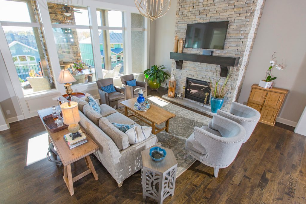
1. Determine the size and style of sofa you need. If you have tall ceilings you will need a sofa that’s in proportion to the room’s height. In contrast if it’s a smaller space you need to make sure the sofa height doesn’t overpower your room and will fit by measuring your space ahead with room to walk around.
2. Ensure the sofa is high quality. As an interior designer I recommend looking for three things:
Please note that if you have a bench style sofa (one seat cushion) you will want a firmer cushion fill so the seat doesn’t lose its shape. If you want to sink down into the sofa and don’t mind the daily care of fluffing your cushions then down fill could be the right option. As an interior designer though, I usually prefer down wrapped foam cushions that look nice on the exterior but still have long term comfort.
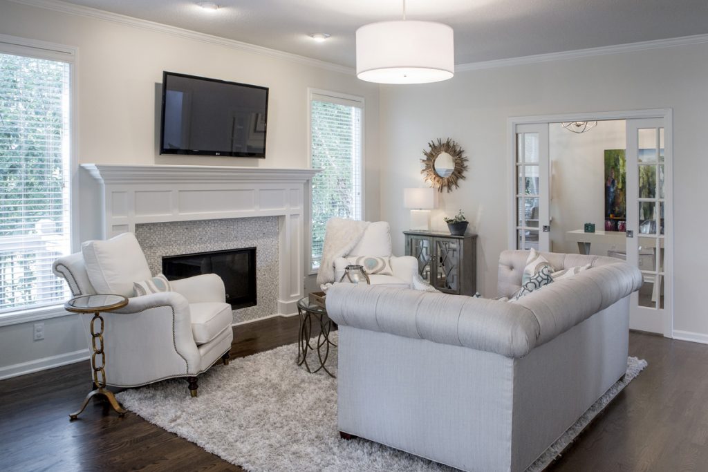
3. Make sure sofa fits your body type and height so your feet aren’t dangling above the floor or you aren’t unable to lean back comfortably in the seat because it too deep.
4. Select the quality fabric meant for upholstery. If you will be using the sofa regularly then you will need a higher double rub count for durability and if you have cats or dogs, avoid fabrics that can be snagged easily. Also keep in mind how easily the fabric will clean.
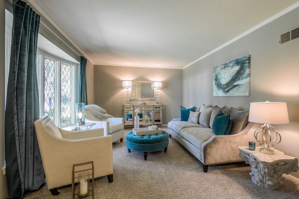
5. Use the best type of pattern. As an interior designer, I usually recommend a solid color or tone on tone fabric (pattern is all the same color) because a sofa usually dominates your room and often can be overpowering or date quickly with a pattern that’s too bold, trendy, or busy.
For more great ideas on selecting furnishings and decorating sign up for our weekly interior design blog here
Plus become a fan of Kansas City’s interior designer and former host of Living Large design show, Karen Mills, on Instagram or Facebook now!
 Interior Design/Interior Decorating
How to Design a Timeless Style Bathroom That’s More Functional For All the Stages of Our Lives
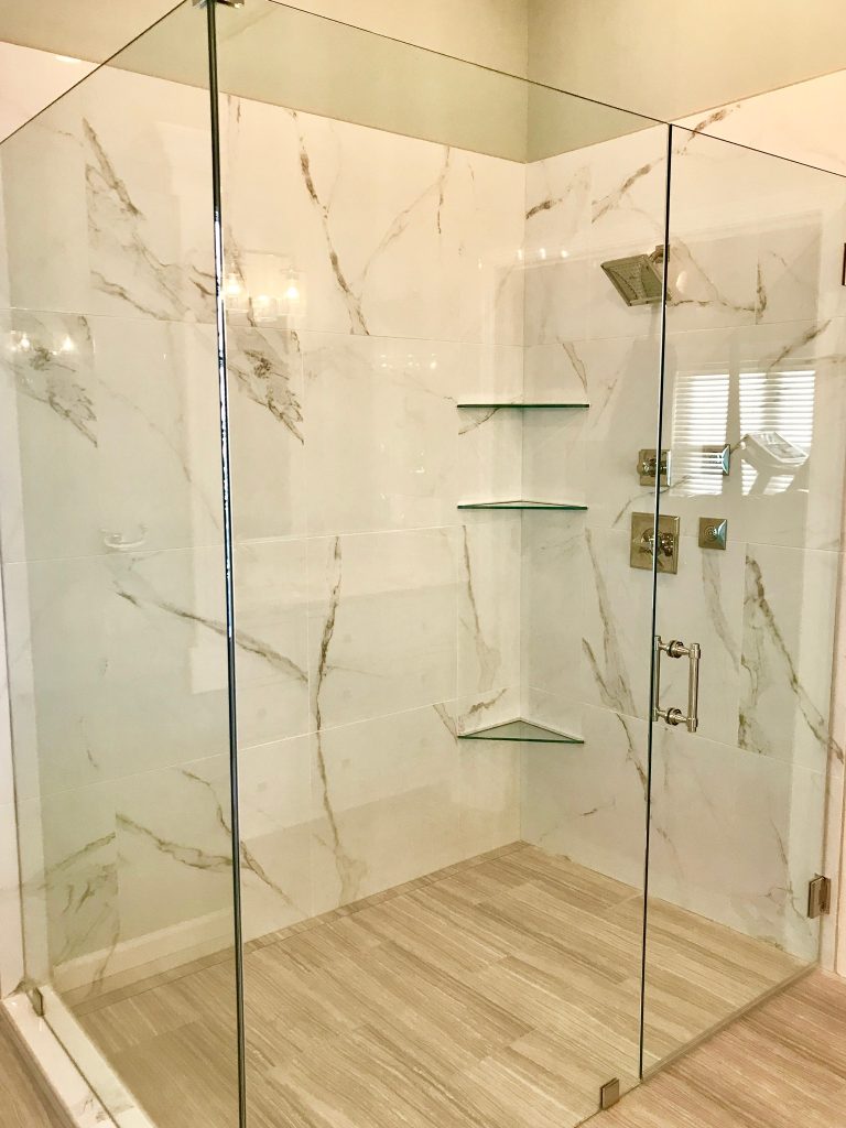
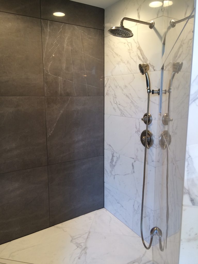
2. Ease of Use A bathroom that functions well for everyone whether they’re a small child, someone needing assistance – even if it’s from breaking your leg skiing, or someone wanting to age in place it’s critical for a bathroom to stand the test of time. Here in this bathroom shower we included attractive grab bars that look like towel bars that provide support when needed, an adjustable shower head that will lower to shower a kid, pet, or someone sitting down and clear access to the shower along with a wider entrance (not shown) to the bathroom. (Please note that a swinging glass door can be added to this shower to hold in the heat.)
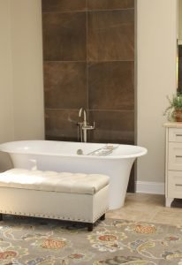
3. Ergonomic – As I was reminded recently when my small grandchild came to visit we need to ensure that all family members can use the bathroom no matter what their size or height. Here the free standing tub allows easy access for taking a bath for the majority of people who might use it because there’s no tub deck blocking access.
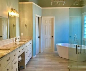
Faucets that can turned on without a knob provide easier access to turning on water as shown here. To make a vanity even more accessible we have also designed bathroom vanities that float on the wall so you can roll right under them to get to the sink.
For more great ideas and photos, sign up for our weekly interior design blog here
Plus become a fan of Kansas City’s interior designer and former host of the Living Large design show, Karen Mills, on Facebook or Instagram here!
 Interior Design/Interior Decorating
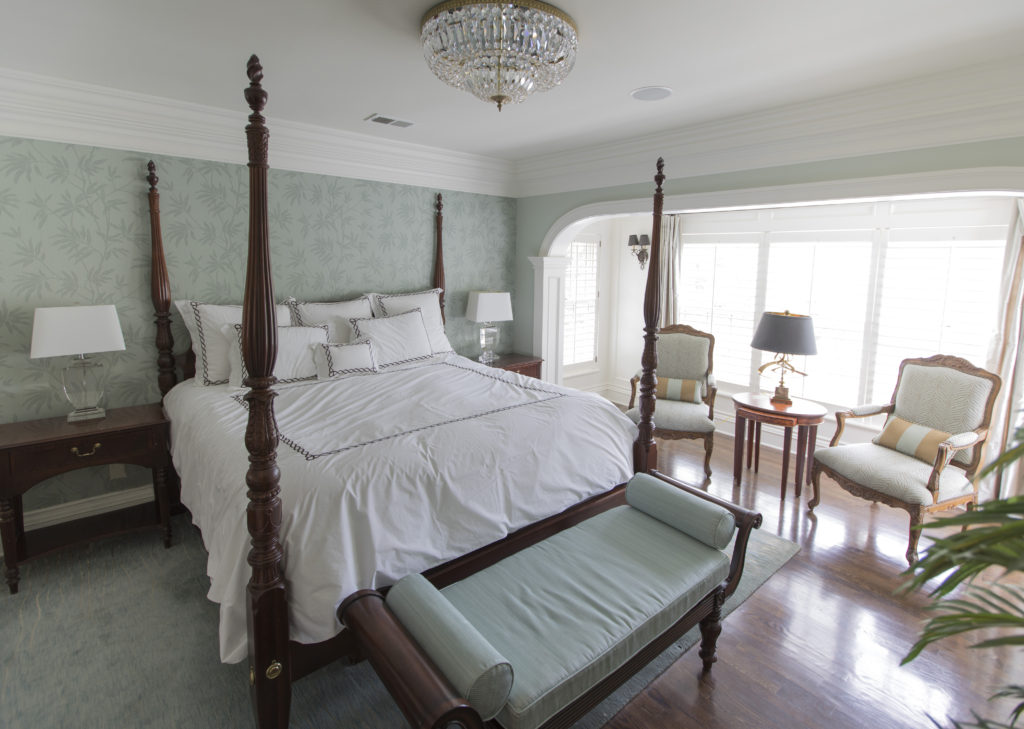
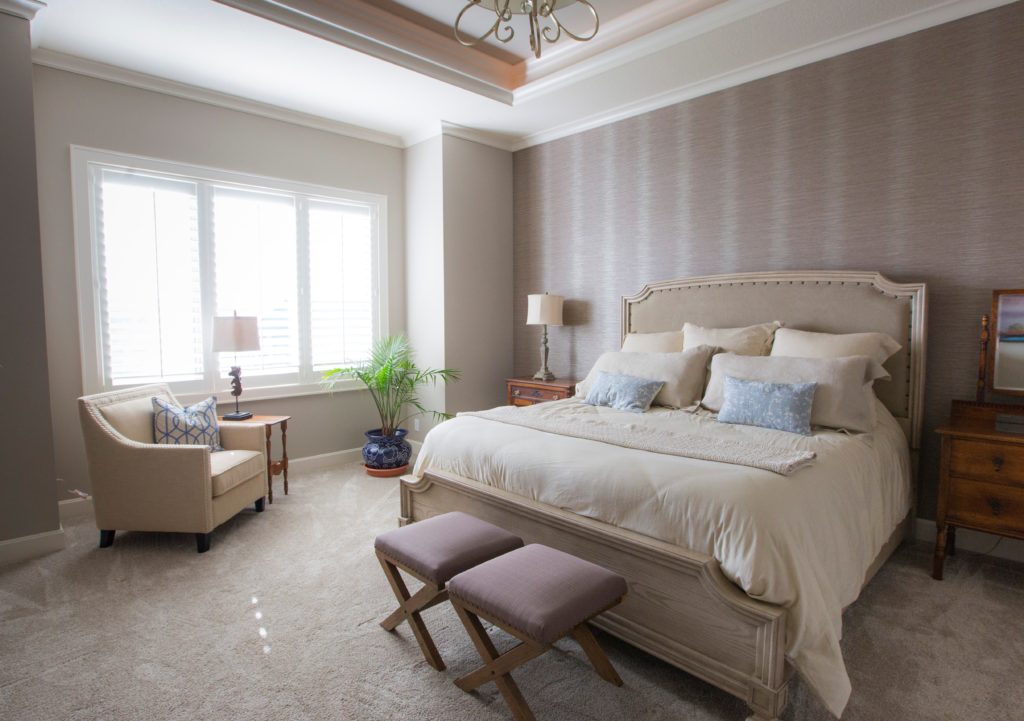
2. Layer in some furniture that feels visually lighter. In this master bedroom, we layered in some furniture with legs showing underneath along with a lighter wood bed, and light fabric on the chair to make the room feel larger. Light neutral bedding, a bed, light painted walls and a light chair bounce more light around the room, visually expanding the space.
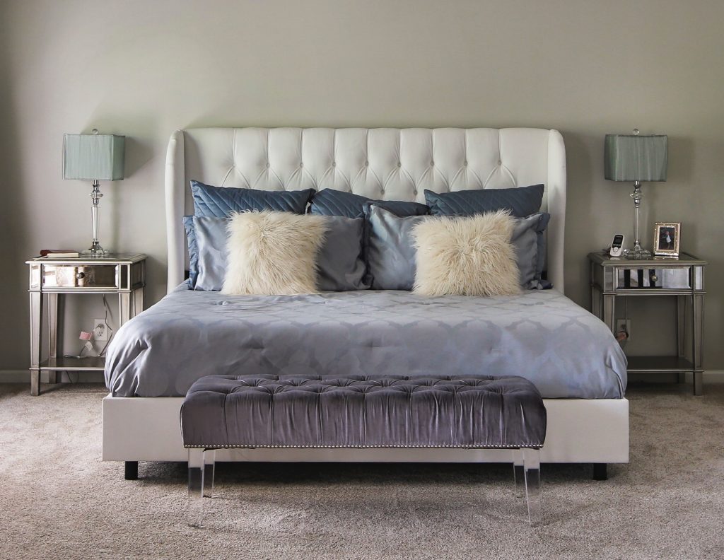
2. Add fabrics and finishes in simple, plain or tone on tone patterns including bedding, walls, furniture, and flooring. In this bedroom the homeowner used tone on tone bedding, a white upholstered bed, an acrylic bench with invisible legs, and mirrored nightstands to help visually expand her bedroom.
For more great ideas on design and decorating sign up for our weekly interior design blog here
Plus become a fan of Kansas City’s interior designer and former host of Living Large design show, Karen Mills, on Instagram or Facebook now!