Interior Design/Interior Decorating

Interior Design: 3 Tips for Making Your Bedroom Look…
example
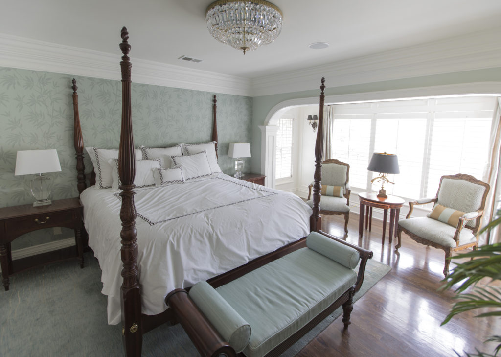
Interior design by Karen Mills featured by Design Icons book
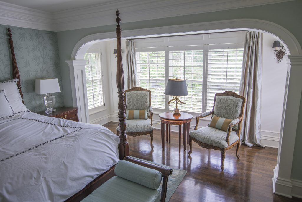
  1. Choose bedding in a similar color to other finishes or lighter.  In this master bedroom design, we opted for white airy bedding that bounces more light around the room while also nicely offsetting the dreamy light blue green wallpaper, hand knotted wool rug, and other reupholstered furnishings . In contrast you can also opt for darker bedding and walls to help the boundaries of the room disappear.
Karen Mills' blog
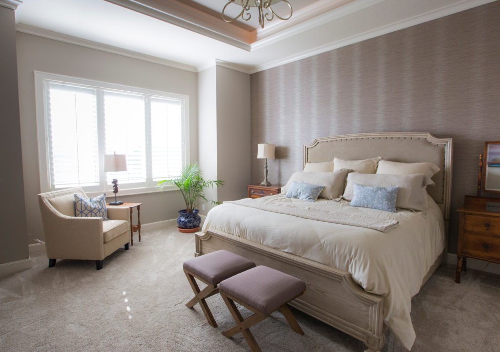
Interior design by Karen Mills

2. Layer in some furniture that feels visually lighter. In this bedroom space, we layered in some furniture with legs showing underneath along with a lighter wood bed, and light fabric on the chair to make the room feel larger. Light neutral bedding, a bed, light painted walls and a light chair bounce more light around the room also visually expanding the space.
Karen Mills' blog

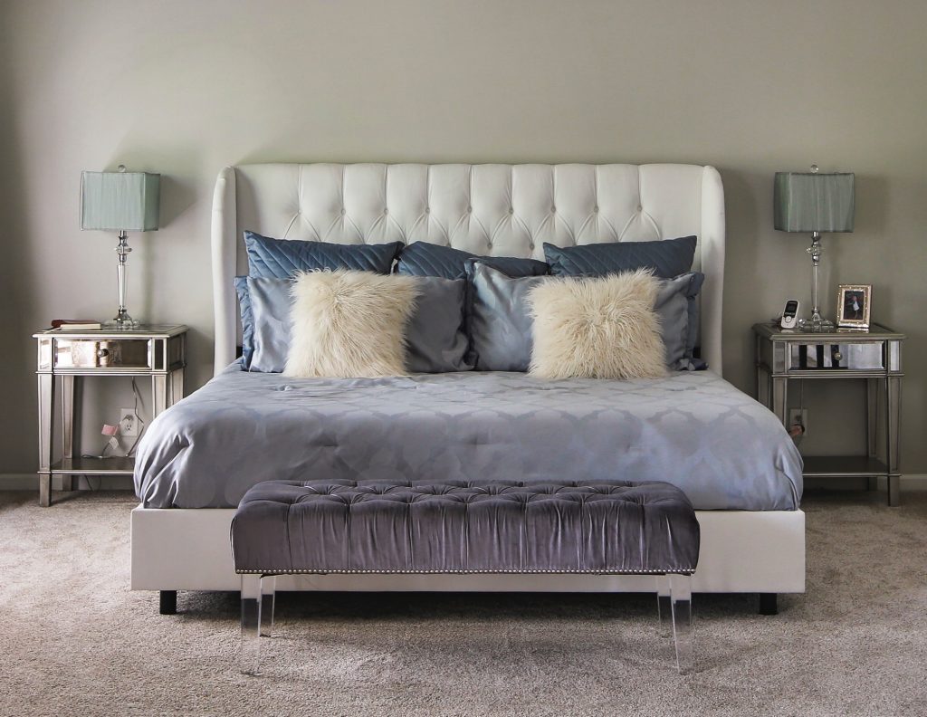
2. Add fabrics and finishes with little or no pattern including bedding, walls, furniture, and flooring. In this bedroom the homeowner used tone on tone bedding, a white upholstered bed, an acrylic bench with invisible legs, and mirrored nightstands to help visually expand her bedroom.

For more great ideas on design and decorating sign up for our weekly interior design blog here

Plus become a fan of Kansas City’s interior designer and former host of Living Large design show, Karen Mills, on Instagram or Facebook now!
Interior Design/Interior Decorating

Interior Design: 3 Tips for Creating Rustic Glam Design…

example


As an interior designer I’ve noticed a huge trend over the past several years towards creating simple spaces that are a wonderful mix of rustic and glamour.  Here are my 3 tips for creating your own style of rustic glam.

Karen Mills' blog
Interior decorating by Karen Mills
  1. Introduce weathered furniture/furnishings

Weathered style furnishings could include anything from antique/vintage brand new furniture in weathered finishes and styles that remind you of a farmhouse look.

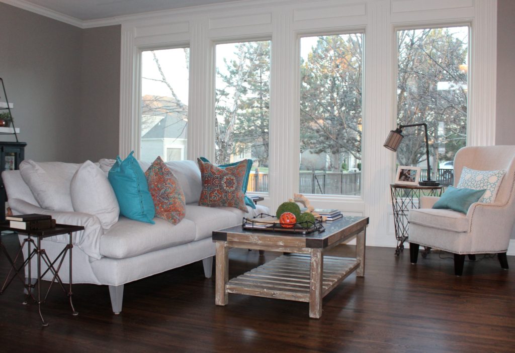
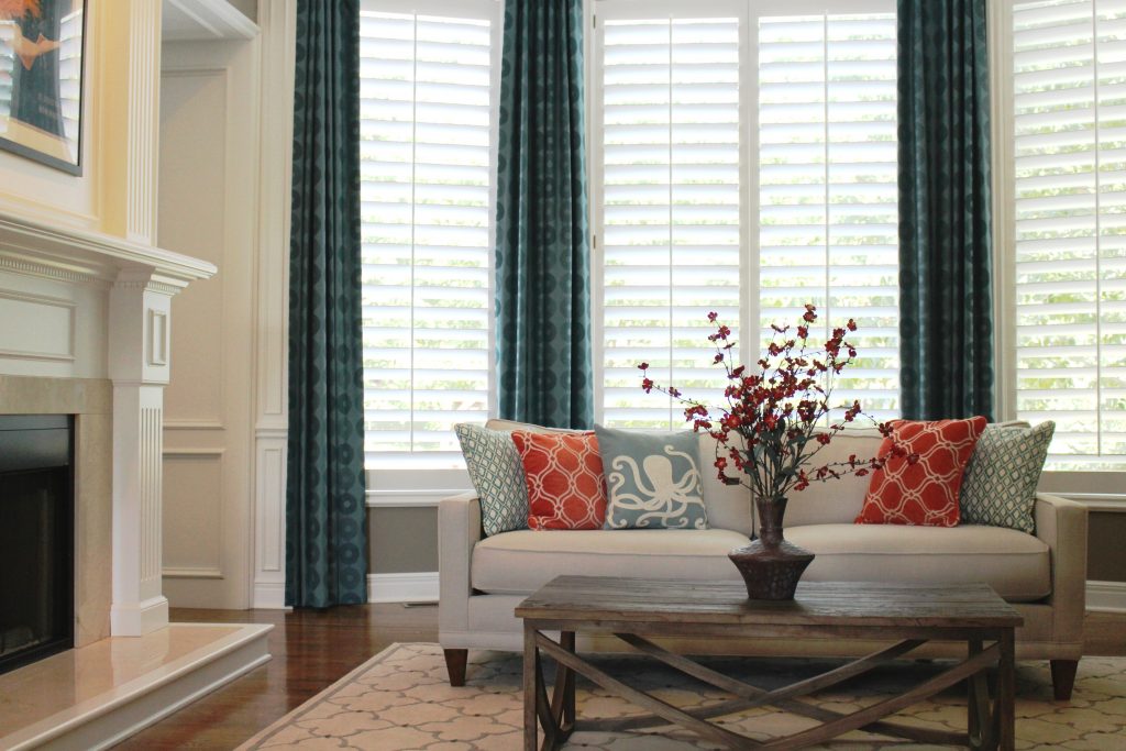
In this great room a rustic wood coffee table and wire bin end table on wheels were introduced along with the casual cotton covered sofa and chair.

Karen Mills' blog
From dark to light

2. Add touches of white

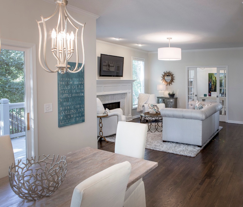
By juxtaposing the white chairs in the eating area against the rustic table finish and shimmery light fixtures, a wonderful symphony is created that undulates between masculine and feminine in this relaxing space.

The family room beyond continues the rustic glam theme with its beach elements on the coffee table contrasting nicely against the tufted sofa and gold mirror beyond which feel more glamorous.

Karen Mills' blog
Interior decorating Mills/Photography by 29Pixels, LLC

3. Layer in a glamorous element

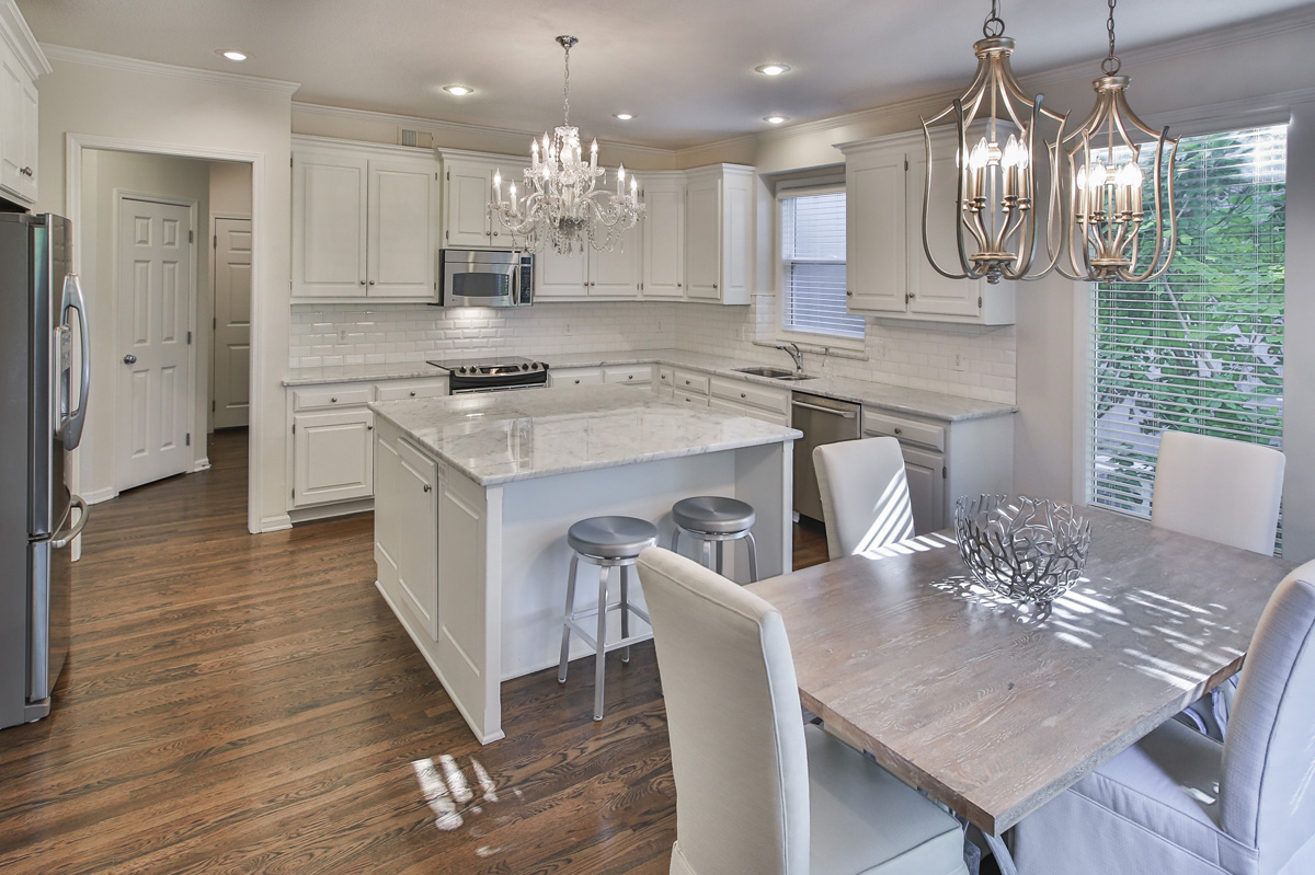
In this kitchen area matching mini chandeliers provides the perfect glam touch to this older kitchen with updated finishes.  The rustic table juxtaposes nicely against the marble in the kitchen to create just the right amount of tension.

For more great ideas and photos on design styles, sign up for our weekly interior design blog here

Plus become a fan of Kansas City’s interior designer and former host of the Living Large design show, Karen Mills, on 
INSTAGRAM and FACEBOOK here!


Interior Design/Interior Decorating

Interior Design: A Historic Kansas City Kitchen Remodel

Are you dreaming of a kitchen like the after but your reality is the before?

BEFORE                                                                   

AFTER

As I toured this historic high rise condo on the plaza in Kansas City for the first time as an interior designer, the reality of the situation was bleak.  The condo hadn’t been updated for years and the maze of tiny crooked rooms  made it difficult to imagine the beautiful open kitchen it could be.  

maid’s room

To start I knew we had to enlarge the kitchen so we took over the tiny adjacent maid’s room shown above to gain a few more feet, knocking out that wall.

Our end goal was a large open inviting kitchen full of natural daylight that was classic like this historic high rise located in the famous Country Club Plaza so to start we tore down the existing entrance wall to open the kitchen up to the existing dining room and  resized the mismatched windows in each room to be more consistent. 

We also relocated the adjoining dining room to the over sized living area and made the former dining room a hearth area that opened into the kitchen.

To make the rooms feel more expansive but also timeless, we tore out the flooring in the kitchen and wove in new wood floors to match the existing wood flooring elsewhere.

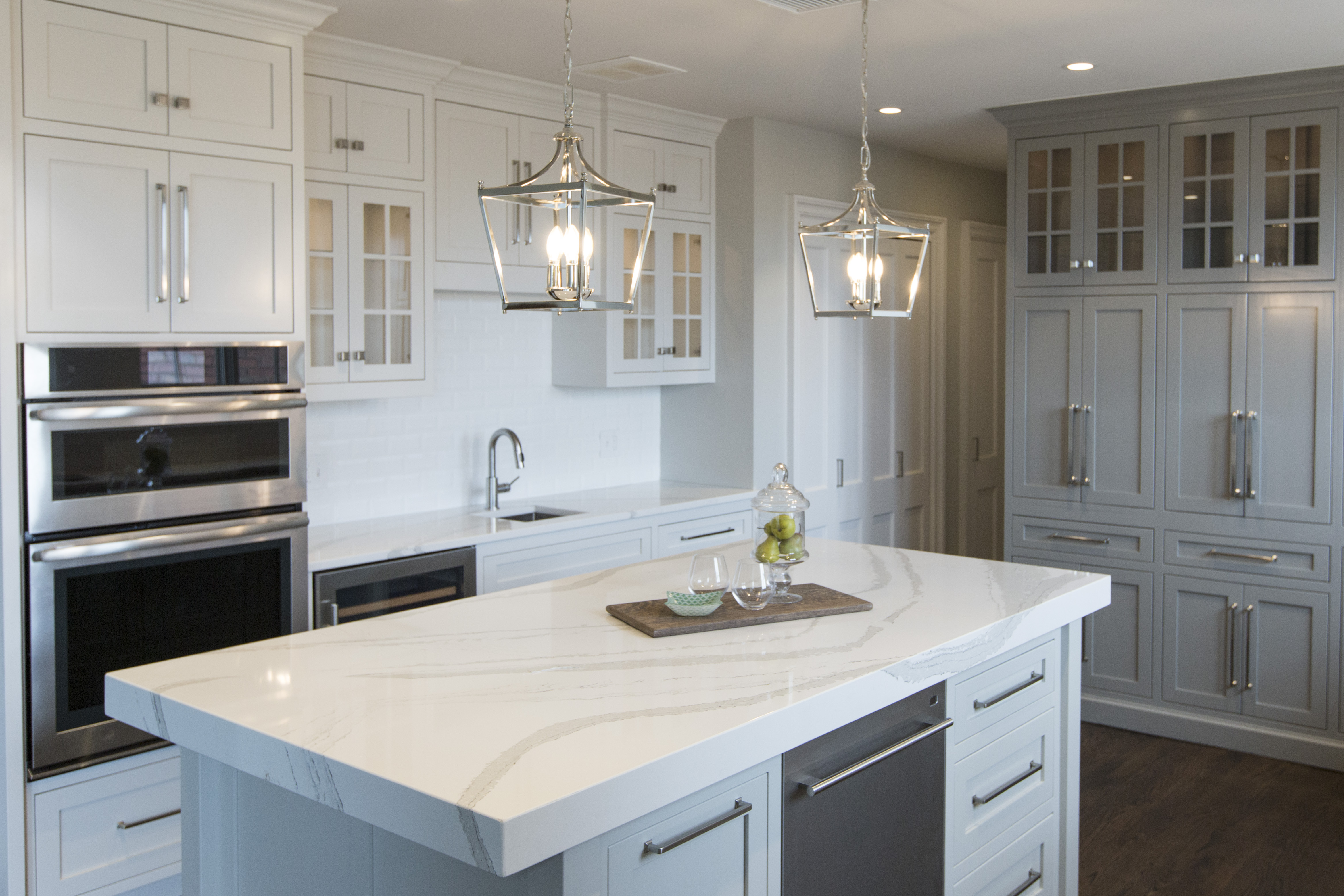
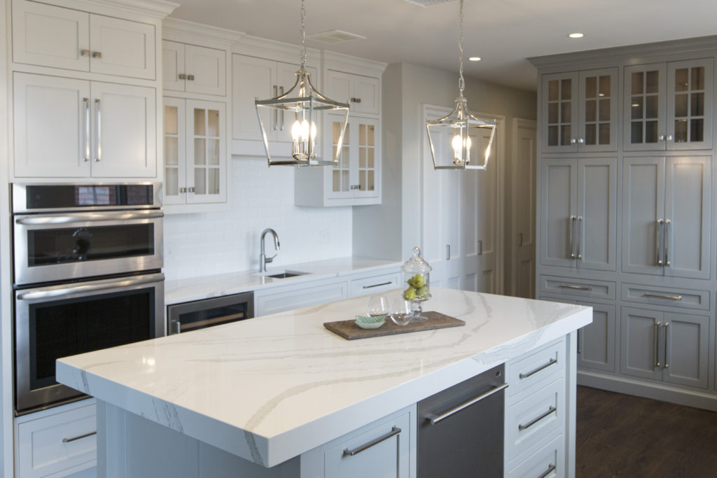
Next we began to lay out a floor plan that included a gorgeous custom island along with designing custom flush mount European style cabinetry that was also functional and a lighting plan that would make the room pop.

Karen Mills' blog
Interior design by Karen Mills/Photography by 29Pixel Studios, LLC

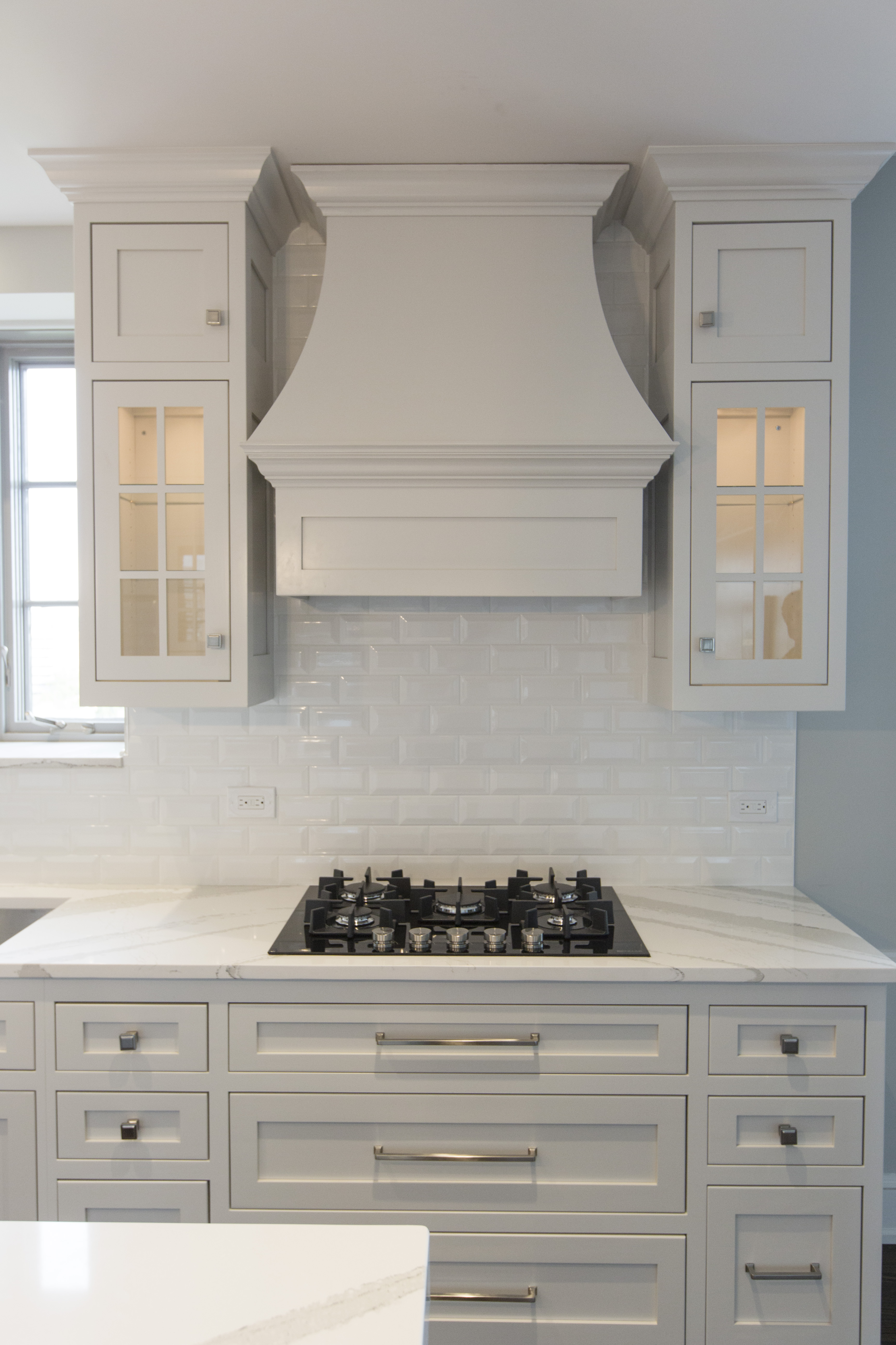
On the right we designed a beautiful custom stove hood with lit glass cabinetry and large drawers underneath to hold pots and pans.  Plus we took the beveled subway tile to the ceiling to add height and drama to the space.

In the back we designed a pantry area that disguised the crooked structural wall and added doors that opened to reveal a coffee station and appliance storage along with additional glass lit cabinetry.

Karen Mills' blog
Interior design by Karen Mills

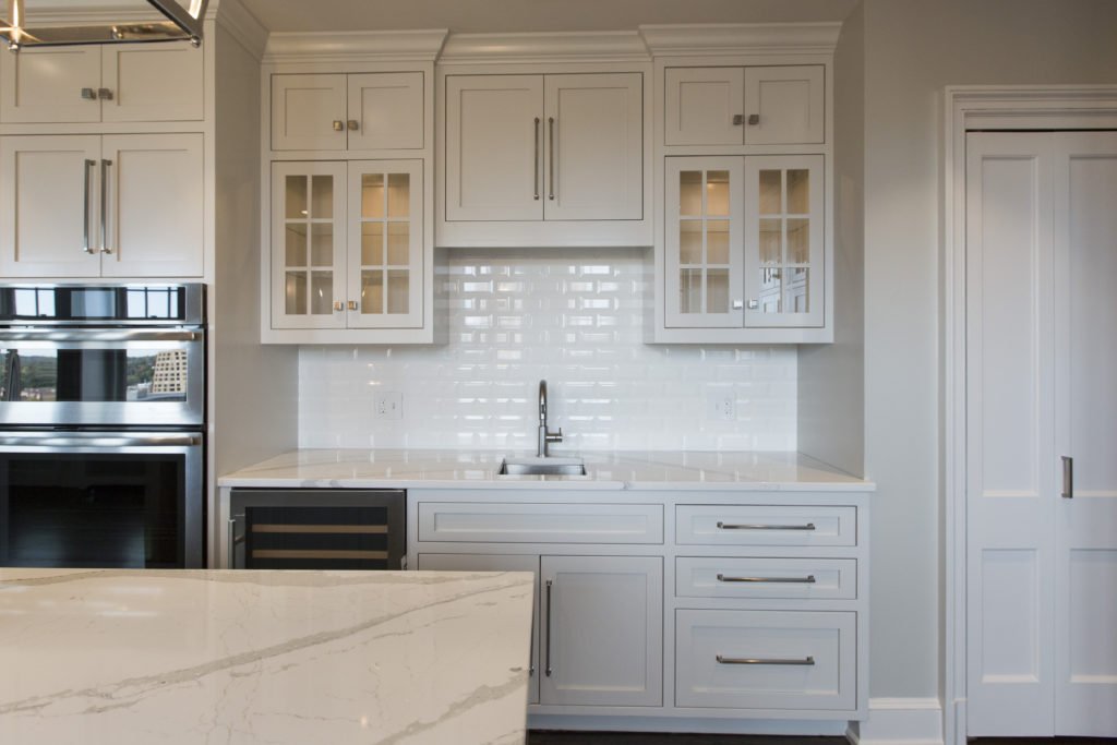
On the left we created a bar area with a wine cooler, additional sink, and storage along with lit glass front cabinetry to hold glassware.

Karen Mills' blog

And on the island we added a thick mitered top to give the beautiful Cambria marble style top even more importance!

The result – a large open living/work space that lives large and is also functional.

For more great ideas sign up for our weekly interior design blog here

Plus become a fan of Kansas City’s interior designer and former host of the Living Large design show, Karen Mills, on 
INSTAGRAM and FACEBOOK here!

Interior Design/Interior Decorating

Interior Design: 3 Big Mistakes to Avoid with Your…

Karen Mills' blog
Design by Karen Mills

One of our biggest fears as a homeowner is that we will make a costly mistake when remodeling, especially one that could cost thousands of dollars. Read on for 3 HUGE MISTAKES I see repeated over and over as an interior designer who specializes in bathroom remodels

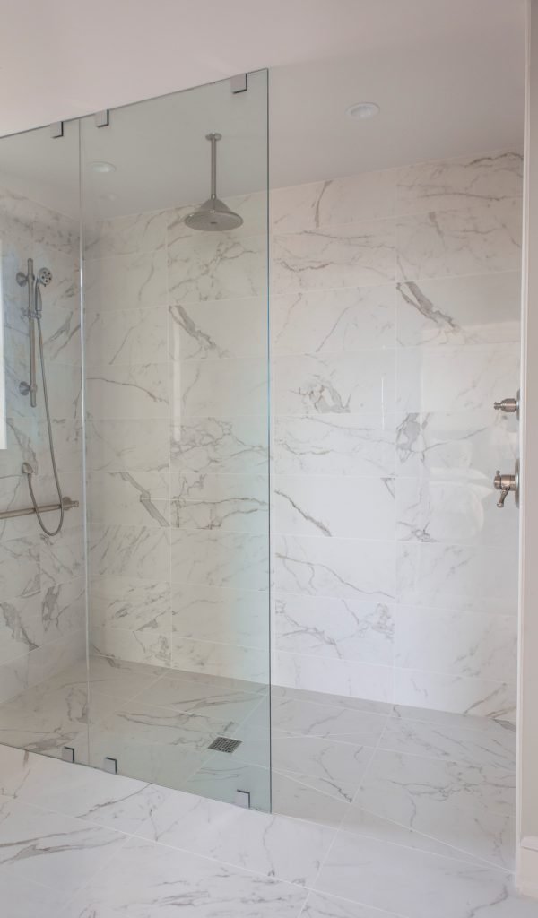
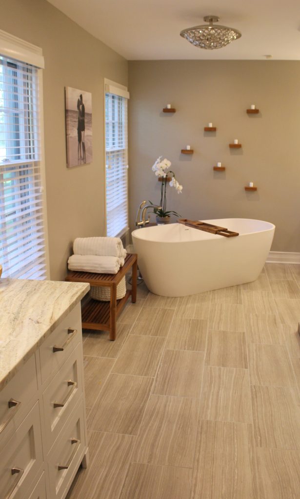
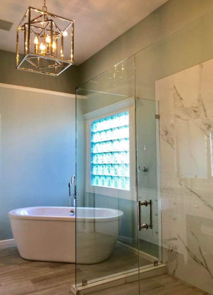
  1. Poor Layout – One of the biggest keys when space planning your bathroom is to ensure it functions well for you. Not only do you need adequate space to move around and access what’s needed without bumping into things but you also want a beautiful bathroom that invites you in for a bathing experience. Here in this gorgeous custom bathroom, we added glass shower walls to make the space feel larger and lighter, while also creating a focal point beyond with a free standing tub and beautiful chandelier with plenty of space to maneuver around.
Karen Mills' blog
Interior design by Karen Mills

2. Too Trendy – Even though I love timeless spaces, I have to admit its fun to add a trendy element that’s new. But I only recommend adding a trendy finish if it either enhances the design and if its easily replaced without much expense like a back splash, wall paint, or light fixture.

In this lovely spa bathroom remodel not only did we open up the closed off spaces in this tiny master bathroom in a historic high rise, but we also went with a classic marble finish to create a more timeless look that could last for years instead of adding trendy accent tile that often dates a bathroom quickly.

Karen Mills' blog
Design by Karen Mills

3. Wrong Finishes – Wrong finishes can be anything from the wrong color, size, or pattern to how all the finishes (cabinetry, paint, tile, light fixtures, etc) come together to create a cohesive whole. The biggest problem I see as an interior designer are the homeowners who chose to do it themselves, but don’t have an eye for design. The final result? Thousands of dollars of investment in what may be beautiful cabinetry, tile, and lighting that just doesn’t play well together.

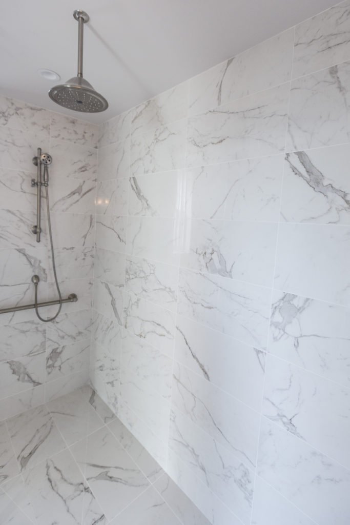
Here in this calming bathroom we selected finishes that were classic and simple in style to create a calm inviting space that will appeal for years to come.

For more great ideas and photos on bathroom remodels/design or custom design, sign up for our weekly interior design blog here

Plus become a fan of Kansas City’s interior designer and former host of the Living Large design show, Karen Mills, on 
INSTAGRAM and FACEBOOK here!

Interior Design/Interior Decorating

3 Tips for Keeping Home Sanitary

3 Steps You Can Take To Help Protect Loved Ones At Home From Germs Now

As an interior designer I know many of our clients are looking for a home environment that will make them feel secure, safe, and sanitary without giving up beauty. Read on to learn my suggestions on how to create a cleaner home environment now.

photo example
  1. Purify the indoor air. To begin install a high quality air purifier that will clean the air in your home on a regular basis. Select an air purifier that will reduce airborne and surface contaminants along with dust and dirt that may include bacteria or viruses like the Vollara unit I recently used on a home project that even removed the smoke odors embedded in the drywall. But don’t stop there. Remember to bring fresh air into your interior every opportunity you get whiles also having your air ducts cleaned regularly.
Karen Mills' blog
Interior design by Karen Mills

2. Remove contaminants before entering your home. Begin by mounting a motion sensor activated disinfectant cleanser bottle directly on the wall in your garage near your interior door to sanitize your hands before entering your home.

Next place a shoe rack in the garage by your interior door for depositing shoes that have been contaminated or purchase a small disinfecting mat that you can step onto before entering your home. Leaving items in the garage that need to decontaminate for 24- 48 hours before being brought inside can also be helpful in keeping contaminants at bay.

Other ways to help keep yourself and your interior clean include placing the clothing you’re wearing into a nearby hamper or washing machine as your enter the house and proceeding directly to the shower to wash off.

In this master bathroom we designed for a high rise building, we included tile on floors and much of the walls that can be scrubbed clean along with an adjustable spray arm that make the cleaning process easier.

Lenova kitchen faucet with an ozone generator

3. Create a More Sanitary Interior. By keeping the inside of your home cleaner you increase the odds that you will stay healthier.

According to the press release by Lenova, their faucets are the first conventional faucet line that is also an ecologically safe way to clean food and any other water-safe surface without chemicals. A small, thin ozone generator uses regular house current to produce ozone water (aqueous ozone), a natural disinfectant 100 times stronger than chlorine that kills 99.9% of common viruses, bacteria and germs. Adding foot pulls at the bottom of frequently used interior doors provide additional peace of mind.

Nostalgic solid brass doorknobs

Other ways to keep your home more sanitary include having your home cleaned regularly, using the sanitize cycle on your dishwasher, and opting for washable materials such as washable indoor/outdoor rugs or bedding made with natural bedding like this master suite.

In summary by simply purifying your indoor air, removing all contaminants possible before entering the house, and keeping surfaces clean you can create a home interior that’s safer overall for the whole family. Click now to read this article on City Lifestyle magazines nationwide.

If you’re looking for interior design, decorating, or remodeling inspiration, ideas, and photos, sign up for our weekly interior design blog here

Plus become a fan of Kansas City’s interior designer and former host of the Living Large design show, Karen Mills, on 
INSTAGRAM and FACEBOOK here!

Interior Design/Interior Decorating

Interior Design: Recipe for a Successful Kitchen Design

The Secret Sauce for Cooking Up a Beautiful Kitchen While Avoiding Costly Mistakes

Interior design by Karen Mills

If you’re seriously considering remodeling your kitchen, read my suggestions as a kitchen designer here first before tearing out walls or hiring a contractor because your kitchen’s a huge investment that can cost thousands of dollars to correct or years of regret if you rush into it and hire someone who’s not reliable or does a poor job. 3 Reasons Why White Kitchens Stand the Test of Time

First I recommend that you look for design inspiration in interior design magazines and online to get ideas of what you like so  you can effectively communicate your vision to the team you assemble.

Interior design by Karen Mills

Next make a list of items you absolutely must have in your kitchen and another list of things you would like to have.   If you’re not sure, start compiling a list as you use your kitchen everyday so your new kitchen will meet all your requirements.

Then hire an interior designer to show you how to layout a kitchen that’s both functional for your family and beautiful!   Some interior designers can be had for as little as one-two hours to review your ideas, plus they will have great resources for contractors, architects, and trades people to help you accomplish your goal. 3 Big Kitchen Trends for 2020

Kitchen designers that don’t serve also as the contractor can also serve as a trusted advisor who will help with selecting contractors, making it functional, creating flow, coordinating finishes, assisting with lighting, and advising on the latest storage options  to ensure your kitchen design looks great!  And if you can’t afford an interior designer for the whole project, I would at least hire an interior designer experienced with remodeling for a couple of hours to help you create a master plan.

Kitchen refresh by Karen Mills

In summary if you have a professional create a master plan that’s not only functional and beautiful with good flow and coordinating finishes, you will have a much higher chance of success and loving the kitchen you’re in!

For more great interior design ideas, sign up for our design blog here!

plus become a fan of Kansas City’s interior designer and former host of the Living Large design show, Karen Mills, on Facebook  and Instagram now!

If you feel someone you know could benefit from this helpful information, pass it on!

Interior Design/Interior Decorating

Interior Design: Tips for Selecting Correct Size of Area…

How to Right Size Your Rug by Room

example
Interior design by Karen Mills


  1. Best Living Room Rug Size – When or calculating the ideal size for an area rug for your living room, try to find a rug that lays underneath ALL of your furniture in the room. But if you want to show off more floor or save money, you can also buy an area rug where only the front feet of your upholstered furniture sits on top of the area rug like shown here.
Karen Mills' rug sizing example
Interior design by Karen Mills

The last option and definitely least preferred by the interior design and rug community is to place a smaller rug in front of your sofa but not under the feet. Please note however, that this example is a larger rug that would actually work under the feet of the sofa and chairs nearby (not shown).

3 Tips for Getting Cozy with Area Rugs

Karen Mills' blog rug example
Interior design by Karen Mills

2. Best Bedroom Rug Size – Interior design clients often have a difficult time understanding this concept but a bedroom area rug should be large enough that it can be laid perpendicular under your bed just up to the edge of the nightstands without sliding under them and still have a few feet showing at the bottom of the bed like shown.

Karen Mills' blog rug example
Interior Design by Karen Mills

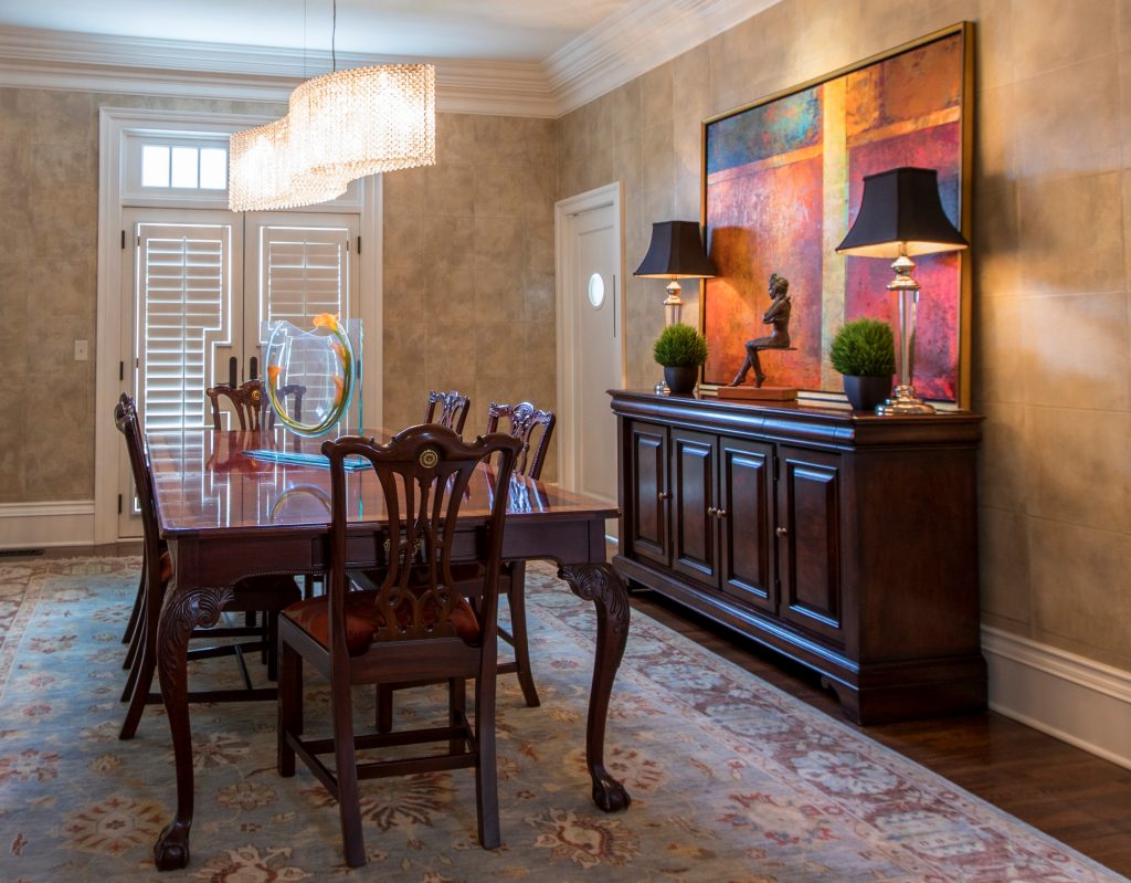
3. Best Dining Room Rug Size – As an interior designer I often see rugs that are just too small under the dining room table. Calculating this rug size can be tricky because you want two feet on each side of the table for room to slide back the chairs, but also need to ensure the final rug size fits into your space like the one shown here.

For more design ideas and photos, sign up for our weekly interior design blog here

plus become a fan of Kansas City’s interior designer and former host of the Living Large design show, Karen Mills, on Facebook  and Instagram now!

If you feel someone you know could benefit from this helpful information, pass it on.


Interior Design/Interior Decorating

Interior Design: 3 Tips To Help You Choose the…

Suggestions for Selecting Paint Colors for Your Interior

Paint color, one of the biggest issue faced by homeowners starting an interior design or interior decorating project is often an overwhelming task so today I’ve broken it down into three manageable steps for you to implement. 3 Reasons Why White Kitchens Stand the Test of Time

  1. View color swatches on a white background – When you’re ready to select paint colors for your interior, start by placing the color swatches on a solid white background to get a true reflection of the color before painting a large sample of the paint on your wall in the room where you want to paint. While making selections, ensure you’re wearing neutral clothing and don’t have bold colors nearby on walls or furniture that could reflect on your paint sample.
Karen Mills' blog
Photo courtesy of Kravet

2. Make your color selection during daylight light hours. And if its a cloudy day, look at the paint sample again on a sunny day to get the full range of changes that color will make as you transition from sunlight to cloudy to dark.  3 Color Scheme Options for Your Living Room

When selecting trim and ceiling paint colors, look to the lightest end of your paint strip for options along with whites. 

Karen Mills' blog
Interior design by Karen Mills

3. Paint large swatches of your paint selection on a backed poster board – All too often I walk in as an interior designer and see clients who’ve painted a light neutral over another color on the wall and the original color is bleeding through or distorting the new color. Once you have the board painted, place it against a neutral white background so you can view it during both daylight and after dark.

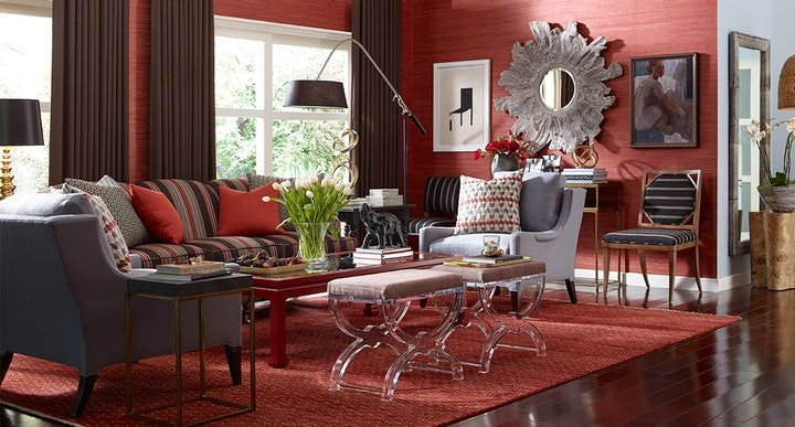
 But what if you don’t even know where to start with paint colors. Then pull inspiration from your closet, artwork, or a rug, for example. Then let the fun begin!


For more great tips on color and how to use it become of fan of our weekly interior design blog here


plus become a fan of Kansas City’s interior designer and former host of Living Large, Karen Mills on Facebookhere!

or instagram here!

Interior Design/Interior Decorating

Interior Design: 3 Reasons Why White Kitchens Stand the…


Karen Mills' blog
Interior design and remodel by Karen Mills
  1. Reflects light and makes us look better – As an interior designer who specializes in kitchen remodels I believe we secretly crave light airy kitchens because they not only feel clean and fresh but also bounce the natural light from outside around our room, enhancing the way we look and feel when we are in there. 3 Big Kitchen Trends for 2020

In addition they make us look younger by reflecting light back onto our face in contrast to darker kitchens that can make you look more haggard..

                                     Interior design by Karen Mills 

2. More Timeless – White kitchens have always stood the test of time as the most popular kitchen cabinet color so if you don’t get too crazy with your design or finishes your white kitchen remodel will likely feel more in style than a darker ktichen over time, especially when it comes time for resale.

Karen Mills' blog
Interior design by Karen Mills

3. More Versatile – White kitchens can be paired with almost any colors and changed up when you tire of the color scheme. And if you’re like the majority of homeowners, you love the ethereal feel of white kitchens, especially one with warm inviting layers of texture like this existing kitchen was refreshed with a can of paint, new back splash, and dining table fixtures. Here the wood tabletop was repainted in a rustic gray finish and existing leather chairs slip slip covered in a washable fabric to finish the look. 5 Big Mistakes We Make In The Kitchen

For more great ideas and photos on kitchen design and kitchen remodels sign up for our weekly interior design blog here

Plus become a fan of Kansas City’s interior designer and former host of the Living Large design show, Karen Mills, on 
INSTAGRAM and FACEBOOK here!

Interior Design/Interior Decorating

Interior Design: 5 Questions to Ask a Contractor Before…

Things to Consider When Procuring a Remodeler Besides Cost

Karen Mills' blog
Interior design by Karen MIlls
  1. What qualifications/experience do you have with my type of project and can you provide references? For example ask if the contractor belongs to NARI, National Association of Remodelers or HBA, Home Building Association.

2. Can your insurance company mail a current copy of your insurance policy(s) before we sign the contract? Contractorsshould have liability insurance to cover any damage to your property and workman’s comp for anyone working on your home to protect you if they get hurt on the job.

3. How do you charge? Normally remodelers give a bid/estimate of total amount for project minus any unseen issues or simply charge for time (hourly) and materials (products). If you want to buy materials yourself and just pay the contractor for your time, make sure they offer that option and that you can put a limit on the hours billed so project doesn’t get out of hand.

photo example
Kansas City Interior design by Karen Mills

4. Can you complete work within my requirements and may I have a timeline/schedule of construction beforehand?

5. Will you provide a signed contract with scope of work to be done and warranty?

Karen Mills' blog
Kansas City Interior design by Karen MIlls

For more great ideas on remodeling or interior design sign up for our weekly interior design blog here

Plus become a fan of Kansas City’s interior designer and former host of the Living Large design show, Karen Mills, on 
INSTAGRAM and FACEBOOK here!