Interior Design/Interior Decorating

Interior Decorating: 3 Tips for Coordinating Mismatched Furnishings in…

Do you have a collection of mismatched furniture that feels unfinished or undone?  Read on for my 3 interior designer tips for creating a cohesive look in your room.
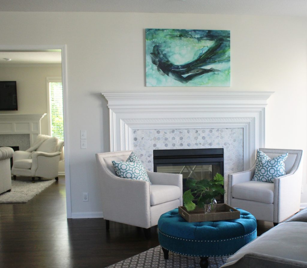
Interior design by Karen Mills

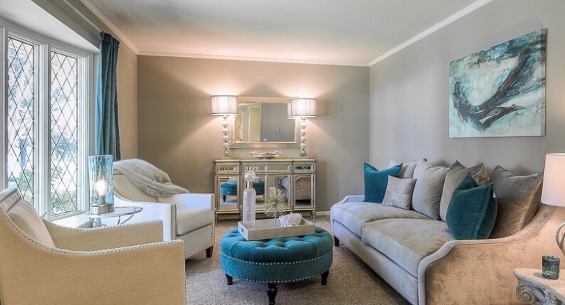
1. Repetition – To coordinate two pieces of mismatched upholstery, unify both pieces by repeating a color from one piece to onto another with a pillow or throw.  Here the blue green color of the ottoman was repeated in the pattern on the pillows, while the artwork brings everything together including the gray velvet sofa in the foreground and the new tile on the fireplace.
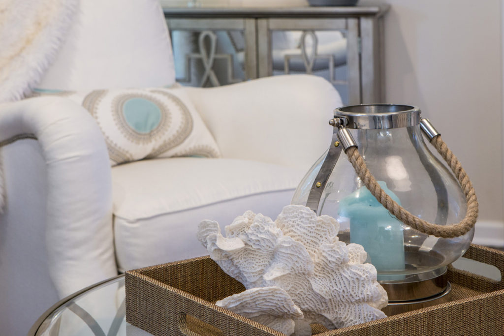
2. Introduce a new design element  – A piece of artwork overhead or nearby accessories  with both colors can also serve as a way to bring two different colors of upholstery together effectively.  Here in this family room the blue center of the pillow is repeated in the blue candle nearby while the white seashell picks up the white upholstery.

When creating vignettes of accessories in your space whether its for a tabletop or shelves, try to place objects of various heights, sizes, texture, and shapes together to create a cohesive whole.  Normally placing the taller narrower items at back with shorter wider items at the front works best.

Karen Mills' blog
Photo courtesy of All Modern furniture

3. Layer a rug underneath – Placing a rug underneath your upholstery helps create a cozy grouping of furniture like this living area but it may also pick up colors from one or several pieces of upholstery.  Here the brown chair color is repeated on a pillow accent color and coffee table while the yellow and gray hues in the rug are mimicked again on the sofa and pillows.

For more great ideas and photos, sign up for our weekly interior design and decorating blog here

Become a fan of Kansas City’s interior designer and former host of the Living Large design show, Karen Mills, on Facebook here!
Interior Design/Interior Decorating

Interior Design: 3 Tips for Getting Cozy with Area…

Suggestions for Creating a More Inviting Feel in Your Living Space Using Area Rugs

Interior design by Karen Mills
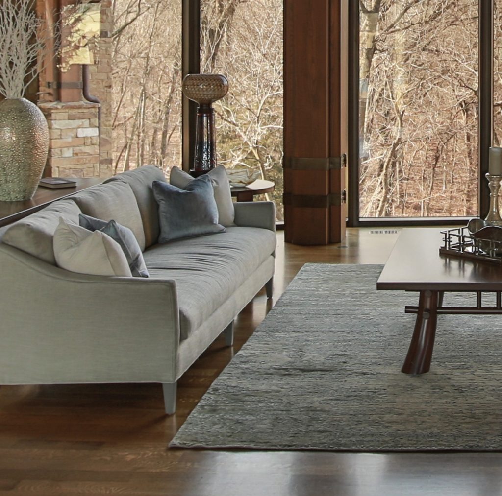
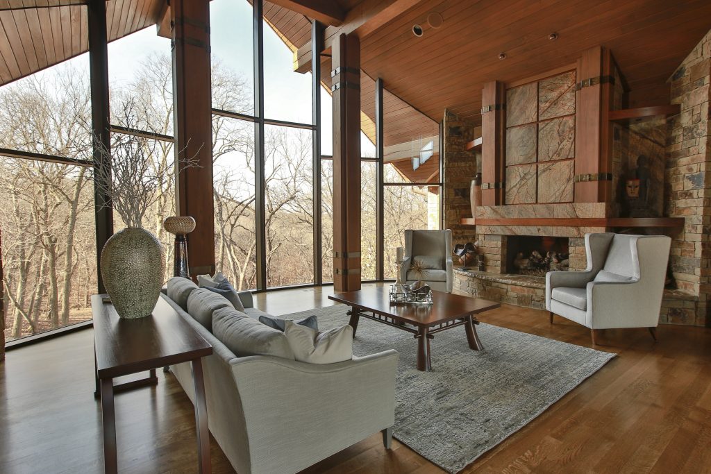
  1. Create a cozy seating area for conversation. In this room we introduced a rug that not only adds another layer of texture but also nice contrast to this darker space, picking up some of the daylight beyond. To further enhance the coziness of this room we went with a wool and silk rug that has a luxurious soft texture so it feels great on bare feet or in socks.
rug sizing example
Interior design by Karen Mills

2. Layer an area rug under the furniture (or at least the feet) of your seating area. Placement of the rug under your furniture in a cozy arrangement draws onlookers into the space for a closer look like shown here where we used a high quality wool rug which are washable and comfortable to the touch.

Interior design by Karen Mills

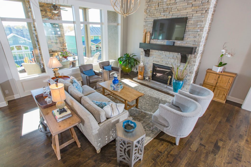
3. Select a rug with a soft hand or texture that feels great underfoot. In this living space we layered in a super lush long shag area rug where you can dig in your toes and snuggle up for conversation, reading, or just watching a movie.

For more great ideas and photos, sign up for our weekly interior design blog here

Plus become a fan of Kansas City’s interior designer and former host of the Living Large design show, Karen Mills, on Facebook or Instagram here!

Interior Design/Interior Decorating

Interior Design: 7 Tips for Creating a Delicious Dining…

Karen Mills' blog rug example
Interior Design by Karen Mills

1. Select Your Personal Design Style –  If  you have no idea what style you are start by finding inspiration photos online or in print.  Then notate your favorite elements from each room to get a sense of your style.

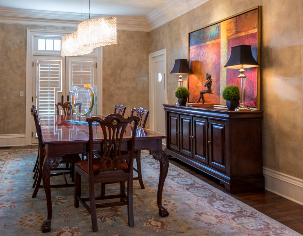
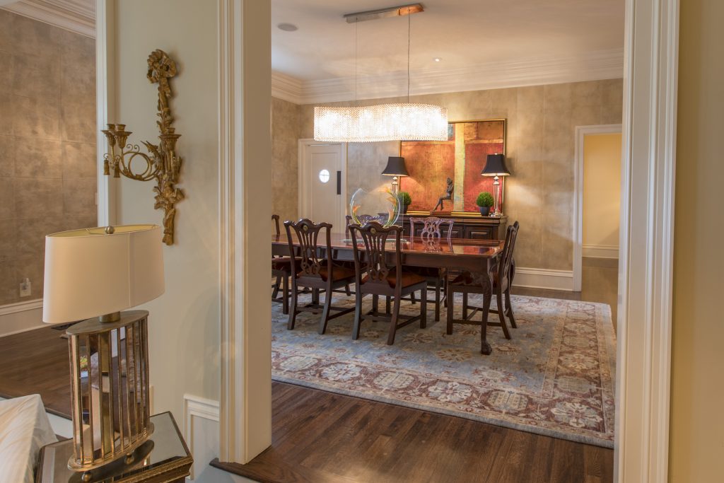
Using existing furniture, we added personality to this room by introducing a stunning crystal chandelier by Schonbek along with an original abstract painting and sculpture, hand knotted rug, custom seat covers, and wallpaper.

Karen Mills
Styling by Summer Ann of Girlsinmadras.com

2. Pick  a Color Scheme –  Most of us don’t spend much time in a dining room so have fun in here and pick colors you love.  Bolder colors can go on decor, rugs, chairs, or even walls but if you like to change up your style often, you might consider neutral walls and floors that give more flexibility when you want to change your color scheme.

3. Add Dining Table and Seating –  The dining room table and chairs along with the items directly behind them are the focal point of your room.   Begin by determining how many people you need to seat and ensuring you have room for the table you want.  Plus remember that your chairs don’t need to match your table, just enhance them.

If you opt for a dramatically styled table, then consider simpler style chairs and backdrop.  Or if you go with a simpler style table, you might bring in drama with a wall covering or beautiful buffet with art above.

Karen Mills' blog
Interior decorating by Karen Mills

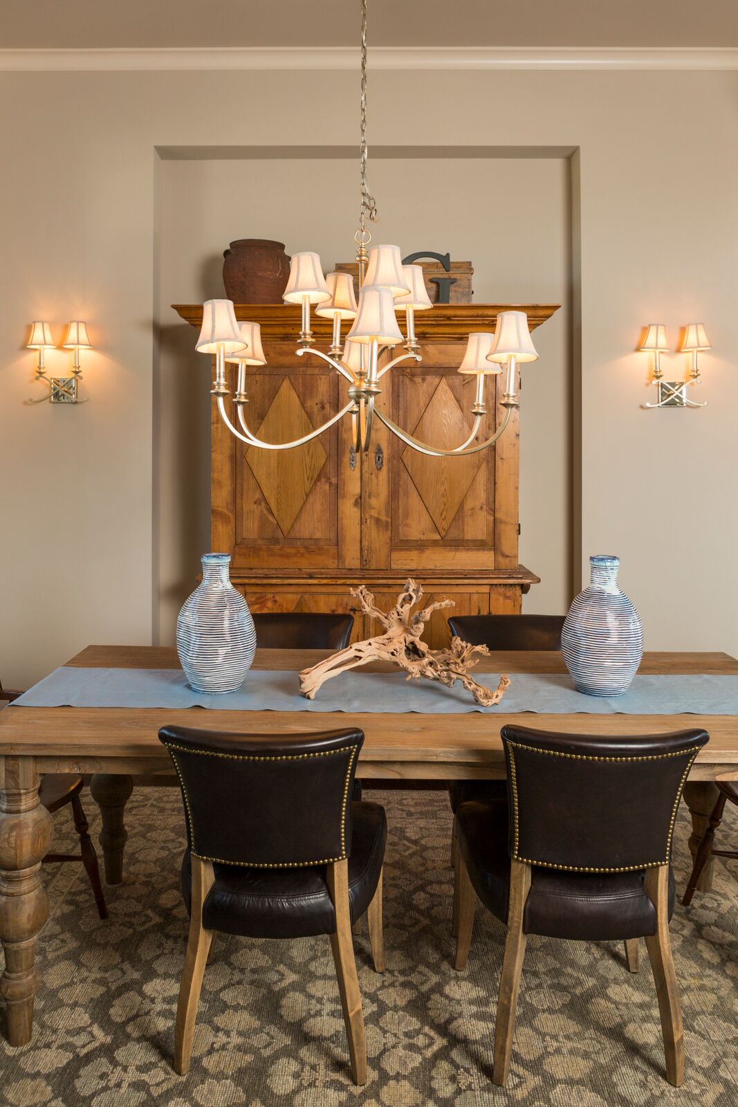
4. Consider Including Additional Furniture –  The majority of dining rooms benefit from functional storage furniture like a buffet and curio cabinets or an antique armoire like shown in this photo, but remember sofa tables, tea carts, and other furnishings can also enhance your room and provide handy surfaces for lamps, platters, trays, or display.

 5. Introduce a Dramatic Element – A bold element can range from a gorgeous piece of art and beautiful buffet to a stunning light fixture over a painting or interesting chair backs and wallpaper like shown here.

Photo courtesy of Kravet

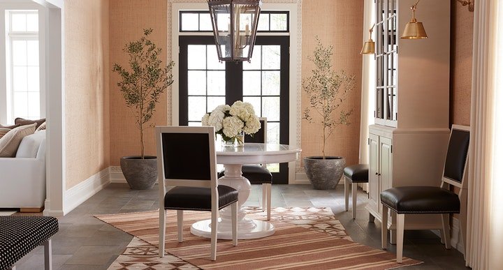
6. Layer in Texture  – Adding texture softens all the hard surfaces of the table, chairs, buffets, and hard flooring.   Texture can be introduced with an area rug, drapes, fresh flowers, and live trees/plants like shown here in this beautiful space.

7.  Add lighting –  Table lamps on a buffet or sofa table look beautiful behind a dining table along with a stunning chandelier and/or sconces on the wall behind. In this dining room courtesy of Kravet, the over sized chandelier commands attention, while the sconces on the right enhance the overall lighting and design scheme.

For more great ideas and photos, sign up for our weekly interior design blog here

Plus become a fan of Kansas City’s interior designer and former host of the Living Large design show, Karen Mills, on Facebook or Instagram here!

Interior Design/Interior Decorating

Interior Design: 3 Tips for Creating a Relaxing Living…

Karen Mills' blog
Photo courtesy of Century Furniture

Nothing’s better than coming home to an inviting relaxing home.   That’s why my focus as an interior designer has always been as much about function as beauty.  Read on for three tips for creating a comfortable interior design.

1. Comfortable seating.  Select upholstery cushions that are comfortable for long periods of sitting, ensuring your feet are able to touch the floor and the seat depth is right.

Karen Mills' blog
Interior design by Karen Mills

2. Layer in texture  Texture can be added with area rugs and/or soft window treatments along with accessories like pillows or throws.  Here an ottoman, tray, throw, pillows, drapes, and art work add layers of texture.

Karen Mills' blog
Photo courtesy of Century Furniture

3. Create a Cozy Conversation Area When interior designers put together a floor plan for a living area, they focus on designing intimate seating areas like this one shown. Adding an area rug underneath helps define the space.

Looking for more great ideas that you can implement?  SIgn up for our weekly interior design blog here

Plus become a fan of Kansas City’s interior designer and former host of the Living Large design show, Karen Mills, on Facebook  or instagram

Interior Design/Interior Decorating

Interior Design: How to Remodel Your Bathroom to Look…

Remodeling a Tiny Bathroom into a Visually Larger Space

Karen Mills' blog

Master bath before remodeling

As an interior designer I think you will find this master bath remodel quite amazing not only because of the transformation of this historic brick high rise built in the early 1900s, but also because of how it visually lives so much larger in the same size space.

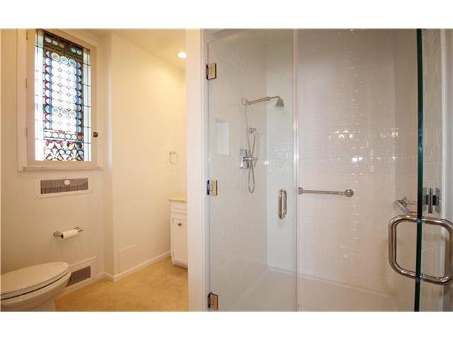
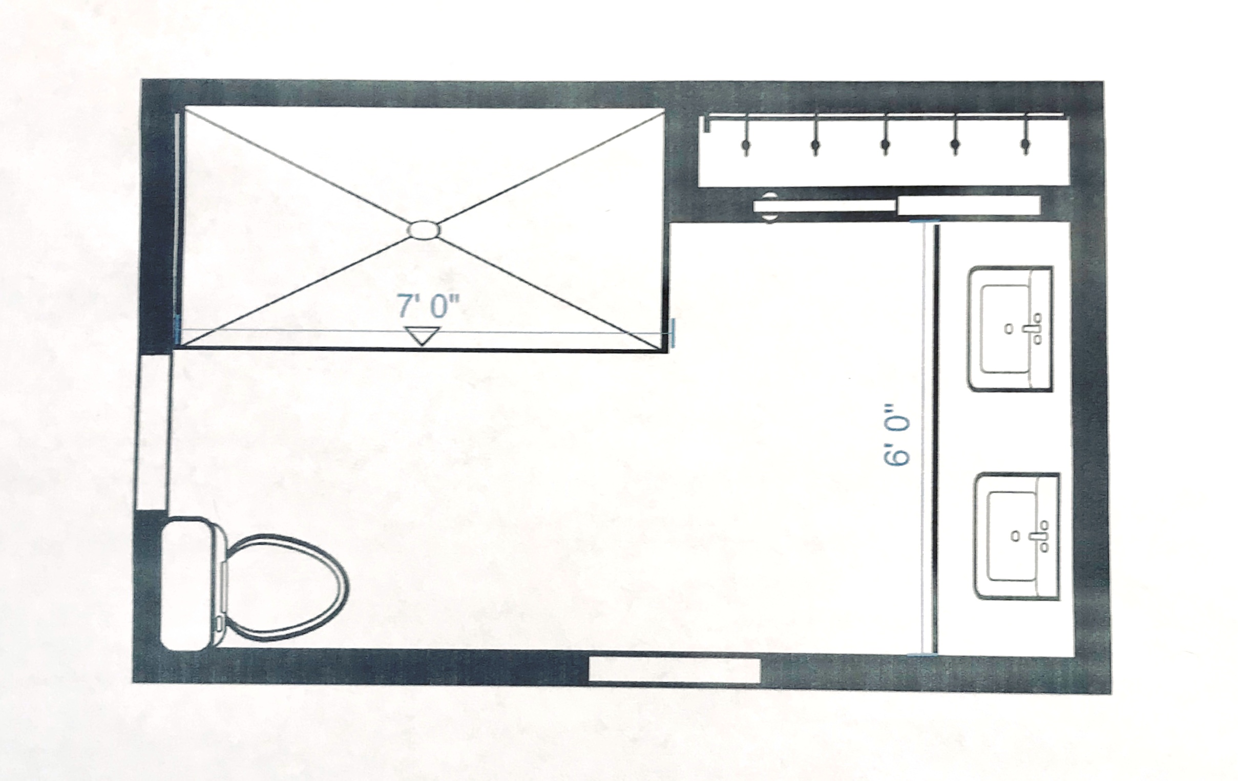
When we entered the master bath shown here the space was chopped up by a walled in shower placed in the middle of the room making the space feel cramped, small, and unattractive.

Karen Mills' blog
Master bath remodel before


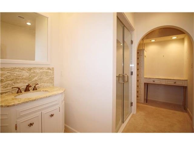
To the right of the shower was a  dimly lit dressing area with a small amount of storage that didn’t function well.


To solve this interior design dilemma we ripped out everything but one small closet and started over.  By pushing back the shower we gave the bathroom a bigger sense of volume and were able to expand the vanity to accommodate two people instead of one.


Karen Mills' blog
MASTER BATH AFTER

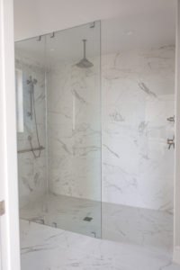
As you can see the transformation was amazing!  By placing the same marble style tile from Italy on the floor and walls the room suddenly visually expanded into a beautiful timeless space with an over sized shower for two.  To help the bathroom live even larger we also eliminated the shower curb and placed a solid glass panel along the front so the shower space virtually disappears.

 
Karen Mills' blog
Hand sketch by Karen Mills


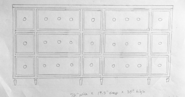
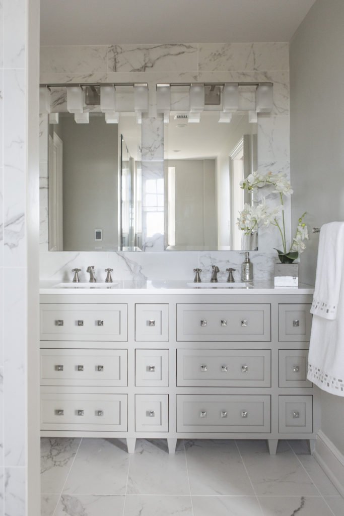
For the former dressing area I designed a double vanity that also included usable top drawers that wrapped around the plumbing for more storage. 

Karen Mills' blog
Interior design by Karen Mills


The result? A gorgeous bathroom that ended up in Kitchen Bath Design News – the national design magazine for kitchens and baths.

Looking for more great bathroom design ideas that you can implement?
Sign up for our weekly interior design blog here

Plus become a fan of Kansas City’s interior designer and former host of the Living Large design show, Karen Mills, on Facebook here!
or instagram 

Interior Design/Interior Decorating

Interior Design: 8 Steps to a Successful Design Project

The Interior Designer’s Guideline to Walking Through a Residential Project

Like any project that involves money, you need a budget or range before you start.
Interior design by Karen Mills

1. Decide on an interior design style or mix of styles that will flow with your architecture and existing furnishings. . Start by selecting several photos of room designs you like and make sure any spouse or significant other involved agrees. In this room the clients requested that we incorporated their family heirlooms into this glamour meets rustic living room.

Interior design by Karen Mills

2. Determine your color scheme ensuring it coordinates with adjoining rooms and any existing furnishings to be used in the interior design.   If you have no idea, take a look in your closet to see what colors you’re drawn too or pull colors out of an inspiration piece such as art, a rug, or fabric. For this entry we began with an existing piece of art, pulling out the colors in other decor items.

rug sizing example
Interior design by Karen Mills

  3. Create a floor plan so you know what fits in your space and the sizes you need.   To do that hire a trained interior designer or go online and use space planning software. In this great room we began by creating a floor plan with size ranges for each piece of furniture so we knew which furniture would work in this space.

Free calendar outline icon & Download free icons for commercial use

 4.  Set a timetable.   At this point you might want to bring in an expert to review your design plan/timetable because investing a few dollars for a master plan and viable timetable can help avoid thousands of dollars in costly mistakes or huge delays.  

Karen Mills' rug sizing example
Interior design by Karen Mills

5. Design and order custom furniture and any built in cabinetry after consulting with your interior designer or tradespeople if you’re managing the project yourself. At this point all custom interior design needs to be finalized and ordered like this Lee custom sofa shown here.   In addition permits need to be pulled for construction.

Free compose outline icon & Download free icons for commercial use

6.  Select and order all plumbing, flooring, tile, and general lighting needed.

7.Design custom draperies, bedding, rugs, wall/floor/ceiling finishes or pillows needed along with choosing hard window coverings, light fixtures, and any ready made furnishings.  Place orders.

Karen Mills' blog
Interior design by Karen Mills as featured in Architecture Today Interior Design and Design Icons books

8. Purchase artwork, hardware pulls, lamps, and all other furnishings needed. In this more traditional dining room with an existing table, chairs, and buffet we sourced an original abstract painting, a metal sculpture, a Schonbek crystal chandelier, modern flower vase, and more to give the room a more curated collected look.

Ready to get started? Give us a call at 913.764.5915 to request a Design Guide or to discuss your project now.

For more great interior design ideas, sign up for our blog here!

Plus become a fan of Kansas City’s interior designer and former host of the Living Large design show, Karen Mills here on Facebook or Instagram here.

Interior Design/Interior Decorating

Interior Decorating: How to Show Off Your Color Personality

Ever wonder what your favorite color says about you and how to use it to showcase your personality?

As an interior designer and color expert, I can tell you that’s not always an easy task because it takes years of experience to learn how colors colors can impact a room in different lighting situations..  No wonder painting is currently listed as the most common home improvement project since countless homeowners waste money having their spaces repainted after selecting a color or combination that doesn’t work.

So here’s some insight on your color’s meaning that may help and ideas for using it in your home.

Karen Mills' blog

If you love red like I do you most likely live life to the fullest with spontaneity and excitement like this little girl pictured in a red Halloween costume.  But what does a red interior say to others?  The color, associated with blood, raises your blood pressure and grabs your attention!  So if you don’t want to go completely red, try using it as an accent color to make your space a little more vibrant.

Karen Mills' blog

Blue, however, exudes stability and calm, making it a perfect color for bedrooms where you need to unwind.  Lovers of this color tend to be dependable, responsible citizens who do the right thing.

Karen Mills' blog

Yellow, like a ray of sunshine on a fall day portrays warmth and optimism in a room, making it perfect for a kitchen or a sunny living area, and fans of this color are often optimistic people with a positive encouraging attitude.

Green, the color of nature exudes calmness and warmth, which makes it a good color for bedrooms or spaces where you need a more relaxed feel.  And fans of this color are usually warm, kind, and charitable.

Karen Mills' blog

Purple fans, often a more complex and creative type of individual, are fascinating individuals but sometimes may seem mysterious or dark to others who don’t understand their creativity.

Orange, the color of hunger and vibrancy fits perfectly into that dining room or kitchen area where you need some life.  And if you’re an orange lover, you probably show the same vibrant spirit as the color with your enthusiastic zest for life.

For more great interior design ideas, sign up for our blog here!

Plus become a fan of Karen Mills, Kansas City’s interior designer and former host of Living Large design show

Plus become a fan of Kansas City’s interior designer and former host of the Living Large design show, Karen Mills, on Facebook or Instagram here!

Interior Design/Interior Decorating

Interior Design: 3 Tips for Decorating Your Living Room…

Share

Interior design by Karen Mills

Do you ever feel like your room is blah or unfinished but don’t want to spend a fortune to finish it? Read on for my 3 tips as an interior designer to add a little life to your space.

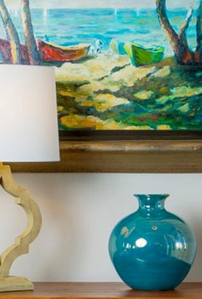
  1. Add Color   Color can be painted on walls and ceilings or introduced with art, furniture or decor like this existing blue painting the client already had. A blue vase enhances the painting while providing an additional punch of color to our interior design client’s entry. Color may also be introduced with fabrics, draperies, rugs, or pillows.
Karen Mills' blog example of pattern
Interior decorating by Karen MIlls

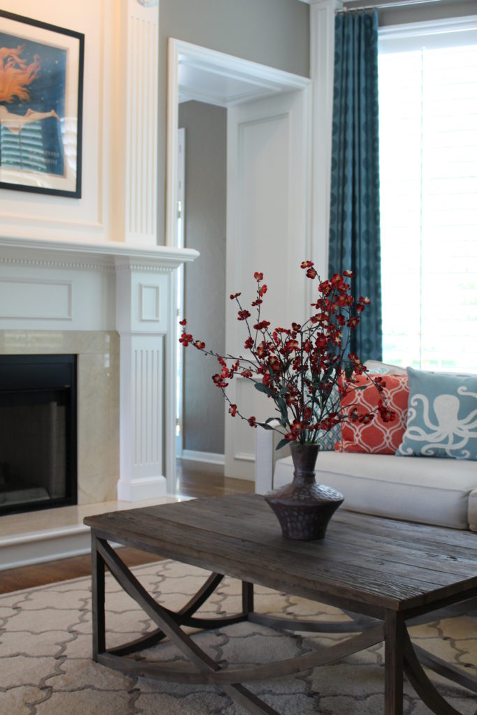
2. Inject pattern –  Introduce pattern with draperies or pillows like this photo of a living room. The artwork, drapes, pillows, and flowers also add a pop of color to this dramatic space.

Karen Mills' blog texture example
Interior decorating by Karen Mills

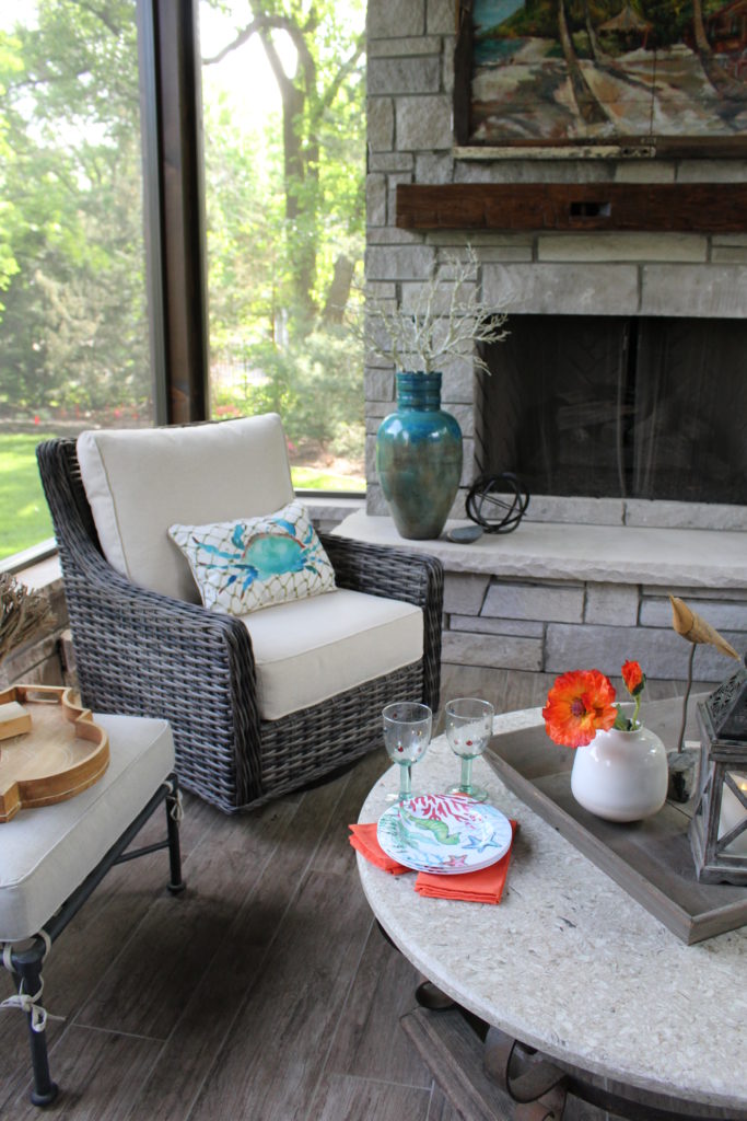
3. Layer in Texture – In this living room, albeit an outdoor one, texture was layered in with flowers, branches, wood trays, and cloth napkin decor. Additional texture in this space includes wicker chairs, a wrought iron table base, a wrought iron bench base, and a stone fireplace.

For more design how to ideas and photos, sign up for our weekly interior design blog here

plus become a fan of Kansas City’s interior designer and former host of the Living Large design show, Karen Mills, on Facebook  and Instagram now!

Interior Design/Interior Decorating

Interior Decorating: How to Determine Correct Area Rug Size…

rug sizing example
Interior design by Karen Mills
  1. Best Living Room Rug Size – When sizing or calculating the ideal size for an area rug for your living room, try to find a rug that lays underneath ALL of your furniture in the room. But if you want to show off more floor or save money, you can also buy an area rug where only the front feet of your upholstered furniture sits on top of the area rug like shown here.
Karen Mills' rug sizing example
Interior design by Karen Mills

The last option and definitely least preferred by the interior design and rug community is to place a smaller rug in front of your sofa but not under the feet. Please note however, that this example is a larger rug that would actually work under the feet of the sofa and chairs nearby (not shown).

Karen Mills' blog rug example
Interior design by Karen Mills

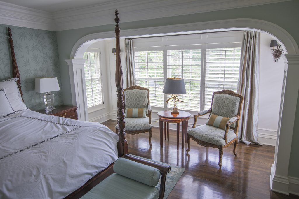
2. Best Bedroom Rug Size – Interior design clients often have a difficult time understanding this concept but a bedroom area rug should be large enough that it can be laid perpendicular under your bed just up to the edge of the nightstands without sliding under them and still have a few feet showing at the bottom of the bed like shown.

Karen Mills' blog rug example
Interior Design by Karen Mills

3. Best Dining Room Rug Size – As an interior designer I often see rugs that are just too small under the dining room table. Calculating this rug size can be tricky because you want two feet on each side of the table for room to slide back the chairs, but also need to ensure the final rug size fits into your space like the one shown here.

For more design ideas and photos, sign up for our weekly interior design blog here

plus become a fan of Kansas City’s interior designer and former host of the Living Large design show, Karen Mills, on Facebook  and Instagram now!

Interior Design/Interior Decorating

Interior Design: 5 Tips for Refreshing Kitchen For Less

Ideas for Bringing Your Kitchen up to Date Without Breaking the Bank

Karen Mills' blog
Interior design by Karen Mills

If a kitchen remodel isn’t in your future because of either lack of budget or not recouping your investment in your current home, then why not consider what I like to call as an interior designer a KITCHEN REFRESH! Read on for my 5 tips for giving your kitchen a budget friendly makeover below.  

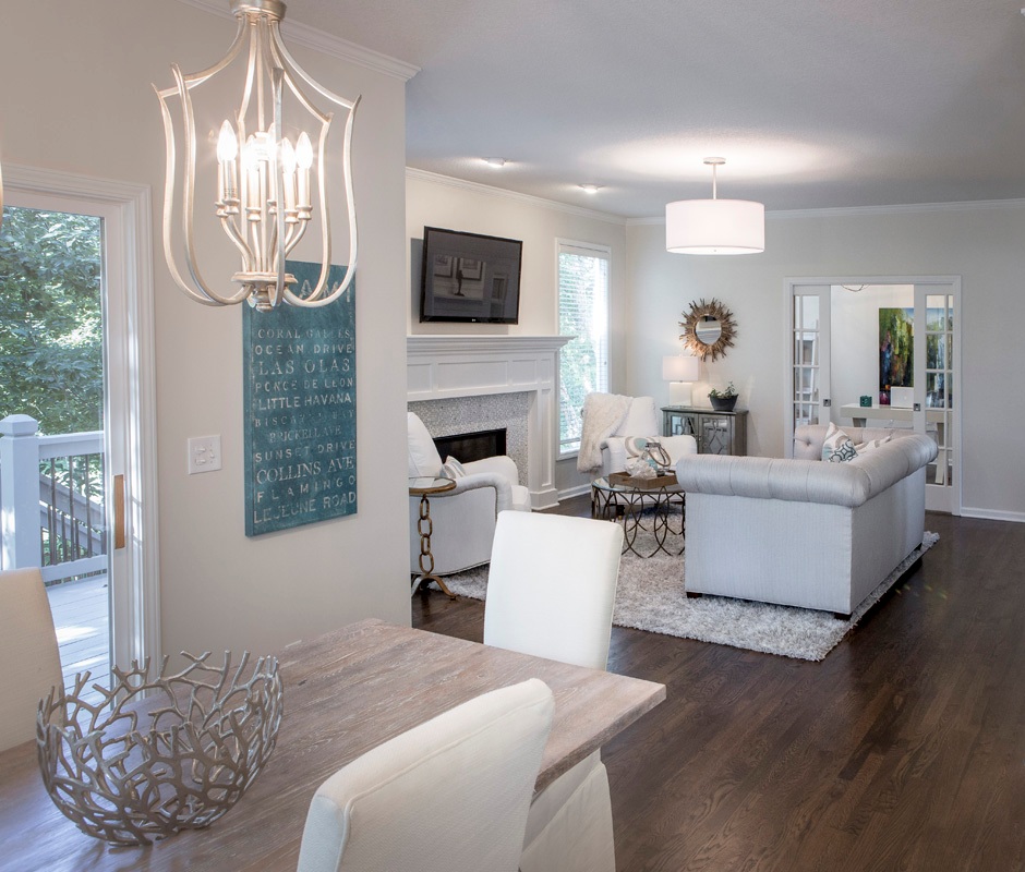
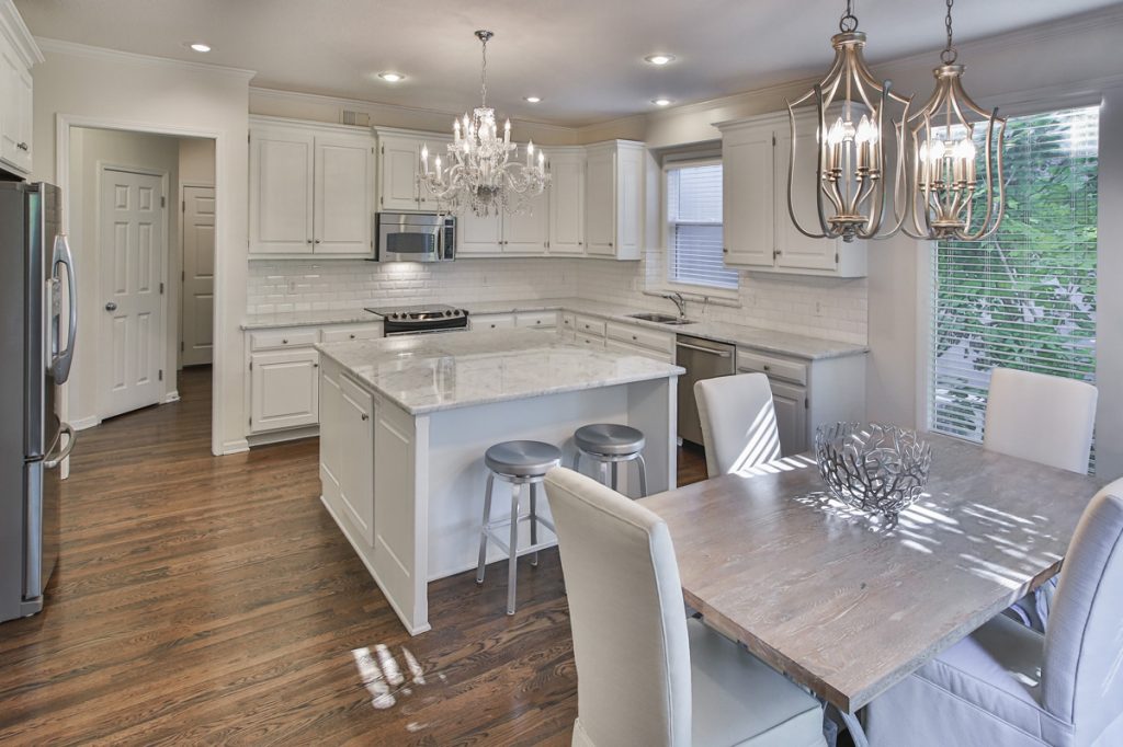
1.Paint both your kitchen cabinets and walls to give your entire space a fresh new look. In this kitchen refresh we repainted darker cabinetry and walls a much lighter version of white to lighten up the space and visually expand it, while also swapping out dark counter tops for light ones.

To save money and not waste perfectly good granite our client re purposed the darker counters to a new basement bar where they were a perfect fit! Then to bring in more light we installed an existing chandelier the client wanted to incorporate and added new mini chandeliers over the eating area where we re purposed a tabletop made out of a door by gray washing it and having slip covers made to hide existing dark leather dining chairs.

Karen MIlls' blog
Interior design by Karen Mills

2.Replace back splash along with counter tops – After working on over 1200 interior design projects a huge problem we’ve noticed is that homeowners planning a budget kitchen remodel typically omit replacing their back splash. Unfortunately an old back splash screams dated so as an interior designer I recommend to our clients that they replace it at the the same time to create a wow factor when you walk into the room.

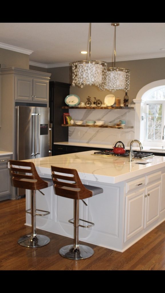
In this playful and creative kitchen makeover, we replaced the dark granite with white mitered quartz tops on the island and ran the quartz up the walls behind the cabinetry instead of traditional tile to add drama and interest. We painted the cabinets three different shades of gray, added new mini chandeliers, and replaced a few wall cabinets with live edge shelves to create a fun focal point.

3. Introduce new bar stools  In addition to the new live edge shelves the client in this kitchen purchased contemporary counter stools that really pop against the gray and white color scheme while adding a little warmth with the wood. New stools that contrast against your island or peninsula can completely have a huge impact on your kitchen without a big investment.

Karen Mills' blog
Kitchen refresh by Karen MIlls

4. Replace dated chandeliers or pendant lights – By updating your light fixtures you can make a great impression walking into your kitchen where the fixtures are usually front and center over an island or table like shown here.

To help these new mini chandeliers and the drum shade beyond in the hearth area blend seamlessly with the existing chandelier the client wanted to use in this space, we went with lighter finishes – champagne on the mini chandeliers and silver on the drum shade.

Karen Mills' blog
Interior design by Karen Mills

5. Layer in accent color with accessories, rug, or art –  When styling a space for an interior design project, especially a kitchen, I love to introduce a fun accent color that can be layered in on everything from napkins or a rug to platters and art.  In this photo the client styled their live edge shelves to showcase their beautiful collection of red and turquoise dishes which creates a real showstopper in this kitchen, while also providing storage.

for more kitchen design ideas and photos, sign up for our weekly interior design blog here

plus become a fan of Kansas City’s interior designer and former host of the Living Large design show, Karen Mills, on Facebook  and Instagram now!

https://www.houzz.com/ideabooks/80705354/list/ideas-for-refreshing-your-kitchen-without-remodeling