Interior Design/Interior Decorating

Our Design Projects Just Published in an International Interior…
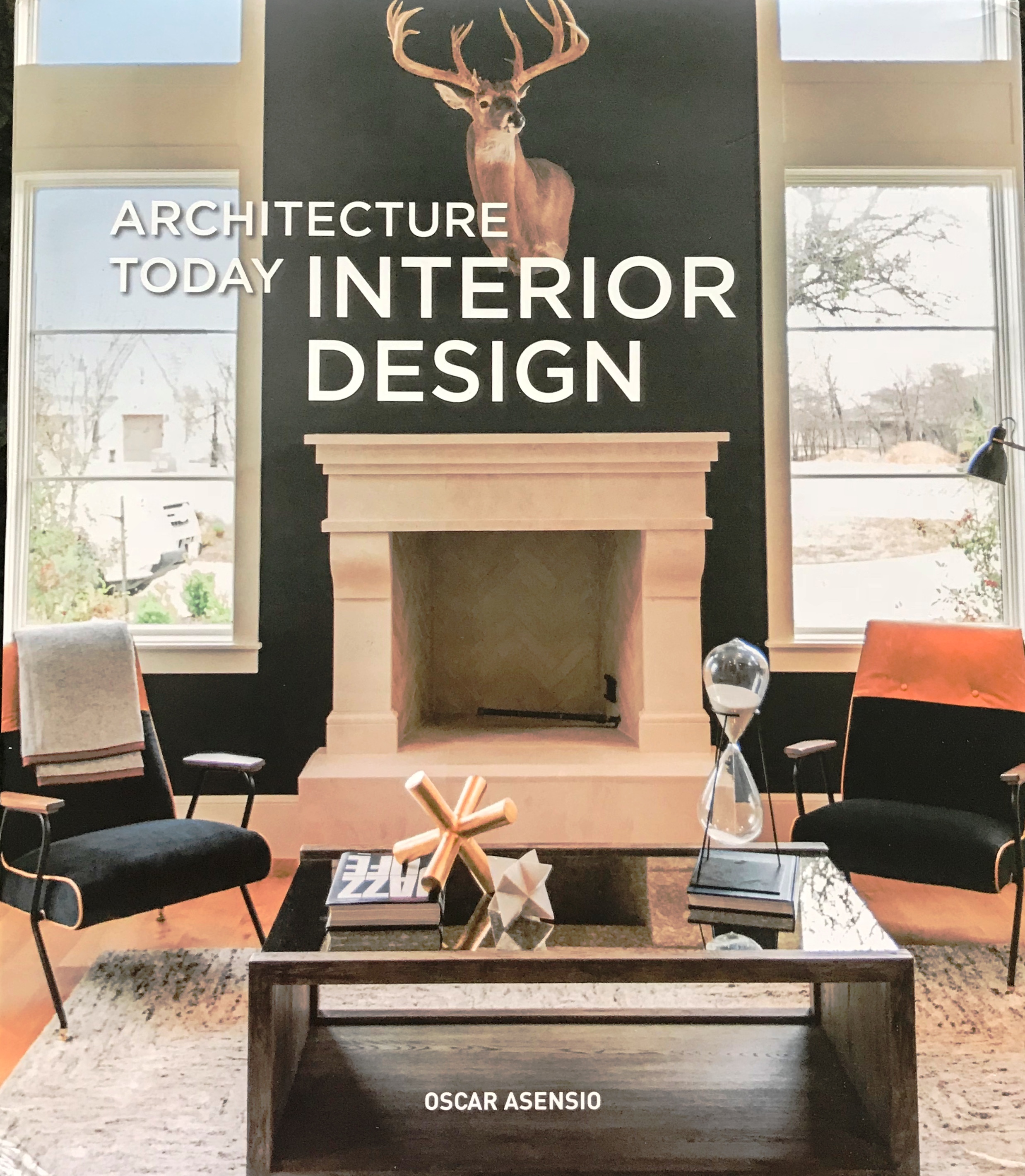
Karen Mills' blogThrilled to announce that our interior design projects were published this month in an international design book titled Architecture Today Interior Design by Booq Publishing in Barcelona, Spain along with other top interior designers and architects around the world whose work is absolutely fabulous!

Above is a photo of the book I snapped with my cell phone as I held it for the first time late yesterday afternoon.
 

Karen Mills' blog
Interior design by Karen Mills/Photography by 29 Pixels Studios, LLC

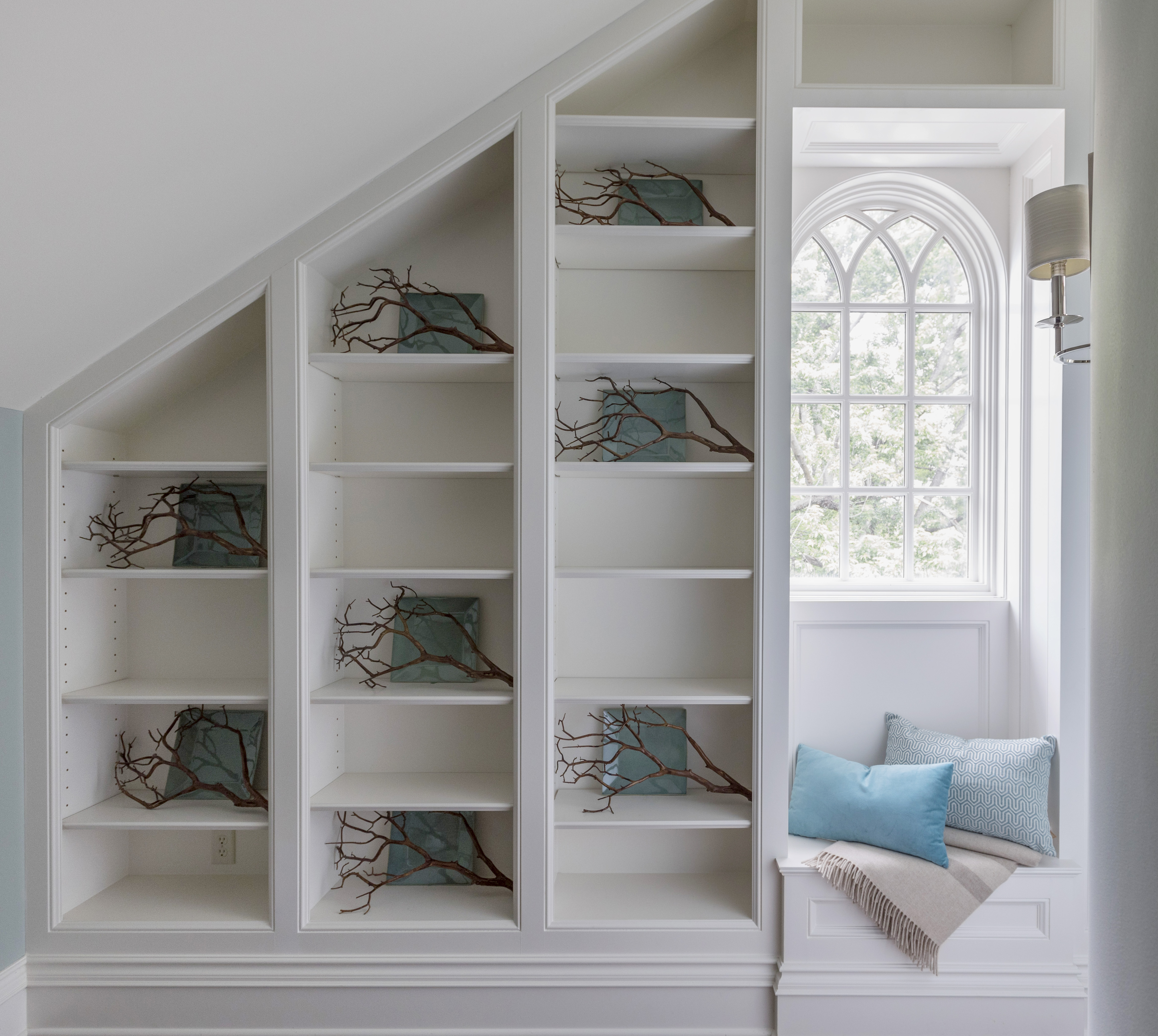
Here’s a sneak peek of one of our favorite projects fondly called the “The Flat” after the clients’ London flat that will be featured along with other wonderful designs.

Karen Mills' blog
Interior design by Karen Mills/Photography by 29 Pixel Studios, LLC

Copies of the book are now available at retailers worldwide so we can’t wait for you to pick up a copy and enjoy this book for years to come!

For more great ideas and photos, sign up for our weekly interior design blog here

Plus become a fan of Kansas City’s interior designer and former host of the long running Living Large design show, Karen Mills, on Facebook here!

Interior Design/Interior Decorating

Interior Decorating: 3 Ways to Decorate Your Outdoor Area…

If you’re ready to get outside and enjoy the weather here are 3 tips for setting up your outdoor porch, pergola, or open seating area to enjoy for months to come.

Karen Mills' blog
Photo courtesy of Lexington Furniture

1. Create a Comfortable Seating Area 

High quality seating and a  “L” or “U” shaped configuration like this outdoor room by Lexington Furniture help create a comfortable and inviting outdoor space.  Here the yellow chair color repeats again on the sofa pillows while the patterned pillows on both upholstered pieces add to the cohesive look.

Karen Mills' blog
Photo courtesy of Lexington Furniture

2.  Introduce Fun Accessories

Some of my favorite accessories are bold pillows, live flowers or plants, and trays for the outdoors like shown in this photo.

Karen Mills' blog
Photo courtesy of Braxton Culler

3.  Layer in an Area Rug to Create a Cozy Grouping

Placing an area rug underneath a seating area helps define the space and make it feel more like the indoors like this outdoor room.  Interesting accessories in turquoise add to the finished look along with the pillows and tray on the table.

For more great ideas sign up for our weekly interior design blog here

plus become a fan of Kansas City’s interior designer and former host of Living Large design show, Karen Mills, on Facebook here

and if you have a porch to decorate, check out my latest article on Houzz titled Get Your Porch Ready for Spring Sitting below

https://www.houzz.com/ideabooks/95204125/list/get-your-porch-ready-for-spring-sitting

Karen Mills' blog

Interior Design/Interior Decorating

Interior Design: 3 Tips for Designing a Restful Bedroom

A good night’s sleep can be difficult enough without adding a room design that’s not relaxing and calm.  Read on for three ways to decorate a bedroom that’s a wonderful place to sleep.

Karen Mills' blog
Photo courtesy of Circa

1. Starting with a soothing color scheme 

When selecting a color palette that’s soothing opt for muted colors or neutrals.  In this bedroom by Circa furniture, the grayed out blues of the bedding, bench fabric, and drapes help calm down the room while also adding a touch of color to the gray walls and white rug.

Karen Mills' blog
Interior design by Karen Mills

2. Choose bedding in natural washable fabrics that are soothing

In this bedroom, we selected washable Italian sourced bedding, wallpaper and furnishings in muted colors with minimum pattern to keep the room’s interior design from getting too busy.  I love washable bedding because it cleans up easily when children or pets make a mess to reduce the worry.

Here the blue of the accent pillows on the bed repeat again on the chair’s pillow while the warmth of the bed’s wood is picked up again by the chair and carpet.

Karen Mills' blog
Photo courtesy of Century Furniture

3. Provide an inviting seating for getting dressed or just relaxing

In this room by Century seating abounds from the large tufted ottoman and bench to the chairs for sitting and reading.  The neutral color palette creates a soothing feel while the plants add life and color.

For more great ideas on interior decorating sign up for our weekly interior design blog here

plus become a fan of Kansas City’s interior designer and former host of the Living Large design show, Karen Mills, on Facebook here!

Interior Design/Interior Decorating

Interior Design: 5 Dining Room Paint Color Palettes

Since we don’t spend much time in dining rooms it’s a great opportunity to show off our personality and design something dramatic or even quirky.  Here are 5 fun color palettes to inspire you to refresh your dining space.

Karen Mills' blog
Photo courtesy of Schumacher

1. Black and White – This classic color combination always looks great not only because o the the stark contrast between dark and light, but also because you can pair almost any color with it like the yellow flowers here.

The wallpaper by Schumacher creates a wow factor in this space and draws your eye up to the ceiling to show off the height of the room.

Karen Mills' blog

Photo courtesy of Lillian August furniture

2. Blue

Blue, one of my favorite colors for dining room, especially navy, pair nicely with several colors including the fuchsia shown in this dining room.  By repeating different shades of blue on both the wrap around settee and wall, you can create a more interesting color scheme.  The fuchsia hue of the chair and pillow repeat again on the rug to create a cohesive feel.

Karen Mills' blog
Photo courtesy of Lillian White for Hickory furniture

3. Green 

Even though you don’t often seen green used in the dining room, I love how the green takes a back seat to the furnishings in creamy white and blue to help soften this bold shade of green.  Here in this photo artwork provides the inspiration for the color scheme of blue and green.

Karen Mills' blog

Photo courtesy of Hickory White furniture

Here’s another example of how to incorporate green into your dining room.  In this photo the yellow green in the art is repeated again on the chairs and reinforced by the green decor on the table.


Karen Mills' blog
Photo courtesy of Kravet

4. White/Neutral

If you love white like I do, why not paint your walls an interesting shade of white or light neutral along with white furnishings to create a fresh feel.  Then you can either leave the room white or layer in an accent color or two to change the look as the mood hits you.

Karen Mills' blog
Interior design by Karen Mils/Photograpy by 29Pixel Studios, LLC


Karen Mills' blog
Photo by Spectrum Limited

5. Color Explosion

If you can’t decide on one accent color you like because you love so many why not keep a neutral wall color and introduce two or three accent colors that you love to create a space that reflects your artistic side like this photo by Spectrum Limited chairs.  To create this same look, keep the furnishings simpler also like these clear Lucite chairs to create your dramatic dining room.

Of course orange and purple can also be colorful options for dining rooms along with more neutrals colors as shown here.

For more great ideas on dining room design or other topics sign up for our weekly interior design blog here

plus become a fan of Kansas City’s interior designer and former host of the Living Large design show, Karen Mills, on Facebook here!


Interior Design/Interior Decorating

Design Dilemma: How to Layer Heirloom Antiques into a…

Karen Mills' blog
Interior design by Karen Mills/Photography by 29Pixel Studios, LLC

When these Kansas City area clients purchased a brand new home that was already finished, they were excited to start over with new furniture too except for a few family heirloom pieces that had sentimental meaning.   So they called on our interior design firm who had worked with them before to solve their design dilemma.

First they needed to incorporate an antique coffee table into the interior design of this spacious living area so we placed the table front and center to create a wonderful conversation piece and cohesive look with the outdoor fireplace beyond.

Karen Mills' blog
Interior design by Karen Mills/Photography by 29Pixel Studios, LLC

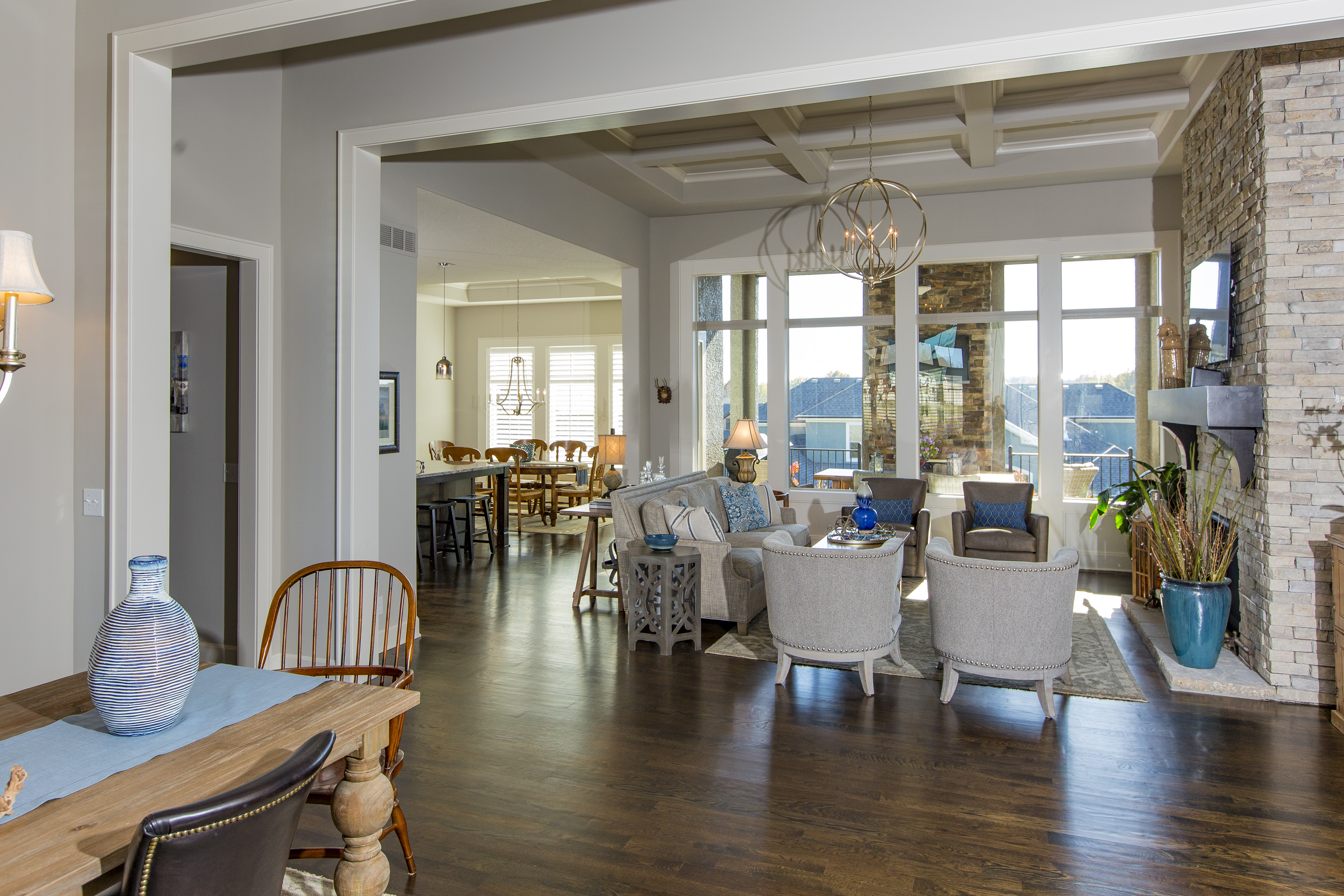
As we placed key heirloom pieces the homeowners wanted to incorporate, we had to ensure the pieces complemented the interior design overall because the main living area was an open concept.

Karen Mills' blog
Interior design by Karen Mils/Photograpy by 29Pixel Studios, LLC

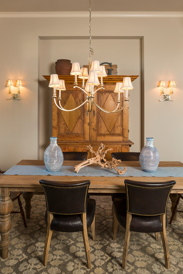
The armoire in the dining area was another existing piece that needed to be incorporated so we placed it behind a rustic style table with two existing end chairs that reflected an era gone by.

Karen Mills' blog
Interior design by Karen Mills/Photography by 29Pixel Studios, LLC

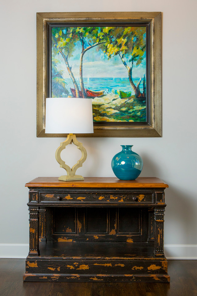
The entry chest, initially one of the biggest dilemmas because of it’s orange speckles, fell into place beautifully once we placed an existing piece of artwork that picked up the same colors as the chest.  To finish off the look we added a more contemporary lamp and vase that mimicked colors in the painting to create a wow factor in the foyer.

Karen Mills' blog
Interior design by Karen Mills /Photography by 29Pixel Studios, LLC

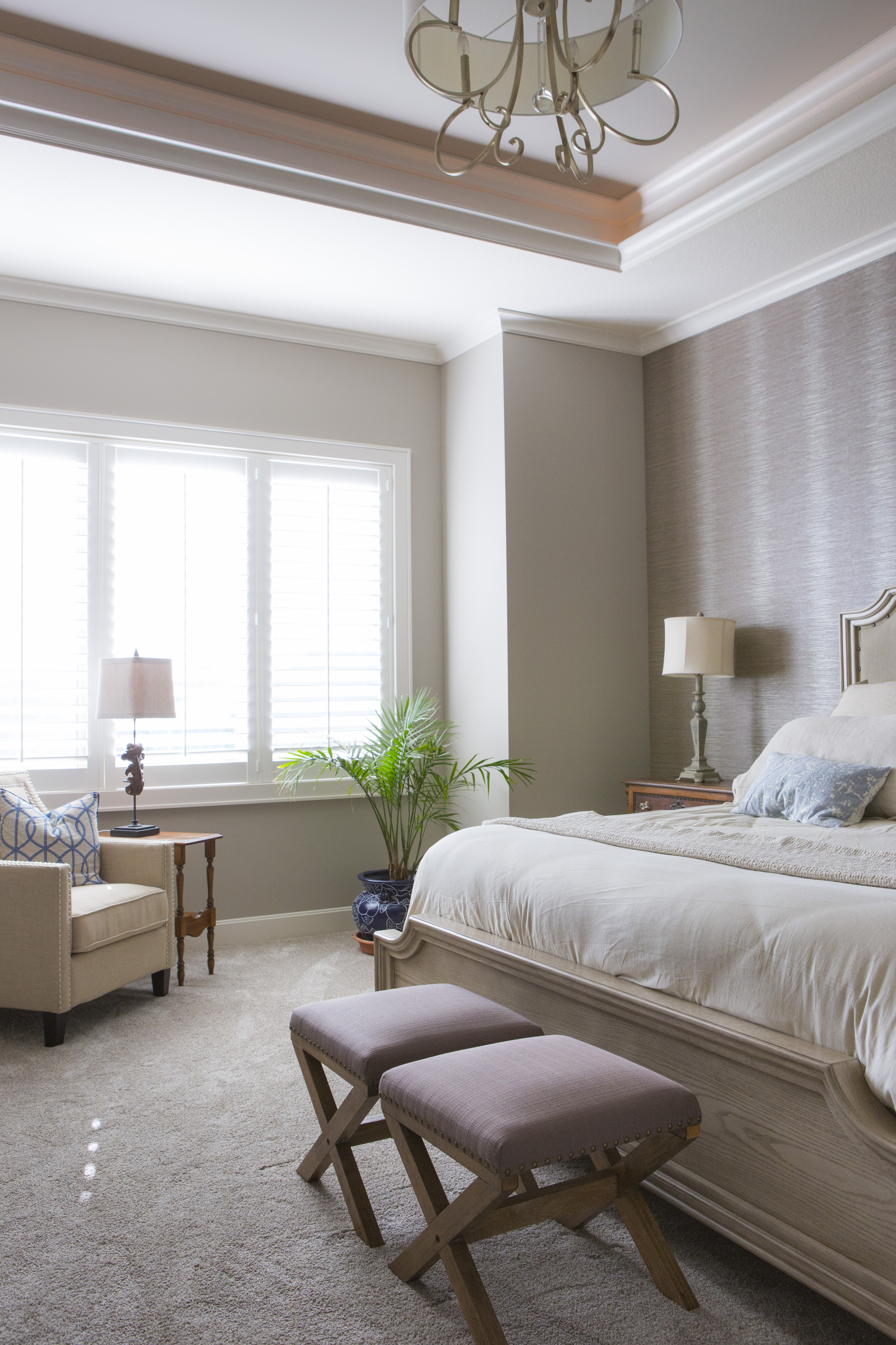
The master bedroom suite was also finished in warm gray colors so by repeating the orange wood hues of family heirlooms around the room along with designing simple custom bedding, the room complemented the antique pieces instead of competing.  A rustic bed and benches also help reinforce the timeworn feel of this space, making it more inviting and serene.

 For more great interior design ideas and photos, sign up for our weekly blog here

Karen Mills' blog
Interior design by Karen Mills/Photography by 29Pixel Studios, LLC

plus become a fan of Kansas City’s interior designer and former host of the Living Large design show, Karen Mills, on Facebook here!


Interior Design/Interior Decorating

Interior Design: 3 Ways to Design Smaller Kitchens to…

Karen Mills' blog
Interior design by Karen Mills/Photography by 29Pixel Studios, LLC

   1. Open up kitchen to rest of the house

In this kitchen we took out the wall to the former dining room and the wall to the maid’s quarters on the opposite end to create a space that lives large and even has enough room for a sit down island.  Once the walls were removed we matched the wood floors of the dining (now hearth) in the kitchen which also visually expands the kitchen so it lives larger.

2. Use lighter colors on walls and cabinetry

Karen Mills' blog
Interior design by Karen Mills/Photography by 29Pixel Studios, LLC

By selecting colors that are similar in hue and lighter in color, this kitchen becomes more cohesive and ultimately feels larger because the lighter colors bounce light around the room.


Karen Mills' blog
Interior design by Karen Mills/Photography by 29 Pixels

In this kitchen by designing a lighter white/gray color palette including the table/chairs, back splash and wall color, the room seems to visually expand also as light is reflected throughout.

  3. Add great lighting 

Karen Mills' blog
Interior design by Karen Mills/Photography by 29Pixel Studios, LLC

Great lighting can make or break a room, especially a kitchen.  Here in this kitchen we not only added great under cabinet lighting, beautiful chandeliers, extensive general lighting. and lit glass cabinetry but we also coordinated the lighting to be the same color temperature so it flowed together beautifully.

Karen Mills' blog
Interior design by Karen Mills

Here’s another example of a smaller kitchen where we layered lighting to create a wonderful ambiance and a happy place to spend cooking or entertaining.

For more great ideas on kitchen design or other topics sign up for our weekly interior design blog here

plus become a fan of Kansas City’s interior designer and former host of the Living Large design show, Karen Mills, on Facebook here!

Interior Design/Interior Decorating

Interior Design: 3 Ways for Small Bathrooms to Live…


Karen Mills' blog
Interior design by Karen Mills/Photography by 29Pixel Studios, LLC

If you’re tired of your cramped small bathroom and considering remodeling here are 3 tips to help your refinished bathroom live larger!

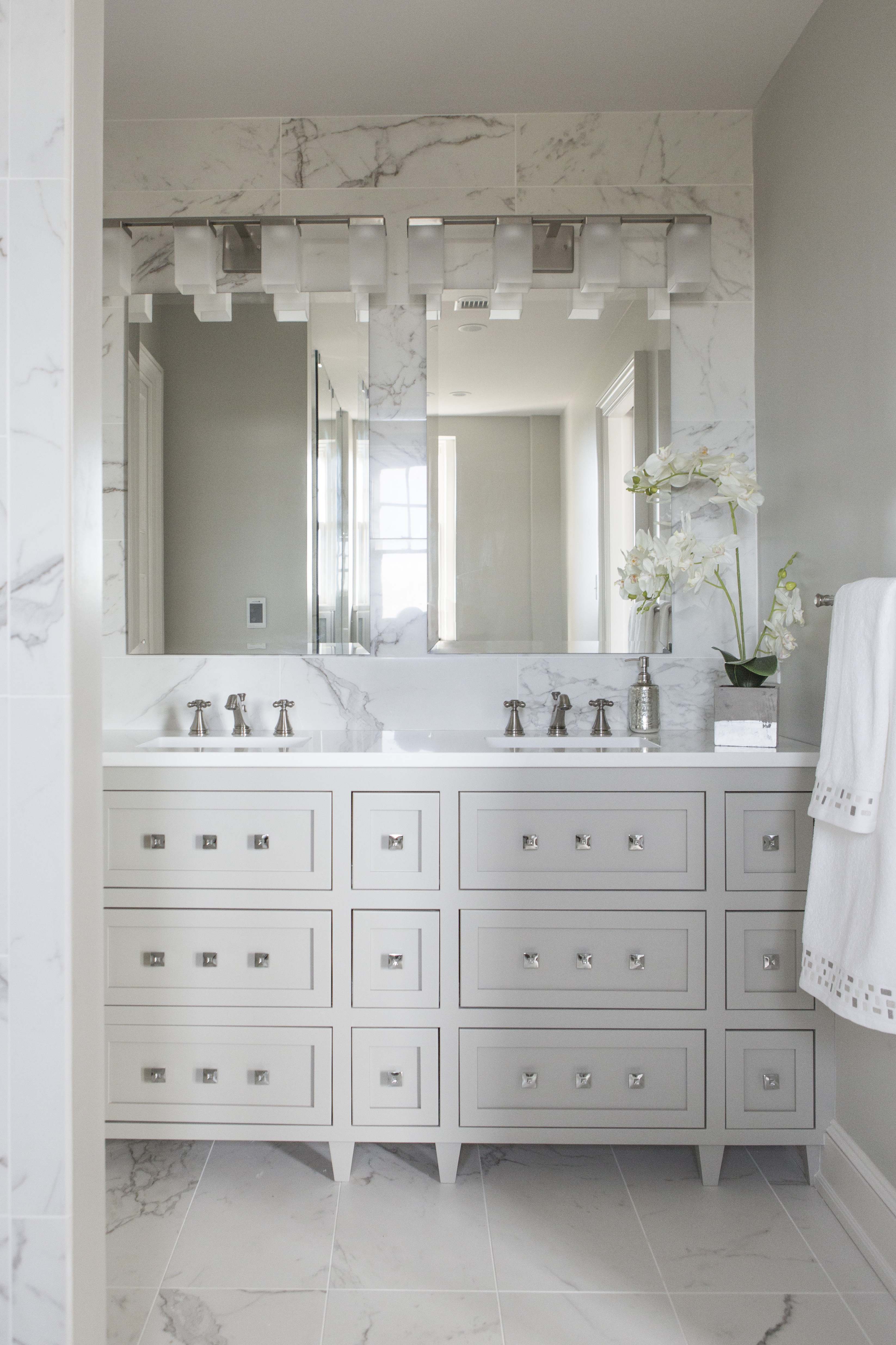
1.  Monochromatic color scheme –  One of my favorite tricks to make a small bathroom look bigger begins with using one color on all the walls, furniture, floors, and decor such as bright white to give it a fresh clean look and bounce existing light around the room like the photo above.


Karen Mills' blog
Interior design by Karen Mills

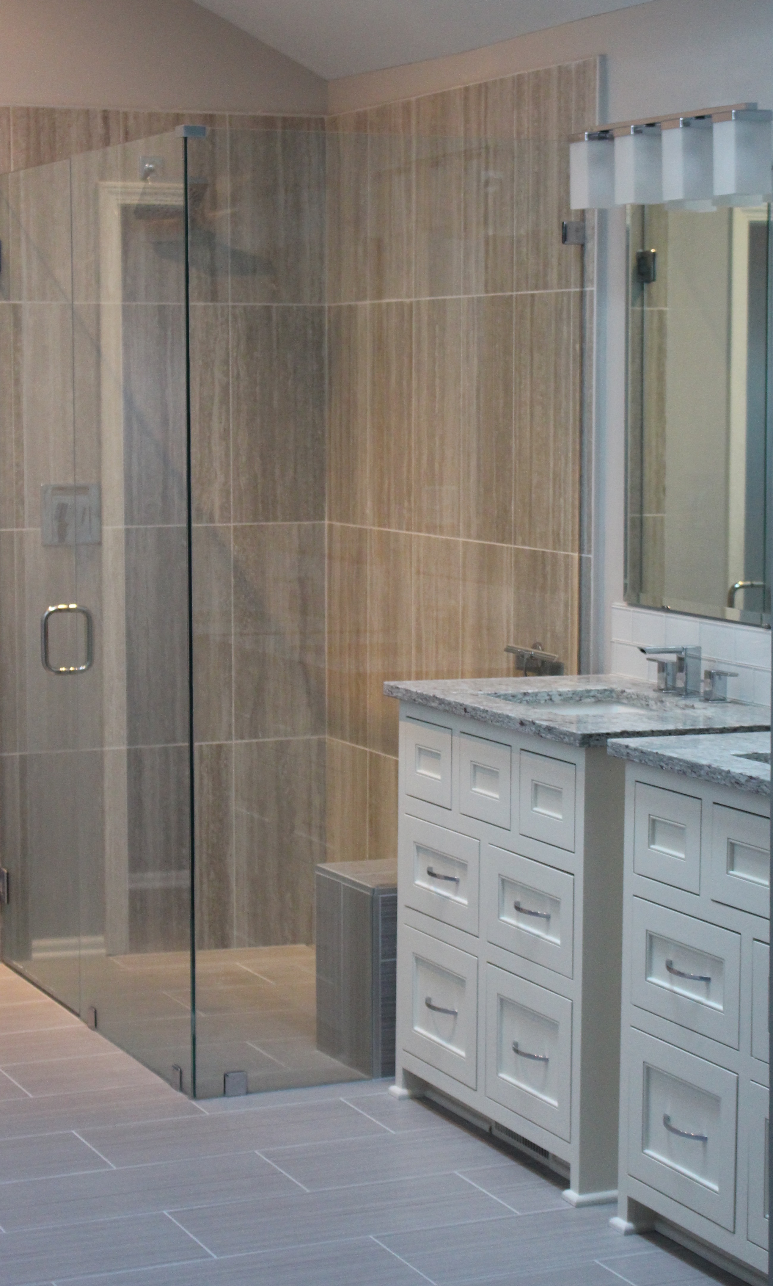
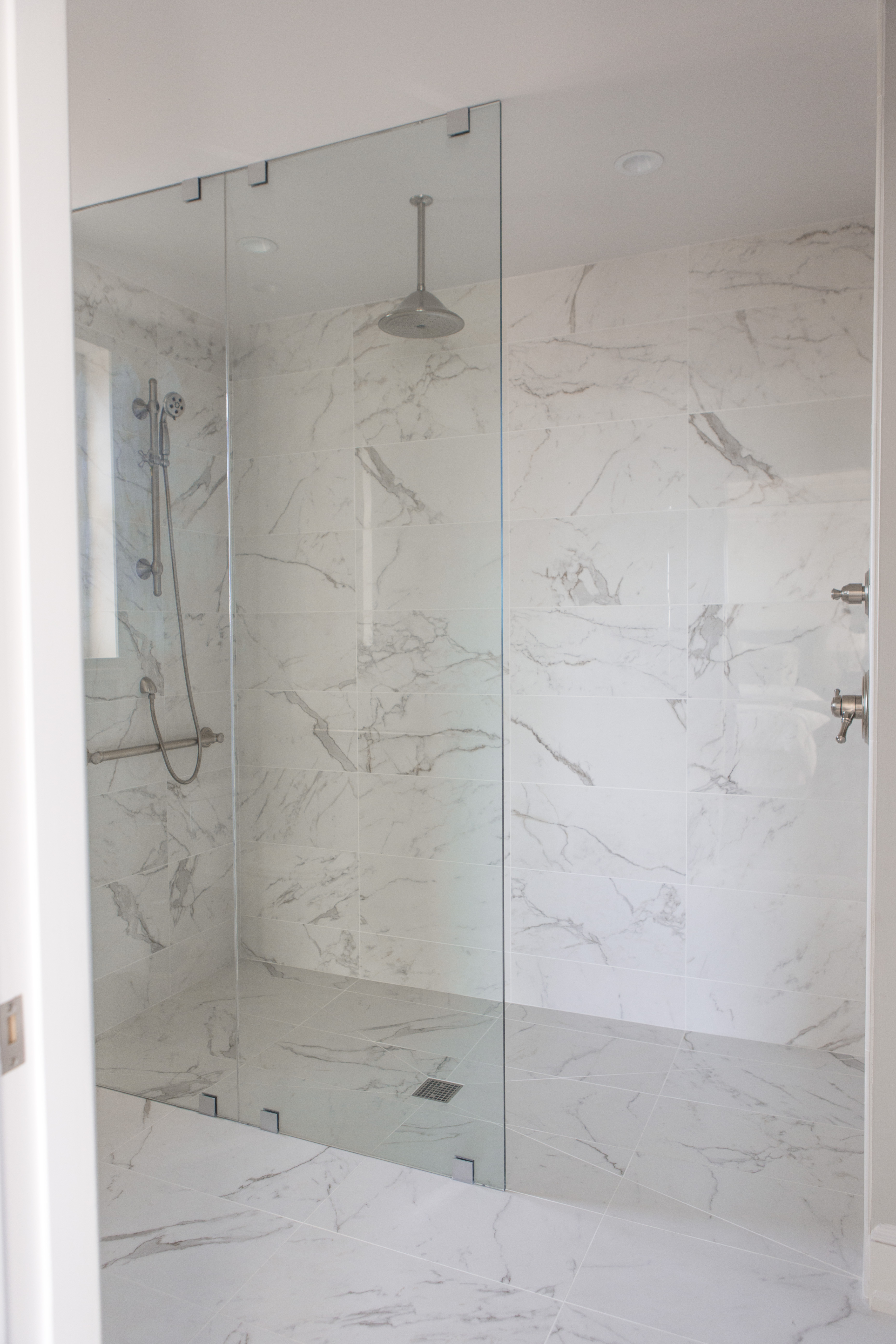
2.  Reflective surfaces –  To visually enlarge your small bathroom, use mirrors to reflect light and a shower of glass surfaces to give your space a light airy feel like we did in the shower above.

Karen Mills' blog
Interior design by Karen Mills/Photography by 29Pixel Studios, LLC

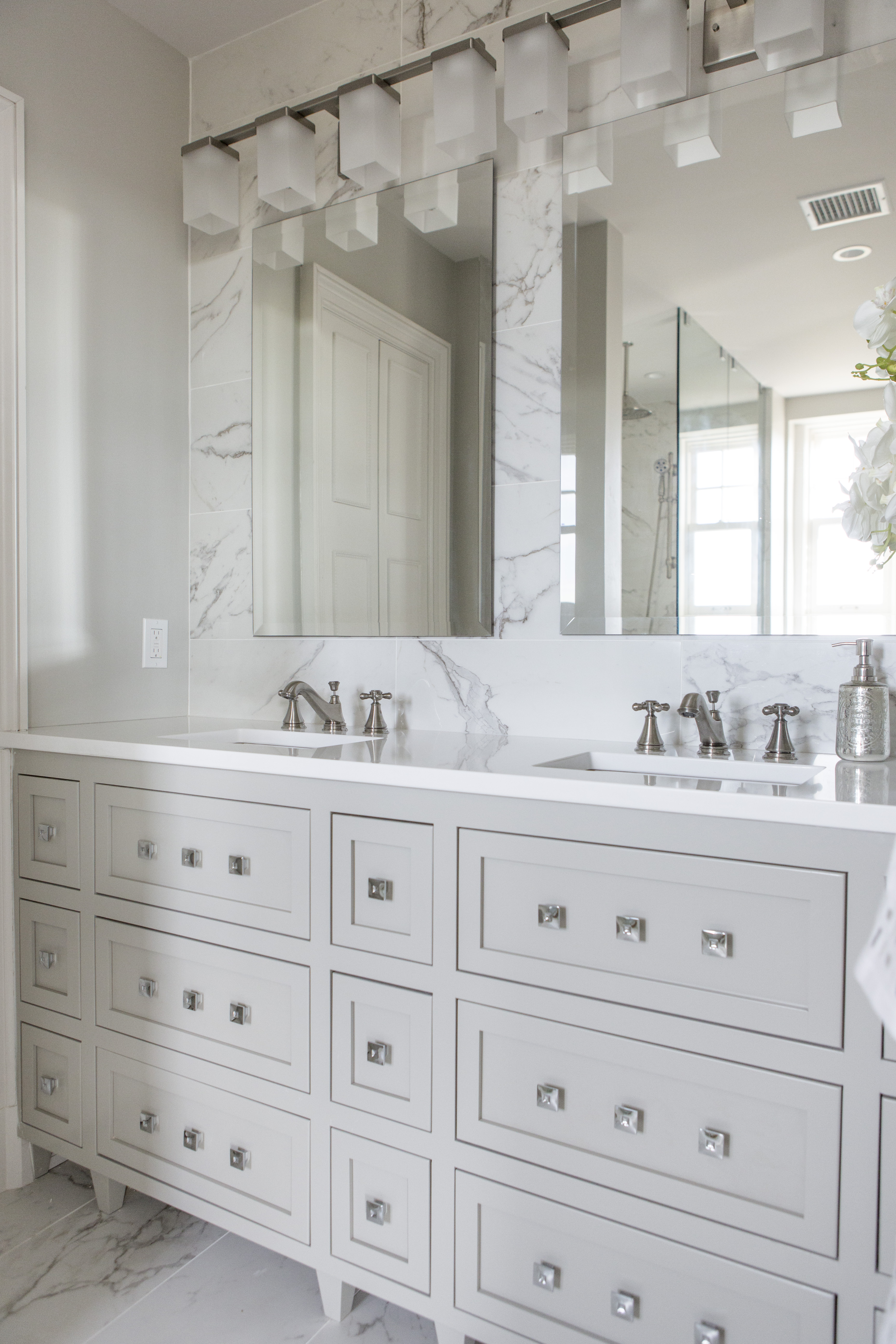
Adding legs to your vanity like the one above also makes your room feel larger.

Karen Mills' blog

Interior design by Karen Mills

Karen Mills' blog

Interior design by Karen Mills

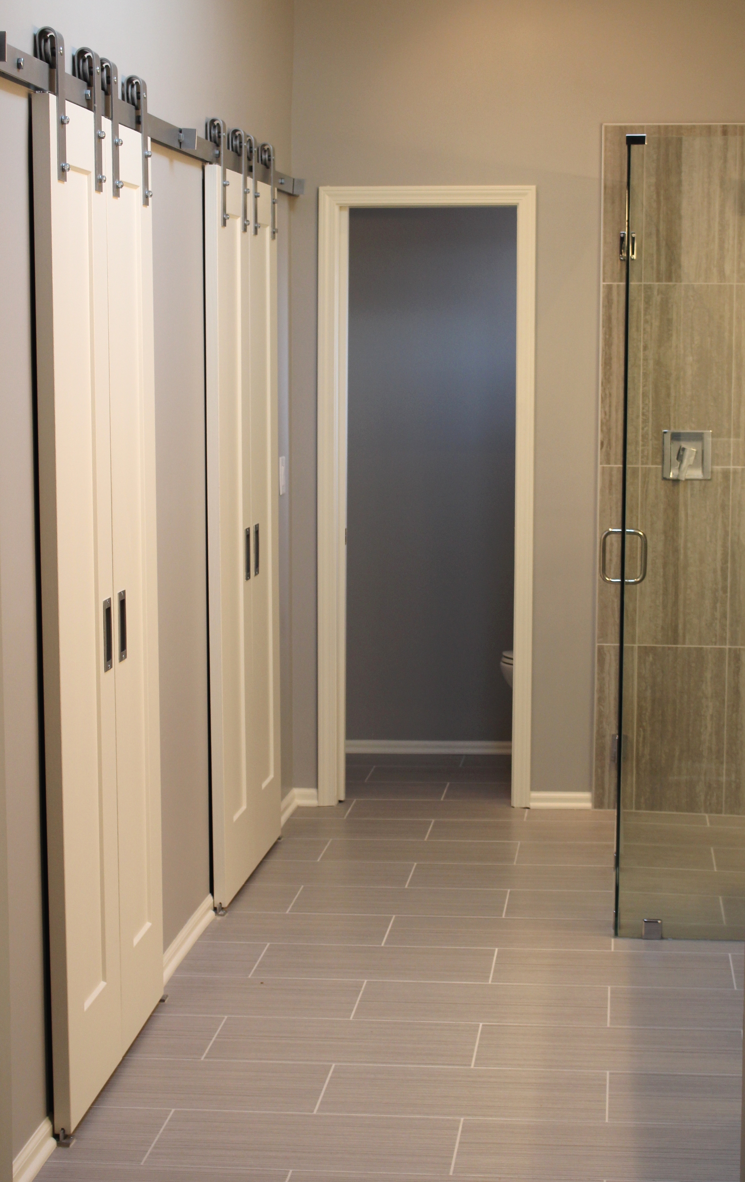
3.  Increase your floor space – Start by swapping out an existing vanity cabinet for a floating vanity/sink or pedestal style sink (see photo below) or swapping your swinging door for pocket doors or barn doors like the bathroom we completed above.

Interior design by Karen Mills/Photography by 29Pixel Studios, LLC

You can also install your toilet tank in the wall along with more shallow sink vanities or use a floating vanity like above.


For more fabulous bathroom interior design tips, sign up for our blog here

And become a fan of Kansas City’s interior designer and former host of Living Large show, Karen Mills, on Facebook here!

Interior Design/Interior Decorating

Interior Design: Top 4 Bathroom Design Trends of 2018


The bathroom remodel industry has continued to explode this year and doesn’t show signs of slowing down anytime soon.  As a bathroom designer I’ve been immersed in so many bathroom remodels the past two years I’ve lost count and the phones just keep ringing.  But during this season, I’ve noticed four bathroom trends in the U.S. that I believe will continue into 2018.

Karen Mills' blog
Interior design by Karen Mills/Photography by 29Pixel Studios, LLC
  1. Clean Lines with a Zen Feel – Hotels and restaurants figured out years ago that ambiance is key for creating an inviting atmosphere and homeowners are starting to crave this inviting look too.  To create a simple zen feel, opt for cleaner lines, less pattern, a mix of textures, and vanities that look more like furniture than a boring row of cabinetry along the wall.


Karen Mills' blog


    2. More Timeless – For years our interior design firm has advocated interior design with staying power in our custom bathrooms but now its becoming a trend as seen in the trend towards classic marble, cleaner lines, less ornate architectural details, simpler tile designs, and less patterns.

    3. Luxury – The word luxury doesn’t mean that your bathroom design has to cost a fortune or be stuffy.  Luxury can be had through beautiful options like free standing tubs, steam showers, heated floors, custom cabinetry, or technology.  Technology could include heated towel racks, a coffee bar, hidden plug  ins for hair dryers, adaptable cabinetry for more efficient storage, or remote control window treatments.

    Karen Mills' blog
    Interior design by Karen Mills

    4. Rustic Elements   Products that fall into this category could include wood walls made of boat wood (duck board or engineered wood flooring, wood surrounds for tubs, concrete vanity tops, concrete wall finishes, river rock vanities, rock floors or walls, stone vessels, or rustic tiles, among others.

    To keep up with the latest trends, sign up for our weekly interior design blog here

    Karen Mills' blog
    Interior design by Karen Mills/Photography by 29Pixel Studios, LLC

    plus become a fan of Kansas City’s interior designer and former host of the Living Large design show, Karen Mills, on Facebook here!


    Interior Design/Interior Decorating

    Interior Design: How to Succeed at A Classic Kitchen…


    Karen Mills' blog  Karen Mills' blog

    BEFORE                                                                      AFTER

    Are you dreaming of a kitchen like the one on the right but your reality is the one on the left?

    As I toured this historic high rise condo on the plaza in Kansas City for the first time as the interior designer, the reality of the situation was bleak.  The condo hadn’t been updated for years and the warren of tiny rooms made it difficult to imagine a beautiful open kitchen.  On top of that the small elevator and restrictions limited what could be done with cabinetry, counters, and much more.


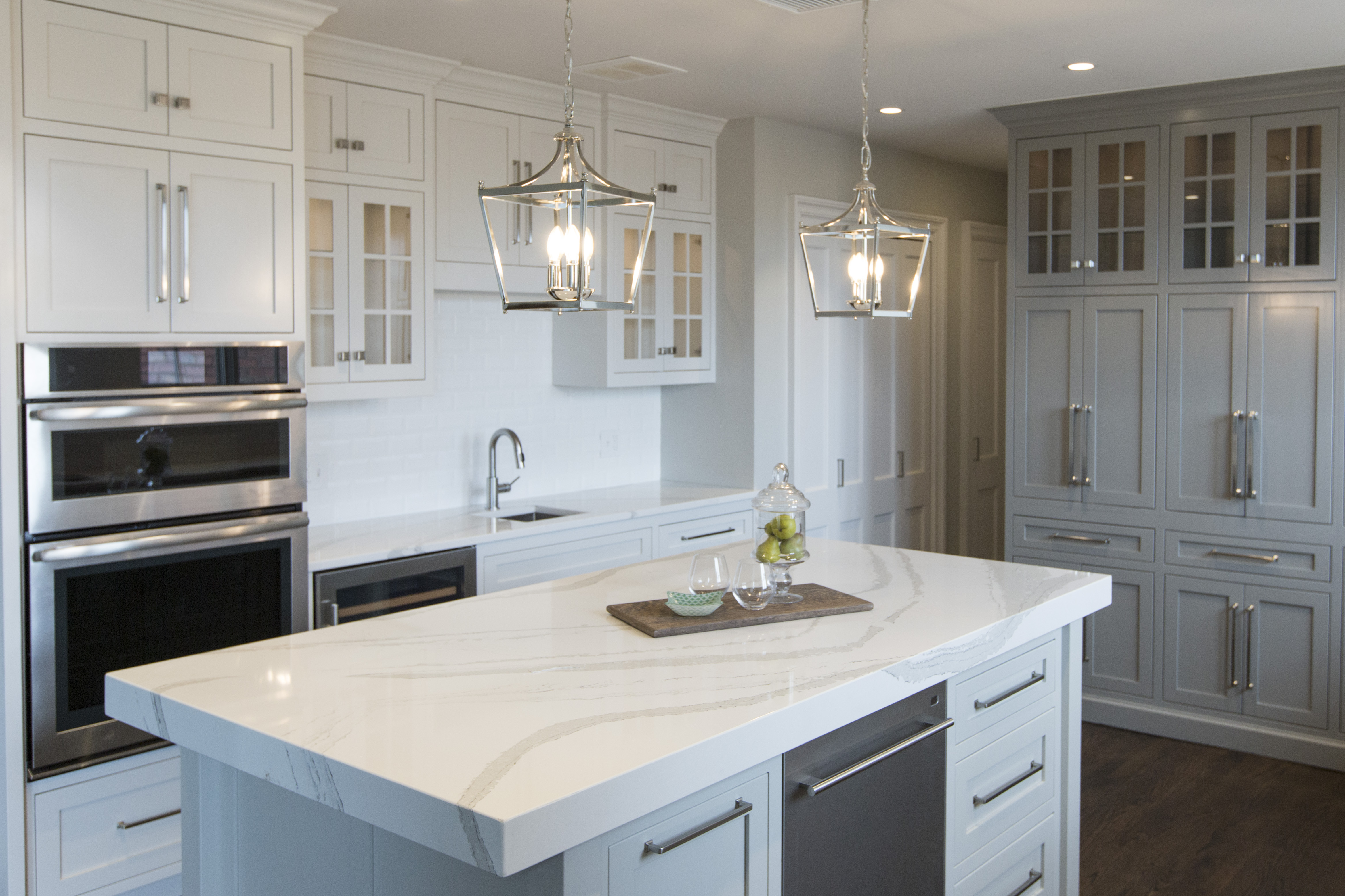
    To start I knew we had to enlarge the kitchen so we took over the tiny adjoining maid’s room shown above to gain a few more feet.

    Our end goal was a large open inviting kitchen full of natural daylight that was a classic so to start we tore down the existing entrance wall (shown on left) to open the kitchen up to the existing dining room and we resized the mismatched windows in each room to flow together as one big window area.

    We also relocated the adjoining dining room to the over sized living area and made the former dining room a hearth area that opened into the kitchen.

    Karen Mills' blog

    To make the rooms feel more expansive but also timeless, we tore out the flooring in the kitchen and wove in new wood floors to match the existing wood flooring elsewhere.

    Next we began to lay out a floor plan that included a gorgeous custom island along with designing custom flush mount European style cabinetry that was also functional and a lighting plan that would make the room pop.


    Karen Mills' blog
    Interior design by Karen Mills/Photography by 29Pixel Studios, LLC

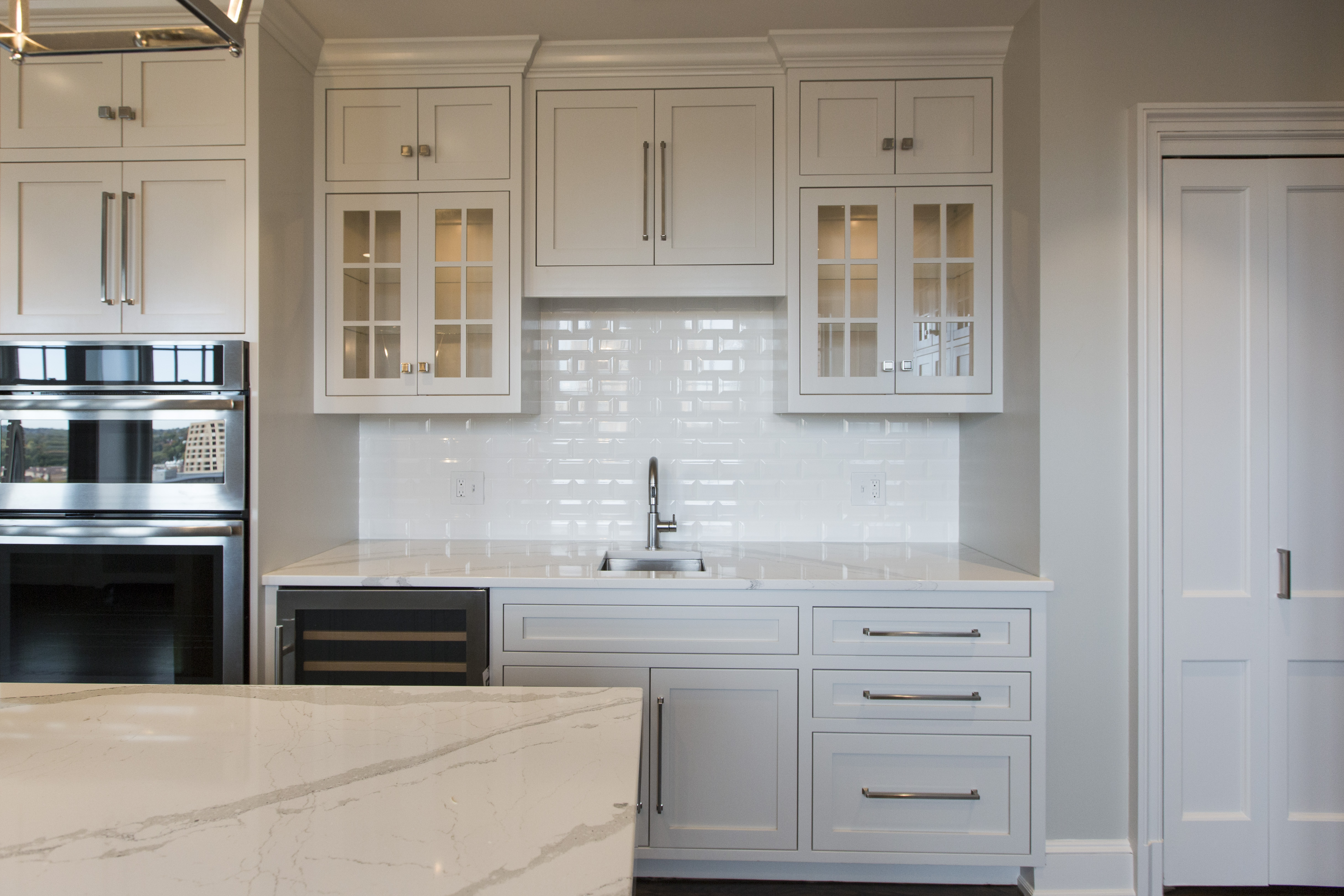
    On the right we designed a beautiful custom stove hood with lit glass cabinetry and large drawers underneath to hold pots and pans.  Plus we took the beveled subway tile to the ceiling to add height and drama to the space.

    Karen Mills' blog
    Interior design by Karen Mills

    In the back we designed a pantry area that disguised the crooked structural wall and added doors that opened to reveal a coffee station and appliance storage along with additional glass lit cabinetry.

    Karen Mills' blog
    Interior design by Karen Mills

    On the left we created a bar area with a wine cooler, additional sink, and storage along with lit glass front cabinetry to hold glassware.

    Karen Mills' blog

    And on the island we added a mitered top to give the beautiful Cambria marble style top even more importance!

    Karen Mills' blog
    Interior design by Karen Mills

    The result – a large open living/work space that lives large and is also functional.

    For more great ideas sign up for our weekly interior design blog here

    Plus become a fan of Kansas City’s interior designer and former host of the Living Large design show, Karen Mills, on Facebook here and let us know how we can make your dream a reality!

    Interior Design/Interior Decorating

    Interior Design: The Making of a Beautiful Bathroom

    Interior Design: The Making of a Beautiful Bathroom

    Karen Mills' blog

    Interior design by Karen Mills

    After working  as an interior designer on over 1200 projects , I’ve realized that most homeowners have no idea the amount of detail that goes into successfully creating a beautiful bathroom redmodel.   That’s why today I’m sharing a NARI award winning bathroom project we designed in a collaborative effort with our clients that’s been featured by Elle Decor magazine and MSN in the United States along with the United Kingdom.

    The clients had a wonderful vision of a Hollywood Glam style bathroom and we helped them turn that vision into a reality, ensuring the bath was  warm, inviting, and up to date.

    Karen Mills' blog

    Since we already had a vision for the Hollywood glam design style, we began by selecting a color scheme from Benjamin Moore.

    shower-layout

    Then we discussed requirements for functionality including layout/space planning, storage, electrical requirements, and more.  And even though we loved the glossy marble finish on the floor, we opted instead for a matte finish to minimize slippage coming out of the zero entry shower or free standing tub.

    Karen Mills' blog

    Karen Mills' blog

    The existing fireplace was not being used, so we decided to replace it with a fabulous custom make up cabinet where our client could relax and get ready.


    Karen Mills' blog


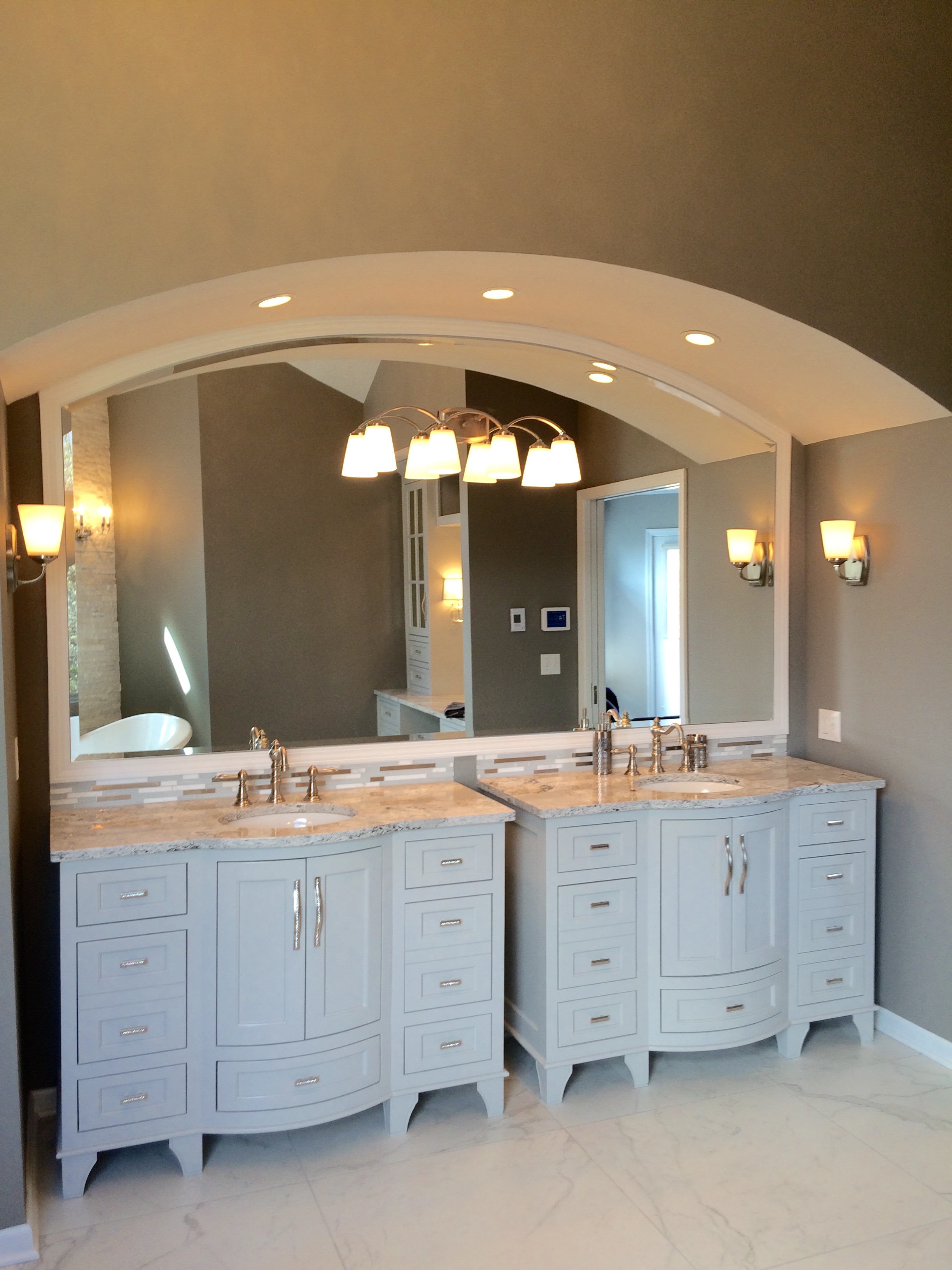
    As we began designing the beautiful custom vanities, we made sure they were functional with drawers deep enough to fit requirements for storage and built in electrical outlets for recharging toothbrushes/razors.  For the custom make up cabinet, we opted for mirrored fronts instead of glass on the upper cabinet doors to hide toiletries and make up.

    finishes

    Marvel floor tile by Atlas Concorde

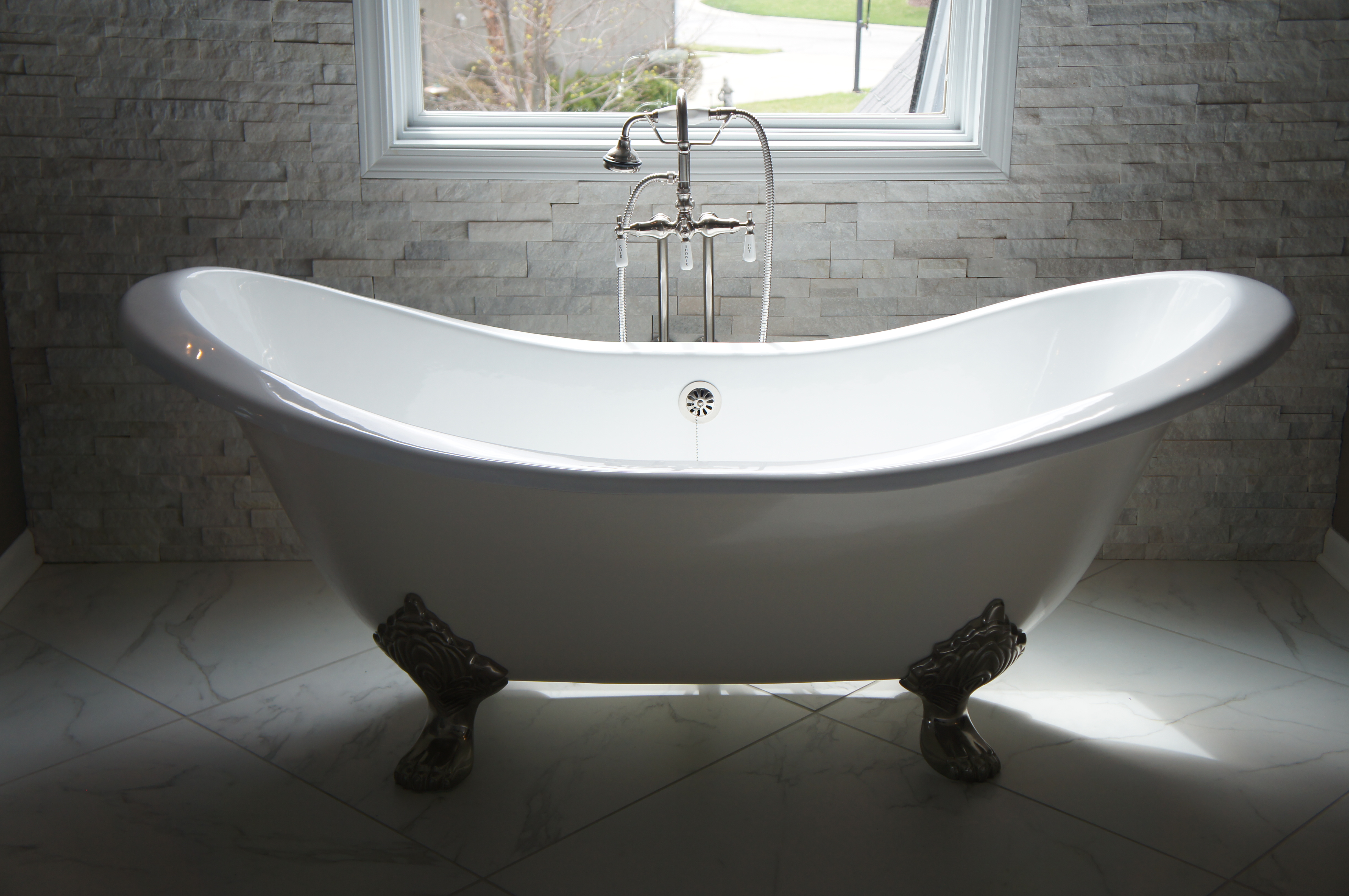
    Once the beautiful custom cabinetry design was finalized, we begin selecting the other finishes for the bathroom including a gorgeous stacked stone with embedded crystals for an accent wall behind the tub, a free standing tub, counter tops, back splash, floor/wall tile, plumbing fixtures, pulls, and light fixtures along with a lighting plan to show it off.

    shower-in-progressKaren Mills' blog

    But we didn’t stop there.  Once the walls were up, we sketched plans on exactly how to layout all the different colors and sizes of tile we had selected so  we would have just the look we wanted.

    master-bath-bench-1

    master-rock-wall-with-lighting-edited-for-website

    The result?  A beautiful one of a kind award winning bathroom that our clients enjoy every day that helps reduce stress and make life better!

    Karen Mills' blog

    Interior design by Karen Mills

    For more great ideas and photos, sign up for our weekly design blog here!

    plus become a fan of Kansas City’s designer and former host of Living Large design show, Karen Mills, on Facebook here.


    vanity-top-closeup