Interior Design/Interior Decorating

7 Tips for Hiding Your Television in a Room

How to Disguise Your TV
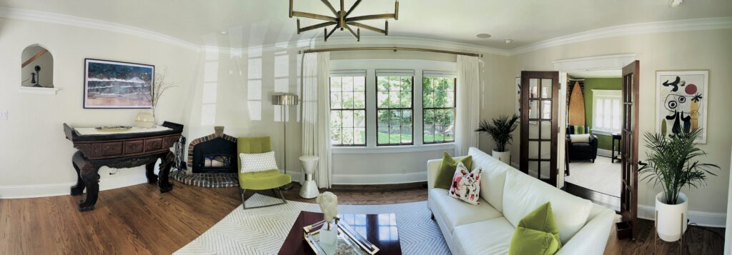
photo example
Interior design by Karen Mills

  Let’s face it.  Even though we often love the convenience of a large flat screen TV in rooms, we don’t always want them to the focal point of our space because they can detract from the beauty of the interior design.  As an interior designer, I usually avoid putting TVs on display in any room except a home theatre or similar space unless it’s to make the TV a focal point.  Read on below to learn more.  

  1.  Disguise television with a frame around it.  We’ve done this for years in our interior design projects to minimize them and make the interior design the star of the room.
  2. Stash it with a TV lift.  My favorite way to hide a television begins with storing it in a lower cabinet on the wall, in a free-standing piece of furniture or in a cabinet at the end of the bed.
Interior design by Karen Mills

3. Conceal your TV with art.    In this interior design project we did, the television is hidden behind two wood panels painted by an artist that swing open to reveal the TV.   For more great photos and interior design sign up for my blog here or click below for four more tips. 

To learn more about DIY interior design, check out our online interior decorating membership – The Decorating Pro.

plus become a fan of Kansas City’s interior designer and former host of the Living Large design show, Karen Mills, on Facebook here!  

And to learn more ways to disguise your TV, read the article I wrote for Houzz – 7 Clever Ways to Conceal Your Flat Screen.  
Interior Design/Interior Decorating

Interior Design: 5 Things to Avoid When Remodeling a…

Functional Kitchen Design or Remodel Tips

Are you ready to refresh or remodel your dated or ugly kitchen? If so, read on for professional designer tips on what to keep in mind.

kitchen example
Interior design by Karen Mills
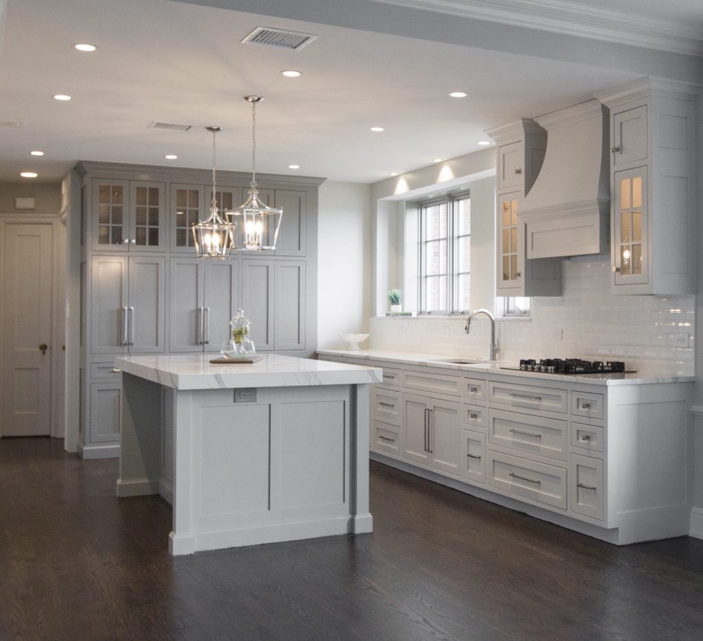
  1. Not bringing in a professional – Hiring a professional kitchen designer with experience who creates kitchens and bathrooms for a living can help you avoid costly mistakes, free up your time, and create the space of your dreams, while ensuring your space is functional. In this kitchen design we opened up the wall between the maid’s room and existing kitchen in this high-rise building to enlarge the space. But we didn’t stop there. We took the two mismatched windows from each existing room and right sized them to work seamlessly together for a more cohesive design and to bring in more light. Then we added wood flooring and beautiful lighting to give the horribly dated dark existing kitchen new life after opening up the wall to the dining room next door so we could create hearth room for relaxing and entertaining.
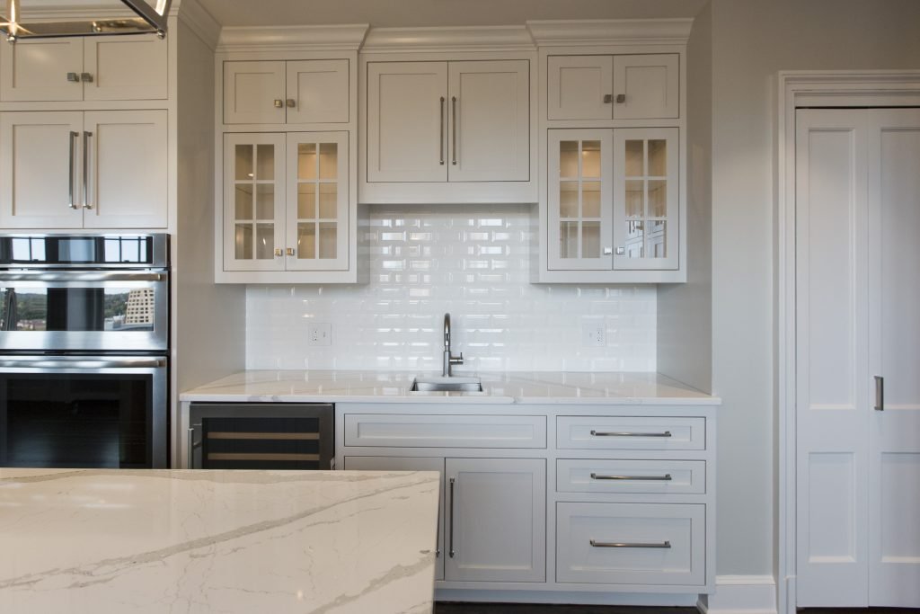
  2. Wasting storage potential – Countless storage options exist so there’s no reason to waste space in the kitchen especially with the adaptive kitchen storage units that make drawers and cabinets more functional from trash pullouts to roll out shelves. Here in this fabulous historic Walnuts condo where space is at a premium, we added pegged drawers under the stove for pots/lids, hidden pop open storage under the island. and used the extra space we gained straightening out a crooked back wall to create a coffee bar and pantry storage cabinet that’s draws you into the space.
photo example
Interior design by Karen Mills

3. Insufficient or appropriate lighting – If your new kitchen doesn’t have a mix of general, task, and accent lighting, it will tend to be a little lackluster in appeal and possibly function too.

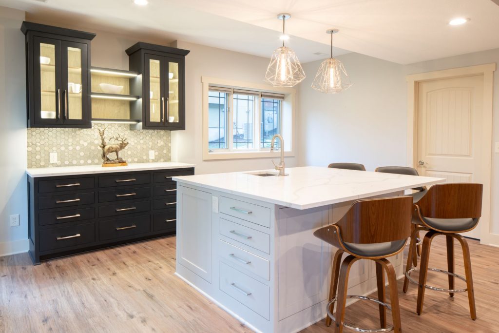
Here in this basement bar kitchen design, I created a space with can lights in the ceiling for general lighting, rope lighting inside glass cabinets/shelves for accent lighting to enhance the design, and mini chandeliers over the island that not only provide accent lighting but also task lighting for working in the kitchen.

Interior design by Karen Mills

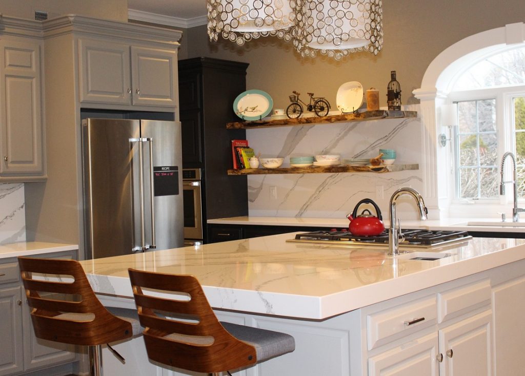
4. Work Area Not Functional – Creating a functional layout is the first step to kitchen design whether you’re designing for a new home or doing a kitchen remodel. Here in this kitchen a work area with the stove, refrigerator, and sink easily accessible within a few steps of each other makes cooking easier and less frustrating.

Kitchen design by Karen Mills

5. Work Area Too Cramped- As an interior designer I’ve lost count on how many times I’ve walked into a home that didn’t have enough workspace. Even though the recommended distance between an island and wall cabinetry is at least 42″ I usually I find that the minimum required distance of 36″ is often the reality of existing kitchens which creates a cramped space that’s not very functional because you can barely open the oven door or get between rows of cabinetry to access a drawer. Other issues I often encounter with interior design clients who have existing kitchens are drawers or refrigerator doors can’t open fully to function correctly.

Here in this kitchen our interior design firm designed, we ensured we had at least 42″ between cabinetry in this small kitchen so everything was easily accessible.

For more inspiration, ideas, and photos, sign up for our semi-monthly interior design blog here.

Or sign up for our exclusive weekly email newsletter where we give you even more insight into interior design simply drop us a line at karen@karenmills.net or reach out to discuss your design project now.

Interior Design/Interior Decorating

Interior Design: 7 Ways to Space Plan an Open…

Tips for Making Sense of Your Living and Dining Room Open Floorplan Design by using an Effective Room Layout

photo example

As an interior designer who’s worked on over 1300 projects, I’ve noticed the number one interior design dilemma that our clients struggle with begins with how to space plan, especially in an awkward space or an open concept floorplan. Read on for my seven design secrets to space planning more effectively in an open floorplan.

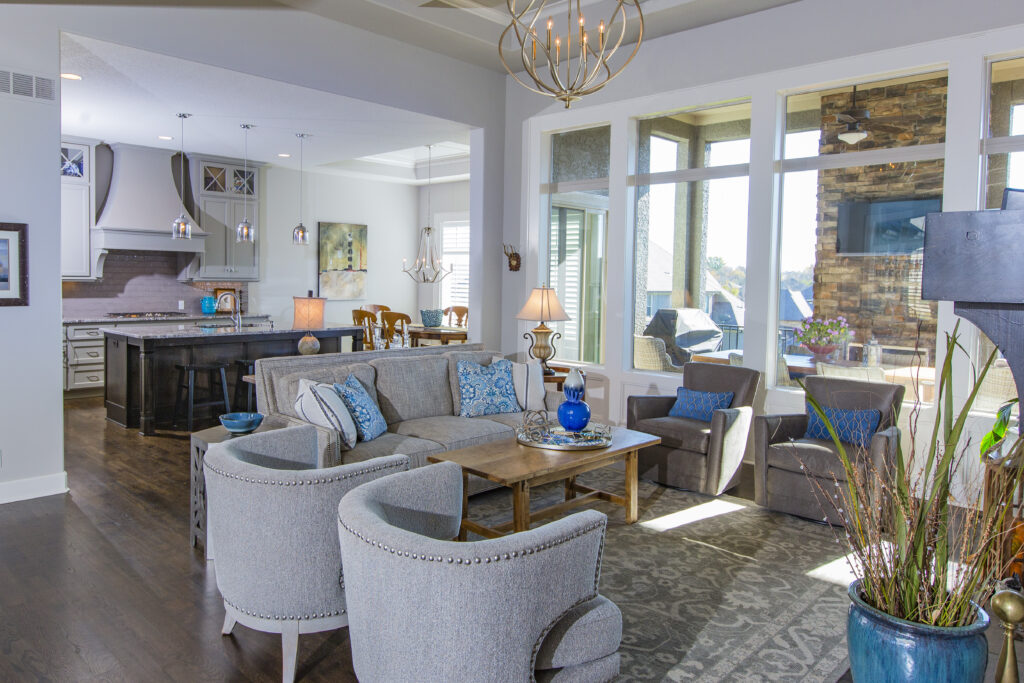
  1. Create Zones – The first step to space planning an open living area is to determine the areas or zones you need to function well in the space whether it’s a TV watching area, conversational grouping, dining area, or work area. But remember when you’re creating zones to ensure they fit naturally into the architecture of that space.
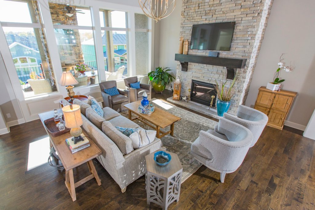
  2. Emphasize Focal Point – Once you’ve laid out the zones and their functions, you need to determine the focal point for each one like the fireplace above, a fantastic view, or a focal point you’ve created with a furniture grouping (vignette).
  3. Place furniture in a cozy grouping – As an interior designer I recommend starting with your living room zone(s) by creating groupings that emphasize conversation with the main sofa or sectional facing your focal point such as a “L” shape, “U” shape configuration. Here in this living room the sofa faces the fireplace focal point while the wingback chairs emphasize the focal point and encourage conversation with people seating on the sofa.
  4. Create cohesiveness with color, design style, rugs, and finishes – When placing furniture in cozy groupings, ensure that you have repeated the same colors and overall design style to make a harmonious space, while layering a rug underneath as shown in this photo.
  5. Leave ample walkways – As you’re creating these zones, remember to leave 3-4′ wide walkways between each one to get from one zone to another, while also leaving room to weave through conversational areas or push back chairs at a dining table.
  6. Use dividers to further separate space when needed, whether it’s a room divider, pocket doors, glass wall or barn doors. Other great ways to divide space when remodeling or building can include different ceiling treatments, ceiling height, architectural features, or even tall elements like trees.
  7. Layer in Lighting – Chandeliers, sconces, lamps, and accent lighting also provide another way to divide a space visually, while adding an ambiance and task lighting when needed.

To learn more about space planning, click here!

Interior Design/Interior Decorating

Interior Design: Creating Space for a Home Office

How to add a Workspace at Home When You Don’t Have a Dedicated Room

design example
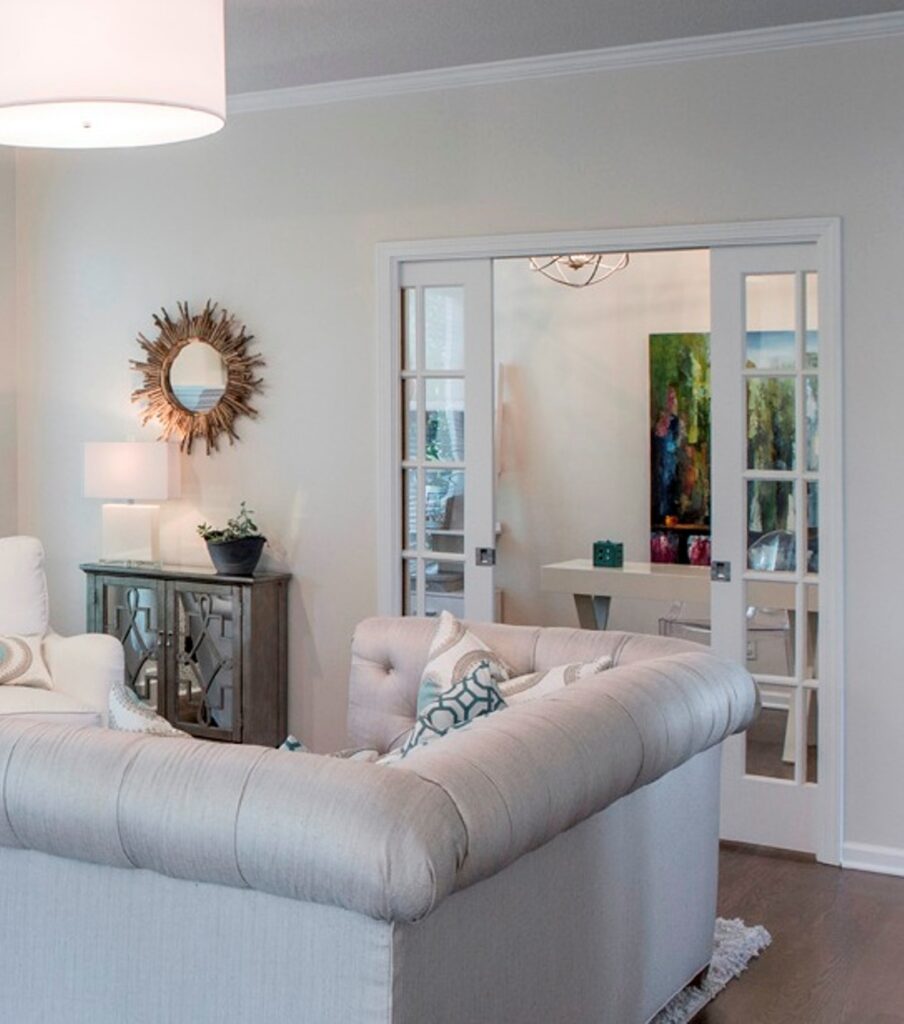
  1. Add French, pocket, or barn doors to close off part of an open floorplan. – In this home office hidden pocket doors slide together to shut off this office space next to the living room to create a cozy area for getting work done without being disturbed.

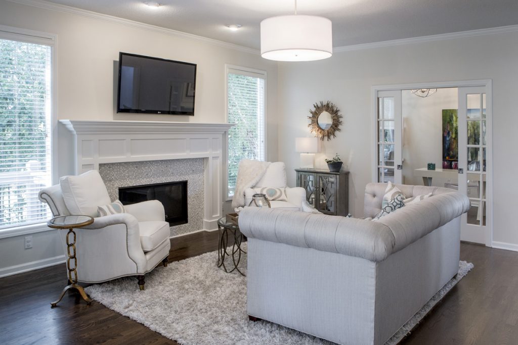
If you prefer to have your home office in full view, you can also opt for French door style pocket doors that can make your overall living space feel larger like this interior design project we designed.

If you prefer to have your home office in full view, you can also opt for French door style pocket doors that can make your overall living space feel larger like this interior design project below we designed.

2. Hide your workspace behind built in cabinetry or in a closet. – As an interior designer I’ve helped numerous clients solve the issue of where to put a home office. One of my favorite solutions as an interior designer was a home office we designed behind kitchen cabinetry as part of a remodel. And we disguised the doors to look like cabinetry which also functions nicely as a safe room.

Other solutions our interior design firm has created includes hiding an office under the stairs, in a niche area on a landing or loft, or inside a step-in closet where you can just shut the door to hide the space.

3. Introduce a piece of furniture that can act as a desk along with storage for your office necessities. Options could include an office armoire or dining table, for example. For one client, our interior design firm helped them take over their rarely used dining room by utilizing the table as a desk for their laptop and custom built in cabinetry on the wall behind to hide everything else. The bottom of the cabinetry held office items, while the top half provided display space for the client.

If you’re looking for more interior design, decorating, or remodeling inspiration, watch our free One Day Makeover video tutorial now.

Plus become a fan of Kansas City’s interior designer and former host of the Living Large design show, Karen Mills, on 
INSTAGRAM and FACEBOOK here.

Interior Design/Interior Decorating

Interior Design: 3 Ways to Brighten a Dreary Living…

Tips for Creating a More Cheerful Space

photo example of topic
  1. Paint walls and ceilings a light color. In this internationally published living space, we designed, we painted the dark walls light, recovered the sofa and chair, slipcovered the armless chairs, and layered a lighter rug underneath the hearth area, completely transforming the space from dark and dreary to light and dreamy.

photo example of upholstery

2. Remove dark window coverings including drapery fabric or hard window treatments that block much of the light. In this hearth living area, the windows are only covered by white blinds, keeping the room feeling light airy.

photo example of partition

3. Replace or recover dark upholstery and rugs. In this living space we recovered all the dark heavy upholstery with lighter shades of fabrics and layered in a lighter rug to bounce additional light around the room.

For more great interior design ideas, sign up for our design blog here plus become a fan of Kansas City’s interior designer and former host of the Living Large design show, Karen Mills, on Facebook  or Instagram now!

We would love to hear from you and any topics you would like to be covered that haven’t. And if someone you know could benefit from this helpful information, we would love to have you pass it on!

Interior Design/Interior Decorating

LEARN TO DECORATE AT YOUR OWN PACE FROM A…

A BRAND-NEW ONLINE SUBSCRIPTION FOR TEACHING DESIGN LOVERS HOW TO DECORATE LIKE A PRO

photo of karen designing
THE DECORATING PRO

I LOVE HELPING OUR DESIGN CLIENTS AVOID COSTLY MISTAKES, SAVE TIME, AND REDUCE STRESS, WHILE GIVING THEM THE INTERIORS OF THEIR DREAMS. AND NOW I LOOK FORWARD TO TEACHING YOU HOW TO CREATE A BEAUTIFUL INTERIOR TOO!

Karen Mills

Ever dreamed about:
➪ a decorating or staging business?
➪ designing your own home like a pro?
➪ learning a new hobby online?

We can help you create a master design plan to win the battle against overwhelm or costly mistakes so you can avoid failure and achieve success easier and faster.

In this exciting membership subscription, we will teach you how to decorate (or stage) in a way that’s not only beautiful and showcases your personal style, but also helps you create more value in your home and provides the perfect space to unwind and relax.

decorating example

Do you ever feel like you have analysis paralysis because you want to avoid making a costly mistake that will haunt you for years to come? Are you feeling overwhelmed or stressed at the thought of trying to figure out how to design your room? Are you wishing you had someone to bounce ideas off? Or just want to refresh your home with existing furnishings, but don’t know how?

We’ve all been there at one time or another. But now you have the opportunity to gain the confidence to decorate (or stage) along with being part of a community of like-minded students who are there to support you along the way.

You will also have exclusive access to a globally renowned interior designer and state certified instructor.

So, if you’re ready to create a beautiful home, learn a new hobby or to start a trade as a professional decorator/ home stager, click THE DECORATING PRO now to learn more and sign up for our Founding Member Waitlist, where for a limited time you get a low guaranteed price for life.

Interior Design/Interior Decorating

Interior Design: Tips for Incorporating Your Favorite Color

What Your Favorite Hue Says About You and How to Use in Your Space

photo example
Room courtesy of Curated Kravet

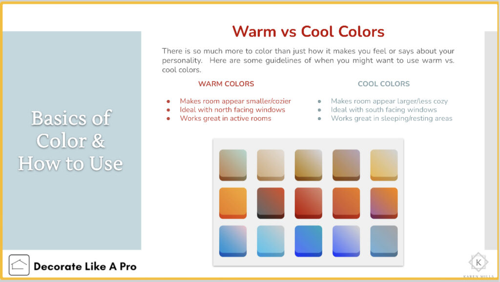
Did you know that your favorite color gives experts insight into your personality type? As an interior designer who’s worked on over 1300 project, I can usually get an immediate sense of someone’s personal style by looking at their outfit or by walking through their home.

Everyone experiences color in different ways. So, as we progress through life, we each end up with our own unique color story based on our experiences.  Lea Eiseman, the world’s leading color expert and a regular guest on my former design show Living Large, shared why that’s true in one of her renowned color books, “…much of color knowledge is based on instinctive responses, cultural conditioning, and those aspects of color that we seem to absorb without much conscious thought.”

Read on to gain insight about your favorite color, what it says about you, and ideas for injecting that color into your home’s interior.

Karen Mills' blog
Photo courtesy of Kravet

RED

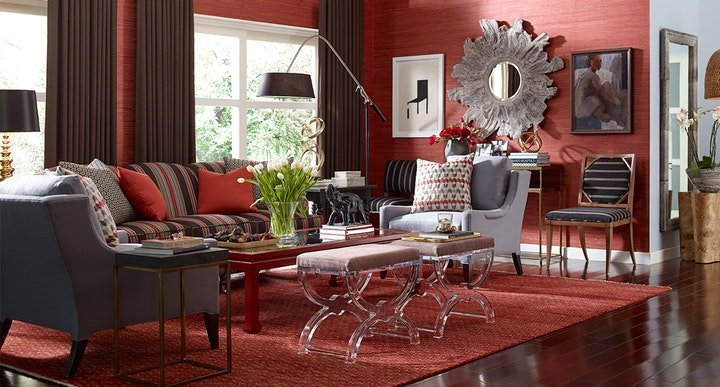
If you love red like I do, you likely possess a passion and intensity that others don’t possess for living life to the fullest. You’re exciting, daring, and spontaneous, with an inner drive to excel in everything you touch.  The color red, associated with blood, instantly raises your blood pressure and grabs your attention.  So, remember when creating a new interior design that a little bit goes a long way in a room as demonstrated in this all-red room that demands your attention. Alternately, soft pink lovers tend to be charming, peace loving, and romantic types who carry some traits that are similar to the red and bright pink personality.

Karen Mills' blog
Interior design by Karen Mills featured in Architecture Today Interior Design book

BLUE

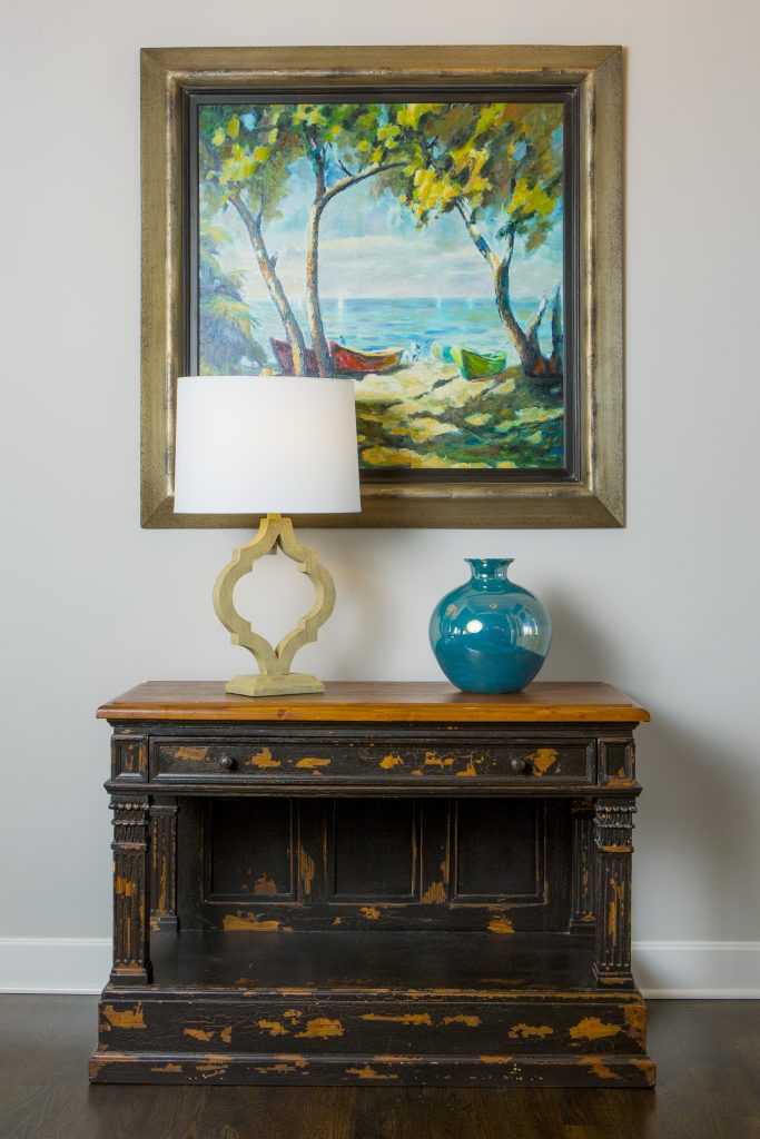
An extension of sky and water, blue exudes stability and calm making it a perfect color for bedrooms or other areas where you want to unwind and relax. Lovers of this color tend to be dependable, responsible citizens who do the right thing. No wonder blue still remains the favorite color of men! In this entryway, a watery blue landscape painting sets the tone for the rest of the living area while the blue vase reinforces this gorgeous accent color.  

YELLOW

Yellow like a ray of sunshine portrays warmth, cheerfulness, and optimism making it a wonderful hue for a cheery kitchen, sunny living area, or any interior lacking sunshine and warmth. Huge fans of yellow are optimistic, warm, and playful, while also being inquisitive and encouraging to others.

photo example
Interior design by Karen Mills

Interior design by Karen Mills featured in Design Icons book

ORANGE

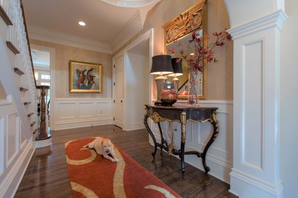
As an orange lover, you have an enthusiastic zest for life, outgoing personality, sense of humor, bright outlook, and longing for adventure. Orange, the color of hunger, fits seamlessly into a dining area or kitchen where hungry people often come. But that’s not all as you can see in this foyer where we sourced a Mattini painting, pulling out the orange hue as as an accent color on our custom designed rug, original ceramic art piece, and flowers, while also repeating a golden hue from the art on the wool rug and handmade chevron wallpaper to add more interest.

Interior design by Karen Mills featured in Design Icons book

GREEN

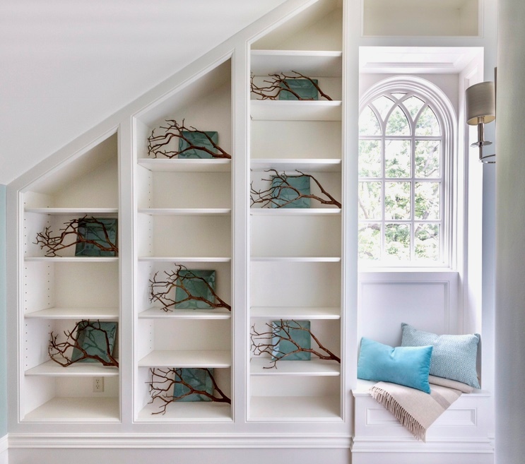
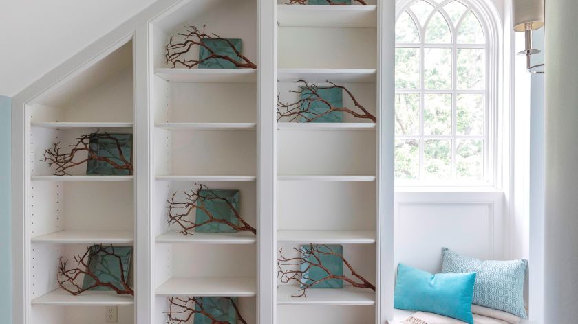
Green, the color of nature, exudes calmness and warmth, making it a perfect color for calming bedrooms or interiors when a more relaxed vibe is wanted.  Enthusiastic fans of green are usually warm, kind, and charitable people who like to give back to their communities. Green fans also bring stability and loyalty as additional attributes. Here in this stunning foyer featured in the international Design Icons book, that we designed, the blue green plates with branches overlaid on the white shelves were repeated to create a dramatic pattern, but also created a calming entry into this third floor foyer aptly named The Flat after our client’s London home.

PURPLE

A complex and creative type of individual, purple lovers are fascinating observant individuals who often have a generous spirit and artistic flair. Purple, the favorite color of most children, also has a mysterious air about it making it popular with artists or creatives too. In interiors purple usually works best as a light or a very dark almost neutral hue wall color or as an accent in any shade.

Interior Design by Karen Mills featured in Architecture Today Interior Design Book

BROWN

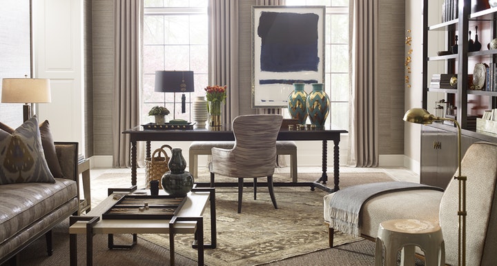
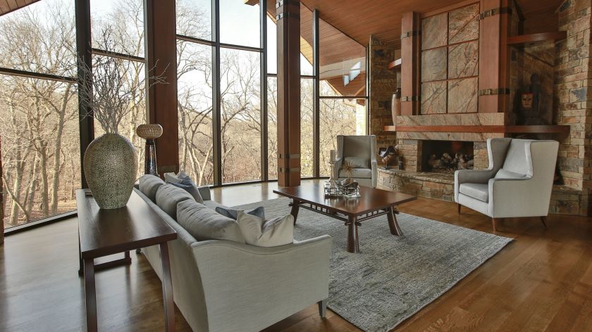
Brown personalities tend to be down to earth, stable, and in harmony with life around them, while still appreciating quality. Brown lovers like to keep things simple, secure, and peaceful, but that doesn’t mean they aren’t cosmopolitan. Brown hues work great for your interior if you’re looking to create a grounded space that’s also cozy and inviting whether its a living room, dining room, den, or even a bedroom. Beige, a lighter version of brown speaks of someone who is warm, reliable, and doesn’t often rock the boat. As a light neutral this color can be introduced almost anywhere including combining it with gray for a cool/warm color combination. Here in this stunning rustic great room featured in the international book Architecture Today Interior Design, that we designedwarm browns wrap around the room like a big hug, creating a welcoming feel. While in contrast calming blue hues on the area rug and pillows, help balanced out the color, adding a soothing feel.

White

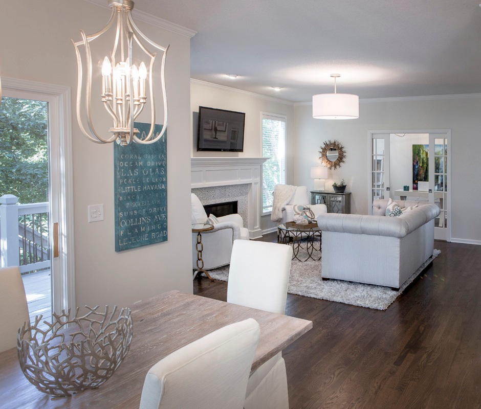
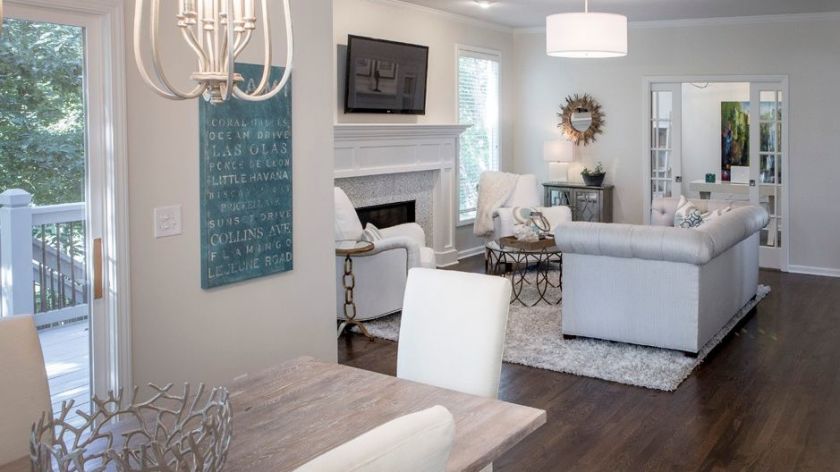
Did you know that white is the sum of all other colors combined? Isn’t that amazing? As an interior designer I love that white can do so much in a room’s interior design from creating more contrast and bouncing light around a room to visually expanding it.  But white also represents innocence, cleanliness, and purity which is why lovers of the white color often have clean fresh organized spaces with a pure aesthetic. In this hearth area we darkened the floors to contrast against the white walls and trim we introduced to create more drama. Then we continued to lighten up the interior by recovering heavy dark fabrics on the upholstery with lighter ones, slip covering the dark leather dining chairs, layering in pillows with white backgrounds, updating the fireplace with a white/gray marble tile, and adding a kitchen table that had been whitewashed a lighter color.

Gray

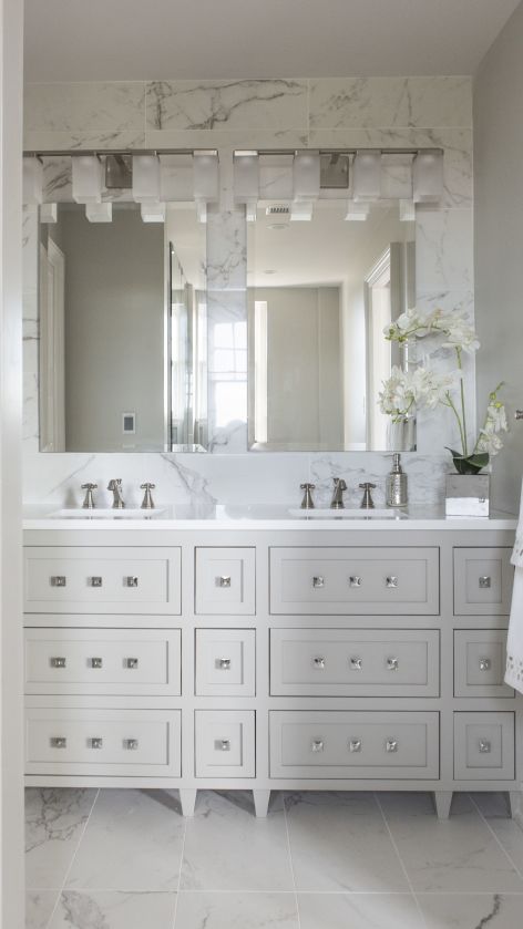
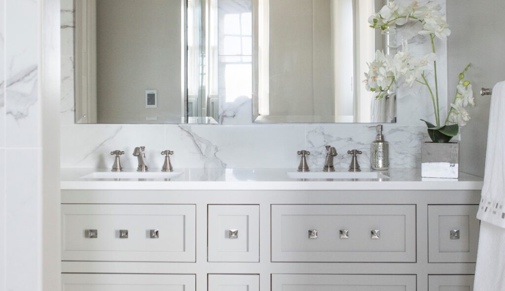
Gray personalities seem content, cool, and collected, often preferring to stay out of the limelight.  Instead, they opt for safety, security, and practicality. That’s why I believe as an interior designer that gray color schemes have become so popular at home for years because this color creates a calm respite from the outside world and works well in almost every room. In this gorgeous high rise master bathroom we designed, the gray in the Italian marble style tile repeats again on the custom designed vanity and walls. White quartz counters, square knobs and a tiled wall enhance the look of this small but stunning space.

example of blog topic
Interior design by Karen Mills

BLACK

Did you know that black is completely void of color?  But as we know the black suit signifies power, sophistication and status in the business world.  Black hue aficionados also seem confident in their ability to hold a conversation, clever in their communication abilities, and make security a top priority in their lives.

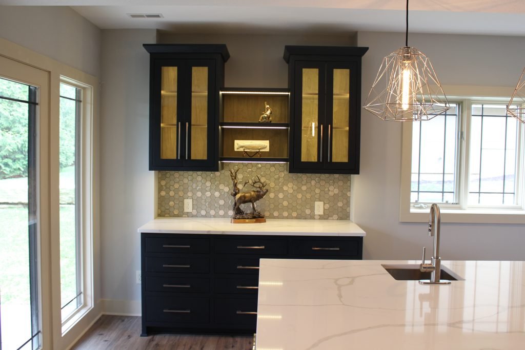
Black is a wonderful color for interiors, especially when combined with white and can used throughout your interior from living, dining, and powder rooms to home theaters, or on doors/trim to create a dramatic look. Here in this bar area, the stunning black cabinetry steals the show with its dramatic color juxtaposed against the warm wood interiors and lit glass cabinetry.

But what if your favorite color is a combination of two different colors? Then you likely have some personality traits from both colors.

To summarize, colors whether worn or used in your interior reveal insight into your personality and life story. And when you utilize your favorite color in your home it can bring back wonderful memories that cradle you in comfort whether it’s on the walls, ceilings, floors or furnishings.

For more great interior design ideas, sign up for our design blog here! plus become a fan of Kansas City’s interior designer and former host of the Living Large design show, Karen Mills, on Facebook  and Instagram now! And if you feel someone you know could benefit from this helpful information, please pass it on!

Interior Design/Interior Decorating

Interior Design: Tips for Selecting the Correct Size Rug…

Guidelines for Purchase the Right Size Area Rug for Your Living, Dining, and Bedrooms

rug example
Interior design by Karen Mills
  1. Living Room Rug Size – When selecting the right size rug for your living room, look for a rug that will hold all your furniture, but if that isn’t in the budget then ensure the feet of your upholstery sit on top of your rug at a minimum like shown here.  That’s important because a smaller rug or one that doesn’t sit up the feet of your upholstery will feel disconnected as though it’s just floating in your room.  Ideal sizes for living room rugs usually start at 8 x 10 or 9 x 12 sizes.

  3 Tips for Getting Cozy with Area Rugs

Karen Mills' blog rug example
Interior design by Karen Mills

2. Best Bedroom Rug Size – Interior design clients often have difficulty with understanding the concept of flipping an area rug the other direction when placing it under a bed but why that direction is so effective is because it allows the bedside tables to be included so they feel like a part of the focal point, making a more powerful statement.   When placing your rug under the bed lay it perpendicular to your bed ending right at the edge of the nightstands but not under them.  That placement will allow a few feet of the rug to still show beyond the base of your rug like shown.  Ideal rug size for a king size bed would be 9 x 12.

Karen Mills' blog rug example
Interior Design by Karen Mills

3. Best Dining Room Rug Size – As an interior designer I often see rugs that are just too small under the dining room table. Calculating this rug size can be tricky because you want two feet on each side of the table to allow room for sliding back the chairs from the table, but you also need to ensure the final rug size fits into your space like the one shown here. For more design ideas and photos, sign up for our weekly interior design blog here plus become a fan of Kansas City’s interior designer and former host of the Living Large design show, Karen Mills, on Facebook  and Instagram now! If you feel someone you know could benefit from this helpful information, pass it on.

Interior Design/Interior Decorating

Interior Design: 3 Enduring Design Trends

Porch photo
Interior Design by Karen Mills

  Post pandemic life at home has changed dramatically for most people around the world both inside and outside with work/life balance issues and the ability to destress becoming even more important.  Read on for what this interior designer believes is here to stay.  

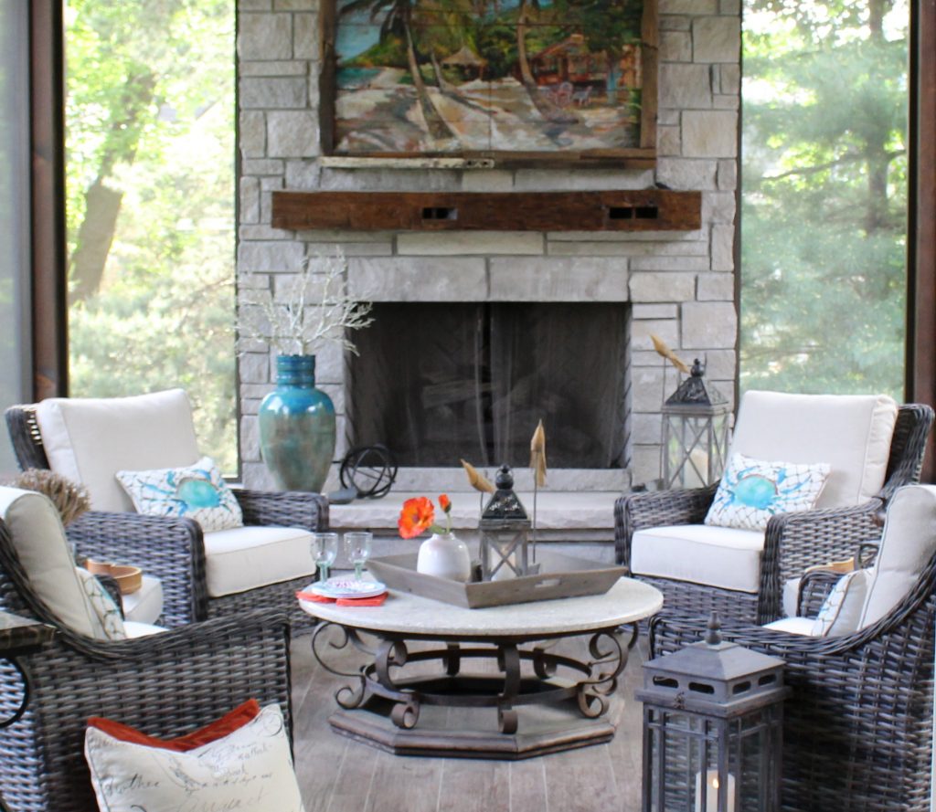
  1. EMPHASIS ON OUTDOOR ROOMS – Having the ability to go outside and just relax is key to our mental and physical well-being.  Not only does nature have the ability to create a calming effect on us emotionally, but it’s good for our physical health to get a little sunshine and Vitamin D every day, if only for a few minutes.  So why not create an amazing outdoor room like this screened in porch shown here with a heated floor and fans to enjoy almost year-round or even just a small space outside your home with a chair or two and table to just relax.
  2. ADAPTABLE INTERIORS – Making the most of each space is crucial now that we find ourselves often living and working in the same space.   When I was in the thriving metropolis of Istanbul years ago, the biggest difference I noticed about the interiors was what I call “Transformer Furniture”.   Sofas had hidden storage under the cushions and transformed into beds when needed as did chairs.  Everything had a functional purpose including screened in porches where clothes were hung to dry besides providing a space to enjoy the outdoors. Here in the United States, we need to shift our thinking to create more adaptable spaces or rooms also.  Using French or barn doors to close off part of the living room for an office, home theatre, or library gives you more options as situations change in your household.  Other ways to make your space adaptable could be hiding a desk area inside kitchen cabinetry, adding a murphy bed to a guest room you now need for an office, or enclosing a niche with barn doors in the basement to hide bunk beds for the grandkids.
example of modern
Interior Design by Karen Mills

3. MORE CONTEMPORY MODERN DESIGN STYLE AESTHETIC – Furnishings and finishes in a lighter airer feel help create a more modern look that can be achieved by layering in more furniture with legs instead of visually heavier pieces.  Layering in more furniture with simple lines and more textural tone on tone finishes instead of busy patterns also help give a room a more modern vibe.  Of course, nature inspired patterns and real plants indoors continue to be popular with the emphasis on outdoors. Here the homeowners wanted to keep their beloved family heirlooms, but also wanted to bring a more modern updated look to their new house with an open floor plan.  That’s why we integrated more modern furniture into the room to give the space a more timeless appeal.

  If you’re looking for more custom interior design, decorating, or remodeling inspiration, ideas, and photos, sign up for our bi-monthly interior design blog here Plus become a fan of Kansas City’s interior designer and former host of the Living Large design show, Karen Mills, on INSTAGRAM and FACEBOOK here!