Interior Design/Interior Decorating

Interior Decorating: 3 Ways to Cozy up Your Bedroom

Often we take sleep for granted until we start to have problems with concentration, alertness, or our overall ability to function well. Then good sleep becomes more of a priority. Read on for 3 ways to create a nest like atmosphere in your bedroom that’s conducive to better sleep.
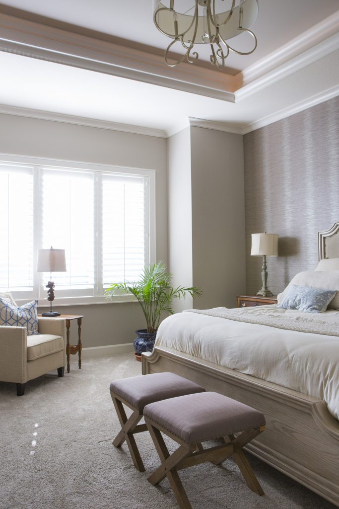
Interior design by Karen Mills featured in international book titled Architecture Today Interior Design
  1. Simpler Bedding and Patterns As an interior designer in Kansas City I’ve used simple tone on tone patterns and texture in bedrooms for years in everything from fabulous washable linens from Italy to textured velvet or sheared fabrics like we’ve seen recently in fashion wear. Here in this Overland Park bedroom Italian bedding from Terrasi Home on the Plaza in simpler patterns, textural finishes and clutter free space create a stress free environment where we can unwind and relax.
Karen Mills' blog
Interior design by Karen Mills featured in international book titled Architecture Today Interior Design

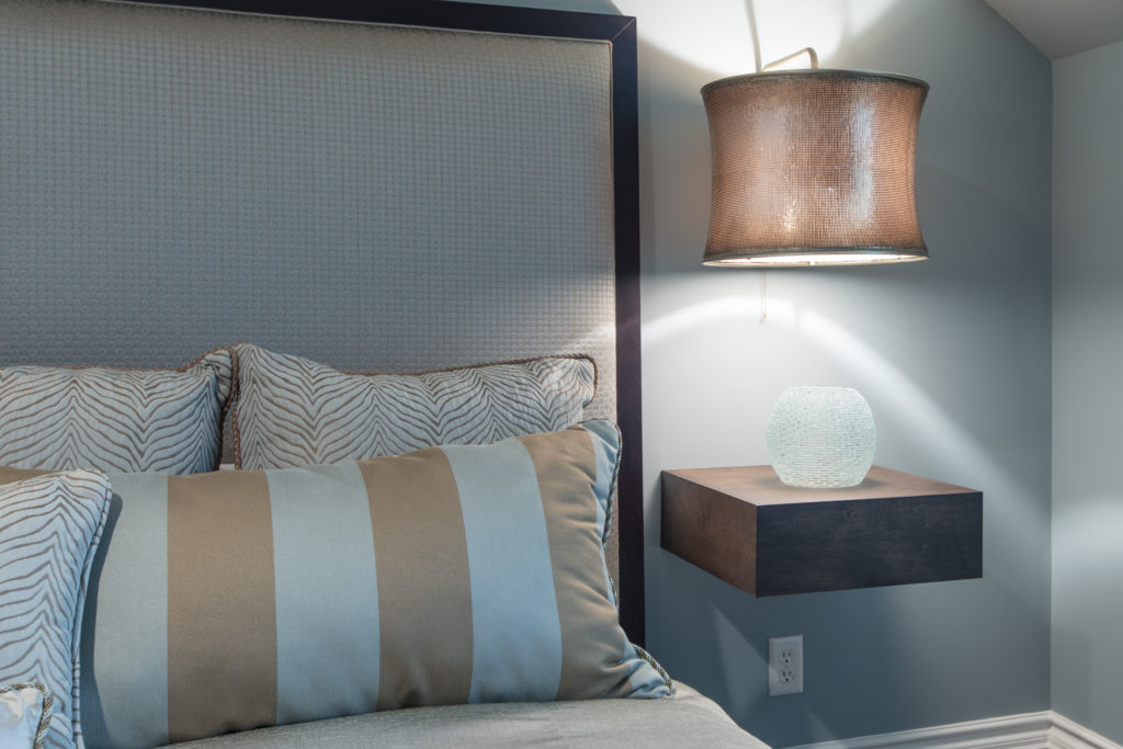
2. Cozy Beds  Beds that envelope us will continue to be popular whether its are a four poster bed, an upholstered bed like this guest room in Mission Hills, or a fabulous combination of both. In this guest room calming colors and patterns, low lighting, and clean lined furnishings enhance the overall feel, creating a beautiful interior design.
Karen Mills' blog
Interior design by Karen Mills featured international book titled Design Icons

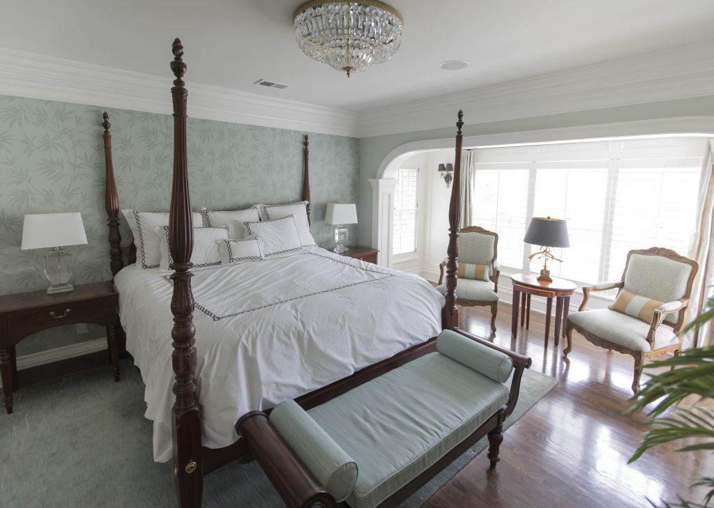
In this bedroom we designed a four poster bed creates a cozy feel
while the wallpaper, area rug, upholstered bench, and simpler fabrics on the chairs beyond enhance the relaxed inviting feel of this beautifully designed master bedroom in Mission Hills.
Karen Mills' blog
Photo courtesy of Curated Kravet


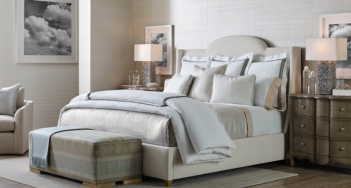
3. Textured Walls  Painted accent walls have been a craze for years but wrapping the whole room in textural walls are becoming more popular. In this interior design space featured by Curated Kravet an upholstered bed, area rug, bench, throw, and bedding add to the cocoon feel created by the gorgeous textural walls enveloping the space.

For more inspiration, ideas, and photos, sign up for our weekly interior design blog here.

For more information on how to get better sleep and create a healthier environment, learn more at SLEEP BETTER LIVE BETTER now!

Plus become a fan of Kansas City’s interior designer and former host of the Living Large interior design show, Karen Mills, on 
INSTAGRAM and FACEBOOK here!
Interior Design/Interior Decorating

Interior Decorating: The 3 Secrets to Monochromatic Living Room…

Custom design by interior designer Karen Mills – Overland Park
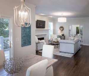
  1. Choose One Color Hue – When an interior designer says the word hue, we are referring to a color family such as blue, white, or black, for example. By focusing on one color like the white we selected for this family room area, you can make a huge impact. Here the white colors vary from walls and trim to finishes, furniture, and floor coverings.

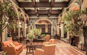
2Use a softer variation of color hue on upholstery or walls. In this lobby living area space, a darker color of pumpkin grounds the floor, while lighter upholstery fabrics and tile on pillars repeat the color scheme

photo example
Courtesy of Kravet

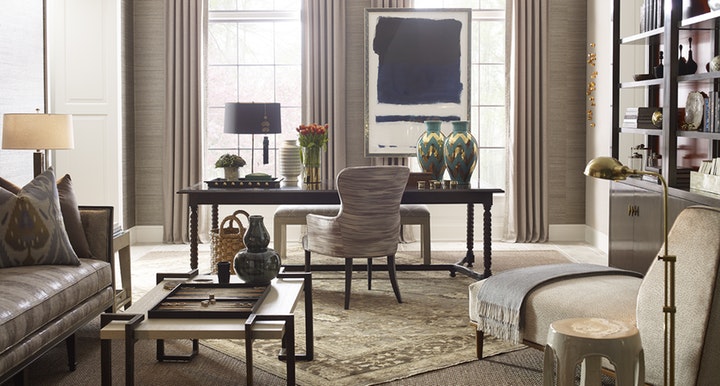
3Layer in multiple textures.  Textured finishes in fabrics, flooring, wall and furniture can make or break a great interior design. Here in this taupe living room texture has been introduced on pillows, draperies, wallpaper, throws, upholstery, and rugs to create an interesting room that’s inviting but not overdone.

For more great ideas on design or interior decorating sign up for our weekly interior design blog here

Plus become a fan of Kansas City’s interior designer and former host of Living Large design show, Karen Mills, on Instagram or Facebook now!

Interior Design/Interior Decorating

Interior Design: 7 Tips for Creating a Delicious Dining…

Karen Mills' blog rug example
Interior Design by Karen Mills

1. Select Your Personal Design Style –  If  you have no idea what style you are start by finding inspiration photos online or in print.  Then notate your favorite elements from each room to get a sense of your style.

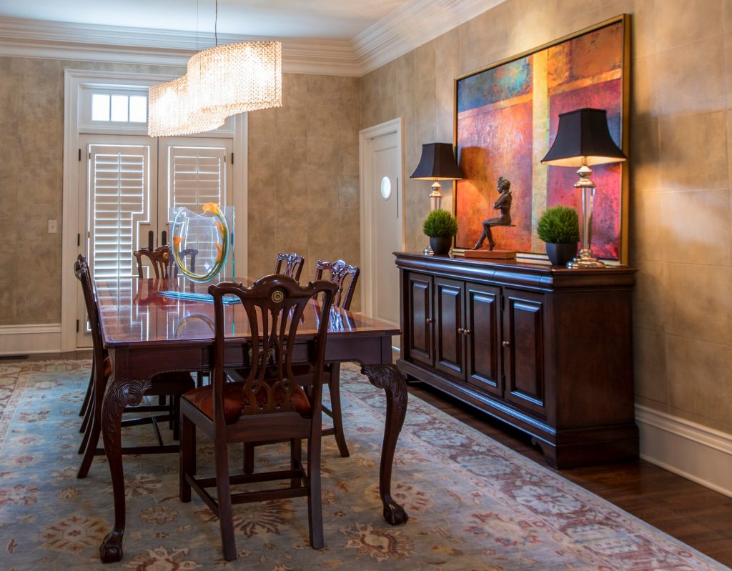
Using existing furniture, we added personality to this room by introducing a stunning crystal chandelier by Schonbek along with an original abstract painting and sculpture, hand knotted rug, custom seat covers, and wallpaper.

Karen Mills
Styling by Summer Ann of Girlsinmadras.com

2. Pick  a Color Scheme –  Most of us don’t spend much time in a dining room so have fun in here and pick colors you love.  Bolder colors can go on decor, rugs, chairs, or even walls but if you like to change up your style often, you might consider neutral walls and floors that give more flexibility when you want to change your color scheme.

3. Add Dining Table and Seating –  The dining room table and chairs along with the items directly behind them are the focal point of your room.   Begin by determining how many people you need to seat and ensuring you have room for the table you want.  Plus remember that your chairs don’t need to match your table, just enhance them.

If you opt for a dramatically styled table, then consider simpler style chairs and backdrop.  Or if you go with a simpler style table, you might bring in drama with a wall covering or beautiful buffet with art above.

Karen Mills' blog
Interior decorating by Karen Mills

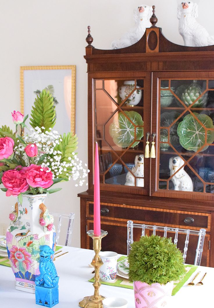
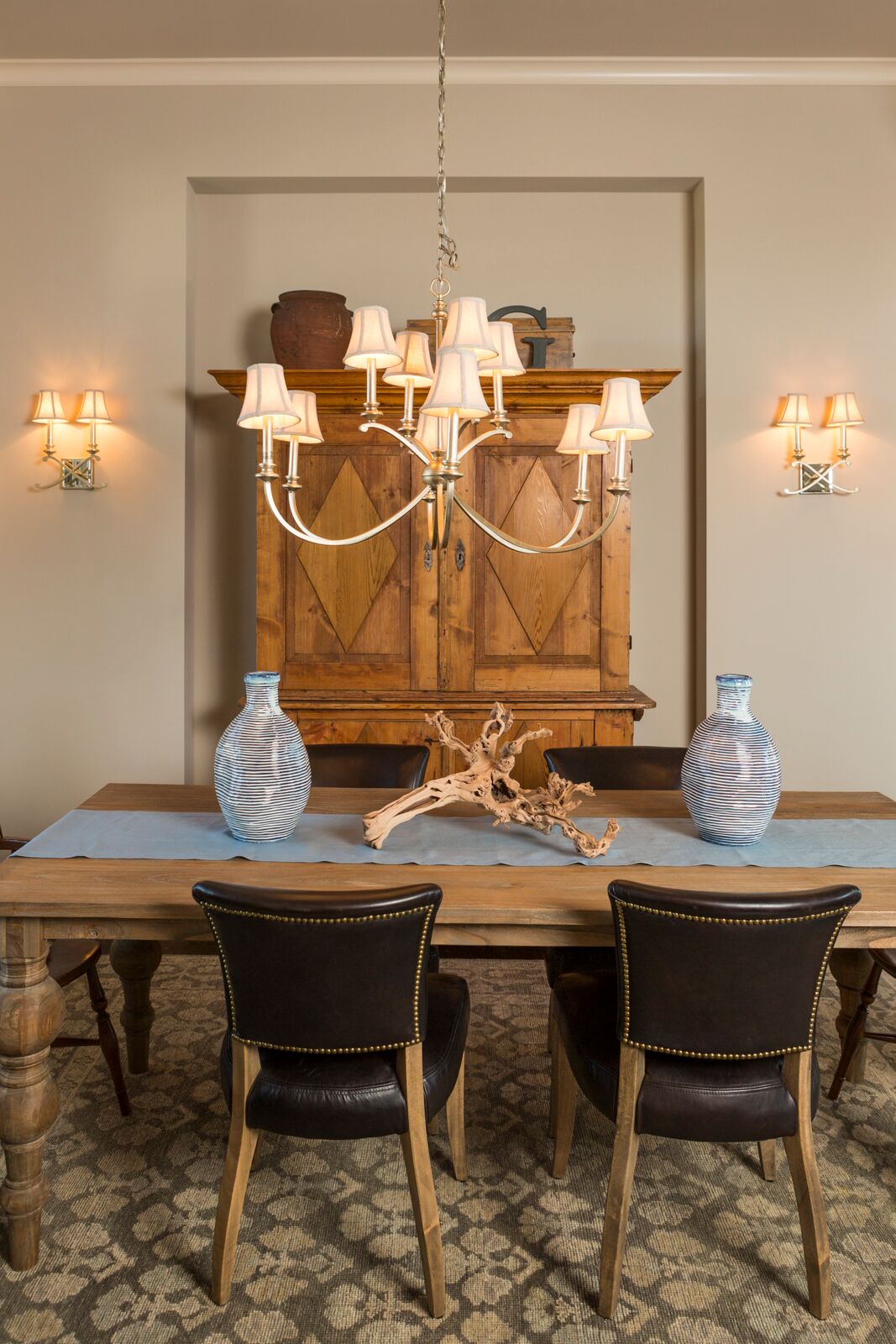
4. Consider Including Additional Furniture –  The majority of dining rooms benefit from functional storage furniture like a buffet and curio cabinets or an antique armoire like shown in this photo, but remember sofa tables, tea carts, and other furnishings can also enhance your room and provide handy surfaces for lamps, platters, trays, or display.

 5. Introduce a Dramatic Element – A bold element can range from a gorgeous piece of art and beautiful buffet to a stunning light fixture over a painting or interesting chair backs and wallpaper like shown here.

Photo courtesy of Kravet

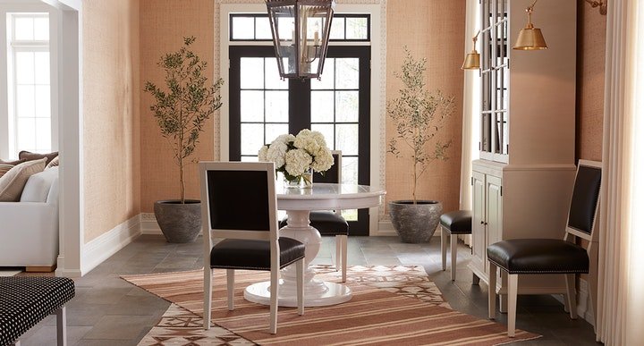
6. Layer in Texture  – Adding texture softens all the hard surfaces of the table, chairs, buffets, and hard flooring.   Texture can be introduced with an area rug, drapes, fresh flowers, and live trees/plants like shown here in this beautiful space.

7.  Add lighting –  Table lamps on a buffet or sofa table look beautiful behind a dining table along with a stunning chandelier and/or sconces on the wall behind. In this dining room courtesy of Kravet, the over sized chandelier commands attention, while the sconces on the right enhance the overall lighting and design scheme.

For more great ideas and photos, sign up for our weekly interior design blog here

Plus become a fan of Kansas City’s interior designer and former host of the Living Large design show, Karen Mills, on Facebook or Instagram here!

Interior Design/Interior Decorating

Interior Decorating: 3 Tips for Selecting the Perfect Color

Helpful Hints for Selecting Paint Color

Color, the biggest issue faced by homeowners starting an interior design or interior decorating project is often an overwhelming task so I’ve broken it down into three manageable steps for you today.

  1. View colors on a white background – First and foremost, when selecting colors, make sure that you’re viewing colors on a white background to get a true sense of the colors before placing them on a wall.   Don’t wear colors that might reflect back on those paint colors while you’re making selections because red, for example, could reflect back on another color giving it a green cast.
Karen Mills' blog
Photo courtesy of Kravet

2. Make color selections during daylight – Consider natural light along with artificial light in the room. 

For trim and ceiling paint colors, look to the lightest end of your paint strip for possibilities along with whites. 

Karen Mills' blog
Interior design by Karen Mills

3. Paint large swatches of your paint selection on a backed poster board – All too often I walk in as an interior designer and see clients who’ve painted a light neutral over another color on the wall and the original color is bleeding through or distorting the hue. Once you have the board painted, place against a neutral white background view during both daylight and after dark to ensure you still like it.

 If you don’t know where to start with color, pull inspiration from a favorite item like artwork, a rug, fabric, jewelry or even nature and let the fun begin!


For more great tips on color and how to use it become of fan of our weekly interior design blog here


plus become a fan of Kansas City’s interior designer and former host of Living Large, Karen Mills on Facebookhere!

or instagram here!

Interior Design/Interior Decorating

Interior Design: What’s Hot and What’s Not for 2019

5 Interior Design Trends To Embrace in 2019

Karen Mills' blog
Photo courtesy of Curated Kravet

1. Warm Vibrant (or Bold) Colors  For the past ten years we’ve seen gray neutral colors dominate the interior design scene but now as an interior designer I’m noticing a return to bolder colors with warmth whether they’re in a whole room color scheme like shown here or just as an accent in a light neutral warm hue.

In fashion this fall crimson red, warm yellow, and tobacco brown mixed in new and unusual ways made a strong comeback including bold combinations like red, black, and white which I will cover in more detail in an upcoming blog.

Karen Mills' blog
Interior Design Project by Karen Mills featured in book DESIGN ICONS

2. Nesting Trend    Homeowners are beginning to return to nesting with all the turmoil in the headlines so we will see a resurgence of comfortable and inviting interiors that are textural including finishes like rattan or raw wood, artisan products, and curves on our sofas or sculptural items.

In this entry the space is warmed up with branches and a comfortable fringe throw along with with comfortable pillows.

Karen Mills' blog
Photo courtesy of Century Furniture


3. Health and Wellness   With environmental factors impacting our health right and left along with an over abundance of processed foods, people are looking for healthy alternatives whether its natural fabrics and controlled sleep environments like our Sleep Better Live Better program or the ability to cook farm fresh meals in the kitchen.

Here in this room shades made of natural fibers, an antler lamp, and wood art piece bring a sense of well being to this space.

Interior design project by Karen Mills featured in Design Icons book

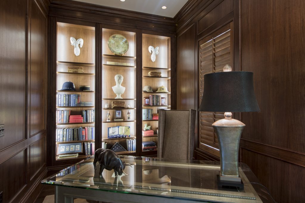
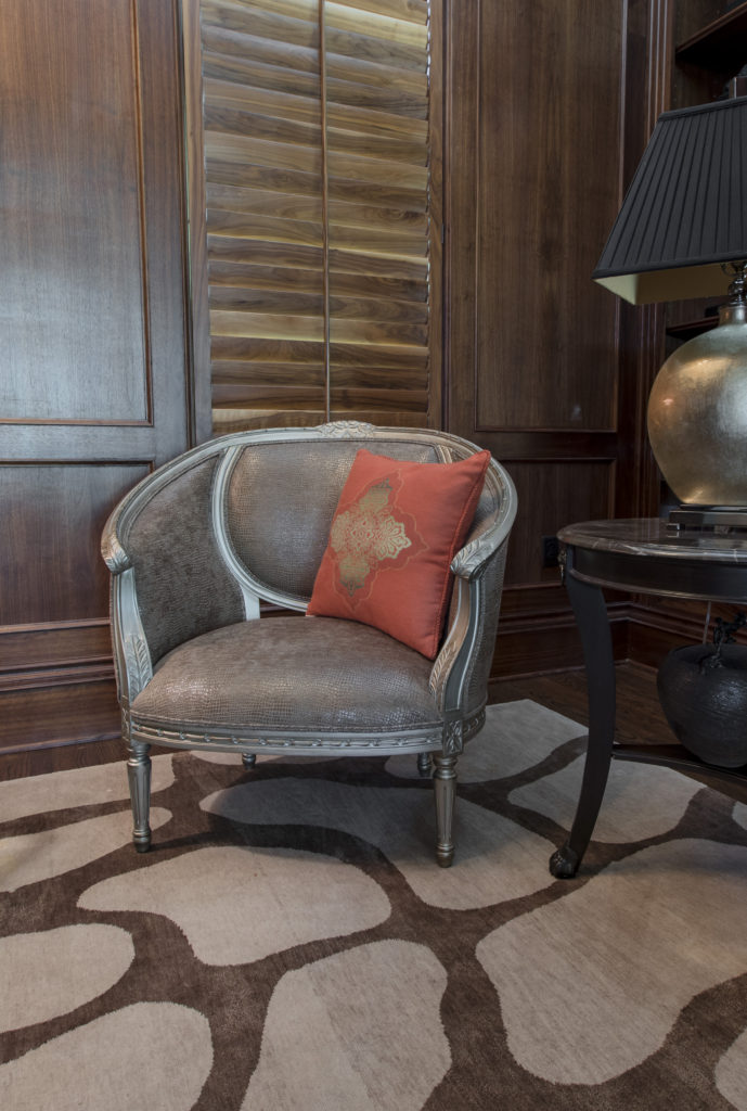
4. Personalization  Even though we’ve heard this term before its still a huge trend this coming year as evidenced in this library we designed that’s has been completely personalized for our client from the custom desk made of champagne wood, leather, and glass and accompanying pebbled leather chair to the custom designed rug underneath, snakeskin chair , and mementos from world travels displayed on the shelves beyond.

Karen Mills' blog
Interior design project by Karen Mills featured in book Architecture Today Interior Design
Karen Mills' blog
Interior design by Karen Mills

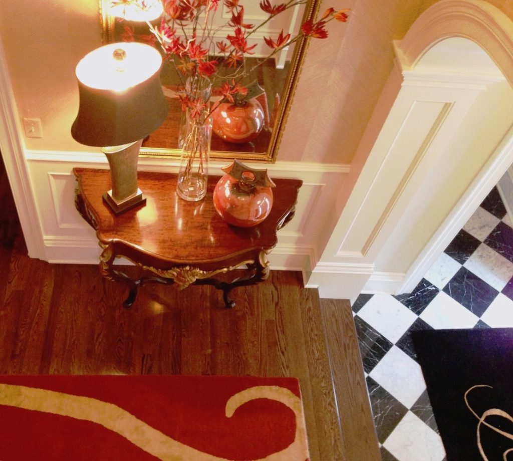
5. Maximalism  For years we’ve seen a minimalist trend with less pattern and movement but that’s changing and we will see more bold patterns and/or colors mixed together in a mix of design styles like this entry that includes an antique french console table, classic black and white tile, hand made wallpaper, and a custom contemporary rug in this contained space.

So what’s not hot for this coming year? First copper or rose gold is starting to lose ground in finishes along with single accent walls and overly ornate details. Cool grays, all stark white, wall signs, and ikat patterns have also fallen off the trend wagon for next year but that doesn’t mean that warm grays or white can’t be combined with other vibrant colors which I will cover in an upcoming blog.

For more inspiration, ideas, and photos, sign up for our weekly interior design blog here

Plus become a fan of Kansas City’s interior designer and former host of the Living Large design show, Karen Mills, on 
Instagram and Facebook here!

Interior Design/Interior Decorating

Interior Design: When Blue Meets White in the Bedroom

How to create a calm respite from daily life in your sleeping quarters

Interior design by Karen Mills/Photography by 29Pixel Studios, LLC

Blues or blue greens in muted hues with more calming patterns can create a sense of safety and peace for you especially in the bedroom where you need to unwind at the end of the day.  And because blues/greens are cooler colors they also recede giving the room a more spacious light feel.

In this master bedroom, the beautiful leaf wallpaper by Thibaut sets the scene with a restful outdoor theme while the Clark & Clark fabric on the bench and Kravet fabrics on the chairs add to the restful atmosphere of this traditional space.


Karen Mills' blog
Interior design by Karen Mills/Photography by 29Pixels, LLC

On the shelves a beautiful mix of blues and greens in the sitting area nearby enhance the calming effect of the room along with paint by Benjamin Moore


Here in this master sitting area a custom designed neutral rug grounds the light airy feel of this area that has a chaise cushion covered in a beautiful velvet Kravet fabric with a Cowtan & Tout silky pillow perched on top.  The adjoining chair brings a nice contrast to the blue green walls with a shimmery fabric from Clark & Clark and the pillow pattern picks up the leaf motif from the bedroom accent wall to create a cohesive feel between the spaces.


Karen Mills' blog
Interior design by Karen Mills/Photography by 29Pixel Studios, LLC

In this rustic lodge home we introduced a beautiful shimmery wallpaper behind the bed picking up variations of the color again on the Italian bedding and nearby chair pillow to create a calming feel.

For more great ideas and photos sign up for our weekly interior design blog here

plus become a fan of Kansas City’s interior designer and former host of the Living Large design show, Karen Mills, on Facebook

or instagram here!


Interior Design/Interior Decorating

INTERIOR DESIGN: 3 TIPS FOR TRANSFORMING YOUR ROOM FROM…

Karen Mills' blog
Photo courtesy of Circa Lighting

Does your interior feel “blah” or boring even though its filled with furniture? Often the reason a space looks unfinished is because rooms either lack the key ingredients to make them come alive or the key ingredients aren’t placed in a way that creates harmony and variety.  So here are my 3 tips to transforming your interior ordinary to extraordinary!

1. A Color Story – The first thing that’s usually missing in a home is color. And I don’t necessarily mean bold color, just a lack of cohesive color throughout.  Take a look at this bedroom design above from Circa.  Even though the grayed out blue isn’t dramatic, by placing it on the headboard, bedding, bench, and drapes it creates a color story of calm and quiet for the person who sleeps there.

Karen Mills' blog
Photo courtesy of Kravet furniture

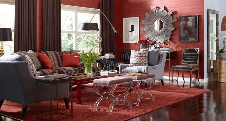
In contrast this dramatic living space by Kravet above shows how you can create drama in a room by using bolder colors like the warm reds  used throughout to draw your eye around the room along with the blue that plays a supporting role and nice contrast in the interior design.


Karen Mills' blog
Photo courtesy of Jonathan Charles furniture

2. Accent lighting – Having ample accent lighting in a space makes it more inviting and interesting. And as a general rule, I  you need at least three lamps in every living space to add ambiance to your interior design.

.

Karen Mills' blog
Interior design by Karen Mills. Photography by 29 Pixels.

3. Groupings of large accessories – Most people tend to buy small accessories which when grouped together often creates a feeling of clutter that adds to the tension in your space instead of enhancing your interior design.  Instead strive for a balance of accessory sizes with more emphasis on large than small.

Another key to successfully accessorizing includes selecting colors, styles, and textures that will enhance your design and grouping accessories together to create vignettes or points of interest throughout your space. For example when I’m adding the final touches to a project as an interior designer, I often mix not only sizes of accessories but also textures which gives the vignette or grouping a more interesting mix.

For more great photos and tip for accessorizing and ideas on interior design, become a fan of Kansas City’s interior designer and former host of Living Large design show, Karen Mills on Facebook here

or sign up for our weekly interior design trend blog here!

Interior Design/Interior Decorating

Interior Design: What’s New & Next in Fabrics and…

Karen Mills' blog
Kate Spade fabrics courtesy of Kravet Furniture

After attending several fall 2016 interior design markets  I wanted to share a few examples of what’s new and next in fabrics, patterns, and finishes.  The biggest trend I’m seeing?  Personalization!

Karen Mills' blog
Designer fabrics

img_0654

Karen Mills' blog
Kate Spade design from Kravet fabric

img_0653

Karen Mills' blog
Courtesy of Lee Industries

But bold colors, organic natural looks, antique reproductions and  patterns that allude to the 1970s or 1980s are still growing in popularity too.

img_0658

img_0662


img_0670

These fun finishes I discovered can be used as tops for furniture.

Karen Mills'
Ralph Lauren fabrics

And I had to share these luscious classic Ralph Lauren fabrics that have been introduced in their fall collection.


img_0664

img_0712

Also loved this fabulous linen stripe from Italy by Schumacher.    Perfect for a beach house or for that type of design style.

img_0664

For more great interior design photos and trends, sign up for our interior design blog here

Plus become a fan of Kansas City’s interior designer and former host of the Living Large design show, Karen Mills, on Facebook now!

Interior Design/Interior Decorating

Interior Design: DecoratingTrends for 2017


Karen Mills' blog
Kate Spade for Kravet

Does anyone else feel besides me feel as though they’ve been catapulted back to the 70s and 80s with the latest introductions in furniture, fabrics, and clothes?

Next year the 70s and 80s will continue to be on trend with their retro looks, flower power, graphic patterns and much more.

Karen Mills' blog

Organic looks and free form style also dominate the scene for next year in everything from furniture to wallcoverings.  Plus color forecasts for next year range from neutrals like the taupe color selected by Sherwin Williams to the bold amethsyt color picked by Benjamin Moore.

Lea Eiseman of Pantone, the most renowned color forecaster,  just named the  Color of the Year for 2017 so be prepared to see this color showing up everywhere from the home industry to fashion and technology.


Karen Mills' blog


One of the newer trends in furniture next year will be more bulbous less tailored upholstery and I’m not sure I’m a fan unless its a more tailored piece like shown above.

Karen Mills' blog
Jean-Louis Deniot furniture by Baker

Another trend you’ll be seeing more of this year will be dramatic spaces like the one shown above along with interesting lighting options.

Karen Mills' blog
Bernhardt furniture

For more design photos and tips, sign up for our weekly blog here

Plus become a fan of Kansas City’s interior designer and former host of Living Large design show, Karen Mills, on Facebook here