Interior Design/Interior Decorating

Interior Design: 5 QUESTIONS TO ASK BEFORE HIRING A…

  • May 20, 2021

What to Consider When Procuring a Contractor in Addition to Costs

As an interior designer I’ve heard numerous sad stories recanted by homeowners who’ve selected a remodeler based on lowest price that resulted in poor craftsmanship, unfinished work, or even worse, damage to their property. Read on for my design tips on what to ask a contractor before hiring.
Karen Mills' blog
Interior design by Karen MIlls
  1. What qualifications/experience do you have with my type of project and can you provide references? Also ask if the contractor belongs to NARI, National Association of Remodelers or HBA, Home Building Association.
Lenexa interior design
Lenexa interior designer Karen MIlls

2. Can your insurance company mail a current copy of your insurance policy(s) before we sign the contract? Contractors need to have liability insurance to cover any damage to your property and workman’s comp for anyone working on your home to protect you if they get hurt on the job.
3. How do you charge? Normally remodelers give a bid/estimate of total amount for project minus any unseen issues or simply charge for time (hourly) and materials (products). If you want to buy materials yourself and just pay the contractor for your time, make sure they offer that option and that you can put a limit on the hours billed so project doesn’t get out of hand.
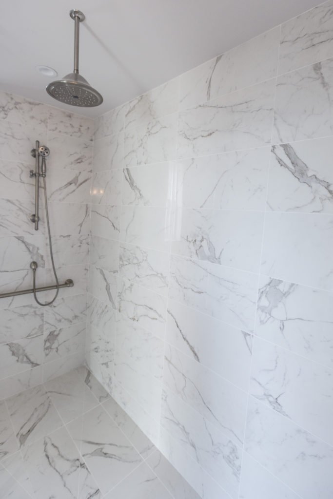
photo example
Kansas City Interior design by Karen Mills

4. Can you complete work within my time requirements and may I have a written timeline/schedule of construction beforehand?
5. Will you provide a signed contract with scope of work to be done that includes a warranty? Warranties are critical because they provide a guarantee and help ensure the remodel is done correctly the first time.
Karen Mills' blog
Kansas City Interior design by Karen MIlls

Now that you’ve hired a contractor ensure you have a professional interior designer also for your project to avoid costly design mistakes. And if you need guidance in that area, give us a call at 913.764.5915 to find out how we can help.

For more great ideas on remodeling or interior design sign up for our interior design blog here

Plus become a fan of Kansas City’s interior designer and former host of the Living Large design show, Karen Mills, on 
INSTAGRAM and FACEBOOK here!

Interior Design/Interior Decorating

Interior Design: High Impact, Low Budget Remodels For The…

How to Remodel for Less

Courtesy of Brosh Architects, Borehamwood, England, United Kingdom

As promised here is part 3 of the three-part series I promised you written by my former executive producer Andrew Ellenberg.

Trevor and his wife Tiffany were sitting on the bleachers watching their oldest son play baseball, waiting for his chance to slide into the home plate from third base when Trevor got a text from his boss that he would be working from home full time. A flood of emotions rushed to his head as he grappled with his ambivalence about the change.

Less time stuck in traffic braving the morning commute for 45 minutes was a game-changer for quality of life and cost savings. But his house wasn’t configured for a home office and needed work.

Over the next several days, as the reality of the remote lifestyle started to settle in, Trevor and Tiffany discussed their options for transforming their house into a remarkable but affordable space for life and business.

After researching the project online for hours, their plan had come into sharper focus. Two weeks after Trevor got the text, they were ready to hire a remodeling contractor. Now they needed to figure out how they would pay for the project.

With 60 percent equity on their mortgage, they were sitting on the right side of supply and demand and figured they could tap some of it to pay for the renovations.

Their research found a loan officer who said he could help them tap the equity in their home to fund their bold new vision. During a date night on their covered porch, they uncorked a bottle of champagne, made a toast, tapped glasses, and laughed uncontrollably in relief and excitement. 

Halfway across the country, it was a brisk evening in May when Bryce Johnson spoke with Life In Style about high-impact remodels that won’t break the bank. He is a seasoned industry vet with a 30-year history of transforming outdated spaces. Johnson has an eye for design, a sharp mind for functionality, and an almost manic intensity about his work. 

He said the perception that luxury remodeling projects need to be exorbitantly priced is mainly misplaced.

“People think that high-end materials and finishes have to be expensive, but that’s not always the case,” Johnson said. “I’ve found that many people are surprised by how affordable their dream home can be.”

People traditionally view luxury vinyl tile as something you would never see in million-dollar homes. But Johnson installs them all the time. They have hundreds of colors and style choices, some with textured or distressed designs to add character.

They are also water-resistant, ideal for high-traffic areas or homes with pets. “The same is true of many other materials people associate with more modest price tags,” Johnson said. “The key is to use them in ways that elevate the overall design.”

He said you don’t have to spend a fortune to make a significant impact. His philosophy at his firm, Bryce Johnson Construction, is that you can find ways to get the look of more expensive materials for a fraction of the price with ingenuity and creativity. That means more bang for the buck while more equity bucks make homeowners flush. 

“Homeowners are likely getting an extra incentive from record-high home equity levels. Home prices continue to gain as demand for housing soars. People are crunching numbers to calculate their ROI on projects,” said Justin Rabin, a loan officer at Fountain Mortgage.

Internationally respected interior designer and regular Life in Style contributor Karen Mills stresses the importance of “future-proofing” your remodel with timeless spaces that don’t go out of style.

“Materials don’t need to be expensive to look high-end. By strategically repeating elements – shapes, colors, lines, finishes, and styles in a design, a true artist can draw you into the room, causing an emotional response that speaks to your soul.” 

Lior Brosh, the owner of UK-based Brosh Architects, recently designed a secret bathroom door for a client with four children. She hid it behind a slick contemporary display cabinet with cool decor bolted to the shelves, so items don’t shift when opening and closing the door. With a budget of less than $10,000, the remodel is stunning and looks like it cost three times more than it did.

“Getting the most value for your money is all about creative thinking,” she said. “There are ways to make affordable materials look like a million bucks.”

Brosh said high-impact remodels don’t have to mean high-budget projects. With savvy design choices and impeccable execution, you can have a stunning space that rivals those at the top of your wish list.

Three months after Trevor received the text message about working from home full time, he sat with Tiffany in their newly remodeled home office. Enclosed in tinted glass, the space is bathed in natural light but provides privacy from the rest of the home.

The built-in transparent desk appears to be floating, and the walls are painted in a burnt orange bursting with energy. The hanging barn doors lead to the kitchen and the living room, a commute two steps from his favorite rooms in the house.

Trevor is in good company. In today’s competitive real estate market, homeowners are looking for ways to increase property values and enhance their quality of life. For many, this means making bold remodeling decisions that will give their homes a high-end look without breaking the bank.

Life in Style, the weekly Publication from Team Real Estate, helps homeowners make more inspired decisions about their homes and lifestyles. It features original news, commentary, tips, and analysis from leading industry experts. To be considered for inclusion in future stories as a professional or homeowner, email  lifeinstyle@teamre.com.

For more inspiration, ideas, and photos, sign up for our weekly interior design blog here.

And become a fan of Kansas City’s interior designer and former host of the Living Large design show, Karen Mills, on INSTAGRAM and FACEBOOK here!

Or give us a call at 913.764.5915 to discuss your remodel project.

Interior Design/Interior Decorating

Imagine Living in a Contemporary Home Like The Ones…

Harmony in the exterior facade at Long Horizontal house

Here is part two of the 3-part series on interior design I promised you. Enjoy!

It doesn’t have to be a big house. It could be like the wood-framed, one-bedroom cantilever you see on Bosch, not much bigger than a Beverly Hills garage with breathtaking views of LA just over the edge of the hill. 

The irreverent detective’s modern house is perched precariously on three steel pylons at its mid-point like a delicate treehouse, floating above the city below. It’s all windows and glass and geometric angles. 

Meanwhile, driving through one of the most affluent neighborhoods in a different city in the midwest, the streamlined profile of another sleek, modern house is so smoothly integrated into the landscape that it is almost indistinguishable from it. At first glance, this architectural gem is functional and stylish with a futuristic vibe.  Dramatic lighting underscores the modular boxes that fit together like lego pieces to create artistic angles, intriguing juxtapositions, and sharp lines.

The house looks like someone ripped it from the pages of a glossy architectural magazine and dropped it on top of a mountain. This is consistent with the spirit of contemporary home design: personal expression and individuality.

In this week’s feature story, the lead graphic showcases the contemporary mountain cabin with two-story ceilings, cinematic wood beams, and a rugged stone fireplace. 

Oversized lighting fixtures, bleached floors, and the ubiquitous but invisible presence of glass reinforce a feeling of openness. The naked eye can’t see where it ends, like an infinity pool, so our imagination fills in the blanks.

Once inside, you are surrounded by large open floor plans and intentional asymmetry, creating more visual interest than the predictable linear repetition of symmetrical shapes in traditional home design. 

Expansive floor-to-ceiling glass panes bring the outside into the interior living space. These homes incorporate the latest home design trends. Modern architects value functionality over aesthetics, removing unnecessary details that divert attention from primary focal points.

Modern homes are more than just a place to live and work. They reflect the people who live there and their unique styles, influenced by a blend of trends from different periods and cultures. The common thread that ties these design ideas together is a commitment to quality, craftsmanship, and durable relevance. 

We can trace the roots of modern architecture back to the 1893 Chicago World’s Fair and the cutting-edge buildings that cemented the role of the US as a world leader in art, architecture, and technology.

From modern furniture pieces carved out of natural materials like wood or granite stone to traditional designs utilizing dark rich woods and marble accents, the trend toward simplicity in design is likely to continue unabated for at least ten years. 

The next big breakthrough is integrating our rapidly expanding arsenal of technology into our sci-fi houses as seamlessly as built-in appliances, recessed lighting, and hidden storage areas. Office equipment is now hiding in plain sight.  It materializes when you need it and gets lost when you don’t. 

Don’t let Sonja Rudolf get started on that text thread. The commercial furniture expert at Vari is passionate about her mission to “elevate workspaces.” 

Rudolf told Life In Style during an exclusive interview that the home office is melding into a “real office with commercial-grade office furniture.” Check out our feature story about home office design in the last episode for more ideas.

Contemporary home office design sports clean lines with a simplistic “less is more” design philosophy. “Straight-lined simple design aesthetics with neutral earthy colors never go out of style, “ said Rudolf. 

Removing unnecessary design elements to spotlight the sharp edges may appear sparse, even impersonal, but many modern homes will welcome you into a warm and inviting interior. 

She cited the materials used in the construction and the interior design of the home – dark woods and marble with toasty accents of color.  

Karen Mills served as the interior designer on a Rustic lodge adjacent to a beautiful lake and forest. “The stunning home nestled between a private lake and woods yearned for a lighter color palette and more spartan furnishings to allow the outside views to take center stage, “ Mills told an international design magazine featuring her work.  

From country homes to beach houses, these ultramodern spaces are filled with edgy materials, bold lighting, streamlined furnishings, and even some pops of color, creating striking spaces. 

The contemporary home represents 21st-century architecture and design. It’s evolutionary, meaning it changes and grows as we do, constantly adapting to what’s new, intriguing, and trending in home design.

The primary distinction between contemporary homes and traditional homes is that they don’t have a predefined style. Modern homes borrow and adopt features from a diversified mix of international, minimalist, modern, and eclectic design styles that are unique yet still familiar.

While traditional architecture and design can be beautiful, they can also feel outdated and stuffy. According to Adam Grimsman, a mortgage banker at USA Mortgage in Overland Park, contemporary homes always feel fresh and current, and demand in this category is rising. 

“Many people want white lines, a nice clean space. We are seeing an uptick in loan applications for contemporary homes as they are more desirable to millennials and Gen Z,” he said. 

Contemporary home design often incorporates natural materials like wood, stone, metal, and glass. This design tends to be more energy-efficient than traditional designs, making it a popular choice for eco-conscious homeowners. We will delve more into that topic next week. 

Popular shelter magazines like Elle Decor, Architectural Digest, and House Beautiful celebrate phenomenal modern home designs. They showcase inviting spaces that feel both contemporary and timeless. 

“When considering a contemporary design approach, my core belief is that good planning and design of space has a direct and positive impact on our quality of life,” said Lior Brosh, owner of UK-based Brosh Architects in Borehamwood, England.  

Brosh recently completed a project in Notting Hill, London for a client who wanted a bright space with a contemporary aesthetic that still felt calm, warm, and homey.  

From streamlined lighting and plumbing fixtures to cool doors, water features, sculptures, window treatments, and oversized address number treatments to dramatic special effect landscape lighting, contemporary design can be stunning.  

Another popular trend is bold geometric shapes in both furniture and architecture. These accents can add tons of visual interest to any space. Once you get comfortable with all the photographers in your living room and cars slowing down to get a closer look at your house, you’ll be fine!

Life in Style, the weekly Publication from Team Real Estate is dedicated to helping homeowners make more inspired decisions about their homes and lifestyles. It features original news, commentary, tips, and analysis from leading industry experts. To be considered for inclusion in future stories, email  lifeinstyle@teamre.com

Interior Design/Interior Decorating

Interior Design: 5 Things to Avoid in a Kitchen…

Tips for Creating a Functional Kitchen Interior Design

If you’re thinking about remodeling or designing your kitchen read on to learn about some of the biggest mistakes homeowners make when designing a kitchen.

Karen Mills' blog
  1. Work Area Not Functional – Creating a functional layout is the first step to kitchen design whether you’re designing for a new home or doing a kitchen remodel. Here in this kitchen a work area with the stove, refrigerator, and sink easily accessible within a few steps of each other makes cooking easier and less frustrating.
Karen Mills' blog
Interior design by Karen Mills

2. Wasting Potential Storage – Countless storage options exist so there’s no reason to waste space in the kitchen especially with the adaptive kitchen storage units that make drawers and cabinets more functional from trash pullouts to roll out shelves. Here in this fabulous historic Walnuts condo where space is at a premium, we added pegged drawers under the stove for pots/lids, hidden pop open storage under the island. and used the extra space we gained straightening out a crooked back wall to create a coffee bar and pantry cabinet that’s draws you into the space.

Karen Mills' blog
Interior design and remodel by Karen Mills

3. Work Area Too Crowded- As an interior designer I’ve lost count on how many times I’ve walked into a home that didn’t have enough work space. Even though the recommended distance between an island and wall cabinetry is at least 42″ I usually I find that the minimum required distance of 36″ is often the reality of existing kitchens which creates a cramped space that’s not very functional. Other issues I often encounter with interior design clients who have existing kitchens already are drawers or refrigerator doors can’t open fully to function correctly.

Here in this kitchen we widened the walking area and made sure counter space was provided where needed whether to set down groceries, place dishes from the dishwasher or a space to simply bake a pie.

Karen Mills' blog
Interior design by Karen Mills

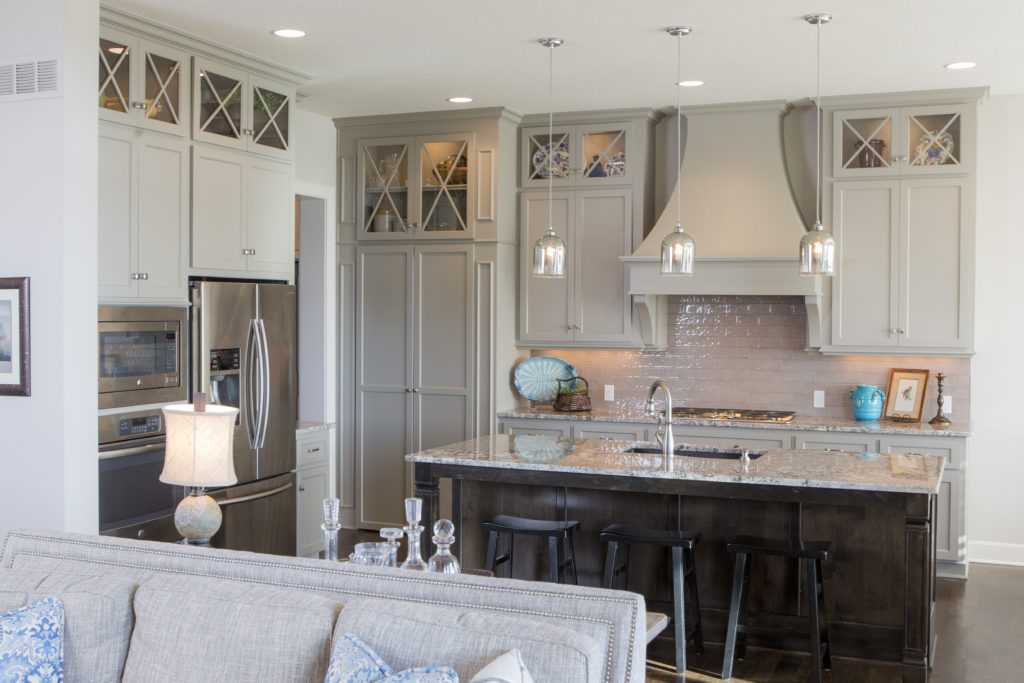
4. Lack of right lighting –  If your new kitchen doesn’t have a mix of general, task, and accent lighting, it will tend to be a little lackluster in appeal and possibly function too. Here in this kitchen design, I created a kitchen with can lights in the ceiling for general lighting, puck lights tucked away inside the glass cabinets for accent lighting, plus introduced mini chandeliers over the island that not only provide accent lighting but also task lighting for working in the kitchen.

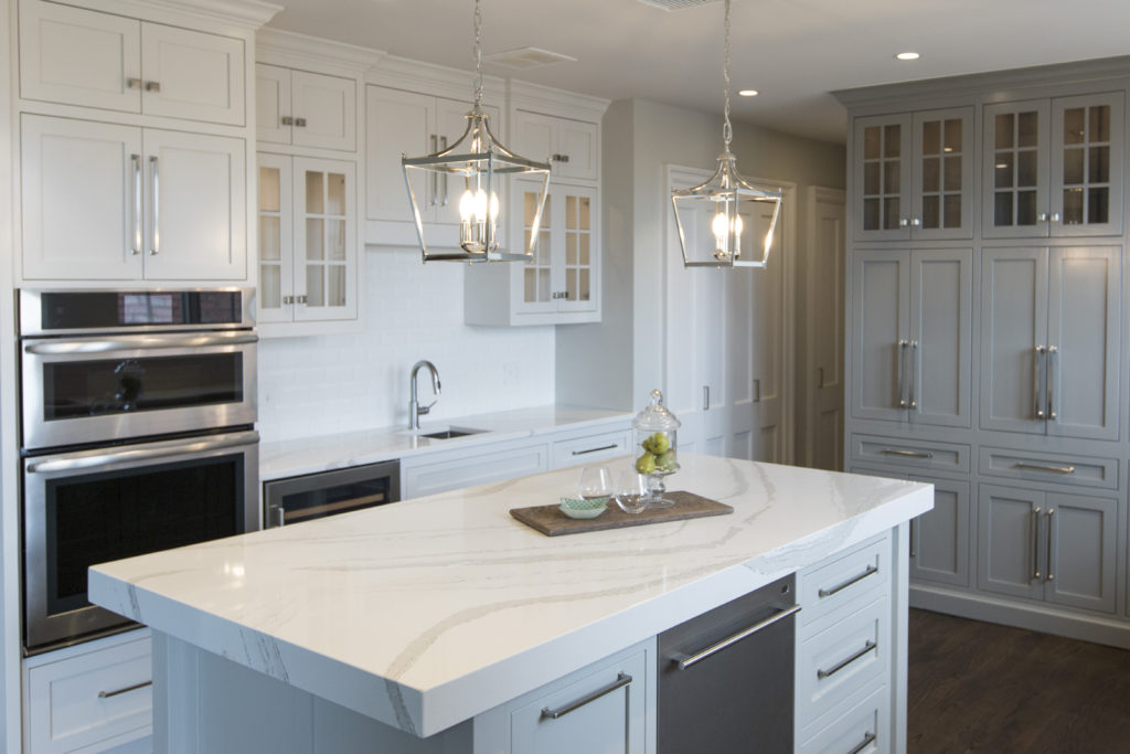
5. Not bringing in a professional –  Hiring a professional kitchen designer with experience who creates kitchens and bathrooms for a living can help you avoid costly mistakes, free up your time, and create the space of your dreams, while ensuring your space is functional. In this kitchen refresh where we reused most of the existing cabinetry, we were able to introduce new elements that created a wow factor – bigger airy light fixtures open shelving, counters that continued up the wall, a mitered edge island counter top, and bold cabinetry colors. The result? A fresh new look that showed off our client’s creative spirit while ensuring the space would function well for them.

For more inspiration, ideas, and photos, sign up for our weekly interior design blog here.

Become a fan of Kansas City’s interior designer and former host of the Living Large design show, Karen Mills, on 
INSTAGRAM and FACEBOOK here!
Or give us a call at 913.764.5915 to discuss your kitchen project.

Interior Design/Interior Decorating

Interior Design: 3 Tips for Adding a Home Office…

How to add a Workspace at Home When You Don’t Have a Dedicated Room

photo example
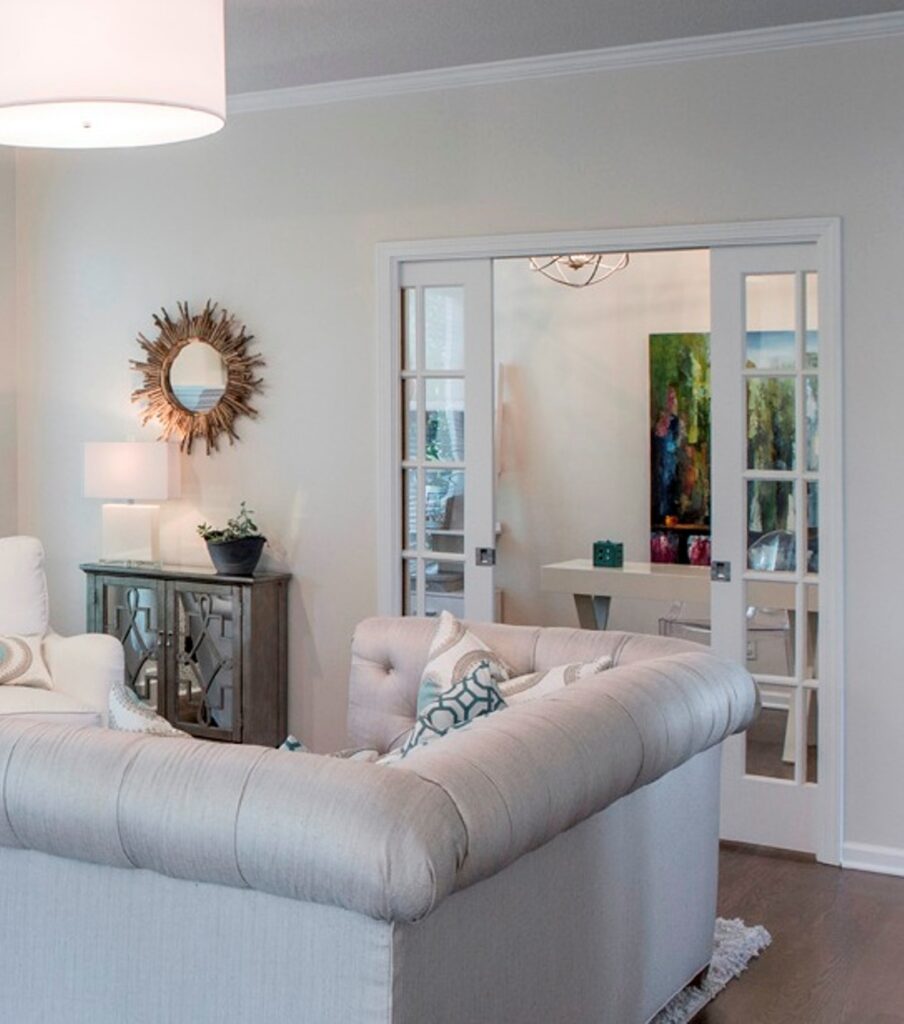
  1. Add sliding doors – pocket, French or barn doors to enclose an open room or space – In this gorgeous home office we designed hidden pocket doors slide together to hide this office space next to the living room to create a cozy area for getting work done without being disturbed.

If you prefer to have your home office in full view, you can also opt for French door style pocket doors that can make your overall living space feel larger like this interior design project below we designed.

If you prefer to have your home office in full view, you can also opt for French door style pocket doors that can make your overall living space feel larger like this interior design project below we designed.

2. Hide your workspace behind built in cabinetry or in a closet. – As an interior designer I’ve helped numerous clients solve the issue of where to put a home office. One of my favorite solutions as an interior designer was a home office we designed behind kitchen cabinetry as part of a remodel. And we disguised the doors to look like cabinetry which also functions nicely as a safe room.

Other solutions our interior design firm has created includes hiding an office under the stairs, in a niche area on a landing or loft, or inside a step-in closet where you can just shut the door to hide the space.

3. Introduce a piece of furniture that can act as a desk along with storage for your office necessities. Options could include an office armoire or dining table, for example. For one client, our interior design firm helped them take over their rarely used dining room by utilizing the table as a desk for their laptop and custom built in cabinetry on the wall behind to hide everything else. The bottom of the cabinetry held office items, while the top half provided display space for the client.

If you’re looking for more custom interior design, decorating, or remodeling inspiration, ideas, and photos, sign up for our weekly interior design blog here

Plus become a fan of Kansas City’s interior designer and former host of the Living Large design show, Karen Mills, on 
INSTAGRAM and FACEBOOK here!

Interior Design/Interior Decorating

Interior Decorating: 3 Ways to Create a Healthier Cleaner…

3 Tips for Making Home More Germ Free

As an interior designer I know many of our clients are looking for a home space that is more sanitary without being sterile. Read on for my ideas on how to create a more germ-free home.

photo example
  1. Decontaminate the indoor air more efficiently with a superior quality purifier that will clean the air in your home on a regular basis. I’ve personally had the most success with a Volara air purifier in my home but ensure you select an air purifier that will reduce airborne and surface contaminants, dust, and dirt that may contain viruses or bacteria. And don’t forget to introduce fresh air inside your home every chance you get along with having your ducts cleaned.
Karen Mills' blog
Interior design by Karen Mills

2. Remove contaminants before going inside.  Start by mounting a motion sensor activated disinfectant cleanser bottle on the wall in your garage or mudroom area to sanitize your hands before entering the remainder of your home.

Then add a rack for shoes nearby to place contaminated shoes or introduce a disinfecting mat that you and/or your family can walkthrough before continuing into the house. Note: Leaving these items in the garage for 24- 48 hours can also be helpful in keeping contamination away.

Placing any contaminated clothing you have on in a hamper or nearby washer and jumping in the shower right after also help fend off germs.

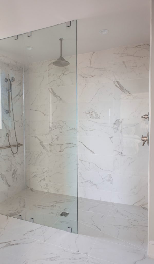
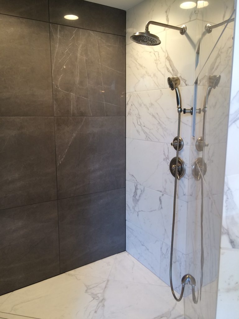
For this bathroom we installed tile on floors and much of the walls that can be scrubbed down along with an adjustable shower head that makes cleaning easier whether it’s kids, pets, or yourself.

Lenova kitchen faucet with an ozone generator

3. Maintain a More Sanitary Home Interior. By keeping the inside of your home more sterile you increase the odds that you will stay healthier. One way to accomplish that feat is by cleaning your home or bringing in a maid. But home products also exist to help you be cleaner.

According to the press release by Lenova, their faucets are the first conventional faucet line that is also an ecologically safe way to clean food and any other water-safe surface without chemicals. A small, thin ozone generator uses regular house current to produce ozone water (aqueous ozone), a natural disinfectant 100 times stronger than chlorine that kills 99.9% of common viruses, bacteria and germs. Adding foot pulls at the bottom of frequently used interior doors provide additional peace of mind.

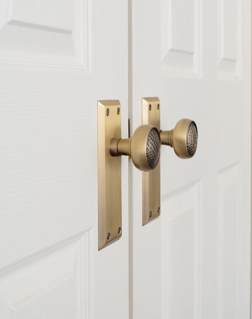
Nostalgic solid brass doorknobs

Brass also keeps germs more at bay than other metals like these solid brass doorknobs shown here. Other ways to keep your home more sanitary would include using the sanitize cycle on your dishwasher and purchasing washable materials – rugs or bedding.

In summary by removing most contaminants possible before coming inside, purifying your indoor air, and keeping surfaces clean you can create a home interior that’s safer overall for the whole family.

If you’re looking for interior design, decorating, or remodeling inspiration, ideas, and photos, sign up for our weekly interior design blog here

Plus become a fan of Kansas City’s interior designer and former host of the Living Large design show, Karen Mills, on 
INSTAGRAM and FACEBOOK here!
Interior Design/Interior Decorating

7 Ways to Give Your Kitchen A Facelift Without…

Tips for Refreshing Your Kitchen For Less

Interior design by Karen Mills

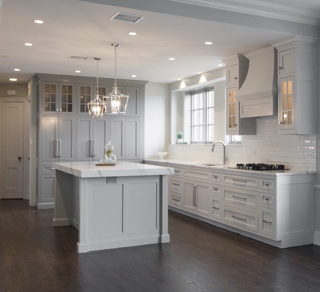
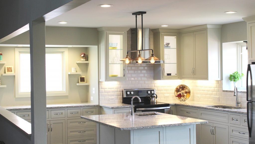
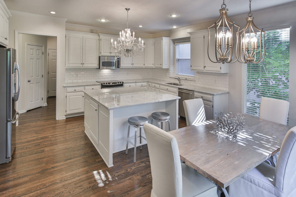
  1. Reface or paint your cabinetry – By refacing your cabinetry you are able to replace your dated cabinet fronts with a fresh on trend look without replacing insides of your cabinetry. In this kitchen our client opted to repaint their cabinetry to give it a fresh new look.

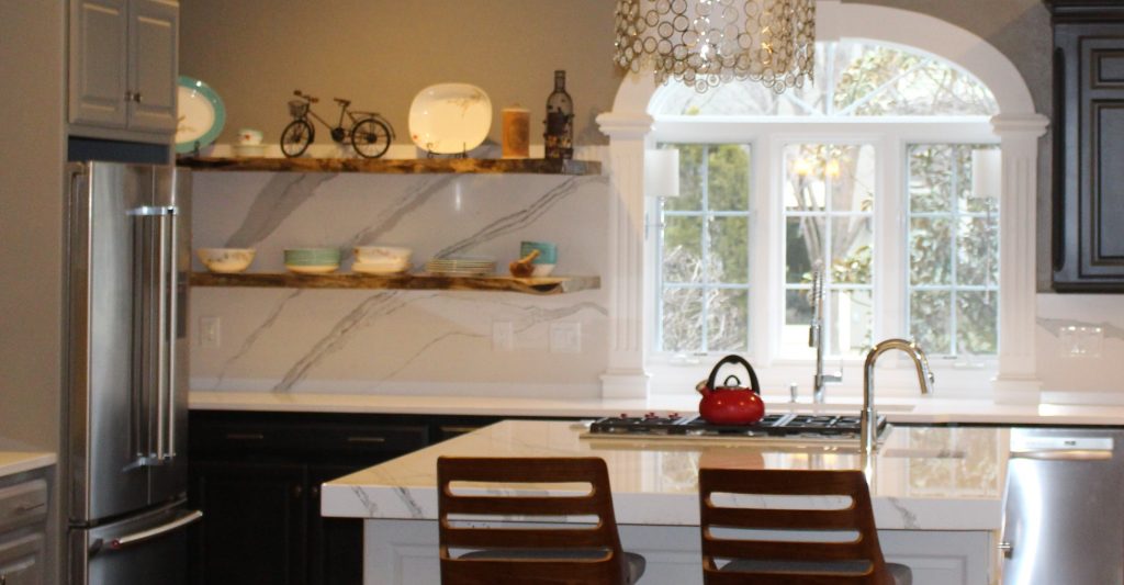
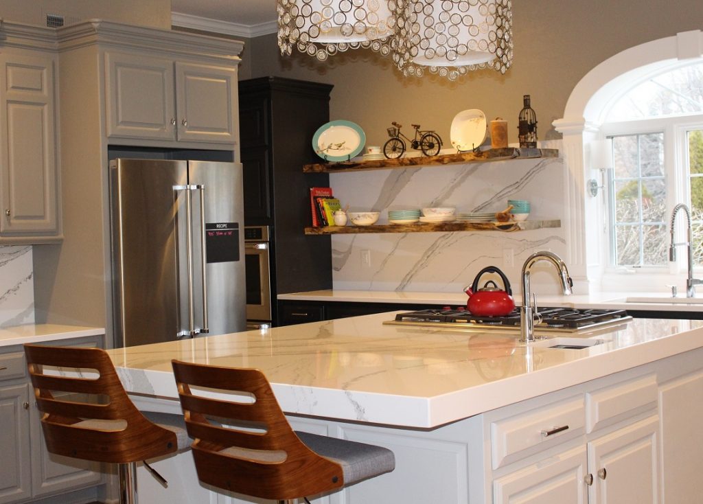
2. Upgrade Your Countertops By updating the countertops in this kitchen we were able to give it a fresher lighter look overall. A mitered island counter and counters that continue up the wall behind live edge shelving add to the the updated dramatic look.

Karen Mills' blog

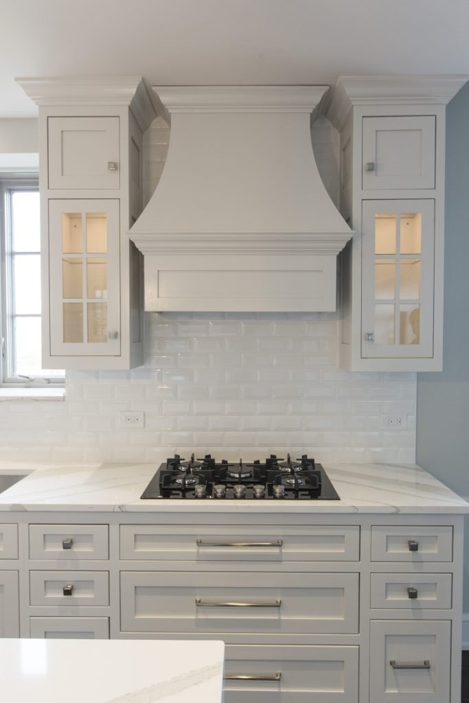
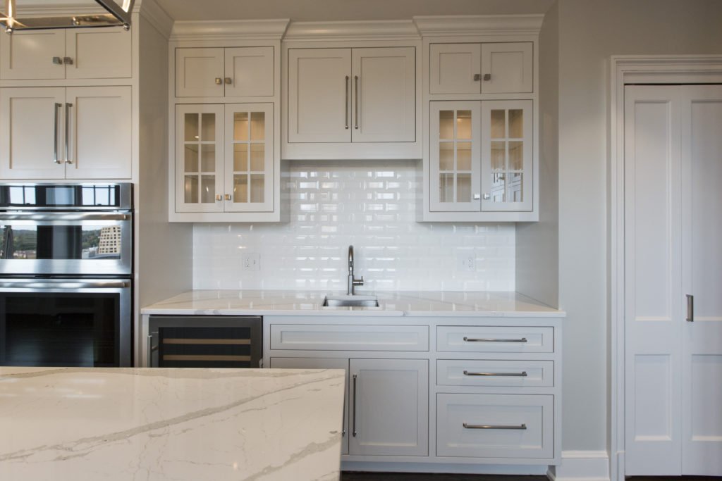
3. Update your backsplash In this completely renovated kitchen we replaced a dated backsplash with new beveled white subway tile to lighten up the space and bounce light throughout.

kitchen example

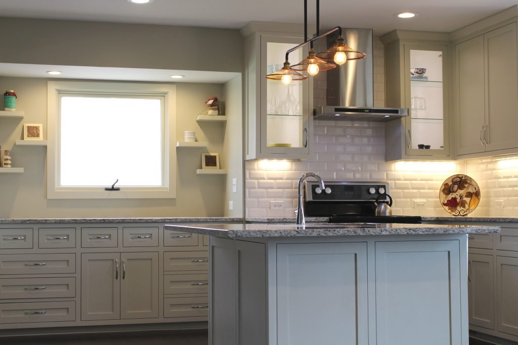
4. Install new hanging light fixtures such as pendants, chandeliers, or sconces along with undercabinet lighting. By adding work and accent lighting to your general lighting overhead you can create an ambiance that’s warm and inviting like this kitchen shown. Lit glass upper cabinets add to the ambiance.

photo example
Interior design by Karen Mills

5. Replace pulls and/or knobs on your cabinetry. New pulls in this renovated kitchen stand out, adding to the fresh new look. Lit cabinetry, new counters and backsplash, new shelving, and a new light fixture enhance the design.

Karen Mills' blog

6. Paint your walls. In this kitchen we not only painted the walls but also redid the wood floors, replaced the backsplash, upgraded the counters, replaced the light fixtures over the table and slipcovered the chairs to create a more updated look.

7. Add a small island – with wheels ideally or a bar height table for more work space in the center of your kitchen, if needed. If you don’t have room for a permanent island and need more work space, consider adding a tiny island on wheels to hold your extra items and give you more counter space when cooking. When not in use just can roll it off to the side out of the way.

For more great interior design ideas, sign up for our design blog here!

plus become a fan of Kansas City’s interior designer and former host of the Living Large design show, Karen Mills, on Facebook  and Instagram now!

And if you feel someone you know could benefit from this helpful information, pass it on!

Interior Design/Interior Decorating

Interior Design: A Before and After Bathroom Transformation

A DEEP DIVE INTO A DESIGNER’S HISTORIC REMODEL JOURNEY INCLUDING BEFORE PHOTOS 

design photo
MASTER BATH AFTER

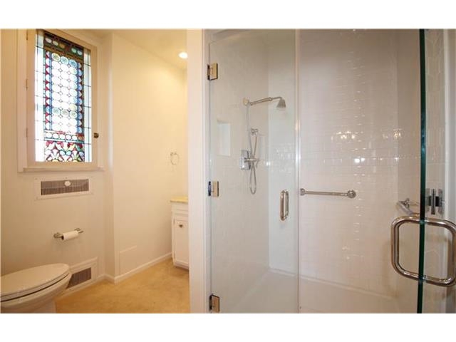
As an interior designer I know you will find this master bath remodel amazing not only because of how ugly and dated high rise bathroom built in the early 1900s on the historic Kansas City plaza was before, but also because of the transformation that takes place in such a compact space to make it live larger.

This image has an empty alt attribute; its file name is bathroom-shower-and-vanity-before.jpg
Master bathroom remodel before

When we first entered this dated bathroom we knew we had a real challenge not only because the space was cut in half by a walled in shower, making the bathroom feel small, cramped, and unappealing but also because we were limited by the restrictions of the historic high rise.

Karen Mills' blog
Master bath remodel before

To make matters worse this ugly master bathroom only had one sink and a dimly lit dressing area that wasn’t necessary.

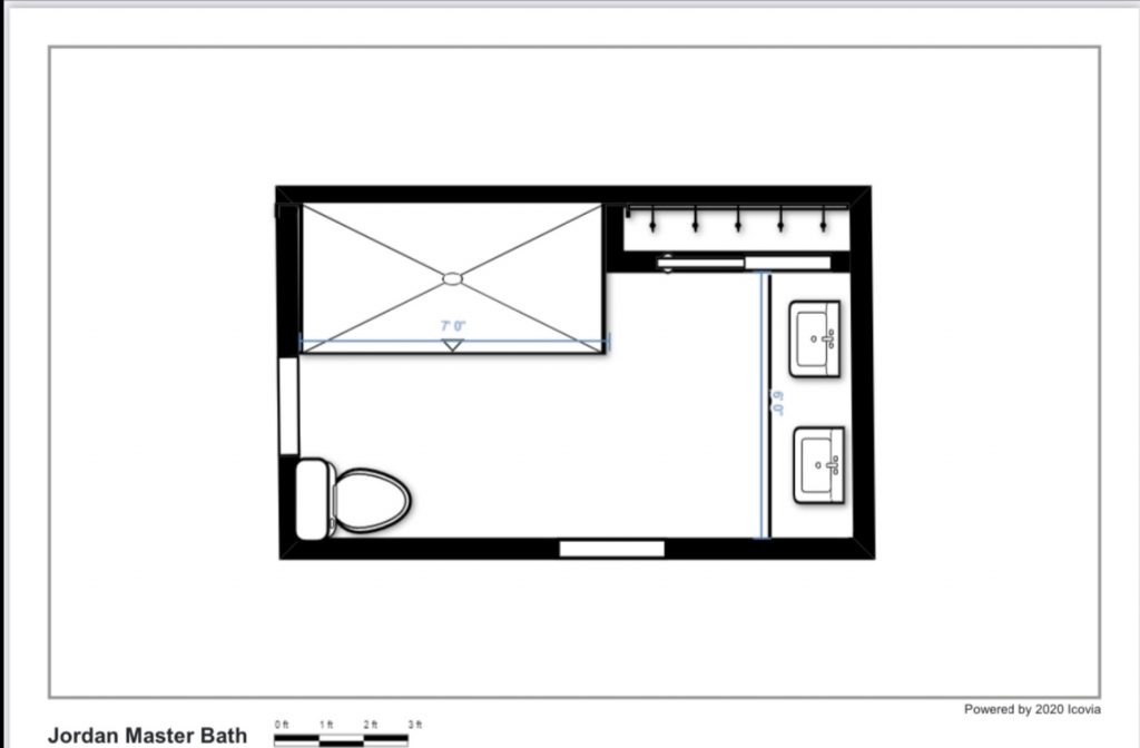
Floorplan by Karen Mills

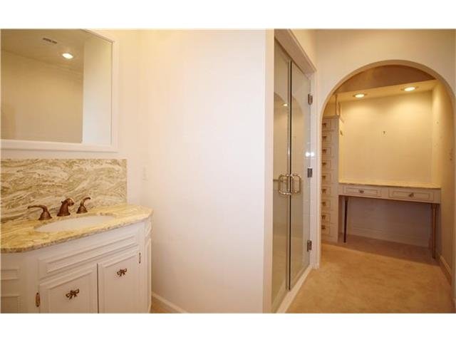
To solve this interior design dilemma we ripped out everything except the small existing closet and started over with a new floor plan, keeping the plumbing in roughly the same place to save costs.  As you can see in this new floor plan we expanded the shower into the former vanity area and flipped the toilet to make the bathroom easier to navigate, while also moving the vanity to the former dressing area.

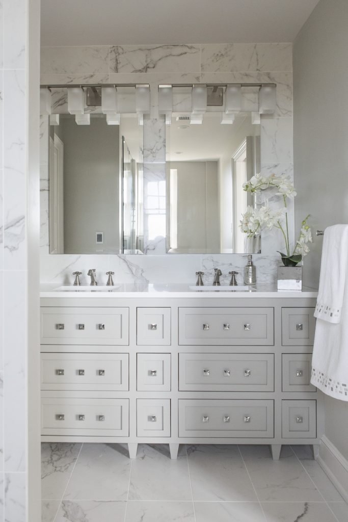
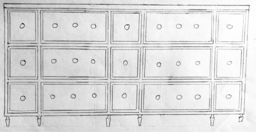
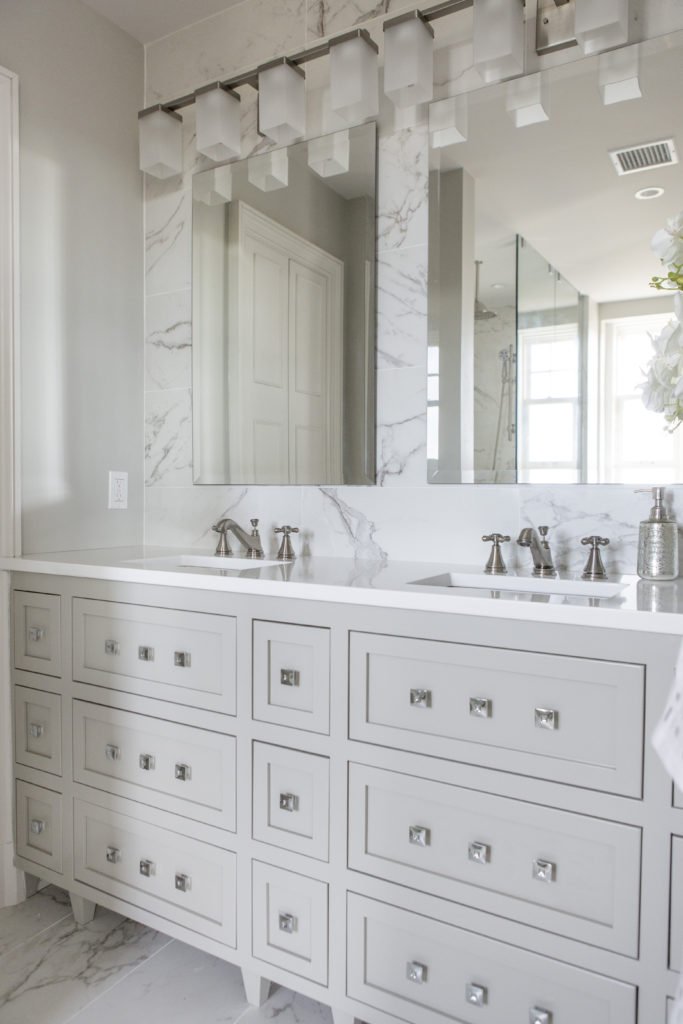
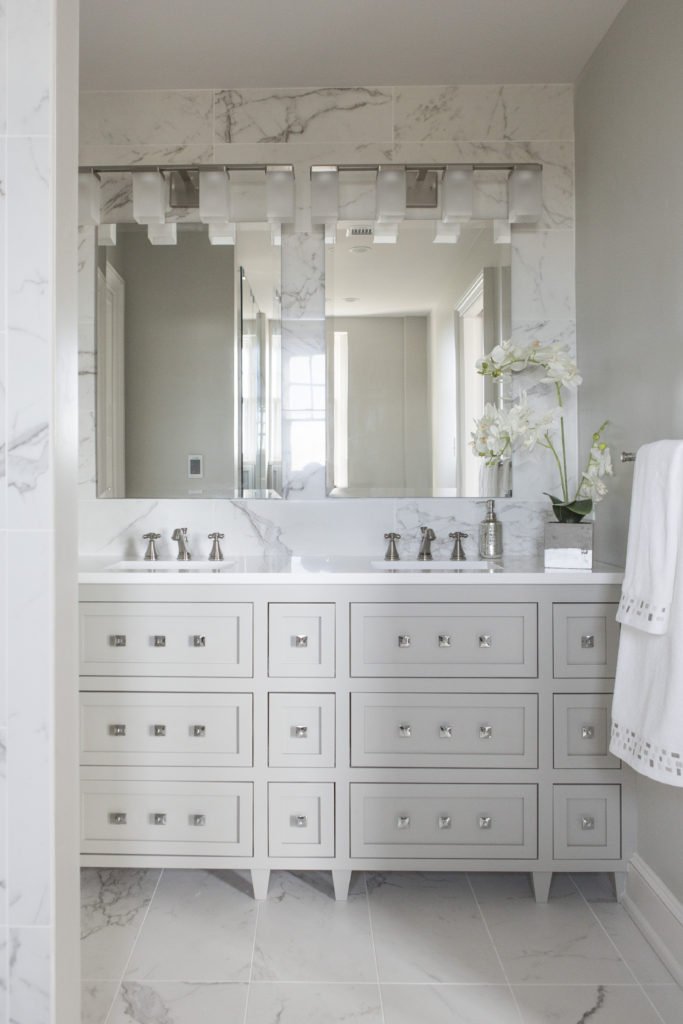
For the new sink area we designed a custom vanity that accommodates two sinks while also adding legs to the vanity to make it appear visually lighter. Drawers that wrap around the plumbing above and below make better use of the space and provide more storage.

Karen Mills' blog
Karen Mills' blog
Interior design by Karen Mills

European style custom shaker cabinets with clean lines also give the room a less fussy look while the wall of tile behind the vanity add to the timeless style of this glamorous master bath that really stands out with a fresh new look.

Karen Mills' blog
MASTER BATH AFTER

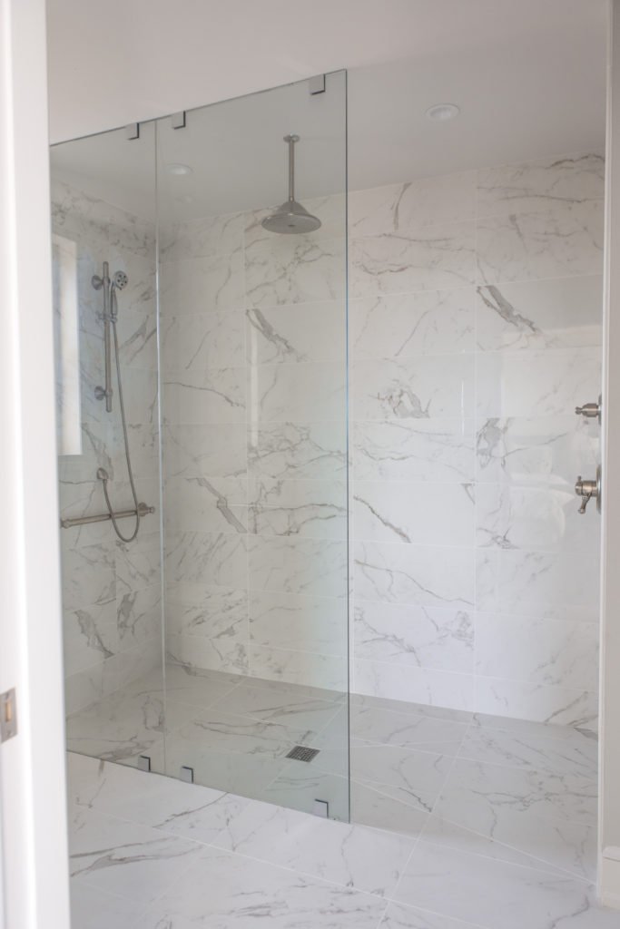
By placing the identical Italian marble style tile on the floor and walls of this compact space, the room visually expands to live much larger than before, while the new over sized shower for two, curb less entry, and partial glass front add to the spacious feel.

Karen Mills' blog
Interior design by Karen Mills


To transform your own dated bathroom into a beautiful new space that lives larger and enhances your living experience, just follow our recipe for success by improving your layout, knocking down walls, visually expanding, and adding light.

For more great interior design ideas, sign up for our design blog here!

plus become a fan of Kansas City’s interior designer and former host of the Living Large design show, Karen Mills, on Facebook  and Instagram now!

Interior Design/Interior Decorating

Interior Design: 3 Biggest Bloopers Made with Basement Remodels

An Interior Designer’s Insight on How to Make Your Basement Live Large

One of the first things I normally see when entering a finished basement are the obvious signs that I’m in a basement. But that’s not what you want. You need to think of your finished basement as professional finished main level living space instead to create the ideal interior design. Read on for my 3 ways to improve the visual appeal of your remodeled basement.

photo example
Interior design by Karen Mills

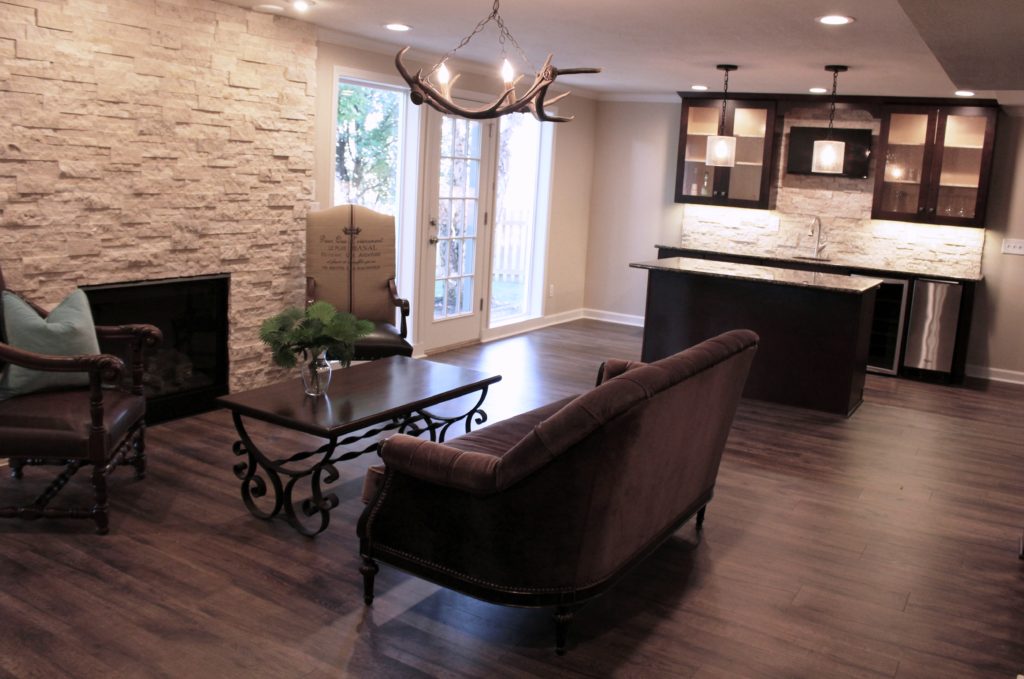
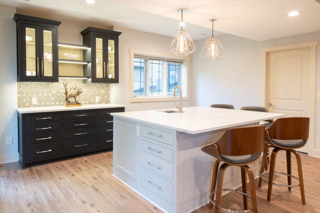
1. Not taking advantage of natural daylight – In this basement design we situated the bar area in a spot surrounded by natural light to make the space feel more like a main floor level interior. To further enhance the light airy feel we also designed the bar with white counter tops, used lighter paint colors and flooring to bounce more light around the room along with adding ample lighting.

Karen Mills' blog
Interior finishes by Karen Mills

2. Not hiding the telltale signs of a basement living space. –When finishing your basement ensure that you hide all horizontal ledges behind dry wall, disguise obvious duct work in the ceiling design, and cover all concrete wall niches or anything else that screams basement.

Here in this space we added wood flooring, artificial light, and and accent lighting to give this basement a first floor feel.

Karen Mills' blog
Interior design by Karen Mills

3. Lack of adequate artificial light – As an interior designer I can’t emphasize enough the importance of artificial lighting. Here we started with general can lights, added task lighting over the island, and then topped it off with accent lighting inside the shelves and under the cabinets to create a real wow factor.

Remember lighting is a major key to success when creating a basement interior design because lighting draws you into the rooms along with a professional finished look.

For more great ideas and photos on basement interior design or remodels, sign up for our weekly interior design blog here

Plus become a fan of Kansas City’s interior designer and former host of the Living Large design show, Karen Mills, on 
INSTAGRAM and FACEBOOK here!
Interior Design/Interior Decorating

Interior Decorating: 3 Tips for Picking the Perfect Paint…

A Designer’s Suggestions for Selecting Paint Colors for Your Interior

Paint color, one of the biggest issue faced by homeowners starting an interior design or interior decorating project is often an overwhelming task so today I’ve broken it down into three manageable steps for you to implement. 3 Reasons Why White Kitchens Stand the Test of Time

  1. View color swatches on a white background – When you’re ready to select paint colors for your interior, start by placing the color swatches on a solid white background to get a true reflection of the color before painting a large sample of the paint on your wall in the room where you want to paint. While making selections, ensure you’re wearing neutral clothing and don’t have bold colors nearby on walls or furniture that could reflect on your paint sample.
Karen Mills' blog
Photo courtesy of Kravet

2. Make your color selection during daylight light hours. And if its a cloudy day, look at the paint sample again on a sunny day to get the full range of changes that color will make as you transition from sunlight to cloudy to dark.  3 Color Scheme Options for Your Living Room

When selecting trim and ceiling paint colors, look to the lightest end of your paint strip for options along with whites. 

Karen Mills' blog
Interior design by Karen Mills

3. Paint large swatches of your paint selection on a backed poster board – All too often I walk in as an interior designer and see clients who’ve painted a light neutral over another color on the wall and the original color is bleeding through or distorting the new color. Once you have the board painted, place it against a neutral white background so you can view it during both daylight and after dark.

 But what if you don’t even know where to start with paint colors. Then pull inspiration from your closet, artwork, or a rug, for example. Then let the fun begin!


For more great tips on color and how to use it become of fan of our weekly interior design blog here


plus become a fan of Kansas City’s interior designer and former host of Living Large, Karen Mills on Facebookhere!

or instagram here!