Interior Design/Interior Decorating

Interior Decorating: A Beginner’s Guide to Collecting Original Art

After traveling the world in search of the perfect artwork to tell a client’s story in an interior design project I’ve learned a few things about selecting original artwork to fit the needs and personality of our clients. Read on for my tips and tricks to getting started with collecting your own original paintings or adding to your collection.

Original artwork available through Karen Mills
  1. Figure out what style(s) of artwork speak to you visually and emotionally. This depiction of a woman or figure would be an impressionist style because of its ethereal feel. To get a sense of what you love select three or more paintings and look for common factors like landscapes, abstract or figures.
Original art by well known artists available through Karen Mills

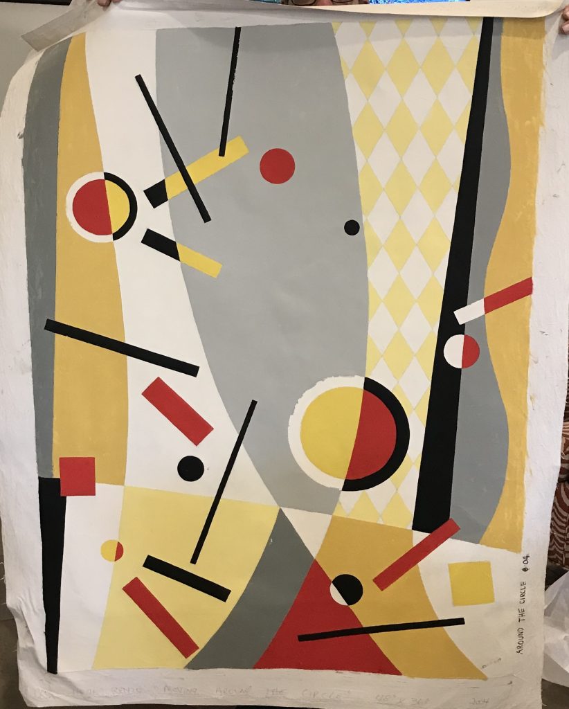
This colorful painting would be classified as a bold color abstract.

2. Select colors that you love which also gives onlookers a hint about your personality.
Orginal art by well known artists available through Karen Mills
Art available through Karen Mills

This painting tells the dramatic story of the parting of the sea with the hand of God hovering above.

3. Coordinate the paintings in your home or office to not only enhance your interior design but also to not compete with each other.

Artwork available through Karen Mills

This bold artwork depicts a more modern version of a landscape scene.

For more inspiration, ideas, and photos, sign up for our popular weekly interior design blog here with subscribers in over 130 countries.

Plus become a fan of Kansas City’s interior designer, former host of the Living Large interior design show, Karen Mills, on INSTAGRAM and FACEBOOK here!
Interior Design/Interior Decorating

3 Tips for Refreshing Your Living Room for Less

Tips for Updating Your Living Space with Budget Savvy Ideas

If you haven’t updated your living room for 5 years or more, it may be time for a refresh.  If your budget doesn’t allow you to start completely over, why not opt for a one day makeover or refresh instead with a local interior designer or decorator? Read on for my top 3 tips for updating your space for less.

Karen Mills' blog
Interior design by Karen Mills

1.  Create an inviting floor plan that emphasizes your main feature whether its a fireplace, a view outside or another prominent feature.  If you don’t have a focal point, design one yourself by grouping furnishings together like a sofa table or chest with a piece of artwork overhead and a table lamp and/or tabletop decor.

In this room our interior design client started with a favorite piece of art over the mantel to emphasize the focal point and we helped them select a new fireplace tile, chair fabric for existing chairs and a new ottoman to support the color scheme in the art.

Karen Mills' blog

2. Shop your entire house for furniture/furnishings you can use in your room.  Keep those items you discover in mind as you start to put together your room, bringing ones you think might work to a staging area nearby.

As an interior designer I often re purpose items to make them work in a space such as this family room where we reupholstered the sofa and chairs along with layering in a new rug, repainting the walls, adding a new light fixture, tables, and decor.

Karen Mills' blog
Interior design by Karen Mills

3. Add a pop of color with accents throughout your room ‘s interior design with pillows, art, drapes, decor or an area rug.   Remember, you can repaint or re purpose items to use in your refreshed room also.

For example, a chest could repainted and moved to your entry, used as a focal point in a living space, or even placed behind a sofa.  Ottomans can be upholstered and tucked under a sofa table for extra seating, used as a coffee table or pulled up to a comfy chair.

In this fabulous ocean blue living room, our interior design firm began with existing mermaid art as inspiration, then introduced bold blue and orange pillows along with custom blue drapes.

Looking for more great budget friendly decorating ideas?  Sign up for our weekly interior design blog here

Plus become a fan of Kansas City’s interior designer and former host of the Living Large design show, Karen Mills, on 
INSTAGRAM and FACEBOOK here! <

Interior Design/Interior Decorating

Interior Design: You Know You Need to Hire a…

How to Avoid Costly Mistakes with Your Interior Design, Decorating, or Remodeling/New Build Project

example

After completing over 1200 interior design and decorating projects as an interior designer I’ve learned a thing or two about how people think and at what point they usually call for help, which is often too late. So today I’m going to reveal those times when you definitely need to hire an interior designer to avoid costly mistakes, have regret, or end up with an interior design that’s either not functional, ugly or both. Read on for my 7 tips for knowing when it’s time to hire an interior design firm for your project.

illustration
  1. You know you need to hire an interior designer when you’re on the verge of divorce from fighting about about your project. You may laugh at this reason why but I have to tell you that our interior design firm gets called on frequently to quietly settle disputes while also helping clients come up with a plan that works for everyone.
illustration

2. You know you need an interior designer when you’re about to make a large furniture purchase you will regret the rest of your life. Interior design firms not only help you design your interior but they also help you avoid costly mistakes by ensuring the furniture purchased is better quality, functional, and a good fit for your body type unless throw away furniture is what you want.

a. poor quality – Most people mistakenly believe that because a furniture store is expensive or popular that they have quality furniture not realizing that often much of the company’s investment goes towards advertising instead. Interior design firms check not only the quality of the frames of upholstered furniture but also ensure the fabric will hold up in your space.

b. wrong size – Can’t tell you how many times clients have asked me to resolve their space planning dilemma when its too late because the furniture they just purchased doesn’t fit into the room or through a doorway like the basement.

c. doesn’t fit – Have you ever purchased a sofa or chair only to find out too late that it doesn’t fit your body type or its uncomfortable? Unfortunately that’s one of the most common mistakes I see clients make that interior designers help you avoid.

illustration

3. You know you need to hire an interior designer when the bad color choice(s) you made are still on the walls. Interior design firms use their expertise and experience with color to help you make better color choices that flow with your designed interior overall.

illustration

4. You know you need to hire an interior designer when you are second guessing your decor selections in the middle of a project like a remodel, new build, or decorating project.

illustration

5. You know you need an interior designer when you know what you like but have no idea how to put the interior design project together

illustration

6. You know you need an interior designer when your space hasn’t been updated for 15-30 years because you can’t make a decision. That’s what interior design firms call analysis paralysis and it simply means you need a professional to help guide you through the process.

For more inspiration, ideas, and photos, sign up for our popular weekly interior design blog here with subscribers in over 130 countries.

Plus become a fan of Kansas City’s interior designer, former host of the Living Large interior design show, Karen Mills, on 
INSTAGRAM and FACEBOOK here!
Interior Design/Interior Decorating

Interior Decorating: 3 Biggest Mistakes We Make in the…

Karen Mills' blog
Interior design by Karen Mills

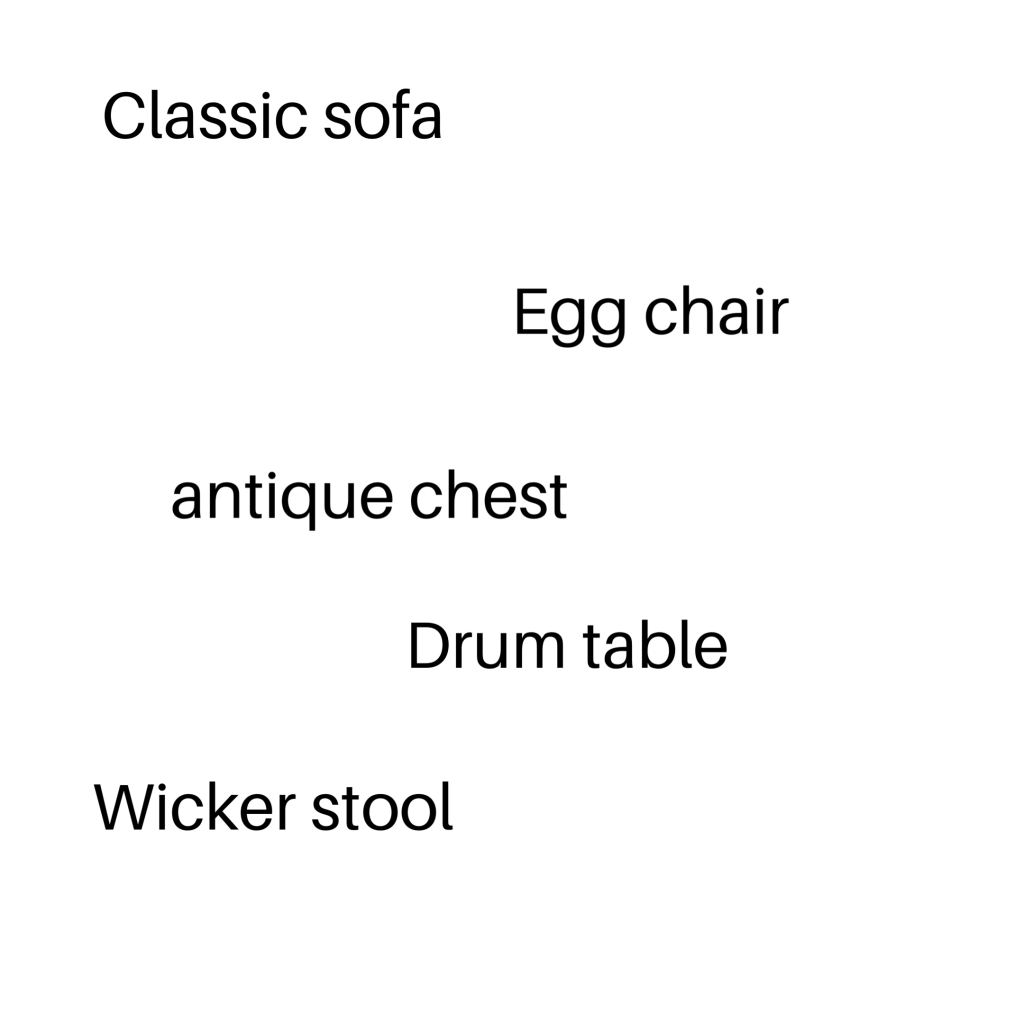
1. Lack of a Focal Point – Often as an interior designer I walk into a bedroom to discover a stark cold space that has no focus. Your bed is the focal point of the bedroom and the area you want to emphasize.

Here in this beautiful inviting bedroom we enhanced the existing poster bed with crisp white bedding, a gorgeous calming textural leaf wallpaper, and a warm hand knotted wool rug.

blog photo
Photo courtesy of Kravet

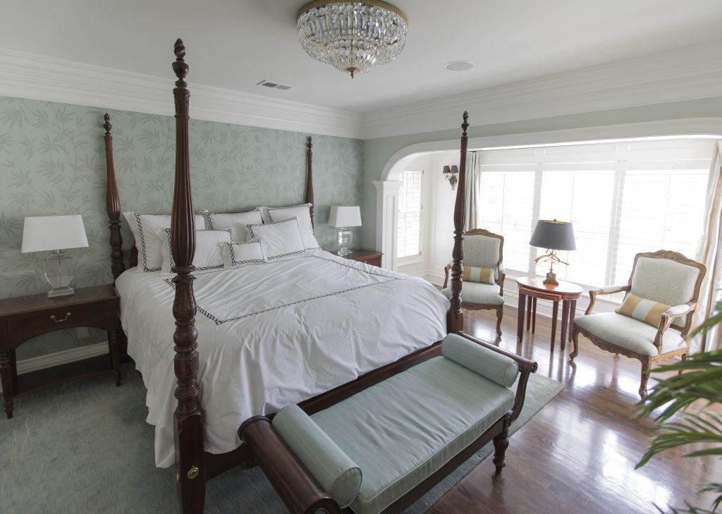
2. Uninviting – Often a bedroom becomes a dumping ground for everything we need to put away or even worse our home office space so to begin remove everything that’s not bedroom related.

In this space by Kravet, simple timeless bedding, a cozy bed that envelopes you and simple furnishings help create an inviting space.

Karen Mills' blog
Interior design by Karen Mills

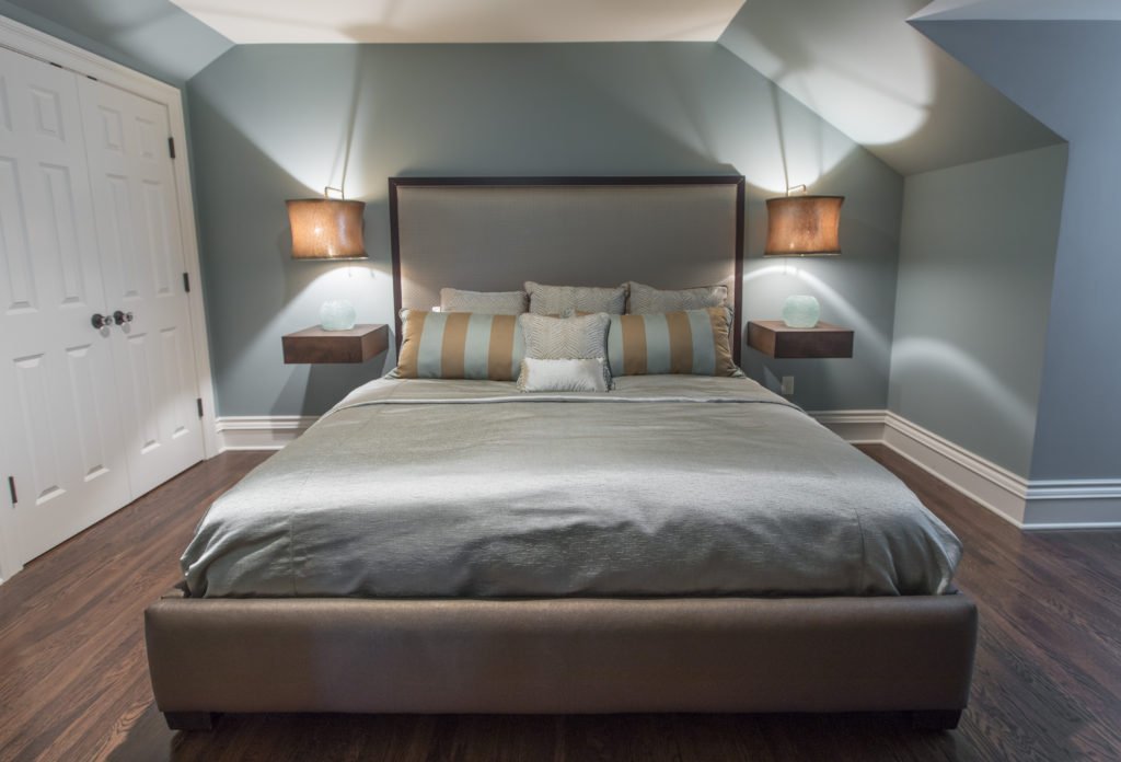
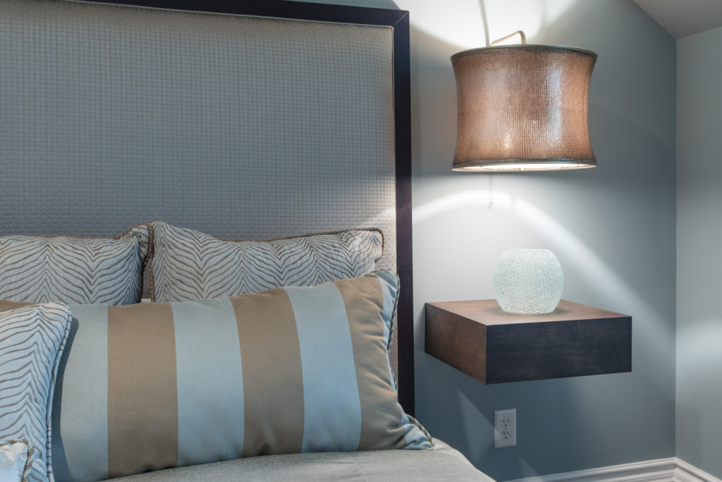
3. Too Cluttered or Crowded – In this smaller attic bedroom we didn’t want the room to feel crowded or cluttered with the king size mattress the clients needed so we designed a bed that didn’t overwhelm the room. Floating tables we designed along with light fixtures we adapted to hover over the tables gives a more open airy feel to the space.

Looking for more great bedroom design or decorating ideas?  Sign up for our weekly interior design blog here,

Karen Mills' blog

Plus become a fan of Kansas City’s interior designer and former host of the Living Large design show, Karen Mills, on 
INSTAGRAM, FACEBOOKTWITTER, or LINKEDIN here!

Interior Design/Interior Decorating

Interior Decorating: 3 Biggest Mistakes We Make in the…

Interior design by Karen Mills featured in two international books
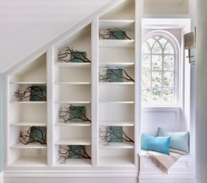
  1. Unwelcoming  –  If you want your guests to feel welcome then its important to create an inviting interior design like this entry where you are greeted by natural light, soothing colors, interesting patterns and textured materials like the pillows, throw, and branches.
Interior Design by Karen Mills

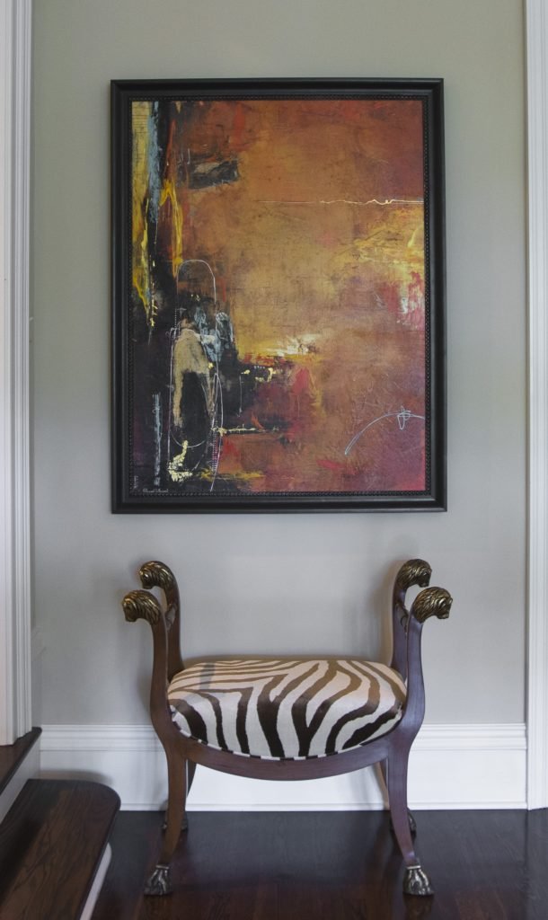
2. Zero Personality – As an interior designer I can’t repeat enough the importance of showcasing your personal style in the foyer. The entry has become the most important area in your home because it gives people an idea of your personality and taste. In this foyer we showcased the clients’ love of animal prints on this traditional custom designed stool while also pairing it with abstract art to reveal their unique style and great taste.

Karen Mills' blog
Interior design by Karen Mills featured in Architecture Today Interior Design book

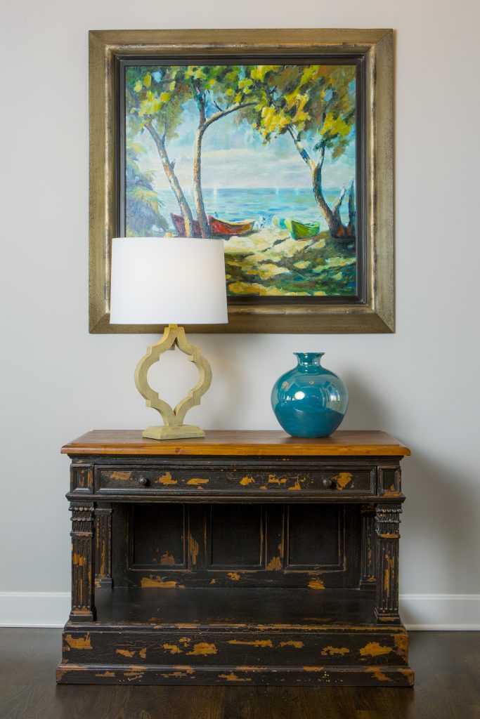
3. Lack of Intrigue   I always tell our interior design clients to think of their foyer as the advertisement for their home because your entry should give visitors a glimpse into what’s coming next from colors and style to personal mementos like this entry where we began with a family heirloom piece and dressed it up with a beautiful landscape painting, vase, and lamp that gives you a preview of the color scheme and what’s next.

For more inspiration, ideas, and photos, sign up for our weekly interior design blog here.

Plus become a fan of Kansas City’s interior designer, former host of the Living Large interior design show, and coach Karen Mills, on 
INSTAGRAM and FACEBOOK here!

And for more foyer inspiration, click here to read my Houzz interior design article on Color Palettes for Pleasing Entryway

or my budget tips titled Refresh Foyer for Less

Interior Design/Interior Decorating

Interior Decorating: 3 Big Design Mistakes We Make in…

rug sizing example
Interior design by Karen Mills
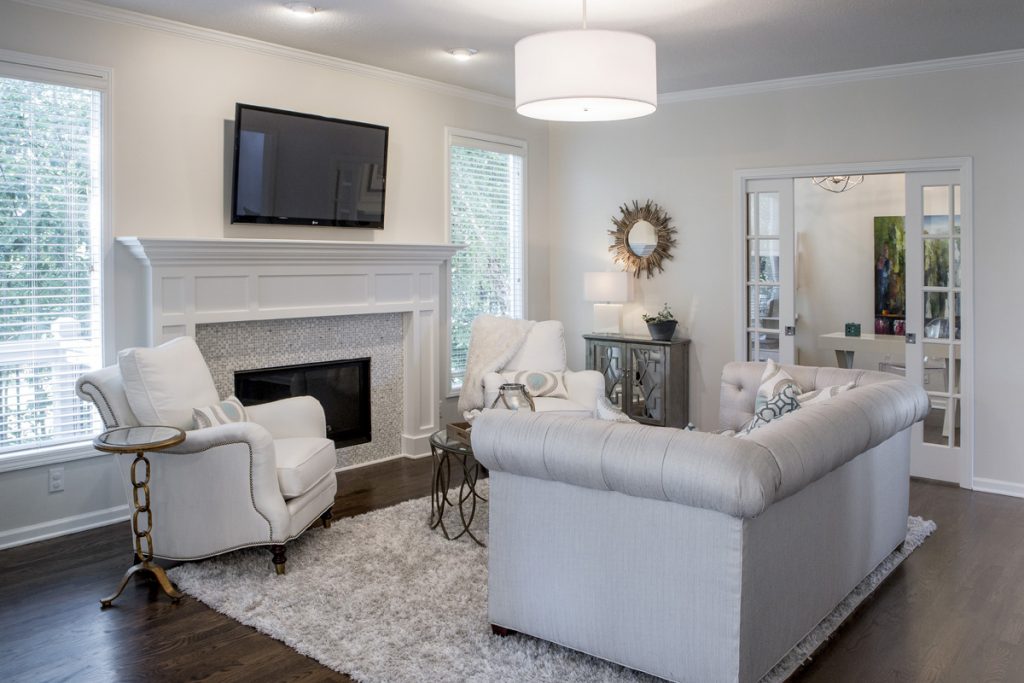
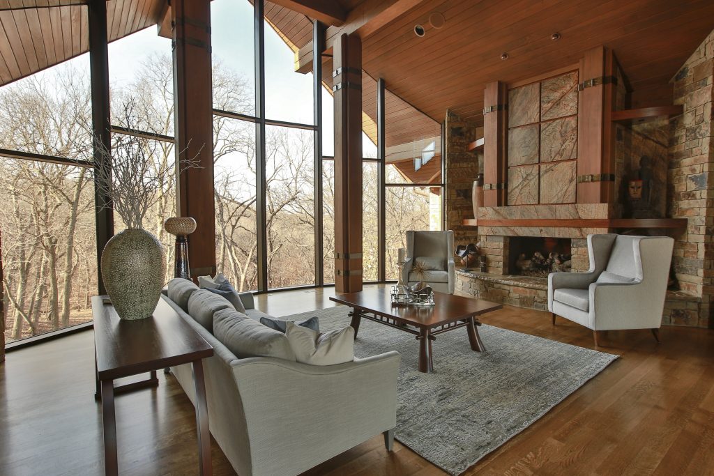
  1. Lack of a Focal Point    Often the best area to emphasize in a living space is the fireplace or great view outside but if you don’t have those options, create a vignette (grouping) of furniture/accessories that will grab your attention. Then group your upholstery around the focal point to emphasize it. Here in this living room the stone fireplace acts as a focal point for the seating area.
Karen Mills' blog
Interior design by Karen Mills

2.  Purchasing Over Sized Upholstery Or Too Many Pieces  Have you ever decided you wanted to buy a new living room grouping but didn’t bother creating a floor plan or measuring the space first? Suddenly your furniture arrives and the furniture takes up so much real estate you can barely walk through or don’t have room? As an interior designer I can’t tell you how many frantic calls I’ve received from homeowners requesting help with their space planning only to discover the wrong furniture was already purchased and they want me to fix it which we know is impossible. In this living room, the right size furniture was used and strategically placed to not only enhance the focal point (fireplace) but also leave ample room for someone to pass through.

Karen Mills' blog
Interior decorating by Karen Mills

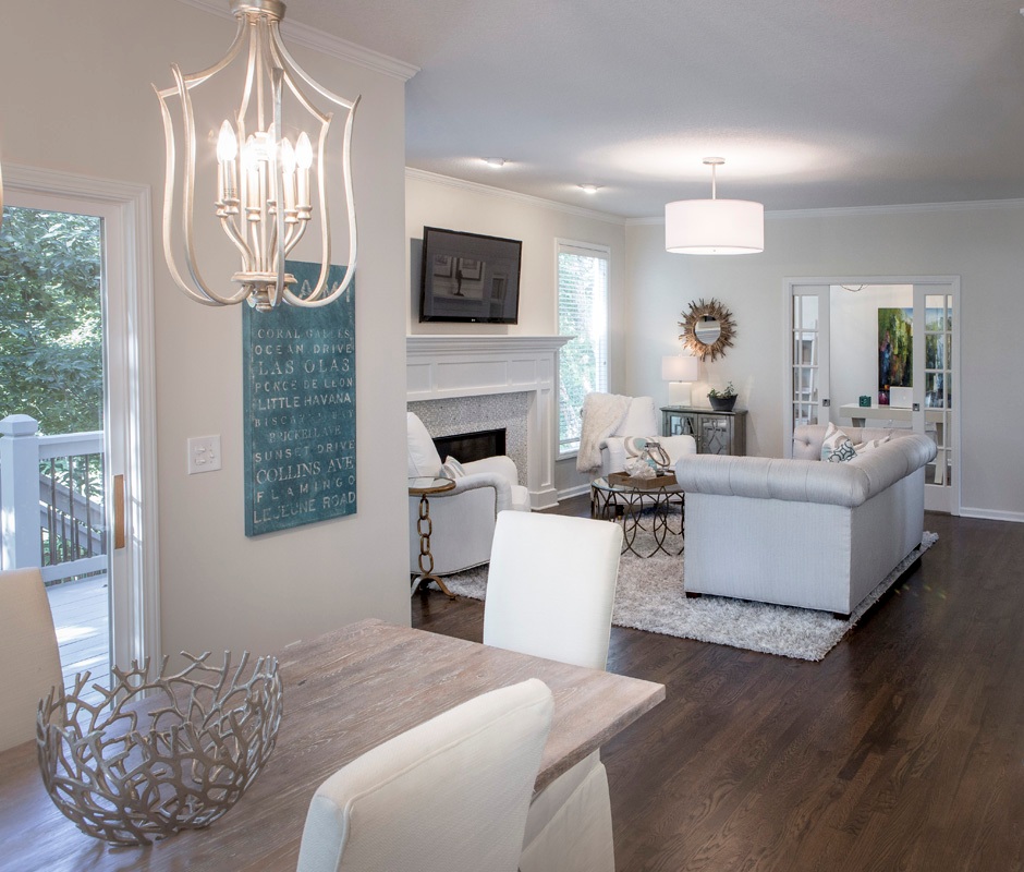
3.  Selecting The Wrong Wall Color   After working on 1200+ interior design projects I see this mistake happen more than any other. We might want to blame a decorating network like HGTV or DIY for making us believe that picking paint colors is easy but I think its because the general public doesn’t realize how much a color can change when it goes from a tiny paint swatch to an interior or in different lighting situations. In this great room we selected the paint color during day that not only coordinated with the finishes and furniture but also played well with other rooms in view.

For more inspiration, ideas, and photos, sign up for our weekly interior design blog here.

Plus become a fan of Kansas City’s interior designer and former host of the Living Large design show, Karen Mills, on 
INSTAGRAM and FACEBOOK here!

Interior Design/Interior Decorating

Interior Design: 5 Tips for Selecting a Sofa That…

Share

Designer Tricks for Picking a Sofa to Perfectly Fit Your Room and Body Type

Karen Mills' blog
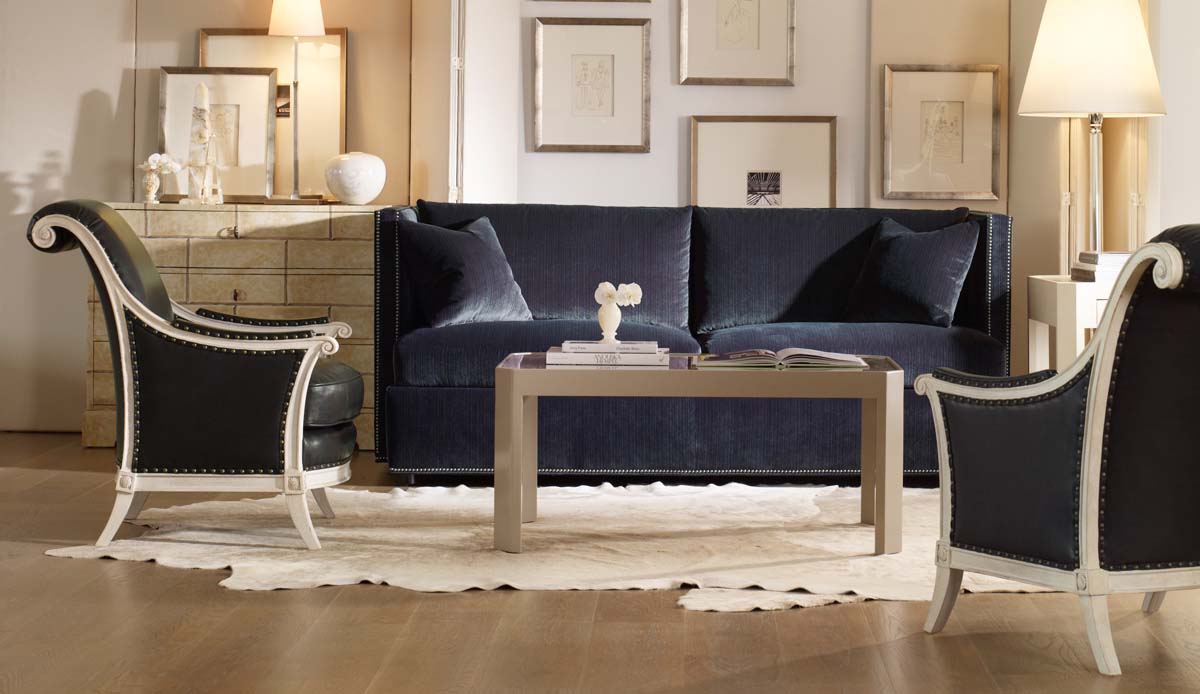
Photo courtesty of Century Furniture

As an interior designer I realize how little most homeowners know about selecting a sofa that will fit them.  Here are my top 5 secrets to selecting a perfect custom sofa for your home!

  1.  Determine the style and size of sofa needed for your space.  If you have tall ceilings and supersized furnishings, you will need a sofa that’s in proportion to the room’s design and if its a smaller cozier space you need to make sure the sofa doesn’t overpower your space.
Karen Mills' blog
Photo courtesy of Century Furniture

2. Make sure you select the right cushioning for your sofa style and your personal preference whether it’s foam and down, all down, allergy free, or a combination of materials on the seat and back of your sofa.

3.  Ensure the sofa fits your body type and height so your feet aren’t dangling above the floor or you aren’t unable to lean back comfortably in the seat because it too deep.

Karen Mills' blog
Photo courtesy of Bernhardt Furniture

4. Select the correct material for your sofa.  If you will be using the sofa  regularly then you will need a higher double rub count for durability and if you have dogs or cats, try to avoid a fabric that can be snagged easily.  Also keep in mind how easily the fabric will clean and if it will go will with your room’s design and other fabrics.

5. Solid or Tone on Tone Sofa Color  As an interior designer, I prefer a solid color or tone on tone sofa because it’s usually one of the biggest items in your room and can seem overpowering if you select a busy pattern or even a color that’s too bold. Of course rules are meant to be broken but only if you are a professional interior designer or have a keen eye to know what works and what doesn’t

Karen Mills' blog
Photo courtesy of Bernhardt furniture

For more great ideas on selecting furnishings and decorating sign up for our weekly interior design blog here

Plus become a fan of Kansas City’s interior designer and former host of Living Large design show, Karen Mills, on Instagram or Facebook now!

Interior Design/Interior Decorating

Interior Decorating: 3 Tips for Coordinating Mismatched Furnishings in…

Do you have a collection of mismatched furniture that feels unfinished or undone?  Read on for my 3 interior designer tips for creating a cohesive look in your room.

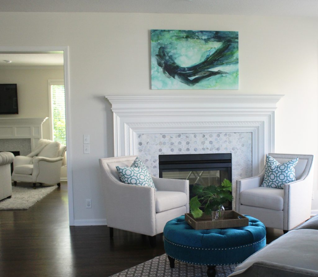
Interior design by Karen Mills

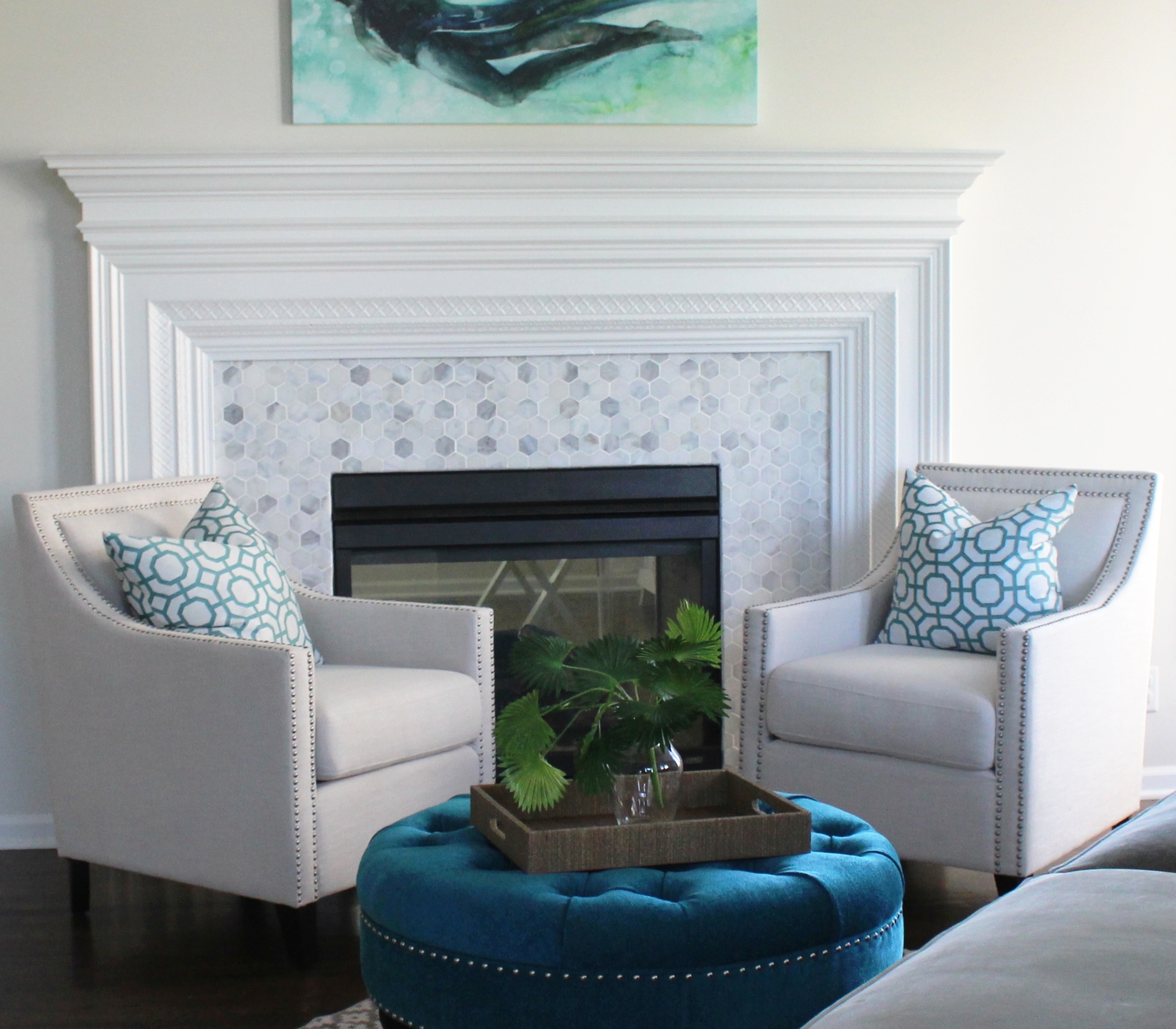
1. Repetition – To coordinate two pieces of mismatched upholstery, unify both pieces by repeating a color from one piece to onto another with a pillow or throw.  Here the blue green color of the ottoman was repeated in the pattern on the pillows, while the artwork brings everything together including the gray velvet sofa in the foreground and the new tile on the fireplace.

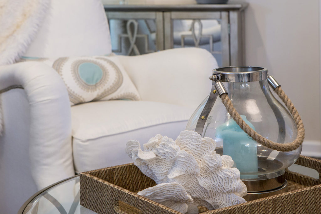
2. Introduce a new design element  – A piece of artwork overhead or nearby accessories  with both colors can also serve as a way to bring two different colors of upholstery together effectively.  Here in this family room the blue center of the pillow is repeated in the blue candle nearby while the white seashell picks up the white upholstery.

When creating vignettes of accessories in your space whether its for a tabletop or shelves, try to place objects of various heights, sizes, texture, and shapes together to create a cohesive whole.  Normally placing the taller narrower items at back with shorter wider items at the front works best.

Karen Mills' blog
Photo courtesy of All Modern furniture

3. Layer a rug underneath – Placing a rug underneath your upholstery helps create a cozy grouping of furniture like this living area but it may also pick up colors from one or several pieces of upholstery.  Here the brown chair color is repeated on a pillow accent color and coffee table while the yellow and gray hues in the rug are mimicked again on the sofa and pillows.

For more great ideas and photos, sign up for our weekly interior design and decorating blog here

Become a fan of Kansas City’s interior designer and former host of the Living Large design show, Karen Mills, on Facebook here!
Interior Design/Interior Decorating

Interior Design: 3 Tips for Getting Cozy with Area…

Suggestions for Creating a More Inviting Feel in Your Living Space Using Area Rugs

Interior design by Karen Mills
  1. Create a cozy seating area for conversation. In this room we introduced a rug that not only adds another layer of texture but also nice contrast to this darker space, picking up some of the daylight beyond. To further enhance the coziness of this room we went with a wool and silk rug that has a luxurious soft texture so it feels great on bare feet or in socks.
rug sizing example
Interior design by Karen Mills

2. Layer an area rug under the furniture (or at least the feet) of your seating area. Placement of the rug under your furniture in a cozy arrangement draws onlookers into the space for a closer look like shown here where we used a high quality wool rug which are washable and comfortable to the touch.

Interior design by Karen Mills

3. Select a rug with a soft hand or texture that feels great underfoot. In this living space we layered in a super lush long shag area rug where you can dig in your toes and snuggle up for conversation, reading, or just watching a movie.

For more great ideas and photos, sign up for our weekly interior design blog here

Plus become a fan of Kansas City’s interior designer and former host of the Living Large design show, Karen Mills, on Facebook or Instagram here!

Interior Design/Interior Decorating

Interior Design: 7 Tips for Creating a Delicious Dining…

Karen Mills' blog rug example
Interior Design by Karen Mills

1. Select Your Personal Design Style –  If  you have no idea what style you are start by finding inspiration photos online or in print.  Then notate your favorite elements from each room to get a sense of your style.

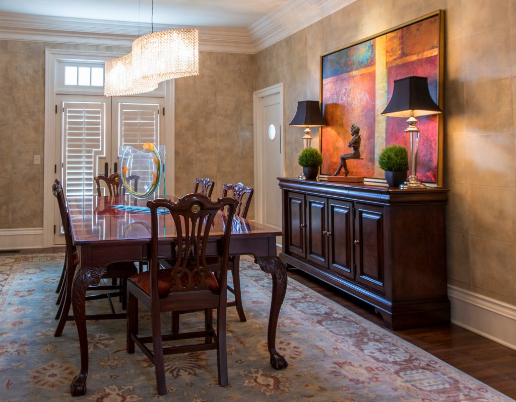
Using existing furniture, we added personality to this room by introducing a stunning crystal chandelier by Schonbek along with an original abstract painting and sculpture, hand knotted rug, custom seat covers, and wallpaper.

Karen Mills
Styling by Summer Ann of Girlsinmadras.com

2. Pick  a Color Scheme –  Most of us don’t spend much time in a dining room so have fun in here and pick colors you love.  Bolder colors can go on decor, rugs, chairs, or even walls but if you like to change up your style often, you might consider neutral walls and floors that give more flexibility when you want to change your color scheme.

3. Add Dining Table and Seating –  The dining room table and chairs along with the items directly behind them are the focal point of your room.   Begin by determining how many people you need to seat and ensuring you have room for the table you want.  Plus remember that your chairs don’t need to match your table, just enhance them.

If you opt for a dramatically styled table, then consider simpler style chairs and backdrop.  Or if you go with a simpler style table, you might bring in drama with a wall covering or beautiful buffet with art above.

Karen Mills' blog
Interior decorating by Karen Mills

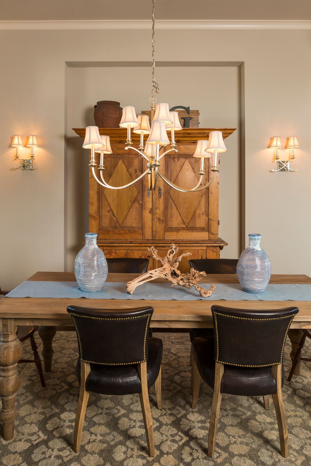
4. Consider Including Additional Furniture –  The majority of dining rooms benefit from functional storage furniture like a buffet and curio cabinets or an antique armoire like shown in this photo, but remember sofa tables, tea carts, and other furnishings can also enhance your room and provide handy surfaces for lamps, platters, trays, or display.

 5. Introduce a Dramatic Element – A bold element can range from a gorgeous piece of art and beautiful buffet to a stunning light fixture over a painting or interesting chair backs and wallpaper like shown here.

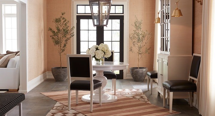
Photo courtesy of Kravet

6. Layer in Texture  – Adding texture softens all the hard surfaces of the table, chairs, buffets, and hard flooring.   Texture can be introduced with an area rug, drapes, fresh flowers, and live trees/plants like shown here in this beautiful space.

7.  Add lighting –  Table lamps on a buffet or sofa table look beautiful behind a dining table along with a stunning chandelier and/or sconces on the wall behind. In this dining room courtesy of Kravet, the over sized chandelier commands attention, while the sconces on the right enhance the overall lighting and design scheme.

For more great ideas and photos, sign up for our weekly interior design blog here

Plus become a fan of Kansas City’s interior designer and former host of the Living Large design show, Karen Mills, on Facebook or Instagram here!