Interior Design/Interior Decorating

Interior Design: 3 Biggest Mistakes We Make in The…

How to Make Your Bedroom More Appealing
Karen Mills' blog
Interior design by Karen Mills

1. Lack of a Focal Point – Often as an interior designer I walk into a bedroom to discover a stark cold space that has no focus. With interior design a bed becomes the focal point and we need to enhance it.

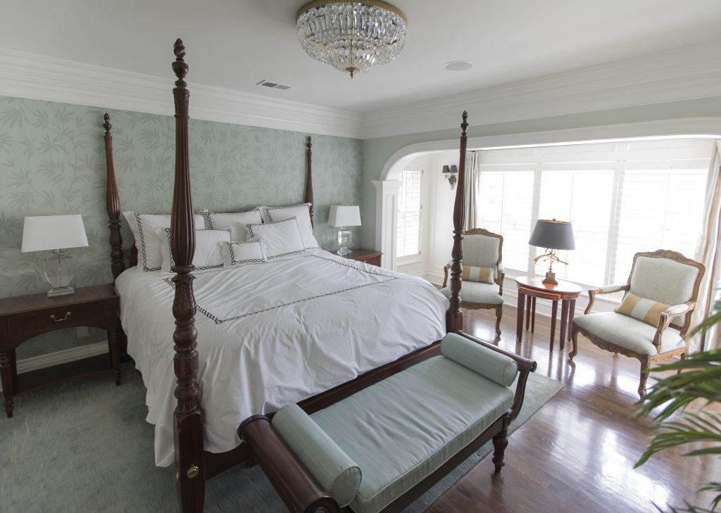
Here in this beautiful inviting bedroom we enhanced this poster bed with crisp white bedding, a fabulous textured leaf wallpaper, and a warm hand knotted wool rug with matching lamps and nightstands flanking it and a bench.
Karen Mills' blog
Interior design by Karen Mills

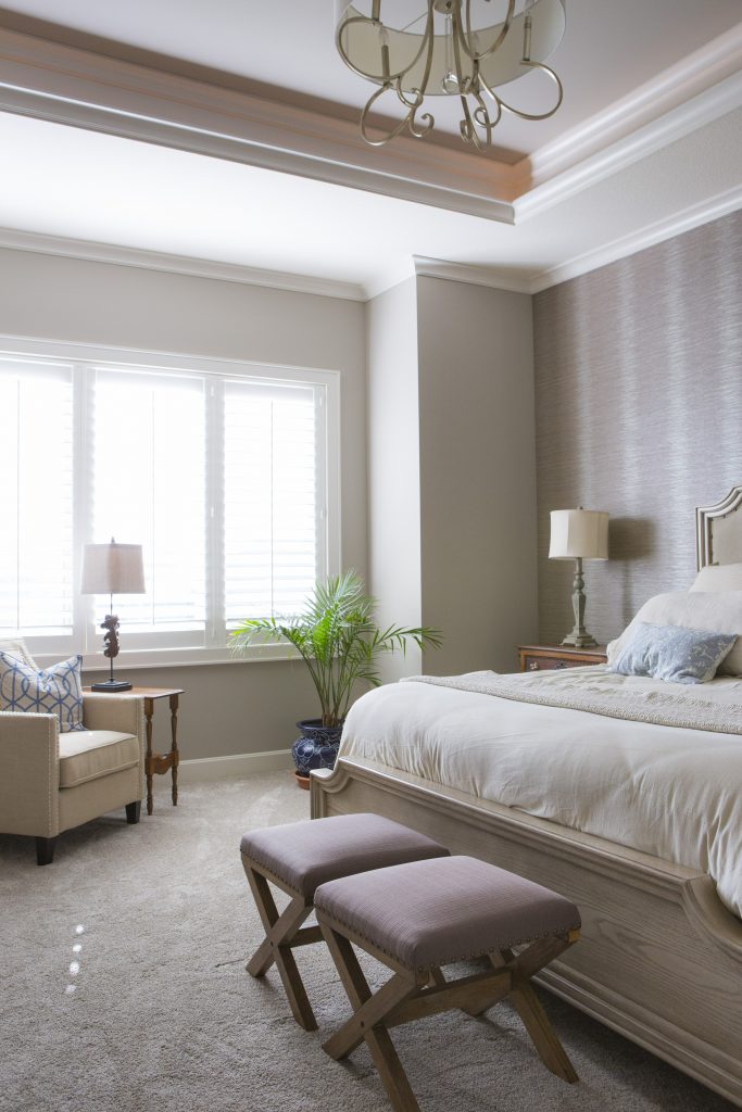
2. Uninviting – To create a more inviting bedroom with the existing American antiques our interior design firm layered in a upholstered bed with wallpaper behind, an attractive chair, and washable European linens that invite to come jump into bed.
Karen Mills' blog
Interior design by Karen Mills

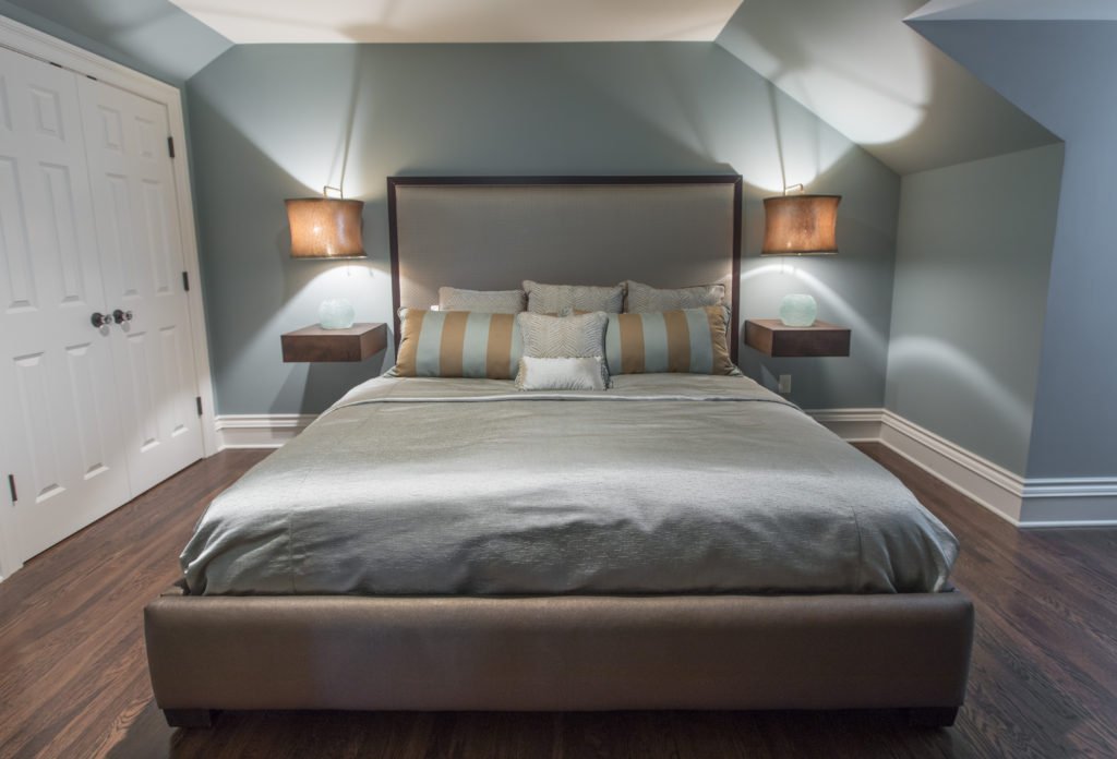
3. Too Cluttered or Crowded – In this tiny converted attic bedroom we didn’t want the room to feel to crowded or cluttered with this king size bed the clients requested so we designed a bed that didn’t overwhelm the room along with floating bedside tables and lamps that didn’t take up any more room on the floor. The lamps also add an inviting element with their low light. Headboard and custom bedding fabrics in more neutral calming colors help keep the space from feeling too busy.

Looking for more great bedroom design or decorating ideas?  Sign up for our weekly interior design blog here

Plus become a fan of Kansas City’s interior designer and former host of the Living Large design show, Karen Mills, on 
INSTAGRAM, FACEBOOK, TWITTER, or LINKEDIN here!
Interior Design/Interior Decorating

3 Ways To Update Your Room for Less

Tips for Updating Your Living Space with Budget Savvy Ideas

If you haven’t updated your living room for 5 years or more, it may be time for a refresh.  If your budget doesn’t allow you to start completely over, why not opt for a one day makeover or refresh instead?

Even though the majority of my time as an interior designer is spent on custom design and remodel projects, when I have a spare hour or two I love helping enthusiast homeowners style their space using existing furnishings in their home to create a fresh new look. So if you’re ready to refresh your space or update using existing furnishings, here are my top three tips!

Karen Mills' blog
Interior design by Karen Mills

1.  Create an inviting floor plan that emphasizes your focal point whether its a fireplace or view, for example.  If you don’t have a focal point, design one yourself by grouping items together such as a sofa table or chest with a piece of artwork overhead and a table lamp and/or tabletop decor.

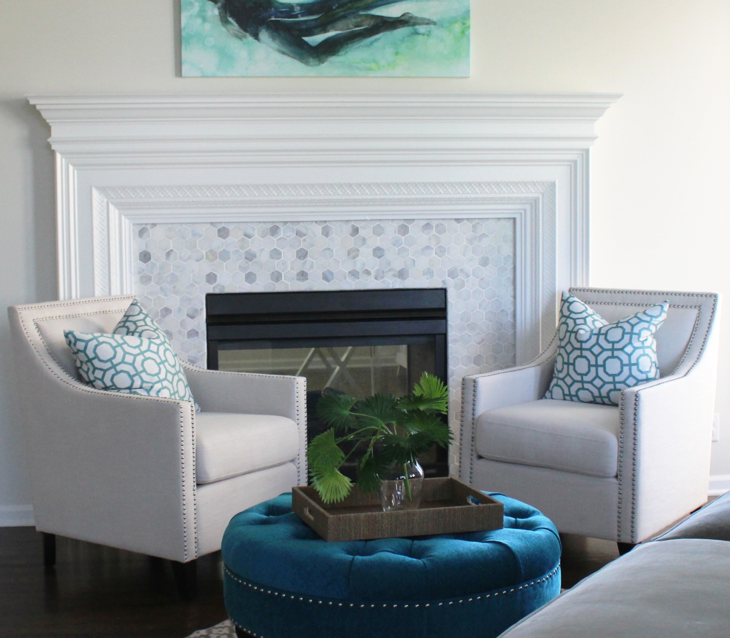
In this room the client started with a favorite piece of art over the mantel and we replaced the fireplace tile along with upholstering the existing chairs and ottoman to create a fabulous new look!

Karen Mills' blog

2. Shop your entire house for furniture/furnishings you can use in your room.  Keep those items you discover in mind as you start to put together your room, bringing ones you think might work to a staging area nearby.

As an interior designer I often re purpose items to make them work in a space such as this family room where we reupholstered the sofa and chairs along with layering in a new rug, repainting the walls, adding a new light fixture, and decor.

Karen Mills' blog
Interior design by Karen Mills

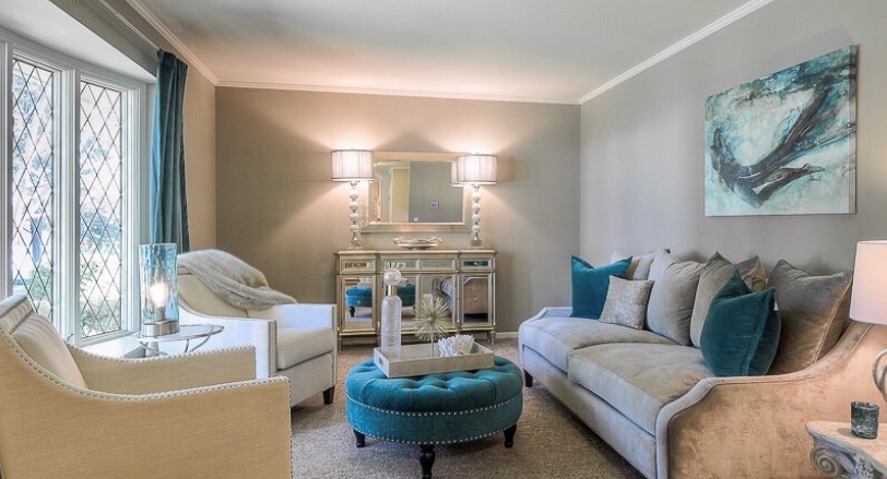
3. Add a pop of color with accents throughout your room with pillows, art, drapes, decor or an area rug.   Remember, you can repaint or re purpose items to use in your refreshed room also.

For example, a chest could repainted and moved to your entry, used as a focal point in a living space, or even placed behind a sofa.  Ottomans can be upholstered and tucked under a sofa table for extra seating, used as a coffee table or pulled up to a comfy chair.

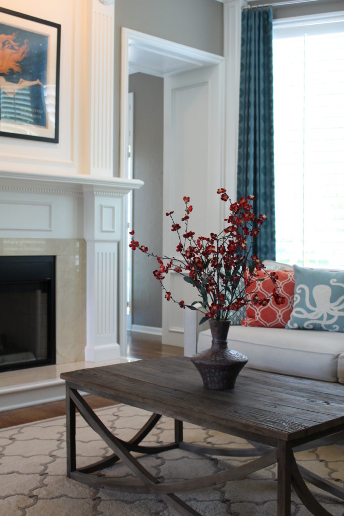
In this fabulous ocean blue living room, we began with existing mermaid art as inspiration, introducing bold blue and orange pillows along with custom blue drapes.

Looking for more great budget friendly decorating ideas?  SIgn up for our weekly interior design blog here

Plus become a fan of Kansas City’s interior designer and former host of the Living Large design show, Karen Mills, on 
INSTAGRAM and FACEBOOK here!

<

Interior Design/Interior Decorating

Interior Design: 3 Biggest Mistakes We Make in the…

Design Tips for Making Your Dining Room More Stunning

Karen Mills' blog
Interior design by Karen Mills as featured in Architecture Today Interior Design and Design Icons books
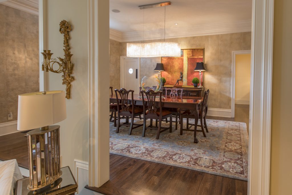
  1. Lack of emphasis  Creating a focal point with your table in the dining room gives you the opportunity to create a dramatic look, perfect for a dinner table or family gathering. Here in this Mission Hills dining room we began with an existing table and buffet along with selecting a fabulous hand knotted wool rug. Then we took the design to another whole level but introducing more contemporary elements from the stunning Swarovoski crystal chandelier that compels you to take a closer look to the bold abstract art beyond, contemporary sculpture, and rich leather squares on the wall.
Karen Mills' blog
Interior design by Karen Mills as featured in Architecture Today Interior Design book

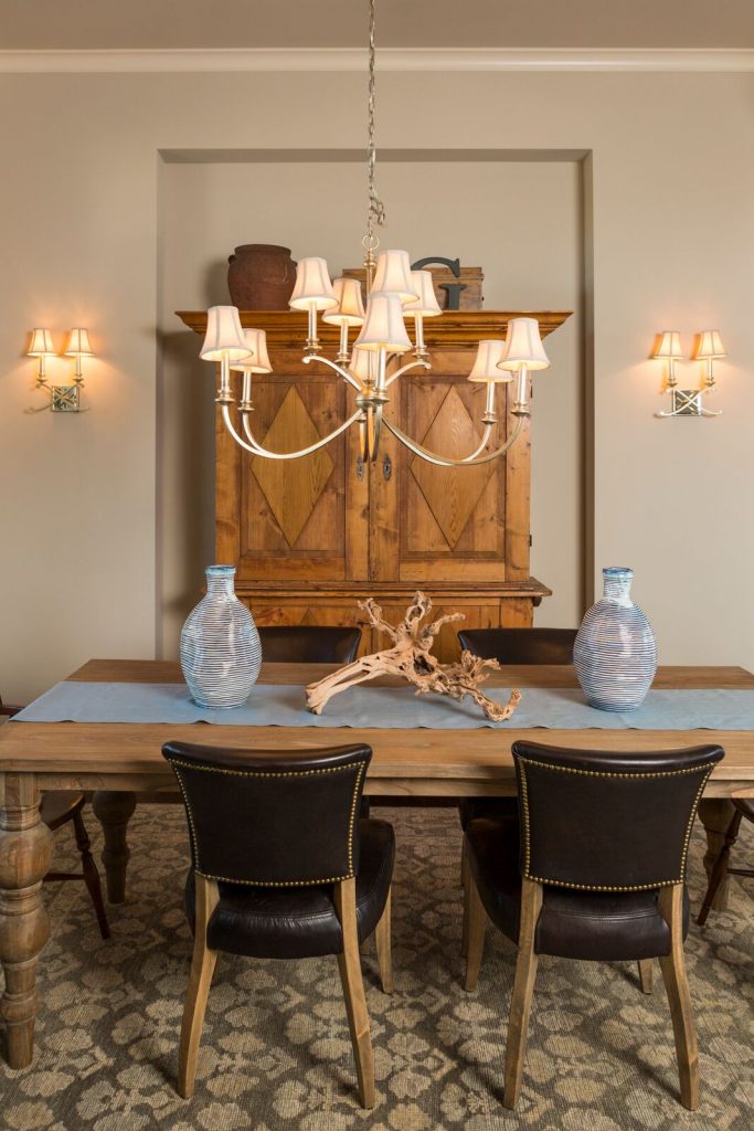
2.  Cold uninviting space –  One of the most common issues I see as an interior designer are dining rooms filled with hard shiny surfaces such as crystal, glass, or ceramic along with nothing on the floor or walls. To rectify this issue, try warming up your dining space with lots of texture. Here in this Overland Park room the client requested we use their heirlooms – a table and armoire, along with leather chairs. To warm up the space, we introduced a piece of gnarled wood, two handmade looking vases, and a custom cloth runner along with layering in a thick hand knotted rug underneath.

Karen Mills' blog
Interior design by Karen Mills

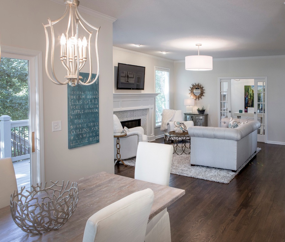
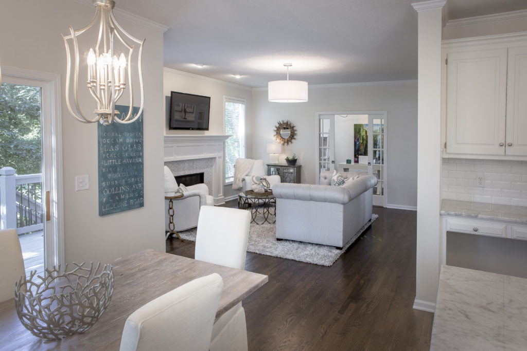
3. Looks Unfinished  When we walk into an interior design client’s home one of the first things we often see is an undone dining room. To enhance this space and make it more updated, I recommend adding color and items of interest whether with texture or design. In this dining area, we refinished a door in a soft neutral gray, updated the light fixtures overhead, put slipcovers on plain dark leather chairs, and added an interesting centerpiece along with blue art to create an inviting area to eat and relax.

For more inspiration, ideas, and photos, sign up for our weekly interior design blog here.

Plus become a fan of Kansas City’s interior designer and former host of the Living Large design show, Karen Mills, on 
INSTAGRAM and FACEBOOK here!

Interior Design/Interior Decorating

Interior Design: 8 Secrets to Creating Interiors That Stand…

How to Design Spaces That Are More Enduring

Karen Mills' blog
Interior design by Karen Mills

As an interior designer I’ve been fortunate to have the innate ability to create living experiences that are more enduring whether its a living room like this one or a work space like the shower in the next photo. In this living space quality upholstery, less patterns, and simple lines create a lasting appeal.

Karen Mills' blog
Interior design by Karen Mills

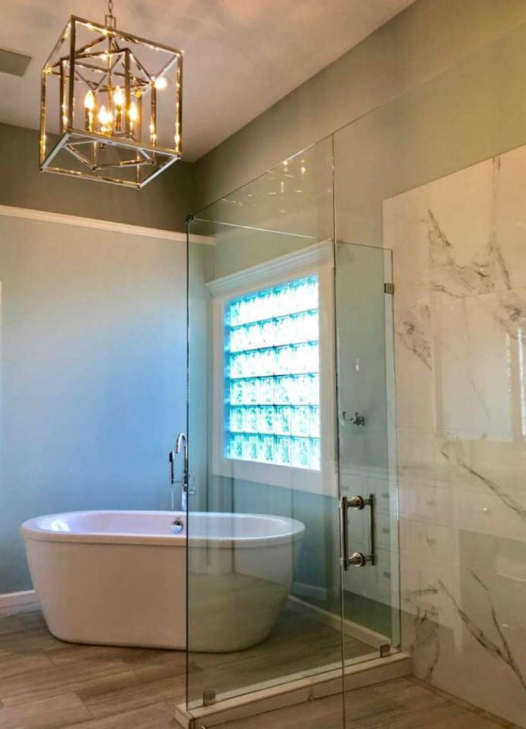
Even though finishes on furniture are important the most critical element to making an interior more timeless begins with finishes that are classic and enduring like this marble type tile we used on this bathroom high rise to make it last for years to come.

To read all 8 of our secrets to creating spaces with staying power that we wrote for HOUZZ, including specific examples of each, click on the link below.

For more inspiration, ideas, and photos, sign up for our weekly interior design blog here.

Plus become a fan of Kansas City’s interior designer and former host of the Living Large design show, Karen Mills, on 
INSTAGRAM and FACEBOOK here!

8 Rooms with Staying Power

Interior Design/Interior Decorating

Interior Design with Intoxicating Color, Rich Texture, and International…

Read on to Learn How We Created a One of Kind Showstopping Design in the Heart of the U.S.

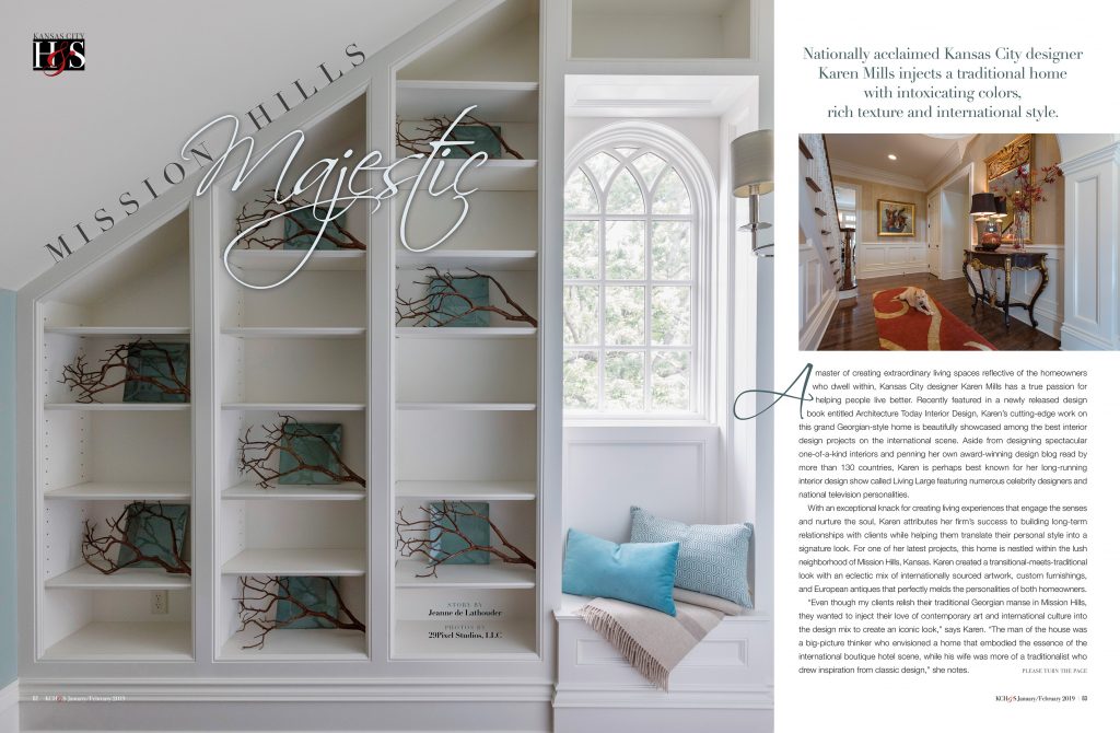
This project was a labor of love for this wonderful family who wanted a place to entertain family and friends. We started with designing the main entry – shown in orange and beige then worked our way through the home and up to the third floor guest suite we affectionately call “The Flat” – pictured in blue and white here, to create a space that’s one of a kind.

Karen Mills' blog
Interior design by Karen Mills

Click now to read the rest of this fabulous article by Kansas City Homes & Style magazine, plus see several more photos, some which have never been seen before.

For more inspiration, ideas, and photos, sign up for our weekly interior design blog here.

Plus become a fan of Kansas City’s interior designer and former host of the Living Large design show, Karen Mills, on 
INSTAGRAM and FACEBOOK here!

Interior Design/Interior Decorating

Interior Design: 3 Big Mistakes People Make in Their…

How to Make Your Entry More Interesting

Karen Mills' blog
Interior design by Karen Mills
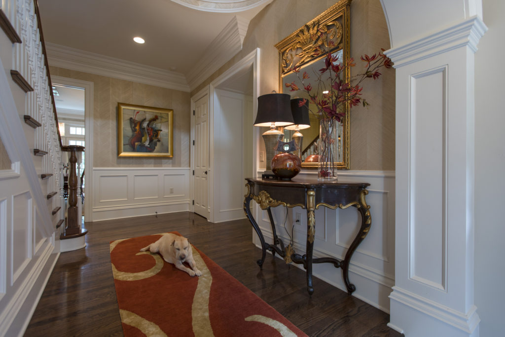
  1. Unwelcoming  –  If you want your guests to feel welcome then its important to create an inviting foyer like this one we designed where you are greeted by rich colors, great lighting, a comfortable rug underneath, and warm textural wall coverings that wrap you in a big hug. Of course Lucy (the dog) will be sure to say hello if she’s around too!
Interior Design by Karen Mills

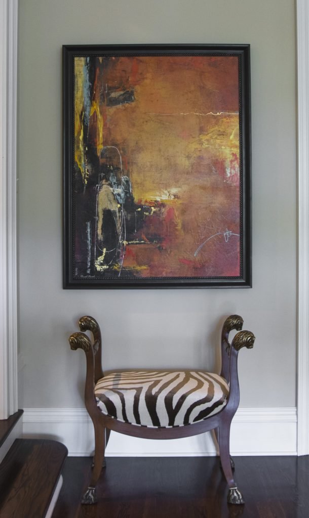
2. Zero Personality – As an interior designer I can’t repeat enough the importance of showcasing your personal style in the foyer. I believe the entry to be the most important area in your home because it gives people a hint of who you are and what you like. In this entry area we showcased the clients’ love of animal prints on this traditional custom designed stool while also showcasing their sophisticated taste in mixing styles with the abstract art above.

Karen Mills' blog
Interior design by Karen Mills featured in Architecture Today Interior Design book

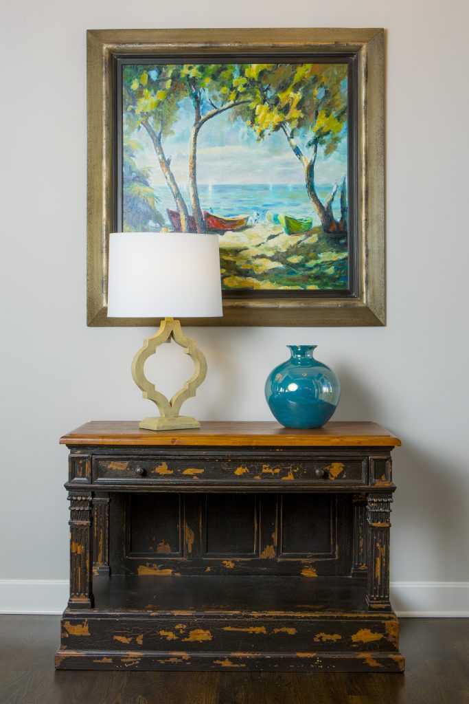
3. Lack of Intrigue   I always tell our interior design clients to think of their entry as the advertisement for their home because your entry should give visitors a glimpse into what’s coming next from colors and style to personal mementos like this entry where we began with a family heirloom piece (one of many) and dressed it up with a beautiful landscape painting, vase, and lamp that give you a preview of the color scheme and what’s next.

For more inspiration, ideas, and photos, sign up for our weekly interior design blog here.

Plus become a fan of Kansas City’s interior designer and former host of the Living Large design show, Karen Mills, on 
INSTAGRAM and FACEBOOK here!

And for more foyer inspiration, click here to read my article on & Color Palettes for Pleasing Entryway

or my budget tips titled Refresh Foyer for Less

Interior Design/Interior Decorating

Interior Design: 3 Big Mistakes People Make in Living…

Karen Mills' blog
Interior design by Karen Mills
  1. Lack of a Focal Point    Often the best spot to emphasize in a living space is the fireplace or great view outside but if you don’t have those options, create a vignette (grouping) of furniture/accessories that will grab your attention. Then group your upholstery around the focal point to emphasize it. Here in this living room a focal point was created on the back wall to entice people into the space for a closer look.
Karen Mills' blog
Interior design by Karen Mills

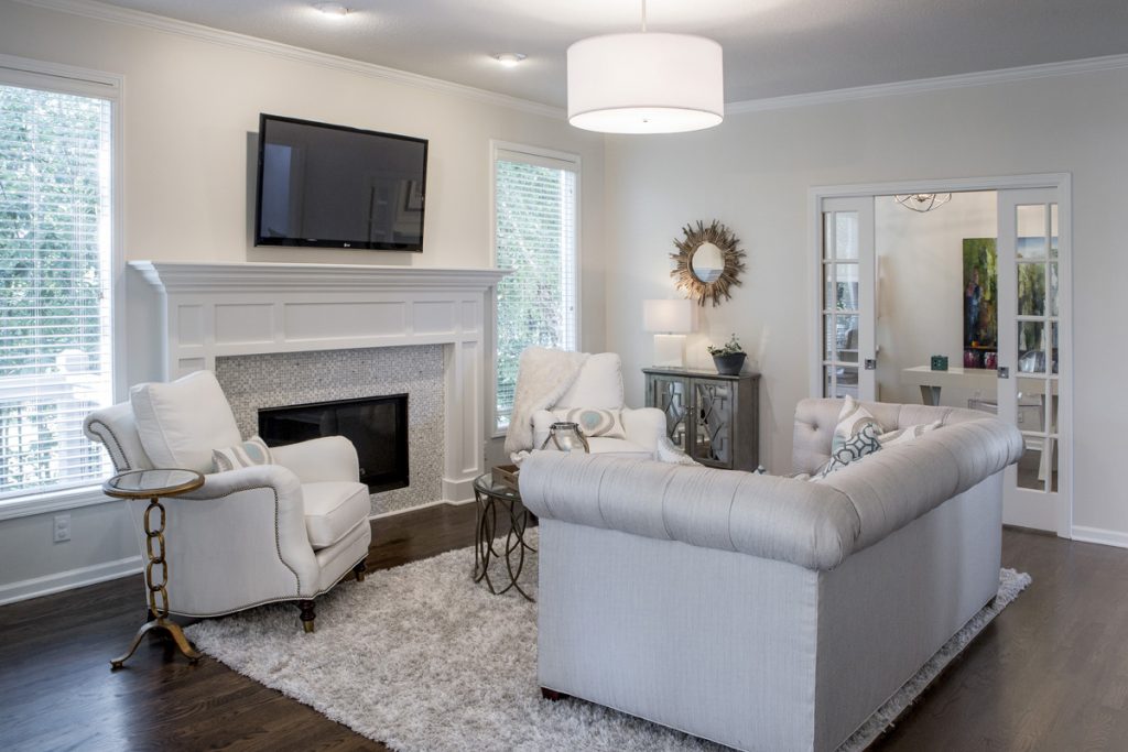
2.  Purchasing Over Sized Upholstery Or Too Many Pieces  Have you ever decided you wanted to buy a new living room grouping but didn’t bother creating a floor plan or measuring the space first? Suddenly your furniture arrives and the furniture takes up so much real estate you can barely walk through or don’t have room? As an interior designer I can’t tell you how many frantic calls I’ve received from homeowners requesting help with their space planning only to discover the wrong furniture was already purchased and they want me to fix it which we know is impossible. In this living room, the right size furniture was used and strategically placed to not only enhance the focal point (fireplace) but also leave ample room for someone to pass through.

Karen Mills' blog
Interior decorating by Karen Mills

3.  Selecting The Wrong Wall Color   After working on 1200+ interior design projects I see this mistake happen more than any other. We might want to blame a decorating network like HGTV or DIY for making us believe that picking paint colors is easy but I think its because the general public doesn’t realize how much a color can change when it goes from a tiny paint swatch to an entire room or house. In this room, we selected the paint color during day that not only coordinated with the finishes and furniture but also played well with other rooms in view.

For more inspiration, ideas, and photos, sign up for our weekly interior design blog here.

Plus become a fan of Kansas City’s interior designer and former host of the Living Large design show, Karen Mills, on 
INSTAGRAM and FACEBOOK here!

Interior Design/Interior Decorating

Interior Design: 3 Big Bathroom Trends for 2019

What’s in and what’s out for bathrooms this year

Karen Mills' blog
Interior design by Karen Mills
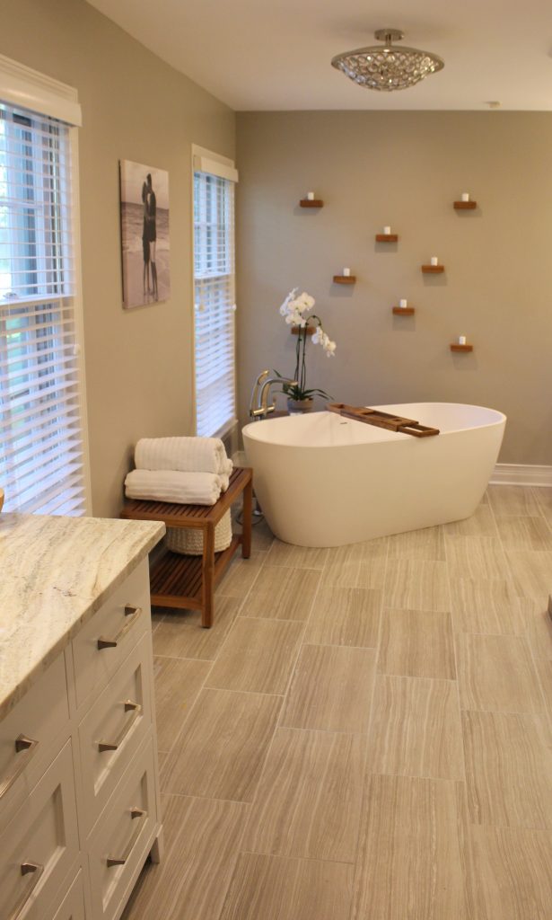
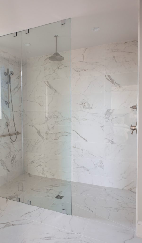
  1. OPEN CONCEPT – In 2008 I talked about open concept living where master suites will merge sleeping and bath areas together on my broadcast interior design show Living Large. Now I’m finally starting to see this open concept appearing more in upscale hotels which means its coming to homes next! The precursor to that open concept are bathrooms with glass or an open shower where you can see the plumbing with zero entry (no curb) tile that extends into the shower which will gain popularity this year like this bathroom above. A free standing tub and light airy chandelier add to the look.
Karen Mills' blog

2. SPA LOOK WITH A WOW FACTOR Not sure the spa look will ever die because its so appealing but bolder colors will increase for this year including a trend towards dark colors like dark gray or black paired with light neutrals, especially white. In this bathroom we added a candle wall over the tub to create a wow factor when you enter the space. The rolled towels and teak furniture in wood to coordinate with the shelves reinforce the teak feel.

Karen Mills' blog
Interior design by Karen Mills featured in Kitchen Bath Design News magazine natonally

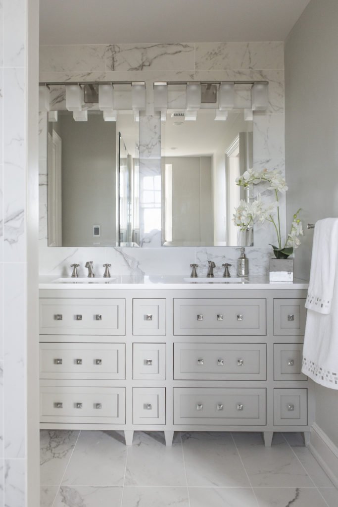
3. MORE TIMELESS APPEAL – Marbled tiles, sleek lines, less busy patterns and a neutral palette help create the more enduring look. In this nationally published project we designed an unique vanity that feels classic in front of marbled tile that runs up to the ceiling for a wow factor.

Karen Mills' blog
Interior design by Karen Mills

And in the adjoining shower we designed a jewel box of a shower that becomes part of the room, making it more timeless and definitely a showstopper.

For more inspiration, ideas, and photos, sign up for our weekly interior design blog here.

Plus become a fan of Kansas City’s interior designer and former host of the Living Large design show, Karen Mills, on 
INSTAGRAM and FACEBOOK here!

Interior Design/Interior Decorating

Interior Design: 3 Hot Kitchen Trends for 2019

The Current Direction of Kitchen Design

Karen Mills' blog
Interior design by Karen Mills

If you’re like most of us whether an interior designer like myself or a homeowner, you’ve probably either recently remodeled your kitchen or are seriously thinking about it. If so here are 3 kitchen trends you might want to consider.

  1. Personalization can come in not only in a fabulous color scheme like this beautiful hint of green mixed with white and bronze selected by one of our favorite clients, but it may also be part of the design aesthetic whether its in materials, finishes, or the overall theme. In this space one of our clients was from Finland so we incorporated a bit of a rustic element to remind them of their lake cabin there while also showcasing their love of contemporary in the stove hood.
Karen Mills' blog
Kitchen refresh by Karen Mills

2.  Bolder RIch Painted  Cabinets  For years we’ve nurtured our love for all things white and I’m not sure that trend in kitchens will ever die because white cottage kitchens give off such an inviting vibe, but the kitchen trend for 2019 is heading towards a bolder painted hue along with color schemes overall. But if white kitchens are you’re love they can still work if you add bold pops of color. In this kitchen refresh with a fun client we absolute love, we painted the existing wall cabinets darker shades to create a bold contrast after installing a counter top that continues up the wall as the back splash too. Live edge shelves, pottery, and whimsical chandeliers add to the personal touch.

Karen Mills' blog
Interior Design by Karen Mills

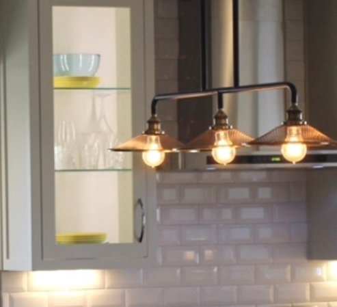
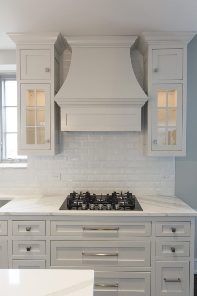
3. Take Your Back splash to the Ceiling  Tiles for the back splash are starting to make a big statement in kitchen remodels for 2019 so we are continuing to see a rise in taking the tile to the ceiling everywhere. Bold patterns are also becoming more popular as the back splash takes center stage. In the kitchen here we ran tiles to the ceiling to accentuate the beautiful hood, the main focal point of the room.

For more inspiration, ideas, and photos, sign up for our weekly interior design blog here.

Plus become a fan of Kansas City’s interior designer and former host of the Living Large design show, Karen Mills, on 
INSTAGRAM and FACEBOOK here!

Interior Design/Interior Decorating

Interior Design: What’s Hot and What’s Not for 2019

5 Interior Design Trends To Embrace in 2019

Karen Mills' blog
Photo courtesy of Curated Kravet

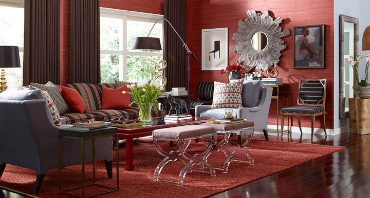
1. Warm Vibrant (or Bold) Colors  For the past ten years we’ve seen gray neutral colors dominate the interior design scene but now as an interior designer I’m noticing a return to bolder colors with warmth whether they’re in a whole room color scheme like shown here or just as an accent in a light neutral warm hue.

In fashion this fall crimson red, warm yellow, and tobacco brown mixed in new and unusual ways made a strong comeback including bold combinations like red, black, and white which I will cover in more detail in an upcoming blog.

Karen Mills' blog
Interior Design Project by Karen Mills featured in book DESIGN ICONS

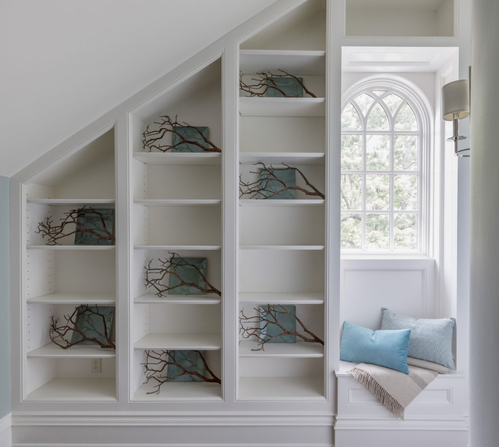
2. Nesting Trend    Homeowners are beginning to return to nesting with all the turmoil in the headlines so we will see a resurgence of comfortable and inviting interiors that are textural including finishes like rattan or raw wood, artisan products, and curves on our sofas or sculptural items.

In this entry the space is warmed up with branches and a comfortable fringe throw along with with comfortable pillows.

Karen Mills' blog
Photo courtesy of Century Furniture


3. Health and Wellness   With environmental factors impacting our health right and left along with an over abundance of processed foods, people are looking for healthy alternatives whether its natural fabrics and controlled sleep environments like our Sleep Better Live Better program or the ability to cook farm fresh meals in the kitchen.

Here in this room shades made of natural fibers, an antler lamp, and wood art piece bring a sense of well being to this space.

Interior design project by Karen Mills featured in Design Icons book

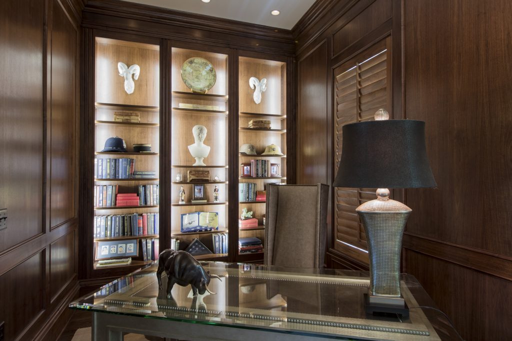
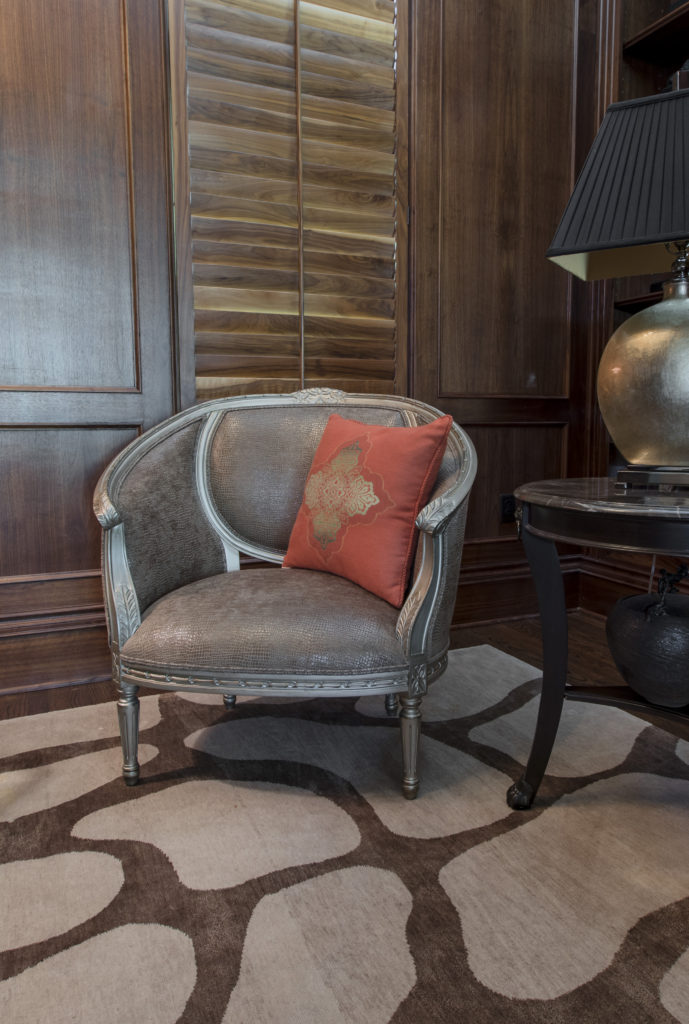
4. Personalization  Even though we’ve heard this term before its still a huge trend this coming year as evidenced in this library we designed that’s has been completely personalized for our client from the custom desk made of champagne wood, leather, and glass and accompanying pebbled leather chair to the custom designed rug underneath, snakeskin chair , and mementos from world travels displayed on the shelves beyond.

Karen Mills' blog
Interior design project by Karen Mills featured in book Architecture Today Interior Design
Karen Mills' blog
Interior design by Karen Mills

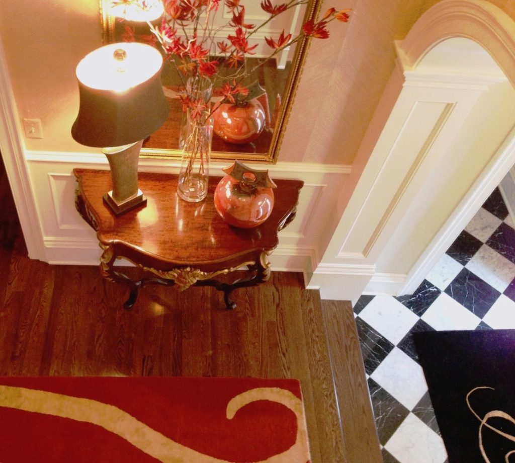
5. Maximalism  For years we’ve seen a minimalist trend with less pattern and movement but that’s changing and we will see more bold patterns and/or colors mixed together in a mix of design styles like this entry that includes an antique french console table, classic black and white tile, hand made wallpaper, and a custom contemporary rug in this contained space.

So what’s not hot for this coming year? First copper or rose gold is starting to lose ground in finishes along with single accent walls and overly ornate details. Cool grays, all stark white, wall signs, and ikat patterns have also fallen off the trend wagon for next year but that doesn’t mean that warm grays or white can’t be combined with other vibrant colors which I will cover in an upcoming blog.

For more inspiration, ideas, and photos, sign up for our weekly interior design blog here

Plus become a fan of Kansas City’s interior designer and former host of the Living Large design show, Karen Mills, on 
Instagram and Facebook here!