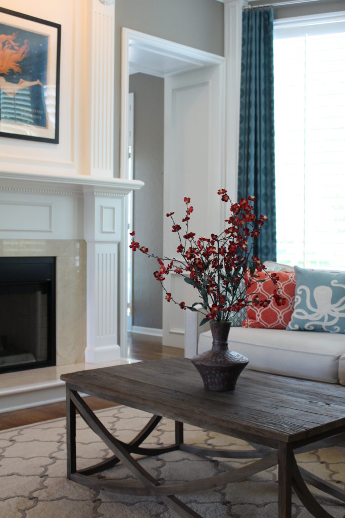
Interior Design/Interior Decorating

Remodel Workbook: Master Bath Renovation

Critical Steps and Timely Tips for Planning Your Bathroom Remodel
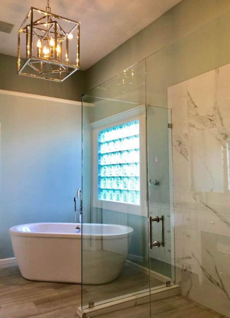
photo example
Lenexa interior design by Karen Mills

1 Get Inspired – As an interior designer I always recommend that you find at least three photos of bathrooms that you love because they will reveal your style preferences.

Since our clients were inspired by the beach, a favorite vacation destination of theirs, we designed their master bathroom remodel around a color scheme of watery blues, white, sandy beige, and warm rustic grays.

Click here to read our blog post 3 Ideas for Luxury Bath Design with Free Standing Tubs
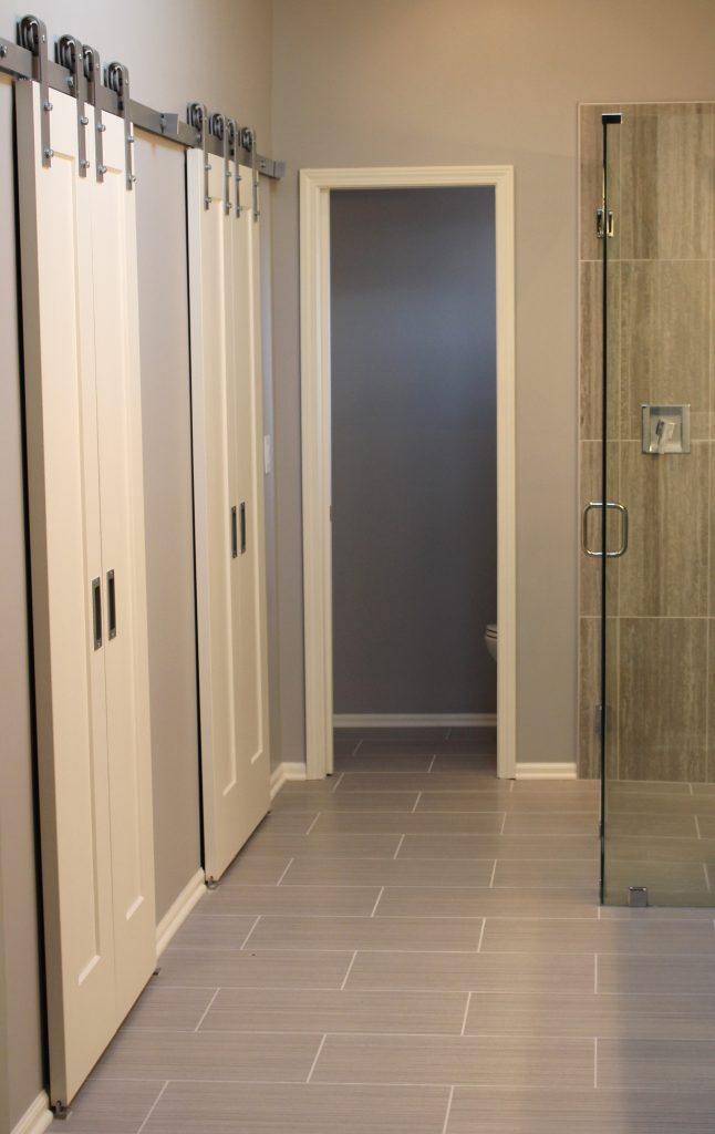
photo example
Kansas City interior design by Karen Mills

2. Evaluate Your Needs -Now that you’re motivated to get started on your bathroom remodel, its time to step back and decide on what’s most important to you functionally. If you’re not sure think about-

A. What can you do to make your space more functional for you??

B. Why are you remodeling in the first place?

C. Do you need to move plumbing? If not, that can mean big savings.

D. Will you be aging in place (retiring) in this bathroom?

E. What are your priorities – tub, shower, or both?

In this bathroom, we needed to enlarge the usable space in the closet area and since there wasn’t room for pocket doors we layered in barn doors which also added a fun unexpected design element.

Click here to read our blog post How to Remodel a Tiny Bathroom into a Visually Larger Space
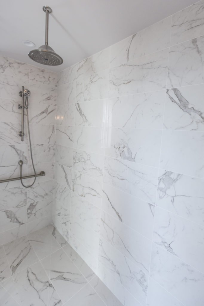
photo example
Kansas City Interior design by Karen Mills

3. Determine a Budget – Now its time to decide how much you can invest into your bathroom remodel. I always suggest to our interior design clients to consider the neighborhood, how long they will stay in the house, and resale.

If you have no idea of costs, you can go online to get a rough idea but remember that many online companies post estimates that are way too low and that’s why I recommend that you reach out to a professional to get a better idea.

In this master bath remodel located in a million dollar high rise apartment we needed to create a wow look on a reasonable budget so I covered the floors and walls with a marble look tile from Italy to give it a wow when you walked in the bathroom.
Karen Mills' blog
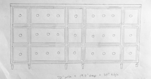
Hand sketch by Karen Mills

4. Reach Out to Professionals – Now that you’ve gotten an idea of your style, figured out your needs, and determined a budget, its time to reach out to a professional interior designer who specializes in bathroom remodels so they can create a design concept, often using sketches, finishes, and floor plans to help you visualize the final project while also helping you determine if your budget will work or not.

Now that you’ve have an interior design plan, its time to reach out to a contractor and/or architect to give you a remodel budget estimate based on your design and schedule a time to start your project.
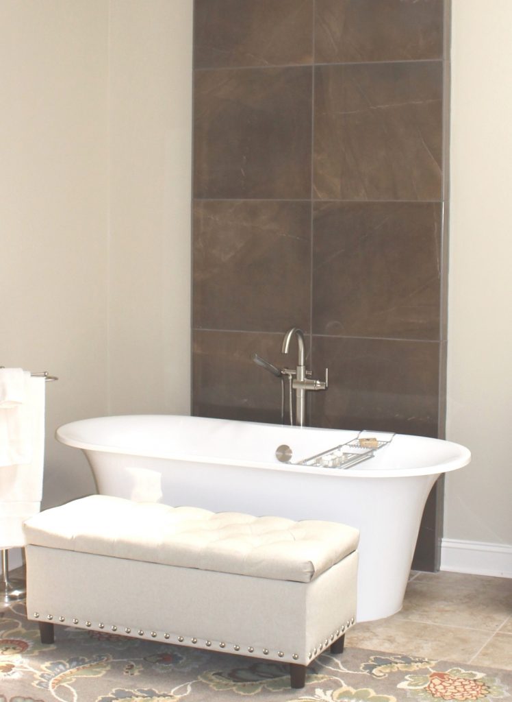
photo example
Overland Park interior design by Karen Mills

5. Finalize Design and Select Finishes– Now that you’ve found inspiration, determined your needs, set a budget, and contacted a professional interior designer, its time to finalize everything that’s part of your project including paint colors, flooring, plumbing, tile, back splash, mirrors, light fixtures and more.

Click here to read our blog post about the 3 Biggest Mistakes We Make in the Bathroom

If you’re looking for more custom interior design, decorating, or remodeling inspiration, ideas, and photos, sign up for our weekly interior design blog here

Plus become a fan of Kansas City’s interior designer and former host of the Living Large design show, Karen Mills, on 
INSTAGRAM and FACEBOOK here!
Interior Design/Interior Decorating

Interior Design: 3 Tips for Reducing Stress and Nurturing…

An Interior Designer’s Suggestions for Adapting to Working or Playing at Home

We understand how you feel and we are here for you, your family, and your business during this season. As the owner of a small business and mother of four with a second grand baby on the way I get it so my biggest focus right now at work/home is keeping everyone safe in a nurturing stress free environment – our specialty.

That’s why I’m reaching out from my home to yours today to share some simple ideas for making your interiors, including your home office, a space that reduces stress and helps nurture the soul.

Interior design by Karen Mills
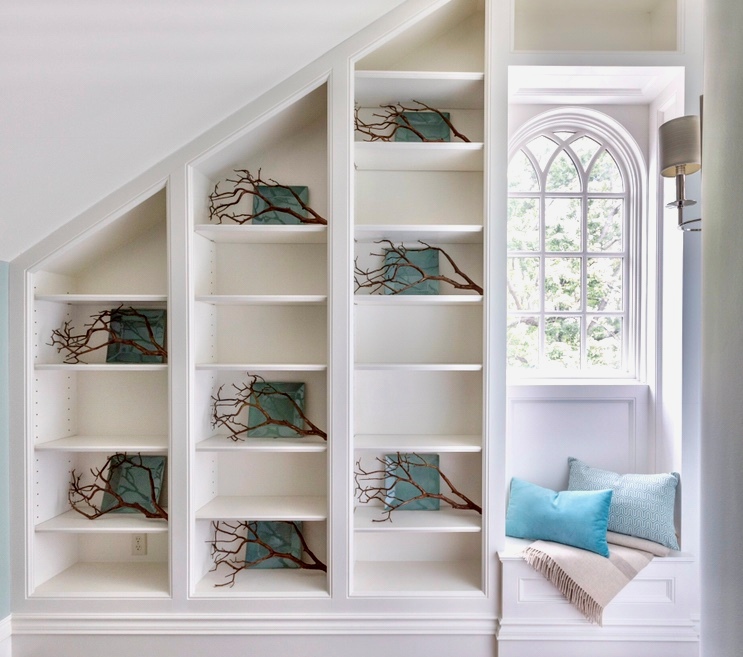
  1. Inviting Ambiance – If you’ve followed our interior design/decorating blog for any length of time you know that our number one requirement for designing a beautiful interior is that it’s inviting. To make your space warm and inviting begin with colors that soothe you, textural finishes, and good lighting for starters without too much pattern.. In this Mission Hills entryway we began with a calming color scheme of blue and white on the walls, then layered in a cozy textural throw and blue pillows to create a perfect spot to relax by the window, while also mimicking the view of nature beyond with branches strategically placed on adjoining shelves. Click here for 3 Tips For Creating a Cozy bedroom.
example
Interior design by Karen Mills

2. Clear Clutter and Get Organized – As an interior designer who’s worked on over 1200 projects I truly understand the impact of clutter and disorganization on elevating stress levels so now is the time to take action and clear the mess before you even think about decorating. Start by removing any clutter on floors, furniture and shelves, while also getting organized and I guarantee when you’re finished you will feel better.

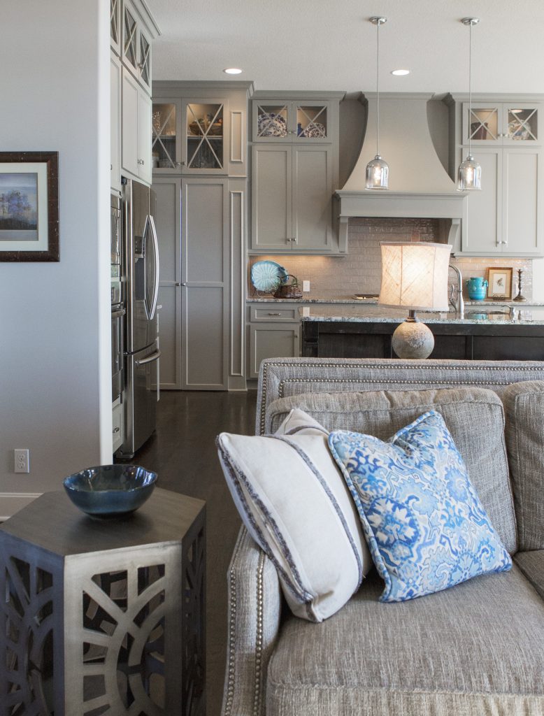
In this Overland Park home interior design project we added only a few decor pieces to create a peaceful atmosphere with calming blue pillows and decor on the sofa, end table, and kitchen counters beyond.

example of comfortable seating
Interior design by Karen Mills

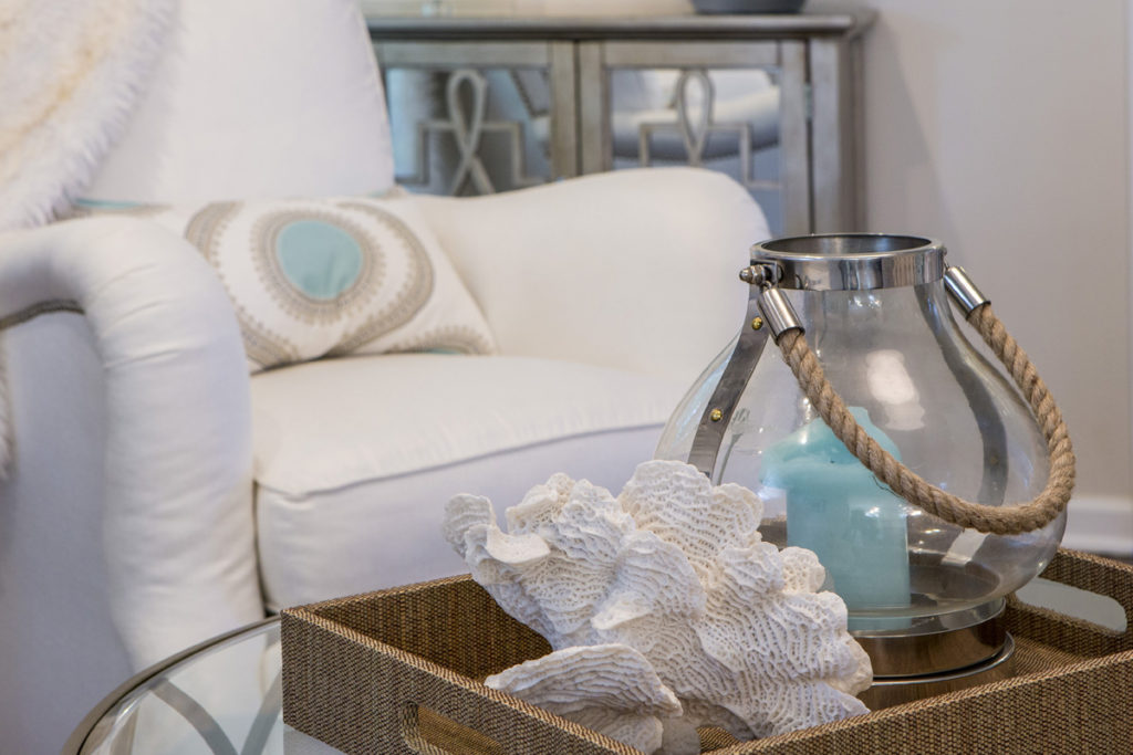
3. Layer in Meaningful Decor – I’m a huge proponent of decorating with items that speak to you on an emotional level whether its a treasured family heirloom as I have throughout my personal living space or items that bring you joy like this Overland Park hearth design that features a tray with casual textural beach items that are a happy reminder to our client of her love of the ocean. Just be sure when you’re introducing your meaningful decor that it doesn’t clash with other items nearby which can add stress instead of a calming feel. Click here to read our Design Dilemma blog on how to layer in meaningful furnishings.

Mila in my Leawood home office

As I’m sitting in my home office right now I’m surrounded by meaningful things -an ocean painting, mouse pad, and blue candle that smells of sea salt – a reminder of a favorite trip to the Galapagos, along with a bright green plant that reminds me of my love of the outdoors, and my adopted dog Mila who’s anxiously awaiting a walk.

Master bedroom retreat example
Design by Karen Mills

Overall the key to creating a nurturing stress free environment begins with decluttering and getting organized then editing out most furnishings with busy patterns, while introducing meaningful things that fit with your interior design.

If you’re looking for more custom interior design, decorating, or remodeling inspiration, ideas, and photos, sign up for our weekly interior design blog here

Plus check out our recent kitchen remodel blogs – 3 Big Kitchen Trends for 2020 and 5 Big Mistakes We Make in the Kitchen and become a fan of Kansas City’s interior designer and former host of the Living Large design show, Karen Mills, on 
INSTAGRAM and FACEBOOK here!
Interior Design/Interior Decorating

Interior Design: 3 Big Kitchen Trends for 2020

What’s hot in colors, finishes, and more…

example of blog topic
Interior design by Karen MIlls
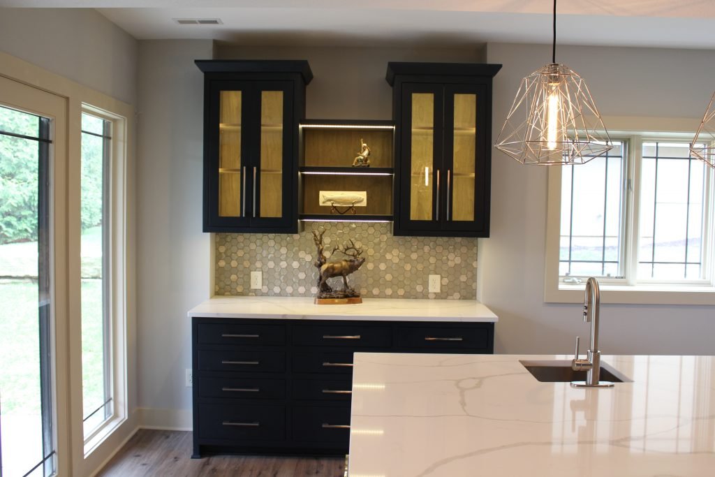
  1. Color – For cabinetry in 2020 we’re still seeing a color trend towards warmer grays and taupe colors grow in popularity along with a newer affinity towards richer cabinet colors like cobalt blue or the black cabinetry shown in this basement kitchen done by our interior design firm. Warmer colors are also making a come back in softer or organic hues like the stained wood finish inside these glass upper cabinets. Even though appliance manufacturers are still pushing the graphite and stainless color appliances, we are also seeing soft hues in pink and beige make an appearance.
Karen Mills' blog
Interior design by Karen Mills

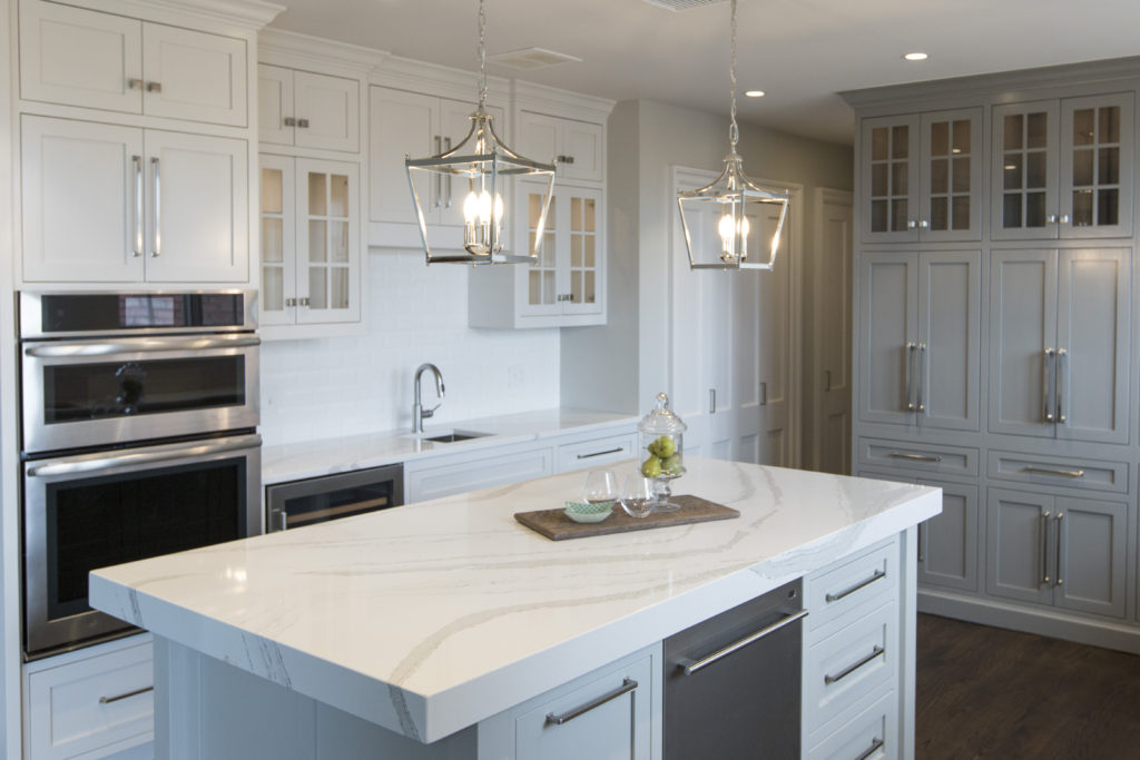
2. Finishes – One of the most common questions I hear as an interior designer from clients is “What counter top should I use?’ Granite reigned for years as the counter top of choice in the kitchen until a few years ago when white quartz made an appearance. White quartz still remains popular but the new trend is a more natural look leaning towards darker counters. In kitchen our interior design firm remodeled we introduced a white and warm gray quartz with veining that mimics marble to make the kitchen feel more timeless and appear larger.

Mixed metals continue to trend for pulls, lighting, and plumbing including the newer matte black but as an interior designer I don’t recommend much mixing and matching unless you have an amazing eye because the result can be disastrous.

Karen Mills' blog
Interior design by Karen Mills

3. Functionality – Even though the kitchen acts as a work space we often neglect the needs of the space in favor of looks, but if your space doesn’t function efficiently, you won’t truly enjoy your kitchen. That’s why I always start a new kitchen design with our clients by discussing what they need and how they use their room.

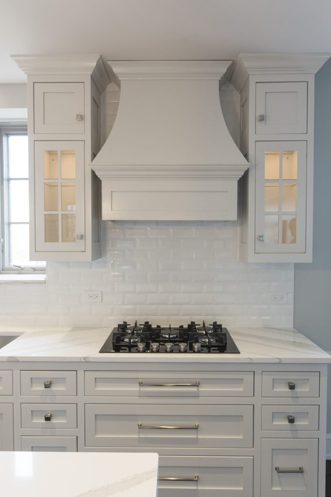
Huge functionality trends for this year are insets in drawers and cabinets that make storage more efficient or maximize space like these pegged drawers under the stove in the kitchen we designed here that hold pots and lids close by in an organized manner.

Other important considerations should include ample lighting for cooking or eating, hands free faucets that can be activated when you have dirty hands, pullouts that allow access to hard to reach places in corners or cabinetry/pantries, and functional back splashes with little or no grout lines.

For more inspiration, ideas, and photos, sign up for our weekly interior design blog here.

Plus become a fan of Kansas City’s interior designer and former host of the Living Large design show, Karen Mills, on 
INSTAGRAM and FACEBOOK here!
Interior Design/Interior Decorating

Interior Design: 3 Huge Mistakes We Make in the…

An Interior Designer’s Tips for Making Your Dining Room More Appealing

Karen Mills' blog
Interior design by Karen Mills as featured in Architecture Today Interior Design and Design Icons books
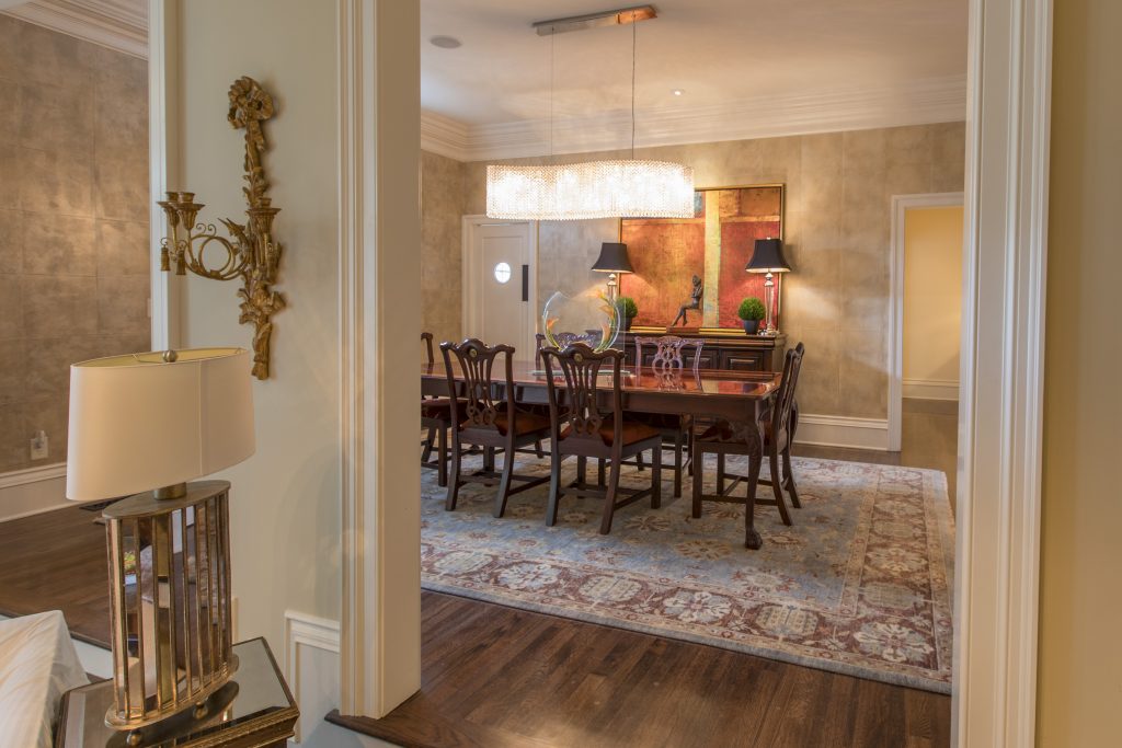
  1. Lack of emphasis  Creating a focal point with your table in the dining room gives you the opportunity to create a dramatic look, perfect for a dinner table or family gathering. Here in this Mission Hills dining room our interior design firm began with an existing table and buffet along with selecting a fabulous hand knotted wool rug. Then we took the design to another whole level but introducing more contemporary elements from the stunning Swarovoski crystal chandelier that compels you to take a closer look to the bold abstract art beyond, contemporary sculpture, and rich leather squares on the wall.
Karen Mills' blog
Interior design by Karen Mills as featured in Architecture Today Interior Design book

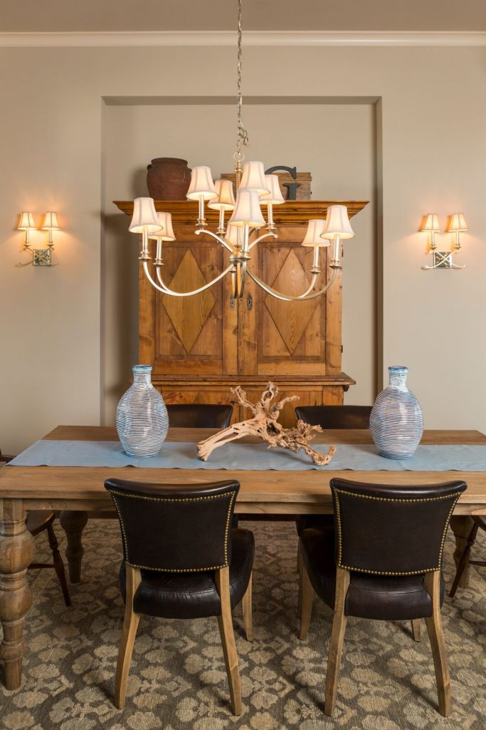
2.  Cold uninviting space –  One of the most common issues I see as an interior designer are dining rooms filled with all hard shiny surfaces such as crystal, glass, or ceramic along with hard flooring like wood or tile and no art on the walls. To solve this dilemna try warming up your dining space with lots of texture. Here in this Overland Park room the client requested we use their heirlooms – a table and armoire, along with leather chairs. To warm up this cold stark space, we introduced a piece of gnarled wood, two beautiful blue vases that look handmade, a custom cloth runner, and a thick hand knotted wool area rug underneath.

Karen Mills' blog
Interior design by Karen Mills

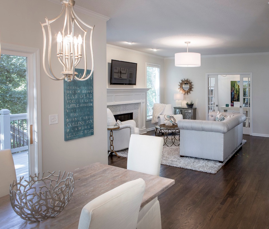
3. Looks Unfinished  When we walk into an interior design client’s home one of the first things we often see is an undone dining room or area. To enhance this space and make it more updated, I recommend adding color or texture like this dining area next to the existing kitchen. In this dining area we refinished a door in a soft neutral gray, replace the dark dated light fixture with two light airy ones, repainted the dark walls white, covered existing leather chairs with custom slipcovers, and add an interesting centerpiece plus a cheerful piece of blue art that reflected our client’s love of the ocean.

For more inspiration, ideas, and photos, sign up for our weekly interior design blog here.

Plus become a fan of Kansas City’s interior designer and former host of the Living Large design show, Karen Mills, on 
INSTAGRAM and FACEBOOK here!

Interior Design/Interior Decorating

Interior Design: 5 Big Mistakes We Make in the…

If you’re thinking about remodeling or designing a new home, read on to learn about some of the biggest mistakes people make when designing a kitchen.

Karen Mills' blog
  1. Work Area Not Functional – Creating a functional layout is the first step to kitchen design that works whether you’re designing for a new home or doing a kitchen remodel. Here in this interior design client’s kitchen a work area with the stove, refrigerator, and sink in an accessible triangle and distance reduces the number of steps required when cooking and easy access.
Karen Mills' blog
Interior design by Karen Mills

2. Wasting Potential Storage – Countless storage options exist so there’s no reason to waste space in the kitchen especially with the adaptive kitchen storage units that make drawers and cabinets more functional from trash pullouts to roll out shelves. Here in this fabulous historic Walnuts condo where space is at a premium, we added pegged drawers under the stove for pots/lids, hidden pop open storage under the island. and used the extra space we gained straightening out a crooked back wall to create a coffee bar and pantry area that’s also draws you into the space.

Karen Mills' blog
Interior design and remodel by Karen Mills

3. Work Area Too Crowded- As an interior designer I’ve lost count on how many times I’ve walked into a home that didn’t have enough work space. Even though the recommended distance between an island and wall cabinetry is at least 42-48″ usually I find that the minimum required distance of 36″ is often the reality of existing kitchens, resulting in a space that’s too cramped and not functional. Other issues I often encounter with interior design clients are kitchens where drawers or refrigerator doors can’t open to function correctly.

Here in this kitchen we widened the walking area and made sure counter space was provided where needed whether to set down groceries or items from the dishwasher or room to simply bake a pie.

Karen Mills' blog
Interior design by Karen Mills

4. Lack of right lighting –  If your new kitchen doesn’t have a mix of general, task, and accent lighting, it will tend to be a little lackluster in appeal and probably function. Here in this kitchen design, I created a kitchen with can lights for general lighting, added puck lights tucked away inside the glass cabinets for accent lighting and interest, plus introduced mini chandeliers over the island that not only provide accent lighting but also task lighting for working in the kitchen.

Karen Mills' blog
Kitchen refresh by Karen Mills

5. Not bringing in a professional –  Hiring a professional kitchen designer with experience who creates kitchens and bathrooms for a living can help you avoid costly mistakes, free up your time, and create the space of your dreams, while ensuring your space is functional. In this kitchen refresh where we reused most of the existing cabinetry, we were able to introduce new elements that created a wow factor – bigger airy light fixtures open shelving, counters that continued up the wall, a mitered edge island counter top, and bold cabinetry colors, to create a fresh new look showed off our client’s creative spirit while ensuring the space would well for them.

For more inspiration, ideas, and photos, sign up for our weekly interior design blog here.

Plus become a fan of Kansas City’s interior designer and former host of the Living Large design show, Karen Mills, on 
INSTAGRAM and FACEBOOK here!
Interior Design/Interior Decorating

Interior Decorating: A Beginner’s Guide to Collecting Original Art

After traveling the world in search of the perfect artwork to tell a client’s story in an interior design project I’ve learned a few things about selecting original artwork to fit the needs and personality of our clients. Read on for my tips and tricks to getting started with collecting your own original paintings or adding to your collection.

Original artwork available through Karen Mills
  1. Figure out what style(s) of artwork speak to you visually and emotionally. This depiction of a woman or figure would be an impressionist style because of its ethereal feel. To get a sense of what you love select three or more paintings and look for common factors like landscapes, abstract or figures.
Original art by well known artists available through Karen Mills

This colorful painting would be classified as a bold color abstract.

2. Select colors that you love which also gives onlookers a hint about your personality.

Orginal art by well known artists available through Karen Mills
Art available through Karen Mills

This painting tells the dramatic story of the parting of the sea with the hand of God hovering above.

3. Coordinate the paintings in your home or office to not only enhance your interior design but also to not compete with each other.

Artwork available through Karen Mills

This bold artwork depicts a more modern version of a landscape scene.

For more inspiration, ideas, and photos, sign up for our popular weekly interior design blog here with subscribers in over 130 countries.

Plus become a fan of Kansas City’s interior designer, former host of the Living Large interior design show, Karen Mills, on INSTAGRAM and FACEBOOK here!

Interior Design/Interior Decorating

3 Tips for Refreshing Your Living Room for Less

Tips for Updating Your Living Space with Budget Savvy Ideas

If you haven’t updated your living room for 5 years or more, it may be time for a refresh.  If your budget doesn’t allow you to start completely over, why not opt for a one day makeover or refresh instead with a local interior designer or decorator? Read on for my top 3 tips for updating your space for less.

Karen Mills' blog
Interior design by Karen Mills

1.  Create an inviting floor plan that emphasizes your main feature whether its a fireplace, a view outside or another prominent feature.  If you don’t have a focal point, design one yourself by grouping furnishings together like a sofa table or chest with a piece of artwork overhead and a table lamp and/or tabletop decor.

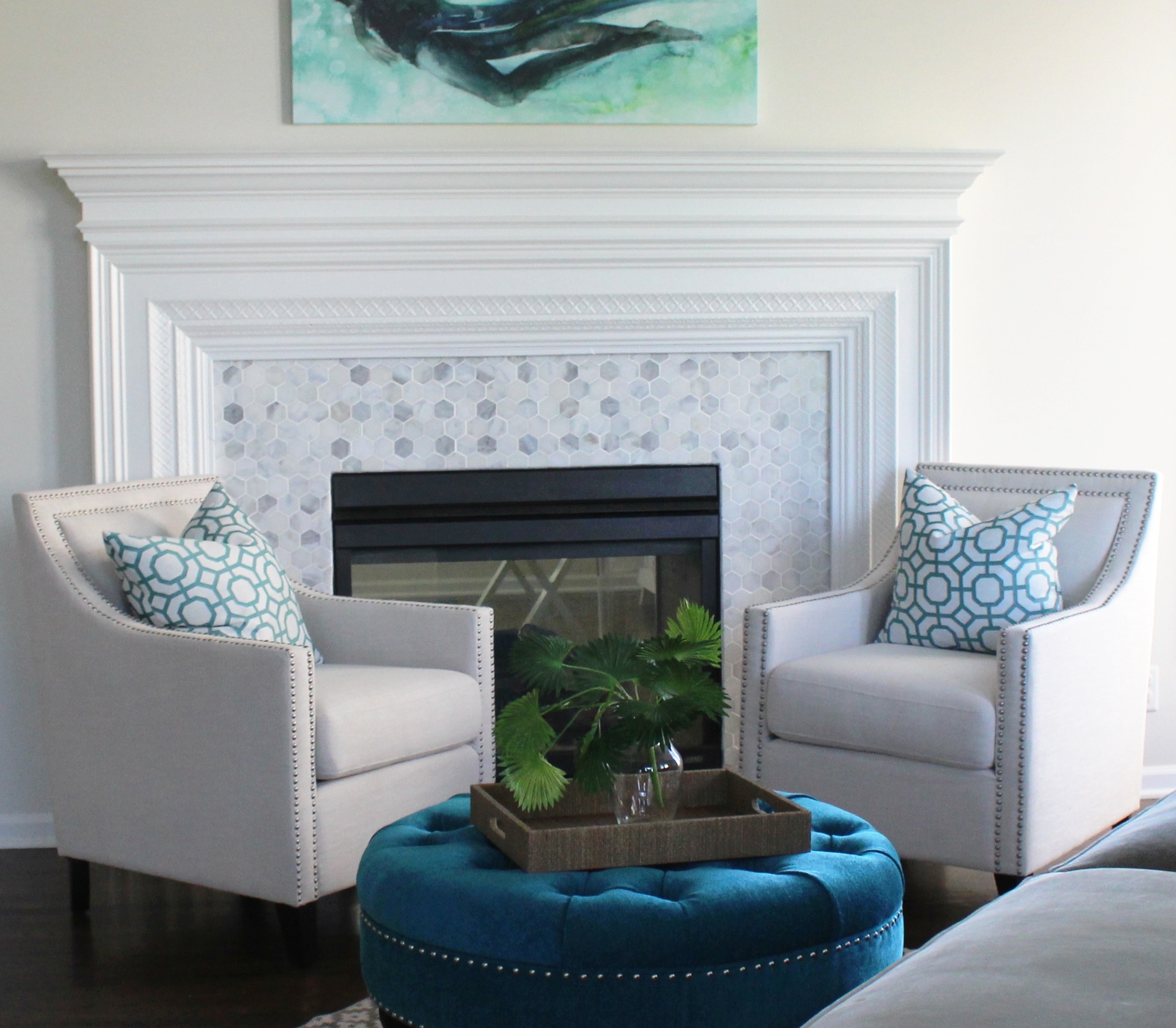
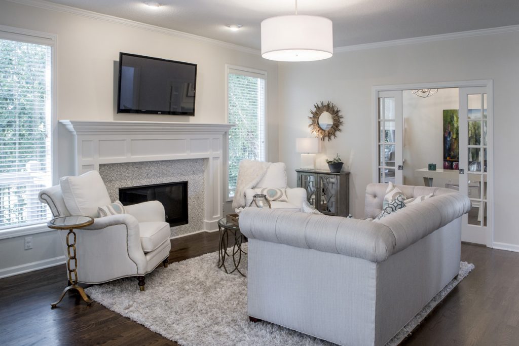
In this room our interior design client started with a favorite piece of art over the mantel to emphasize the focal point and we helped them select a new fireplace tile, chair fabric for existing chairs and a new ottoman to support the color scheme in the art.

Karen Mills' blog

2. Shop your entire house for furniture/furnishings you can use in your room.  Keep those items you discover in mind as you start to put together your room, bringing ones you think might work to a staging area nearby.

As an interior designer I often re purpose items to make them work in a space such as this family room where we reupholstered the sofa and chairs along with layering in a new rug, repainting the walls, adding a new light fixture, tables, and decor.

Karen Mills' blog
Interior design by Karen Mills

3. Add a pop of color with accents throughout your room ‘s interior design with pillows, art, drapes, decor or an area rug.   Remember, you can repaint or re purpose items to use in your refreshed room also.

For example, a chest could repainted and moved to your entry, used as a focal point in a living space, or even placed behind a sofa.  Ottomans can be upholstered and tucked under a sofa table for extra seating, used as a coffee table or pulled up to a comfy chair.

In this fabulous ocean blue living room, our interior design firm began with existing mermaid art as inspiration, then introduced bold blue and orange pillows along with custom blue drapes.

Looking for more great budget friendly decorating ideas?  Sign up for our weekly interior design blog here

Plus become a fan of Kansas City’s interior designer and former host of the Living Large design show, Karen Mills, on 
INSTAGRAM and FACEBOOK here! <
Interior Design/Interior Decorating

Interior Decorating: 3 Biggest Mistakes We Make in the…

Karen Mills' blog
Interior design by Karen Mills

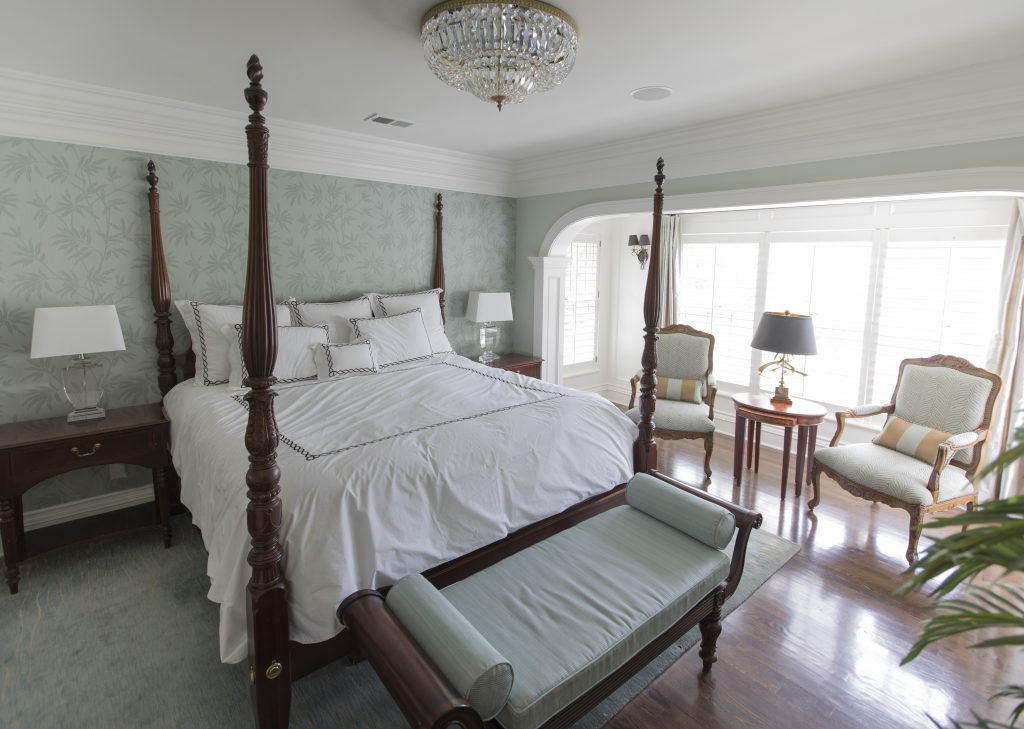
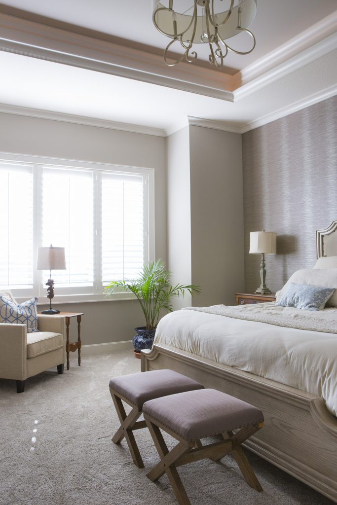
1. Lack of a Focal Point – Often as an interior designer I walk into a bedroom to discover a stark cold space that has no focus. Your bed is the focal point of the bedroom and the area you want to emphasize.

Here in this beautiful inviting bedroom we enhanced the existing poster bed with crisp white bedding, a gorgeous calming textural leaf wallpaper, and a warm hand knotted wool rug.

blog photo
Photo courtesy of Kravet

2. Uninviting – Often a bedroom becomes a dumping ground for everything we need to put away or even worse our home office space so to begin remove everything that’s not bedroom related.

In this space by Kravet, simple timeless bedding, a cozy bed that envelopes you and simple furnishings help create an inviting space.

Karen Mills' blog
Interior design by Karen Mills

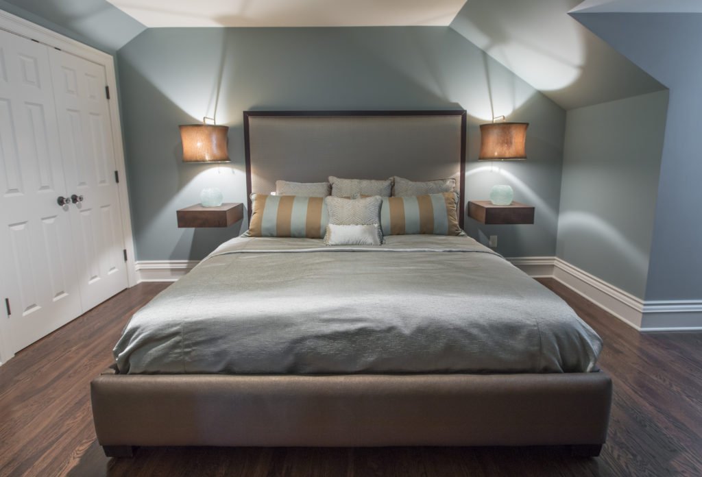
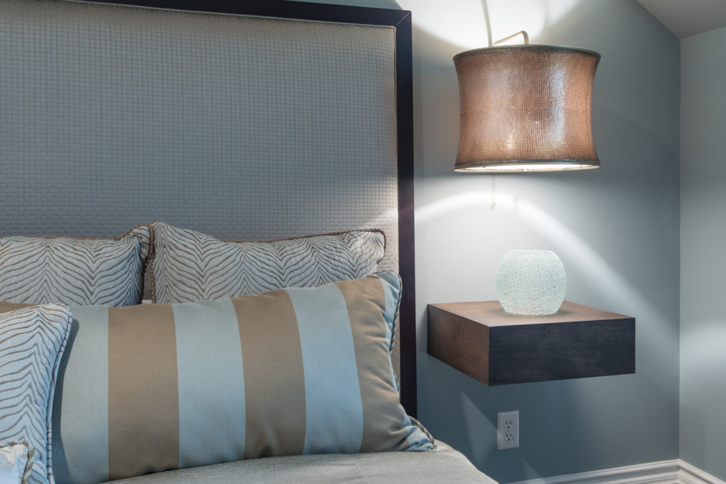
3. Too Cluttered or Crowded – In this smaller attic bedroom we didn’t want the room to feel crowded or cluttered with the king size mattress the clients needed so we designed a bed that didn’t overwhelm the room. Floating tables we designed along with light fixtures we adapted to hover over the tables gives a more open airy feel to the space.

Looking for more great bedroom design or decorating ideas?  Sign up for our weekly interior design blog here,

Karen Mills' blog

Plus become a fan of Kansas City’s interior designer and former host of the Living Large design show, Karen Mills, on 
INSTAGRAM, FACEBOOKTWITTER, or LINKEDIN here!

Interior Design/Interior Decorating

Interior Decorating: 3 Biggest Mistakes We Make in the…

Interior design by Karen Mills featured in two international books
  1. Unwelcoming  –  If you want your guests to feel welcome then its important to create an inviting interior design like this entry where you are greeted by natural light, soothing colors, interesting patterns and textured materials like the pillows, throw, and branches.
Interior Design by Karen Mills

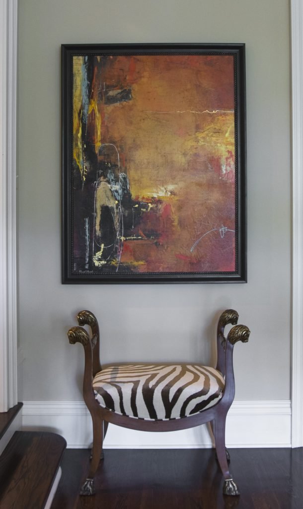
2. Zero Personality – As an interior designer I can’t repeat enough the importance of showcasing your personal style in the foyer. The entry has become the most important area in your home because it gives people an idea of your personality and taste. In this foyer we showcased the clients’ love of animal prints on this traditional custom designed stool while also pairing it with abstract art to reveal their unique style and great taste.

Karen Mills' blog
Interior design by Karen Mills featured in Architecture Today Interior Design book

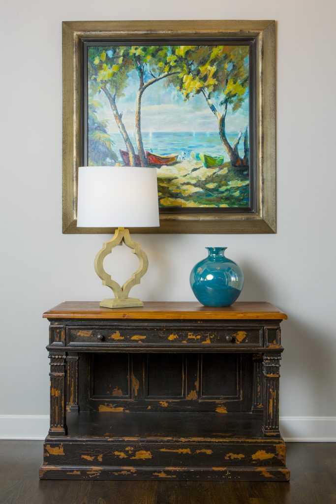
3. Lack of Intrigue   I always tell our interior design clients to think of their foyer as the advertisement for their home because your entry should give visitors a glimpse into what’s coming next from colors and style to personal mementos like this entry where we began with a family heirloom piece and dressed it up with a beautiful landscape painting, vase, and lamp that gives you a preview of the color scheme and what’s next.

For more inspiration, ideas, and photos, sign up for our weekly interior design blog here.

Plus become a fan of Kansas City’s interior designer, former host of the Living Large interior design show, and coach Karen Mills, on 
INSTAGRAM and FACEBOOK here!
And for more foyer inspiration, click here to read my Houzz interior design article on Color Palettes for Pleasing Entryway

or my budget tips titled Refresh Foyer for Less

Interior Design/Interior Decorating

Interior Decorating: 3 Big Design Mistakes We Make in…

rug sizing example
Interior design by Karen Mills
  1. Lack of a Focal Point    Often the best area to emphasize in a living space is the fireplace or great view outside but if you don’t have those options, create a vignette (grouping) of furniture/accessories that will grab your attention. Then group your upholstery around the focal point to emphasize it. Here in this living room the stone fireplace acts as a focal point for the seating area.
Karen Mills' blog
Interior design by Karen Mills

2.  Purchasing Over Sized Upholstery Or Too Many Pieces  Have you ever decided you wanted to buy a new living room grouping but didn’t bother creating a floor plan or measuring the space first? Suddenly your furniture arrives and the furniture takes up so much real estate you can barely walk through or don’t have room? As an interior designer I can’t tell you how many frantic calls I’ve received from homeowners requesting help with their space planning only to discover the wrong furniture was already purchased and they want me to fix it which we know is impossible. In this living room, the right size furniture was used and strategically placed to not only enhance the focal point (fireplace) but also leave ample room for someone to pass through.

Karen Mills' blog
Interior decorating by Karen Mills

3.  Selecting The Wrong Wall Color   After working on 1200+ interior design projects I see this mistake happen more than any other. We might want to blame a decorating network like HGTV or DIY for making us believe that picking paint colors is easy but I think its because the general public doesn’t realize how much a color can change when it goes from a tiny paint swatch to an interior or in different lighting situations. In this great room we selected the paint color during day that not only coordinated with the finishes and furniture but also played well with other rooms in view.

For more inspiration, ideas, and photos, sign up for our weekly interior design blog here.

Plus become a fan of Kansas City’s interior designer and former host of the Living Large design show, Karen Mills, on 
INSTAGRAM and FACEBOOK here!