Interior Design/Interior Decorating

Interior Design: 3 Tips for Selecting Quality Outdoor Upholstery

How to Choose Your Outdoor Furniture Wisely

As Memorial Day is drawing near some of you are contemplating an investment in quality outdoor upholstery where you can spend the days outdoors relaxing with family or friends.   Here are my 3 tips as an interior designer for selecting outdoor furniture that will be a good investment.
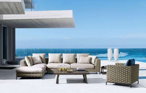
Photo courtesy of B&B Italia

  1. Functional Furniture – Comfort is my top priority when selecting outdoor upholstery so make sure you try sitting on the furniture for at least 20 minutes to ensure it’s comfortable and fits your body type – seating height and depth plus arm location and overall size. Thicker cushions and sizes are also critical when purchasing because the furniture may too large for your space if you haven’t measured ahead. Here in this outdoor space by B&B Italia furniture the furniture is amply spaced apart providing comfortable seating.
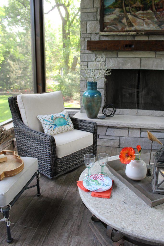
Interior design by Karen Mills

2. A color that will stand the test of time I think we as consumers are naturally drawn to our favorite colors and often purchase based on that fact alone but when you’re investing in a quality piece(s) of outdoor furniture you might want to consider longevity of a frame when selecting colors that aren’t neutral.

Of course if a particular color is part of who you are and always has been, then it may not matter.  For me as an interior designer, my favorite color is usually what we are designing that day or week.  That’s why neutral seating frames and/or cushions like shown on this porch are often best because pillows and other accessories can create a fresh new look without a big investment.
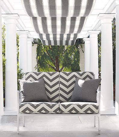
Photo courtesy of Schumacher

3. Design Style

Style, a key factor in selecting furniture, plays a huge role outside because the furnishings must not only coordinate with the exterior of the home and the view beyond but also relate to the adjacent rooms inside.

In this outdoor space the white furniture and cushion color help marry the contemporary fabric with the more traditional Greek pillars to create a more cohesive feel.

For more great ideas and photos on outdoor design and furniture, sign up for our weekly interior design blog here

Plus become a fan of Kansas City’s interior designer and former host of the Living Large design show, Karen Mills, on 
INSTAGRAM and FACEBOOK here!
Interior Design/Interior Decorating

Interior Design: 3 Biggest Mistakes We Make in Basement…

Karen Mills' blog
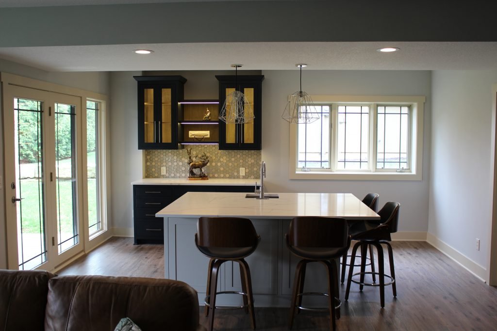
Interior design by Karen Mills

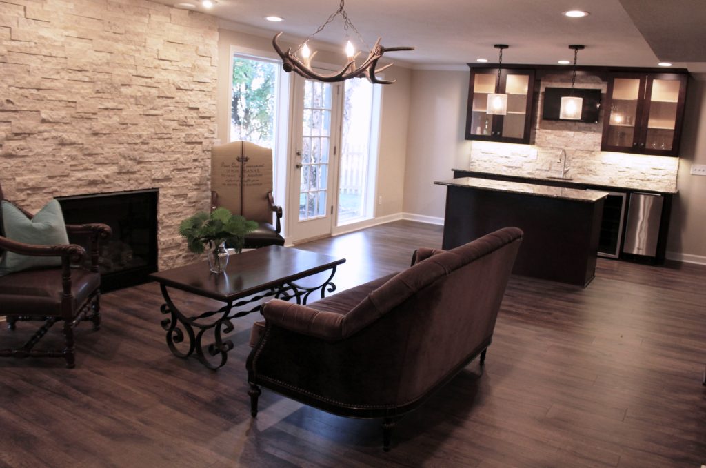
1. Not taking advantage of natural daylight – In this recent basement design we situated the bar area in a spot surrounded by natural light to make the space feel like the main level of the home. To further enhance the light airy feel we designed the bar with white counter tops and lighter paint colors to bounce more light around the room.

Karen Mills' blog

2. Not hiding the telltale signs of a basement living space. –When finishing your basement ensure that you hide all ledges, duct work, and niches or anything else that screams basement. Here in this space we added wood flooring, artificial light, and and accent lighting to give this basement a first floor feel.

Karen Mills' blog
Interior design by Karen Mills

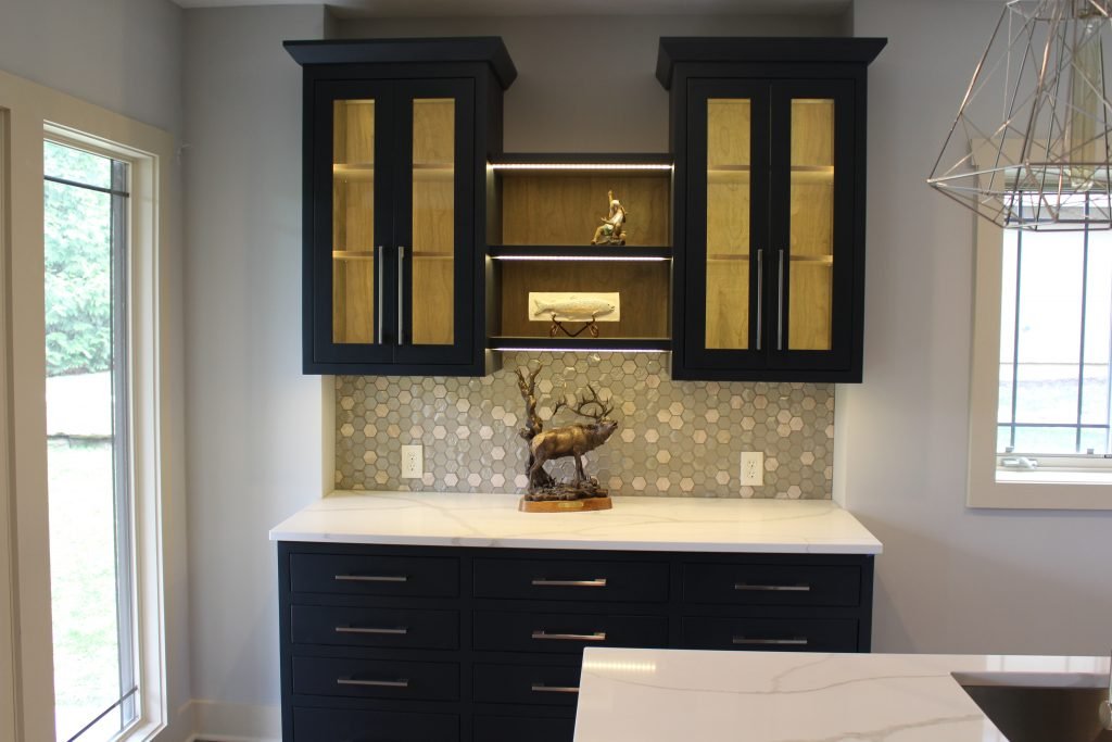
3. Lack of adequate artificial light – As an interior designer I can’t emphasize enough the importance of artificial lighting. Here we started with general can lights, added task lighting over the island, and then topped it off with accent lighting inside the shelves and under the cabinets to create a wow factor.

For more great ideas and photos on basement interior design or remodels, sign up for our weekly interior design blog here

Plus become a fan of Kansas City’s interior designer and former host of the Living Large design show, Karen Mills, on 
INSTAGRAM and FACEBOOK here!
Interior Design/Interior Decorating

Interior Design: 5 Hottest Product Trends for Kitchen Design/Remodels…

Karen Mills' blog
Interior design by Karen Mills
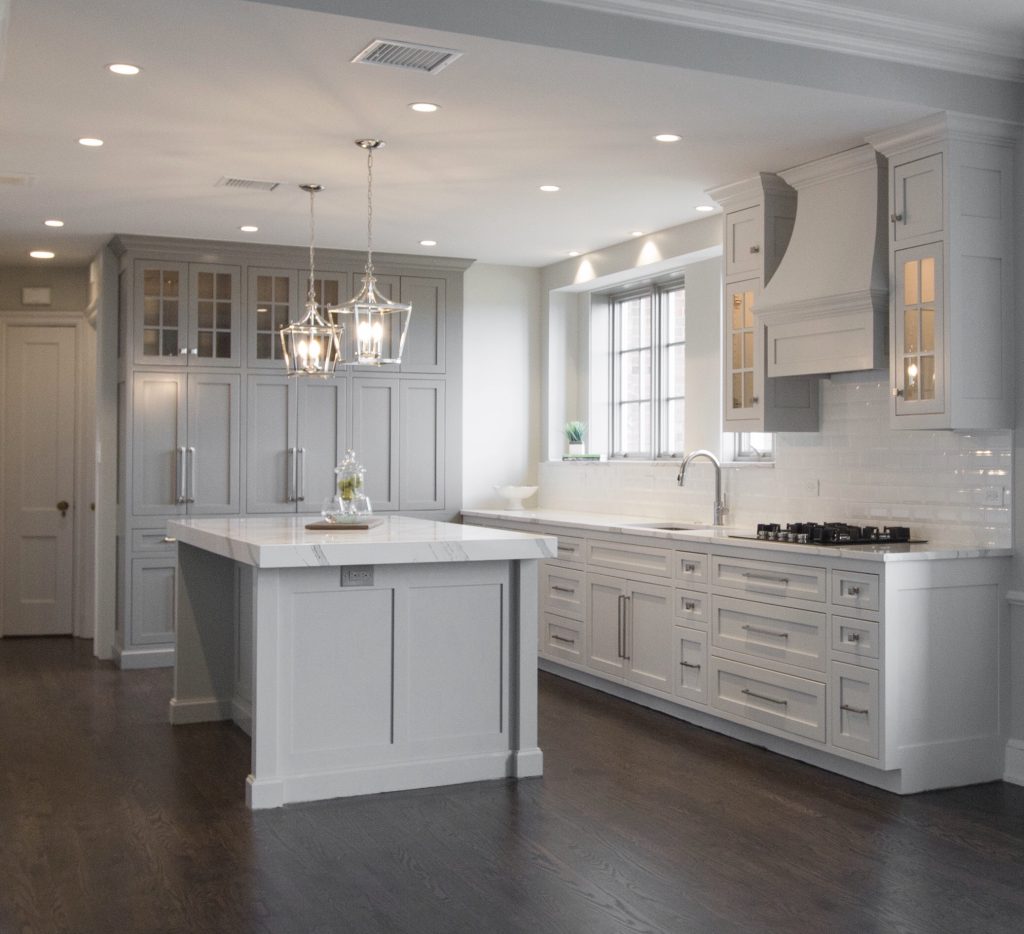
  1. White Quartz Counter tops – Even though darker kitchens are making appearances across the U.S. and especially on the coasts, white quartz counters still dominate with interior design clients as the most popular material here in the United States. As an interior designer I’ve worked with over 1200 clients and believe wholeheartedly the reason for this appeal is because white reflected back onto our skin makes us look and feel younger. White also feels fresh after years of darker colors plus marble style patterns are classic and timeless.

Here in this kitchen the island counter has been designed with a mitered edge (thick) which is another huge kitchen remodel trend that gives a more luxurious feel and wow factor.

Karen Mills' blog
Interior decorating by Karen Mills

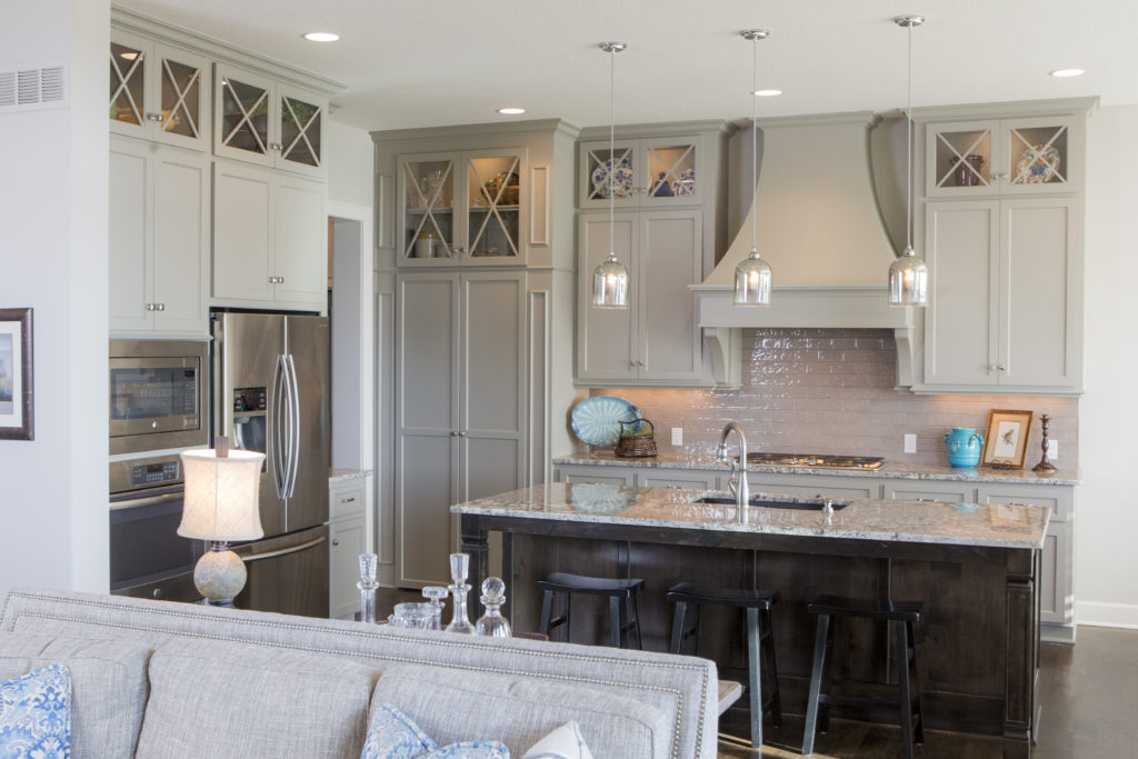
2. Counter Depth Refrigerator Here in this kitchen space a counter depth fridge creates a wider walkway through the kitchen to the garage and other rooms behind. Other trendy features include reflective tile back splash, and lit glass cabinets.

3. Touch Faucet – Touch faucets are gaining popularity because you only need to touch the faucet with a part of your body to activate or deactivate the flow of water at a preset temperature.

4. Steam Convection Oven – Who doesn’t love an oven that can cook food in half the time at a lower temperature plus keep foods moister and brown bread.

Karen Mills' blog
Interior design by Karen Mills

5. LED lighting

For more great ideas and photos on kitchen design or kitchen remodels, sign up for our weekly interior design blog here

Plus become a fan of Kansas City’s interior designer and former host of the Living Large design show, Karen Mills, on 
INSTAGRAM and FACEBOOK here!
Interior Design/Interior Decorating

Interior Design: 7 Steps to a Successful Living Room…

Like any project that involves money, you need a budget or at least a range before you start. Do some research and bring in the experts  – an interior designer, contractor/builder, and/or architect  to give an estimated investment.  Then follow these 7 steps to create the room of your dreams!

Karen Mills' blog
Interior design by Karen Mills
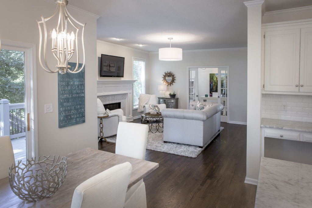
  1. Decide on a design style or mix of styles that will flow with your architecture and existing furnishings you will be re purposing.   As an interior designer in Kansas City, I always suggest clients select several photos of room designs they like and make sure any spouse or significant other involved agrees. Here in this great room our client wanted a glamorous Hollywood style mixed with touches from the beach in decor and color.

 2. Determine your color scheme ensuring it coordinates with adjoining rooms and any  existing furnishings to be used in the interior design.   If you have no idea, take a look in your closet to see what colors you’re drawn too or pull colors out of an inspiration piece like we did here with the existing artwork.

Karen Mills' blog
Interior design by Karen Mills

  3. Create a floor plan so you know what fits in your space and the sizes you need.   To do that you can go online and use space planning software or get an interior designer to help.

In this living room, we created a U shaped seating area to add emphasis to the fireplace which is the main focal point in the room.

  4.  Set a timetable.   At this point you might want to bring in an expert – interior designer and/or contractor/builder to review your design time frame because investing a few dollars for a master plan and viable timetable can help avoid thousands of dollars in costly mistakes later.

Karen Mills' blog
Interior design by Karen Mills. Photo by 29 Pixels, LLC

5. Design and order custom furniture and any built in cabinetry after consulting with your interior designer or tradespeople if you’re managing the project yourself. At this point all custom designs need to be finalized and ordered.   In addition permits need to be pulled for any construction.

In this great room we designed a custom sofa and reupholstered two chairs to perch atop a cozy organic style rug we found.

6.  Select and order all plumbing, flooring, tile, and general lighting, if needed.

Karen Mills' blog
Interior design by Karen MIlls

7.  Design additional furnishings

Furnishings may include rugs, window treatments, pillows, bedding or other items.  In addition ensure you select art, finishes, and other decor needed. Here we found coordinating pillow fabrics, a rug, tables, lamps, and decor to coordinate the custom sofa we designed.

For more great ideas and photos, sign up for our weekly interior design blog here

Plus become a fan of Kansas City’s interior designer and former host of the Living Large design show, Karen Mills, on 
INSTAGRAM and FACEBOOK here!
Interior Design/Interior Decorating

Interior Design: 3 Biggest Mistakes We Make in The…

How to Make Your Bedroom More Appealing

Karen Mills' blog
Interior design by Karen Mills

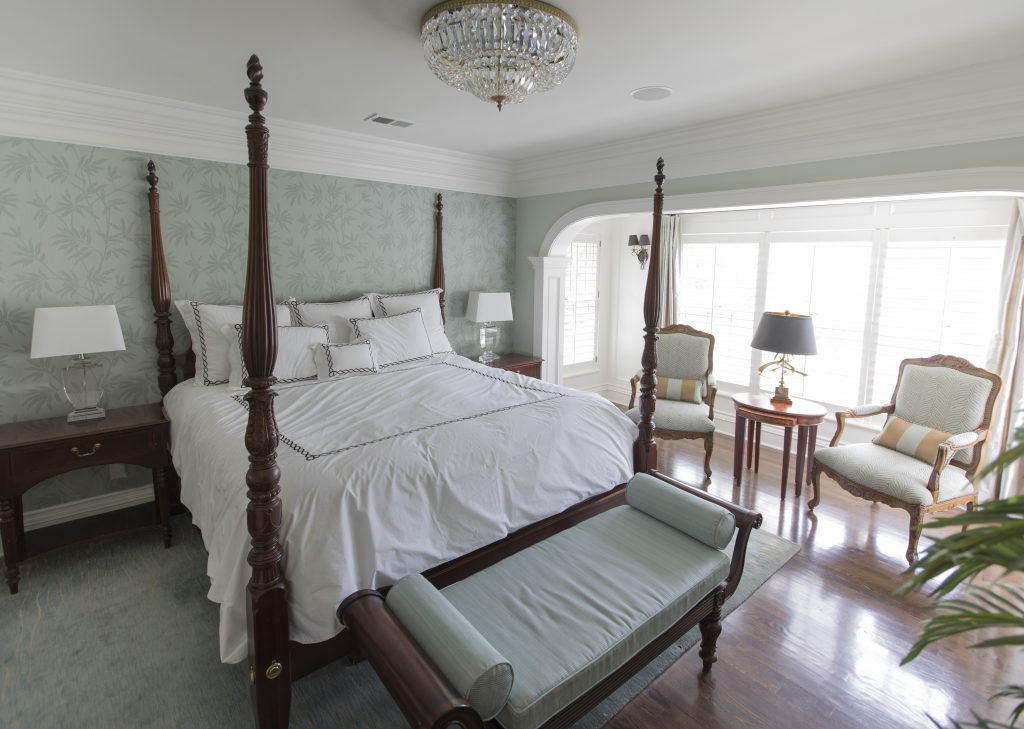
1. Lack of a Focal Point – Often as an interior designer I walk into a bedroom to discover a stark cold space that has no focus. With interior design a bed becomes the focal point and we need to enhance it.

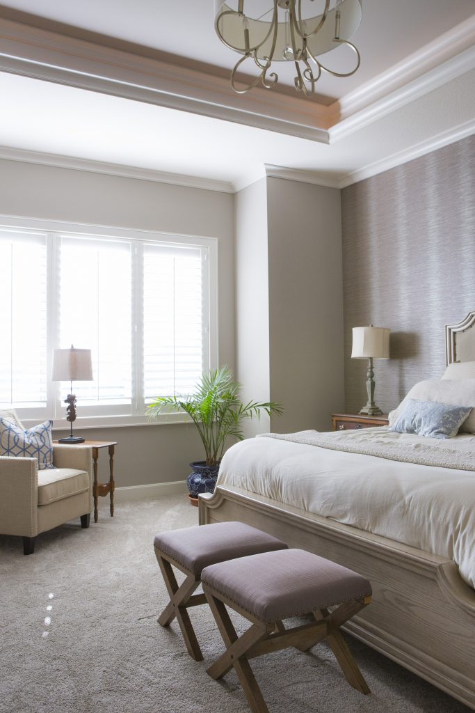
Here in this beautiful inviting bedroom we enhanced this poster bed with crisp white bedding, a fabulous textured leaf wallpaper, and a warm hand knotted wool rug with matching lamps and nightstands flanking it and a bench.

Karen Mills' blog
Interior design by Karen Mills

2. Uninviting – To create a more inviting bedroom with the existing American antiques our interior design firm layered in a upholstered bed with wallpaper behind, an attractive chair, and washable European linens that invite to come jump into bed.

Karen Mills' blog
Interior design by Karen Mills

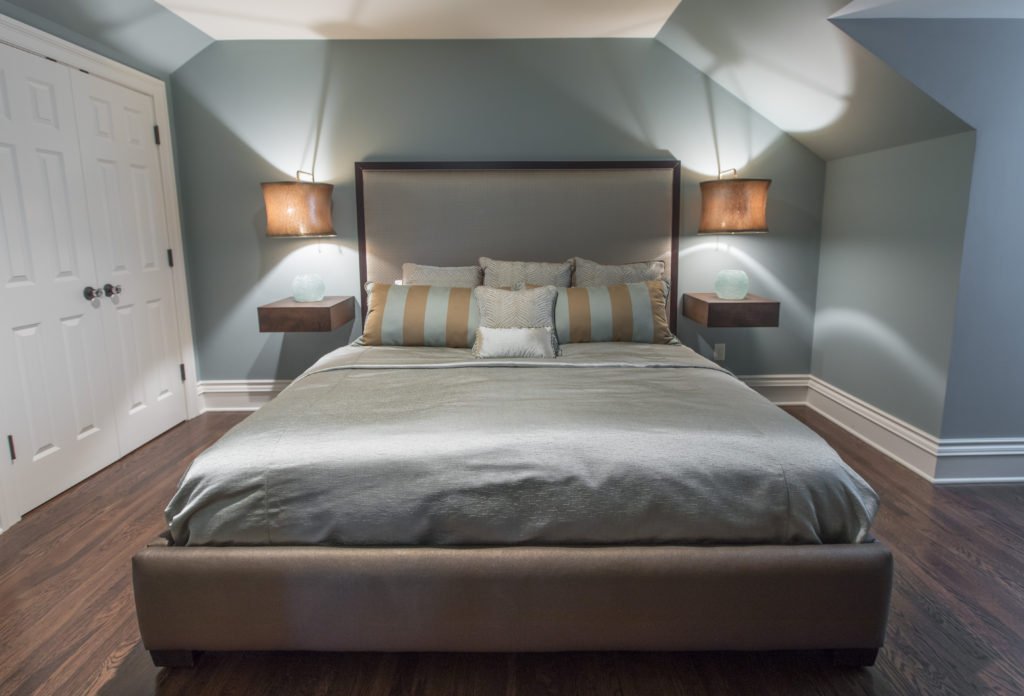
3. Too Cluttered or Crowded – In this tiny converted attic bedroom we didn’t want the room to feel to crowded or cluttered with this king size bed the clients requested so we designed a bed that didn’t overwhelm the room along with floating bedside tables and lamps that didn’t take up any more room on the floor. The lamps also add an inviting element with their low light. Headboard and custom bedding fabrics in more neutral calming colors help keep the space from feeling too busy.

Looking for more great bedroom design or decorating ideas?  Sign up for our weekly interior design blog here

Plus become a fan of Kansas City’s interior designer and former host of the Living Large design show, Karen Mills, on 
INSTAGRAM, FACEBOOK, TWITTER, or LINKEDIN here!

Interior Design/Interior Decorating

Interior Design: 3 Biggest Mistakes We Make in the…

Design Tips for Making Your Dining Room More Stunning

Karen Mills' blog
Interior design by Karen Mills as featured in Architecture Today Interior Design and Design Icons books
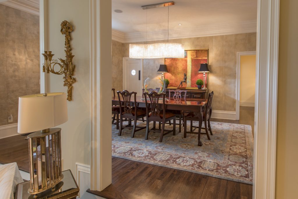
  1. Lack of emphasis  Creating a focal point with your table in the dining room gives you the opportunity to create a dramatic look, perfect for a dinner table or family gathering. Here in this Mission Hills dining room we began with an existing table and buffet along with selecting a fabulous hand knotted wool rug. Then we took the design to another whole level but introducing more contemporary elements from the stunning Swarovoski crystal chandelier that compels you to take a closer look to the bold abstract art beyond, contemporary sculpture, and rich leather squares on the wall.
Karen Mills' blog
Interior design by Karen Mills as featured in Architecture Today Interior Design book

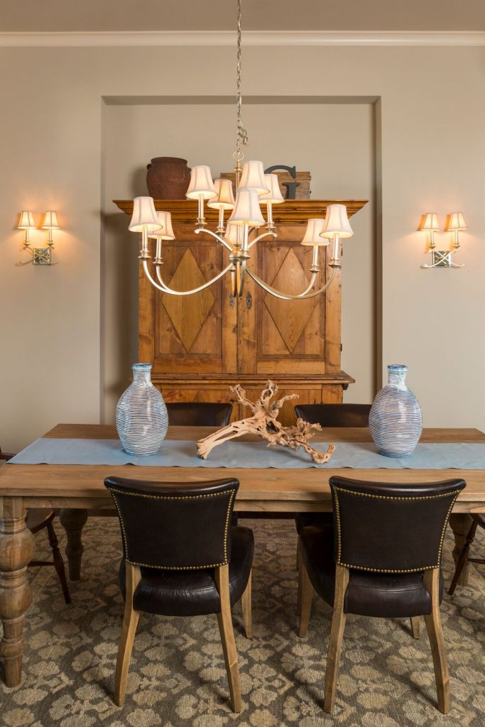
2.  Cold uninviting space –  One of the most common issues I see as an interior designer are dining rooms filled with hard shiny surfaces such as crystal, glass, or ceramic along with nothing on the floor or walls. To rectify this issue, try warming up your dining space with lots of texture. Here in this Overland Park room the client requested we use their heirlooms – a table and armoire, along with leather chairs. To warm up the space, we introduced a piece of gnarled wood, two handmade looking vases, and a custom cloth runner along with layering in a thick hand knotted rug underneath.

Karen Mills' blog
Interior design by Karen Mills

3. Looks Unfinished  When we walk into an interior design client’s home one of the first things we often see is an undone dining room. To enhance this space and make it more updated, I recommend adding color and items of interest whether with texture or design. In this dining area, we refinished a door in a soft neutral gray, updated the light fixtures overhead, put slipcovers on plain dark leather chairs, and added an interesting centerpiece along with blue art to create an inviting area to eat and relax.

For more inspiration, ideas, and photos, sign up for our weekly interior design blog here.

Plus become a fan of Kansas City’s interior designer and former host of the Living Large design show, Karen Mills, on 
INSTAGRAM and FACEBOOK here!
Interior Design/Interior Decorating

Interior Design: 8 Secrets to Creating Interiors That Stand…

How to Design Spaces That Are More Enduring

Karen Mills' blog
Interior design by Karen Mills

As an interior designer I’ve been fortunate to have the innate ability to create living experiences that are more enduring whether its a living room like this one or a work space like the shower in the next photo. In this living space quality upholstery, less patterns, and simple lines create a lasting appeal.

Karen Mills' blog
Interior design by Karen Mills

Even though finishes on furniture are important the most critical element to making an interior more timeless begins with finishes that are classic and enduring like this marble type tile we used on this bathroom high rise to make it last for years to come.

To read all 8 of our secrets to creating spaces with staying power that we wrote for HOUZZ, including specific examples of each, click on the link below.

For more inspiration, ideas, and photos, sign up for our weekly interior design blog here.

Plus become a fan of Kansas City’s interior designer and former host of the Living Large design show, Karen Mills, on 
INSTAGRAM and FACEBOOK here!
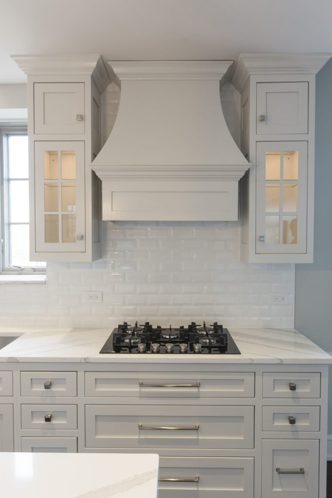
8 Rooms with Staying Power

Interior Design/Interior Decorating

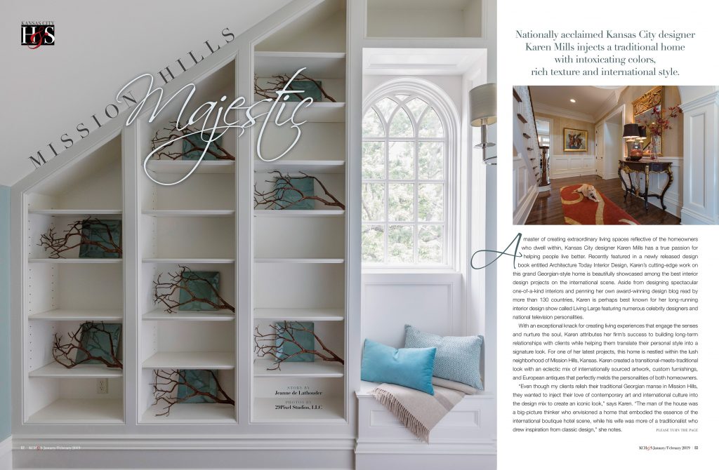
Interior Design with Intoxicating Color, Rich Texture, and International…

Read on to Learn How We Created a One of Kind Showstopping Design in the Heart of the U.S.

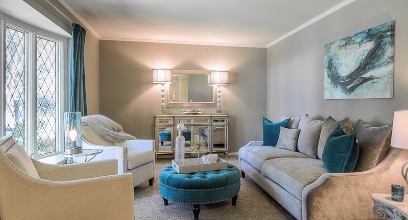
This project was a labor of love for this wonderful family who wanted a place to entertain family and friends. We started with designing the main entry – shown in orange and beige then worked our way through the home and up to the third floor guest suite we affectionately call “The Flat” – pictured in blue and white here, to create a space that’s one of a kind.

Karen Mills' blog
Interior design by Karen Mills

Click now to read the rest of this fabulous article by Kansas City Homes & Style magazine, plus see several more photos, some which have never been seen before.

For more inspiration, ideas, and photos, sign up for our weekly interior design blog here.

Plus become a fan of Kansas City’s interior designer and former host of the Living Large design show, Karen Mills, on 
INSTAGRAM and FACEBOOK here!
Interior Design/Interior Decorating

Interior Design: 3 Big Mistakes People Make in Their…

How to Make Your Entry More Interesting

Karen Mills' blog
Interior design by Karen Mills
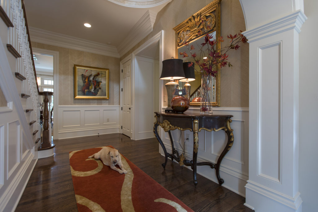
  1. Unwelcoming  –  If you want your guests to feel welcome then its important to create an inviting foyer like this one we designed where you are greeted by rich colors, great lighting, a comfortable rug underneath, and warm textural wall coverings that wrap you in a big hug. Of course Lucy (the dog) will be sure to say hello if she’s around too!
Interior Design by Karen Mills

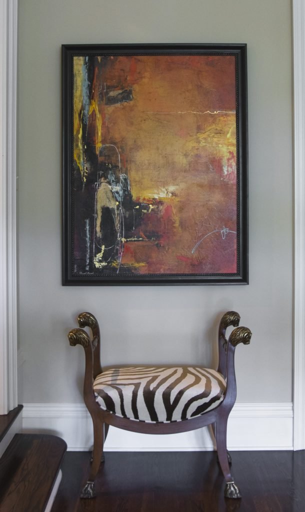
2. Zero Personality – As an interior designer I can’t repeat enough the importance of showcasing your personal style in the foyer. I believe the entry to be the most important area in your home because it gives people a hint of who you are and what you like. In this entry area we showcased the clients’ love of animal prints on this traditional custom designed stool while also showcasing their sophisticated taste in mixing styles with the abstract art above.

Karen Mills' blog
Interior design by Karen Mills featured in Architecture Today Interior Design book

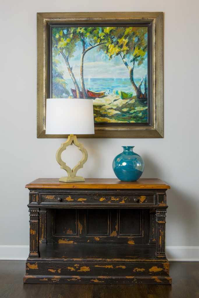
3. Lack of Intrigue   I always tell our interior design clients to think of their entry as the advertisement for their home because your entry should give visitors a glimpse into what’s coming next from colors and style to personal mementos like this entry where we began with a family heirloom piece (one of many) and dressed it up with a beautiful landscape painting, vase, and lamp that give you a preview of the color scheme and what’s next.

For more inspiration, ideas, and photos, sign up for our weekly interior design blog here.

Plus become a fan of Kansas City’s interior designer and former host of the Living Large design show, Karen Mills, on 
INSTAGRAM and FACEBOOK here!

And for more foyer inspiration, click here to read my article on & Color Palettes for Pleasing Entryway

or my budget tips titled Refresh Foyer for Less

Interior Design/Interior Decorating

Interior Design: 3 Big Mistakes People Make in Living…

Karen Mills' blog
Interior design by Karen Mills
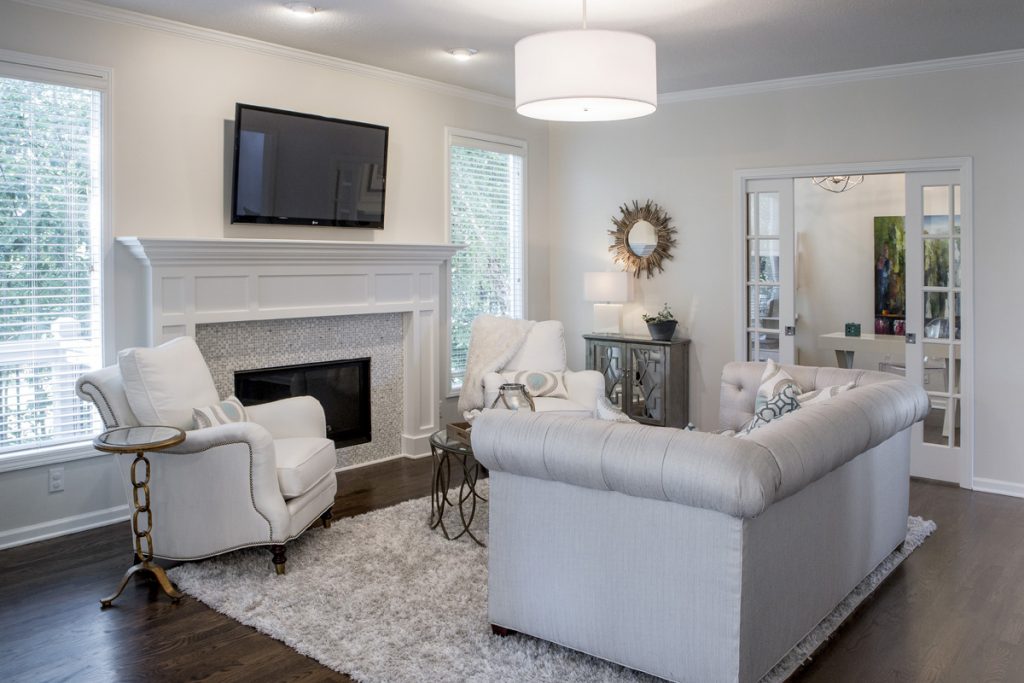
  1. Lack of a Focal Point    Often the best spot to emphasize in a living space is the fireplace or great view outside but if you don’t have those options, create a vignette (grouping) of furniture/accessories that will grab your attention. Then group your upholstery around the focal point to emphasize it. Here in this living room a focal point was created on the back wall to entice people into the space for a closer look.
Karen Mills' blog
Interior design by Karen Mills

2.  Purchasing Over Sized Upholstery Or Too Many Pieces  Have you ever decided you wanted to buy a new living room grouping but didn’t bother creating a floor plan or measuring the space first? Suddenly your furniture arrives and the furniture takes up so much real estate you can barely walk through or don’t have room? As an interior designer I can’t tell you how many frantic calls I’ve received from homeowners requesting help with their space planning only to discover the wrong furniture was already purchased and they want me to fix it which we know is impossible. In this living room, the right size furniture was used and strategically placed to not only enhance the focal point (fireplace) but also leave ample room for someone to pass through.

Karen Mills' blog
Interior decorating by Karen Mills

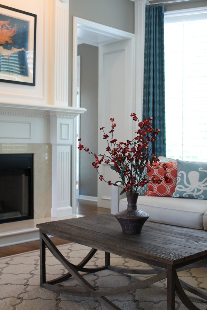
3.  Selecting The Wrong Wall Color   After working on 1200+ interior design projects I see this mistake happen more than any other. We might want to blame a decorating network like HGTV or DIY for making us believe that picking paint colors is easy but I think its because the general public doesn’t realize how much a color can change when it goes from a tiny paint swatch to an entire room or house. In this room, we selected the paint color during day that not only coordinated with the finishes and furniture but also played well with other rooms in view.

For more inspiration, ideas, and photos, sign up for our weekly interior design blog here.

Plus become a fan of Kansas City’s interior designer and former host of the Living Large design show, Karen Mills, on 
INSTAGRAM and FACEBOOK here!