Interior Design/Interior Decorating

Interior Decorating: 3 Design Tips for Cozying Up Your…

Ideas for Creating a Comfortable Nest at Home
Karen Mills' blog
Interior design by Karen Mills.

1. Comfortable seating.  As an interior designer I recommend selecting high quality upholstery with upgraded cushions that will provide comfortable seating for hours at a time, while also making sure the sofa fits your body type from the seat height and depth to level of cushioning desired and style of seating cushion needed.

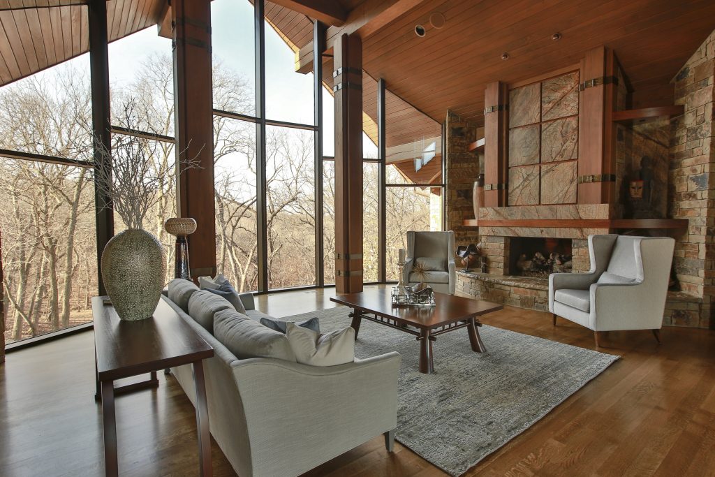
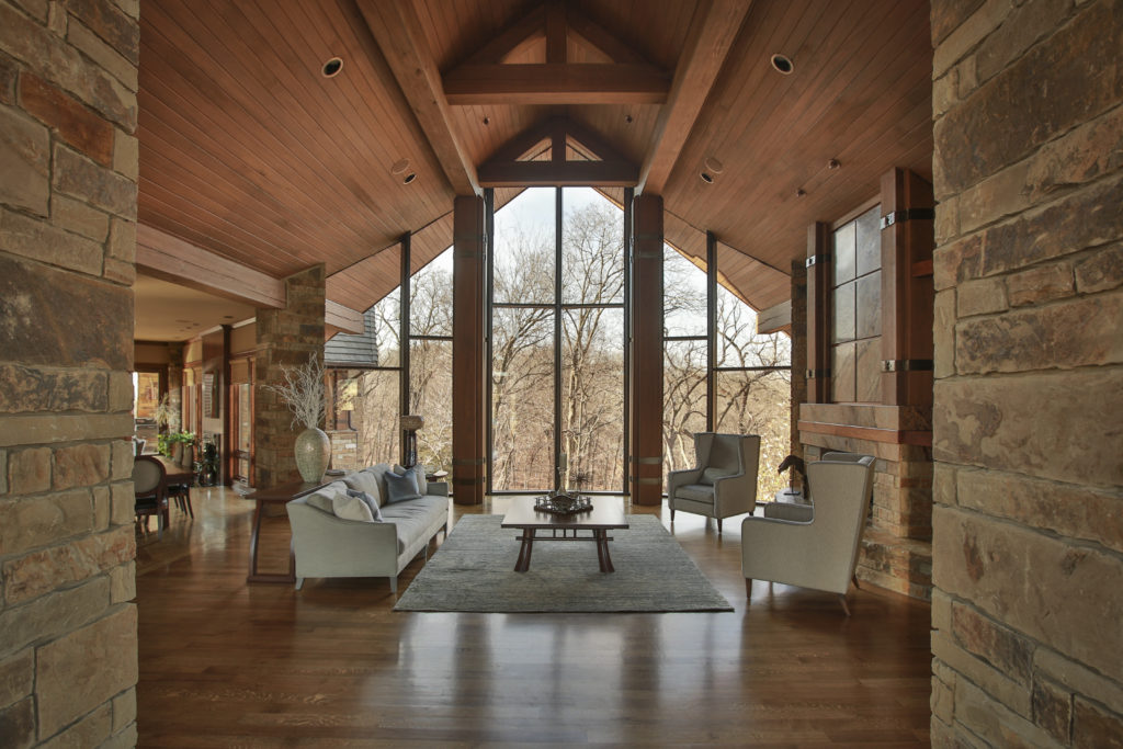
In this room we went with high quality custom furniture that you can sink into while enjoying the incredible views. We included a branch style fabric pattern on the sides of the chairs to tie them into the outdoors beyond.  3 Tips for a Budget Living Room Makeover

rug sizing example
Overland Park interior design by Karen Mills

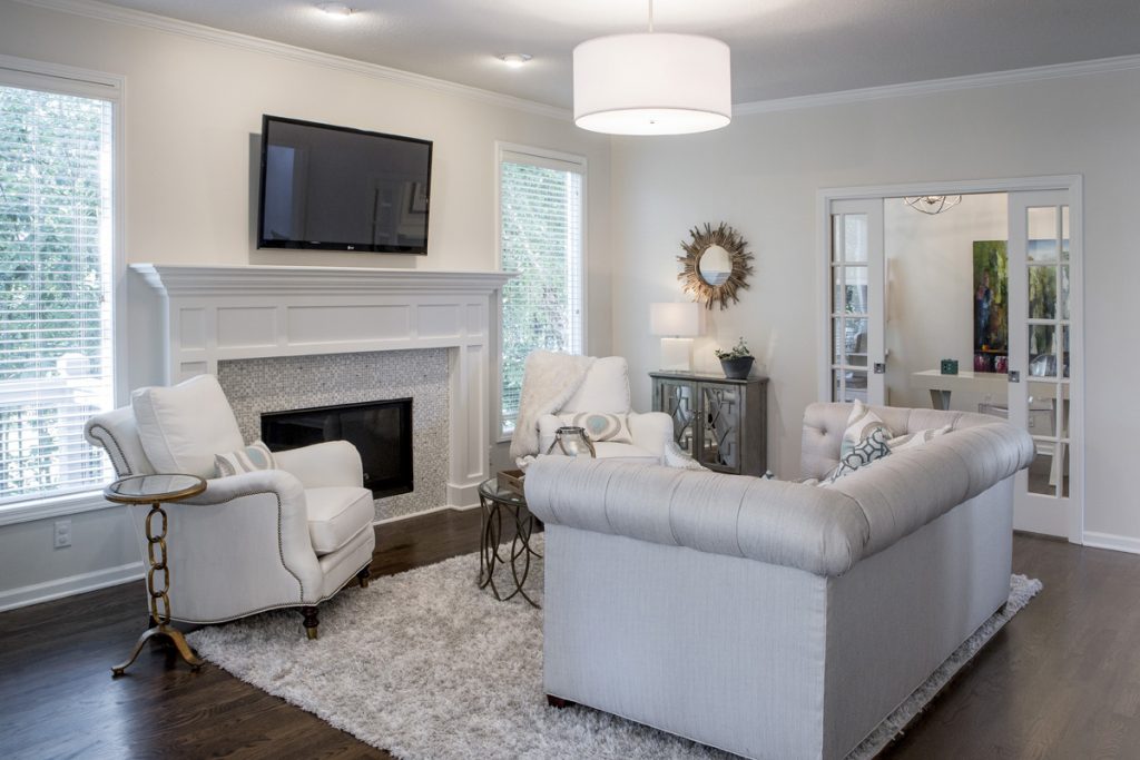
2. Create a Cozy Conversation Area When we put together a floor plan for a living area, we should focus on designing intimate seating areas like this one shown to create a relaxing comfortable space. Adding an area rug underneath helps define the space and cozy pillows enhance the feel. 3 Big Design Mistakes We Make in Living Rooms
Karen Mills' blog
Interior design by Karen Mills

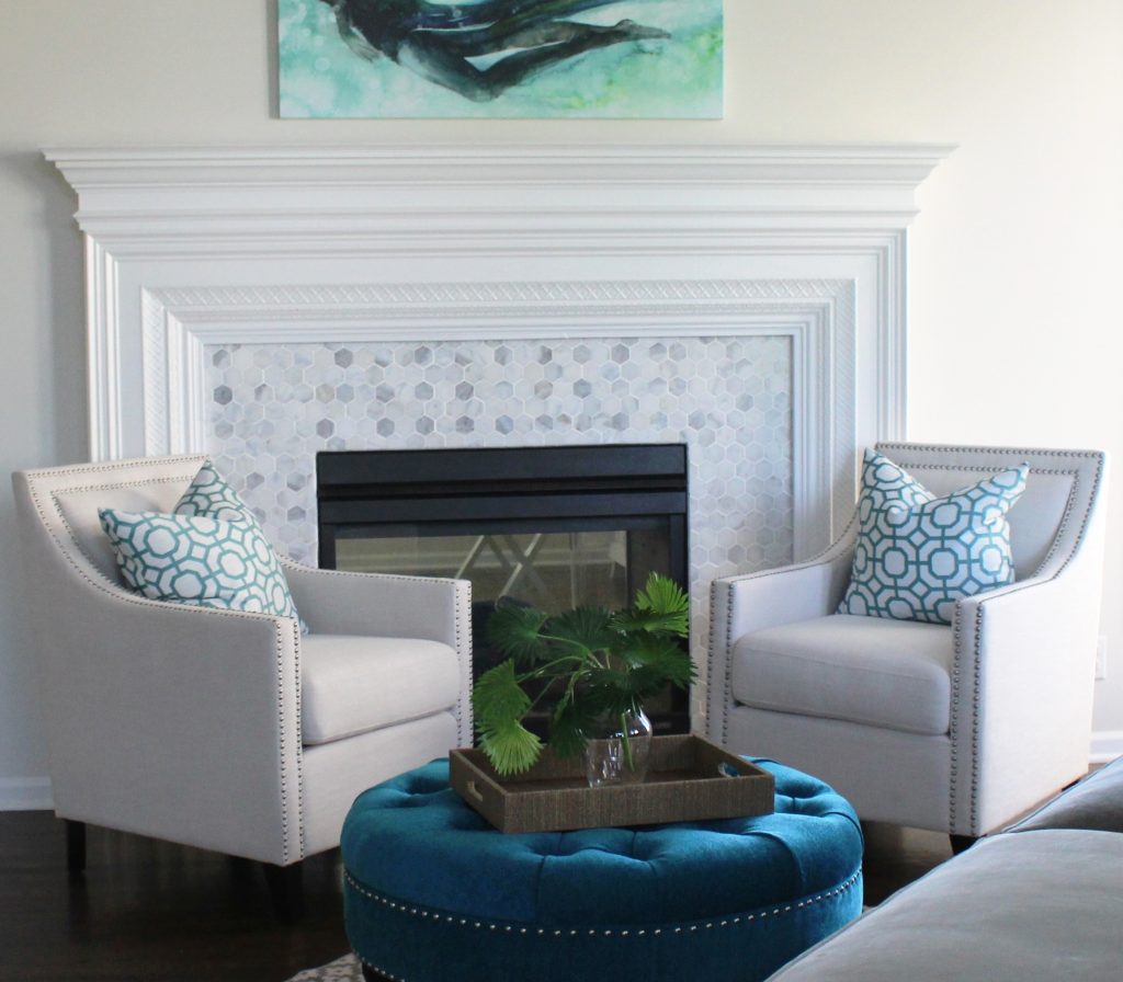
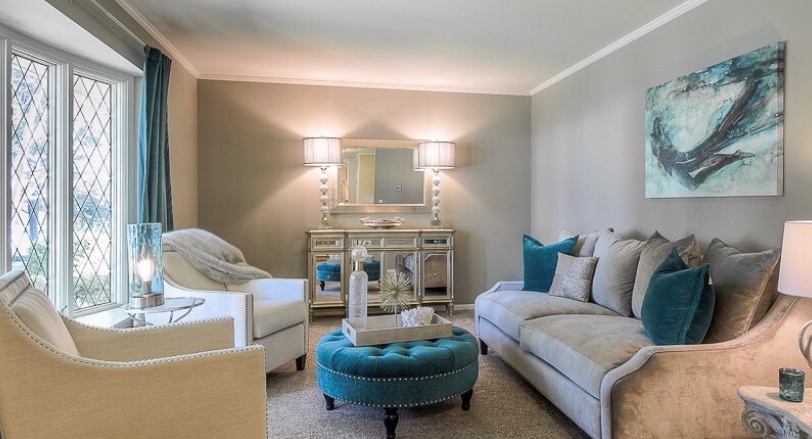
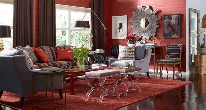
3. Layer in texture  Texture can be added with fabrics, soft window treatments, decor, rugs, or art. In this intimate living area, drapes, pillows, and a throw bring texture into the space along with a fabric ottoman, tray, and artwork.

Looking for more great ideas that you can implement?  Sign up for our weekly interior design blog here

Plus become a fan of Kansas City’s interior designer and former host of the Living Large design showKaren Mills, on Facebook  or Instagram now.
Interior Design/Interior Decorating

5 Frequent Furniture Arranging Mistakes Made in the Living…

How to Space Plan Your Living Room

example
Interior design by Karen Mills
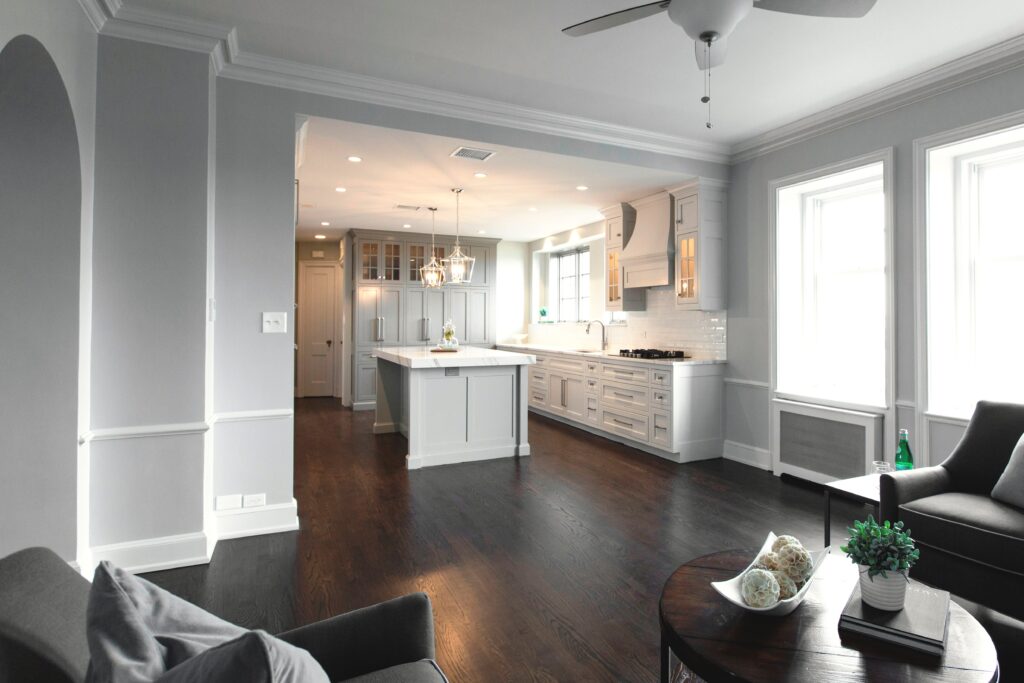
  1. Too Much Stuff – A room with too much furniture is visually overwhelming because it doesn’t give the eye a place to rest which can be unnerving. A well laid out living room will have a main sitting area around a focal point or if a larger space, different seating zones that can stand on their own. Here in this great room there’s ample seating and tables for drinks/books without overwhelming the space, making it calm and inviting.
Karen Mills' blog
Interior design by Karen Mills

2. Not Functional Before you lay out your furniture ensure you have ample room for 3 foot walkways to and from other rooms in addition to creating a path through your living room. Plus leave a 4 foot wide path to any exterior exits. Here in this compact living room we created a cozy seating area while leaving ample room to walk through to other spaces.

Karen Mills' blog
Interior design by Karen Mills

3. Oversized Furniture – One of the most common mistakes I see as an interior designer are clients who purchased upholstered furniture that’s way too big for their room and are determined to make their costly mistake work. The best way to avoid that problem is to measure your room before purchasing furniture or ideally hire an interior designer to give you a floorplan that works. In this cozy living area the armless chairs take up less space visually along with the round ottoman to keep the room feeling larger overall.

Karen Mills' blog
Interior design by Karen Mills

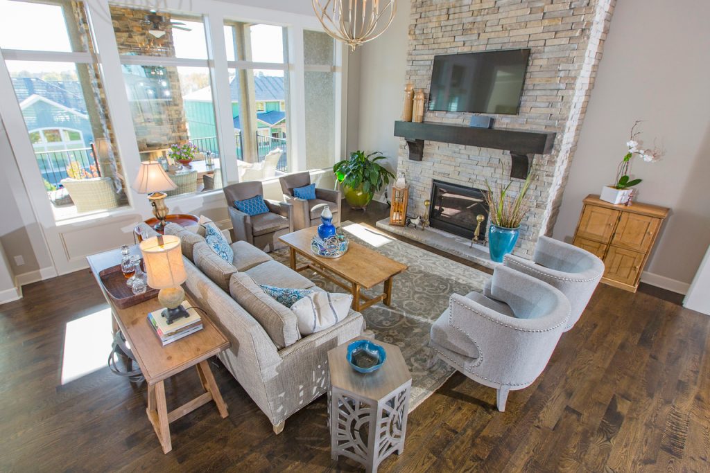
4. Off Balance – When arranging furniture ensure your room is evenly balanced on both sides of the space and distributed throughout the room instead of hugging the walls. Also make sure you have vertically balanced your room by using taller furnishings or architecture to draw the eye up to the ceiling and/or by having the right size of furniture for your room. In this sitting area we’ve placed the sofa facing the fireplace center and chairs on either side to create balance on both sides of the room. A rug completes the look to bring everything together.

blog post example

5. Seating That Doesn’t Emphasize Your Focal Point – Before arranging your furniture determine your main focal point. Ideally your focal point will be a dramatic architectural feature like a fireplace or great view out a window. But if that isn’t possible you can create a focal point with furniture and art, for example. In this great room the seating is arranged to emphasize the grand fireplace by facing the sofa towards it while also allowing the incredible view out the window to be clearly visible from the entry.
For more great interior design ideas, sign up for our design blog here!

plus become a fan of Kansas City’s interior designer and former host of the Living Large design show, Karen Mills, on Facebook  and Instagram now!

And if you feel someone you know could benefit from this helpful information, pass it on!

Interior Design/Interior Decorating

5 Frequent Furniture Arranging Mistakes We Make in the…

What to Avoid When Space Planning Your Bedroom

Karen Mills' blog example
Interior design by Karen Mills
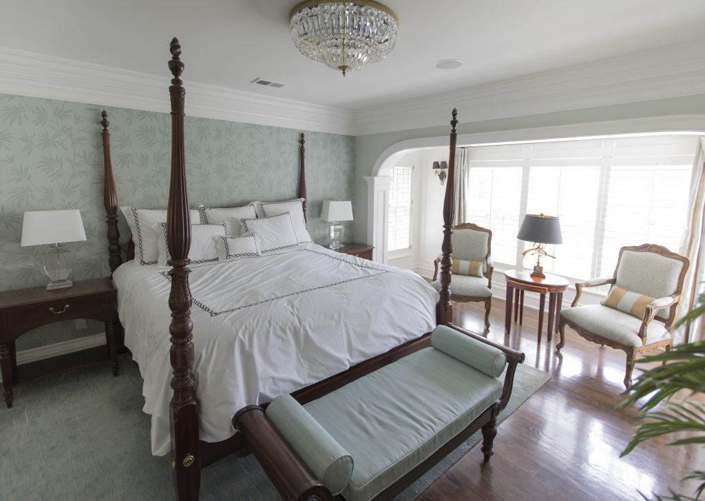
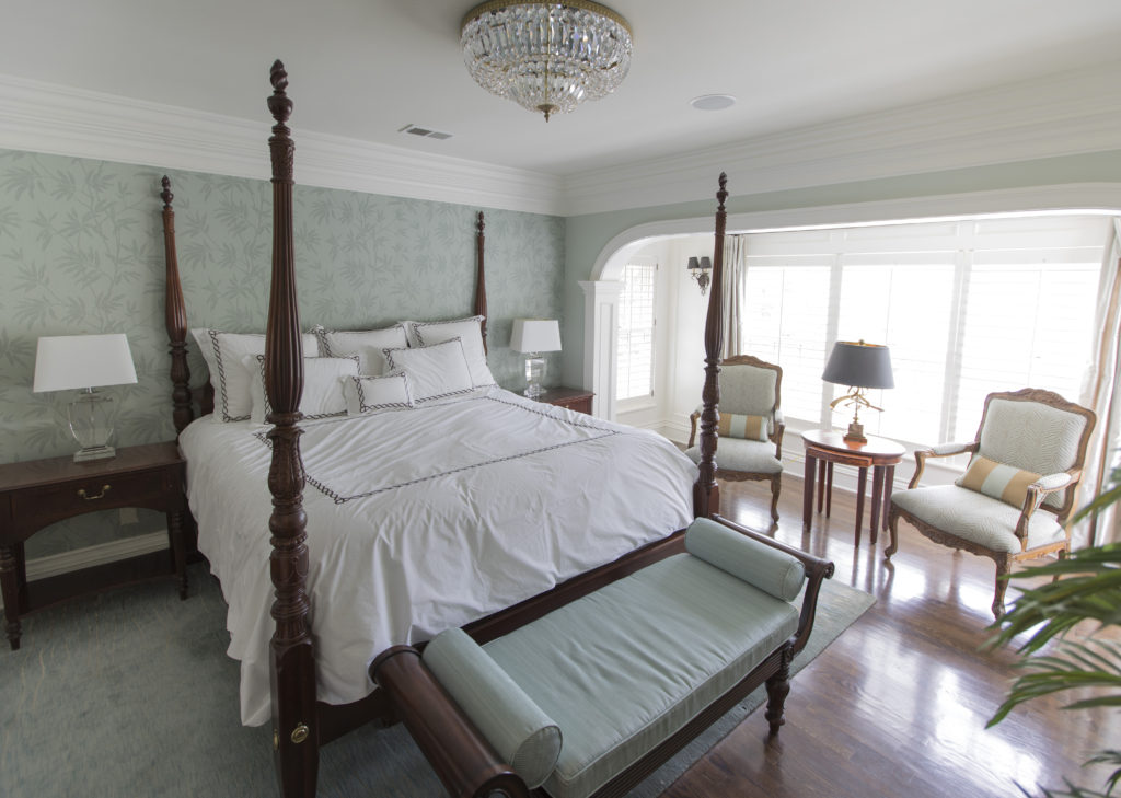
  1. Not Making Your Bed the Focal Point In this bedroom we emphasized the bed as the focal point by placing it on the longest wall, ensuring you can see it from the entry, and by layering in a luxurious blue green wallpaper behind it. Flanking end tables and lamps along with a bench and area rug also emphasize the bed as a focal point. 3 Suggestions for Creating a Restful Bedroom Retreat
Interior design by Karen Mills

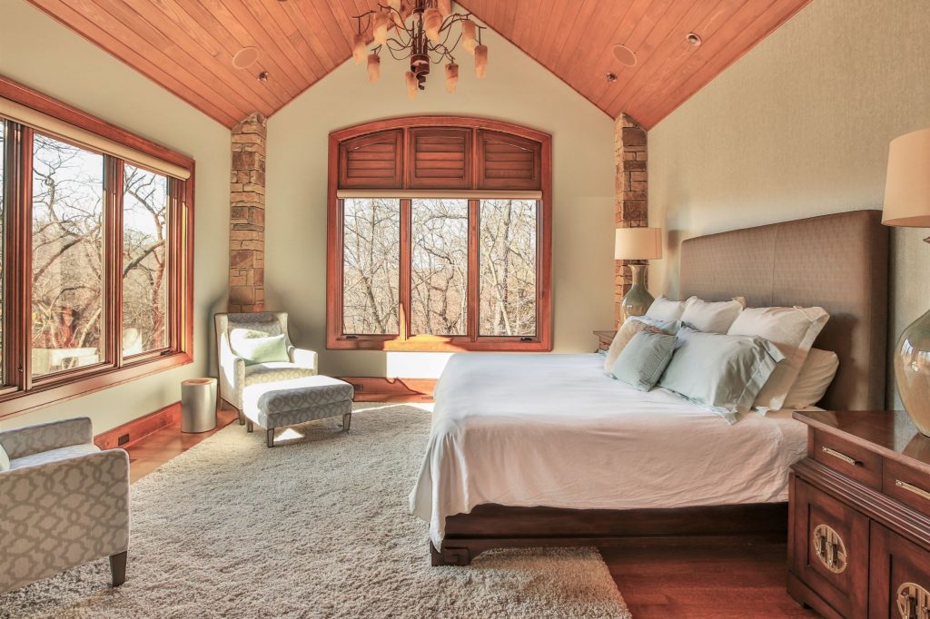
2. Placing the head of your bed in front of windows without draperies framing it. The only exception to this design rule would be if you had a glass wall and you were floating the bed in front of it and the view beyond enhanced your bed. That’s because if you place the head of a bed in front of a whole or partial window suddenly the bed loses importance and the window/view gains it. In this space the bed placement is perfect not only because its on the longest wall and can be seen from the entry but also because the bed now affords a view of the spectacular woods beyond. End tables and lamps enhance the look along with a textural wallpaper behind the headboard.

Interior design by Karen Mills

3. Unrelated furniture or furnishings As an interior designer I often walk into a master bedroom for the first time to discover a desk or something else totally unrelated to the bedroom which takes away from the rest of the design. Of course with the trend to stay at home right now a desk might be necessary because of space limitations but in general all work related items need to be out of sight so you can focus on just relaxing and enjoying your sanctuary.

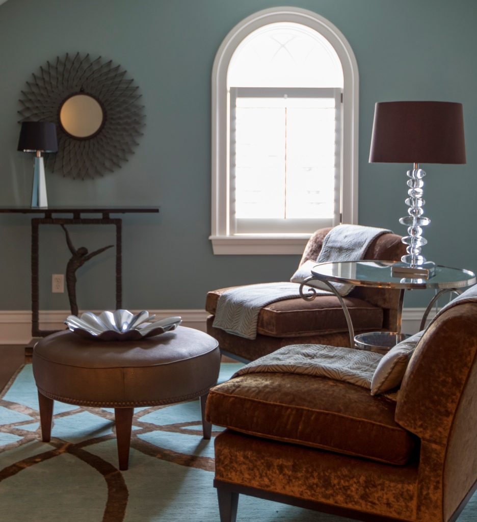
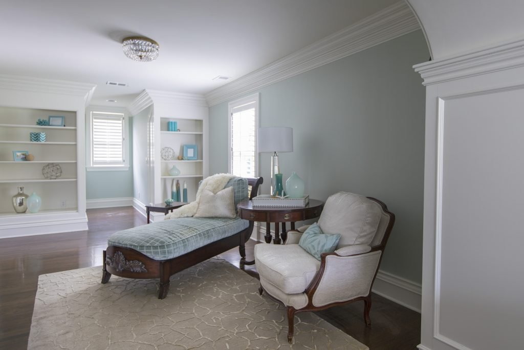
In this bedroom sitting area the furniture fits perfectly providing a place to take a nap, read a book, or just have a conversation.

photo example
Interior decorating by Karen Mills

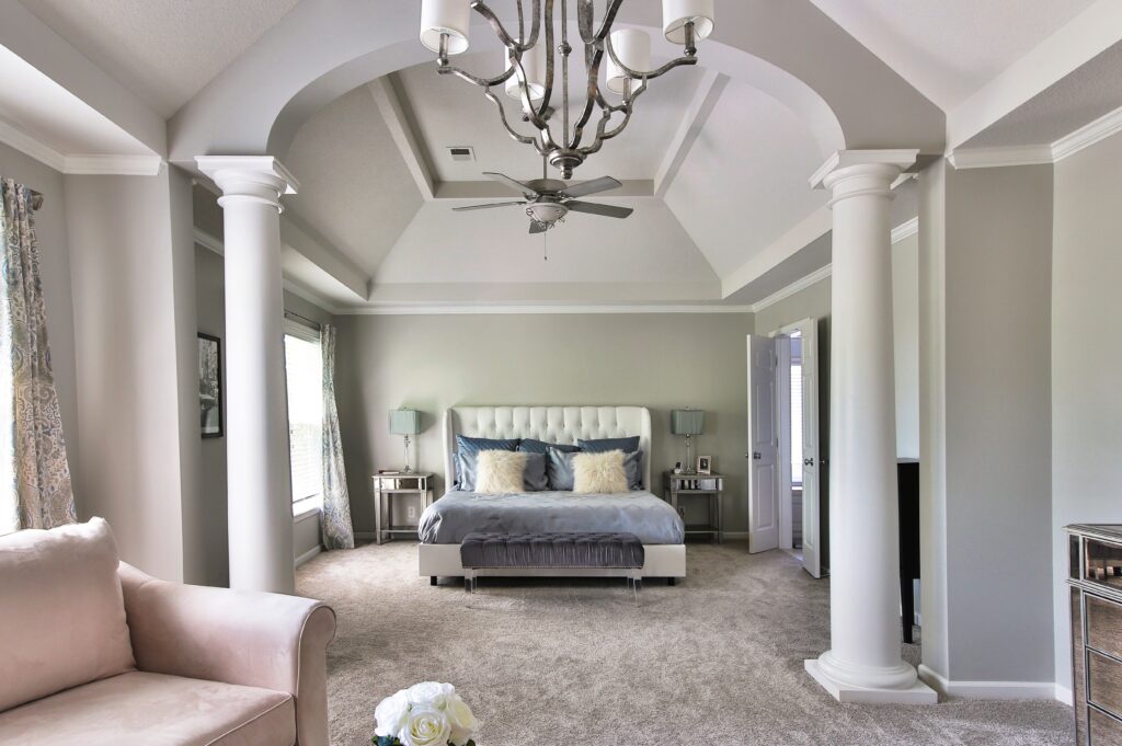
4. Lack of seating. Having a place to sit down on put on shoes or just relax and rejuvenate should be a top priority if you have the space. In this master suite a bench at the end of the bed provides an option for removing shoes while the chairs in the forefront offer a place to unwind at the end of the day. 3 Biggest Mistakes We Make in The Bedroom

Karen Mills' blog
Interior design by Karen Mills

5. Wrong size or placement of rug under bed. This problem is often one of the most common problems we encounter as interior designers. The rug is either turned the wrong direction, not under the bed at all or doesn’t emphasize the bed in a positive way.

Area rugs should be long enough span the width of the bed and nightstands. Place the rug in front of the nightstands ensuring the part of the rug is showing beyond the end of the bed to enhance the bed as your focal point.

For more great interior design ideas, sign up for our design blog here!

plus become a fan of Kansas City’s interior designer and former host of the Living Large design show, Karen Mills, on Facebook  and Instagram now!

And if you feel someone you know could benefit from this helpful information, pass it on!

Interior Design/Interior Decorating

7 Ways to Give Your Kitchen A Facelift Without…

Tips for Refreshing Your Kitchen For Less

Interior design by Karen Mills

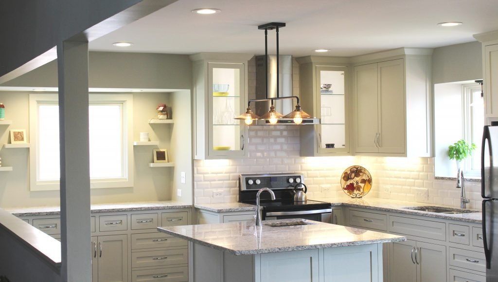
  1. Reface or paint your cabinetry – By refacing your cabinetry you are able to replace your dated cabinet fronts with a fresh on trend look without replacing insides of your cabinetry. In this kitchen our client opted to repaint their cabinetry to give it a fresh new look.

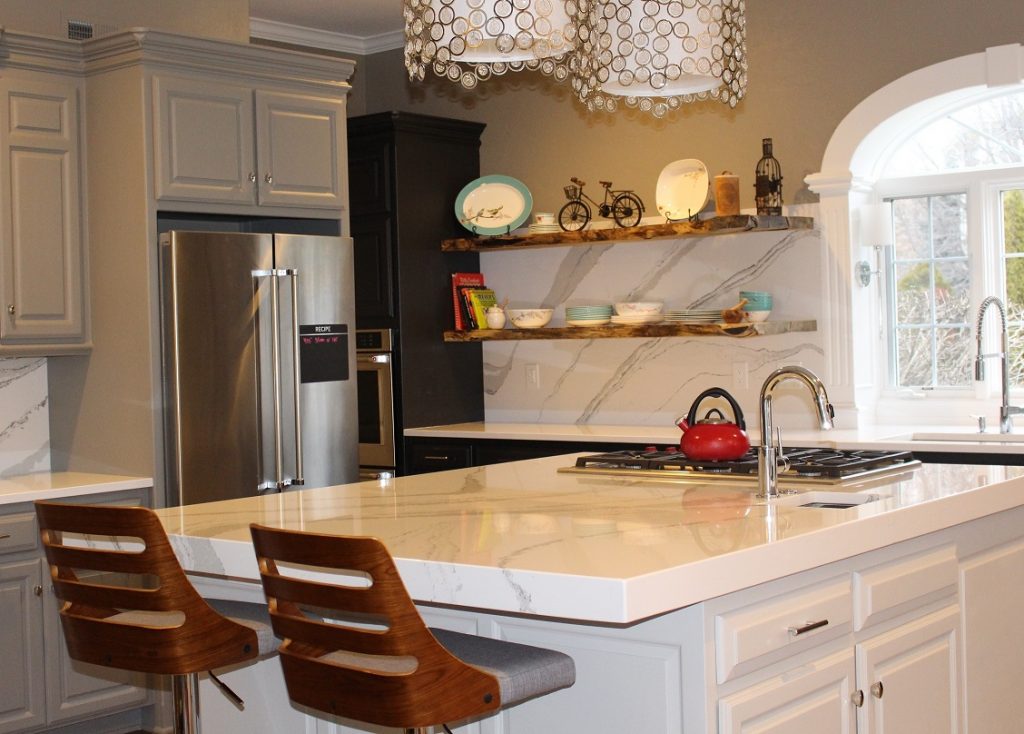
2. Upgrade Your Countertops By updating the countertops in this kitchen we were able to give it a fresher lighter look overall. A mitered island counter and counters that continue up the wall behind live edge shelving add to the the updated dramatic look.

Karen Mills' blog

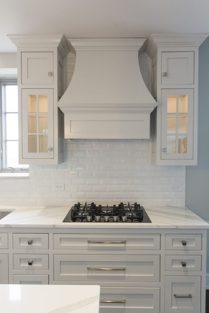
3. Update your backsplash In this completely renovated kitchen we replaced a dated backsplash with new beveled white subway tile to lighten up the space and bounce light throughout.

kitchen example

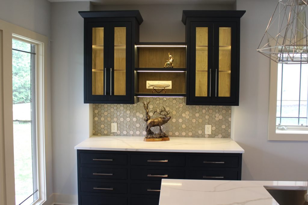
4. Install new hanging light fixtures such as pendants, chandeliers, or sconces along with undercabinet lighting. By adding work and accent lighting to your general lighting overhead you can create an ambiance that’s warm and inviting like this kitchen shown. Lit glass upper cabinets add to the ambiance.

photo example
Interior design by Karen Mills

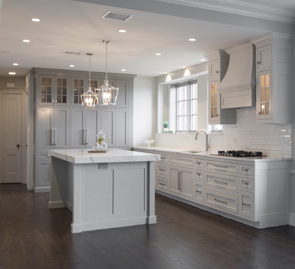
5. Replace pulls and/or knobs on your cabinetry. New pulls in this renovated kitchen stand out, adding to the fresh new look. Lit cabinetry, new counters and backsplash, new shelving, and a new light fixture enhance the design.

Karen Mills' blog

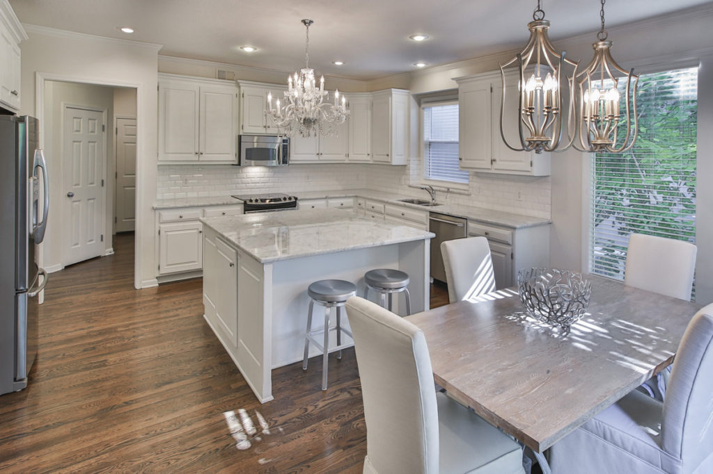
6. Paint your walls. In this kitchen we not only painted the walls but also redid the wood floors, replaced the backsplash, upgraded the counters, replaced the light fixtures over the table and slipcovered the chairs to create a more updated look.

7. Add a small island – with wheels ideally or a bar height table for more work space in the center of your kitchen, if needed. If you don’t have room for a permanent island and need more work space, consider adding a tiny island on wheels to hold your extra items and give you more counter space when cooking. When not in use just can roll it off to the side out of the way.

For more great interior design ideas, sign up for our design blog here!

plus become a fan of Kansas City’s interior designer and former host of the Living Large design show, Karen Mills, on Facebook  and Instagram now!

And if you feel someone you know could benefit from this helpful information, pass it on!

Interior Design/Interior Decorating

Interior Design: A Before and After Bathroom Transformation

A DEEP DIVE INTO A DESIGNER’S HISTORIC REMODEL JOURNEY INCLUDING BEFORE PHOTOS 

design photo
MASTER BATH AFTER

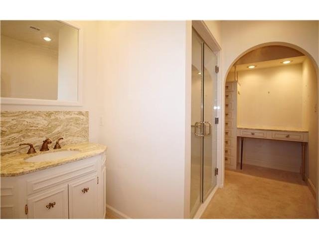
As an interior designer I know you will find this master bath remodel amazing not only because of how ugly and dated high rise bathroom built in the early 1900s on the historic Kansas City plaza was before, but also because of the transformation that takes place in such a compact space to make it live larger.

This image has an empty alt attribute; its file name is bathroom-shower-and-vanity-before.jpg
Master bathroom remodel before

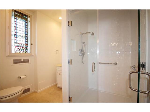
When we first entered this dated bathroom we knew we had a real challenge not only because the space was cut in half by a walled in shower, making the bathroom feel small, cramped, and unappealing but also because we were limited by the restrictions of the historic high rise.

Karen Mills' blog
Master bath remodel before

To make matters worse this ugly master bathroom only had one sink and a dimly lit dressing area that wasn’t necessary.

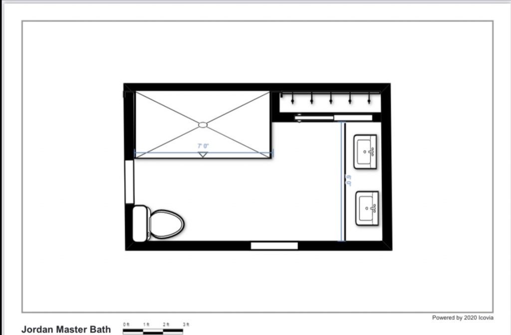
Floorplan by Karen Mills

To solve this interior design dilemma we ripped out everything except the small existing closet and started over with a new floor plan, keeping the plumbing in roughly the same place to save costs.  As you can see in this new floor plan we expanded the shower into the former vanity area and flipped the toilet to make the bathroom easier to navigate, while also moving the vanity to the former dressing area.

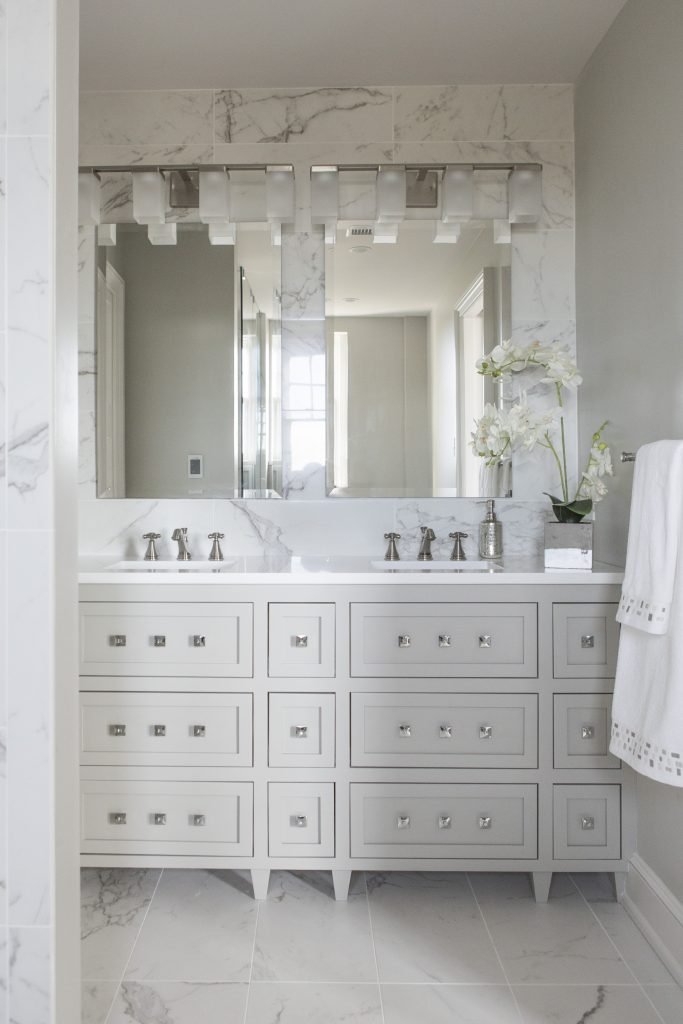
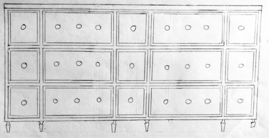
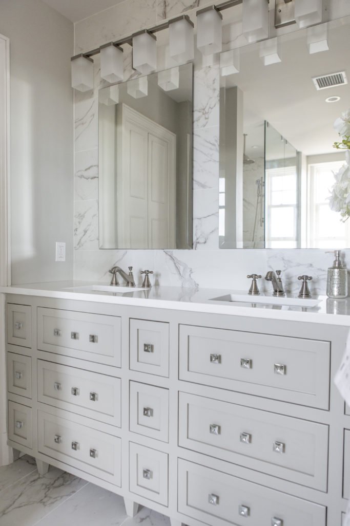
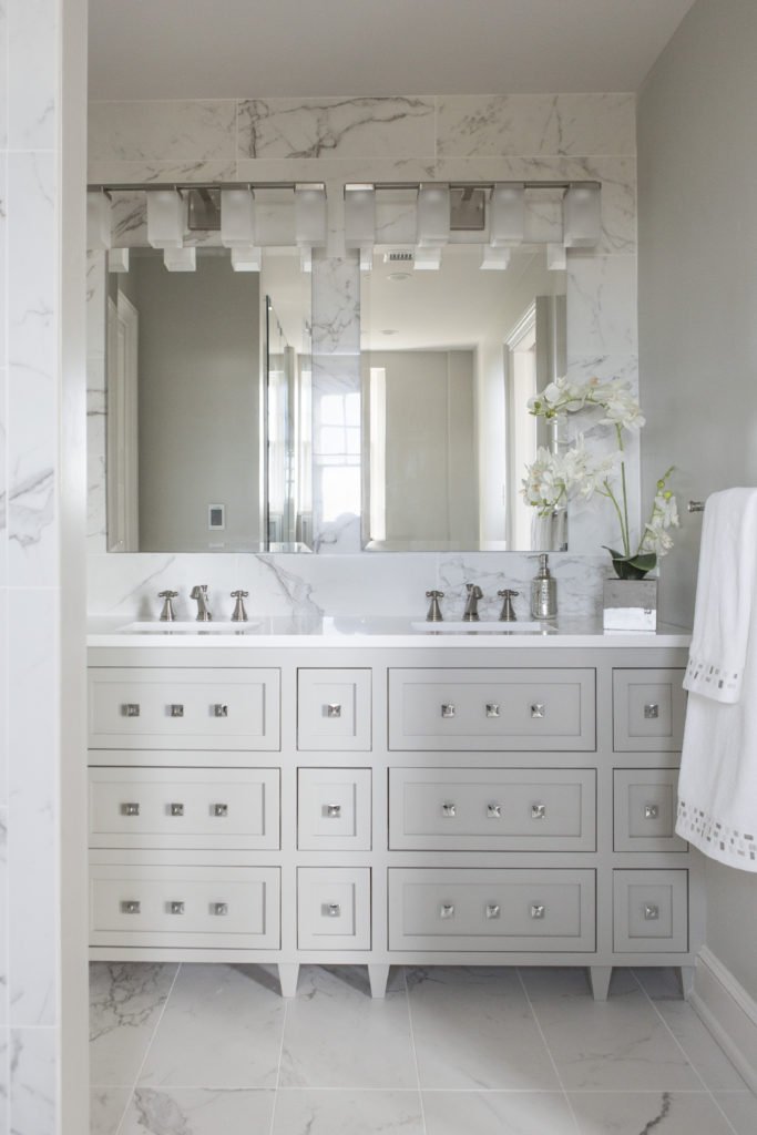
For the new sink area we designed a custom vanity that accommodates two sinks while also adding legs to the vanity to make it appear visually lighter. Drawers that wrap around the plumbing above and below make better use of the space and provide more storage.

Karen Mills' blog
Karen Mills' blog
Interior design by Karen Mills

European style custom shaker cabinets with clean lines also give the room a less fussy look while the wall of tile behind the vanity add to the timeless style of this glamorous master bath that really stands out with a fresh new look.

Karen Mills' blog
MASTER BATH AFTER

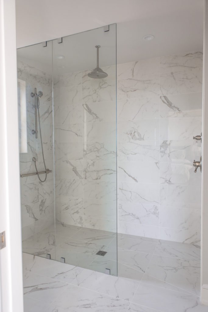
By placing the identical Italian marble style tile on the floor and walls of this compact space, the room visually expands to live much larger than before, while the new over sized shower for two, curb less entry, and partial glass front add to the spacious feel.

Karen Mills' blog
Interior design by Karen Mills


To transform your own dated bathroom into a beautiful new space that lives larger and enhances your living experience, just follow our recipe for success by improving your layout, knocking down walls, visually expanding, and adding light.

For more great interior design ideas, sign up for our design blog here!

plus become a fan of Kansas City’s interior designer and former host of the Living Large design show, Karen Mills, on Facebook  and Instagram now!

Interior Design/Interior Decorating

Interior Decorating: How to Use Your Favorite Hue at…

Tips for Injecting Your Favorite Color into Your Interior

example
Interior design by Karen Mills featured by Design Icons book

Did you know that your favorite color gives experts insight into your personality type? As an interior designer who’s been in over 1200 homes I can get an immediate sense of someone’s personality just by looking at the styles and colors of clothing in their closet or by walking through their home interior when we first meet.

You may be wondering how that’s possible, but all of us experience color in different ways as we progress through life creating an unique color story that’s all our own. Lea Eiseman, the world’s leading color expert and a regular guest on my former design show Living Large, shared why that’s true in one of her renowned color books, “…much of color knowledge is based on instinctive responses, cultural conditioning, and those aspects of color that we seem to absorb without much conscious thought.” Read on to gain insight about your favorite color, what it says about you, and ideas for injecting that color into your home’s interior.

Karen Mills' blog
Interior design by Karen Mills

RED

If you love red like I do you live life to the fullest with a passion and intensity that others don’t possess. You’re exciting, daring, and spontaneous, but also have an inner drive to excel at everything you do. So how does that color translate into an interior design? The color red that we associate with blood, instantly raises your blood pressure and grabs your attention so remember that a little bit goes a long way in a room! 

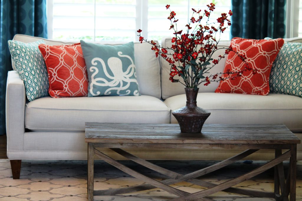
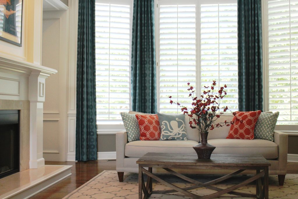
In this great room orange red pillows and flowers pop against the white sofa creating an exciting tension and bold contrast, while the custom blue draperies we designed introduce a secondary color that’s cooler and more restful.

Alternately, soft pink lovers tend to be charming, peace loving, and romantic types who carry some of the same traits as the red/bright pink.

example of comfortable seating
Interior design by Karen Mills featured in Architecture Today Interior Design book

BLUE

An extension of sky and water, blue exudes stability and calm making it a perfect color for bedrooms or other areas where you want to unwind and relax. Lovers of this color tend to be dependable, responsible citizens who do the right thing. No wonder blue still remains the favorite color of men!

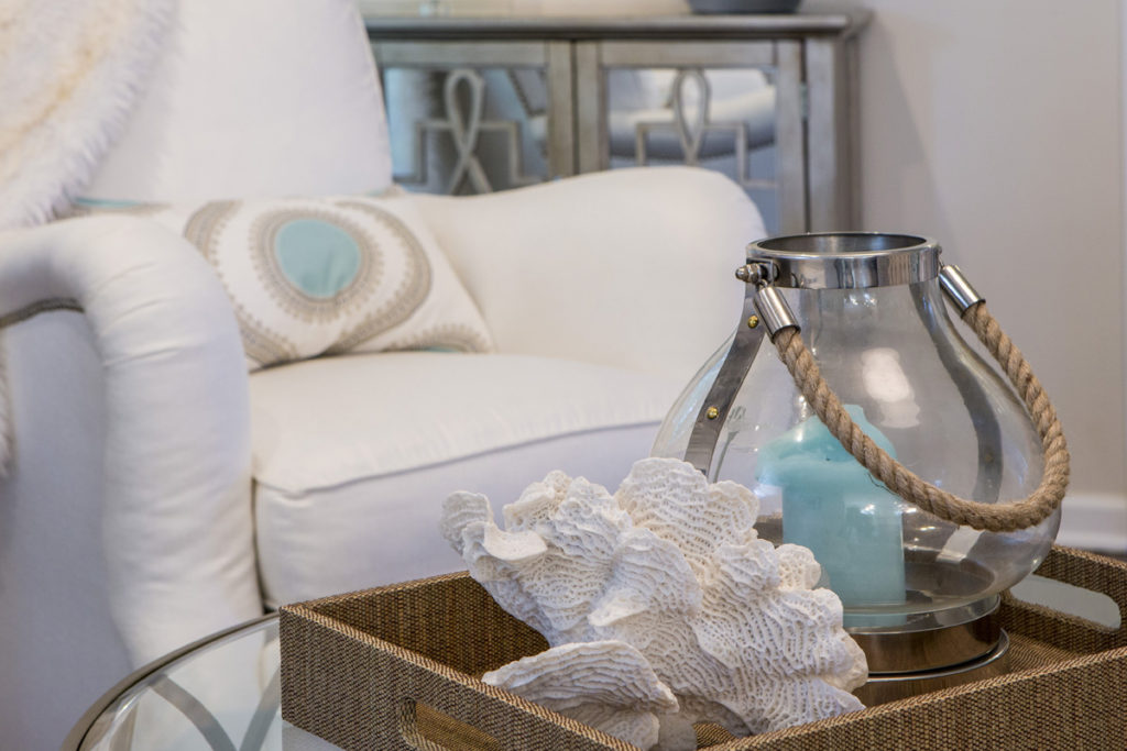
In this close up photo of a family room we designed, a watery blue pillow and candle join forces with rustic beach elements – a shell and rope – to create a wonderful ocean vibe in this space. 

YELLOW

Yellow like a ray of sunshine portrays warmth, cheerfulness, and optimism making it a wonderful hue for a cheery kitchen, sunny living area, or any interior lacking sunshine and warmth. Huge fans of yellow are optimistic, warm, and playful, while also being inquisitive and encouraging to others. 

example
Interior design by Karen Mills featured in Design Icons book

ORANGE

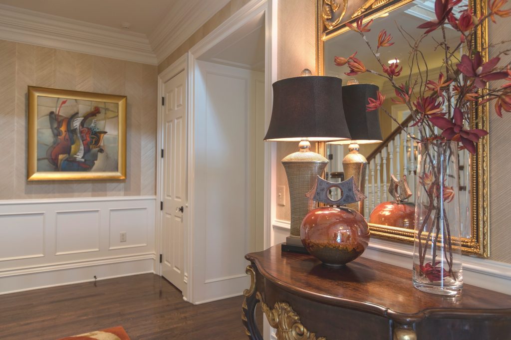
As an orange enthusiast you share an enthusiastic zest for life, outgoing personality, sense of humor, bright outlook, and longing for adventure. Orange, known as the color of hunger, fits perfectly into a dining room or kitchen eat in area where you need some energy or more life. But that’s not all as you can see in this foyer where we sourced an original Mattini painting and pulled out the orange hue as as the main accent color on our custom designed rug, original ceramic art piece, and flowers, while also repeating a golden hue from the art on the wool rug and and handmade chevron wallpaper to add more interest.

Interior design by Karen Mills featured in Design Icons book

GREEN

Green, the color of nature exudes calmness and warmth, which makes it a great color for bedrooms or spaces where you need a more relaxed feel like a sun room, den, or library.  Enthusiastic fans of green are usually warm, kind, and charitable people who like to give back to their communities. Green fans also bring stability and loyalty as additional attributes.

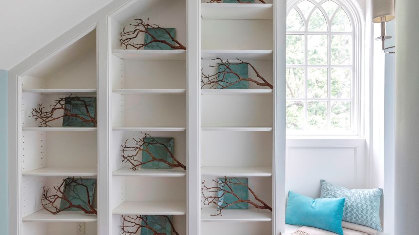
Here in this stunning foyer we designed that was featured in the international Design Icons book, we repeated the blue green plates with branches overlaid on the white shelves to create a dramatic but also calm entrance into this third floor foyer aptly named The Flat after our client’s London home.

PURPLE

A complex and creative type of individual, purple lovers are fascinating observant individuals who often have a generous spirit and artistic flair. Purple, the favorite color of most children, also has a mysterious air about it making it popular with artists or creatives too. In interiors purple usually works best as a light or a very dark almost neutral hue wall color or as an accent in any shade. 

Interior Design by Karen Mills featured in Architecture Today Interior Design Book

BROWN

Brown personalities tend to be down to earth, stable, and in harmony with life around them, while still appreciating quality. Brown lovers like to keep things simple, secure, and peaceful, but that doesn’t mean they aren’t cosmopolitan. Brown hues work great for your interior if you’re looking to create a grounded space that’s also cozy and inviting whether its a living room, dining room, den, or even a bedroom.

Beige, a lighter version of brown speaks of someone who is warm, reliable, and doesn’t often rock the boat. As a light neutral this color can be introduced almost anywhere including combining it with gray for a cool/warm color combination. 

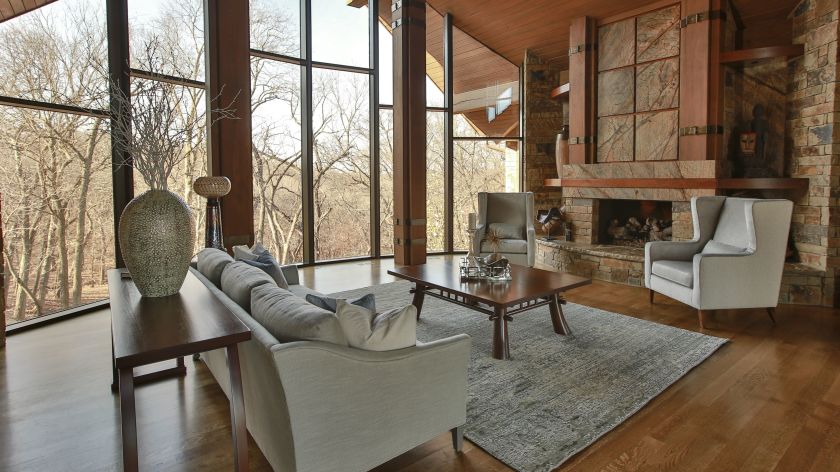
Here in this stunning rustic great room we designed that was featured in the international book Architecture Today Interior Design, warm browns wrap around the room like a big hug, creating a welcoming feel.

White

Did you know that white is the sum of all other colors combined? Isn’t that amazing? As an interior designer I love that white can do so much in a room’s interior design from creating more contrast and bouncing light around a room to visually expanding it. But white also signifies innocence, cleanliness, and purity so you may notice that white hue lovers sometimes have the same characteristics in their neatly organized and well kept homes or crave the innocence of their youth.   

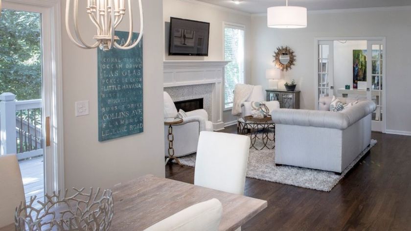
In this hearth area renovation we darkened the floors to contrast against the white walls and trim we introduced. Then we continued the white theme by slip covering dining chairs, upholstering arm chairs, layering in pillows with white backgrounds, putting in white/gray marble tile, and adding a table we had white washed that was formerly a door.

Gray

The gray personalities that I’ve experienced are content to be calm, cool, and collected. They prefer to stay out of the limelight, opting instead for safety, security, and practicality. That’s why I believe as an interior designer that gray color schemes have become so popular at home for years because this color creates a calm respite from the outside world and works well in almost every room.

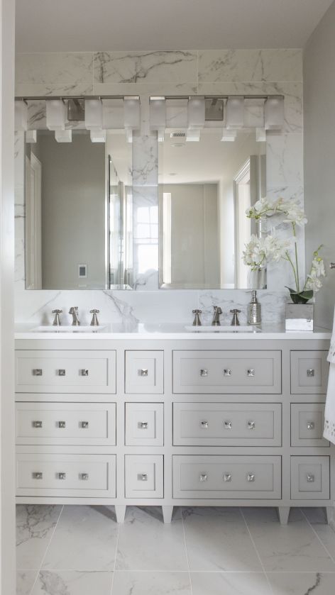
In this gorgeous high rise master bathroom we designed, gray from the Italian marble style tile repeats again on the custom designed vanity and walls. White quartz counters, square knobs and a tiled wall enhance the look of this small but stunning space.

BLACK

Don’t know if you aware of this little known fact, but black is completely void of color, the opposite of white. Of course we all know that the black suit signifies sophistication and status in the business world, but black color hue aficionados are also confident in their ability to hold a conversation, clever in their communication abilities, and make security a top priority in their lives. Black is a wonderful color for interiors, especially when combined with white and can used throughout your interior from living, dining, and powder rooms to home theaters, or on doors/trim to create a dramatic look.

So what if your favorite color is a combination of two colors. If that’s the case, simply combine the traits associated with each color for a picture of your personality.

To summarize, colors whether worn or used in your interior reveal insight into your personality and life story. And when you utilize your favorite color in your home it can bring back wonderful memories that cradle you in comfort whether its on the walls, ceilings, floors or furnishings. 

For more great interior design ideas, sign up for our design blog here!

plus become a fan of Kansas City’s interior designer and former host of the Living Large design show, Karen Mills, on Facebook  and Instagram now!

If you feel someone you know could benefit from this helpful information, pass it on!

Interior Design/Interior Decorating

Interior Decorating: 3 Designer Suggestions for How to Incorporate…

Tips for Injecting Your Favorite Color into Your Interior

example
Interior design by Karen Mills featured by Design Icons book

Did you know that your favorite color gives experts insight into your personality type? As an interior designer who’s been in over 1200 homes I can get an immediate sense of someone’s personality just by looking at the styles and colors of clothing in their closet or by walking through their home interior when we first meet.

You may be wondering how that’s possible, but all of us experience color in different ways as we progress through life creating an unique color story that’s all our own. Lea Eiseman, the world’s leading color expert and a regular guest on my former design show Living Large, shared why that’s true in one of her renowned color books, “…much of color knowledge is based on instinctive responses, cultural conditioning, and those aspects of color that we seem to absorb without much conscious thought.” Read on to gain insight about your favorite color, what it says about you, and ideas for injecting that color into your home’s interior.

Karen Mills' blog
Interior design by Karen Mills

RED

If you love red like I do you live life to the fullest with a passion and intensity that others don’t possess. You’re exciting, daring, and spontaneous, but also have an inner drive to excel at everything you do. So how does that color translate into an interior design? The color red that we associate with blood, instantly raises your blood pressure and grabs your attention so remember that a little bit goes a long way in a room! 

In this great room orange red pillows and flowers pop against the white sofa creating an exciting tension and bold contrast, while the custom blue draperies we designed introduce a secondary color that’s cooler and more restful.

Alternately, soft pink lovers tend to be charming, peace loving, and romantic types who carry some of the same traits as the red/bright pink.

example of comfortable seating
Interior design by Karen Mills featured in Architecture Today Interior Design book

BLUE

An extension of sky and water, blue exudes stability and calm making it a perfect color for bedrooms or other areas where you want to unwind and relax. Lovers of this color tend to be dependable, responsible citizens who do the right thing. No wonder blue still remains the favorite color of men!

In this close up photo of a family room we designed, a watery blue pillow and candle join forces with rustic beach elements – a shell and rope – to create a wonderful ocean vibe in this space. 

YELLOW

Yellow like a ray of sunshine portrays warmth, cheerfulness, and optimism making it a wonderful hue for a cheery kitchen, sunny living area, or any interior lacking sunshine and warmth. Huge fans of yellow are optimistic, warm, and playful, while also being inquisitive and encouraging to others. 

example
Interior design by Karen Mills featured in Design Icons book

ORANGE

As an orange enthusiast you share an enthusiastic zest for life, outgoing personality, sense of humor, bright outlook, and longing for adventure. Orange, known as the color of hunger, fits perfectly into a dining room or kitchen eat in area where you need some energy or more life. But that’s not all as you can see in this foyer where we sourced an original Mattini painting and pulled out the orange hue as as the main accent color on our custom designed rug, original ceramic art piece, and flowers, while also repeating a golden hue from the art on the wool rug and and handmade chevron wallpaper to add more interest.

Interior design by Karen Mills featured in Design Icons book

GREEN

Green, the color of nature exudes calmness and warmth, which makes it a great color for bedrooms or spaces where you need a more relaxed feel like a sun room, den, or library.  Enthusiastic fans of green are usually warm, kind, and charitable people who like to give back to their communities. Green fans also bring stability and loyalty as additional attributes.

Here in this stunning foyer we designed that was featured in the international Design Icons book, we repeated the blue green plates with branches overlaid on the white shelves to create a dramatic but also calm entrance into this third floor foyer aptly named The Flat after our client’s London home.

PURPLE

A complex and creative type of individual, purple lovers are fascinating observant individuals who often have a generous spirit and artistic flair. Purple, the favorite color of most children, also has a mysterious air about it making it popular with artists or creatives too. In interiors purple usually works best as a light or a very dark almost neutral hue wall color or as an accent in any shade. 

Interior Design by Karen Mills featured in Architecture Today Interior Design Book

BROWN

Brown personalities tend to be down to earth, stable, and in harmony with life around them, while still appreciating quality. Brown lovers like to keep things simple, secure, and peaceful, but that doesn’t mean they aren’t cosmopolitan. Brown hues work great for your interior if you’re looking to create a grounded space that’s also cozy and inviting whether its a living room, dining room, den, or even a bedroom.

Beige, a lighter version of brown speaks of someone who is warm, reliable, and doesn’t often rock the boat. As a light neutral this color can be introduced almost anywhere including combining it with gray for a cool/warm color combination. 

Here in this stunning rustic great room we designed that was featured in the international book Architecture Today Interior Design, warm browns wrap around the room like a big hug, creating a welcoming feel.

White

Did you know that white is the sum of all other colors combined? Isn’t that amazing? As an interior designer I love that white can do so much in a room’s interior design from creating more contrast and bouncing light around a room to visually expanding it. But white also signifies innocence, cleanliness, and purity so you may notice that white hue lovers sometimes have the same characteristics in their neatly organized and well kept homes or crave the innocence of their youth.   

In this hearth area renovation we darkened the floors to contrast against the white walls and trim we introduced. Then we continued the white theme by slip covering dining chairs, upholstering arm chairs, layering in pillows with white backgrounds, putting in white/gray marble tile, and adding a table we had white washed that was formerly a door.

Gray

The gray personalities that I’ve experienced are content to be calm, cool, and collected. They prefer to stay out of the limelight, opting instead for safety, security, and practicality. That’s why I believe as an interior designer that gray color schemes have become so popular at home for years because this color creates a calm respite from the outside world and works well in almost every room.

In this gorgeous high rise master bathroom we designed, gray from the Italian marble style tile repeats again on the custom designed vanity and walls. White quartz counters, square knobs and a tiled wall enhance the look of this small but stunning space.

BLACK

Don’t know if you aware of this little known fact, but black is completely void of color, the opposite of white. Of course we all know that the black suit signifies sophistication and status in the business world, but black color hue aficionados are also confident in their ability to hold a conversation, clever in their communication abilities, and make security a top priority in their lives. Black is a wonderful color for interiors, especially when combined with white and can used throughout your interior from living, dining, and powder rooms to home theaters, or on doors/trim to create a dramatic look.

So what if your favorite color is a combination of two colors. If that’s the case, simply combine the traits associated with each color for a picture of your personality.

To summarize, colors whether worn or used in your interior reveal insight into your personality and life story. And when you utilize your favorite color in your home it can bring back wonderful memories that cradle you in comfort whether its on the walls, ceilings, floors or furnishings. 

For more great interior design ideas, sign up for our design blog here!

plus become a fan of Kansas City’s interior designer and former host of the Living Large design show, Karen Mills, on Facebook  and Instagram now!

If you feel someone you know could benefit from this helpful information, pass it on by clicking this link to City Lifestyle magazine where I originally posted this article, and then share or like it.

Interior Design/Interior Decorating

Interior Design: 3 Biggest Bloopers Made with Basement Remodels

An Interior Designer’s Insight on How to Make Your Basement Live Large

One of the first things I normally see when entering a finished basement are the obvious signs that I’m in a basement. But that’s not what you want. You need to think of your finished basement as professional finished main level living space instead to create the ideal interior design. Read on for my 3 ways to improve the visual appeal of your remodeled basement.

photo example
Interior design by Karen Mills

1. Not taking advantage of natural daylight – In this basement design we situated the bar area in a spot surrounded by natural light to make the space feel more like a main floor level interior. To further enhance the light airy feel we also designed the bar with white counter tops, used lighter paint colors and flooring to bounce more light around the room along with adding ample lighting.

Karen Mills' blog
Interior finishes by Karen Mills

2. Not hiding the telltale signs of a basement living space. –When finishing your basement ensure that you hide all horizontal ledges behind dry wall, disguise obvious duct work in the ceiling design, and cover all concrete wall niches or anything else that screams basement.

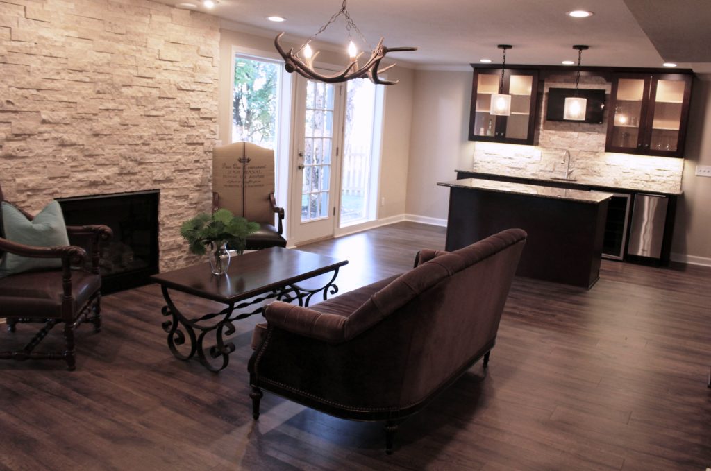
Here in this space we added wood flooring, artificial light, and and accent lighting to give this basement a first floor feel.

Karen Mills' blog
Interior design by Karen Mills

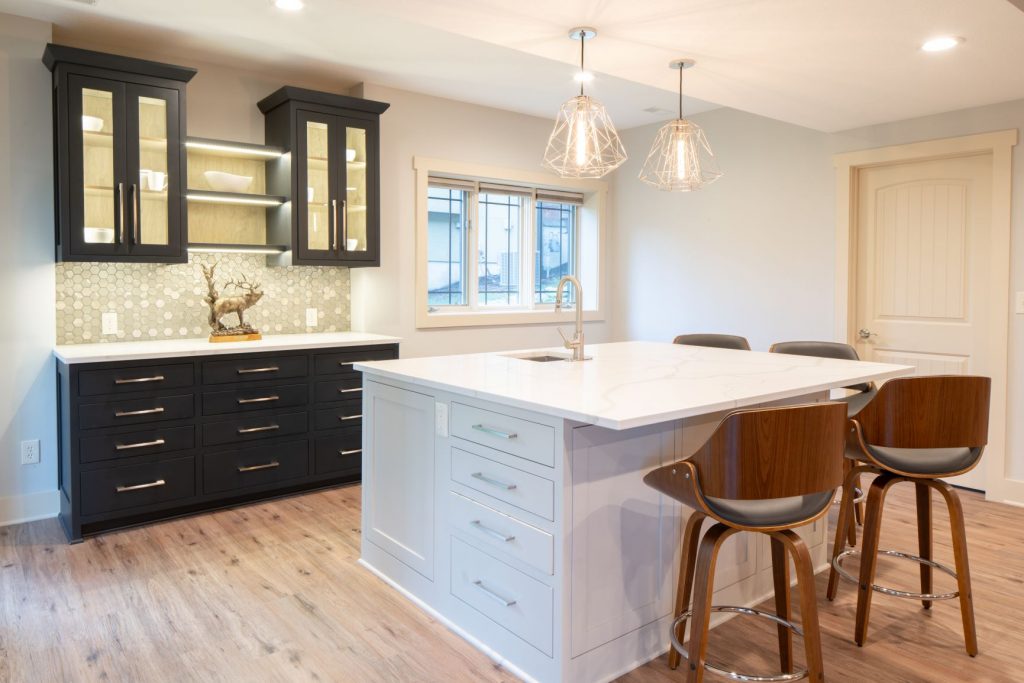
3. Lack of adequate artificial light – As an interior designer I can’t emphasize enough the importance of artificial lighting. Here we started with general can lights, added task lighting over the island, and then topped it off with accent lighting inside the shelves and under the cabinets to create a real wow factor.

Remember lighting is a major key to success when creating a basement interior design because lighting draws you into the rooms along with a professional finished look.

For more great ideas and photos on basement interior design or remodels, sign up for our weekly interior design blog here

Plus become a fan of Kansas City’s interior designer and former host of the Living Large design show, Karen Mills, on 
INSTAGRAM and FACEBOOK here!

Interior Design/Interior Decorating

Interior Decorating: 3 Tips for Picking the Perfect Paint…

A Designer’s Suggestions for Selecting Paint Colors for Your Interior

Paint color, one of the biggest issue faced by homeowners starting an interior design or interior decorating project is often an overwhelming task so today I’ve broken it down into three manageable steps for you to implement. 3 Reasons Why White Kitchens Stand the Test of Time

  1. View color swatches on a white background – When you’re ready to select paint colors for your interior, start by placing the color swatches on a solid white background to get a true reflection of the color before painting a large sample of the paint on your wall in the room where you want to paint. While making selections, ensure you’re wearing neutral clothing and don’t have bold colors nearby on walls or furniture that could reflect on your paint sample.
Karen Mills' blog
Photo courtesy of Kravet

2. Make your color selection during daylight light hours. And if its a cloudy day, look at the paint sample again on a sunny day to get the full range of changes that color will make as you transition from sunlight to cloudy to dark.  3 Color Scheme Options for Your Living Room

When selecting trim and ceiling paint colors, look to the lightest end of your paint strip for options along with whites. 

Karen Mills' blog
Interior design by Karen Mills

3. Paint large swatches of your paint selection on a backed poster board – All too often I walk in as an interior designer and see clients who’ve painted a light neutral over another color on the wall and the original color is bleeding through or distorting the new color. Once you have the board painted, place it against a neutral white background so you can view it during both daylight and after dark.

 But what if you don’t even know where to start with paint colors. Then pull inspiration from your closet, artwork, or a rug, for example. Then let the fun begin!


For more great tips on color and how to use it become of fan of our weekly interior design blog here


plus become a fan of Kansas City’s interior designer and former host of Living Large, Karen Mills on Facebookhere!

or instagram here!

Interior Design/Interior Decorating

A Kitchen Reimagined: Before & After

An Interior Designer’s Insightful Steps to Transforming a High-Rise Kitchen

photo example
Interior design by Karen Mills

Because of a background in television I see everything through the lens of a TV camera. developing the story plot as I go to create a design that reflects both the architecture and the taste of the homeowners. But stepping into this early 1900s high rise for the first time I knew this interior design remodel project would be much more of a challenge, not only because of the tiny warren of rooms that revealed themselves as they zigzagged back and forth, but also because of the the challenges of redesigning this entire apartment within the confines of a brick building with limited access to the upper floors.

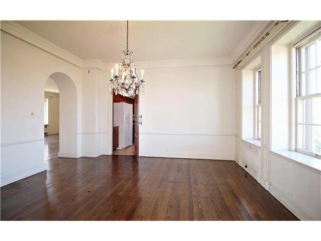
Entering the kitchen initially, I was immediately struck by how small, unappealing, and closed in I felt in the space, so I knew our team would need to remove some walls after reimagining the layout of the entire apartment for both function and aesthetics.                                                          

As we passed through the kitchen, we noticed a tiny maid’s room tucked beyond the kitchen with a window that would be perfect for enlarging the kitchen, while also bringing in more natural light. So our team began by tearing down the wall between the two rooms, while I determined how to best resize the disparate windows that would ultimately reside side by side in the kitchen.

Next, it was time to open up the kitchen to visually expand the space even more by tearing down a wall. The living room wouldn’t work because the wood-burning fireplace that was in the middle of that wall. That meant the only option left was the wall between the dining room and the kitchen.

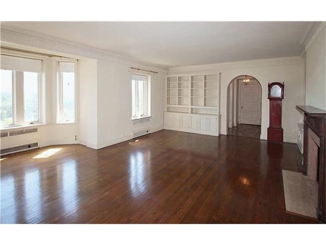
But I didn’t like the idea of the kitchen just opening into a formal dining room without a place to relax, so we decided to move the dining room to the large living room where ample space existed for both functions. And then we made the former dining room a new hearth room.

Now we were ready to space plan the layout of the kitchen to ensure it would function well for our client, while also being inviting.

Interior design by Karen Mills

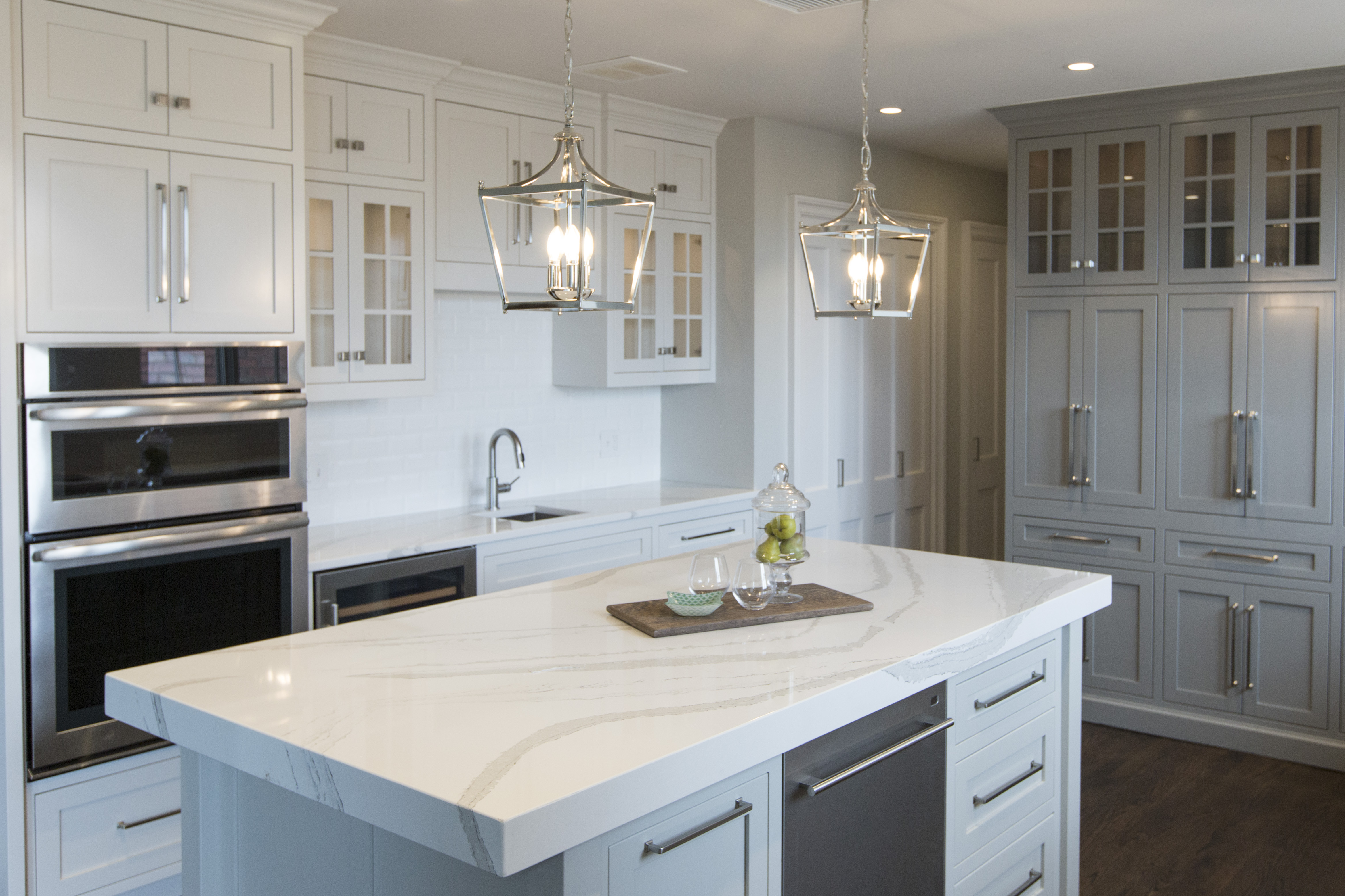
When space planning the kitchen, we made sure to include not only a functioning work zone, but also an island for entertaining guests with a mitered (chunkier) island and small chandeliers to add more emphasis.

Karen Mills' blog
Interior design by Karen Mills/Photography by 29Pixel Studios, LLC

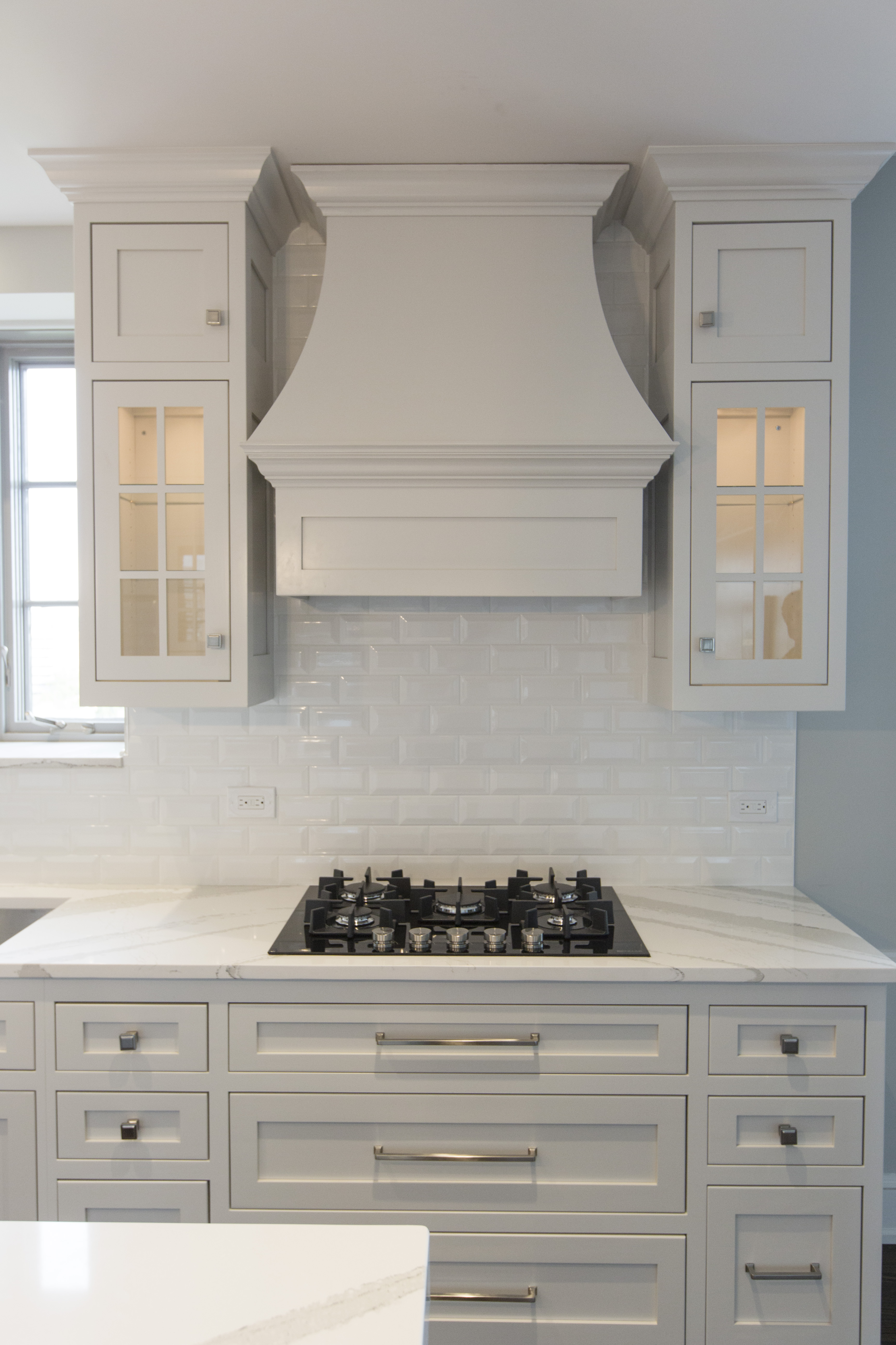
In the main cooking zone, we added pegged drawers under the stove top for lids and pots, while also adding lit glass upper cabinets, a custom designed hood, and ran backsplash tile up to the ceiling to create a more dramatic look.

Karen Mills' blog
Interior design by Karen Mills

At the far end of the kitchen was the former maid’s room with a slanted wall that couldn’t be removed for functional reasons. To resolve this issue, I designed a coffee bar cabinet and storage that hid the slanted wall complete with tuck back doors that opened to reveal the coffee area. Lit upper cabinets and large pulls complete the look.

Karen Mills' blog
Interior design by Karen Mills

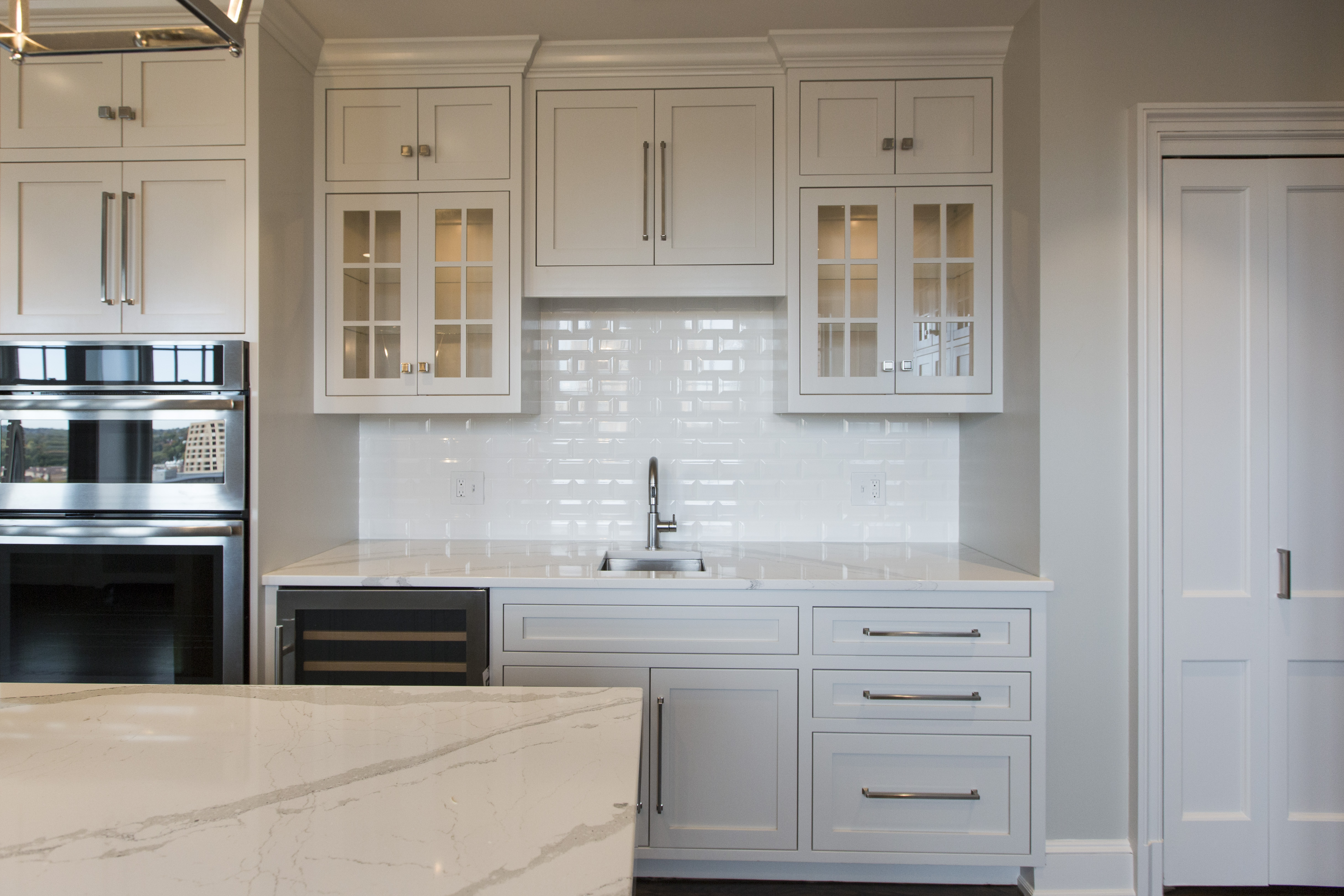
On the opposite side of the stove hood, we created a wine bar area replete with a wine fridge, a bar sink and lit glass front cabinets for wine glass storage.

For more great ideas sign up for our weekly interior design blog here!

Plus become a fan of Kansas City’s interior designer and former host of the Living Large design show, Karen Mills, on 
INSTAGRAM and FACEBOOK here!