Interior Design/Interior Decorating

Interior Design: 3 Reasons Why White Kitchens Are Timeless
Karen Mills' blog
Interior design and remodel by Karen Mills

White kitchens remind me of grandmother’s house that was nestled in the middle of beautiful flower garden where she taught me how to bake and make pie crusts as a 5 years old. That’s why I will always love white kitchens and I’m sure it might be why you do too because they are often warm, inviting, casual, and smell oh so delicious. Read on for the three other reasons I believe we secretly love white kitchens.

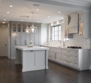
  1. Reflects light and makes us look better – As an interior designer who specializes in kitchen remodels I believe we secretly crave light airy kitchens because they not only feel clean and fresh but also bounce the natural light from outside around our room, enhancing the way we look and feel when we are in there. 3 Big Kitchen Trends for 2020

In addition they make us look younger by reflecting light back onto our face in contrast to darker kitchens that can make you look more haggard..
                                     Interior design by Karen Mills 

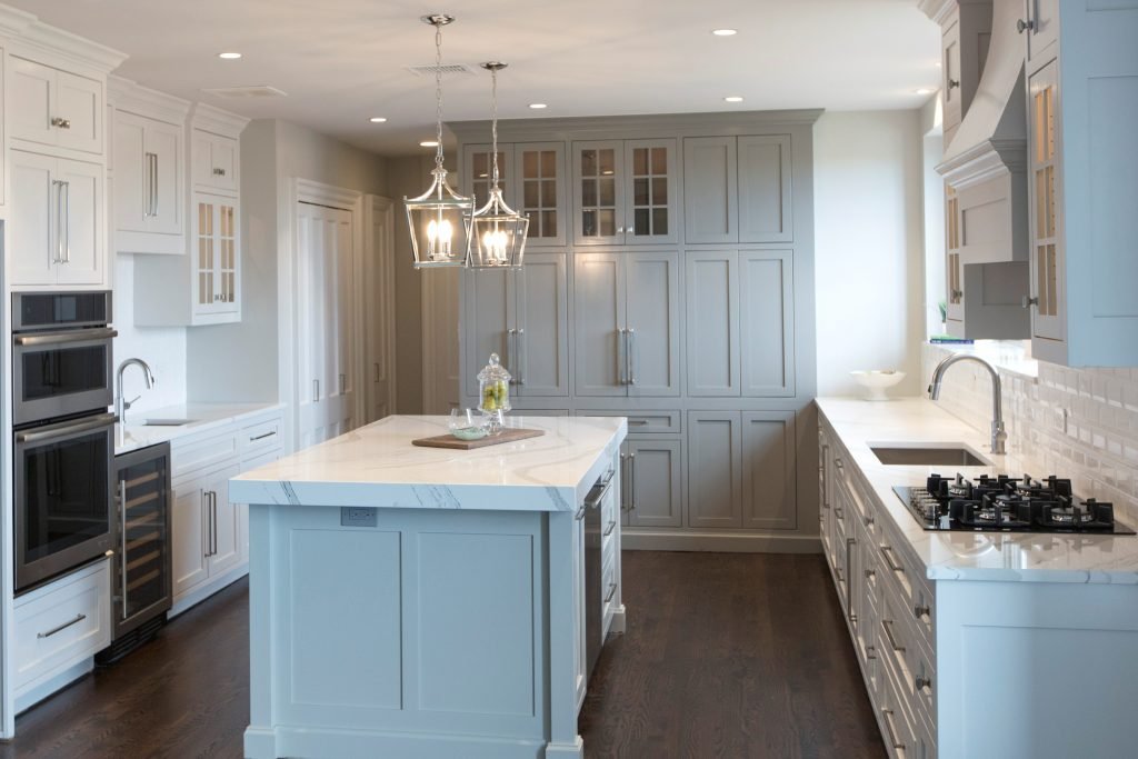
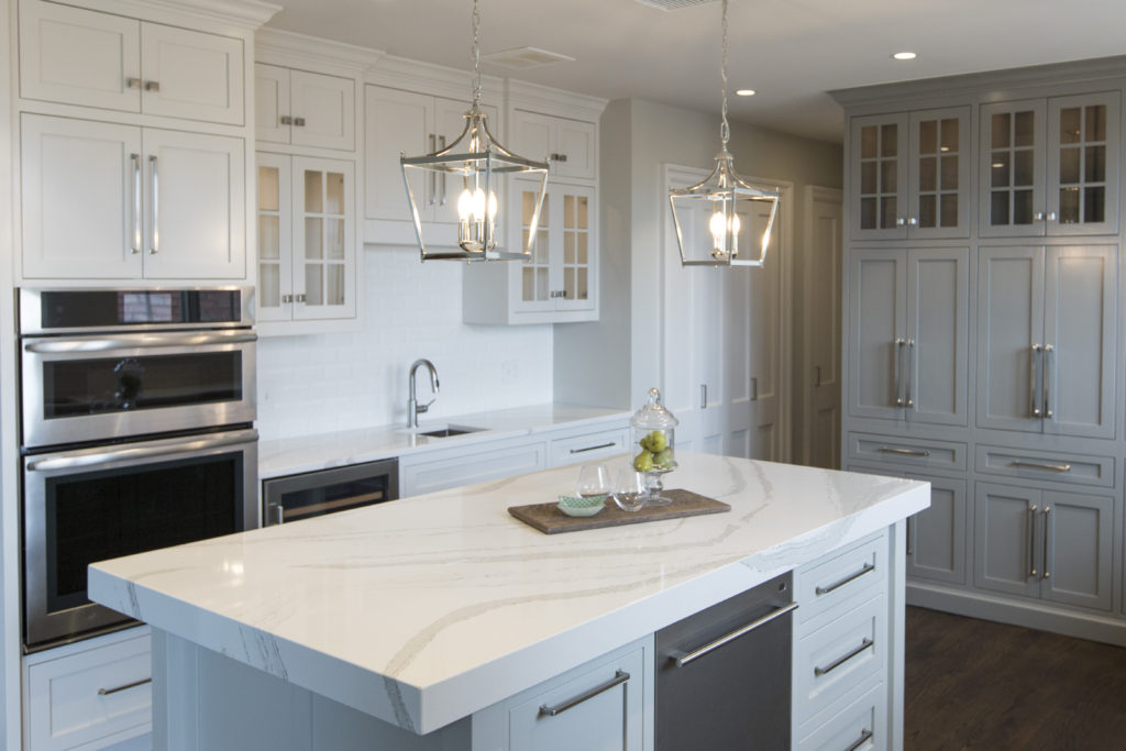
2. More Timeless – White kitchens have always stood the test of time as the most popular kitchen cabinet color so if you don’t get too crazy with your design or finishes your white kitchen remodel will likely feel more in style than a darker ktichen over time, especially when it comes time for resale.
Karen Mills' blog
Interior design by Karen Mills

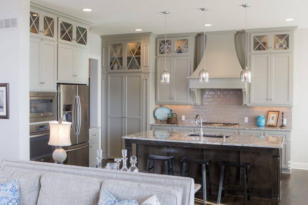
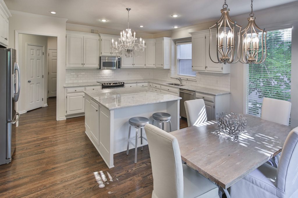
3. More Versatile – White kitchens can be paired with almost any colors and changed up when you tire of the color scheme. And if you’re like the majority of homeowners, you love the ethereal feel of white kitchens, especially one with warm inviting layers of texture like this existing kitchen was refreshed with a can of paint, new back splash, and dining table fixtures. Here the wood tabletop was repainted in a rustic gray finish and existing leather chairs slip slip covered in a washable fabric to finish the look. 5 Big Mistakes We Make In The Kitchen

For more great ideas and photos on kitchen design and kitchen remodels sign up for our weekly interior design blog here

Plus become a fan of Kansas City’s interior designer and former host of the Living Large design show, Karen Mills, on 
INSTAGRAM and FACEBOOK here!
Interior Design/Interior Decorating

Interior Design: 5 Decorating Tips to Make Your Living…

Read on for how to make your room feel bigger without remodeling

example
Overland Park interior design by Karen Mills
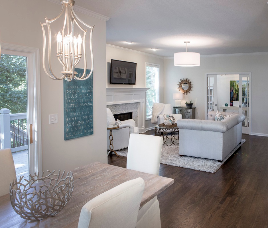
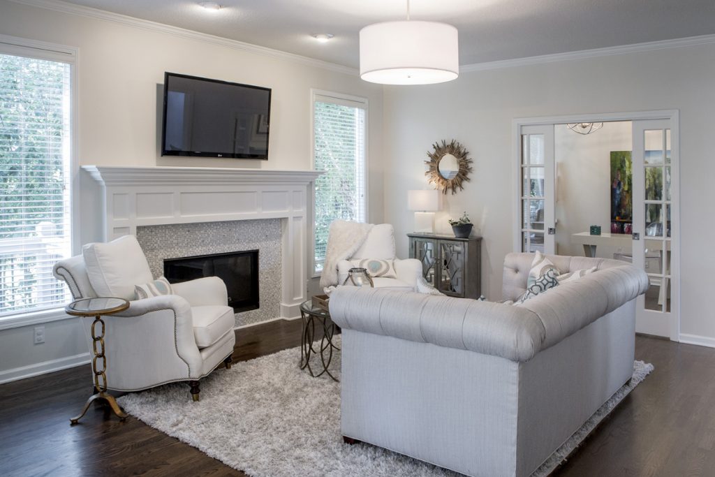
  1. Unify Your Wall Color – When our interior design clients ask how to the visually expand their living spaces I always recommend starting with painting the walls all one color – usually lighter . In this hearth room we painted the dark dated walls Sherwin William’s Shoji White to lighten up the room and make it appear larger.
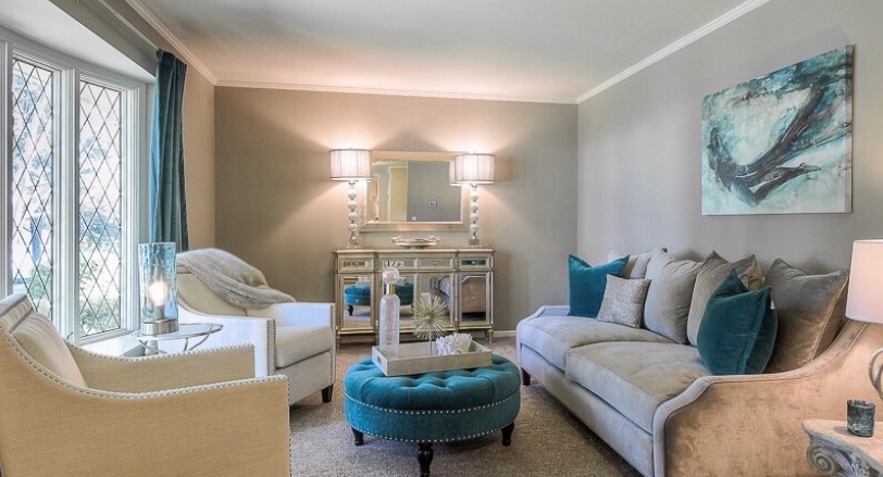
  2. Bring in More Daylight – Begin by removing dark furnishings and window coverings to bounce more light around. Introducing mirrors also brings more natural daylight into your space. Here we recovered a dark sofa and chairs to to a light neutral palette plus replaced light fixtures to bring in more light, making the space expand. 3 Tips for Refreshing Living Room for Less
Karen Mills' blog
Overland Park interior design by Karen Mills

3. Place furniture on an angle – By placing all your furniture on an angle away from the walls like this living room, you visually expand the size of your room.  3 Tips for Coordinating Mismatched Furniture in Your Living Room

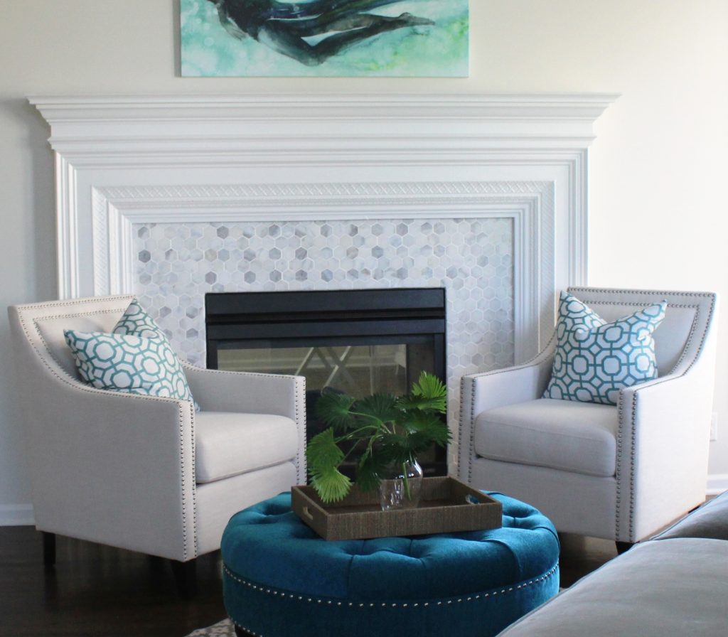
4. Introduce Round Furnishings By bringing in a round ottoman like this space we visually expanded the room but you can create the same effect with a round rug or circular furniture.

Karen Mills' blog
Interior design by Karen Mills

5. Lighten up Your Floors – When I’m talking about interior decorating I don’t mean that you should re stain wood floors light, but go with lighter area rugs or carpet to bounce more light throughout to make it larger. Here our client opted for a plush rug that would feel good with bare feet while enlarging this smaller room.

In summary by removing dark furnishings, painting your walls lighter, and layering back in lighter furnishings you can visually expand your living room. 3 Ways to Make Your Living Space Bloom for Spring

If you would like to learn more about our services or need professional help, click our services link above.

And ff you’re just looking for more custom interior design, decorating, or remodeling inspiration, ideas, and photos, sign up for our weekly interior design blog here

Plus become a fan of Kansas City’s interior designer and former host of the Living Large design show, Karen Mills, on INSTAGRAM and FACEBOOK here!
Interior Design/Interior Decorating

Interior Design: How to Refresh Your Living Space

Tips for Giving Your Living Room a One Day Makeover While You’re Nesting at Home

I’ve noticed that as clients have been working from home more the past year they’ve become more aware of their surroundings and are ready for change. So today I’m sharing my top 3 tips as an interior designer for refreshing your space!

Karen Mills' blog
Interior design by Karen Mills

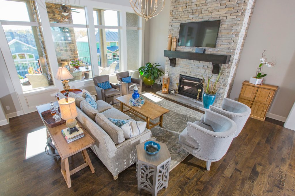
1.  Create a floor plan that emphasizes your focal point like we did in this great room by placing furniture arranged around the fireplace. If you don’t have an obvious focal point, then design one yourself by grouping items together such as a sofa table/chest with a piece of artwork overhead and a buffet lamp with tabletop decor on your surface.

Before you start I recommend emptying your living room of all furnishings so you can have a fresh perspective on your room’s possibilities without the distraction of furnishings and decor. For more tips check out our blog post 3 Big Design Mistakes We Make in the Living Room

In this great room we introduced a new custom designed sofa and rug before layering in existing wing back chairs we had upholstered in two different designer fabrics along with an existing coffee table, sofa table, and end table.

Decor arrangement by Karen M

2. Shop your entire house for furniture/furnishings you can use in your room.  Keep those items you discover in mind as you start to put together your room, bringing ones you think might work to a staging area nearby.  

Here in this room our interior design client didn’t have anything appropriate for this coffee table or sofa table so we purchased decor for them to enhance the overall look of their space.

Interior design by Karen Mills

Karen Mills' blog

3. Add a pop of color with accents throughout your room with pillows, art, drapes, decor or an area rug.   Remember, you can repaint or re purpose items to use in your room too.  In this great room our interior design client had asked us to use an existing family heirloom piece they had so we placed on the wall with a painting we found in another room. Then we topped the chest off with a newly purchased lamp and vase to complete the look. Click here for 3 Tips for Creating a Relaxing Living Area

If you would like to refresh your living space right now but know that’s beyond your capabilities, check out our virtual design options that we have for interior design clients whether its for remodel/new home builds, a design dilemma, or just decorating.

Looking for more great budget friendly decorating ideas that you can implement this summer?  Sign up for our weekly interior design blog here

Plus become a fan of Kansas City’s interior designer and former host of the Living Large design show, Karen Mills, on Facebook here!

or instagram here!

Interior Design/Interior Decorating

Interior Design: 5 Tips for Decorating Your Living Room

An Interior Designer’s Tips for Creating a Living Space That’s Both Attractive and Functional

Interior design by Karen Mills
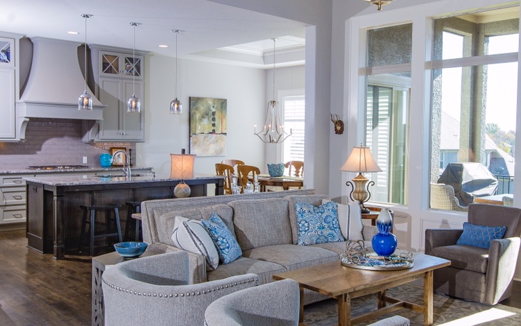
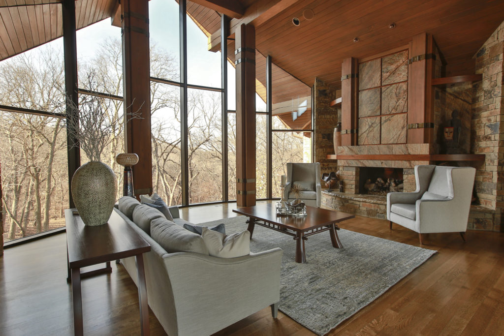
  1. Introduce a neutral color palette of furnishings in varying textures and colors instead of opting for all matching furniture. In this great room design we designed custom furniture in varying shades of warm grays to contrast nicely against existing antiques the homeowners wanted to keep to create interest. A mix of textures, color, and cozy seating enhance the look.
Karen Mills' blog rug sizing example
Interior design by Karen MIlls

2. Create a little drama by contrasting light finishes with darker ones. In this great room design we opted for lighter upholstered custom furniture and rug to create a noticeable contrast between the furniture and hard finishes like flooring, tile, and stone. An interesting combination of styles, finishes, and shapes add to this interior designed living room.

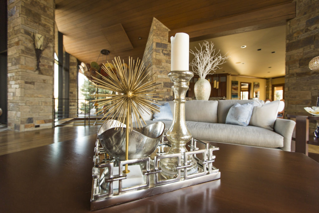
3. Layer in texture. Texture can be achieved with fabrics, plants, flowers, and/or a variety of finishes such as wood or metal. In this living space, we introduced different textures through pillow fabrics, an accessory made of rope, metal tray, glass vase/bowl, and wood tables to create an interesting mix that looks collected instead of staged.

Karen Mills' blog
Interior design by Karen Mills

4. Space plan your room to create cozy conversational areas. In this living room we designed a conversational grouping of seating around a fireplace to draw visitors in to sit down and relax.

Interior design by Karen Mills

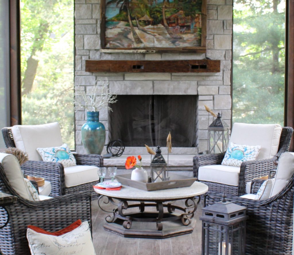
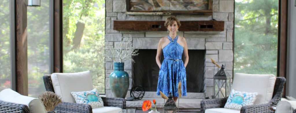
5. Add pops of color. In this outdoor living room we introduced pops of color to this space with blue and orange to create more interest and drama. A variety of textures – wicker, metal, wood, stone, and fabric also add to this beautifully designed porch.

If you’re looking for more custom interior design, decorating, or remodeling inspiration, ideas, and photos, sign up for our weekly interior design blog here or contact us now at 913.764.5915.

Plus become a fan of Kansas City’s interior designer and former host of the Living Large design show, Karen Mills, on 
INSTAGRAM and FACEBOOK here!

Interior Design/Interior Decorating

Interior Design: Hot Bathroom Remodel Trends for 2021

An Interior Designer’s Tips for What’s Hot in 2021 for Master Bathroom Design

Interior design by Karen Mills

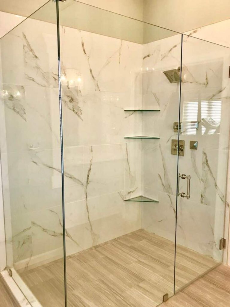
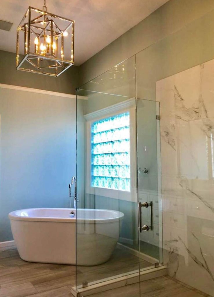
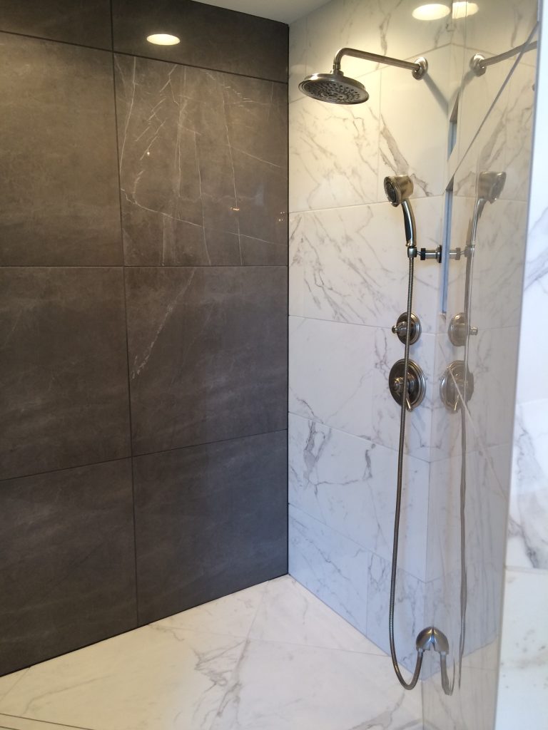
Zero Entry (Curbless) Oversized Glass Showers continue to rise in popularity because they visually expand size of your bathroom while also providing a more universal space that’s safer and more usable whether you’re recovering from surgery or are aging in place and want to avoid tripping over a curbed shower.   

Interior design by Karen Mills

2. Bold Contemporary Chandeliers not only make a grand statement in your bathroom renovation but they also can update your look by bringing in an unexpected element whether its a more artistic piece or modern like shown here.

Interior design by Karen Mills

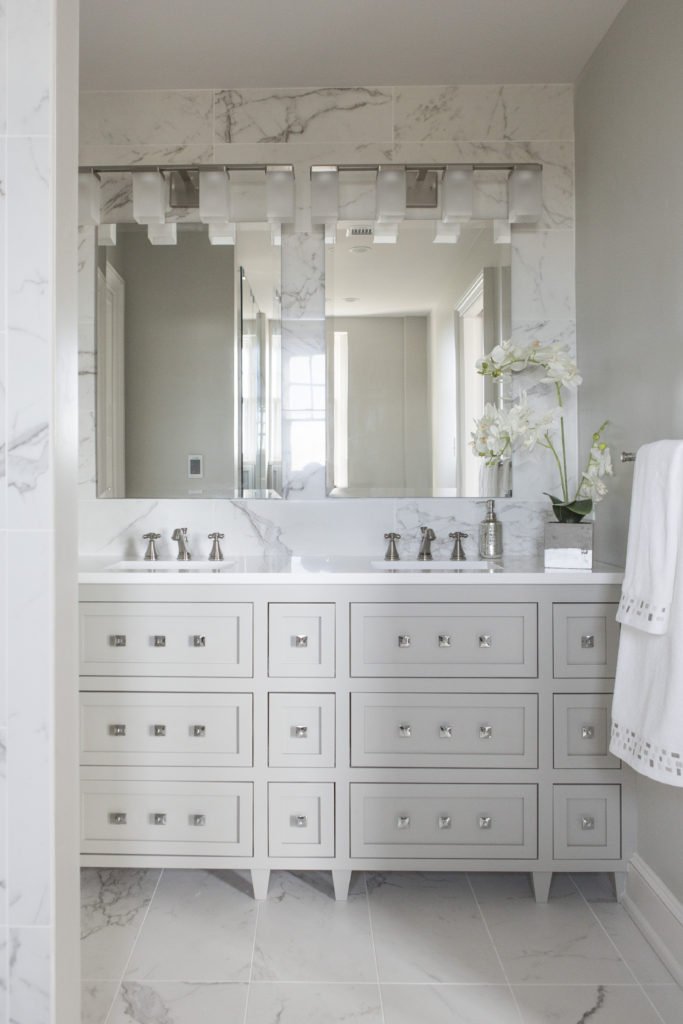
3. Marble Tiles never go out of style and bring a timeless appeal to your bathroom that will last for years whether its a classic gray and white or more contemporary color.

If you’re looking for more custom interior design, decorating, or remodeling inspiration, ideas, and photos, sign up for our weekly interior design blog here or contact us now at 913.764.5915.

Plus become a fan of Kansas City’s interior designer and former host of the Living Large design show, Karen Mills, on 
INSTAGRAM and FACEBOOK here!
Interior Design/Interior Decorating

Remodel Workbook: Master Bath

5 Critical Steps and Timely Tips for Planning Your Bathroom Remodel From an Interior Designer’s Perspective

photo example
Lenexa interior design by Karen Mills

1. Get Inspired – As an

I always recommend that you find at least three photos of bathrooms that you love because they will reveal your style preferences.

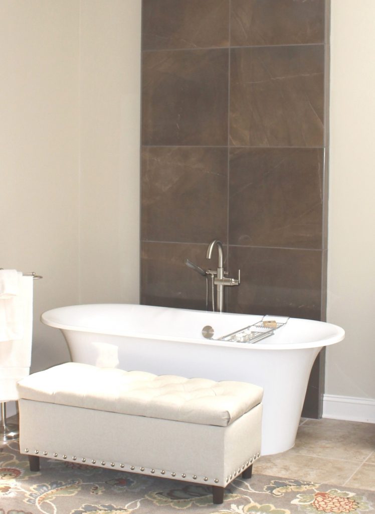
Since our clients were inspired by the beach, a favorite vacation destination of theirs, we designed their master bathroom remodel around a color scheme of watery blues, white, sandy beige, and warm rustic grays including the sandy colored wood look tile on the floor.

Click here to read our blog post 3 Ideas for Luxury Bath Design with Free Standing Tubs

photo example
Kansas City interior design by Karen Mills

2. Evaluate Your Needs -Now that you’re motivated to get started on your bathroom remodel, its time to step back for a bit and decide what’s most important to you from a functional standpoint. If you’re not sure think about-

A. What can you do to make your space more functional for you??

B. Why are you remodeling in the first place?

C. Do you need to move plumbing? If not, that can mean big savings.

D. Will you be aging in place (retiring) in this bathroom?

E. What are your priorities – tub, shower, or both?

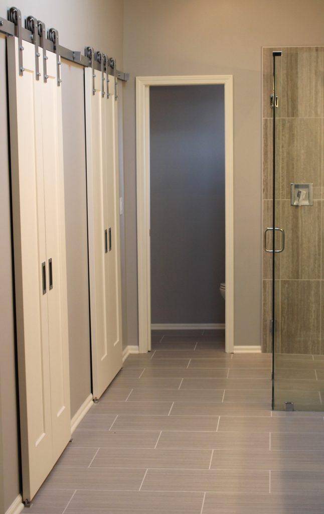
In this bathroom, we needed to enlarge the usable space in the closet area and since there wasn’t room for pocket doors we layered in barn doors which also added a fun unexpected design element.

Click here to read our blog post How to Remodel a Tiny Bathroom into a Visually Larger Space

photo example
Kansas City Interior design by Karen Mills

3. Determine a Budget – Now its time to decide how much you can invest into your bathroom remodel. I always suggest to our interior design clients to consider the house value, neighborhood, how long they will stay in the house, and resale.

If you have no idea of costs, you can go online to get a rough idea but remember that many online companies post estimates that are way too low and that’s why I recommend that you reach out to a professional to get a better idea.

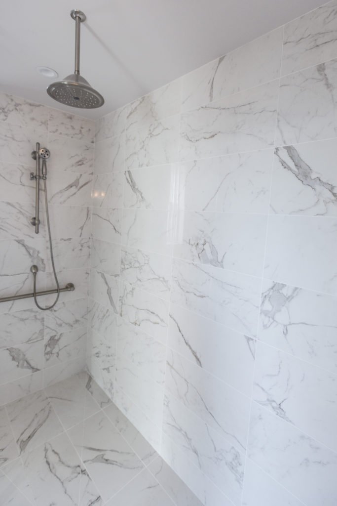
In this master bath remodel located in a million dollar high rise apartment on the plaza we needed to create a wow look on a reasonable budget so I covered the floors and walls with a marble look tile from Italy to give it a wow when you walked in the bathroom.

Karen Mills' blog
Hand sketch by Karen Mills

4. Reach Out to Professionals – Now that you’ve gotten an idea of your style, figured out your needs, and determined a budget, its time to reach out to a professional interior designer who specializes in bathroom remodels so they can create a design concept, often using sketches, finishes, and floor plans, to help you visualize the final project while also helping you determine if your budget will work or not.

Then reach out to a contractor and/or architect to give you a remodel budget estimate based on your design and schedule a time to start your project.

photo example
Overland Park interior design by Karen Mills

5. Finalize Design and Select Finishes– Now that you’ve found inspiration, determined your needs, set a budget, and contacted a professional interior designer, its time to finalize everything that’s part of your project including paint colors, flooring, plumbing, tile, back splash, mirrors, light fixtures and more.

Click here to read our blog post about the 3 Biggest Mistakes We Make in the Bathroom

If you’re looking for more custom interior design, decorating, or remodeling inspiration, ideas, and photos, sign up for our weekly interior design blog here

Plus become a fan of Kansas City’s interior designer and former host of the Living Large design show, Karen Mills, on 
INSTAGRAM and FACEBOOK here!
Interior Design/Interior Decorating

Interior Design: 7 Biggest Mistakes We Make in the…

Insightful Tips From an Interior Designer for Creating a More Inviting Entry

Interior design by Karen Mills

When it comes to interior design often the entry is overlooked even though it makes a huge impact on every new visitor coming through the door.  As an interior designer I tell my clients to think of their foyer as an advertisement for their home and what’s to come. At a minimum an entry should hold a few of your favorite things and introduce the color scheme for your home’s interior design, while also revealing a little bit about your personal style. Read on for 7 simple ways to create a beautiful foyer of your own.

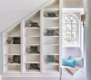
  1. Introduce a Statement Piece of Furniture  – Begin with a piece of furniture that fits easily in your entry such as a sofa table, chest, small desk, or curio. Or emphasize existing architectural features like the built in shelves and bench shown in this foyer. Here the blue green plates add drama to the shelves, while adding a pop of color to help emphasize the dreamy skies beyond.
  2.   Freshen Up with Live Flowers or a Plant – Nothing adds life to a space more than living things from flowers and plants to fresh fruit. But if live plants aren’t feasible, opt for dried branches or another textural element to bring the outdoors in like shown here.
Interior design by Karen Mills

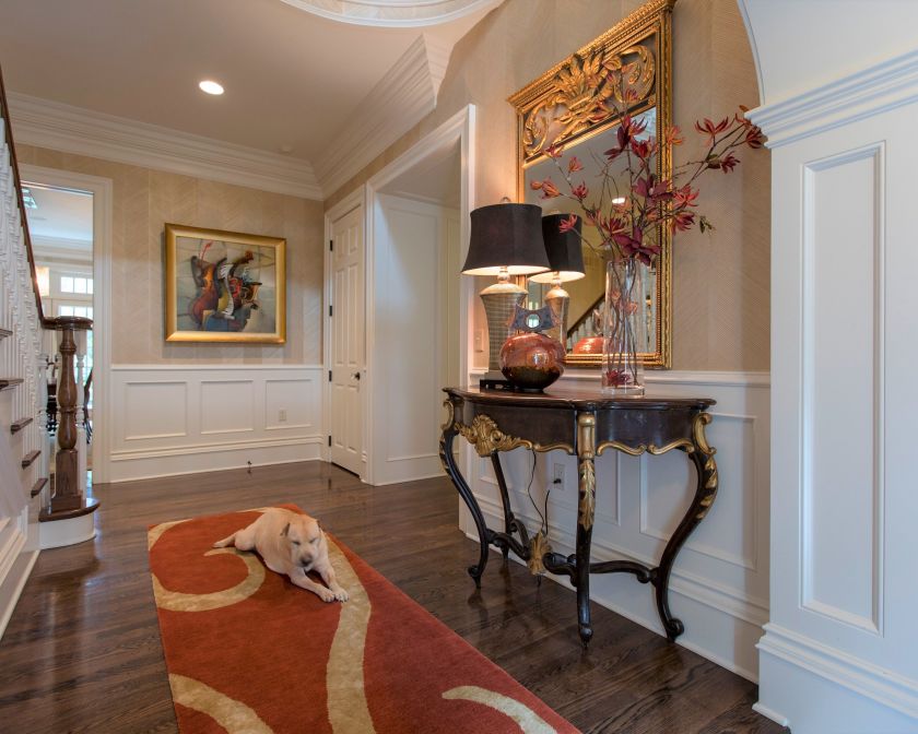
3. Layer in Artwork or a Mirror – Introducing artwork can add texture and reveal a bit of your personality like this original contemporary Mattini painting that’s a mix of musical instruments and sets the color scheme for the room. The mirror here is not only functional but also makes a style statement and bounces light around the room. The antique table underneath sourced from the south of France, provides an interesting juxtaposition against the hand made chevron wallpaper and contemporary sculpture in front of it.

4. Ground Your Entry with a Rug – Layering a rug underneath adds warmth, color, and style to your foyer as you can see in this spectacular foyer in Mission Hills.

5. Light it up With a Lamp – Lamps not only provide function and ambiance, but they can introduce more style to a space like this little black dress of a gold lamp oozes with class and style.

Karen Mills' blog
Interior design by Karen Mills featured in Architecture Today Interior Design book

6. Replace Your Overhead Lighting Here in this entry a transitional chandelier (not shown) adds emphasis to this dramatic space while a light hearted Moroccan motif lamp keeps it fun.

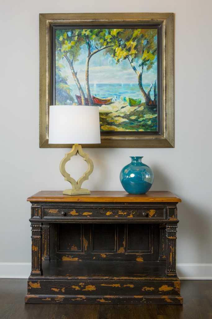
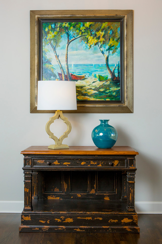
7. Tell a Color Story – The colors you introduce in the foyer should reveal the color palette to come in your living spaces beyond. Here we placed a family’s beloved heirloom chest front and center and layered in an existing painting overhead that introduced all the colors in the interior from dreamy blues and whites to warm grays, , while also repeating the brown black color of the chest. A blue vase reinforces the color scheme along with the lamp color.

For more inspiration, ideas, and photos, sign up for our weekly interior design blog here.

Plus become a fan of Kansas City’s interior designer, former host of the Living Large interior design show, and coach Karen Mills, on 
INSTAGRAM and FACEBOOK here!
And for more foyer inspiration, click here to read my Houzz interior design article on Color Palettes for Pleasing Entryway

or my budget tips titled Refresh Foyer for Less

Interior Design/Interior Decorating

Interior Design: Tips for Remodeling a Tiny Master Bath…

A Case Study of an Interior Designer’s Transformation of a Tiny Cramped Bathroom into a Modern Day Miracle

Master bath before remodeling

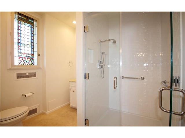
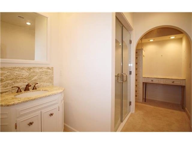
As an interior designer I think you will find this master bath remodel quite amazing not only because of the transformation of this historic brick high rise built in the early 1900s, but also because of how it visually lives so much larger in the same size space.

When we entered the master bath shown here the space was chopped up by a walled in shower placed in the middle of the room making the space feel cramped, small, and unattractive.

Karen Mills' blog
Master bath remodel before

To the right of the shower was a  dimly lit dressing area with a small amount of storage that didn’t function well.

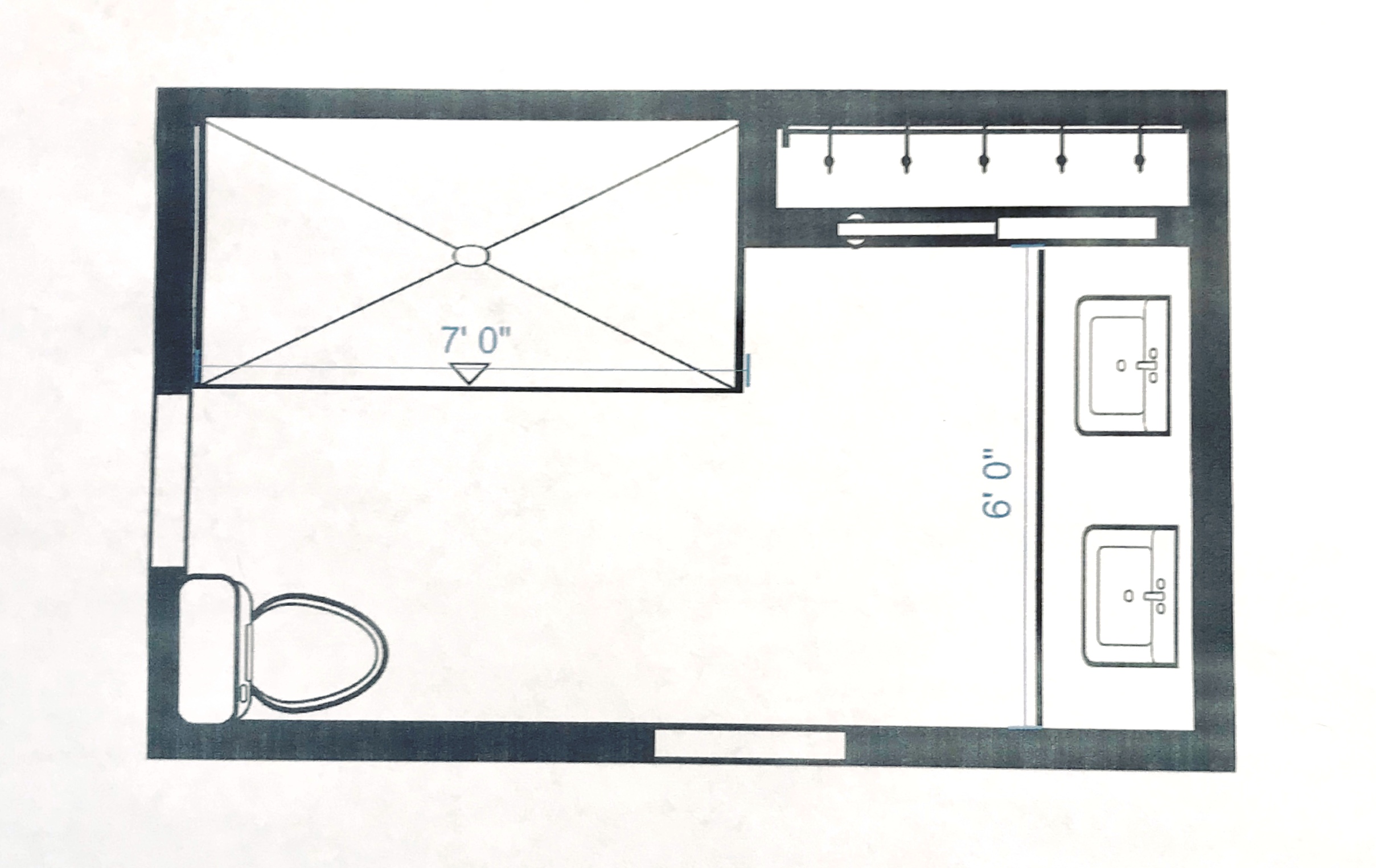
To solve this interior design dilemma we ripped out everything but one small closet and started over.  By pushing back the shower we gave the bathroom a bigger sense of volume and were able to expand the vanity to accommodate two people instead of one.

Karen Mills' blog
MASTER BATH AFTER

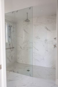
As you can see the transformation was amazing!  By placing the same marble style tile from Italy on the floor and walls the room suddenly visually expanded into a beautiful timeless space with an over sized shower for two.  To help the bathroom live even larger we also eliminated the shower curb and placed a solid glass panel along the front so the shower space virtually disappears.

Karen Mills' blog
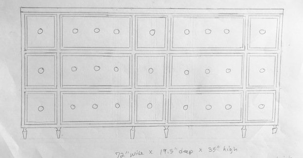
Hand sketch by Karen Mills

For the former dressing area I designed a double vanity that also included usable top drawers that wrapped around the plumbing for more storage. 

Karen Mills' blog
Interior design by Karen Mills


The result? A gorgeous bathroom that ended up in Kitchen Bath Design News – the national design magazine for kitchens and baths.

Looking for more great bathroom design ideas that you can implement?
Sign up for our weekly interior design blog here

Plus become a fan of Kansas City’s interior designer and former host of the Living Large design show, Karen Mills, on Facebook here!
or instagram 

Interior Design/Interior Decorating

Interior Design: 3 Hot Kitchen Trends for 2021

What to Consider Before Remodeling Your Kitchen From an Interior Designer’s Point of View

photo exampl
Interior design by Karen Mills
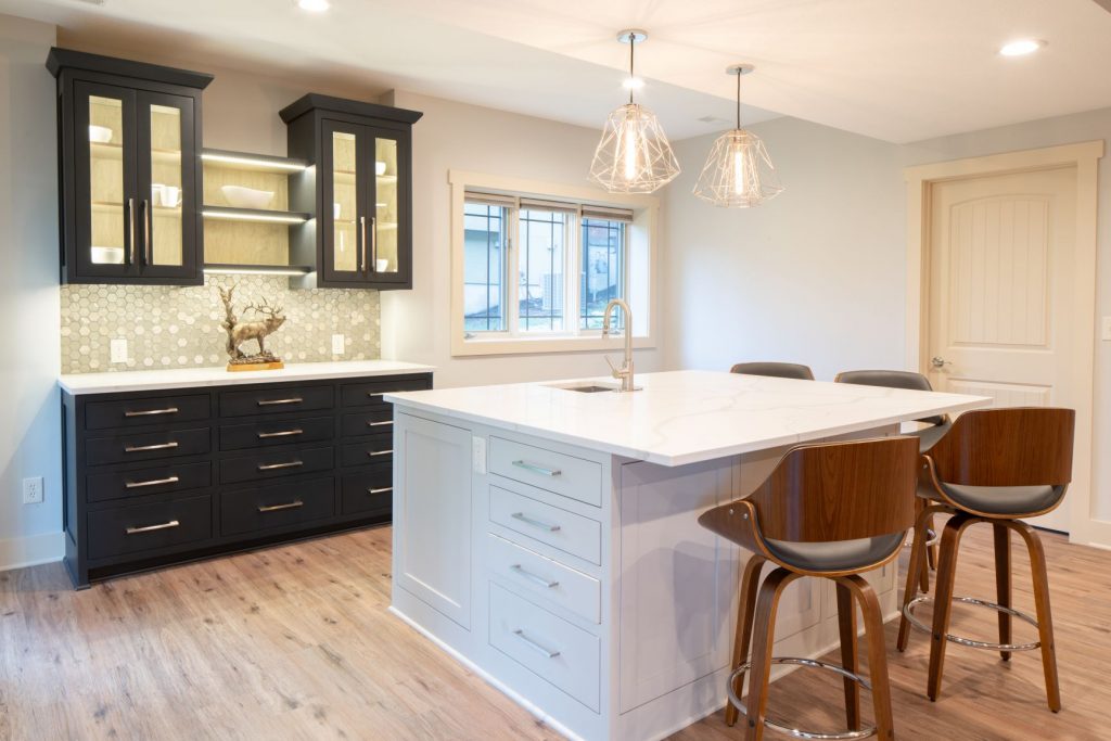
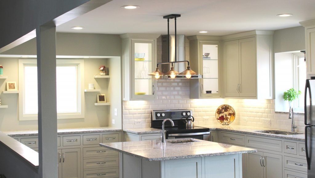
  1. Cabinetry colors trends ranging from timeless white and light stained wood to a dark painted color like shown in this kitchen bar area where we contrasted iron ore painted cabinetry on the exterior with a light warm stained wood on the interior of the glass upper cabinets to make it more interesting and dramatic. Contrasting colors on the wall cabinetry and island also add to the fresh new look.

2. Upgraded plumbing, accessories, or hidden storage ranging from touchless faucets and cutting boards or racks offered as an add on to kitchen sinks to built in coffee makers and cabinetry storage options are becoming increasingly important as we spend more time in the kitchen.

after photo
Interior design by Karen Mills

3. Restaurant like amenities that make being at home more enjoyable may include a built in coffee bar like the one tucked away in the gray cabinetry we designed at back of this kitchen or a wine bar similar to the one shown on the left that includes everything you need to serve wine from a temperature controlled wine fridge to glass fronted storage for wine glasses and hidden storage for everything else.

photo example
Interior design by Karen Mills

Other popular restaurant like amenities that I’ve noticed as an interior designer include a dedicated baking area like this one in the back niche of the kitchen we designed for our interior design client to create delicious creations for her family and friends.

For more great ideas and photos, sign up for our weekly interior design blog here

Plus become a fan of Kansas City’s interior designer and former host of the Living Large design show, Karen Mills, on Facebook or Instagram here!
Interior Design/Interior Decorating

Interior Design: 5 Steps to Space Planning Your Living…

photo example
Interior design by Karen Mills

Do you ever feel frustrated or lost when it comes to deciding how to place your furniture in the living room? Read on for my tips as an interior designer on how to space plan your room to be both functional and appealing.

  1. Make it Functional – The first question I ask interior design clients who want our firm to space plan their living room is how they will use the room and what they need in the room to accomplish that. For example, how much seating do you need daily? And if you entertain often how many people do you need to accommodate? Other questions to ask yourself is what else do you want to do in the living room? If you’re reading a book, you will need a lamp nearby and if you’re eating or drinking, tabletops will be critical for placing glasses or plates down. In this great room we designed, a coffee table and sofa table provide surfaces to place items on while a nearby end table holds a much-needed lamp.
Description

2. Determine Your Focal Point – In this outdoor living room the focal point is the fireplace we placed front and center in the design of the porch, but if you don’t have a fireplace or great outdoor view, you can create one with a vignette. A vignette is a grouping of furnishings created to make a focal point such as a table, artwork, and lamp arranged together.

example
Interior design by Karen Mills

3. Place your sofa or largest upholstery (seating) facing your focal point to give it more emphasis or importance.  Here in this great room design we placed the sofa facing the fireplace because it’s the focal point and your eye naturally goes to where the largest piece of upholstery is facing. Two more pairs of chairs flank the sofa, adding more emphasis and a cozy atmosphere, while the rug we layered underneath creates a cohesive pulled together look.

Karen Mills' blog

4. Make your furniture arrangement inviting and cozy, but not crowded. In this living room the sofa is facing a focal point, the view out the window. A round ottoman helps create a more spacious feel while the chairs are angled to mimic the shape of the ottoman while still being a part of the intimate seating arrangement that makes the space planning a success.

5. Layer in tables and an area rug underneath. Tables are critical in your room both for holding lamps to provide ample lighting and for placing glasses, plates, or other items in your possession. In this hearth living space we remodeled, we faced the sofa towards the fireplace or focal point. Then we flanked matching chairs on each side of the fireplace to further emphasize the focal point. Next, we layered in functional tables and a comfortable rug underneath to bring the furnishings into a cozy grouping.

For more great ideas and photos, sign up for our weekly interior design blog here

Plus become a fan of Kansas City’s interior designer and former host of the Living Large design show, Karen Mills, on Facebook or Instagram here!