Interior Design/Interior Decorating

Interior Design: 3 Tips for Selecting Outdoor Furniture

How to Make Smart Choices for Outdoor Seating
to explain point
Interior Design by Karen Mills
  1. Comfort

Comfort is the most important factor when it comes to seating, especially if its where you will sit for prolonged periods relaxing in your outdoor room. When selecting furniture I always tell our interior design clients to ensure your legs can comfortable touch the floor and that the seat isn’t too short or too deep.

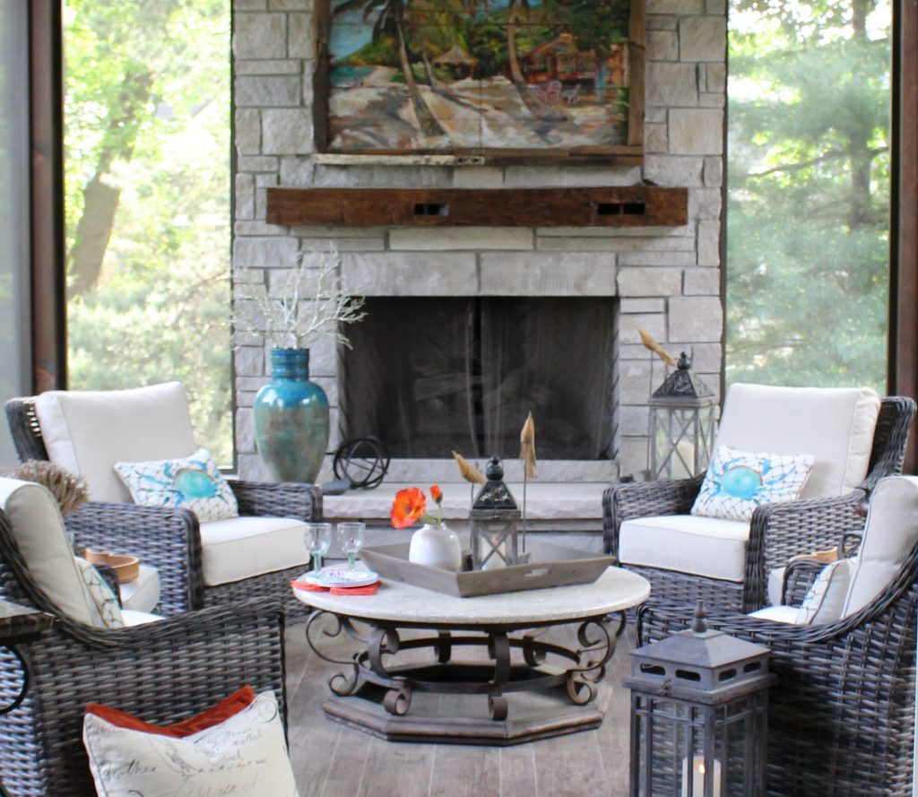
Here on this porch the chairs provide thick cushions helping ensure a comfortable place to relax or entertain.
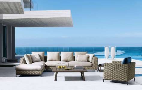
photo example
Photo courtesy of B & B Italia

2. Furniture Style

Style, a key factor in selecting furniture, plays a huge role outside because the furnishings must coordinate with both the exterior finishes of your home and the view beyond, while also relating to the the adjacent rooms inside.

In this outdoor space, contemporary style furniture with clean lines blend beautifully with the modern house architecture.
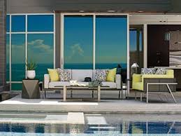
Photo courtesy of Lexington Furniture

3. Color

I think we as consumers are naturally drawn to our favorite colors and often purchase products based on that fact alone. But as an interior designer who thinks long term I would recommend selecting a solid neutral color frame and even cushion. That’s because you can always switch out pillows and accessories but quality furniture will be with you much longer.

If you’re looking for interior design, decorating, or remodeling inspiration, ideas, and photos, sign up for our weekly interior design blog here

Plus become a fan of Kansas City’s interior designer and former host of the Living Large design show, Karen Mills, on 
INSTAGRAM and FACEBOOK here!
https://share.icloud.com/photos/0G979TTtj2tFEZRajSv_qOCYg
Interior Design/Interior Decorating

Interior Decorating: The Art of Framing

3 Critical Tips You Need to know to Frame Paintings, Memorabilia, or Photos

Unfortunately most people have no idea how to properly frame art to enhance its overall look or even protect its value so today I’m sharing a few tips to get you started on the art of framing

example
Interior design by Karen Mills
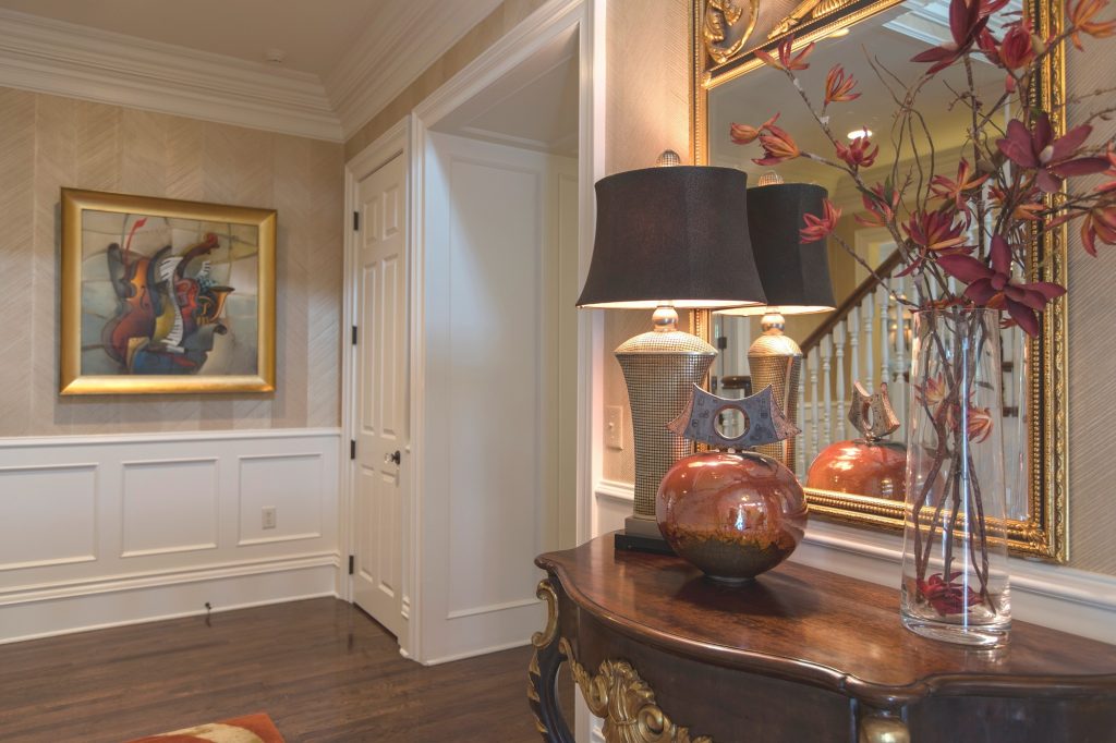
  1. Use matting to add impact to most artwork. Ideal for personal photos, smaller items, and memorabilia, the recommended matting size should follow the golden ratio of 1 to 1.6 unless its a smaller painting or item that needs more matting area to help size it a bit larger. Matting in a neutral hue like the white matting shown here is best unless you’re a interior designer or artist who understands how to frame art and the way to combine colors for the best look overall. Here a simple gold frame that ties in with the painting colors and other decor adds to the overall look. A Beginner’s Guide to Collecting Original Art
Interior design by Karen Mills

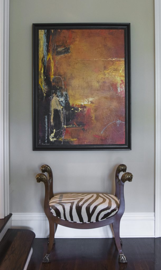
2. Select a frame style that coordinates with the artwork style or period. Traditional artwork, period art, or classic artwork normally pairs well with a more traditional style frame in wood tones or gold while ethereal, light, or abstract art – like shown here plays well with simpler frames. Of course you can always break the rules but please don’t try it unless you’re an expert.

Karen Mills' blog
Interior design by Karen MIlls

3. Adjust frame molding width to fit size of artwork With this original large artwork we had to fit the painting over the top of the buffet so instead of a larger width frame molding we did a narrow frame to make it work.

If you would like to help selecting or sourcing original artwork from around the world or help designing the best framing/matting/protective options for your artwork, click here for our services.

If you’re looking for interior design, decorating, or remodeling inspiration, ideas, and photos, sign up for our weekly interior design blog here

Plus become a fan of Kansas City’s interior designer and former host of the Living Large design show, Karen Mills, on 
INSTAGRAM and FACEBOOK here!
Interior Design/Interior Decorating

Interior Design: 5 Decorating Tips for Enlarging Your Living…

Read on for how to make your room feel bigger without remodeling

example
Overland Park interior design by Karen Mills
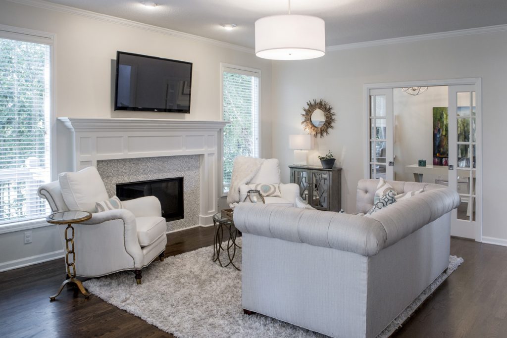
  1. Unify Your Wall Color – When our interior design clients ask how to the visually expand their living spaces I always recommend starting with painting the walls all one color – usually lighter . In this hearth room we painted the dark dated walls Sherwin William’s Shoji White to lighten up the room and make it appear larger.

2. Bring in More Daylight – Begin by removing dark furnishings and window coverings to bounce more light around. Introducing mirrors also brings more natural daylight into your space. Here we recovered a dark sofa and chairs to to a light neutral palette plus replaced light fixtures to bring in more light, making the space expand. 3 Tips for Refreshing Living Room for Less

Karen Mills' blog
Overland Park interior design by Karen Mills

3. Place furniture on an angle – By placing all your furniture on an angle away from the walls like this living room, you visually expand the size of your room. Round items like a rug or a piece of furniture like this ottoman we designed make your space feel larger. 3 Tips for Coordinating Mismatched Furniture in Your Living Room

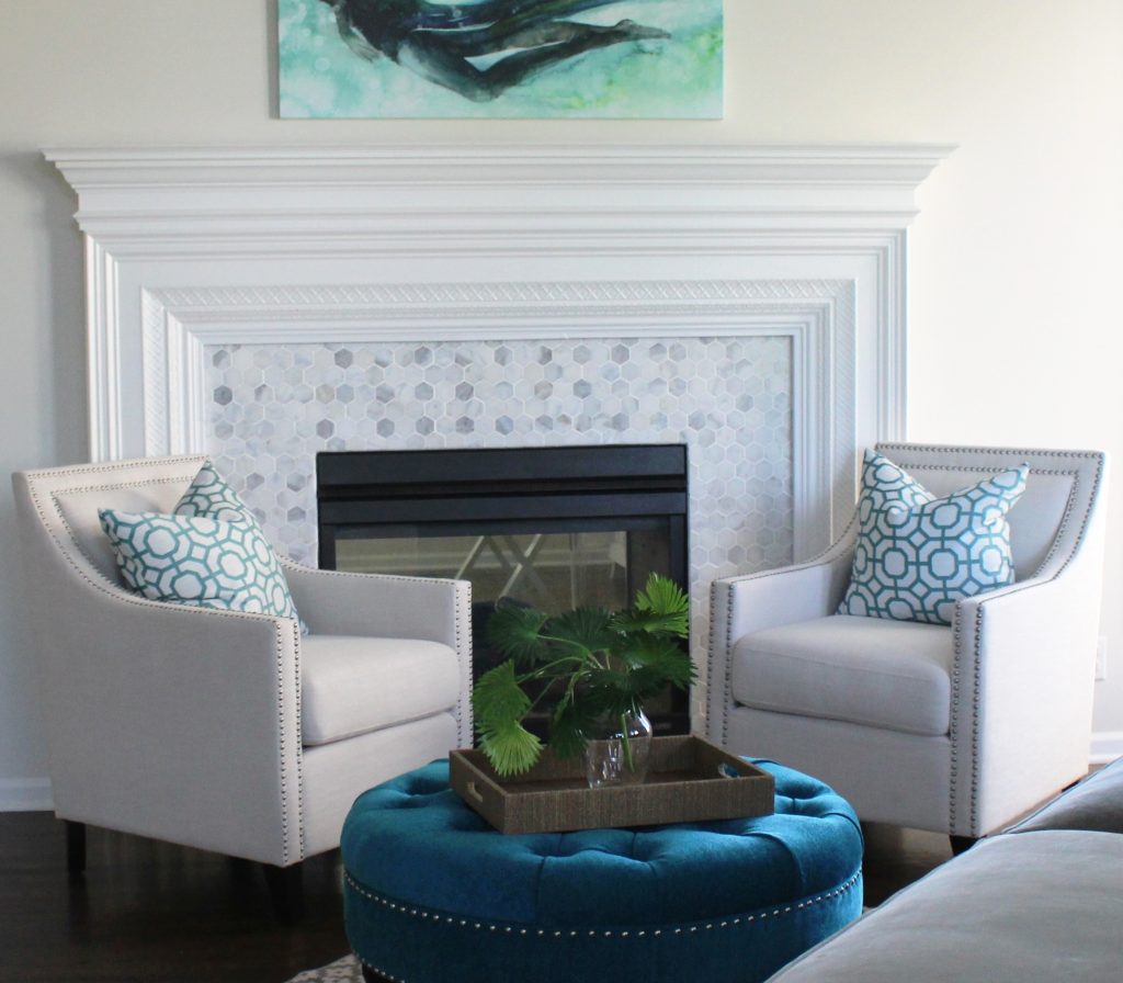
4. Introduce Round Furnishings By bringing in a round ottoman like this space we visually expanded the room but you can create the same effect with a round rug or circular furniture.

Karen Mills' blog
Interior design by Karen Mills

5. Lighten up Your Floors – When I’m talking about interior decorating I don’t mean that you should re stain wood floors light, but go with lighter area rugs or carpet to bounce more light throughout to make it larger. Here our client opted for a plush rug that would feel good with bare feet while enlarging this smaller room.

In summary by removing dark furnishings, painting your walls lighter, and layering back in lighter furnishings you can visually expand your living room. 3 Ways to Make Your Living Space Bloom for Spring

If you would like to re decorate you living spaces right now check out our  interior design and decorating options that we have whether its for remodel/new home builds, a design dilemma, or just decorating.

If you’re looking for more custom interior design, decorating, or remodeling inspiration, ideas, and photos, sign up for our weekly interior design blog here

Plus become a fan of Kansas City’s interior designer and former host of the Living Large design show, Karen Mills, on 
INSTAGRAM and FACEBOOK here!
Interior Design/Interior Decorating

Remodel Workbook: Master Bath Renovation

Critical Steps and Timely Tips for Planning Your Bathroom Remodel

photo example
Lenexa interior design by Karen Mills

1 Get Inspired – As an interior designer I always recommend that you find at least three photos of bathrooms that you love because they will reveal your style preferences.

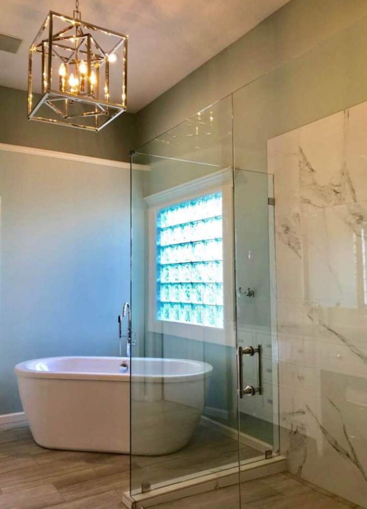
Since our clients were inspired by the beach, a favorite vacation destination of theirs, we designed their master bathroom remodel around a color scheme of watery blues, white, sandy beige, and warm rustic grays.

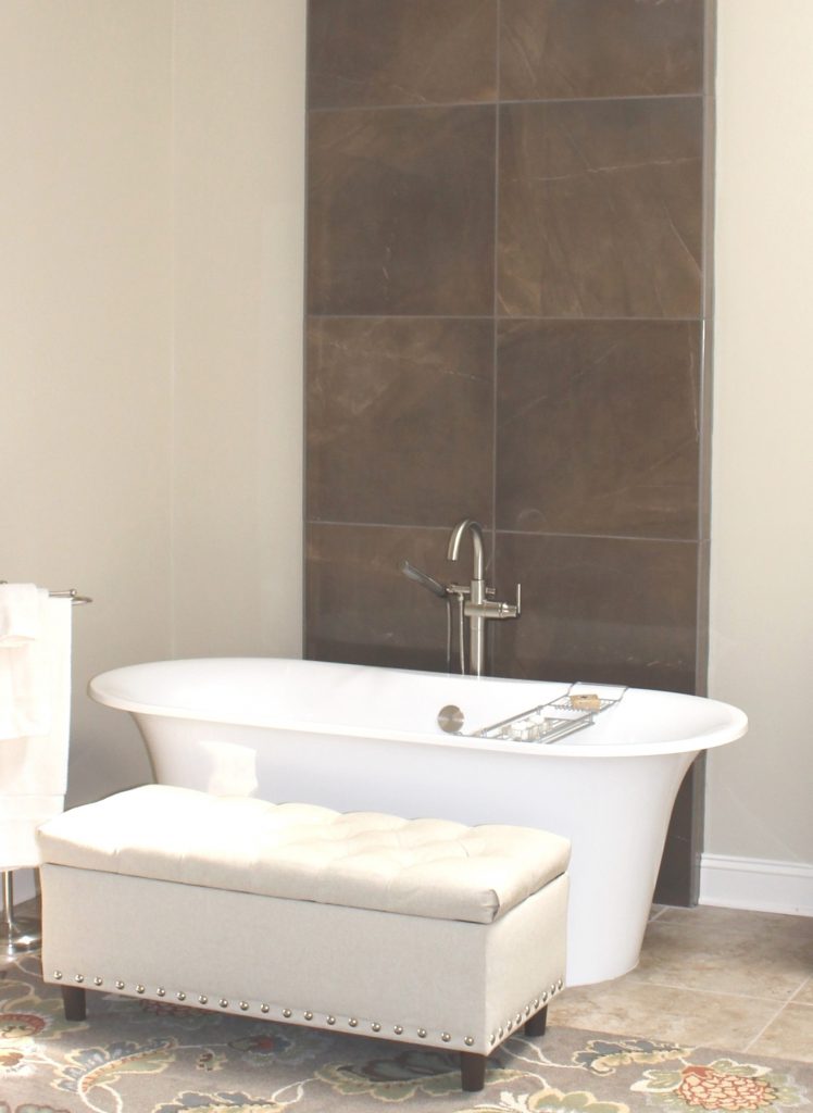
Click here to read our blog post 3 Ideas for Luxury Bath Design with Free Standing Tubs

photo example
Kansas City interior design by Karen Mills

2. Evaluate Your Needs -Now that you’re motivated to get started on your bathroom remodel, its time to step back and decide on what’s most important to you functionally. If you’re not sure think about-

A. What can you do to make your space more functional for you??

B. Why are you remodeling in the first place?

C. Do you need to move plumbing? If not, that can mean big savings.

D. Will you be aging in place (retiring) in this bathroom?

E. What are your priorities – tub, shower, or both?

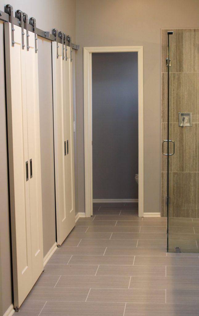
In this bathroom, we needed to enlarge the usable space in the closet area and since there wasn’t room for pocket doors we layered in barn doors which also added a fun unexpected design element.

Click here to read our blog post How to Remodel a Tiny Bathroom into a Visually Larger Space

photo example
Kansas City Interior design by Karen Mills

3. Determine a Budget – Now its time to decide how much you can invest into your bathroom remodel. I always suggest to our interior design clients to consider the neighborhood, how long they will stay in the house, and resale.

If you have no idea of costs, you can go online to get a rough idea but remember that many online companies post estimates that are way too low and that’s why I recommend that you reach out to a professional to get a better idea.

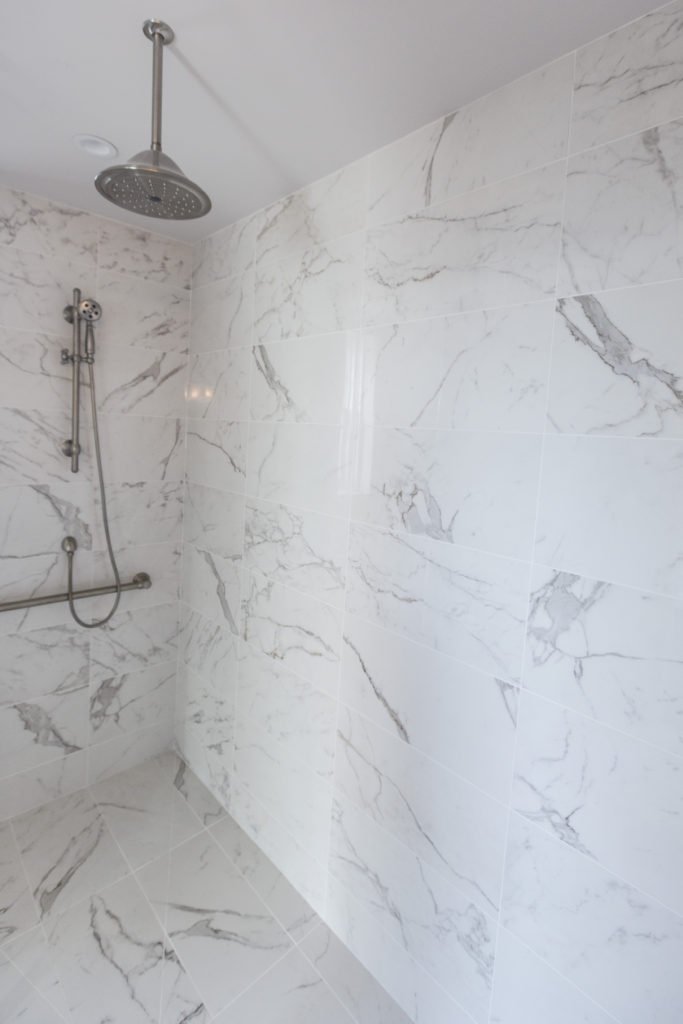
In this master bath remodel located in a million dollar high rise apartment we needed to create a wow look on a reasonable budget so I covered the floors and walls with a marble look tile from Italy to give it a wow when you walked in the bathroom.

Karen Mills' blog
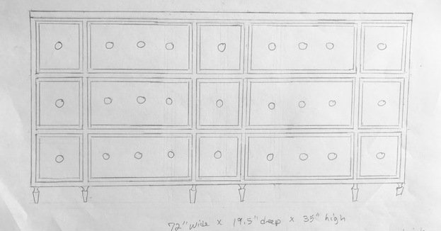
Hand sketch by Karen Mills

4. Reach Out to Professionals – Now that you’ve gotten an idea of your style, figured out your needs, and determined a budget, its time to reach out to a professional interior designer who specializes in bathroom remodels so they can create a design concept, often using sketches, finishes, and floor plans to help you visualize the final project while also helping you determine if your budget will work or not.

Now that you’ve have an interior design plan, its time to reach out to a contractor and/or architect to give you a remodel budget estimate based on your design and schedule a time to start your project.

photo example
Overland Park interior design by Karen Mills

5. Finalize Design and Select Finishes– Now that you’ve found inspiration, determined your needs, set a budget, and contacted a professional interior designer, its time to finalize everything that’s part of your project including paint colors, flooring, plumbing, tile, back splash, mirrors, light fixtures and more.

Click here to read our blog post about the 3 Biggest Mistakes We Make in the Bathroom

If you’re looking for more custom interior design, decorating, or remodeling inspiration, ideas, and photos, sign up for our weekly interior design blog here

Plus become a fan of Kansas City’s interior designer and former host of the Living Large design show, Karen Mills, on 
INSTAGRAM and FACEBOOK here!

Interior Design/Interior Decorating

Interior Design: 3 Big Kitchen Trends for 2020

What’s hot in colors, finishes, and more…

example of blog topic
Interior design by Karen MIlls
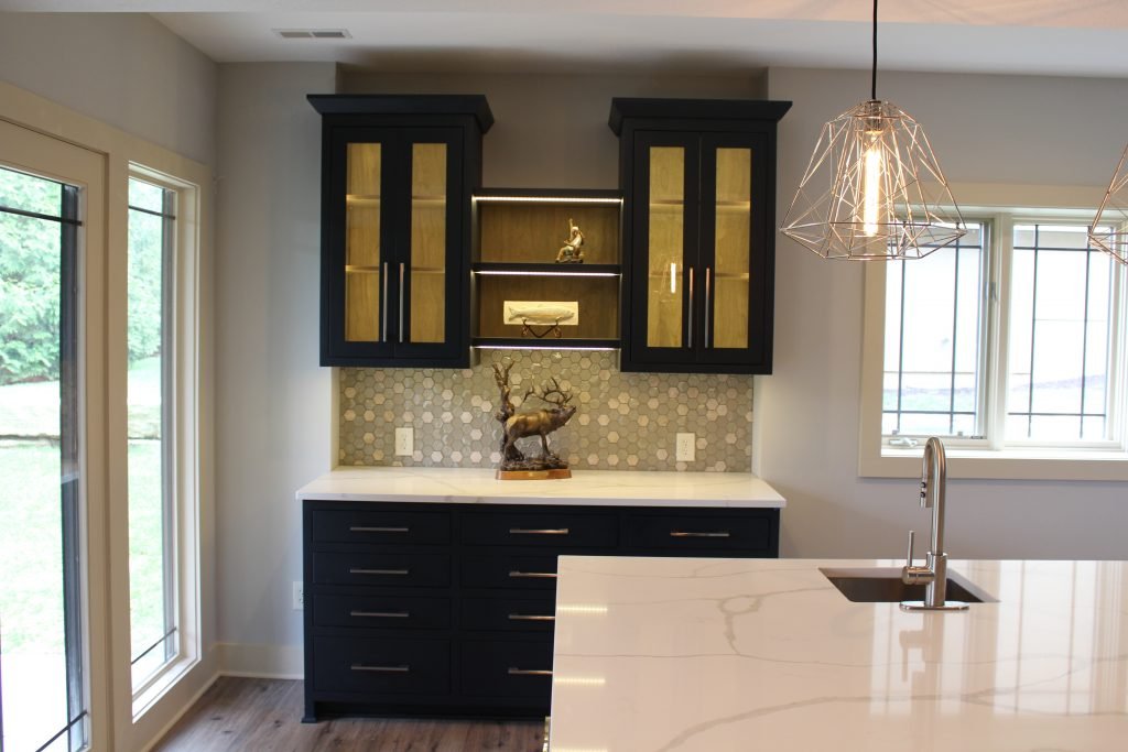
  1. Color – For cabinetry in 2020 we’re still seeing a color trend towards warmer grays and taupe colors grow in popularity along with a newer affinity towards richer cabinet colors like cobalt blue or the black cabinetry shown in this basement kitchen done by our interior design firm. Warmer colors are also making a come back in softer or organic hues like the stained wood finish inside these glass upper cabinets. Even though appliance manufacturers are still pushing the graphite and stainless color appliances, we are also seeing soft hues in pink and beige make an appearance.
Karen Mills' blog
Interior design by Karen Mills

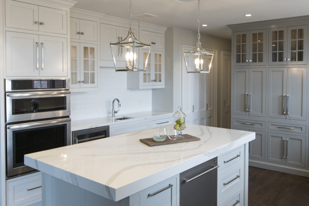
2. Finishes – One of the most common questions I hear as an interior designer from clients is “What counter top should I use?’ Granite reigned for years as the counter top of choice in the kitchen until a few years ago when white quartz made an appearance. White quartz still remains popular but the new trend is a more natural look leaning towards darker counters. In kitchen our interior design firm remodeled we introduced a white and warm gray quartz with veining that mimics marble to make the kitchen feel more timeless and appear larger.

Mixed metals continue to trend for pulls, lighting, and plumbing including the newer matte black but as an interior designer I don’t recommend much mixing and matching unless you have an amazing eye because the result can be disastrous.

Karen Mills' blog
Interior design by Karen Mills

3. Functionality – Even though the kitchen acts as a work space we often neglect the needs of the space in favor of looks, but if your space doesn’t function efficiently, you won’t truly enjoy your kitchen. That’s why I always start a new kitchen design with our clients by discussing what they need and how they use their room.

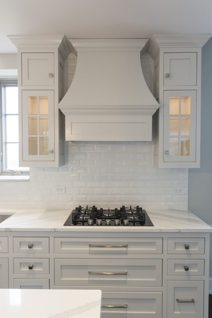
Huge functionality trends for this year are insets in drawers and cabinets that make storage more efficient or maximize space like these pegged drawers under the stove in the kitchen we designed here that hold pots and lids close by in an organized manner.

Other important considerations should include ample lighting for cooking or eating, hands free faucets that can be activated when you have dirty hands, pullouts that allow access to hard to reach places in corners or cabinetry/pantries, and functional back splashes with little or no grout lines.

For more inspiration, ideas, and photos, sign up for our weekly interior design blog here.

Plus become a fan of Kansas City’s interior designer and former host of the Living Large design show, Karen Mills, on 
INSTAGRAM and FACEBOOK here!
Interior Design/Interior Decorating

Interior Design: 3 Huge Mistakes We Make in the…

An Interior Designer’s Tips for Making Your Dining Room More Appealing

Karen Mills' blog
Interior design by Karen Mills as featured in Architecture Today Interior Design and Design Icons books
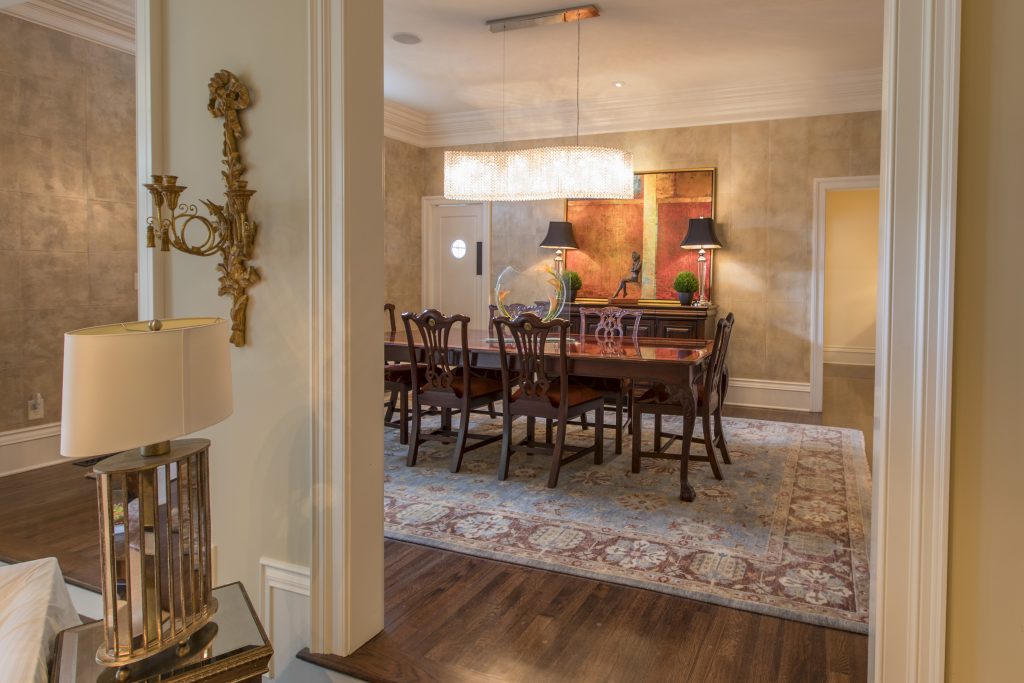
  1. Lack of emphasis  Creating a focal point with your table in the dining room gives you the opportunity to create a dramatic look, perfect for a dinner table or family gathering. Here in this Mission Hills dining room our interior design firm began with an existing table and buffet along with selecting a fabulous hand knotted wool rug. Then we took the design to another whole level but introducing more contemporary elements from the stunning Swarovoski crystal chandelier that compels you to take a closer look to the bold abstract art beyond, contemporary sculpture, and rich leather squares on the wall.
Karen Mills' blog
Interior design by Karen Mills as featured in Architecture Today Interior Design book

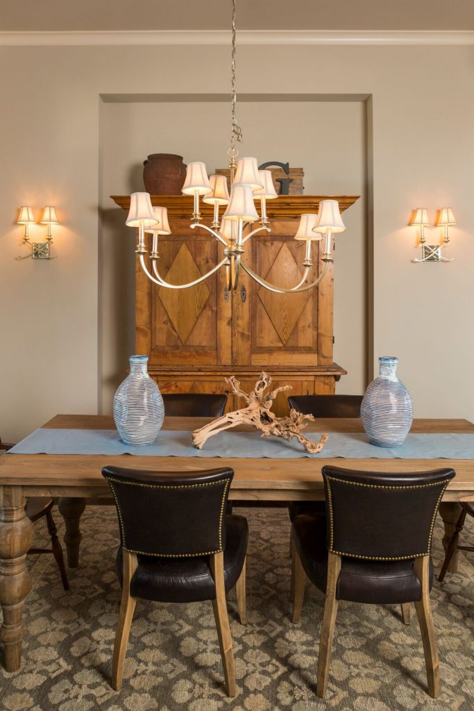
2.  Cold uninviting space –  One of the most common issues I see as an interior designer are dining rooms filled with all hard shiny surfaces such as crystal, glass, or ceramic along with hard flooring like wood or tile and no art on the walls. To solve this dilemna try warming up your dining space with lots of texture. Here in this Overland Park room the client requested we use their heirlooms – a table and armoire, along with leather chairs. To warm up this cold stark space, we introduced a piece of gnarled wood, two beautiful blue vases that look handmade, a custom cloth runner, and a thick hand knotted wool area rug underneath.

Karen Mills' blog
Interior design by Karen Mills

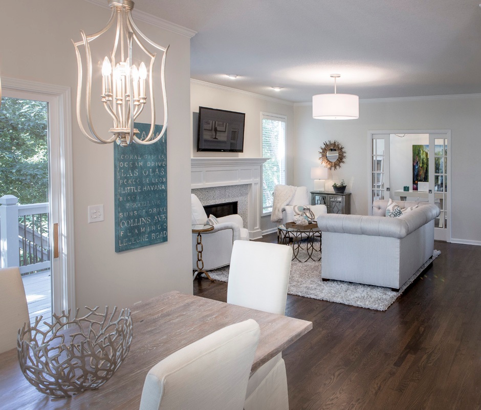
3. Looks Unfinished  When we walk into an interior design client’s home one of the first things we often see is an undone dining room or area. To enhance this space and make it more updated, I recommend adding color or texture like this dining area next to the existing kitchen. In this dining area we refinished a door in a soft neutral gray, replace the dark dated light fixture with two light airy ones, repainted the dark walls white, covered existing leather chairs with custom slipcovers, and add an interesting centerpiece plus a cheerful piece of blue art that reflected our client’s love of the ocean.

For more inspiration, ideas, and photos, sign up for our weekly interior design blog here.

Plus become a fan of Kansas City’s interior designer and former host of the Living Large design show, Karen Mills, on 
INSTAGRAM and FACEBOOK here!
Interior Design/Interior Decorating

Interior Design: You Know You Need to Hire a…

How to Avoid Costly Mistakes with Your Interior Design, Decorating, or Remodeling/New Build Project

example

After completing over 1200 interior design and decorating projects as an interior designer I’ve learned a thing or two about how people think and at what point they usually call for help, which is often too late. So today I’m going to reveal those times when you definitely need to hire an interior designer to avoid costly mistakes, have regret, or end up with an interior design that’s either not functional, ugly or both. Read on for my 7 tips for knowing when it’s time to hire an interior design firm for your project.

illustration
  1. You know you need to hire an interior designer when you’re on the verge of divorce from fighting about about your project. You may laugh at this reason why but I have to tell you that our interior design firm gets called on frequently to quietly settle disputes while also helping clients come up with a plan that works for everyone.
illustration

2. You know you need an interior designer when you’re about to make a large furniture purchase you will regret the rest of your life. Interior design firms not only help you design your interior but they also help you avoid costly mistakes by ensuring the furniture purchased is better quality, functional, and a good fit for your body type unless throw away furniture is what you want.

a. poor quality – Most people mistakenly believe that because a furniture store is expensive or popular that they have quality furniture not realizing that often much of the company’s investment goes towards advertising instead. Interior design firms check not only the quality of the frames of upholstered furniture but also ensure the fabric will hold up in your space.

b. wrong size – Can’t tell you how many times clients have asked me to resolve their space planning dilemma when its too late because the furniture they just purchased doesn’t fit into the room or through a doorway like the basement.

c. doesn’t fit – Have you ever purchased a sofa or chair only to find out too late that it doesn’t fit your body type or its uncomfortable? Unfortunately that’s one of the most common mistakes I see clients make that interior designers help you avoid.

illustration

3. You know you need to hire an interior designer when the bad color choice(s) you made are still on the walls. Interior design firms use their expertise and experience with color to help you make better color choices that flow with your designed interior overall.

illustration

4. You know you need to hire an interior designer when you are second guessing your decor selections in the middle of a project like a remodel, new build, or decorating project.

illustration

5. You know you need an interior designer when you know what you like but have no idea how to put the interior design project together

illustration

6. You know you need an interior designer when your space hasn’t been updated for 15-30 years because you can’t make a decision. That’s what interior design firms call analysis paralysis and it simply means you need a professional to help guide you through the process.

For more inspiration, ideas, and photos, sign up for our popular weekly interior design blog here with subscribers in over 130 countries.

Plus become a fan of Kansas City’s interior designer, former host of the Living Large interior design show, Karen Mills, on 
INSTAGRAM and FACEBOOK here!

Interior Design/Interior Decorating

Interior Decorating: 3 Big Design Mistakes We Make in…

rug sizing example
Interior design by Karen Mills
  1. Lack of a Focal Point    Often the best area to emphasize in a living space is the fireplace or great view outside but if you don’t have those options, create a vignette (grouping) of furniture/accessories that will grab your attention. Then group your upholstery around the focal point to emphasize it. Here in this living room the stone fireplace acts as a focal point for the seating area.
Karen Mills' blog
Interior design by Karen Mills

2.  Purchasing Over Sized Upholstery Or Too Many Pieces  Have you ever decided you wanted to buy a new living room grouping but didn’t bother creating a floor plan or measuring the space first? Suddenly your furniture arrives and the furniture takes up so much real estate you can barely walk through or don’t have room? As an interior designer I can’t tell you how many frantic calls I’ve received from homeowners requesting help with their space planning only to discover the wrong furniture was already purchased and they want me to fix it which we know is impossible. In this living room, the right size furniture was used and strategically placed to not only enhance the focal point (fireplace) but also leave ample room for someone to pass through.

Karen Mills' blog
Interior decorating by Karen Mills

3.  Selecting The Wrong Wall Color   After working on 1200+ interior design projects I see this mistake happen more than any other. We might want to blame a decorating network like HGTV or DIY for making us believe that picking paint colors is easy but I think its because the general public doesn’t realize how much a color can change when it goes from a tiny paint swatch to an interior or in different lighting situations. In this great room we selected the paint color during day that not only coordinated with the finishes and furniture but also played well with other rooms in view.

For more inspiration, ideas, and photos, sign up for our weekly interior design blog here.

Plus become a fan of Kansas City’s interior designer and former host of the Living Large design show, Karen Mills, on 
INSTAGRAM and FACEBOOK here!
Interior Design/Interior Decorating

Interior Decorating: 3 Tips for Creating a Cozy Bedroom

Often we take sleep for granted until we start to have problems with concentration, alertness, or our overall ability to function well. Then good sleep becomes more of a priority. Read on for 3 ways to create a nest like atmosphere in your bedroom that’s conducive to better sleep.

Interior design by Karen Mills featured in international book titled Architecture Today Interior Design
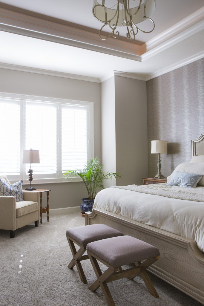
  1. Simpler Bedding and Patterns As an interior designer in Kansas City I’ve used simple tone on tone patterns and texture in bedrooms for years in everything from fabulous washable linens from Italy to textured velvet or sheared fabrics like we’ve seen recently in fashion wear. Here in this Overland Park bedroom Italian bedding from Terrasi Home on the Plaza in simpler patterns, textural finishes and clutter free space create a stress free environment where we can unwind and relax.
Karen Mills' blog
Interior design by Karen Mills featured in international book titled Architecture Today Interior Design

2. Cozy Beds  Beds that envelope us will continue to be popular whether its are a four poster bed, an upholstered bed like this guest room in Mission Hills, or a fabulous combination of both. In this guest room calming colors and patterns, low lighting, and clean lined furnishings enhance the overall feel, creating a beautiful interior design.

Karen Mills' blog
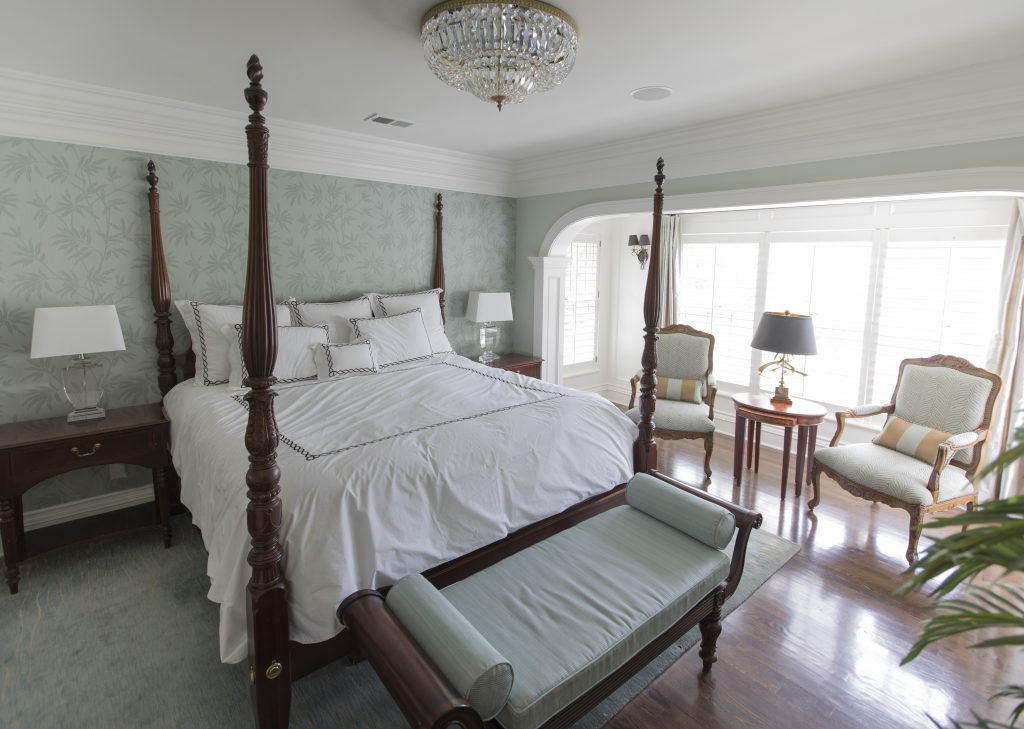
Interior design by Karen Mills featured international book titled Design Icons

In this bedroom a four poster bed creates a cozy feel
while the wallpaper, area rug, upholstered bench, and simpler fabrics on the chairs beyond enhance the relaxed inviting feel of this beautifully designed master bedroom in Mission Hills.

Karen Mills' blog
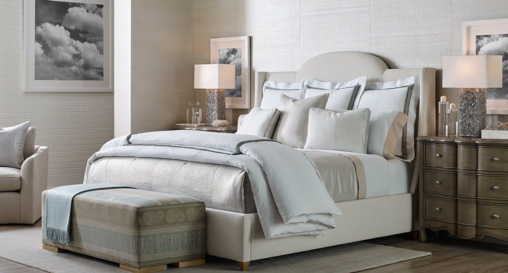
Photo courtesy of Curated Kravet


3. Textured Walls  Painted accent walls have been a craze for years but wrapping the whole room in textural walls will gain popularity again this year. In this interior design space featured by Curated Kravet an upholstered bed, area rug, bench, throw, and bedding add to the cocoon feel created by the gorgeous textural walls enveloping the space.

For more inspiration, ideas, and photos, sign up for our weekly interior design blog here.

For more information on how to get better sleep and create a healthier environment, learn more at SLEEP BETTER LIVE BETTER now!

Plus become a fan of Kansas City’s interior designer and former host of the Living Large interior design show, Karen Mills, on 
INSTAGRAM and FACEBOOK here!
Interior Design/Interior Decorating

Interior Design: 3 Ways to Remodel Smaller Kitchens to…

An Interior Designer’s Perspective on How to Make Your Kitchen Remodel Appear Bigger

As an interior designer who specializes in kitchen remodels, I often get called on to make a kitchen live larger. Read on for my 3 expert tips on how to do just that.

Interior design by Karen Mills – Kansas City
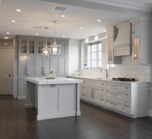
  1. Paint cabinets white or a light neutral color to reflect light around the room so the kitchen appears larger and cabinets seem to disappear. In this kitchen remodel natural light and interior lighting also give the room a larger feel.
Interior design by Karen Mills – Leawood

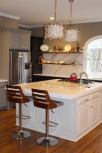
2. Incorporate open shelving or another design element to make cabinetry not appear so overwhelming. In this kitchen partial remodel we ran beautiful white quartz counter tops by Cambria up the wall as a back splash behind the shelving to offset the dark cabinets and lighten the room.

Interior design by Karen Mills – Kansas City

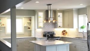
3. Glass front shelves, preferably lit, help open up this kitchen remodel to make it live larger by visually shrinking the cabinetry. Great interior lighting, sunlight, light neutral painted kitchen cabinets, white granite counter tops, and open shelves add to the larger feel.

For more great ideas on design or interior decorating sign up for our weekly interior design blog here

Plus become a fan of Kansas City’s interior designer and former host of Living Large design show, Karen Mills, on Instagram or Facebook now!